5.19. THE NEW YORK PRODUCE EXCHANGE: POST’S MASTERPIECE

George B. Post, Produce Exchange, New York, 1880. (Online)

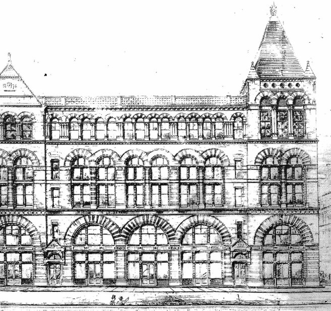
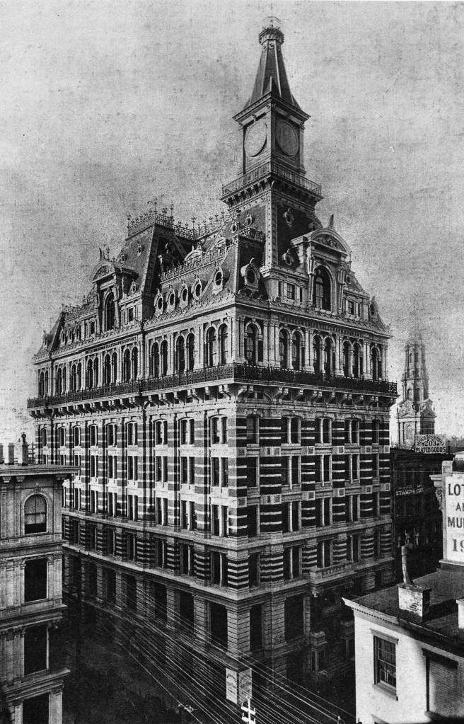
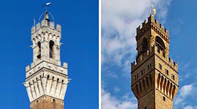
Post did not, however, abandon the romantic arch or the triple window motif by any means, for he did incorporate both details into his design of the New York Produce Exchange.  In October 1880, he was named the winner of an invited competition to design the building for a site adjacent to the Bowling Green at 2 Broadway.  Among the architects invited for the competition had been Charles B. Atwood, Leopold Eidlitz, Richard Upjohn, and E. Townsend Mix (the Milwaukee architect who had designed the Mitchell and Chamber of Commerce Buildings), who took second place.  It is interesting to note that while Post was involved in the design of two of New York’s larger buildings at the same time, he was still experimenting with both the formal and the rational alternatives to facade composition that were then in fashion.  While he had refined the use of multistory piers to impart a vertical accent to the elevations of the Mills Building, Post was incorporating superimposed multistory arcades to organize the horizontal elevation of the Produce Exchange.  This was probably due to the different proportions of the Produce Exchange that were much longer (300′ x 150′) and, therefore, more horizontal than those of the Mills Building.  One cannot ignore the symbolic image, however, that the building exudes recalling the Renaissance palazzos of Florence, the “trading” capitol of Italy. He incorporated a 225′ tall tower in the Produce Exchange that lent a counterbalancing vertical force to the building’s horizontal composition as well as a civic presence in New York’s urban landscape, once again seemingly recalling the towers of Florence’s Palazzo Vecchio and Siena’s Palazzo Pubblico

Post, Produce Exchange. (Online)
Tower, Palazzo Pubblico, Siena; Right: Tower, Palazzo Vecchio, Florence. (Online)

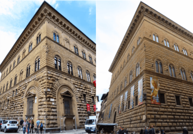
Although his winning design included a mansard roof not unlike his original design for the Mills Building, the later addition of another floor allowed him to reconsider and he opted for the palazzo box.  Historians have likened Post’s final design of strong, horizontal layers to each of the master palazzos of Medici-Ricardi, Strozzi, and Rome’s Farnese. 

Left: Palazzo Medici-Ricardi; Right: Palazzo Strozzi, Florence. (Online)

None of these palazzos, however, incorporated the motif of stacked arcades in a geometric progression.  I have reviewed Post’s early experiments during the early 1870s with arcaded elevations, but none of these ever used a sequence of arcaded spacings.  For Post’s inspiration we must credit Richard Morris Hunt in his early scheme for the New York Tribune Building.

Richard Morris Hunt, Study for the New York Tribune Building, New York, 1873. (Online)

I chose Hunt’s scheme over those by Lienau and Richardson (see Section 5.9) because Hunt did not use an A-B-A rhythm in his arcades; i.e., a major-minor rhythm between the primary piers and the intermediate piers.  More on this later.

Post, Produce Exchange, Detail of arcaded elevation. Note how he respects the integrity of each arch: the lower arches have triple windows, the upper arches have one semicircular piece of glass. (Andrews, Architecture in New York)

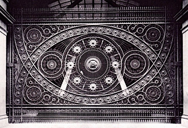
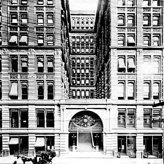
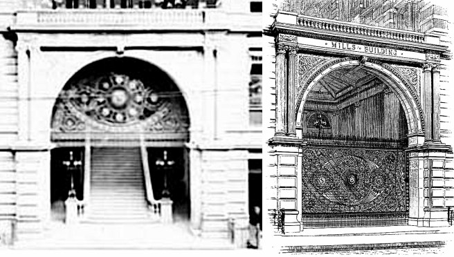
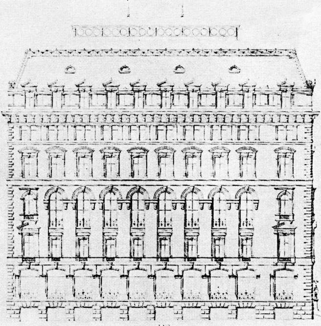
Post broke the elevation into four horizontal layers that expressed the building’s internal organization.  A one-story base of square-headed shops was surmounted by two layers of arcades: the lower layer corresponding to the 64′ high Exchange Room at the second floor and the upper one to the office floors above it.  Colossal pilasters at the corners were used to frame each layer, as well as to provide the symbolic buttressing of the end thrusts of the arcades.  

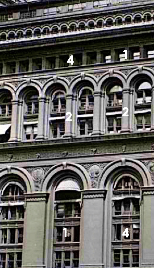
The arcade that surrounded the Exchange Hall set the primary structural bay and was detailed to contain four layers of triple windows.  The upper arcade doubled this rhythm with two arches over each primary arch below and contained two floors of offices. The corner pilasters grouped this arcade with an attic of square-headed windows that again doubled the spacing, so that four windows were located within the primary bay.  Post had arranged the openings in the red brick and terra-cotta exterior in a increasing geometric progression of 1:2:4 while the number of floors had a vertical rhythm of 4:2:1. An arcaded cornice enclosing the top floor of offices capped the composition.  The genius I see in this portion of the façade is that the smaller windows relate directly to the fact that the offices on this floor were smaller than those in the two lower floors (see below for this reason).  In my opinion, this building (and its architect) has never received the recognition its quality demands.

Richardson, Cheney Building. Rhythm of sopports in upper arcades. (Author’s collection)

Unlike Lienau and Richardson, who set the primary rhythm or “measures” in their layered arcades by carrying the major piers up, into the upper arcades, and then articulated the hierarchical rhythm in the smaller, upper arcades by modulating the thickness of the piers with respect to their overall position in the geometric order (as Richardson did in the Cheney Block), Post treated each arcade as a layer unto itself and made no differentiation in the piers’ thickness within an arcade layer.  This resulted in an unrelenting staccato across the 300’ long face of the building within the confines of the corner colossal piers that gave the elevation a strong, unmistakable horizontal reading, that was complemented by a monochromatic color palette of cherry red brick and matching terra cotta.

Post, Produce Exchange, Interior of Trading Room. (Online)

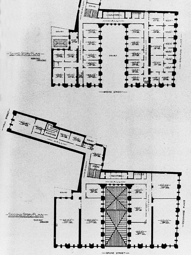
Faced with a program that required a very large (215’ long x 134′ wide), skylighted trading room with a ceiling height that varied in height from 45′ to 64,’ in addition to the requirement to provide 300 private offices for the brokers and rental income, Post revisited his original hollow-donut plan scheme for the Mills Building and arrived at a solution not unlike his design for the Equitable Building.  

Post, Produce Exchange. Transverse section. You can see the difference in the location of the corridor between the lower single-loaded corridor floors and the upper double-loaded floors. (Landau, Post)

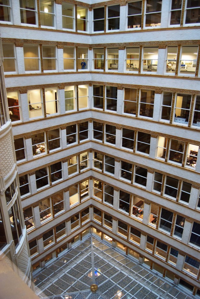
He placed the four floors of office space above the trading room and lined the perimeter of the large site with the cellular offices (the lower two floors contained larger offices that were single-loaded while the offices in the upper two floors were smaller and, therefore, could be double-loaded), thus creating an exterior lightwell in the center that not only lit and ventilated the inner tier of offices, but also allowed the placement of a skylight over the center of the trading floor to illuminate it as well. 

Post, Produce Exchange. Photo of construction showing the iron framing employed in the interior and skylight. (Landau, Post)

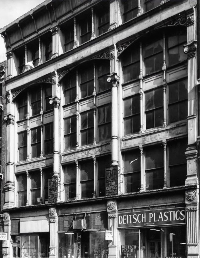
The requirement for a column-free interior in the trading room forced Post to use long-span wrought-iron trusses. Instead of supporting these directly on the large cast iron columns that supported the four floors of offices above, however, Post extended a cantilever from each column to move the support end of the truss a distance away from the column.  This allowed him to create a range of clerestory windows under the truss that would provide daylight for the Exchange Hall that was pulled away from the windows of the offices that lined the light court, thereby avoiding any conflict between either set of windows.  This detail also provided a space for maintenance men working on the skylight, as well as provided space for snow to accumulate without piling up against the windows of the adjacent offices. Using a similar detail to what is thought he had used in the Equitable Building’s lightcourt exterior walls, he designed the four stories of exterior walls ringing the lightcourt as an iron skeleton frame that supported its exterior brick curtain walls.  

Post, Produce Exchange. Elevation of the lightcourt’s exterior walls. Note that the cantilevered support of the trusses pulled the skylight away from the windows of the first floor of offices. (Landau, Post)

He expressed the iron structure in the design of these elevations by articulating the rectilinear framework of columns and beams by covering them with a cast iron panel, a detail similar to how Bogardus had protected the iron columns in the Tatham Bros. shot tower of 1856.  By simply infilling the voids either with double-hung windows or with a brick panel, he had created one of the earliest, if not the first, truly modern curtain-walled exterior elevations based on the expression of its construction and structure.   Much later, at the 1894 A.I.A. Convention, Post would state: 

“I built the tower of the Produce Exchange with a wrought and cast iron cage, filling in the panels with brickwork, but covering it on the outside with cast iron plates in the form of pilasters and stringpieces and cornices so that it could be painted as necessary… I have never enclosed a cage in solid mason work.  I never dared to.  I have always built the cage detached inside, anchoring the walls to it, so that in the case of corrosion, it could be painted and repaired.

While there is only the one extant photograph of Post’s iron structure in the Equitable’s lightcourt walls, we know the Produce Exchange’s actual construction and final appearance from Post’s existing drawings and construction photographs. 

Post, Produce Exchange, Photo of Construction showing the iron skeleton framing in the lightcourt walls. (Landau and Condit, New York)

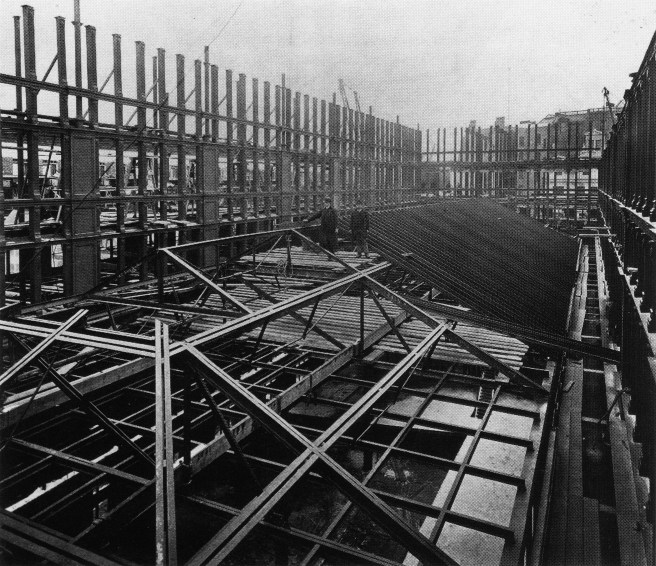
There can be no argument about whether or not iron skeleton framing was first used by Post in these exterior walls of the Produce Exchange, for it is right there in the photograph, clear as daylight, for everyone to see.  While James Bogardus can be credited as the inventor of the American iron skeleton frame, George Post deserves the credit as being the first post-Civil War architect in America to use the multistory iron skeleton frame in the exterior of a building.  Again, I refer back to Daniel H. Burnham’s cryptic statement, “George Post was the father of the tall building in New York.”  As there were no iron skeleton framed buildings in Chicago during the design and construction of the Produce Exchange, I repeat, Post deserves to be known not only as “the father of the skyscraper,” but also as “a pioneer of the iron skeleton frame” in the U.S.

FURTHER READING:

Landau, Sarah B. George B. Post, Architect.  New York: Monacelli Press, 1998.

Landau, Sarah B., and Carl Condit.  The Rise of the New York Skyscraper, 1865-1913. New Haven: Yale University Press, 1996.

(If you have any questions or suggestions, please feel free to eMail me at: thearchitectureprofessor@gmail.com)

5.18. THE MILLS BUILDING: THE FIRST MODERN OFFICE BUILDING

George B. Post, Mills Building, New York, 1881. Wrought Iron Portcullis. (Landau, Post)

While Post had taken his inspiration for the design of his Cornelius Vanderbilt II mansion from Hunt’s earlier chateauesque designs, his final design for the Mills Building seems to owe more to Snook’s William H. Vanderbilt palazzo.  In the final ten-story, 156′ high design of what can be considered to be the first large office building of the 1880s, Post completely abandoned his original ornate roofline, in favor of the overall box-like, palazzo form of the Shillito’s store.  He conversely reverted to the standard paired window and colossal Classical pilaster language of his office buildings of the 1870s, to arrange the elevation into a two-story stone base with the upper eight floors articulated into a 2:3:2:attic rhythm.   As he had done in the Western Union building, Post tried to make a transition in the second layer by alternating layers of the base’s brownstone with layers of red brick from the upper four floors that were sheathed in red brick and terra cotta (provided by Loring’s Chicago Terra Cotta).  It had the result of once again imparting an unnecessary busyness to that area of the building’s façade.  As in the Shillito’s Building, there were no arches in the facade of the Mills Building, except for the triumphal arched entry.  The Mills Building was another early example of a non-romantic, rational composition of a multistory façade (with applied Classical details).

George B. Post, Mills Building, New York, 1881. Note that all the windows have awnings. (Online)

Structurally, the building was typical “boxed” construction with its interior iron frame and exterior masonry bearing piers.  In the process of excavation, a body of quicksand was found within the site that forced the redesign of the building’s foundation.  I want to describe the building’s foundation simply to show that even New York City had sometimes presented builders with geologic problems, not unlike those faced by builders in Chicago.  Fearing that further excavation might cause adjacent buildings to settle because the quicksand would ooze into the excavation, lowering the bearing elevation of existing foundations, thereby causing portions of these buildings to settle more and possibly crack, Post redesigned the foundation to be a solid brick wall that at grade began at 3’ 6” in thickness, with a constant outward slope that reached 5’ in thickness, at 18’ below grade (remember in New York, in this case bedrock was at 65’ below grade, basements were not limited to only the first 12’ below grade as was the case in Chicago).  Here Post placed an 8’ wide continuous concrete pad under the wall.

Post, Mills Building. Floor Plans. (Landau, Post)

As he had eventually rejected the triple windows of the Shillito’s Building, Post also deviated from its plan.  As opposed to lining the perimeter of the site with single-loaded corridor offices around an interior atrium, as his initial scheme apparently had done, it is evident that by experimenting, Post realized he could create more rentable office space if he used two double-loaded corridors that were pushed to the short sides of the site and separated these with an exterior lightcourt, not at all unlike Snook’s entry in the W.H. Vanderbilt mansions and similar to how he had just designed the Post Building.  This created a highly efficient circulation scheme, symmetric about the centrally-located elevator core. (There also an extension wing built to provide on entrance on Wall Street.) The building’s footprint at grade was some 23,000 sq.ft., that resulted in almost 200,000 sq.ft. of rentable floor area.  This created over 300 offices that had a reported 800 tenants with 1500 employees in the building.  All of which could be served lunch in a restaurant located on the top floor.

Post, Mills Building. Entrance. Note the repetitive windows in front of the elevator bank on each floor. The grand staircase to the Entresol testifies to the importance of the second floor at this time (and could easily have been the influence for Root’s staircase in the Rookery’s atrium). The wrought iron portcullis was lowered at closing, thereby offering better night time security. (Online)

The lightcourt plan also vastly improved the natural lighting and ventilation of the internal office spaces, and also permitted a more flexible subdivision of each floor that could respond to a specific client’s needs.  This was accomplished with the use of lightweight hollow tile partitions that no longer needed to be placed directly over a beam for support.  The exterior exposure of the lightcourt also changed the proportions of the facade that now had a distinct vertical accent, while it also broke up the great mass of the entrance facade at its center that helped to emphasize the symmetrical location of the entrance.  Post located the entry lobby and hall directly under the skylight at the bottom of the lightcourt.  The first two floors were designed for banks, insurance and finance companies, for which a central grand staircase took visitors immediately up to the entresol.  For those visiting the upper floors, the lobby led directly to the bank of four elevators located at the rear of the building.  The building’s ornamental highlight had to have been the wrought iron portcullis that was hydraulically raised every morning in time for the start of the business day.

The reverse arch in the portcullis’ ironwork would complete a circle with the semicircular arch above. (Left: Online; Right: ClipArt ETC)

In 1883, in the basement that Post had created with the foundation, the building was the first to have its own electricity-generating plant, that supplied power for some 5,600 lights throughout the building.  (Thomas Edison had held the first public display of his new incandescent light bulb on December 31, 1879, that received its patent only a month later in January 1880.)  For good reason, Winston Weisman in an article in 1972 had identified the Mills Building as the first modern office building.  Darius Mills had brought the Palace Hotel’s “over-the-top” aesthetic (at $1.43 million it was the most expensive commercial building in New York to date, with cherry trimmed offices and corridors with tile floors and marble wainscotting) to the New York City speculative office building/skyscraper.  He and George Post had set the bar for the competition at a much higher level than what had existed prior to the Depression.  Nothing like this existed at this time in New York, let alone at the fringe of civilization in Chicago.

FURTHER READING:

Landau, Sarah B. George B. Post, Architect.  New York: Monacelli Press, 1998.

Landau, Sarah B., and Carl Condit.  The Rise of the New York Skyscraper, 1865-1913. New Haven: Yale University Press, 1996.

Weisman, Winston, “The Commercial Architecture of George B. Post.” JSAH, Vol. 31 No. 3, Oct, 1972.

(If you have any questions or suggestions, please feel free to eMail me at: thearchitectureprofessor@gmail.com)

5.16. THE INFLUENCE OF THE SHILLITO’S STORE ON GEORGE POST

George Post, Smith Building, New York, 1879. (JSAH, October 1972)

The Shillito’s store had its impact on George Post, as well, judging by his projects that immediately followed the October 1877 publication of its design and details in American Architect.  In 1879 he designed the Smith Building in which in its elevation he rotated his typical horizontal accent, such as how he had detailed the pre-Shillito’s New York Hospital, to a vertical emphasis à la Shillito’s. In fact, he even kept McLaughlin’s rhythm of a base, a three-story middle (tied together also with colossal pilasters) and a one-story top, upon which he placed the still fashionable mansard roof with dormers.

In 1880, Darius Ogden Mills, California’s wealthiest resident and until 1878, the President of the Bank of California, returned to New York, his hometown to retire and to continue in the development business.  We last discussed Mills in Volume One in relation to his role in the construction of San Francisco’s grand Palace Hotel. He was one of the three members of San Francisco’s “Comstock Ring,” along with William C. Ralston and William Sharon, that had made a killing in bankrolling would-be miners in Nevada’s Comstock Lode’s silver bonanza of the 1860s.  In 1864, the three “bankers” had founded the Bank of California, destined to become the largest bank west of the Mississippi, with Mills as the president, Ralston as the Cashier, and Sharon as the manager of the branch bank in Virginia City, Nevada. 

John P. Gaynor, Palace Hotel, San Francisco, 1871. The Grand Court. (Lewis, Bonanza Inn)

As I discussed in Volume One, Ralston had used his wealth to build the country’s most expensive hotel (over $5 million, Chicago’s contemporary Palmer House had cost a mere $3.5 million), the Palace Hotel.  Unfortunately, he never lived to see its completion because his two partners had turned against him and exposed his financial manipulations first as the Bank’s Cashier, and then following Mills’ strategic resignation, as its President to assist in funding the construction of the hotel during the early days of the 70s economic depression.  Once the two exposed his malfeasance Ralston resigned the next day and never returned the following day from his daily swim in San Francisco Bay.  Sharon now owned the Palace Hotel that was formally opened for business on October 2, 1875, the same day that the Bank of California reopened its doors, with Darius Ogden Mills once again in the president’s seat.

George B. Post, Preliminary Design for the Mills Building, New York, 1880. (Weisman, American Architecture)

New York’s economy had started to come out of the depression in 1878 and by 1880 had sufficiently recovered to allow the revival of construction of ten-story skyscrapers.  Mills commissioned Post to design a huge, expensive speculative office building at the corner of Broad Street and Exchange Place.  Post’s original design was nothing more than an exact copy of the Shillito’s Store (I have photoshopped the image to compare) with a dormered mansard roof, like the Smith Building, placed directly on top, in an apparent attempt to lend a level of ornateness to the spartan body of Shillito’s. This would have been more appropriate for the image of a pre-depression office building, than that of a building that was a result of five years of economic depression.  Although no plan has survived, I can surmise from the site plan and the elevations that it would have been a single-loaded corridor scheme, again repeating the Shillito’s plan, but also I can’t resist the idea that Mills had suggested that Post reprise the interior of the San Francisco Palace Hotel.

Top: Shillito’s; Bottom: Post’s Original Design for the Mills Building, sans Mansard Roof. (Author’s collection)

5.17. THE FIRST EXTERIOR-EXPOSED LIGHTCOURTS: THE VANDERBILT MANSIONS AND THE POST BUILDING

George Post, the Post Building, New York, 1880. (Landau, Post)

While the Mills Building’s preliminaries were developing, Post received the commission to design another New York office building, the Post Building.  Here Post showed his openness to new ideas by convincing the owners, Post’s own father Joel Browne Post and uncle John, that he could give them not only more offices, but also ones better supplied with daylight and fresh air with a floor plan that broke from the street front with the use of an exterior lightcourt, i.e., a U-shaped plan.  Montgomery Schuyler, the critic for American Architect, reported that  “The most striking feature is the interior court gained by a bold recess in one of the fronts which is thus divided into projecting wings and a center withdrawn half the depth of the building.”  The building’s massing comprised of a two-story bluestone base, with asymmetrical wings to either side of the lightcourt, the building’s entrance being located immediately beneath the lightcourt.  The elevations of the wings consisted of a four-story body (curiously, after he had detailed both the Equitable and the Western Union Buildings with flat-headed windows, Post had regressed to using arch-headed windows in each floor that were connected with colossal Classical pilasters), that supported a two-story top. These upper six floors were sheathed with pale yellow brick and matching terra cotta.

John B. Snook, William H. Vanderbilt twin residences, New York, 1879. Hunt’s house for W.K. Vanderbilt is immediately across the street. (Online)

Historically, Post should not be given credit for this idea, for John Snook, the architect of Vanderbilt’s Grand Central Depot (for which Root had been the construction superintendent), had used this idea the year before in the design for a new mansion on the west side of Fifth Avenue between 51st and 52nd Streets for William H. Vanderbilt, the new patriarch of the Vanderbilt clan and the New York Central Railroad system, following the death of his father on January 4, 1877. Vanderbilt had asked Snook to design two mansions: one for himself, the other, joined by a common entrance, for his two daughters and their families.  Snook designed two brownstone palazzos that were linked in the center of the lot by a glazed atrium that served as an entrance for both residences.  Snook had set the precedent that would be imitated in many coming buildings, including the Mills Building.

George B. Post, Cornelius Vanderbilt II residence, New York, 1879. (Landau, Post)

There was no way Post could have been ignorant of Snook’s design as he himself had been commissioned by the old “Commodore’s” oldest grandson, Cornelius II, to design his mansion on the northwest corner of Fifth Avenue and 57th, five blocks north of his father’s mansion and only a block south of Grand Army Plaza and Central Park.  All this new construction was made possible once the elder Vanderbilt’s estate had been finally settled in April 1879, after which the Commodore’s son and his two eldest grandsons, Cornelius II and William K., took little time in spending a portion of their inheritances in erecting what would be known as “Vanderbilt Row.”  Post had produced a French chateau-inspired design that employed both late Gothic and early Renaissance details with a highly ornamented pitched roof, not unlike the one he would employ the following year in his first design of the Mills Building.  We will discuss the third mansion, that of grandson William K. when appropriate.

FURTHER READING:

Landau, Sarah B. George B. Post, Architect.  New York: Monacelli Press, 1998.

Landau, Sarah B., and Carl Condit.  The Rise of the New York Skyscraper, 1865-1913. New Haven: Yale University Press, 1996.

(If you have any questions or suggestions, please feel free to eMail me at: thearchitectureprofessor@gmail.com)

5.12. AFTER THE SECOND EMPIRE: THE RETURN OF THE PALAZZO BOX

James McLaughlin, John Shillito and Co. Store, Cincinnati, 1877. (Cincinnati, The Queen City, 1901)

The Depression had brought on an increased awareness of cost as seen in the shedding of towers and of tall Mansard roofs in favor of a flat-roofed brick box.  The elimination of the Mansard roof at this time was not coincidental, as the Second Empire had just recently been defeated by the Prussians and had been replaced in France with the Third Republic.  Apparently, the more pragmatic aesthetic of the Renaissance or Italianate palazzo was deemed more appropriate for New York’s office buildings during the poor economic conditions of 1874-79 than was the overly-ornate style of the Second Empire.  

C. F. Mengelson, New York Evening Post, New York, 1875. (Landau and Condit, New York)

In 1875, C.F. Mengelson designed the ten-story New York Evening Post Building for the corner of Broadway and Fulton.  Although it contained the same number of floors as its competitor’s, the Tribune building, the Evening Post building’s meager height of only 115 feet was over 50 feet shy of the top of the Tribune‘s high roof.  The Post‘s brick elevations employed not only the colossal pilasters of the Tribune Building, but also used these in a similar manner to group the middle floors into a 3:2:1 progression, which was reinforced by the use of arches in the windows in the top floor of each layer.  These layers were then topped by an attic with a Mansard roof pavilion (a less expensive memory of the mansard roof) centered over the main entrance.  This pavilion, a sorry remnant of the Tribune‘s grand tower, was also linked to the entrance in the same manner as in the Tribune by two continuous lines of pilasters that flanked the entry.

5.13. THE INFLUENCE OF NEW YORK ON THE SHILLITO’S STORE

Meanwhile, the first building of any size that consistently employed the alternative to the romantic arcade, the rational, rectilinear grid of the structure, and therefore, not only represented the resolution of many of the various design issues of the period, but also presaged developments to come in Chicago during the 1880s, was  James McLaughlin’s Shillito’s Store in Cincinnati (that I discussed in Vol. Two, Chap. 6). The elevations revealed his intimate knowledge of contemporary developments in New York.  The piers of the first two floors incorporated red brick laid in black mortar with alternating thin bands of light stone, an effect quite like that which Post had used in the middle floors of the Western Union Building. Meanwhile, the grid-like detailing of the intersection of the recessed spandrels with the mullions was similar to the way Hunt had solved the problem in both the Delaware and Hudson Building and the Tribune Building.  In fact, the fluted pilasters of the sixth floor are an extended version of Hunt’s detailing of the Tribune‘s piers.  

George B. Post, New York Hospital, New York, 1874. (American Architect, March 17, 1877)

The triple windows of the Shillito’s Building also owe their origin to Hunt, as first seen in the warehouse he had designed in 1873 at 478 Broadway.  In addition, prior to McLaughlin’s use of this technique, American Architect had published in its March 17, 1877, issue a rendering of the New York Hospital designed by Post in 1874.  Post had employed the triple window and square transom motif in the lower three floors, although while the ground floor showed three openings, the center “opening” of the grouping was actually a recessed opaque panel in the second and third floors. McLaughlin’s detailing of the transom mullion is an exact copy of Post’s.

Comparison of window detailing. Left: George Post, New York Hospital; Right: McLaughlin, Shillito’s Store. (Author’s collection)

5.14. THE INFLUENCE OF THE SHILLITO’S STORE ON NEW YORK

James McLaughlin, John Shillito and Co. Store, Cincinnati, 1877. (American Architect, October 13, 1877)

As McLaughlin’s Shillito’s Building had had a direct impact on Chicago’s architecture, via Jenney’s design for the First Leiter Building (see Chap. 1, Section  9),  it would also be a strong influence on New York’s buildings.  Engravings of the elevations and structural details of the Shillito’s store were published in the October 13, 1877, issue of American Architect, exposing the greater part of the profession to a viable logical, rational alternative to the lyrical, romantic arcade as a technique for detailing the openings in a multistoried building’s exterior elevations.  

Stephen Hatch, Boreel Building, New York, 1878. (Online)

The influence of the Shillito’s triple window and brick pier language is quite evident in the ground floor of the corner bays of the Boreel Building in New York at the corner of Broadway and Cedar, directly opposite the Equitable Building.  Designed by Stephen Hatch in 1878, the Boreel elevations inverted Hunt’s diminishing 3:2:1 rhythm in his original design for the Tribune and used the strip pilasters to group the middle six floors into an atypically increasing 1:2:3 sequence.  This may have been an attempt on Hatch’s part to use the extended verticality of this arrangement to offset the long street facade of the large 101′ x 146′ site.  Hatch also used the pilasters to break this elevation into a central entrance bay with flanking corner bays.  The central bay, however, was marked not by a proud tower, but by a squat pediment that was perched above the flat roofline of the brick box.  Although no plan of the building has survived, Lee Gray uncovered an article in the April 1881 Scientific American that described the buildings four hydraulic elevators and included an illustration of the building’s atrium. The eight floors shown in the elevation would have resulted in an eight-story high, balcony-lined (as seen in the interior drawing) space covered by a glass skylight.

Hatch, Boreel Building. Interior atrium. (Gray, Elevator)

From the given 42’ by 51’ dimensions of the atrium and using this illustration, I would conclude that there were three street fronts per the exterior photo.  Assuming a symmetrical plan, subtracting 42’ from the 101’ width leaves 60,’ sufficient for a single-loaded corridor located along the two side streetfronts. Subtracting 51’ from the 146’ depth leaves us with 95,’ that would equate to one double-loaded and one single-loaded corridor.  The illustration shows both a window wall (the double-loaded portion) and a balcony overlooking the atrium, typical for a single-loaded scheme.  I submit that Hatch placed the single-corridor against the back of the building because the atrium would provide sufficient light, while he placed the double-loaded corridor along the Broadway front.  The interior illustration shows a tunnel to the atrium that I interpret as leading from the Broadway entrance to the atrium (I can think of no other reason for such a tunnel if placed at the rear).  The elevators are in wire-lined, but other than that open shafts, in pairs to either side of the atrium.  At the far end of the atrium Hatch located stairs to the entresol.  (The similarities to Root’s design four years later of the Chicago, Burlington, and Quincy Railroad Building are not coincidental, as we will see in the next chapter.)

Hatch, Boreel Building. Reconstructed First Floor Plan. (Author’s collection)

As if its central pediment had been lowered on vertical tracks attached to the center piers, the Morse Building by Silliman and Farnsworth, also designed in 1878, represented the final elimination of any reference to a roof in a New York building.  Here the central pediment was located immediately above the entrance, resulting in a cubic red brick volume with a flat roofline, echoing McLaughlin’s box-like form of the Shillito’s Building.  Its owners would late claim that it was “the tallest straight wall building in the world.”  As it was located on the corner of Nassau and Beekman, it was adjacent to the TribuneBuilding, and, therefore, offered the opportunity to compare what one could consider to be the bookends of the evolution of New York’s skyscrapers of the 1870s.

Silliman and Farnsworth, Morse Building, New York, 1878. (Landau and Condit, New York)

Although pilasters were used once again to group the floors into larger horizontal layers, there was no attempt to create a statement of a vertical progression in the Morse Building.  Instead, the first nine floors were handled as a static repetition of an alternating 2:1 rhythm.  The continuous vertical lines of the pilasters were contradicted, however, in the way that each floor was articulated to read as a distinct horizontal unit between the pilasters by continuous banding at the windowsills.  This was reinforced by the detailing of the windows as single openings, even though the architects attempted to restate the larger segmental arches of the basement in the lower two floors of each 2:1 layer.  The tenth floor was detailed as an attic with an arcade that doubled the rhythm of the single windows below.  This capped the facade’s continuous vertical thrust of the stacked pilasters as a rather under-scaled cornice, resulting in a confused restlessness in the overall effect of the elevations.  Flat roof aside, the Morse Building was also a landmark in that it was the culmination of the search for a fireproof exterior, for it was the first tall commercial building to eschew the use of any stone in its exterior.  Instead, the architects responded to Post’s recent experiments with Loring’s terra cotta by giving Chicago Terra-Cotta a contract to provide all of the windowsills and stringcourses.  Upon its completion, American Architect showcased the Morse Building as an example of an all-masonry exterior:

“The first use of the noteworthy attempts to build in brick alone, and to discard stone, even in the positions in which stone had been accepted as indispensable, was… the Morse Building which remains one of the most interesting and successful of these attempts.  The manufacture of terra-cotta has been much improved in the interval, but there has been no example of brick-work built since in which moulded brick and colored brick have been used with more fitness and sobriety, nor in which a more agreeable and satisfactory result has been attained.”

Silliman and Farnsworth, Morse Building, Entrance. (American Architect, October 9, 1880)

The exterior walls were thick, starting at 3′-6″ in the ground floor.  The interior construction was completely fireproofed using techniques pioneered in the Western Union and Tribune Buildings.  The floors were supported by 15″ wrought iron beams, from which were supported corrugated sheet iron arches.  These were then topped with concrete to level off the floors.  The building was an immediate success, with the top three floors being leased fourteen months before the building was completed, evidence that the elevator had, indeed, inverted New York’s rent culture.

5.15. PEABODY & STEARNS: THE UNITED BANK BUILDING

Peabody & Stearns, United Bank Building, New York, 1880. Entrance. (American Architect, April 23, 1881)

Perhaps the best-designed building of the red brick boxes at the end of the 1870s was the nine-story United Bank Building at the northeast corner of Broadway and Wall Streets designed by Peabody & Stearns of Boston in 1880.  Robert S. Peabody had graduated from Harvard in 1866, worked for a brief stint for Ware & Van Brunt, where he first met Chief Draftsman John G. Stearns. Stearns had received his Bachelor of Science in Engineering from Harvard earlier in 1863 and had began working in the office, rising to Chief Draftsman. Peabody didn’t stay long as he then left for a three-year tour of Europe.  During this time he studied at the École des Beaux-Arts in the Atelier Daumet, where he had worked with Charles Follen McKim, a recent graduate of Harvard’s Lawrence Scientific School.  Upon Peabody’s return to the U.S. in 1870, he and Stearns established their partnership that by 1880 had risen in reputation in Boston to being second only to that of the great Richardson.  Peabody was the designer and business head, while Stearns was in charge of construction and field supervision.

Actually, the building’s design appears to have been the product not of Peabody but of George A. Fuller, who had been made a partner in 1876 and put uncharge of establishing the New York office. Fuller had been born in 1851 in nearby Worcester, MA, and had learned construction “in the field” before he briefly had some architectural training at MIT, then commonly referred to as “Boston Tech,” prior to his finding a post with Peabody & Stearns in 1872. He was known as having a natural instinct with construction-related issues. By the time the office received the commission for the United Bank, Fuller had become a strong advocate for the use of steel in building construction. In the United Bank Building, although he apparently had unsuccessfully tried to convince his partners to allow him to use steel, he did use iron columns in the exterior of the first two floors in the long Wall Street facade, providing more daylight and usable floor space.

George Fuller, United Bank Building. Detail of iron columns used in the storefront along Wall Street. The iron column is visible immediately to the left of the telegraph pole. (Online)

Fuller had placed a four-story red brick arcade at the top of both street fronts.  Like Post, he also employed smaller, square-headed windows in the attic to cap the elevation.  The spacing of these windows in relation to the lower arches, however, was not handled in an apparently consistent manner, as the attic openings did not relate to the lower arcade in the same way from one arch to the next.  Instead, the rhythm of the openings in the attic reinforced the sense of a central entrance by continuing the thrust of the entrance’s flanking piers into this layer of the elevation.

Peabody & Stearns, United Bank Building. Close-up of Brick Detailing. (American Architect, April 23, 1881)

FURTHER READING:

Gray, Lee E. From Ascending Rooms to Express Elevators: A History of the Passenger Elevator in the 19th Century. Mobile, AL: Elevator World, 2002.

Landau, Sarah B. George B. Post, Architect.  New York: Monacelli Press, 1998.

Landau, Sarah B., and Carl Condit.  The Rise of the New York Skyscraper, 1865-1913. New Haven: Yale University Press, 1996.

 (If you have any questions or suggestions, please feel free to eMail me at: thearchitectureprofessor@gmail.com)

5.10. RICHARDSON RETURNS FROM FRANCE

H.H. Richardson, Cheney Building, Hartford, CT., 1875. (Online)

Richardson chose to return at the end of the war not to his native New Orleans or to Boston, where he had a built-in client network of Harvard classmates now in important business positions, but to New York.  After floundering on his own for the better part of two years, he was taken on by Charles Gambrill as his junior partner in October 1867 to fill the void created by George Post’s decision to start his own practice after he had been hired by Equitable to redesign Gilman & Kendall’s winning proposal. Richardson had also submitted an entry in the competition that I will return to in a moment.

H.H. Richardson, Grace Episcopal Church, Medford, MA, 1867. (Online)

Before partnering with Gambrill, Richardson had been one of three architects invited in February 1867 to submit a design for the competition for the church of Peter and Shepherd Brooks,  Grace Episcopal Church in Medford, MA, (Medford was the location of the Brookses’ summer estate, some nine miles north of Brookline) for which his entry was chosen.  He actually may have received the invitation because of Shepherd whom he had known while he was at Harvard. Nonetheless, by the completion of the church’s construction in 1869, both Brookses had to have intimate knowledge of Richardson, if for no other reason than when it became obvious that his design was going to be over budget the Brookses ended up having to pay for all of the church, and then had to lease it back to the congregation.   Such fiscal irresponsibility would not have sat well with the shrewd businessmen, and this may well have been the reason that the Brookses never again used Richardson (even though all three lived in Brookline) who was eventually to become the county’s most famous architect, for any of their later projects.  They may not have even considered Richardson for the design of their post-fire Portland Block in Chicago because in 1872 his forte was churches and residences, as witnessed by his successful submission in the competition to design the replacement for the fire-destroyed Trinity Church in Boston, the church of one of the country’s leading clergymen, Philips Brooks (no immediate relation to Peter and Shepherd Brooks).  Not long after, Gambrill & Richardson were commissioned in 1873 by American Express to design its post-fire Building in Chicago at 21 W. Monroe.

H.H. Richardson, Competition Design for Trinity Church, Boston, 1872. Concern over the ability of wood pilings to support the weight of the tower in the soft soil of Boston’s Back Bay forced the congregation’s building committee to ask Richardson to redesign the tower, which he did. This concern may have been sparked by the foundation problems the American Express Building in Chicago was experiencing at that moment. (Van Rensselaer, H.H. Richardson)

5.11. RICHARDSON RELOCATES TO BOSTON

H.H. Richardson, Proposed Design for the Equitable Life Assurance Building, New York, 1867. (Hitchcock, H.H. RIchardson)

Having to supervise construction of Trinity, Richardson left New York (while he maintained the partnership with Gambrill until 1878, they appear to have done their own designs) to return to Boston in May 1874.  Although he had somewhat timidly experimented with a progression with multistory arcades for masonry skeletal construction in his 1867 competition submission for the Equitable Building, he wouldn’t use it in a constructed building until 1875 on a small five-story office building owned by his wife and other heirs of his late father-in-law’s estate.  

H.H. Richardson, Hayden Building, Boston, 1875. (Online)

The Hayden Building was designed in early 1875, coming after Hunt’s and Cady’s Tribune proposals of 1873 and Post’s Marine Bank of 1874.  As Richardson was still in New York when these three schemes were proposed and, more importantly, as he was the editor of the New York Sketchbook of Architecture in which Cady’s scheme was published in the July 1874 issue, it is inconceivable that Richardson was not familiar with these designs.  In fact, the rough sandstone exterior of the Hayden was an interesting blend of Cady’s and Post’s schemes.  The third and fourth floors were grouped together by a two-story arcade. The second story in the short elevation, meanwhile, was detailed with a single-story segmental arch similar to Cady’s Tribune.  The attic of this elevation consisted of four square-headed windows like those of Post’s bank, creating an unresolved rhythm of 1:3:4. 

Richard Morris Hunt, Study for the New York Tribune Building, New York, 1873. (Online)

However, it was Hunt’s preliminary scheme for the Tribune that must have made a lasting impression on Richardson for a sketch of the Tribune was the first illustration he published as the editor of the Sketchbook.  Only a few months after designing the Hayden Building, he received the commission in the summer of 1875 for the Cheney Building in Hartford, CT.  In its five-story brownstone and limestone elevations, Richardson finally succeeded in erecting Hunt’s proposed three-layered arcades in a diminishing progression of 1:2:4.  

Richardson broke the elevation into three parts both horizontally and vertically.  Vertically, he detailed the elevation with the conventional parti of a middle with flanking corner pavilions.  Horizontally, the lowest layer contained the first two floors grouped under wide, round arches, the transom of which lit the second floor.  Richardson, probably inspired by Detlef Lienau’s Noel and Saurel Building, extended the width of the structural piers of the ground floor into the upper levels, creating once again what one could consider to the equivalent of a musical “measure.”  The middle layer contained the third and fourth floors that were connected by a two-story arcade similar to the Hayden Building.  The structural bay or “measure” now contained two arches that were supported by an intermediate pier that was thinner than the primary pier, which established an alternating A:B:A rhythm or hierarchy in this layer.  He also understood the importance of using two mullions under the arched openings, á la how Post had employed triple windows within his arcades (a single mullion would appear as a support directly under the middle of arch that would compromise of the structural integrity of the arch and negate the need for an arch to span the distance between the arch’s supports). 

Richardson, Cheney Building. Rhythm of supports in upper arcades. (Author’s collection)

The third arcade at the fifth floor in the center position of the wall employed its own rhythm as well as being the completion of the overall scheme.  Richardson completed the 1:2:4 progression by placing four arches in each of the bays in this layer.  He still maintained the overall hierarchy of the original bay/measure by supporting the arches with either one, two or three engaged columns, depending upon their place in the overall hierarchy that created a subtle 3:1:2:1:3 rhythm within each of the major bays in this layer. 

Richardson, Cheney Building. Third Floor Plan. (Ochsner, H.H. Richardson)

Meanwhile, to further articulate the corner pavilions, the top arcade in these bays contained three instead of four arches, creating a 1:2:3 rhythm at either end.  The light available through these extensive exterior openings was further augmented by a narrow central atrium that extended the entire height of the interior to a skylight at the roof.  Interestingly, the original scheme published in the September 1875 New York Sketchbook of Architecture, was actually rendered in brick, an even more faithful evolution of Hunt’s Tribune proposal, revealing Richardson’s intrigue with the brick box of the 1870s. 

Richardson, Cheney Building. Early scheme in brick. (New York Sketchbook, Sept. 1875)

When he was asked to do an addition to the Cheney Building in 1877, surprisingly Richardson initially rejected the ashlar of the existing building in favor of the brick of his original scheme.  In many ways, it was a more refined Hayden facade, only in brick.  The Hayden’s somewhat awkward rhythm in its short elevation of 1:3:4 was fine-tuned to a smoother 1:3:5 progression in the Cheney addition.  

H.H. Richardson, Addition to Cheney Building, Hartford, 1877. (American Architect, October 27, 1877)

A single segmental arch at the first floor was surmounted by three arches at the second floor and five arches in the third and fourth floors.  Curiously, he did not employ the multistory arcade of the previous two commercial projects in the final design of the addition.  In fact, while he would again use brick in Harvard’s Sever Hall in 1878 and the rectory for Trinity Church in 1879, Richardson would not experiment with the multistory arcade again until 1882, seven years later.  One wonders if this was because it took that long for Richardson to secure another rare commercial commission, or if he was just not satisfied with the elongated arcade at this time as an architectonic device.  In either case, it would be left to other architects to develop the technique that he is historically renowned for and is so commonly associated with Richardson’s later work.  The bottom line historically is, while he used the geometrically sequenced layered arcade as a motif in his later buildings, Richardson does not deserve any credit for having introduced it to American architecture.

H.H. Richardson, Seaver Hall, Harvard, 1878. (Online)

FURTHER READING:

Hitchcock, Henry-Russell. The Architecture of H.H. Richardson and His Times. Cambridge: MIT Press, 1961.

Ochsner, Jeffrey Karl. H.H. Richardson: Complete Architectural Works. Cambridge: MIT Press, 1982.

O’Gorman, James F. H.H. Richardson: Architectural Forms for an American Society. Chicago: University of Chicago Press, 1987.

(If you have any questions or suggestions, please feel free to eMail me at: thearchitectureprofessor@gmail.com)

5.8. H.H. RICHARDSON AND THE LAYERED ARCADE

Gambrill and Richardson, Original Design for American (Merchant’s Union) Express Company Building, Chicago, 21 W. Monroe, 1872. (The Land Owner, November 1872)

Of course, the American architect most famous for his use of arcades was Henry Hobson Richardson, and I have minimized my reporting of him to this point because it was not until 1875 that he began to employ the arcade and I wanted to establish that he was not the first American architect to do so.  That being said, I can no longer, nor do I wish to ignore the great Richardson.  I had introduced him in Volume One in relation to his firm, Gambrill & Richardson, having designed the post-fire American Express Building but that was some time ago, so let me give a quick summary of his background to 1875.

Richardson, born in Louisiana and raised in New Orleans, had moved to Boston in 1856 to attend Harvard from 1856-1859, originally intending to become an engineer.   His interests had shifted to architecture and his stepfather had volunteered to pay to send him to Europe in the summer of 1859 so that he could study its great buildings.   After Great Britain, Richardson had moved on to Paris, where he decided to apply to study architecture at the École des beaux-arts in Paris (where he became the second American, following Hunt, to do so; note, however that this occurred after Jenney had graduated from the École Centrale in 1856).  His family’s financial resources were drained during the first part of the Civil War, however, that forced him to leave the school and seek employment in Paris during the remainder of the Civil War in order to avoid the Confederate draft. 

Henri Labrouste, Bibliothèque Sainte-Geneviève, Paris, 1838-51. (Author’s collection)

He found employment in the office of Henri Labrouste’s older brother, Théodore Labrouste, an architect in his own right who had won the Prix de Rome in 1827, and therefore, had been in residence at the Villa Medici in Rome while his brother was preparing his controversial envoi of 1828.  

Henri Labrouste, Bibliothèque nationale, Reading Room, Paris, 1861-1868. (Author’s collection)

During his time in Labrouste’s office, Richardson was exposed to the two brothers’ work and theory of a “Romantique” architecture.  In fact, in addition to studying the completed Bibliothèque Sainte-Geneviève, he was able to watch the construction of the older Labrouste’s Reading Room for the Bibliothèque impériale (following downfall of the Second Empire, its name was restored to Bibliothèque nationale.)

5.9. THE FRENCH INTEREST IN THE ROMANESQUE: SYRIAN BYZANTINE AND SICILIAN NORMANESQUE

Edmond Duthoit, Ruins of the Monastery of St. Simeon Stylites, Antakya, Turkey, watercolor shown at the Salon of 1864. Richardson was in Paris during this time. (Middleton, The Beaux-Arts)

The young Richardson was also in Paris when Edmond Duthoit was exhibiting in the Salons of 1863 and 1864 a number of his watercolors and reconstructions of the Byzantine monastery complex of St. Simeon Stylites, erected in 475 near ancient Antioch, what is now Antakya, Turkey but then was Syria (hence, the interest in “Syrian” detailing).  Historian Robin Middleton has shown that during Richardson’s stay in Paris, Byzantine architecture was being championed by a number of French architects as a style from which nineteenth century architects might glean a process of how to evolve a modern, nineteenth century style, as Byzantine was seen as a transition from Roman to Gothic architecture: a style that had abandoned the Roman model of copying Greek architecture and returned to the principles of the Greek “rational” process of evolving forms to meet their own unique conditions.  

Ruins of the Monastery of St. Simeon Stylites, Antakya, Turkey. (Online)

A second historic style that these same French architects championed at this time was the Romanesque, as best represented by the Norman Cathedral of Monreale in Sicily erected in 1174. While the Gothic Revival also had its champions in Paris, especially in the writings of Viollet-le-Duc, it also had its detractors for a variety of reasons.  Some saw the round arch as “purer” than the pointed, while others simply pointed to what the British Gothic Revivalists were building. 

Cathedral of Monreale, Palermo, Sicily, 1174. (Online)

These theorists argued that while Gothic had reached a point of perfection in the early 13th-century, as time marched on Gothic had degenerated into decadence, as most styles in history had done.  One exception to this “natural law” of stylistic development, perfection, and decay, however, had been the Romanesque because the onset of Gothic (by Abbot Suger at St. Denis) had prematurely interrupted the use of Romanesque before it had run its natural course.  Thereby, not only was there still “room” for Romanesque to continue to develop, but there were also no examples of “decadent” Romanesque to negatively influence architects, and this was critical, because these advocates saw Romanesque as the transitional phase from Byzantine to Gothic.  They focused on the Romanesque because they were looking for a design process that could develop or evolve an appropriate style for the 19th-century and they had envisioned their own period also as one of transition, that is, from the Neoclassicism of the 18th-century to whatever might evolve in the late 19th-century.  Viollet-le-Duc had summarized this attitude succinctly in 1863:

“How is it that after establishment of the Eastern Empire, the Byzantines were able to apply new forms to Roman structure without any apparent transition?  To ask that question, and to resolve it, is to find the key to the whole of medieval art, both in the East and in the West.”

Cathedral of Monreale, Palermo, Sicily, 1174. (Online)

For our purposes, Syria and Sicily provided Byzantine and Romanesque examples as an alternative inspiration to Gothic for French architects in search of a style for their century.  Richardson’s American buildings cannot be understood without knowing of the impact that this body of work had had on his own development while in Paris.

FURTHER READING:

Hitchcock, Henry-Russell. The Architecture of H.H. Richardson and His Times. Cambridge: MIT Press, 1961.

Middleton, Robin (ed.). The Beaux-Arts and Nineteenth-Century French Architecture. Cambridge: MITPress, 1982.

Ochsner, Jeffrey Karl. H.H. Richardson: Complete Architectural Works. Cambridge: MIT Press, 1982.

O’Gorman, James F. H.H. Richardson: Architectural Forms for an American Society. Chicago: University of Chicago Press, 1987.

(If you have any questions or suggestions, please feel free to eMail me at: thearchitectureprofessor@gmail.com)

5.7. GEORGE POST ADOPTS THE MULTISTORIED ARCADE

George Post, Proposed Design for the Marine Bank, New York, c. 1874. (Landau and Condit, New York)

Although Hunt had ultimately chosen not to use the multistoried arcade in the Tribune’s building, he did use it in a five-story warehouse at 478 Broadway.  He broke the elevation into three vertical bays within which he placed triple windows framed between thin cast iron mullions.  He treated the elevation as a tripartite composition with a one-story base and one-story cornice that framed the middle three-story arcade of segmental arches that were nothing more than cast iron screens (more than likely to minimize the loss of daylight vs. actual arched openings).

Richard M. Hunt, 478-482 Broadway, New York, 1873. (Online)

George Post appears to have taken the triple window scheme of Hunt’s elevation and combined it with the multistoried arcade in Cady’s Tribune competition entry,  in an extremely prophetic employment of the multistory arcade, proposed in 1874 for the Marine Bank in New York.  The middle three floors were grouped together under a three-story arcade that was strikingly skeletal in concept as Post continued the triple windows down into the building’s base.  As this was his first serious use of an arcade, however, Post had made an error in its design as he did not increase the size of the corner piers in relation to the interior piers in order to express the fact that they were buttressing the entire thrusts throughout the arcade; a mistake he would not repeat in later buildings.  The large voids between the piers were divided into triple windows by what appears to have been thin iron mullions.  In the attic Post experimented for the first time with a progression of openings.  He divided this layer by continuing the rhythm of the main piers into it with opaque panels instead of windows that fill the other divisions.  This created a 1:2 rhythm between the lower arch and the upper windows.   The corresponding increase in the proportion of opaque material gave the top of the building a more solid, horizontal top reading, an effect he had undoubtedly intended.

George B. Post, Chickering Hall, New York, 1874. (Landau, Post)

While the Bank was not constructed, Post did use the elongated arcade in another 1874 design that was built.  He was commissioned to design a new building in New York City for the Chickering Piano Company that was to incorporate a store and a concert hall.  Post reused the Marine Bank’s tripartite parti of an arcade sandwiched between a base and a cornice.  The two-story arcade used at the auditorium level even employed the triple window of the Bank design but did not repeat the mistake of not increasing the size of the corner piers.  In fact, the Piano Building appears to mark a conscious change in Post’s preferred aesthetic.  While the Bank’s overall image is vaguely Romanesque, the Piano’s arcade is proudly Classical, one of the country’s earlier attempts at a Renaissance Revival design.  Post would not waiver from this course during the rest of his career. (The historical record reveals that Post, who had never studied in Europe, had adopted the Classical before his teacher, Hunt had done likewise.) The attic in the Piano Store is also Classical in its pure horizontality, completely independent of the layer beneath it: i.e., the width of the arcade’s piers is not brought into the rhythm of the attic. The attic has its own repetitive staccato; only the centerlines of the attic’s mullions line up with the centerlines of the lower piers. The attic was designed with a progression of four windows to each of the main bays, resulting in a more open layer than the solid read Post had achieved in this same location in the Bank’s design, that tended to visually make the roof appear to float above the body of the building.

George B. Post, Long Island Historical Society Building, Brooklyn Heights, 1878. (Landau, Post)

Post then had a chance to perfect the defects in his first two arcaded designs in 1878, in a competition for a building for the Long Island Historical Society in which he incorporated an arcade in the final design. The elevations were broken into four horizontal layers, a dormered Queen Anne roof, an attic of square-headed windows and two single-story arcades.  Curiously, he felt compelled to once again bring the thickness of the lower piers into the attic as he had with the bank project. This project was during the same time that he was designing the Braehm House in which he first used Loring’s terra cotta, and so we can pick up the story of Loring’s penetration into the New York market from where we left it in the previous chapter.  The Historical Society’s monochromatic design took Post’s experiment in the Braehm House to the extreme by eliminating all contrasting banding, except to highlight each of the major horizontal sillcourses.  Pressed red brick piers framed and supported red terra cotta arches, spandrels and stringcourses that were fabricated at Loring’s Boston works. Gone was the polychrome of the Victorian Gothic era.

Alfred H. Thorp, Racquet Club, New York, 1875. (Landau and Condit, New York)

The extreme openness of Post’s arcaded schemes is best appreciated when compared to a contemporary arcaded scheme that was built in 1875.  Although the arches that Alfred Thorp used in the Racquet Club at Sixth Avenue and 26th Street extended continuously for four stories, the degree of openness between the brick piers by no means even approached the truly skeletal nature of Post’s Marine Bank scheme or any of the earlier brick arcaded facades in Philadelphia.  Instead, the facade of the Racquet Club reads as a brick wall with windows that are grouped vertically by the applied decoration of the pilasters of the arcade  Apparently as was also the case in the 1850s, due to either stylistic preference or perhaps the building code, the multistory arcade, although it appeared in a number of unbuilt schemes, had still not been exploited by New York architects in commercial buildings to any significant extent during the 1870s as a true method of masonry skeletal construction.  

FURTHER READING:

Landau, Sarah B. George B. Post, Architect.  New York: Monacelli Press, 1998.

Landau, Sarah B., and Carl Condit.  The Rise of the New York Skyscraper, 1865-1913. New Haven: Yale University Press, 1996.

(If you have any questions or suggestions, please feel free to eMail me at: thearchitectureprofessor@gmail.com)

5.4. HUNT AND THE NEW YORK TRIBUNE BUILDING

Richard Morris Hunt, 474-6 Broadway, New York, 1872. (American Architect, July 15, 1876)

Hunt had used a tripartite progression of openings similar to the 1864 Lienau facade, just prior to designing the Coal and Iron Exchange.  In 1872 he had designed his first cast iron front for a small five-story store at 474-6 Broadway. He built upon the cast iron tradition of the multistory arcade by using it in conjunction with Lienau’s progressive layering.  The first two floors were grouped under two, two-story arches.  This spacing was halved at the third and fourth floors by a two-story arcade of four bays.  The openings of the third layer at the fifth floor halved the spacing once again with an arcade of eight bays, completing a sequence of 1:2:4.  Lienau’s subtle corner pavilions were transformed by Hunt into clearly articulated elements by continuous verticals of stacked pilasters.  This resulted in an unfortunate restlessness between the end verticals and the deep horizontal banding in the middle that was only compounded by Hunt’s bold polychromatic display of red, blue, white, black, and yellow.

Richard Morris Hunt, Study for the New York Tribune Building, New York, 1873. (Online)

Only a few months after designing the Coal and Iron Exchange, Hunt won the competition in early 1873 to design the new Tribune building on Nassau and Spruce Streets, fronting Printing House Square.  In this early scheme that contained eight floors Hunt had extended the smooth-surfaced, red pressed brick and stone language of the Coal and Iron Exchange Building into a lyrical triple layer progression with a tower 30 feet taller than Post’s Western Union Building.  Like the Coal and Iron Exchange, a rusticated granite base and a steep dormered Mansard roof sandwiched the three middle horizontal layers.  However, in this scheme Hunt experimented with the three layers so that they were also vertically sequenced into a 3:2:1 rhythm in the number of floors in each layer, that reinforced the window width progression of 1:2:4.  The resulting visual foreshortening enhanced the original continuous vertical thrust of the tower for, instead of placing the tower on the roof of the building’s body like Post had, Hunt tried to integrate it within the street elevation, thereby expressing its vertical continuity to the ground.  It was a quite handsome design that exuded the very essence of Owen Jones’ ultimate objective for good architecture: repose.

J. Cleveland Cady, Proposed Design for the New York Tribune Building, New York, 1873. (Landau and Condit, New York)

Hunt was not alone in his experiment with stacked arcades because a similar progression had been incorporated in another entry for the Tribune competition.  As Henry-Russell Hitchcock had first noted, J. Cleveland Cady’s proposal stacked arcades in a 3:1:1 rhythm with a 1:2:3 progression.

5.5. JENNEY PARALLELS NEW YORK’S EARLY USE OF THE ARCADE PROGRESSION

William Le Baron Jenney, Mason Building, Chicago, 1872. (Turak, Jenney)

French-trained William Le Baron Jenney also employed the stacked arcade in his first post-fire designs in 1872/3.  His first post-fire design (it appears that it was not constructed) had been the Mason Building in 1872.  In its exterior he employed the traditional compositional device of a 3-by-3 rectilinear grid, placing its entry on axis, creating a central bay with projected pilasters.  Each of the building’s three floors was articulated as a horizontal layer with continuous sillcourses.  Jenney attempted to create a foreshortening effect by creating a progression in the windowheads of each of the floors: the basement with flat lintels, the first-floor sporting segmental arches, the second full-half round arches, and the top floor with pointed arches.  This effect was enhanced in the third floor where Jenney doubled the number of windows within each bay.

William Le Baron Jenney, Post-fire Portland Block, Chicago, 1872. (The Land Owner, June 1873)

Jenney had also used the device of a progression in the shape of the window heads in the Portland Block of 1872.  He arranged the elevations into a raised basement of stone with flat lintels that supported three horizontal layers of two floors each.  Each layer was articulated as a distinct unit by continuous stringcourses in floors three and five.  This was reinforced by his detailing of the intersection of the main piers and intermediate floors in floors four and six that allowed the piers to be read as continuous for two stories.   Jenney’s inexperience as a designer at this early point in his architectural career was apparent in the way the continuous, two-story piers conflicted with his treatment of each floor as an arcade, rather than limiting the arches to only the upper floor in each layer in order to create two-story arcades in each layer.  The vertical accent of the piers was reinforced by the forced perspective created by the decreasing floor heights in the top layer.  This was augmented not only in the increasing of the number of windows (in most bays they were doubled, but a few contained triple windows) in the upper two layers, but also by a subtle vertical progression in the shape of the window heads, from flat in the basement, through segmental and semicircular in the middle, to an elongated pointed profile in the top.

5.6. THE FINAL CONSTRUCTED DESIGN OF THE TRIBUNE BUILDING

Richard Morris Hunt, New York Tribune Building, Final Design, New York, 1873. (Online)

However, even though Hunt had used the avant-garde motif of superimposed arcades in a diminishing progression in his initial design for the Tribune building, it was not incorporated in the building’s more conservative final design.  Hunt kept the general parti of the granite base, the 3:2:1 sequence for the middle three layers, and the Second Empire mansard roof.  However, the compositional progression of multistory arcades of the earlier scheme was replaced by a structural rectilinear grid of colossal continuous pilasters at the corners, in line with the tower, and in between the tower and the left corner.  This broke the elevation into four vertical bays, which, unfortunately, emphasized the asymmetric placement of the tower.  The wall areas between the pilasters were then infilled with three flatheaded windows defined by a rectilinear network of dark red Baltimore pressed brick and light stone accents, whose emphasis was changed in each of the three zones.  The lowest layer of three stories was given a distinct horizontal accent with continuous stone spandrels with a shallow, underscored arches trying to link the pilasters, while the middle two floors contained continuous vertical piers with recessed spandrels.  The uppermost single floor didn’t even use pilasters but opted for a surface within which the windows were carved and flanked by engaged columns.  This curious smorgasbord of treatments in the 170′ high main body was only made more convoluted by the last minute addition of an extra floor, after construction had already begun.

Richard Morris Hunt, New York Tribune Building, New York, 1873. Left: Final Design; Right: Actual Constructed. Arrow points to added floor. (Online)

Therefore, he was forced to put it where it did the least damage, inserting a the new floor at the bottom of the mansard roof, on top of the one-story layer of the progression, that made the final facade to appear extremely top-heavy. The awkwardness of the exterior was only compounded by Hunt’s final detailing of the tower, that extended 30′ higher than the Western Union’s tower to a total height of 260.’  Instead of being detailed as a continuous vertical element from the ground as was done in the earlier study and would have lent an element of consistency as a datum to the design of the otherwise chaotic facade, the tower was detailed to bulge out from the fourth floor on corbels, that only amplified the top-heaviness of the building (and spoke of the influence of Viollet-le-Duc’s latest publication in which such corbelled projections were prominently displayed.

Viollet-le-Duc, design for a 46-meter span polyhedral vaulted hall, employing iron and stone. (Entretiens sur l’Architecture, 1863.)

As actually constructed, the tower seemed to be leaning out, over the rest of the building.  In response to questions about the unresolved quality of the building’s final appearance, Hunt pointed his finger at the newness of such a building type: “the exigencies of the case demanded a new style of architecture – a style which was at once an outgrowth of the country and the demands of the time.”  As the Prussians had brought about the end of the reign of the Second Empire, American commercial forces were beginning to do the same to the Second Empire’s architectural dominance.

(If you have any questions or suggestions, please feel free to eMail me at: thearchitectureprofessor@gmail.com)

CHAPTER 5. CONTEMPORARY EASTERN PRECEDENTS: NEW YORK AND RICHARDSON

Richard Morris Hunt, Study for the New York Tribune Building, New York, 1873. (online)

In the last chapter, I started with Root at his drawing board, mulling over ideas and precedents he might use in the design of the Grannis Block.  I then reviewed the historical precedents he could have used for inspiration.  In this chapter I will review buildings and designs by his contemporaries that were recently completed or published.  As the economy had begun to improve from the 1870s depression first in the East, he would find a number of new ideas and ten-storied buildings that might provide him with inspiration.

5.1. THE HEIGHT OF THE SECOND EMPIRE: THE EQUITABLE AND THE WESTERN UNION BUILDINGS

George Post, Western Union Building, New York, 1872. (Silver, Lost New York)

In 1867 when Equitable had staged its competition, there was nothing more fashionable than Napoléon III’s Second Empire, hence, Kendall and Gilman had produced a solid Second Empire massing scheme.  I have already noted, however, that the body of the building was efficiently designed as a repetitive rectangular grid of piers and spandrels, one that achieved a maximum of daylighting for the interior rental spaces, for which George Post had been hired to engineer an iron interior structure.  In his 1872 design for the Western Union Building, Post had simply extruded the body of the Equitable and added a gratuitous tower.   We find the seeds for architectural change, following the defeat of the Second Empire in 1871, in Richard Morris Hunt’s first design for the New York Tribune.  During his education in Paris during the 1850s, Hunt had been exposed to the Néo-Grec movement set off by Henri Labrouste’s design of the Bibliothèque Sainte-Geneviève, that may have provided the precedent for him to try something different in his monochromatic proposal of his first skyscraper.

5.2. HUNT AND THE LAYERED-ARCADE ELEVATION

Richard Morris Hunt, Delaware and Hudson Canal Company (Coal and Iron Exchange) Building, New York, 1873. Original design. (Landau and Condit, New York)

Prior to getting the commission for the Tribune Building, Hunt was commissioned earlier in 1873 to design a nine-story building in New York on the southeast corner of Cortlandt and Church for the Delaware and Hudson Canal Company (later its name was changed to the Coal and Iron Exchange Building). Similar to Post’s elevations in the Western Union, Hunt’s original design treated the building as a series of horizontal layers.  The facade comprised a rusticated base and a dormered Mansard roof that bounded the three middle layers, each one comprised of two stories.  Hunt’s elevation revealed his mastery of design composition in that it did not have the unresolved conflict between horizontal and vertical forces that plagued Post’s middle zone of the Western Union.  Hunt detailed each of the three layers as a two-story arcade by recessing the spandrel in the intermediate floor.  In between the brick piers he placed triple windows, imparting a large sense of openness to the facade that would have surely flooded the interior with daylight.  The end bays were detailed as corner pavilions/buttresses and articulated as such with only two windows.  Before construction began, however, the company eliminated two floors in the building and so Hunt had to rework the final elevation accordingly. He was forced to replace the lowest two-story layer with single story arches and the third two-story layer with a compromised single story of flat lintels that kept the same window spacing.  

Richard Morris Hunt, Delaware and Hudson Canal Company (Coal and Iron Exchange) Building, New York, 1873. (Online)

Nonetheless, Hunt’s design of the Coal and Iron Exchange Building was never as “rationally” derived from its structure as had been Post’s Western Union.  Hunt was pursuing a more traditionally composed or “formal” facade, one that still incorporated the age-old motif often used in multistory structures: a collection of superimposed or stacked arcades.

5.3. DETLEF LIENAU AND THE “FIRST” ARCADED-PROGRESSION ELEVATION

Detlef Lienau, Noel and Saurel Building, New York, 1864. (JSAH, May 1952)

Hunt’s precedent for the superimposed arcades, as well as for the detailing of the brick piers and stone impost blocks, was most likely the Noel & Saurel Building on Crosby Street, designed by Detlef Lienau in 1864.  Danish-born Lienau had been educated in Germany and had then worked in Paris with Henri Labrouste during the construction of the Bibliothèque Sainte-Geneviève before immigrating to the U.S. in 1848.  Therefore, Lienau had been the first to bring Labrouste’s ideas and designs to the U.S. (Hunt would not return from Paris until 1855.)  Lienau’s four-story brick facade had not only incorporated the same broad, segmental arches over the first floor bays that Hunt would detail in the Coal and Iron Exchange, but even went so far as to suggest a tripartite division of openings in its elevation with a 1:2:6 progressive order.  Lienau had extended the primary piers of the ground floor into the two upper layers, thereby creating a primary rhythm, or using a musical term, a “measure.”  The top three floors that surmounted the lower wider bay, contained paired windows that were separated by a stone pier.  This contrasted with the brick primary pier, thereby creating an alternating A:B:A rhythm in each bay in this layer.  He carried this alternating rhythm into the third layer that comprised of a pair of vertical projections that alternated with single projections.  Between these projections he detailed three small openings, creating a 1:2:6 vertical progression.  Leinau had also avoided a monotonous repetition of piers by increasing the width of the first interior pier in from each corner by locating only one window above the ground floor.  This, in effect, had not only created flanking corner pavilions, but also, appropriately resulted in a thickening of the corner piers to buttress the end thrusts of the arcades. (If one looks carefully at Lienau’s elevation, one can find the skewback impost block detail for which Furness would become known.)

Amiens Cathedral, Nave Elevation. Note the progression of openings from 1:2:4. (Online)

Similar rhythms had been used throughout history, the most analogous application being the nave elevations of Gothic cathedrals, such as Amiens Cathedra as it also had a 1:2:4 progression in its openings.  If we ignore the use of geometric progressions, however, we can take the use of stacked arcades all the way back to the Roman aqueducts, probably the most often quoted example being that of the Pont du Gard in Remoulins, France. 

Pont du Gard, Remoulins, France, 19 BC-50 AD. (Online)

FURTHER READING:

Hamlin, Talbot, “The Rise of Eclecticism in New York,” Journal of the Society of Architectural Historians, May 1952, p. 8.  

Kramer, Ellen W., “Detlef Lienau, An Architect of the Brown Decades,” Journal of the Society of Architectural Historians, March 1955, pp. 18-25.

(If you have any questions or suggestions, please feel free to eMail me at: thearchitectureprofessor@gmail.com)

4.10. A MODERN AMERICAN ORNAMENT VIA “THE GRAMMAR OF ORNAMENT”

The final, finishing touch of the design was the building’s ornament.  I have devoted many paragraphs in the previous sections to the mounting arguments in Europe and, eventually in the U.S. to develop a modern, and in the U.S., an American style of architecture.  I have shown how these ideas came to Chicago following the end of the Civil War in the persons and works of Jenney and Wight, who begot Root.  The campaign for an American culture, started by Emerson, was continued through the efforts in Philadelphia by Charles Stillé, Provost of the University of Pennsylvania whose ideas were manifested in the buildings designed by Frank Furness, who begot Sullivan.

Owen Jones, The Grammar of Ornament, 1856. (Online)

Although there were a number of European theorists who were influential on the Chicago School architects, when it came to ornament, it was Owen Jones who was the fountainhead.  He wrote their bible, The Grammar of Ornament, first published in 1856, in which he exhorted his readers not to “slavishly copy” the works from the past, but to develop new styles of art for the contemporary world:

“How is any new style of art or new style of ornament to be formed, or even attempted to be formed?… the rising generation in both classes are born under happier auspices, and it is to them we must look for hope in the future.  It is for their use that we have gathered together this collection of the works of the past; not that they should be slavishly copied, but that artists should, by an attentive examination of the principles which pervade all the works of the past, and which have excited universal admiration, be led to the creation of new forms equally beautiful… “

Root had thoroughly digested Jones’ theory and applied it rigorously :

“To rightly estimate an essentially modern building, it must not be viewed solely from an archeological standpoint… Whenever in the world there was a period or style of architecture worth preserving, its inner spirit so closely fitted to the age wherein it flourished, that the style could not be fully preserved, either by the people who immediately succeeded it, or by us after many years… Our architecture if it is good will fit us… The object of all this study of architectural styles must be to acquire from former times the spirit in which our predecessors worked; not to copy what they did.”

In The Grammar of Ornament Jones was one of the first, and the strongest voice calling for architects to stop copying the architecture from past cultures and focus on developing an architecture that reflected contemporary life in the nineteenth century:

“All, therefore, that I have proposed to myself in forming… The Grammar of Ornament… in thus bringing into immediate juxtaposition the many forms of beauty which every style of ornament presents, I might aid in arresting that unfortunate tendency of our time to be content with copying… the forms peculiar to any bygone age.

“It is more probable that the first result of sending forth to the world this collection will be seriously to increase this dangerous tendency, and that many will be content to borrow from the past those forms of beauty which have not already been used up ad nauseum.  It has been my desire to arrest this tendency, and to awaken a higher ambition.

“If the student will but endeavor to search out the thoughts which have been expressed in so many different languages, he may assuredly hope to find as ever-gushing fountain in place of a half-filled stagnant reservoir….

“How is any new style of art or new style of ornament to be formed, or even attempted to be formed?  In the first place, we have little hope that we are destined to see more than the commencement of a change; the architectural profession is at present time too much under the influence of past education on the one hand, and too much influenced by an ill-informed public on the other: the rising generation in both classes are born under happier auspices, and it is to them we must look for hope in the future.  It is for their use that we have gathered together this collection of the works of the past; not that they should be slavishly copied, but that artists should, by an attentive examination of the principles which pervade all the works of the past, and which have excited  universal admiration, be led to the creation of new forms equally beautiful.

“I have endeavored to show, that the future progress of Ornamental Art may be best secured by engrafting on the experience of the past the knowledge we may obtain by a return to Nature for fresh inspiration.  To attempt to build up theories of art, or to forma style, independent of the past, would be an act of supreme folly.  It would be at once to reject the experiences and accumulated knowledge of thousands of years.  On the contrary, we should regard as our inheritance all the successful labours of the past, not blindly following them, but employing them simply as guides to find the true path.

Jones had laid out 37 propositions of good design that would influence the best American architects of this period.  The most important of these as they pertained to a nineteenth century style of architecture were:

#2. Architecture is the material expression of the wants, the faculties, and the sentiments of the age in which it is created.  Style in Architecture is the peculiar form that expression takes under the influence of climate and materials at command.

#3. As Architecture, so all works of the Decorative Arts, should possess fitness, proportion, harmony, the result of all which is repose.

#4. True beauty results from that repose which the mind feels when the eye, the intellect, and the affections, are satisfied from the absence of any want.

#5. Construction should be decorated.  Decoration should never be purposely constructed.  That which is beautiful is true; that which is true must be beautiful.

#36. The principles discoverable in the works of the past belong to us; not so the results.  It is taking the ends for the means.

While during the Chicago School’s early phase, its ornament admitted the free use of any historical detail, including Classical details, the real challenge faced by these architects was developing a “modern” expression or language.   The central idea was Truth:  truth in function, truth in the use of materials, and truth in construction.  During the 1880s, they slowly but consciously moved away from their starting point, the then fashionable Romanesque Revival (the round-arched style championed by H.H. Richardson and used throughout the country) and abandoned the romantic, but anachronistic use of arches (needed to span openings in masonry construction) as the iron frame was carefully worked into the exteriors of their buildings.  

Burnham and Root, The Rookery. Exterior lightcourt. (Author’s collection)

Jones had pointed the way for “inventing” a new style of ornament:

#8. All ornament should be based upon a geometrical construction

Owen Jones, The Grammar of Ornament, 1856. “Proposition Ten.” Jones recommended achieving harmony in a new ornamental system by “the propering balancing , and contrast of, the straight, the angular, and the curved.” One can find Jones’ system in most of Sullivan’s ornament. (Flores, Owen Jones)

#10. Harmony of form consists in the proper balancing, and contrast of, the straight, the inclined, and the curved.

#11. In surface decoration all lines should flow out of a parent stem.  Every ornament, however, distant, should be traced to its branch and root.

Owen Jones, The Grammar of Ornament, 1856. “All lines should flow out of a parent stem.”(Flores, Owen Jones)

An architect needed to only use geometry and/or nature to invent a new style of ornament.  Nobody was more talented in this arena than Louis Sullivan, who took Jones’s propositions as gospel.

Louis H. Sullivan, A System of Architectural Ornament, 1924. “Development of a blank block through a series of mechanical manipulations.” (Zukowsky, Chicago)

Eventually, some owners would even question the need (cost) of ornament.  But to be clear, during the 1880s in Chicago, there was no architect who equated the complete lack of ornament with an American modern architectural style.  Architectural ornament was still a very important element of a building, but as Jones had so forthrightly stated:

“To attempt to build up theories of art, or to form a style, independent of the past, would be an act of supreme folly.  It would be at once to reject the experiences and accumulated knowledge of thousands of years.  On the contrary, we should regard as our inheritance all the successful labours of the past, not blindly following them, but employing them simply as guides to find the true path…

“The principles discoverable in the works of the past belong to us; not so the results.”

All ornament by Sullivan above can be found on exhibit in the Art Institute of Chicago. (Author’s collection)

(If you have any questions or suggestions, please feel free to eMail me at: thearchitectureprofessor@gmail.com)