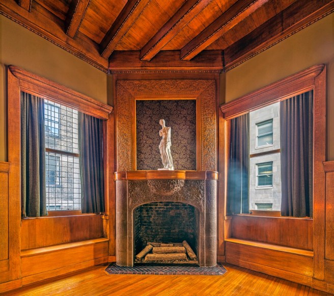
Left: Burnham and Root in the Library. (Online); Right: Restored Library. (therookerybuilding.com)
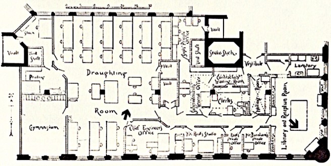
In April 1888, Burnham & Root moved their office from the Montauk Block (to where they had moved following the 1885 Grannis Block fire) to the top floor of the Rookery. Here they occupied the two-thirds of the south side, starting with the southeast corner.
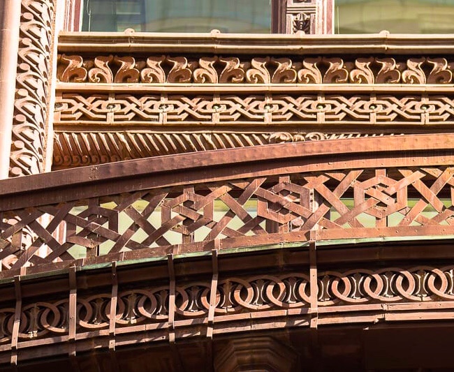
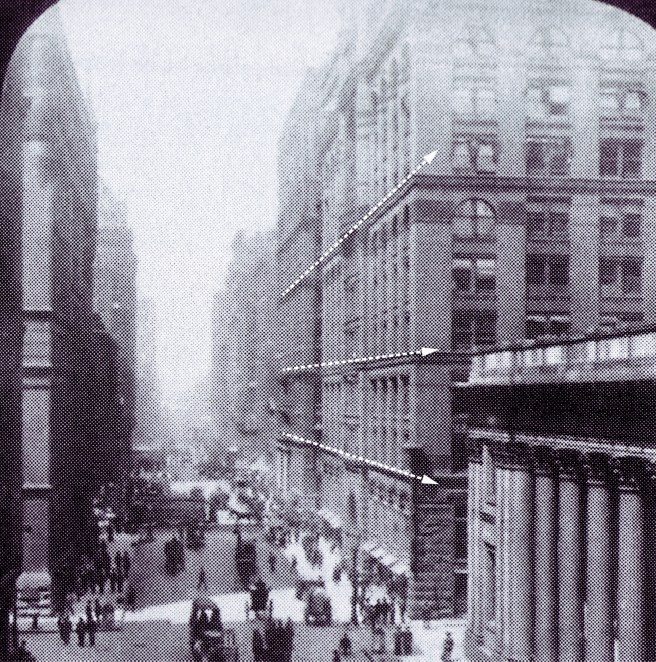
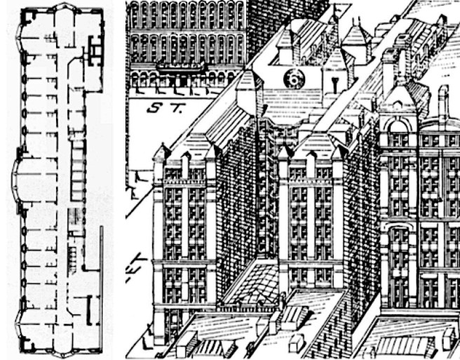
Plan of the office of Burnham & Root. The left arrow points to the view of the drafting room, the right arrow is the library view. (Hoffmann, Root)
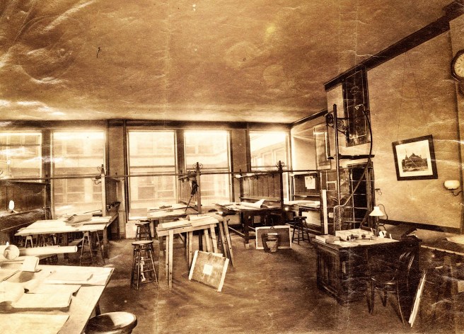
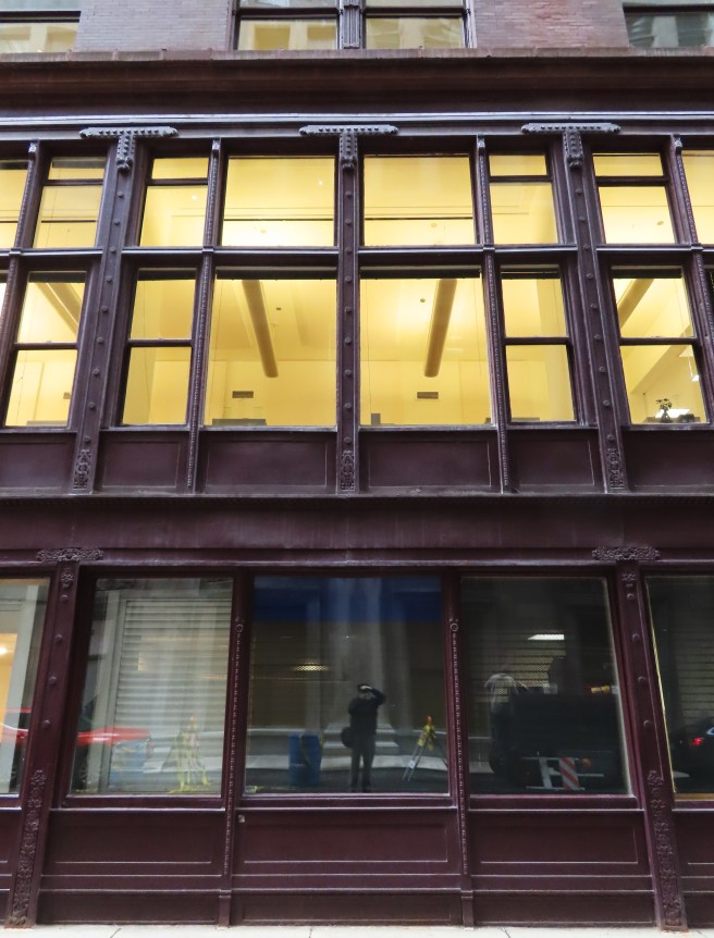
The drafting room was well-lighted because they took out the corridor on this side so that the drafting room opened from the glass on the south face to the north-facing glass lining the light court. There would always be uniform northern daylight for the draftsmen along the light court because they were on the top floor (no shadow).
Drafting Room, Burnham & Root. You can look into the light court. Do not be confused by the line of windows across the way that are in a floor higher than the top floor: these are the windows for the attic. (urbanremainschicago.com)
The library, where clients would wait offered spectacular views of Lake Michigan to the east and of the city as it spread out beneath to the south and southwest. It was assured of a sunny morning, weather permitting. From the top of the Rookery, Burnham and Root would plan and execute a number of designs and professional reforms, none more important than the 1893 World’s Columbian Exposition. It would be in the library, in fact, where all of the architects chosen to design the buildings for the Fair would first meet on January 12, 1891. But that date with destiny was still over two and half years in the future, meanwhile, many things had changed between when excavation for the Rookery had begun in November 1885, and when Burnham and Root first walked into their new office…
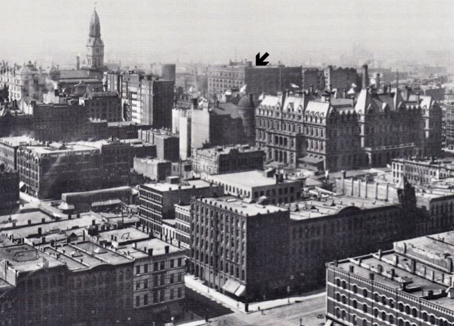
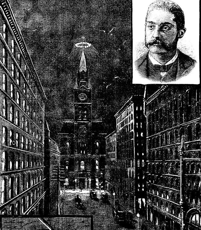
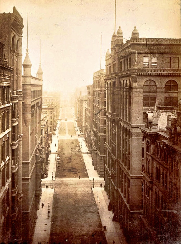
View of Chicago, showing the Rookery and the location of Burnham & Root’s office. Their Phoenix Building stood only a half block to the south. (Bluestone, Constructing Chicago)
And in the evening, especially during the dark winter months, they could always rely on the 40,000 foot-candles produced by Sperry’s Corona, sitting atop the Board of Trade, only a half block to the south…
Board of Trade. Sperry’s Corona at Night. The Rookery is at the left, the Insurance Exchange at the right. (Chicago Graphic News)
Let’s end the Rookery with some eye candy, we have all earned it!
(therookerybuilding.com)
One of the original iron columns that was encased by Wright in the 1905 remodeling. (therookerybuilding.com)
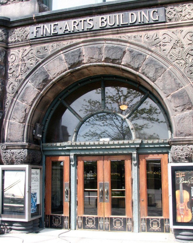
The Brookses tried their best to give the building any name but “The Rookery.” Even if they had had their way, Root had enshrined the site’s heritage at both sides of the entrance. (Chicago Architecture Foundation, The Rookery)
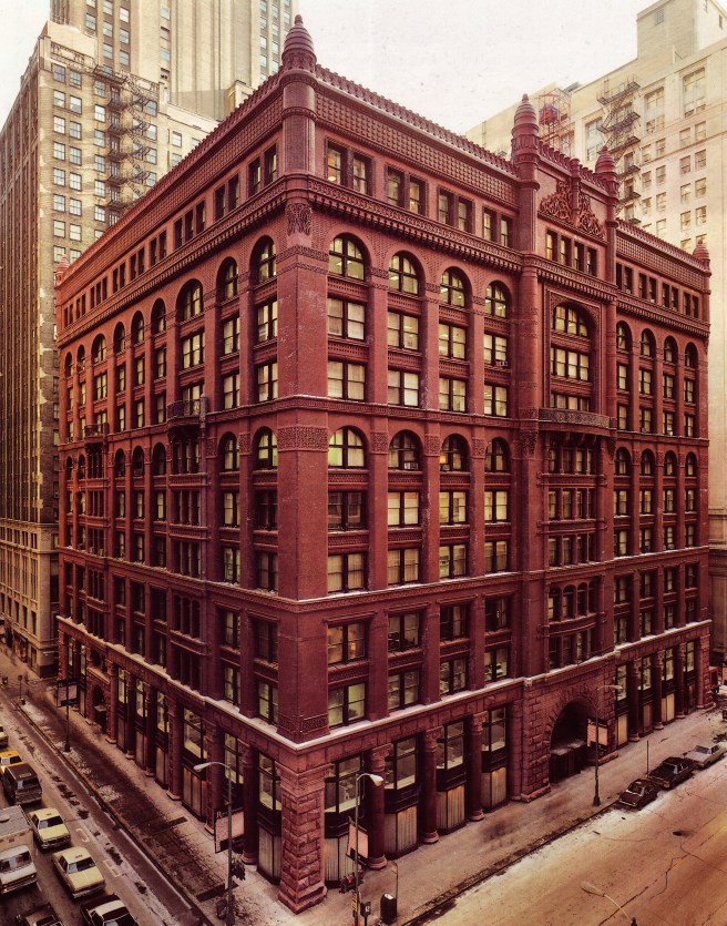
Burnham & Root. The Rookery. (Chicago Architectural Center)
While the Exchange Hall was the primary reason for building the Produce Exchange, the Rookery had no reason for an equivalent “showcase” space on the ground floor. The Rookery was being built simply to provide as much rentable floor area as possible. Root could have simply designed a well-detailed ground floor of shops and offices lining the perimeter of the skylighted atrium. More than likely, because Burnham was one of the owners, Root took advantage of this situation and added a “little flair” to the two-story atrium. Although denied the opportunity to add another of his designs to Chicago’s growing collection of tall, light-filled atria (Grannis, Burlington, First National Bank, Royal Insurance, and Traders), Root took advantage of the lowered location of the Rookery’s skylight to allow people the opportunity to experience something they couldn’t in his multistoried atriums: the ability to penetrate up and through the skylight and into the exterior light court itself, blurring the boundary between what was inside and what was outside.
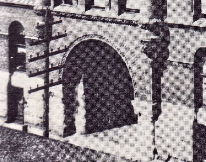
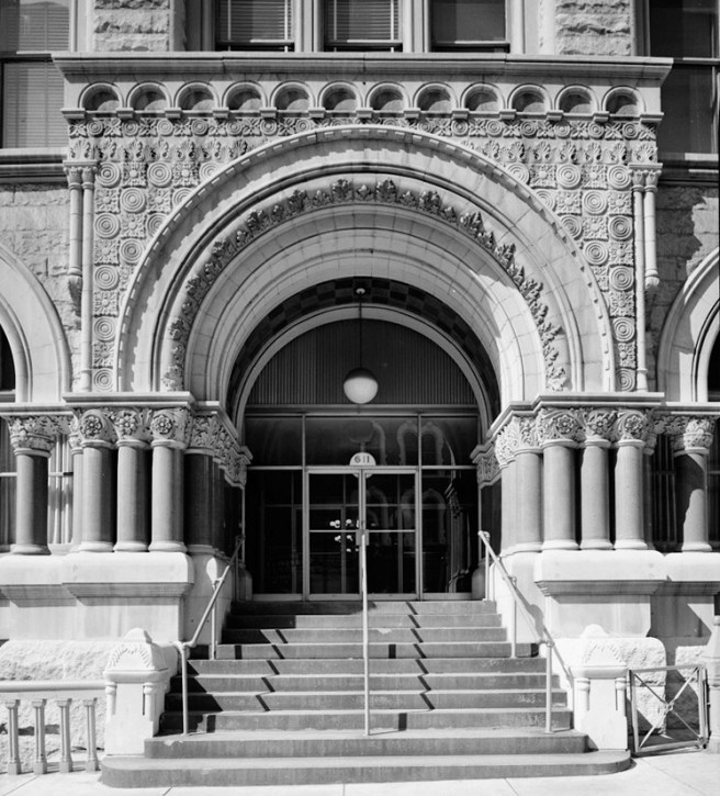
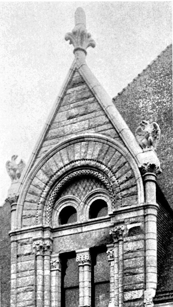
Burnham & Root, The Rookery. La Salle Street entrance. (Hoffmann, John Wellborn Root)
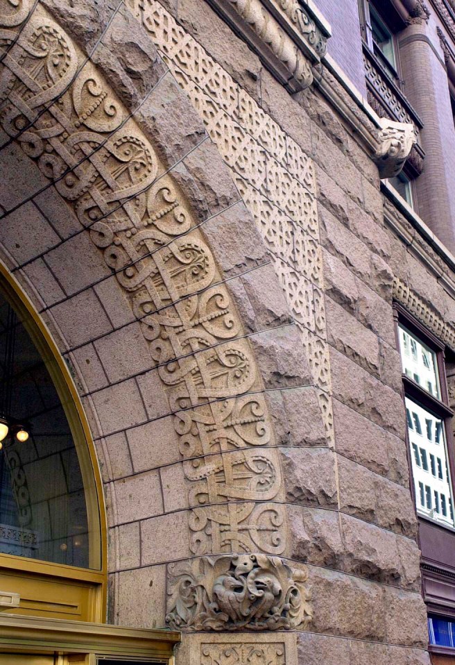
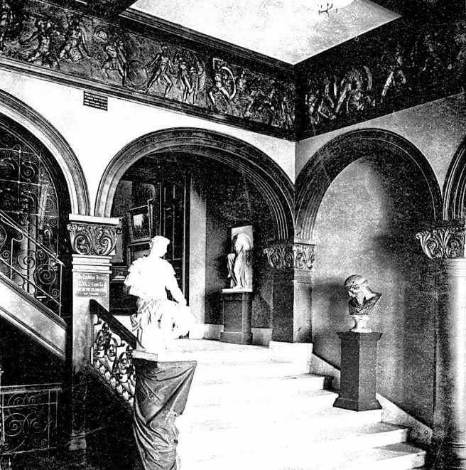
In essence, the play of contrasts, especially that between outside versus inside and between dark versus light, was the leitmotiv of Root’s rhapsody of movement through space and light in the Rookery. Penetrating the heavy, dark brick exterior, darkened with atmospheric pollution, through the stone triumphal arch, one entered a two-story vestibule of white stone and onyx with gold-leafed trim, an attenuated version of the Phoenix’s entry.
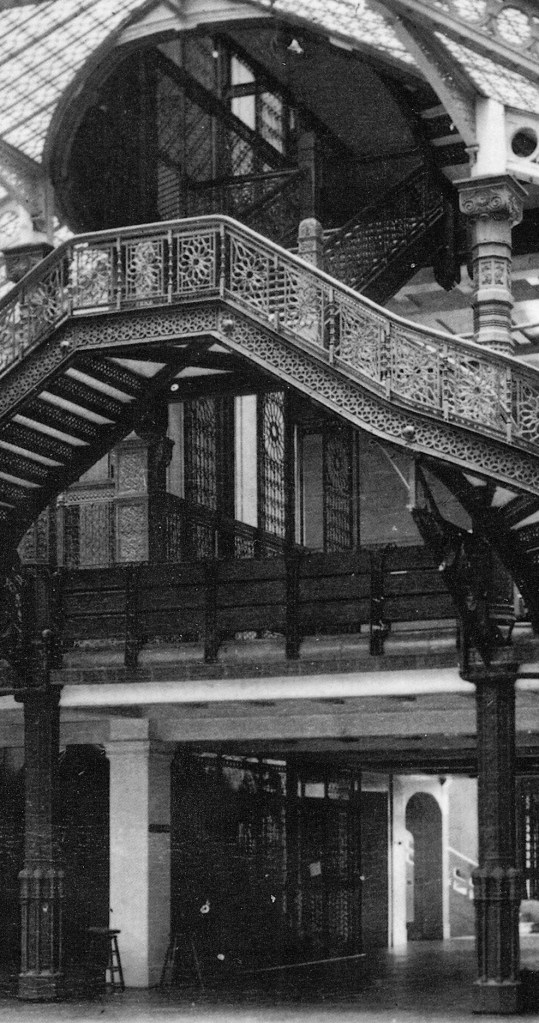
Burnham & Root. Above: Phoenix Building. Lobby. Note the windows in the rear wall, in back of the elevators, that open into the lightwell. These were made possible by Root’s first use of the iron frame in an exterior wall. Below: The Rookery. Lobby. Root uses the smoothly-curving (note the smooth-topped handrail post at the bottom right) mezzanine to block the immediate view to the atrium. (Hoffmann, Root)
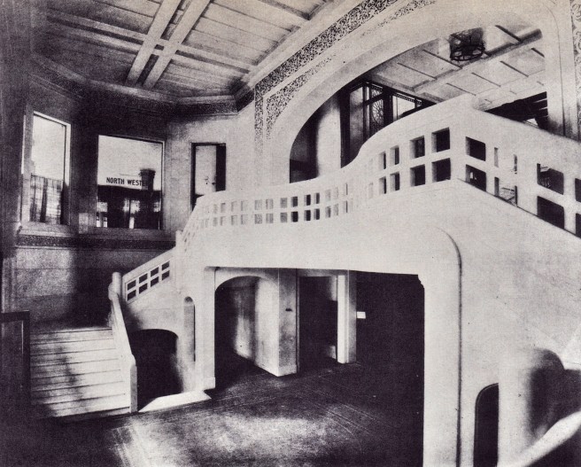
Stairs at both sides joined overhead in a balcony that beckoned a visitor up to the entresol. Flanking the stairs going up were vomitoria that led to the basement where the vaults of the Central Safety Deposit Company were located, space for which had been gained by Root’s new foundations. But here the similarities between his two designs diverged: where the Phoenix was “a one-liner,” i.e., you walked into the lobby and saw the bank of moving elevators backlit by the ten-story wall of glass, in the Rookery Root concealed the climax of the sequence from the lobby with the mezzanine he had projected into the lobby, enticing the visitor to explore what they would encounter next in the Rookery.
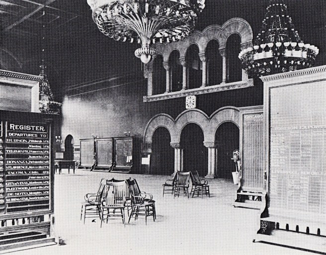
Burnham & Root. The Rookery. View from the elevator lobby into the atrium. (therookerybuilding.com)
Drawn forward by the light of the courtyard ahead, one was compressed as he or she passed underneath the mezzanine and past the open grille doors and the movements of the elevator cabs that were silhouetted against the wall of windows at the far side of each bank.
Left: Burnham & Root, The Rookery. Cantivered stairway into the lightcourt. Note the openness of the elevator shafts just beyond the cantilevered stairway. This complex space was eliminated when the elevator bank was walled in. Right: Daylight for the elevators was provided by the windows at either side of the stairway. (Zukowski, Chicago: Growth of a Metropolis)
This compression heightened the spatial perception of the otherwise “downsized” courtyard. The transparency of the skylight not only allowed daylight to bathe the white marble in the two story atrium with brightness (that would have contrasted dramatically with the eleven-story shadow cast on La Salle by the Rookery that one had to walk through to enter the building in the morning), but also permitted one to view not only the sky above, and, more importantly from the standpoint of architectural history, a prophetic vision of the future: the exterior elevation Root had designed for the inner tier of offices that faced onto the lightcourt.
Burnham & Root, The Rookery. Left: Ground floor plan; Right:: Second floor plan; (Zukowski, Chicago: Growth of a Metropolis)
Coming through the aperture of the Rookery’s elevator lobby, Root enticed you to come up, through the skylight and into the lightcourt itself, in order to view this new architectural language. One was presented by Root’s unconscious prophesy of what a skyscraper’s exterior in the immediate future would look like: thin, lightweight, rectilinear, light-colored and clean, and somewhat released from the tyranny of gravity: free from having to be vertically connected to the ground. (One only had to wait five years for it to appear on the Reliance Building.) The contrast between the exterior’s elevations and those of the atrium not only must have been startling, it was also profound. Root had not only changed construction history with the Rookery; he had also designed a history lesson for later generations to appreciate the radical differences between the two structural systems. The chrysalis of the skyscraper had emerged within the protective confines of its protective masonry cocoon, for Bogardus’ iron skeleton frame of the shot towers had finally reappeared in the exterior of a tall building. The lightcourt in the Rookery could be described as taking a department store with a skeletal structure, such as Shillito’s in Cincinnati, and enclosing its multistory atrium at every floor with Bogardus’s technique of supporting brick panels that he had first used thirty years earlier in the McCollough Shot Tower. In fact, Root had even inserted such a form within the lightcourt that housed his by now characteristic cantilevered oriel stair tower. It would take a few more years before this non-romantic elevational expression would make its first appearance on the public exterior of a building, yet one cannot dispute that Root’s atrium walls was its first showcase. Unknowingly (perhaps?), Root had devised a very thorough monument to the history of the iron skeleton frame.
Left: The Rookery. Stair tower in the light court. (Zukowsky, Chicago: Growth of a Metropolis); Right: James Bogardus, McCullough Shot Tower, New York, 1855. (Silver, Lost New York)
Of course, Root did not reveal all of these delights to a visitor the instant he or she burst into the courtyard, but instead tantalized the observer by choreographing one new event after another, in order to control one’s circulation around both floors of the courtyard, to maximize the exposure of visitors to each of the storefronts in this prime, high rental zone.
Burnham & Root, The Rookery. Stairs to the entresol. Note the open risers in the stairs extend the motif of light and space. (Hoffmann, Meaning of Architecture)
He pulled a visitor across the ground floor of the courtyard by placing a monumental stair to the mezzanine directly opposite from where one had entered that was flanked by electroliers that outshone even those he had designed for the Phoenix. Walking to the stair, one’s head moved upward, looking through the crystal skylight. The visitor caught a glimpse of the light court stair tower above and then saw Root’s piece d’ resistance: a floating set of stairs that would actually take one through the skylight and into the stair tower of the light court.
Burnham & Root, The Rookery. Atrium. (Zukowski, Chicago: Growth of a Metropolis)
Of course, this was purposefully located over the entry through which one had just passed, requiring a person to reverse direction and travel, once again, the entire length of the courtyard this time on the second level, upon arriving at the top of the monumental staircase.
Burnham & Root, The Rookery. View into the atrium from the entresol. (Zukowski, Chicago: Growth of a Metropolis)
At this point, one would be exposed to the storefronts on the second floor, assuming that any attention was paid to them in one’s rush to get to the floating staircase. Here, Root had once again used his engineering genius to create a very clever perch for the birds in his new “Rookery” not just to look out into his cage of glass, but also to be looked upon.
Burnham & Root, The Rookery. Cantilevered stair to “the Perch.” Frank Lloyd Wright in his remodeling of 1905 was asked by the owners to add the iron support bars you can see here to alleviate the fears of some people. (Chicago Architecture Center)
From this overlook, one continued up the half-flight of stairs that carried the visitor through the skylight and onto the third floor landing. In the original building, this point provided a visitor with a wealth of visual/spatial pleasures: looking back through the aperture in the skylight with the cantilevered balcony beyond, to either side the dynamic ballet of the open cages of the six elevators moving up and down in their open eleven-storied shafts (until these were framed in during the 1905 remodeling, and, of course, the first step into the Piranesiesque space of the spiral stairway that projected into the lightcourt, from where one could see Root’s gleaming elevations in all their glory.
Burnham & Root, The Rookery. Above: Stairway through the skylight, into the lightcourt. In the original building this view would have been even more dynamic because at your back would have been the six open cage elevators moving up and down, that you can see in the photo of the elevator lobbies above. (Chicago Architectural Foundation, The Rookery); Below: Stairway. (therookerybuilding.com)
The era’s leading critic, Henry Van Brunt, summarized his opinion of Root’s design in the obituary he penned for Root in early in 1891:
“Even the imaginative prison visions in the famous etchings of Piranesi, [it was well-known that Root’s library had a portfolio of Piranesi’s drawings] with their aerial ladders and impossible galleries, present nothing more audacious… The Rookery is not only a noted example of great fertility of design, but there is nothing bolder, more original or more inspiring in modern civic architecture either here or elsewhere than its glass-covered court.”
Giovanni Battista Piranesi, “The Round Tower” from Imaginary Prisons, ca. 1749. (Metropolitan Museum of Art)
FURTHER READING:
Clausen, Meredith L., “Paris of the 1880s and the Rookery,” Zukowski, John (ed.), Chicago Architecture, 1872-1922: Birth of a Metropolis. Chicago, The Art Institute of Chicago, 1987.
Hoffmann, Donald. The Architecture of John Wellborn Root. Baltimore: Johns Hopkins University Press, 1973.
Stack, Joanne. Saving a Treasure: Chicago’s Rookery Building. Joanne R. Stack, 2019.
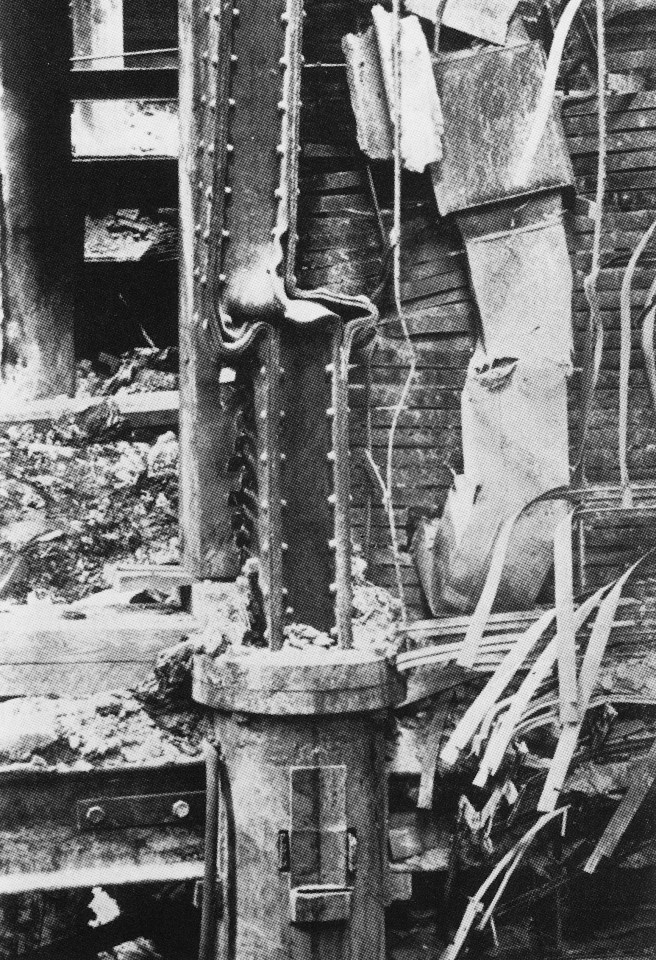
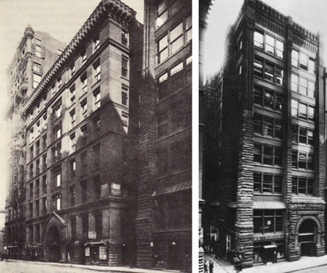
George Post, Equitable Building, New York, 1867. Left: Banking Hall as it appeared in 1889, showing the iron columns that support the walls above. (Landau, Post) Right: Interior iron structure exposed after a fire on January 9, 1912. The cast iron column is in the center bottom. Wrought iron girders frame into both sides of the column. Above the cast iron columns stands the built-up wrought iron column that supported the walls lining the lightcourt. (Landau, Rise of New York Skyscraper)
At the beginning of this Chapter I started with Root inventing the iron-reinforced concrete foundation. This was only one of a number of construction innovations involved with this building, and I believe we can credit this to the mutually-reinforcing relationship between the two former New Yorkers, Root and George Fuller (Root was less than a year older). Root’s family had moved to New York following the end of the Civil War, where he had returned following his graduation from “high school” in Liverpool. He had enrolled in and graduated from what would become NYU in Engineering, the same technical training that George Post had experienced twelve years earlier. Root was attending classes while Post was completing the innovative Equitable Building, that you know I claim to be the first skyscraper. Knowing architecture students like the back of my hand, Root would have been studying every detail in that building. Root had left for Chicago in early 1872, four years before George Fuller was named the head of the New York office of Peabody & Stearns. His last project before he left Peabody & Stearns to set up his own firm in Chicago was the United Bank Building.
George Post, New York Produce Exchange. Left: Photo of construction showing the iron framing employed in the interior and skylight; Right: Section through the light court, showing the brick/glass curtain wall supported on an iron frame. (Landau, George Post)
It is critical to note that during Fuller’s two years in New York, Post was erecting the New York Produce Exchange, a building for which we have photographic evidence proving that its light court was completely iron skeleton-framed and enclosed with an masonry and glass curtain wall. To summarize an earlier chapter, if we discount the Equitable Building as the first use of iron skeleton-framing in its light court because of lack of hard evidence, than by default, Post’s Produce Exchange (1880-1) deserves that honor. So in 1885 in Chicago we have Root, having studied Post’s structure in the Equitable building, and Fuller, having just arrived in Chicago after having watched the construction of Post’s Produce Exchange and having completed the construction of the Opera House Block, combining their talents and knowledge of Post’s detailing of iron framing to erect the Rookery. No one should be surprised that the result would be the first use of iron skeleton framing in a Chicago building, inspired by Post’s pioneering efforts with iron framing in New York. (Note that iron skeleton framing was first developed and used in New York, not Chicago.)
Burnham & Root. Left: From left to right: Phoenix Building, Traders Building, 305 S. La Salle, Commerce Building; Right: Commerce Building, 319 S. La Salle, 1885. (Hoffmann, Root)
But before we can start erecting the Rookery’s iron, we need excavation and the foundations. In November 1885, excavation finally began on three projects designed by Burnham & Root: the Phoenix, the Commerce Building, located immediately south of the Phoenix, and the Rookery. Although the weather in November and early December of that year was exceptionally mild, it was only a matter of time before cold weather would once again mark the traditional end to the year’s building season. But Root/Fuller’s ingenuity was again sparked by this challenge, resulting in a solution that defeated winter, the age-old nemesis of the contractor, once and for all. Each of the construction sites was covered with a wood-supported enclosure heated by portable heaters. This kept the temperature within the enclosure above freezing, permitting the construction of the foundations to proceed throughout the entire winter season. Root’s matter-of-fact explanation of the technique at the February meeting of the Illinois State Association (WAA) the belied the revolutionary nature of his invention:
“We adopted the cover over our foundation work also under necessity, as the work had to be rushed and we could not allow the weather to interfere. The shed over the foundations for the Phoenix building on Jackson and Clark streets, cost less than $1,200, and about one half of that will come back in lumber which can be used for scaffolding, etc. The shed is perfectly lighted and a few salamanders keep it perfectly heated.”
However, other Chicago professionals recognized Root’s achievement in his liberation from the grasp of Father Winter. Dankmar Adler, following Root’s talk, paid homage to Root’s technical genius.
“A method has been introduced of using T rails and concrete in foundations which has become generally used in the large buildings now being erected. Mr. John W. Root is present, and as he has large experience with this method as well as with construction under cover, he could perhaps give valuable information and data on this subject. In regard to Burnham & Root’s construction of foundations in winter under cover they deserve great credit, in the same degree as is awarded to the man who causes two blades of grass grow where one grew before.”
Typical floor plan of a double-loaded corridor scheme for a site with a width greater than 100’ compared to a single-loaded corridor on a site with a width less than 100.’ (Drawing by Kyle Campbell)
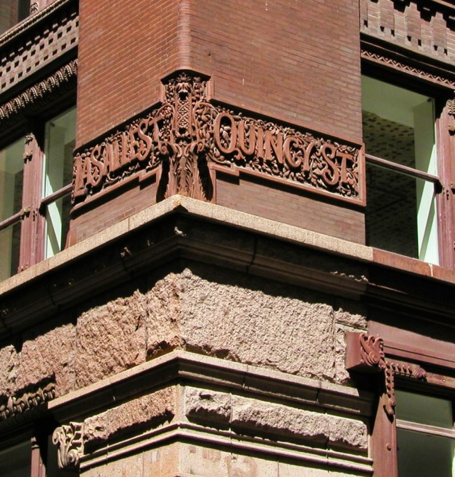
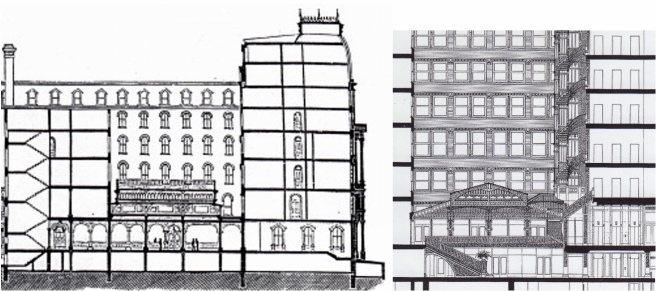
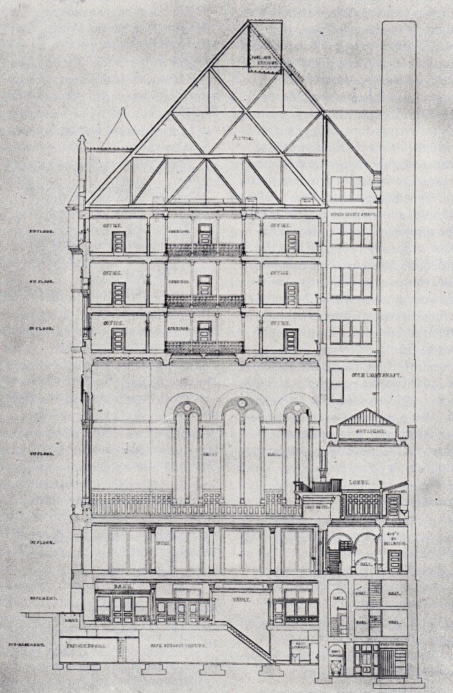
If the exterior design of the Rookery presented Root with a challenge similar to the Burlington Building, the problems in the design of the interiors of the two buildings could not have been more different. Whereas the Burlington’s plan was a doughnut with a single-loaded corridor, the Rookery was a doughnut with a double-loaded corridor. The difference is obvious: while the Rookery’s inner ring of offices needed direct exterior exposure for daylight and natural ventilation, the Burlington’s cantilevered balconied hallways had no such need. Root, therefore, could put the Burlington’s skylight that enclosed its 55′ by 75′ central atrium at the roofline, creating a tall, invigorating space filled with daylight and five stories of motion. In the Rookery, however, in order to allow exterior air and light to reach the inner tier of offices, Root was forced to pull the skylight all the way down from its lofty height at the roof to the point where it hovered, somewhat menacingly, over the 62′ by 71′ atrium at the relatively low level of the third floor. This was the same solution that Boyington had used fifteen years earlier in the Grand Pacific Hotel, located on the opposite side of Quincy Street.
Left: W.W. Boyington, Grand Pacific Hotel, 1870. Section showing the skylight at the second floor and the light court above; Right: Burnham & Root, The Rookery, 1885. Section showing the same type of skylight and light court. (Left: The Land Owner, April 1870; Right: Chicago Architecture Foundation, The Rookery)
As these two sites had the same dimensions, the design problem was the same as well, a double-loaded corridor doughnut plan. thereby the solutions should have been similar. And they were, with the exception that Root, fifteen years later, had a more developed iron framing technology to employ. Where Boyington had used masonry bearing walls, to support the walls of the lightcourt that Root had also employed in the walls lining the Burlington’s atrium, Root now used the Rookery’s light court to experiment with using the iron skeleton frame to support an exterior wall, the first such example in Chicago. While the Rookery’s exterior walls were still required by the building code to be a masonry bearing wall (if anyone knows how the curtain wall in the two alleys were permitted, please let me know!), the exterior walls of the lightcourt were well within the site’s lotlines, and therefore, not considered to be party walls. Hence, they were not subject to the building code’s requirement to be a solid masonry party wall. Those heavy masonry exterior walls also provided the building’s lateral stability against wind loads, allowing Root to experiment with iron framing in the atrium walls without having to worry about having to provide lateral rigidity within the iron framing, the problem that will keep Chicago’s architects from using only iron skeletal framing in a tall building for the next four years.
Burnham & Root. Left: Burlington Building. The five-story atrium. Note that the atrium walls are masonry bearing, especially on the ground floor; Right: The Rookery. The two-story atrium. Note the walls lining the court are iron framed with large windows. (Left: Hoffmann, Root; Right: Zukowsky, Metropolis)
One of the many advantages that iron framing offered in this interior location was that the interior walls enclosing the shops/offices in the first two stories could be opened up with a maximum of glass (a opposed to how this same problem was solved by Root with bearing walls-see perspective above). This not only allowed daylight from these spaces to help light the atrium, but also it allowed views from the atrium into the shops (display windows) encircling the atrium.
Burnham & Root, Phoenix Building. South(rear) elevation. Demolition photo taken by Richard Nickel in 1959. The windows behind the four elevators that were supported by iron skeleton framing. (urbanremainschicago.com)
In the Phoenix Building that was constructed first, Root had used the iron frame along the rear lightwell to not only support the elevators but also to permit large panes of glass that maximized the amount of daylight needed for illumination in both the elevators and the adjacent corridors, Factually, this appears to have been the first use of iron framing in an exterior wall in a Chicago building. (Does it sound like I’m walking a legal tightrope… I am!) Root and Fuller, both deserve credit, took this idea and applied it not to the elevator core in the Rookery, but to all four exterior walls enclosing the Rookery’s light court. Here, again, I am being particular in my choice of words. It is one thing to support a bank of moving elevators (dynamic loads) while also supplying the elevators with daylight (i.e., The Phoenix). It is a different problem to expropriate this specific detail for the general application of merely enclosing an interior (i.e., The Rookery). The light court walls could have easily been masonry bearing walls supported above the second floor with an iron transfer beam on iron columns. Fuller had already done this in the Opera Block, and this was the exact detail, that is a bearing wall sitting on an iron beam, that would be used in the Rookery’s two alley walls. So the curtain wall on an iron frame was the detail deliberately chosen by Root and Fuller for the Rookery’s light court walls. It was the exact type of construction Post had used for the exact same location in the New York Produce Exchange.
Left: Post, Produce Exchange. Section through the lightcourt. (Landau, George B. Post); Right: Burnham & Root, The Rookery. Section through the lightcourt. (Chicago Architecture Foundation, The Rookery)
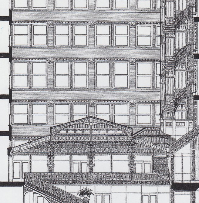
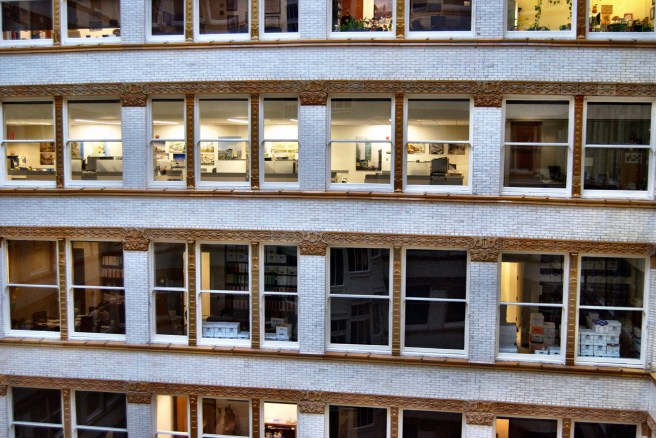
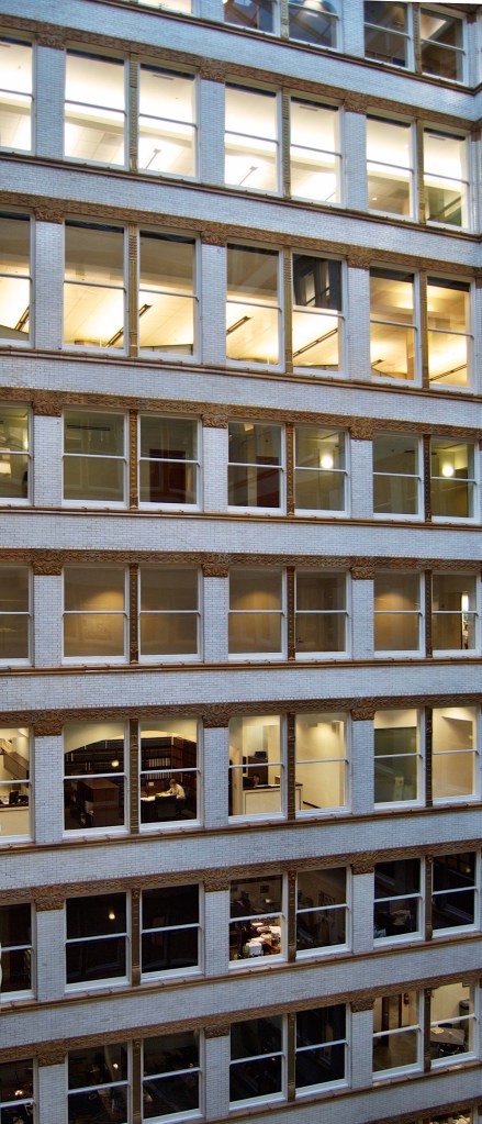
This allowed Root to detail and construct the four court walls as he had in the rear wall of the Phoenix Building, as an independent iron frame that supported a uniformly dimensioned masonry curtain wall at every floor, a great improvement over Jenney’s anachronistic system of iron-reinforced masonry piers used across the street in the Home Insurance Building. Root cantilevered a line of 7-inch channel sections and 12-inch I-sections off the face of the columns to support an interior wall of hollow tile and the exterior brick veneer.
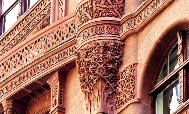
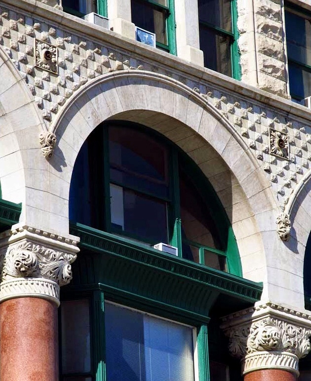
Burnham & Root, Rookery. Structural detail of the light court curtain walls. Note the bearing shelf and web bracket cast with the column. (Thanks to Kevin Wilson at TGRWA, Nathaniel Parks at the Art Institute of Chicago, and Gunny Harboe for helping me to find this image!)
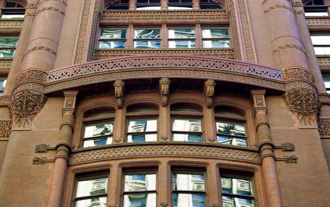
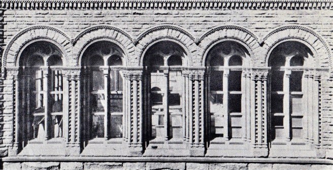
In order to reflect as much light as possible down into the lightcourt and into the individual offices, Root used an English cream-colored glazed enameled brick. He completed this essay on modern, iron skeleton construction by subtly detailing the brick spandrel at each floor level as a continuous, unbroken horizontal layer around the court, interrupting the vertical line of the columns.
As the masonry was no longer supporting its own weight continuously to the ground, Root had expressed this new reality by making the vertical masonry covering of the iron columns discontinuous, stopped at each of the horizontal bands. The lines of the floors were accented with bands of gold-leafed, brown glazed terra cotta at the top and bottom of each spandrel that flowed continuously through, interrupting the vertical continuity of the column’s masonry surface. The columns, although also faced with the brick, were, thereby, appropriately subordinated to the spandrels by being inserted within the spandrels’ trim, with each column panel being capped with a matching terra cotta capital. The resulting horizontal composition of alternating layers of white brick and ribbon windows, was a straightforward expression of the wall’s construction, gone were the romantic arches of an earlier era. While the rear elevation of the Phoenix had been the first manifestation of the new language, very few people would ever see or appreciate it for what it was due to its location. This would not be the case with the Rookery’s lightcourt. A modern architectural expression had finally appeared in public. (Le Corbusier would name this detail some forty years later as the “free façade” in his “Five Points of a New Architecture.”)
Left: Chicago School; Right: Romanesque Revival. 1. “Honest” expression of function (this includes construction, structure, program, and aesthetic). We will see examples of all four in the coming work of Root, Sullivan, and the others. 2. No use of accurate archeological ornament.
FURTHER READING:
Hoffmann, Donald. The Architecture of John Wellborn Root. Baltimore: Johns Hopkins University Press, 1973.
Stack, Joanne. Saving a Treasure: Chicago’s Rookery Building. Joanne R. Stack, 2019.
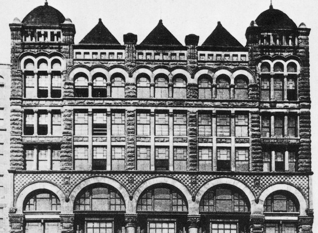
Burnham & Root, The Rookery, Chicago, 1885. (Zukowski, Chicago: Growth of a Metropolis)
Apparently wanting to keep the rhythm of the lower floors of the Home Insurance Building that was the view that most pedestrians would experience, Root decided to put the extra floor in the upper arcade, increasing its height from two to three stories. While this raised the upper arcade back to the tenth-floor location of the arcade in the Home Insurance Building, it also destroyed the false perspective he had achieved with the 3:2:1 progression. This was replaced in the final design with a static duplication of two stacked three-story arcades, that, when viewed from the ground, was rendered top-heavy by true perspective.
The extra floor and added dimension completely destroyed the elevation’s architectonic repose. What had been a finely proportioned composition, that had balanced the horizontal with the vertical, had grown into that awkward, lanky proportion of the adolescent, who is too tall for last year’s clothes that now look a tad tight and too short. The final dimensions of the Rookery were still too wide to be vertical, but they were also now too tall to remain comfortably horizontal. The skyscraper had begun to grow up.
Root capped the elevation with a one-story attic in the eleventh floor that owed its allegiance more to the McCormick Building and the Phoenix rather than the Insurance Exchange across the street. Not only were the windows flat-headed, as opposed to the arches in the Insurance Exchange, but they were also better related to the structural rhythm of the elevation than those in the Insurance Exchange. As with the windows in the attic of the McCormick Building, he simply carved two windows into the flat brick surface in the space between each pier in the Rookery.
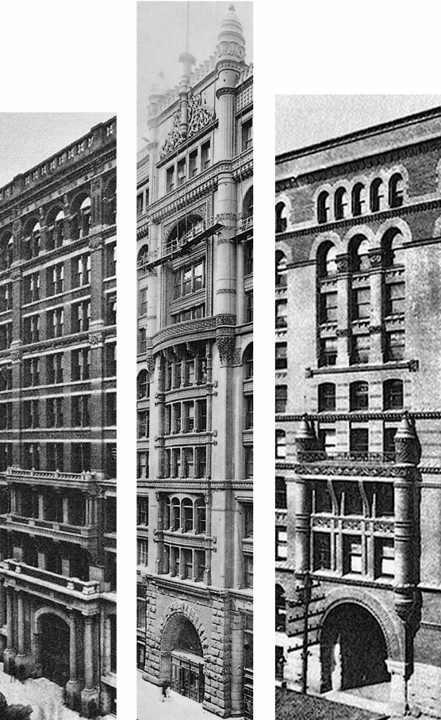
From Left to Right: Insurance Exchange, Phoenix, and the Rookery. The first was too tall, the second was too short, but the third was just right…
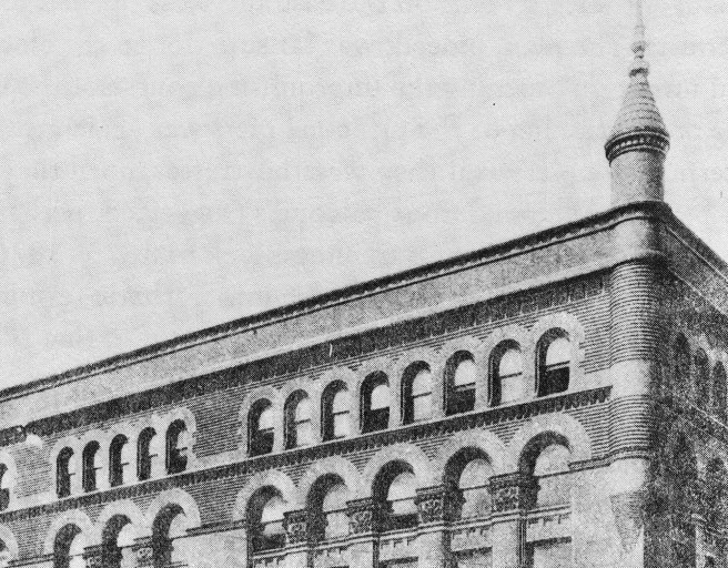
As if the under-scaled buds he had placed at the corners of the Phoenix’s roof had finally blossomed, Root again placed turrets at the corners of the Rookery’s roofline, complementing the youthful exuberance of the tall corner turrets of the Insurance Exchange with a stouter, more mature profile in those of the Rookery.
Left: Phoenix Building; Right: Rookery.
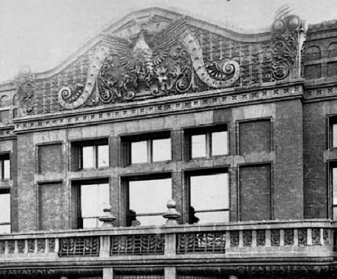
He also kept the raised center bay pavilion of the Phoenix, but this time gave it a more refined profile finishing it off with a flat roofline by pulling an ornamental pediment of Saracen-inspired swirling bands that visually supported a flagstaff, within the frame at the top of the center bay. Once again attempting to do Jenney one better, Root accentuated the Rookery’s center bay by placing a slightly projecting balcony at the eighth floor, three floors higher than the balconies in both the Home Insurance Building and the Insurance Exchange.
Dueling Balconies. From Left to Right: Home Insurance, the Rookery, and the Insurance Exchange. The turrets that support the balcony in the Insurance Exchange have moved to the top of the Rookery from where the balcony is now “suspended.”
Compositionally, Root connected the Rookery’s balcony to the Insurance Exchange by inverting the Insurance Exchange’s use of central turrets: in the Insurance Exchange, the turrets rose from the building’s base to engage the balcony at the fifth floor; in the Rookery, Root extended the turrets three floors down from the attic to engage the porch from above.
There is one more aspect of the elevations we must examine: the use of one of the first all iron and glass curtain walls on the first two floors of the alley elevations. The cast iron front had been used since Bogardus invented it in 1848. The difference between the cast iron front and the Rookery’s alley elevations was that the glass was located between the iron columns in a cast iron front, while in the Rookery, the glass (curtain) wall was located in front of the iron columns.
Note that the iron framing is projected in front of the wall surface. (Author’s image)
The difference is quite evident in the Chicago Opera House completed at about the time the Rookery was commissioned. The elevation of the first two floors in the Opera Block comprised of exposed structural iron, infilled with glass, that supported the masonry piers above. Although designed by Cobb & Frost, this innovative construction is usually credited to the building’s contractor, George Fuller.
Cobb and Frost, Chicago Opera House, Detail of exposed iron framing in the first two floors. (Siry, Auditorium)
He may have been the one responsible for proposing a similar detail in the first two stories of the alley elevations of the Rookery, for he was also the general contractor for the Rookery (his name is signed in the right margin of the 1886 rendering above). It is believed that this detail was used because the alleys were narrow, limiting the amount of daylight available, especially in the lower floors. Root’s final solution to frame the first two floors along the two alleys with iron framing varied from Cobb & Frost’s detailing in one important way: rather than inserting the glass within each bay of iron framing, Root employed the cantilevered lintel that he had just used in the Phoenix Building to project the glass and its iron framing in front of the plane of the columns and beams.
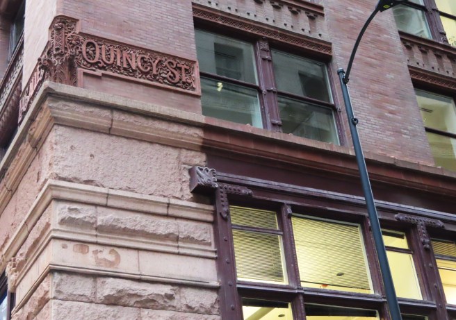
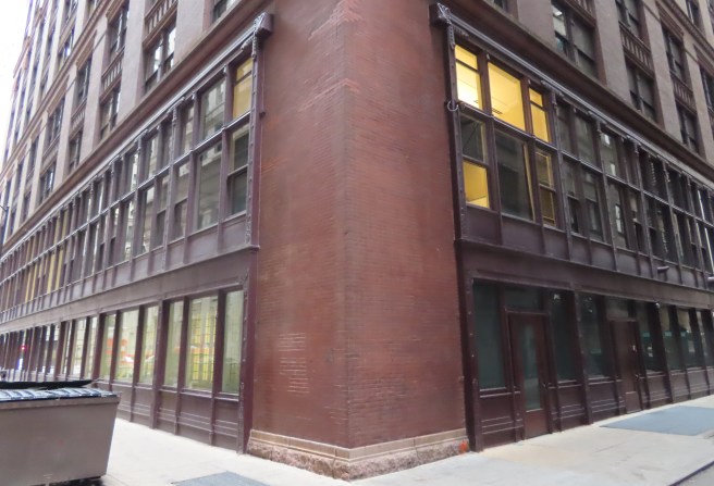
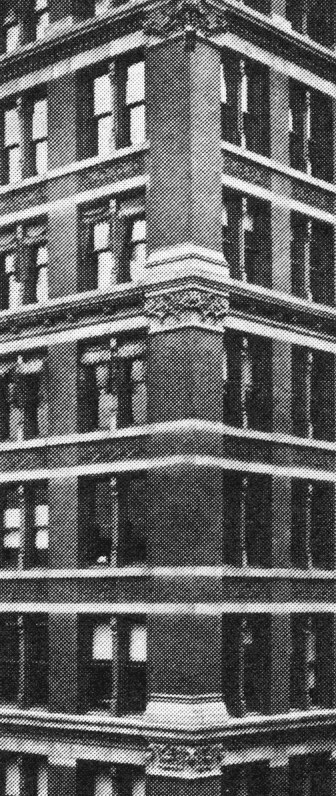
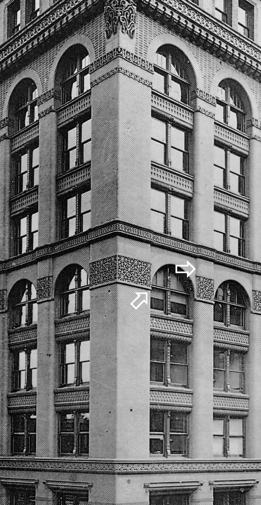
Rookery. Southeast corner showing the intersection of the two alley facades. One can see how the curtain wall is projected beyond the wall surface. (Author’s image)
Root must have realized the awkwardness in the Opera House arising from the placement of the visually heavy masonry piers atop the spindly iron columns, and resolved to avoid a similar relationship in the Rookery. Nowhere in the Rookery can one see the heavy brick piers sitting on thin iron columns. Root wrapped the masonry corner pier around the corner and up to the iron storefront, to avoid what was particularly visually awkward at the corners of the Opera House: the slender iron column visually supporting the two, much larger masonry surfaces of the corner.
Cobb & Frost, Chicago Opera House Block, Chicago, 1884. Detail of exterior iron framing. (Online)
In Sec 3.8. I discussed the possible influence that Peter Ellis’ Oriel Chambers in Liverpool (1864) alley elevation may have had on Root. Therefore, he could minimize the width of the vertical mullion placed directly in front of each column, and created one of, if not the first, example of what Le Corbusier would name the “ribbon window,” some thirty years later.
Therefore, I always appreciate the historical significance of the Rookery’s alley elevations because they contain not only this early example of the iron-and-glass curtain wall, but also because Root eliminated the arches in the seventh floor, it’s rational pier-and-spandrel language looks to the future of the skyscraper.
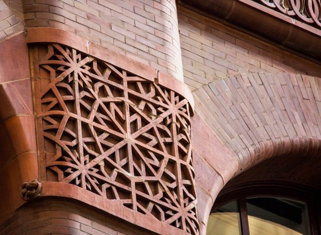
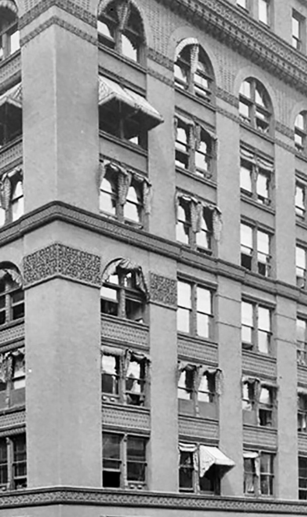
There is a postscript I would like to add. The Luxfer prism company had a showroom on the lower floors at the rear of the building. Some of their products are still in place and visible on the east elevation. Luxfer prisms were designed to reflect daylight back up to the ceiling to project daylight deeper into an office space. Before the onset of sufficient electric light, these were installed in the upper reaches of windows and door transoms.
Rookery. East elevation showing the installation of Luxfer prisms. (Author’s image)
FURTHER READING:
Hoffmann, Donald. The Architecture of John Wellborn Root. Baltimore: Johns Hopkins University Press, 1973.
Stack, Joanne. Saving a Treasure: Chicago’s Rookery Building. Joanne R. Stack, 2019.
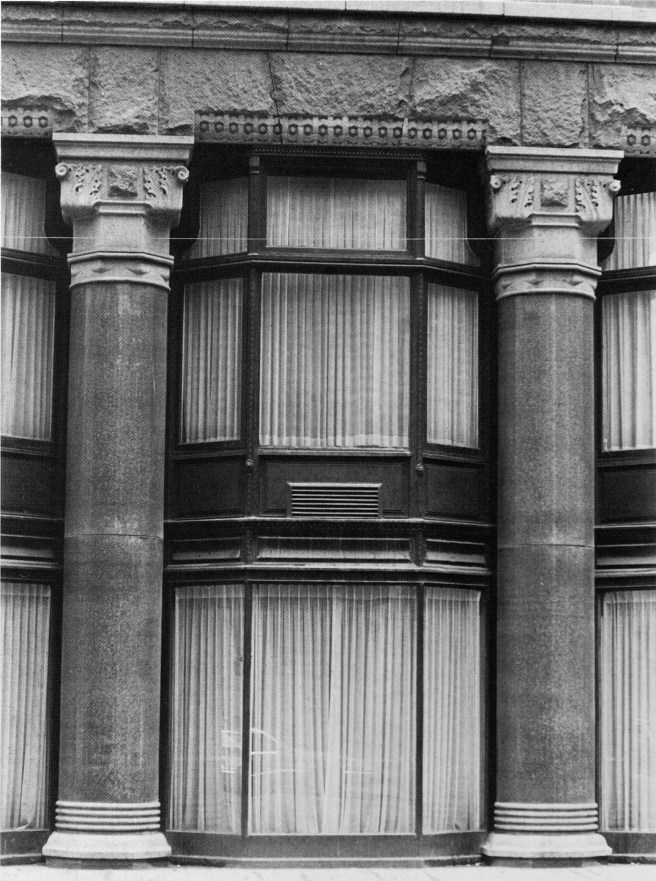
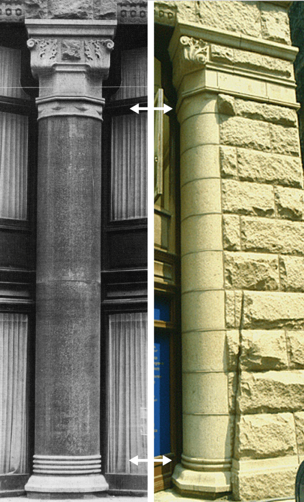
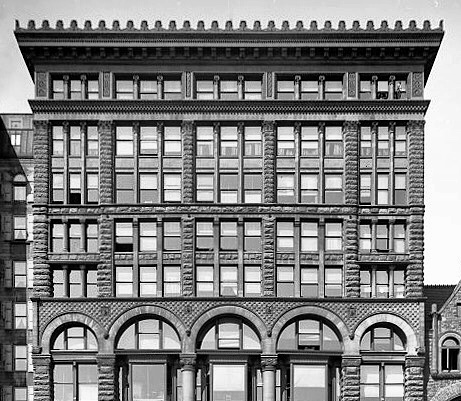
Comparison of the Home Insurance base with the base of the Rookery. Where Jenney broke his two-story base into two one-story layers with a continuous band of stone (arrow) at the second floor, Root detailed his base as a two-story layer articulated by the two-story oriel windows and granite columns. The Home Insurance was known for its four granite columns at the La Salle entrance (there were none at its Adams entrance). Root used ten of the same-sized columns along his base: six on La Salle and four on Adams.
In the design of the Rookery’s base, Root was confronted with having to choose between Jenney’s clearly-articulated, two-story base of rusticated stone or his own recent experiments in blending the stone base and brick body in an intermediate, transition story that he had attempted in the Insurance Exchange and intended for the Phoenix. Evidently, he realized that these experiments were less than satisfactory, for he never again used two different materials in the transition story of his commercial buildings. In the Rookery, he returned to the standard two-story base of one material, like that of the Home Insurance. The problem that Root addressed in the design of the Rookery’s base was quite evident in Jenney’s design of the Home Insurance Building’s base. Why Jenney had projected the stone band at the second floor in front of the face of the piers seems a mystery, for this detail not only divided the two-story base into two horizontal layers, but it also prevented the reading of the two-story piers as a set of vertical legs upon which was set the masonry cage above. Instead, the confused result read more as a stone arcade in the second story that was set atop the very stubby stone piers of the ground floor or basement.
Burnham & Root, Rialto Building. Detail of base showing two-story oriel windows.
In the Rialto, Root had already designed a better solution than Jenney’s for such a problem of receiving the vertical force of a line of continuous piers. The piers in the Rialto’s two-story stone base were unbroken at the second floor because Root had pulled this floor to the back of the piers at precisely this point of intersection. This was reinforced by the use of the inset oriel window storefronts that emphasized the continuity of the two-story piers. (I mentioned the possible influence of Peter Ellis’ Oriel Chambers in Liverpool. Sec. 7.14)
Burnham & Root, The Rookery. Detail of how the granite columns frame the oriel windows. (Zukowski, Chicago: Growth of a Metropolis)
Not one to shun a challenge or to stop experimenting in the design of his buildings, Root attempted to show how to detail such a base even ‘better.’ He also tried make his base even more ‘open’ than Jenney’s elevation by reusing the inset oriels from the base of the Rialto, but replacing the Rialto’s stone piers with two-story polished red granite columns that had a smaller diameter than the width of the piers that would correspondingly increase the size of the ground floor windows.
S. S. Beman, Studebaker Building. Two-story columns in Floors 3 and 4. (Chicago Architecture Center)
This detail is too close to an exact copy of Beman’s detailing in the third and fourth floors of the Studebaker Building, a rendering of which was published in the November 1885 issue of Inland Architect, not to have been seen by Root. However, the columns could have just as easily been inspired by the large columns that Jenney placed at the entrance of the Home Insurance, a detail for which the building had become famous as soon as they were put in place (indeed, Root had not only made his columns taller than Jenney’s, but he also increased the number of them from four to ten).
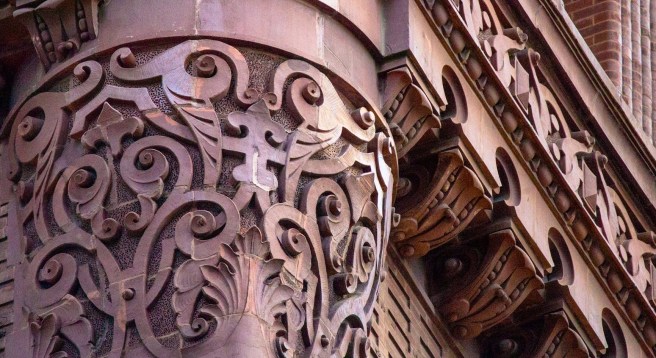
Burnham & Root, The Rookery. Detail of column emerging from the corner pier. (Author images)
Root placed his columns within a rock-faced stone base that was framed by stone piers at the corners and a continuous rock-faced lintel at the third floor. The lintel was supported by the polished granite columns that appear to have been called into being from the rock-faced corner piers by a transition as masterfully detailed as if they had been carved in place by Michelangelo. As he had done in many of his transitional layers, Root used the material of the pier, but the shape of the column. (Truly, one of my all-time favorite details in the history of architecture.)
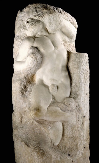
Michelangelo Buonarroti, The Awakening Slave, 1519. (Online); Burnham & Root, The Rookery. Detail of column carved from the corner pier. (Author image)
Root didn’t merely copy the details of the “mature” granite column onto the emerging stone pilaster, but detailed the pilaster alluding to its “gestation:” the capitals’ volutes are different as well as its bottom ring has yet to completely form in the pilaster; at the base the pilaster at this point in its formation has only two of the final four rings in the mature column. Root was very much alive at this time so this was detailed on purpose, it was not a “mistake.” (I owe credit for this observation to my dear friend and reader, Margie Crutchfield. One of the advantages of having all of you read my blog….!)
Root emphasized the granite columns’ two-story integrity, as he had done in the Rialto, by placing two-story inset oriel windows between the columns. This created the impression that the large volume of interior space, apparently imprisoned within the brick cage of the Rookery, was being pulled down by gravity and was trying to escape at the ground, being restrained from doing so only by the granite sentries. This sense of taught restraint in the bay windows was heightened by Root’s detailing of the windows in the upper floors. Whereas he had pushed the glass as far back as possible into the upper body of the building to allow the mass of the structural cage (the thickness of the masonry bearing piers) to read, the bays at the sidewalk, on the other hand, strained forward to the point where they (being iron-skeletal framed) were flush with the exterior face of the stone base.
While trying to achieve the same amount of openness that Jenney had accomplished in the Home Insurance Building with its pier-and-spandrel brick body of the upper eight stories in order to improve the lighting of the interior offices (without having to resort to Jenney’s embedding of iron sections in his masonry piers), Root also tried to improve upon the conflict between the horizontals and verticals in Jenney’s elevations. Compositionally, I believe he attempted to achieve Owen Jones’ “repose,” that is a balance between the facade’s horizontal and vertical accents. Using your eyes, let them alternate between the two photos below… Jenney’s Home is most definitely horizontal, with the vertical corner piers trying to reassert the vertical but are compromised by the awkward extension of the stone banding around them in floors six and seven.
Meanwhile, Root reinforced the horizontal groupings of floors in each layer by allowing the piers to be continuous within each layer without interruption by the lines of the spandrels being carried across the face of the piers, as Jenney had done. My eyes on the Rookery gravitate immediately to the vertical lines of the piers, then they register the horizontal banding that articulates the major layers, and then come to rest on the central projected entrance pavilion and its relation to the two-story base. An appropriate hierarchy had been established: major horizontal layer bounded between continuous stringcourses, primary; continuous vertical piers within each layer, secondary; individual floor spandrels between piers, tertiary. A neat trick indeed! That is, to achieve a design in which there is dynamic movement between vertical and horizontal without one dominating the over: a dynamic repose.
At the same time, Root also addressed the Insurance Exchange by lowering Jenney’s arcade from the tenth floor to match the ninth floor location in the Insurance Exchange. Still desiring to maintain Jenney’s rhythm of 2:2:3:2:1, however, Root was faced with a difficult problem: how to then detail the top of the seventh story? Having to keep Jenney’s stringcourse at this level meant that the arches in the ninth floor would result in only a two-story tall arcade. (The photo above is of the final eleven-story design, refer to the original design below.) Was this too short in a ten-story elevation? Jenney had also detailed capitals in his border piers at the major stringcourse levels. How should he cap the piers in floors five through seven when they reached the stringcourse at the eighth floor? The original ten-story rendering reveals Root’s indecisiveness at this point, the only unresolved detail in this elevation for which he can be truly faulted.
Burnham & Root, The Rookery. Preliminary Elevation Study. (Zukowski, Chicago: Growth of a Metropolis)
So why did Root feel he needed to put a second arcade in the Rookery’s two street elevations? The arch was a lingering romantic conceit in a skeletal-framed building, for the spandrel beams in a building were all iron by this date: a voussoir arch was no longer needed to span a window and was no longer “truthful.” As if he had not been satisfied with his two most recent elevations that incorporated only a single arcade (the Insurance Exchange and the Phoenix), he returned to the layered arcades of the Grannis Block (that was then being rebuilt following the fire) and the Burlington Building, by placing a second set of arches in the seventh story.
Left: Phoenix Building; Right: Insurance Exchange. Both buildings contain only one arcade (below the cornice).
An arch was more expensive to construct than a flat-headed window, and it also reduced the amount of daylight, therefore he did not use them at the seventh-floor in the Rookery’s two alley elevations (other than to turn the corner in the first bay). Was this merely a budget item, or had he taken the opportunity to experiment once again with a full-scale model? I would love to be able to digitally add the central entrance bay to the alley elevation below to judge which elevation would have been better? After I had originally posted this piece, I realized that Root had also been looking diagonally across Adams and Quincy at the Quincy elevation of Boyington’s Royal Insurance Building (as, it is now obvious, so had been Jenney when designing the Home Insurance Building.)
Diagonally across Adams from the Rookery. The Maller’s Building with its corner turret of stacked vaults. To its right is Boyington’s Royal Insurance Building and its brick facade.
Maybe the more “structural” alley elevation was too close to Jenney’s elevation for Root’s liking, nonetheless, the alley elevations were pointing to the future…
Rookery. Left: Quincy St. (alley) elevation; Right: Adams Street elevation.
The addition of the second arcade posed apparently an unsolvable conundrum at this point in the upper portion of the seventh floor: in addition to Root’s objective of achieving a dynamic repose between his verticals and horizontals, Jenney had detailed colossal capitals under each of the major stringcourses in his border piers, especially noticeable were those on the pier overlooking the corner of La Salle and Adams. Without the seventh floor arcade, Root would have been free to locate his capitals immediately under the lintels (as Jenney had detailed), logically lending visual support to them (you can visualize this with the alley elevation).
However, the lower arcade introduced the arch into this design problem. The arch’s spring point needed articulation, a job always achieved with a column capital… What to do? He needed to lower the capitals from being directly under the lintels so that they could visually support the arches. At the same time, he wanted the verticals to read continuous, so he recessed the plane of the arcade behind the plane of the wall surface so that the stub pilaster would read unbroken up to the lintel. Note that he did not recess the arch in the upper layer nor the lintel in the layer below. This detail allowed these two layers to read as a continuous surface between the corners of the building while the middle layer attempted to keep the verticals as a continuous line through all upper eight floors. (I believe he understood his mistake, for while he did detail two arcades in some of his subsequent designs, he never again recessed the arch in back of the wall plane in these buildings: he kept the arches always within the wall plane as he had done in the Rookery’s upper layer.)
Left: First design detailed with a skewback to receive the arch in the seventh floor. While the arch is supported by the capital, the lintel above still would like to have that capital supporting it; Middle: In the two street fronts of the final design, the capital in the seventh floor supports neither the arch nor the lintel: it is floating; Right: The floating capital still appears in the alley elevations, but you can imagine here how this detail would have appeared if Root had not incorporated the second arcade.
Overlooking the one aberration of the floating capitals in the seventh story, Root had struck a reposeful relation between horizontal and vertical in the original ten-story elevation of the Rookery: having taken the existing rhythm of the layers in Jenney’s Home Insurance Building as his point of departure, Root had delineated five horizontal layers, with each layer given a vertical counterpoint with the continuous piers. The single-story tenth floor combined with the two arcades to create a sense of false perspective in the upper six floors that had a diminishing progression with a 3:2:1 rhythm, resulting in one of Root’s better elevational designs to date. And then the owners demanded the addition of another floor, increasing its height to eleven floors… So much for all that time and effort in trying to resolve the subtle 3-2-1 visual foreshortening of the elevation. Unfortunately, contracts had been signed and as the owners had said, “just add one more floor to the top.” Indeed, it was just that simple, wasn’t it? I’m sure Root, known for his enjoyment of life’s finer pleasures, headed for the bar…
FURTHER READING:
Hoffmann, Donald. The Architecture of John Wellborn Root. Baltimore: Johns Hopkins University Press, 1973.
Stack, Joanne. Saving a Treasure: Chicago’s Rookery Building. Joanne R. Stack, 2019.
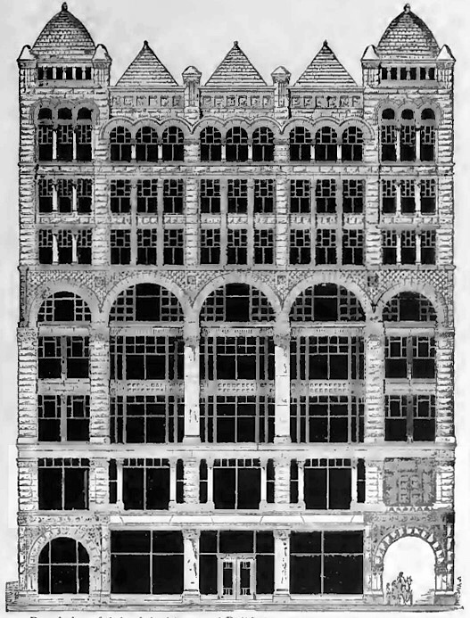
Burnham & Root, The Rookery. Preliminary Elevation Study. (Zukowski, Chicago: Growth of a Metropolis)
Root’s first strokes of lightning on brown paper, although containing initially only ten of the final eleven stories, already revealed not only all of the conceptual organization of the design and materials of the Rookery’s final appearance, but also, incredibly, most of the actual ornamental details that would comprise the elevations with little deviation or revision. And just what was the hint that had unleashed Root’s imagination that produced this drawing?
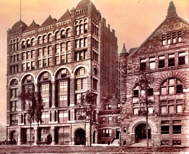
Above: Intersection of La Salle and Adams, looking south. The Rookery (left) and the Insurance Exchange (right) as the portal to the Board of Trade district. The entrance of the Home Insurance Building with its famous columns is in the left front. The Maller’s Building with its corner turret of stacked vaults is in back of the Insurance Exchange. (Merwood-Salisbury, Chicago 1890); Below: Intersection of La Salle and Adams, looking north. On the left: the Gaff, the Maller, the Insurance Exchange, the Marshall Field dormant excavation; on the right: the Grand Pacific Hotel, the Rookery (note how the additional story in the Rookery lifted its roof over the Home Insurance across the street (photo taken prior to when the addition floors were added). (urbanremainschicago.com)
Once again, as with Burnham’s studies, it was the site and its urban context. The existing urban void of the site was defined by his own Insurance Exchange, directly opposite of what would be the La Salle Street elevation, and Jenney’s Home Insurance Building, across Adams from what would be the Adams façade. Therefore, as the new building would sit only one block north of the Board of Trade, across La Salle Street from the Insurance Exchange and immediately south of the Home Insurance Building, it would make the intersection of La Salle and Adams one of Chicago’s most architecturally significant locations.
Reconstruction of Adams Street Looking East from Franklin, showing the portal at La Salle created between the Home Insurance Building at the left and the Rookery at the right. Root’s Burlington Building is at the far right, while his Insurance Exchange is at the far right. Cobb & Frost’s Owings Building, in back of the Rookery is three years in the future. (Digital image by David Burwinkel)
The proposed building on this site would not only cement the reputation of La Salle Street directly in front of the new Board of Trade as the city’s premiere financial district, but also reinforce the emerging Adams Street corridor, that began to read as a “who’s who in Chicago architecture”: from east to west: Interstate Exposition Building, Pullman Building, Post Office/Custom House, Rookery, Home Insurance Building, Insurance Exchange, the Burlington Building, and Union Station. Boyington, Beman, and Jenney each had designed one of these; the Rookery would be Burnham & Root’s third (actually, it was four, counting the Brunswick Hotel at Michigan and Adams, across from the Pullman Building…with more to come…)
John Wellborn Root, Comparative Study of Five Skyscraper Elevations, 1883-5. From left to right: Arcade with single window: Insurance Exchange, Phoenix; Combined: Rookery; Pier-and-spadrel paired windows: 13-story version of Monadnock, Rialto. (Drawn by Kyle Campbell)
Coming as it did during the start of construction of the Rialto, and in the midst of the design of the Phoenix and Monadnock, the design of the Rookery’s elevations can also be viewed in the continuum of Root’s experimentation in developing an appropriate exterior expression for the skyscraper employing either arcades with single windows (Insurance Exchange and Phoenix) or paired windows within a pier-and-spandrel structure (Rialto and Monadnock). The Rookery provided Root with the opportunity not only to show how far this new building typology had evolved both in design and in construction technology during the past hectic twelve months, but also demanded of him a certain urbanistic response in its design to attempt to synthesize the alignment of the geometries of the two existing buildings in his design of the new building’s facades:
Left: The Rookery. (Zukowski, Chicago: Growth of a Metropolis); Right: Insurance Exchange. (Hoffmann, Root)
As the Rookery would directly face the Insurance Exchange with approximately the same length of facade along La Salle, the opportunity to create a portal to Chicago’s financial district with these two brick bookends was one that Root must have quietly savored as a commission that many architects dream of, but rarely succeed in being awarded. It is intriguing then, to wonder why he did not use the cherry red brick of the Insurance Exchange but opted instead for a reddish-brown brick for the Rookery. (In all likelihood, Root chose the Rookery’s color as a transition between the lighter color of the Insurance Exchange and the darker color Jenney had used on the Home Insurance.) Nonetheless, the Rookery’s elevations can be viewed as Root taking the features of the Rialto, Phoenix, and Monadnock that he was most intrigued with at the time, and composing them into a framework that would complement, nay, engage the Insurance Exchange in a dialogue.
Left: Home Insurance Building; Right: The Rookery. (Zukowski, Chicago: Growth of a Metropolis)
Yet, one should also not ignore the influence of the Rookery’s northern neighbor, the Home Insurance Building, if one is to truly understand the subtleties of Root’s original composition. As much as the Rookery would be seen in conjunction with the Insurance Exchange, in some ways the Home Insurance Building represented an even more challenging architectural opportunity: while the Adams Street facade would directly face the Home Insurance Building, thereby also creating a portal to La Salle Street for those approaching along Adams from the west (this would have been even more effective if the owners had not added an extra floor as Root’s original design was to match the height of the Home Insurance), both buildings’ long La Salle Street elevations would be seen next to each other, presenting an obvious opportunity for direct comparison. Here one may start to discover Root’s intentions in his initial design of the Rookery.
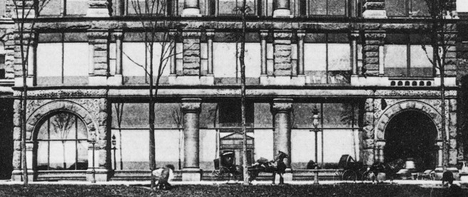
Above: Intersection of La Salle and Adams, looking north. Note how Root carried over the primary stringcourses of the Home Insurance Building (white lines) into the elevation of the Rookery. Root’s original ten-story design would have also reflected the upper floors of the Home Insurance, but the last-minute additional floor pushed its stringcourse out of alignment with that of the Home. (Merwood-Salisbury, Chicago 1890); Below: In this view you can appreciate how Root has aligned the Rookery’s major horizontal layers with those in the Home Insurance, as well as how the two skyscrapers side-by-side acted as a portal into the Adams Street corridor. Note the the tower of the Board of Trade has been removed. (urbanremainschicago.com)
He carried the major horizontal stringcourses of Jenney’s elevation across Adams Street, repeating the Home Insurance’s layering sequence of 2:2:3:2:1. He projected its central entrance bay that not only established another symmetry with the Home Insurance, but also created a direct axis across La Salle with the triumphal arched-entry of the Insurance Exchange. Root reinforced this axis by duplicating the triumphal arched-entrance in the Rookery’s base. Coming out of either building at this point, one was confronted with a virtual mirror image across the street.
Entrances. Left: The Rookery; Right: Insurance Exchange.
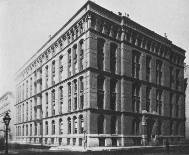
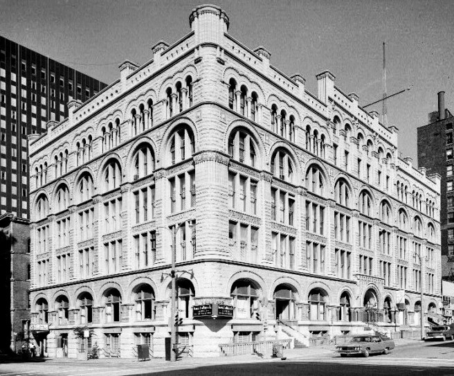
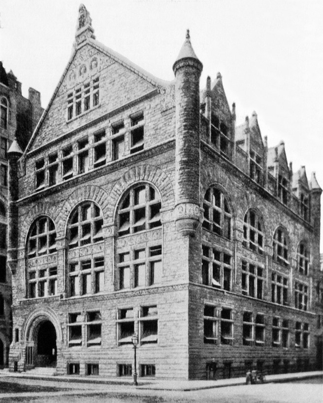
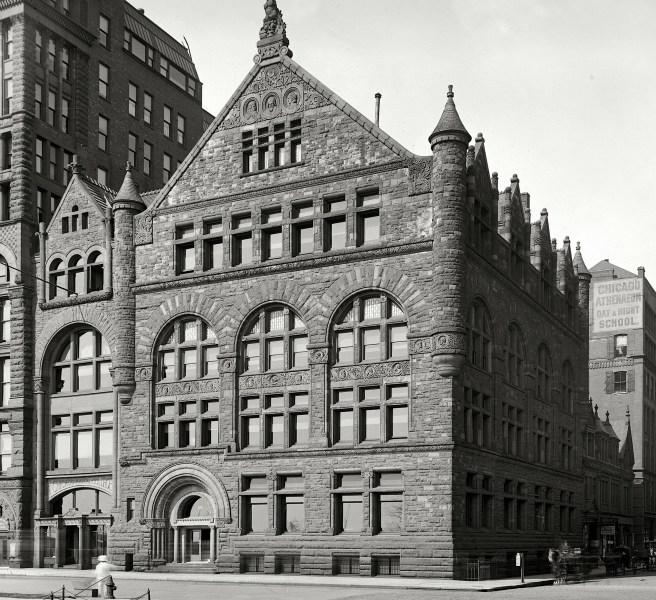
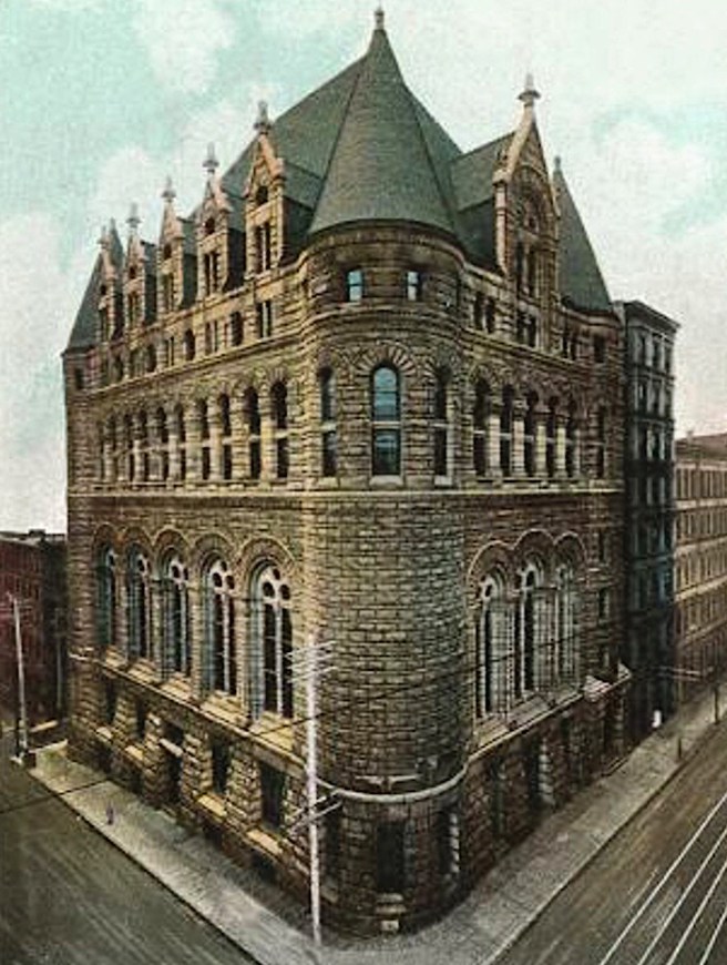
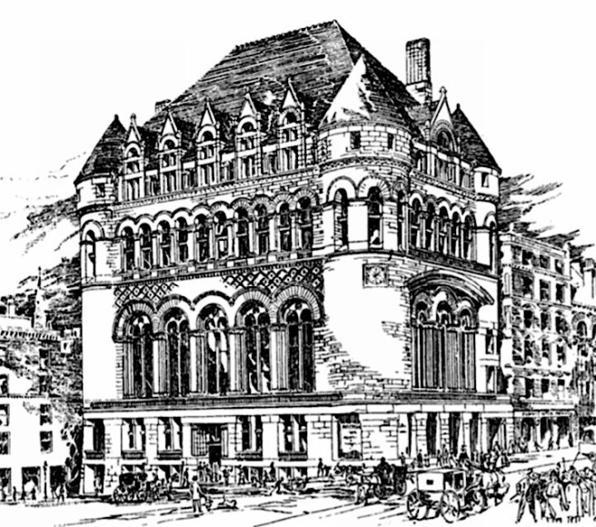
Burnham & Root, The Rookery, Chicago, SE corner of La Salle and Adams, 1885. (Zukowsky, Chicago: Growth of a Metropolis)
We last discussed the Rookery in Sec. 8.26, in which I covered the opening of the new Post-fire County Courthouse/City Hall Building in December 1884, some thirteen years after the fire. The city had moved all of its offices from the post-fire “temporary” City Hall (pejoratively referred to as “The Rookery”) that Van Osdel had designed around the surviving Water Reservoir at the southwest corner of Adams and La Salle, abandoning the site. Hoping to raise some badly needed income, it began looking for a developer to lease the land who would promise to erect a fireproof building with a value of not less than $800,000. There were three offers, of which the one chosen, that of Henry. S. Everhart’s had been suspiciously the lowest. While the other two had offered to start paying rent and taxes immediately, Everhart had asked to be exempt from rent and taxes from March 1885 to May 1886, a reduction to the city of $30,000 in rent and $6,000 in taxes. Nevertheless, Everhart’s offer was chosen the week before the Grannis fire (Feb. 19) by a majority of City Council (who surely had been promised considerably less than the $36,000 for their vote).
Mayor Harrison wisely responded to the public outcry over the scandal by vetoing the council vote and recommended that further bids be sought. Three months of quiet negotiating resulted in an announcement on May 12, 1885, that the site would be leased to a group of investors led by Edward C. Waller for 99 years at an annual rent of $35,000. In return, the group promised to erect the city’s largest office building, estimated to cost $1 million (for which it was reported that sketches for a 10-story structure had already been made) and would begin paying rent as of May 1, 1886. The company that had cemented the deal was the Central Safety Deposit Company, a “front company” formed in response to state law that prohibited companies from real estate speculation, unless, and here is the loophole, the company was a “banking association” that needed a building to conduct its business. Many such entities were formed by Chicago real estate developers who only had to build a vault in the basement of their new building to meet the letter of the law. Among the stockholders of the Central Safety Deposit Company, represented by Waller (treasurer and secretary) were Owen F. Aldis (pres.), Norman B. Ream (vice pres., who was a grain trader), G. W. Hale (brother of William E. Hale, inventor of the hydraulic elevator) and Waller’s long-time friend, Daniel H. Burnham (see Sec. 3.11). The project was to be financed by none other than Peter C. and Shepherd Brooks, the princes of Dearborn Street. Evidently, the Brookses and Aldis had seized the opportunity to gain a prime site in the heart of the emerging La Salle Street financial district that was also in the Adams Street corridor, by once again acquiring vacated public property (as they had done with the Montauk Block on the old Customs House site) to build another large office building designed by Burnham & Root. If Aldis and the Brookses couldn’t beat City Hall in their effort to develop Dearborn, they, at least, now had the “clout” to buy City Hall and make money on La Salle.
We had first encountered E.C. Waller in Sec. 8.13 as the real estate broker who pulled together the lots at the northeast corner of La Salle and Adams for the Home Insurance Company’s building by Jenney. Waller (1854-1931), born in Maysville, Kentucky, had moved with his family prior to the Civil War to Chicago where his father had settled on the West Side, in the heart of Chicago’s affluent colony of former Kentuckians centered around the intersection of Ashland (the name of the home of Kentucky’s favorite son, Henry Clay) and Jackson. The Waller children were close friends with the family across the street who had moved here from Louisville. The father of the friends’ family was Carter Harrison who, long before he was elected mayor, had become like an uncle to the young Waller and his siblings. A new insider deal had simply supplanted the earlier boodle scheme that the Mayor had vetoed.
Burnham & Root, The Rookery. Preliminary Elevation Study. (Zukowski, Chicago: Growth of a Metropolis)
By March 1886, the foundations of The Rookery had been completed (see Sec. 10 below on Construction), with work commencing on the superstructure. The design of the building’s exterior, therefore, must have been substantially completed by the fall of 1885, in order for the stone and terra cotta contracts to have been awarded with sufficient lead time to start construction in March. Both Inland Architect and the Inter-Ocean in their reports on the awarding of the lease to the Waller group in May 1885, stated that sketches for the building had already been made. Harriet Monroe’s biography of Root provided an insight into the probable sequence of events in Burnham and Root’s office that produced the design of the Rookery:
“Mr. Burnham was skillful in laying out a building. Root did not enjoy this part of the work, and rarely assumed it… When a building came to the office, Mr. Burnham, as a rule, laid out more or less roughly ground and floor plans. Frequently he made many such studies, the partners deciding together upon the best one, which Root would use as the first element of his problem in designing the exterior… Root often felt a certain reluctance in initiative. His mind was of the Shakespearean type: it could build temples, towers and palaces upon a hint; but it craved the hint, as Shakespear [sic] craved his plot, for a starting-point of his dream. Usually this hint came from one or more conditions of building, kind of material to be used, amount to be expended or some other element of the equation. Sometimes the suggestive word came from a client, oftener from his partner, or perhaps the latter would embody it in a sketch drawn in a few rough lines. And from such a seed the plant would grow and flower in Root’s brain as swiftly as a magical mango-tree… He had the rare power of seeing the finished building with his mind’s eye before he put pencil to paper – a complete architectural prevision. A word, a hint, a sudden thought, would send a great structure shooting upward in his imagination, and a rush of swift exact strokes on brown paper would make it a reality. “He could really see it,” says Mr. Burnham; “I have never seen any one like him in this respect. He would grow abstracted and silent, and a far-away look would come into his eyes, and the building was there before him – every stone of it.”
“Another [architect who had worked for Root], dwells upon the accuracy of Root’s drawing… “When he had a new job in his mind he would sit and think it over quietly; and then perhaps he would pull down a book of photographs in the style he wanted; and he would give just a glance to each picture – never stopping – go through the whole book in five minutes, turning the leaves just as fast as he could with his chubby fingers. And then he would shut it up and say, ‘demmit!’ under his breath – still turning the thing over and over in his mind. And in a day or two he would see that building in front of him, and throw it on paper like lightning.”
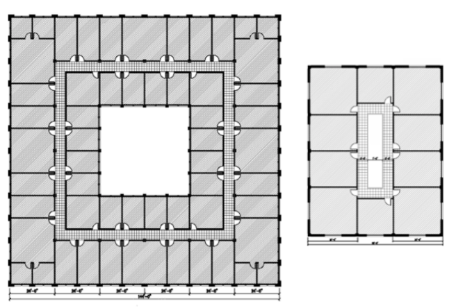
Most likely, the Rookery was no exception to the office’s standard procedures. I have already reviewed how 19th century architects planned a building around daylight requirements (see Sec. 2.7-11). Hence, Burnham’s preliminary plan studies for the site, surrounded on all four sides by a street (i.e., immediate daylight) would have revealed a startling fact: unlike all of their previous skyscrapers, the site’s 168′ x 178′ dimensions would free them from their conventional scheme of a thin slab of a double-loaded corridor (Insurance Exchange and the Phoenix).
One alternative would have been an H-plan like the Rialto, i.e., a thin double-loaded corridor facing La Salle with second one paralleling it to the east. The problem with this scheme was two-fold, First, it didn’t take advantage of the views/space/daylight available along Adams, and second, too much space would be lost in the exposed light courts between the two slabs. A second option, then would have been to expand the hollow doughnut scheme of the Burlington Building.
This would have resulted in a huge waste of floor area ($$) in the resulting interior atrium. More than likely Burnham would have tried all of these schemes just to make sure that what he probably felt all along, that is, that the double-loaded corridor plan that Boyington had employed fifteen years earlier in the Grand Pacific Hotel, for a site with the same overall dimensions just across Quincy Street, would be the most efficient use of the site.
Typical floor plan of a double-loaded corridor scheme for a site with a width greater than 100’ compared to a single-loaded corridor on a site with a width less than 100.’ (Drawing by Kyle Campbell)
W.W. Boyington, Grand Pacific Hotel, Chicago, 1872. Above: Partial Section through Lobby, Skylight, and Lightcourt above; Bottom: Partial Ground Floor Plan. (The Land Owner, April 1870)
This meant that the Rookery would present Root not with a front and a side elevation to design, as was the case with the Rialto, but instead, two long, contiguous elevations, a situation similar to the challenge he faced with the much shorter Chicago, Burlington, and Quincy Railroad Building, also facing Adams Street and only two blocks to the west.
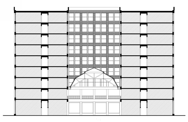
Quite a different problem from the Burlington Building, however, would be the design of the Rookery’s atrium, for instead of presenting Root with the design of a similar awe-inspiring tall space (even though the size of the two courts were similar, CBQ’s was 55′ x 75′ while the Rookery’s would be 62′ x 71″), the double-loaded corridor scheme of the Rookery would require that the skylight over the atrium be brought down to the second floor, so that the inner tier of offices above would have direct exposure to fresh air and daylight. The atrium of the Rookery would feel more like a greenhouse than like a larger version of the Burlington’s spacious atrium or the 84′ x 144′ Grand Court in San Francisco’s Palace Hotel (1871).
Above: Decimus Burton and Richard Turner, Palm House, Kew Royal Gardens, 1844. (Online); Bottom Left: Building section of a double-loaded corridor scheme, showing that the skylight has been lowered from the roof to the second floor. (Drawing by Kyle Campbell); Bottom Right: John P. Gaynor, Palace Hotel, San Francisco, 1871. The Grand Court. (Lewis, Bonanza Inn)
In reality, once again it would be George Post to whom Root would look for ideas. In this case, the problem he faced was remarkably similar to the one Post had confronted in the design of the recently completed New York Produce Exchange.
George B. Post, Produce Exchange, New York, 1880. (Online) Below Right: Transverse section. (Landau, George B. Post)
FURTHER READING:
Hoffmann, Donald. The Architecture of John Wellborn Root. Baltimore: Johns Hopkins University Press, 1973.
Zukowski, John. Chicago Architecture 1872-1922: Birth of a Metropolis, Munich: Prestel, 1987.
S.S. Beman, Studebaker Brothers Building, Chicago, 410 S. Michigan, 1885. (Cornell University Digital)
By this time, however, a building that was even more conspicuous in its Richardsonian detailing was already under construction immediately to the south of the Art Institute’s site along Michigan Avenue. Where else in a major city could one find the city’s Art Museum next to a new car showroom and assembly factory? The Studebaker Brothers, who manufactured carriages and wagons in South Bend, Indiana, had leased a showroom and sales office in Chicago since the end of the Civil War. In 1883, they had started acquiring the land along Michigan Avenue, just south of where the Art Institute would eventually locate, to erect their own building that would contain a showroom and a multistory factory to assemble the parts shipped from their factory in South Bend.
The choice of Michigan Avenue for a factory may at first glance appear to have been extravagant, but the building was also to be the company’s showroom. As Michigan Avenue was not only the main carriage drive due to its views to the lake, but also was still one of the primary residential areas for the city’s elite (i.e., customers), the location had been well-thought out. The 107′ x 170′ site on Michigan Avenue, was only two blocks south of the Pullman Building that was owned by another manufacturer. The proximity to the Pullman Building may have influenced the Studebakers to commission its designer, S. S. Beman, to design their new building. The June 27, 1885, issue of Real Estate and Building Journal announced the project, the date being of no little consequence, for only the day before Judge Moran had issued the injunction on the behalf of Leiter that had halted construction on Field’s skyscraper that had been designed by Beman. As no drawings of Beman’s design for the Field Building are known to exist, one is led to surmise how much of the Field design Beman carried over into the eight-story Studebaker Building.
S. S. Beman, Northwestern Mutual Life Insurance Building, Milwaukee, WI, 1885. (Above: Online; Below: SAH Archipedia)
Just prior to having received this commission, Beman had designed a four-story plus basement building for Milwaukee’s Northwestern Mutual Life Insurance Company. Its design was a straightforward Norman Romanesque in which Beman achieved a maximum of window area with a highly skeletal façade using arches only in the upper most floor of each of the building’s three layers.
Beman, Studebaker Building. (Zukowski, Chicago: Growth of a Metropolis)
Upon first view, one’s suspicions are immediately aroused by Beman’s use of granite in the 107′ long Michigan Avenue elevation. As granite had been used up to that time on only one other commercial building, the Royal Insurance Building, and was planned for only one more, Field’s skyscraper, Beman’s use of it, instead of the more common and less expensive brick, on a relatively unimportant manufacturing house spoke either to the Studebakers’ desire to erect an extravagant commercial edifice on the lakefront, or Beman’s desire to get his ideas for the Field project built one way or another. Although he had employed many of Richardson’s Romanesque details, he failed to achieve any sense of Richardson’s repose.
He layered the elevation in a 1-1-3-2-1 rhythm, thereby achieving a sense of false perspective in the upper floors. Vertically, he divided the elevation into five bays, the two end bays detailed as slightly thinner corner pavilions which framed the three wider, central bays. This scheme was further emphasized by projecting the two end bays slightly beyond the roofline of the building’s center and topping each of them with a domical roof that ended with a flagpole. Each central bay was also capped, but with a smaller pyramid. His overall massing scheme of end bays framing arcades in the middle reminds me of an elongated version of Richardson’s Cheney Building in Hartford from 1875, updated in Richardson’s current monochromatic palette.
Because both functions of the building, showroom and factory, required a maximum of daylight, especially considering its 170′ depth, Beman’s objective in the design of the front elevation was to open up the wall for as much glass as physically feasible. The first two stories, which contained the show floors, were detailed as a base in red granite, while the upper six floors in which the assembly operations took place, were faced with a light gray Bedford granite. The ground floor, appropriately, was almost entirely sheathed in glass, the better to entice a prospective buyer into the showroom on the first floor. Huge plates of glass filled the three central bays which were flanked on both sides by a granite arch in the end bays: the left one likewise was filled in with glass as a display window, while the right one provided an entry way to drive one’s new purchase off the showroom floor. (If the Home Insurance Building that was finished and open for business by this date, had actually incorporated iron skeleton framing in its exterior, as was claimed by later historians, I must speculate why Beman, who himself had a fair amount of experience with iron framing, did not use iron framing in the Studebaker’s Michigan Avenue façade? My answer is simply that true iron framing was not used in the Home Insurance Building, and in fact, its use was still six to eight months in the future.)
Beman, Studebaker Building. Note how the panes of glass get smaller as one moves up the elevation.(Chicagology)
The building’s entrance was located not in either of the two monumental arches that one would have expected at first glance but was rather meekly understated within the glass of the middle bay. Undoubtedly, Beman attempted to overcome this weakness by placing polished granite columns (à la Jenney’s Home Insurance Building), at either side of the entrance bay, but because of the large span of the central bays, the columns not only were too far apart to reinforce the sense of entry of the small doors, but their scale also dwarfed the actual entry, tending to redirect one’s visual search for an appropriately scaled entry to the more monumental flanking arches.
The second floor was also used to exhibit the company’s products, so Beman also located large panes of glass in this story so that all five bays could be used as display windows. In an attempt to again highlight the center three bays, he placed smaller flanking columns at both sides of each of these windows, trying to create a set of more specialized display windows in this location. This was an unfortunate detail for not only do the columns seem to be precariously balanced on short blocks cantilevered from the main piers, but this also forced Beman to use piers throughout the second story in order to be able to contrast the smaller flanking columns, rather than continuing to use colossal columns between the middle three bays that could have made a more promising connection between those in the ground floor and the two-story monumental columns that Beman placed in the third and fourth stories.
These two large columns supported an arcade at the fifth floor, thereby unifying floors three through five into one layer. The horizontal continuity of this zone was greatly enhanced by a Richardson-inspired grid of alternating sculpted and smooth-faced square stones that filled in the area above the arches. Although this detail tied together all five vertical bays at this point, its strong horizontality awkwardly interrupted the vertical thrust of the piers at this point, resulting in the upper three stories appearing to have been stacked on top of the arcade. Because these floors housed assembly operations, and not show floors, Beman could use less expensive, smaller panes of glass to enclose the space between the vertical members. To further accentuate the building’s highlight, the monumental two-story columns in floors three and four, Beman incorporated Root’s two-story bay windows from the Rialto Building. By pulling the sides of the oriels to the back of the columns, Beman had created a very effective frame that focused one’s visual attention on the columns.
Sources differ in the actual function of the various floors. Some same only the first two floors were showrooms, while Randall states that the first four floors were showrooms in which over 2000 carriages were always on view. Judging by the height of the floors and the size of the window panes, I believe that while the first two floors provided street display windows, the upper three floors, too high from the street for a carriage to be seen, still had large panes of glass to function as show floors, offering a view of a customer’s new carriage against a background of Lake Michigan. I include the fifth floor as a display floor because of its floor-to-floor height, and the fact that those beautiful arches overlooking Lake Michigan would have been under-appreciated for the mere assembly of carriages.
Beman, Studebaker Building. Arcade at Fifth Floor. Note Beman’s Byzantine/Art Nouveau capitals. (chicago.designslinger)
W.W. Boyington, Royal Insurance Building, Chicago, 1883.
The bays in the upper three floors were each broken into three windows, similar to Boyington’s Royal Insurance Building, the triple arcade in the top floor being a virtual copy of the same detail in Boyington’s top floor. This smaller unit of division aided the sense of perspective, which was further reinforced by the shortening of the floor-to-floor heights in these stories. With that being said, let me critique the design and offer a few improvements:
-first, the second-floor piers and minor columns was simply wrong and just jarringly out-of-character. I want to combine the ground and second floor into a unified two-story base, within which the display windows are located and made to stand out by relocating the monumental columns in floors 3-5 to the base. Their current location simply pulls the eye towards the middle of the building and away from the base (merchandise the carriages).
Beman, Studebaker Building. Entrance and its “Celtic” bands of ornament. (Author’s collection)
-second, the central entry is totally out-of-scale with the building. I want to relocate it to the left bay and give the grand archway there some meaning. This also would balance the carriage exit in the right bay (i.e., one enters through the left arch and departs in one’s new carriage from the right arch). This would also remove the entrance from the center so that an onlooker could concentrate on three bays of carriages on display, on both floors. This could be reinforced by moving the recessed bay windows and the two-story tall columns from the third/fourth floors to this location. The recessed bays would push the carriages closer to the viewer and still allow the polished columns, now two stories tall, to be read as dominant structural elements (à la The Rookery). While one might argue about the asymmetrical nature of this, the carriage exit at the right has already destroyed any symmetry at the base, that this move might restore. Also, Root’s offset entrance in the adjacent Art Institute would reinforce this new location.
-third, either let the arcade at the fifth floor remain as is, terminating its “horizontal layer” and eliminate the corner pavilions above so that he upper three floors give a cleared reading of a layer with two floors with the top layer of one floor, OR…. continue the corner pavilions through the fifth floor as Richardson had done in the Cheney Building, rather than making them “disappear.” Beman did exactly that, eliminate the corner pavilions in his addition of 1898.
All things considered, Beman’s elevation was not only a remarkably wide open skeletal composition in which plate glass comprised the vast majority of the exterior surface, but visually, its subtle play with proportions also made the building appear taller than its 135 foot height. Beman could take some solace after the disappointment of the Field project, in the fact the two tallest buildings on Michigan Avenue, first viewed by people upon their approach by the Illinois Central tracks along the lakefront, had come from his drafting board.
S.S. Beman on Michigan Avenue. Left: Studebaker Building. (O’Gorman, H.H.Richardson-American Forms); Right: Pullman Building. (J.W. Taylor: Chicago Historical Society)
FURTHER READING:
Larson, Paul Clifford (ed.). The Spirit of H. H. Richardson on the Midland Prairies. Minneapolis: University of Minnesota Press, 1988.
Zukowski, John. Chicago Architecture 1872-1922: Birth of a Metropolis, Munich: Prestel, 1987.
Burnham and Root, Art Institute, Chicago, SW corner of Michigan and Van Buren, 1884. (Larson, Richardson)
In August 1885, the three-year old Art Institute of Chicago announced that it was about to commence the construction of a new building by Burnham & Root on the southwest corner of Michigan and Van Buren, immediately east of its existing relatively meager building on Van Buren that Root had designed in 1882. Once again, this was a reaction to events transpiring in Cincinnati, as it seems to have been in response to the imminent completion of the new Cincinnati Art Museum designed by James McLaughlin, the architect of the huge Shillito’s department store.
James McLaughlin, Cincinnati Art Museum and Art Academy, Eden Park, 1882. Left: The Art Academy; Right: The Museum. (Online)
Following Philadelphia’s Centennial Exhibition, a group of Cincinnati women, once again led by the indomitable Maria Longworth Nichols and her husband George Ward Nichols, the same Cincinnatians who were responsible for the formation of the city’s May Festival and Conservatory of Music (see Vol. Two, Sec. 6.3) had formed the Women’s Art Museum Association whose goal was to coordinate Cincinnati’s various independent galleries and studios into an art museum and art school for Cincinnati, based on the South Kensington Museum and School that was had been established by Henry Cole and Owen Jones following the success of the 1851 London World’s Exhibition. To review the background of the Nichols, she was the granddaughter of the city’s richest man, millionaire real estate magnate Joseph Longworth, Her family’s wealth allowed her to follow her youthful passions of painting and piano. In 1868, her father had hired Nichols, then the art critic for the New York Evening Post, to catalog his vast art collection. The two had married late in 1868. Two years later, following the successful 1870 Nord-Amerikanisches Saengerbund festival, Maria had been inspired to organize Cincinnati’s May Festival, directed by Theodore Thomas in May 1873.
McLaughlin, Cincinnati Art Museum and Art Academy, Eden Park, 1882. Left: The Art Academy; Right: The Museum. (Online)
In Volume Two I recorded that following Chicago’s having overtaken Cincinnati’s population and manufacturing by the end of the Civil War, the Cincinnati’s leaders had embarked on a campaign to make the city the Arts Capital of the West. Music was not the only art they had focused on, and Maria Longworth Nichols’ upbringing in painting and piano had prepared her well for the tasks she would take on in this campaign. Around the time of the first May Festival, she had moved into painting by taking classes in china painting (in 1880 she would found the Rookwood pottery company) at Cincinnati’s McMicken School of Drawing and Design (est. in 1869). She had been one of the organizers to send a collection of examples by the city’s artists to the 1876 World’s Fair, following which they had formed the Women’s Art Museum Association. In 1878 they sponsored a lecture series on the role that art could play in the city’s industrial development (taken directly from Cole’s Kensington program), in order to drum up support for the Art Museum. In 1881 the Cincinnati Art Museum was incorporated with the city’s progressive municipal government once again donating public land, twenty acres in beautiful Eden Park for the new institution in 1882. McLaughlin was commissioned to design the first solely-dedicated Art Museum west of the Alleghenies, with a parallel art school a lá South Kensington. The complex would be dedicated on May 17, 1886, only ten days after Chicago’s infamous Haymarket Square incident.
11.6. THE ART INSTITUTE OF CHICAGO
Antebellum Chicago had certainly paralleled these early artistic efforts in Cincinnati. In Volume One I introduced Chicago’s two leading artists, painter George P. A. Healy (brought to Chicago by William Ogden in 1856, father of George L. Healy of the firm Healy & Millet) and sculptor Leonard Volk (brought to Chicago in 1857 by his wife’s cousin Stephen Douglas). Volk had joined Healy in comprising the city’s antebellum embryonic artistic community that also included a number of the city’s leading patricians who were collectors and connoisseurs of the arts. One of the city’s leading artistic personalities at this time was Uranus H. Crosby, whose successful distilling business had allowed him to consider himself to be, as well as to act the part of a bon vivant and a true patron of the arts.
In May 1859, a group that included Crosby, Healy, and Volk met at the Chicago Historical Society to plan the city’s first art exhibition, the Fine Arts Exposition of the Northwest, for the six weeks between May and June 1859 in Burch’s Building at the corner of Lake and Wabash. The success of this event encouraged a number of local artists and art connoisseurs to form the Chicago Art Union later in 1859. This organization held its first, and only, art exhibition at Alexander Hessler’s photography gallery on Dec. 7, 1860. J. Young Scammon provided for the safe keeping of the organization’s nascent art collection that the group had managed to purchase from Healy, until a permanent building for its display could be procured. In December 1862, Volk and painter John Antrobus had opened a gallery known as “The Art Gallery,” in the old Walker mansion at the northeast corner of State and Washington (the future site of Marshall Field’s) that he was able to lease with funding provided by John B. Turner, Uranus Crosby, and David A. Gage, intended to house exhibitions and receptions in an attempt to further the education of public taste. For the 1863 Sanitary Fair’s art exhibition, Volk had managed to secure over three hundred works from the city’s collectors among whom were Ogden, Scammon, Walter Newberry, and Ezra McCagg, the highlight of which was an original Rembrandt, that were housed in McVicker’s Theater. This exhibition was reprised for the 1865 Sanitary Fair with a Fine Art Gallery housed in Bryan Hall.
By the time the 1865 Fair had opened on May 30, Uranus Crosby had opened his Opera House in which he had included space for artists’ studios as well as the building’s 60’ long by 30’ wide by 18’ high Art Gallery (note this was a gallery, not a permanent museum). This was located on the top floor so skylights could provide better daylighting of the works on display. Following the very successful Fine Arts Exhibition at the 1865 Northwest Sanitary Fair, the art gallery and studios that Crosby had included in the upper floors of his Opera House begged for a formal organization to take control of scheduling the classes and exhibitions that the city could now stage. Just such an organization was founded in late 1866 by 35 local artists, based on the model of Britain’s Royal Academy, as the Academy of Design to promote art and its education. Its first festival was held in Crosby’s Opera House on Friday, May 3, 1867. Although its opening was successful, local interest quickly waned, leaving the affairs of the fledgling organization in a deficit.
Academy of Design, Chicago, 66 W. Adams, 1867. (Andreas-v.2)
The group soon disbanded over artistic differences, only to be reformed on November 18, 1867, with a new constitution under the presidency of Leonard Volk (who guided the organization’s affairs in this position until 1878). Free drawing classes and a variety of receptions and exhibitions filled the year 1868 and led to the formal incorporation the Academy of Design under the guidance of Ezra McCagg on March 16, 1869. Among the Academy’s incorporators were artists Volk and Healy and architects Sanford E. Loring and John C. Cochrane. The high expectations for the Academy were apparently dashed with the refusal of Crosby to allow the continued free use of his rooms in the Opera House due to his worsening financial situation, but this obstacle actually resulted in the group’s search for independence that led to the construction of its own building. A five-story building at 66 W. Adams, between State and Dearborn was erected by Jonathan Clark to serve the needs of the Academy. The new Academy of Design, containing two galleries, a lecture hall, sixteen studios, and numerous classrooms opened with a reception thrown on March 22, 1870.
W.W. Boyington, Inter-state Industrial Exposition Building. Ground floor plan. Note the Art Gallery located in the center of the lakefront side. (Siry, Auditorium)
Unfortunately, the 1871 fire destroyed Crosby’s Opera House and the Art Academy. Boyington made an attempt to replace the loss of Crosby’s art gallery by including a gallery in the post-fire Exposition Building. This was located In the center of the side facing the lake, that was flanked on either side by restaurants. Meanwhile, the Art Academy floundered over lack of a permanent home, finally having to close due in 1879 to bankruptcy brought on the depression of the 1870s.
On May 24, 1879, a core group of its members (businessmen who were frustrated with the unbusinesslike running of the organization by the artists) had formed a new organization, the Chicago Academy of Fine Arts at this same time, purchasing much of the former organization’s assets. The leaders of this group were Pres. Levi Leiter (pre-break with Field) and Vice-President Charles L. Hutchinson (1854-1924), son of Benjamin P. Hutchinson, one of the Board of Trade’s leading and most respected (feared) grain traders (speculators), banker, and owner of Chicago packing, the country’s largest meat packing company. In many ways the younger Hutchinson paralleled Ferdinand Peck: both were scions of Chicago’s wealthy founders who were more interested in philanthropy than business. In fact, one might consider them as Chicago’s cultural bookends: Peck interested in music while Hutchinson shepherded fine art. (Quite literally they would bookend the block of Michigan between Congress and Van Buren: The Auditorium at the south end at Congress and the Art Institute at the north end at Van Buren.) When Hutchinson turned 21 in 1875, he had joined his father’s company but from early on his lifetime’s passion was to build an art museum for Chicago.
(?) Burnham & Root, 1882 Art Institute of Chicago Building, Van Buren between Michigan and Wabash, 1882. This image is from an enhanced photo of the 1885 building (far left). The 1882 building was not demolished when the 1885 “addition” was erected, therefore I believe this image is the 1882 bulding. (Chicagology.com)
In 1882, more than likely being goaded into action by Cincinnati’s latest announcement about the construction of its new museum, Hutchinson set into motion his own plan to build an equivalent institution for Chicago. He “loaned” the money to buy the southwest corner of Michigan and Van Buren to erect its first building. (Finally, post-fire Chicago had a wealthy benefactor of the likes of Crosby or Cincinnati’s Reuben Springer, the donor behind the Music Hall.)
Michigan Avenue, looking south from Jackson Street, ca. 1886. The skyscraper at the end is the Studebaker Building, (the Auditorium is not yet under construction) with the Art Institute in front of it. Across the avenue on the left is Lake Park, the location of IWPA Socialist rallies during the mid-1880s. (O’Gorman, H.H.Richardson-American Forms)
There can be little doubt that he was among the upper-class elites and their plan of cultural assimilation of the middle-class for this site was directly across Michigan Avenue from where the IWPA under Albert Parsons would hold their Sunday afternoon rallies in Lake Park (as documented by Siry). In other words, Hutchinson was in league with Peck to “take back” the lakefront from Chicago’s socialists. At this same time, the Board of Directors changed the organization’s name to The Art Institute of Chicago and elected Hutchinson as President of its Board, a position he retained until his death in 1924.
Burnham & Root, The Art Institute. Note that the original Root building stopped at the house remaining in between it and the Studebaker Building. The addition seen below was added at a later date. (Cornell University Digital)
Burnham & Root, The Art Institute. (Chicagology.com)
The organization moved into the existing building at the corner and hired Burnham & Root to design a small three-story “addition” to the west along Van Buren for studios and small gallery. In August 1885, as construction on the Cincinnati Museum was winding down, Hutchinson bought the vacant lot immediately to the south of the existing corner building and commissioned Burnham & Root to design a four-story plus basement building to replace the original building on the corner, for a program that included a number of galleries, in addition to artist’s studios and clubrooms in the upper two levels.
The Book of Kells, c. 800 AD. Illustrations. (Online)
Note that each capital of the mullions under the arcade is unique.
It is somewhat ironic, then, to find that Root, after having successfully eliminated the need for cut stone in his subterranean foundations, would now at this precise moment employ it as the dominant material in the exterior of one of his urban buildings (he had always used it in many of his residential projects). Many Root scholars cite this design as Root’s most “Richardsonian Romanesque” building. With the cut stone exterior and its large voussoired arcades and the Richardsonian gabled dormers on the Van Buren façade, its hard not to admit that Root had been influenced by Richardson’s winning design for the Cincinnati Chamber of Commerce. I consider it a divertimento, if you will; a precious little Celtic-etched jewel box allowing Root a break from the bevy of 10+ storied behemoths he was responsible for at this moment. I believe it is not coincidental that at just this precise moment, Richardson was also attempting to do his most “Rootian Commercial” design for Marshall Field’s wholesale store. It was, so to say, “Drawn pencils at twenty paces”…
Burnham & Root, Art Institute. Grand Stairway. (Chicagology)
FURTHER READING:
Hoffmann, Donald. The Architecture of John Wellborn Root. Baltimore: Johns Hopkins University Press, 1973.
Monroe, Harriet. John Wellborn Root; A Study of His Life and Work. Park Forest: Prairie School Press, 1966.
Siry, Joseph M. The Chicago Auditorium Building. Chicago: University of Chicago Press, 2002.
H.H. Richardson, Cincinnati Chamber of Commerce, 1885. (Online)
Let’s review the major competitions that occurred between Cincinnati and Chicago as they struggled after the Civil Wat to be the dominant center of the Midwest:
1.Pork: Chicago overtook Cincinnati’s Pork Production with the start of the Civil War, claiming Cincinnati’s title of “Porkopolis.”
2. Opera House/Convention Center: Uranus Crosby had built his Opera House in 1865 to be larger than Cincinnati’s Pike’s Opera House. Following the end of the war, Cincinnati launched its campaign to be the “Art Center” of the West, erecting its huge Saengerfest-Halle and Exhibition Buildings in 1870. Following the destruction of Crosby’s Opera House by the 1871 fire, Chicago erected the Interstate Exposition Center. Cincinnati responded by erecting the even larger Music Hall and Exhibition complex in 1876 to house its biannual May Festivals. It would take over 12 years (1888) for Chicago to erect an equivalent facility, the Auditorium.
3. In 1876, Cincinnati erected the largest department store in the West, the Shillito’s Department Store. It would take a number of years for Marshall Field to build an equivalent building.
4. Cincinnati would beat Chicago in holding not only the first Music Festivals, its biannual May Festivals conducted by Theodore Thomas, but also the first Grand Opera Festivals in 1881 and 1882. Chicago finally had responded in 1885.
Competition Submissions for the Cincinnati Chamber of Commerce, Cincinnati, 1885. Left: H.H. Richardson (first place); Right: John W. Root (second place) (Rudd, JSAH 1968)
Round Five would be the erection of a central “Exchange Hall.” Chicago had beaten Cincinnati to the punch with not only the formation of its Board of Trade in 1848, but also its construction of Boyington’s Board of Trade with its 303’ tall tower. As its construction neared completion during the fall of 1884, Cincinnati finally responded with a competition to design its new Chamber of Commerce, that included an “Exchange Hall.” The competition was announced in December 1884, with invitations extended to local architects James McLaughlin (Shillito’s) and Samuel Hannford (Music Hall), as well as to Burnham & Root (Chicago), George Post (New York), and Richardson (Boston). Richardson was named the winner on June 8, 1885, (one month after Chicago’s Board of Trade had opened its doors) with Burnham & Root’s Flemish-inspired design taking second place. Richardson’s drawing was published in American Architect later that year for all to study.
Richardson, Cincinnati Chamber of Commerce. Left: Section showing the top three floors suspended from iron roof trusses. Right: Exchange Hall. (Ochsner, Richardson)
The building’s section was organized into three layers: the ground floor of rental shops, the three-story high (48’) Exchange Hall, with three floors of offices/clubrooms suspended over the Hall from steeply-angled high trusses. The elevation expressed this layering as was his conventional practice at this stage in his career. Although similar to the Allegheny County Courthouse, the Cincinnati design was a year later and revealed the evolution occurring in Richardson’s head about how to approach an elevation.
The difference being, however, subtle, was that the upper sill courses were detailed within the plane of the wall, instead of being projecting beyond as was still the case in the Courthouse, thereby being absorbed into the wall surface, allowing the building to be read more as a unified mass that has been wrapped with a continuous surface, similar in its effect to what I noted in the upper stories of the courtyard elevations of the Courthouse.
Note Richardson’s characteristic alternating rhythm between the piers of the larger bay from below and the intermediate piers of the smaller bays detailed with three engaged pilasters. (Ochsner, Richardson)
In comparing the earlier Ames Wholesale Store, the Allegheny County Courthouse, and the Cincinnati building, all designed within the relatively short span of only three years, one can sense the subtle evolution of Richardson’s understanding of his elevations and massing. Especially noteworthy in all three is Richardson’s continued use of the picturesque, steep-sloped hip roof, punctuated by high-pitched dormers. All three designs exhibit his favorite roof detail, allowing a dormer to extend to the exterior wall line of the building, where it is intersected by the vertical projection of the wall plane beyond the eave of the roof until it blended into the dormer’s gable.
Richardson, Cincinnati Chamber of Commerce. Dormer. (Online)
This detail denied any chance for the wall to end in a Renaissance-like horizontal cornice that could conceivably hide his beloved roofs from an observer on the ground. As one reviews Richardson’s designs following his return from Europe, be they small residential projects or large, urban blocks, one constant formal theme is quite evident: the roof of a building designed by Richardson at this time was an important, indispensable part of the building that had to be architectonically celebrated.