
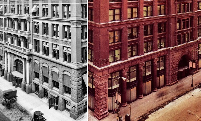
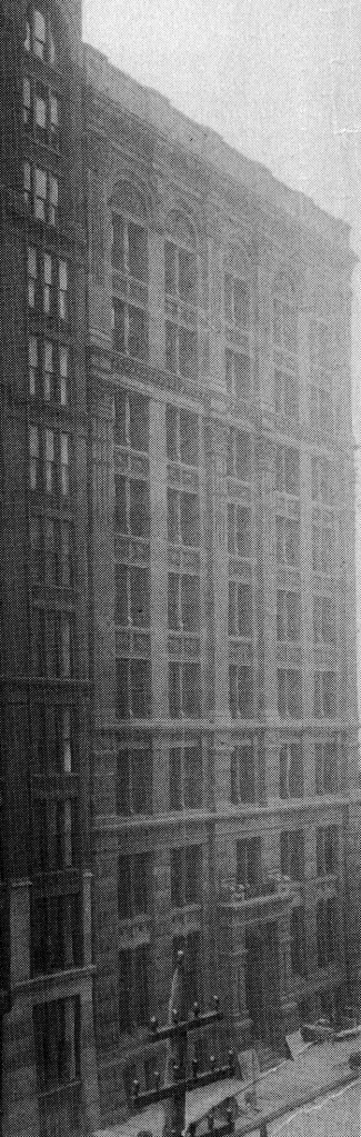
In the design of the Rookery’s base, Root was confronted with having to choose between Jenney’s clearly-articulated, two-story base of rusticated stone or his own recent experiments in blending the stone base and brick body in an intermediate, transition story that he had attempted in the Insurance Exchange and intended for the Phoenix. Evidently, he realized that these experiments were less than satisfactory, for he never again used two different materials in the transition story of his commercial buildings. In the Rookery, he returned to the standard two-story base of one material, like that of the Home Insurance. The problem that Root addressed in the design of the Rookery’s base was quite evident in Jenney’s design of the Home Insurance Building’s base. Why Jenney had projected the stone band at the second floor in front of the face of the piers seems a mystery, for this detail not only divided the two-story base into two horizontal layers, but it also prevented the reading of the two-story piers as a set of vertical legs upon which was set the masonry cage above. Instead, the confused result read more as a stone arcade in the second story that was set atop the very stubby stone piers of the ground floor or basement.
In the Rialto, Root had already designed a better solution than Jenney’s for such a problem of receiving the vertical force of a line of continuous piers. The piers in the Rialto’s two-story stone base were unbroken at the second floor because Root had pulled this floor to the back of the piers at precisely this point of intersection. This was reinforced by the use of the inset oriel window storefronts that emphasized the continuity of the two-story piers. (I mentioned the possible influence of Peter Ellis’ Oriel Chambers in Liverpool. Sec. 7.14)

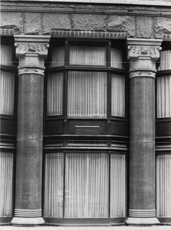
Not one to shun a challenge or to stop experimenting in the design of his buildings, Root attempted to show how to detail such a base even ‘better.’ He also tried make his base even more ‘open’ than Jenney’s elevation by reusing the inset oriels from the base of the Rialto, but replacing the Rialto’s stone piers with two-story polished red granite columns that had a smaller diameter than the width of the piers that would correspondingly increase the size of the ground floor windows.
This detail is too close to an exact copy of Beman’s detailing in the third and fourth floors of the Studebaker Building, a rendering of which was published in the November 1885 issue of Inland Architect, not to have been seen by Root. However, the columns could have just as easily been inspired by the large columns that Jenney placed at the entrance of the Home Insurance, a detail for which the building had become famous as soon as they were put in place (indeed, Root had not only made his columns taller than Jenney’s, but he also increased the number of them from four to ten).
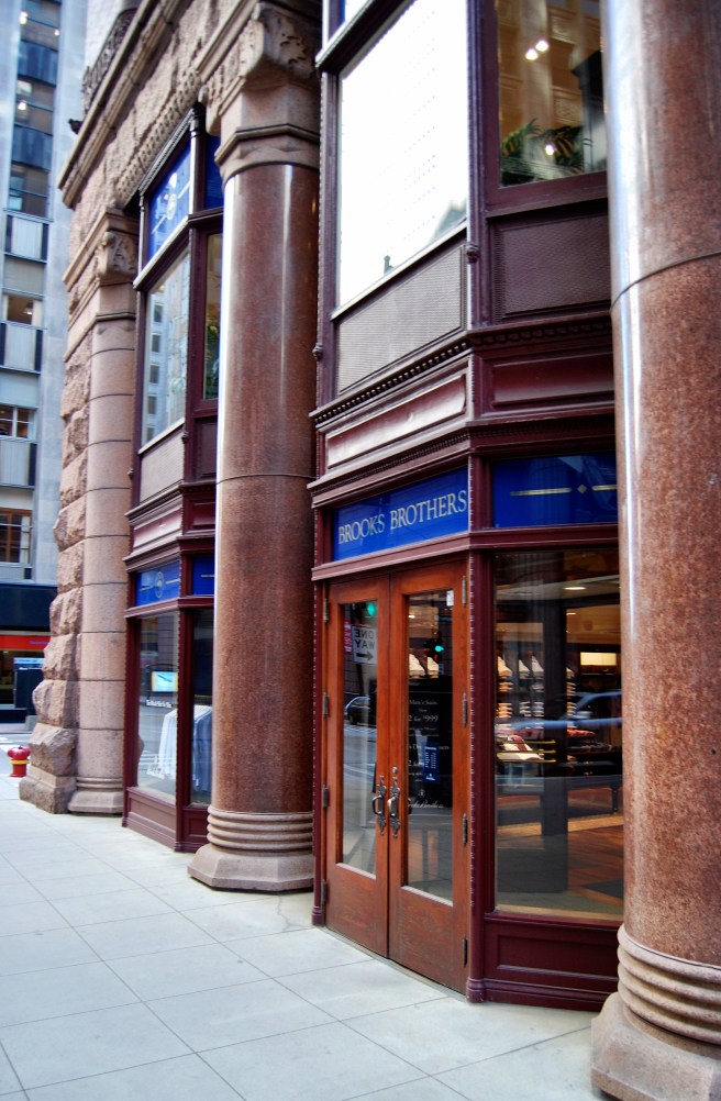
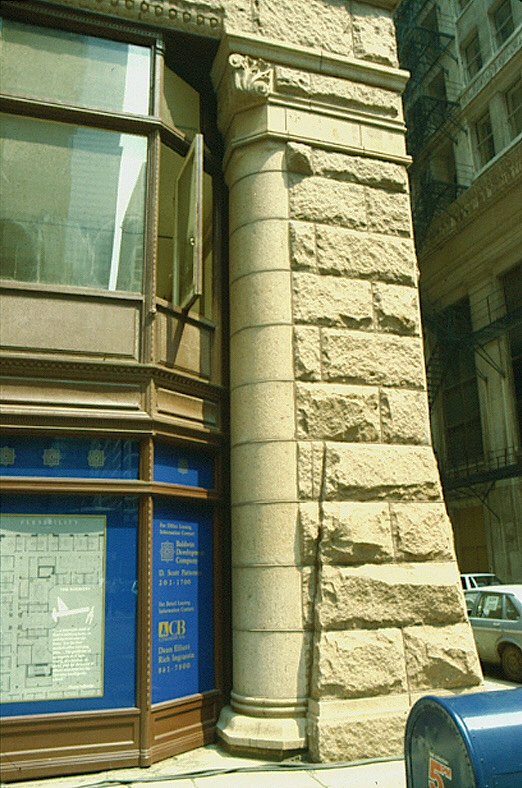
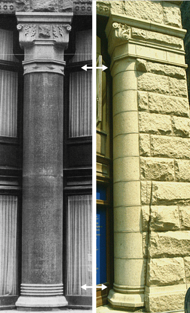
Root placed his columns within a rock-faced stone base that was framed by stone piers at the corners and a continuous rock-faced lintel at the third floor. The lintel was supported by the polished granite columns that appear to have been called into being from the rock-faced corner piers by a transition as masterfully detailed as if they had been carved in place by Michelangelo. As he had done in many of his transitional layers, Root used the material of the pier, but the shape of the column. (Truly, one of my all-time favorite details in the history of architecture.)
Root didn’t merely copy the details of the “mature” granite column onto the emerging stone pilaster, but detailed the pilaster alluding to its “gestation:” the capitals’ volutes are different as well as its bottom ring has yet to completely form in the pilaster; at the base the pilaster at this point in its formation has only two of the final four rings in the mature column. Root was very much alive at this time so this was detailed on purpose, it was not a “mistake.” (I owe credit for this observation to my dear friend and reader, Margie Crutchfield. One of the advantages of having all of you read my blog….!)
Root emphasized the granite columns’ two-story integrity, as he had done in the Rialto, by placing two-story inset oriel windows between the columns. This created the impression that the large volume of interior space, apparently imprisoned within the brick cage of the Rookery, was being pulled down by gravity and was trying to escape at the ground, being restrained from doing so only by the granite sentries. This sense of taught restraint in the bay windows was heightened by Root’s detailing of the windows in the upper floors. Whereas he had pushed the glass as far back as possible into the upper body of the building to allow the mass of the structural cage (the thickness of the masonry bearing piers) to read, the bays at the sidewalk, on the other hand, strained forward to the point where they (being iron-skeletal framed) were flush with the exterior face of the stone base.
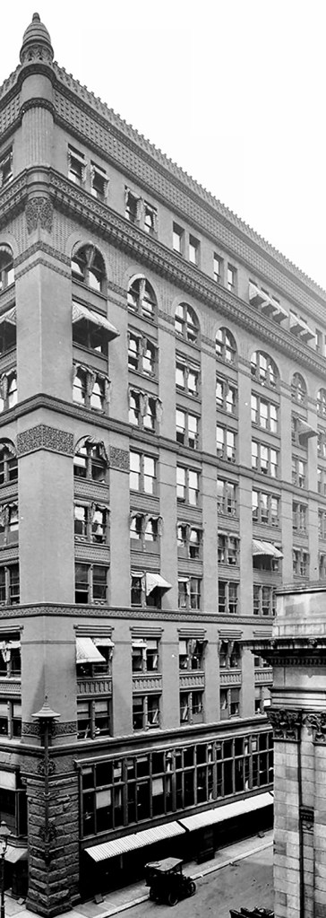
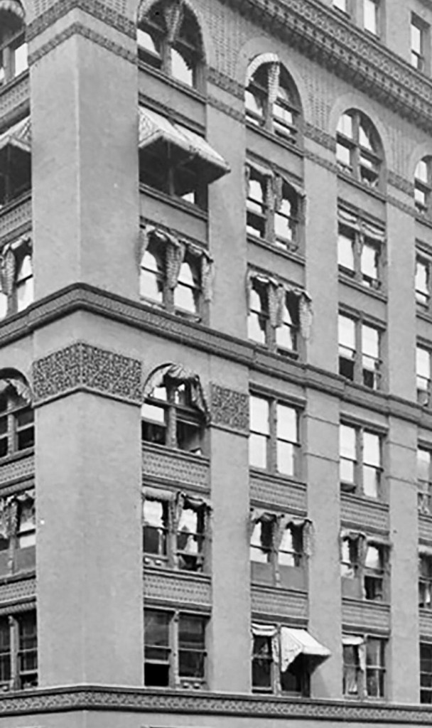
While trying to achieve the same amount of openness that Jenney had accomplished in the Home Insurance Building with its pier-and-spandrel brick body of the upper eight stories in order to improve the lighting of the interior offices (without having to resort to Jenney’s embedding of iron sections in his masonry piers), Root also tried to improve upon the conflict between the horizontals and verticals in Jenney’s elevations. Compositionally, I believe he attempted to achieve Owen Jones’ “repose,” that is a balance between the facade’s horizontal and vertical accents. Using your eyes, let them alternate between the two photos below… Jenney’s Home is most definitely horizontal, with the vertical corner piers trying to reassert the vertical but are compromised by the awkward extension of the stone banding around them in floors six and seven.


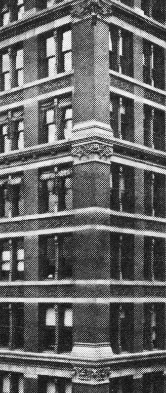
Meanwhile, Root reinforced the horizontal groupings of floors in each layer by allowing the piers to be continuous within each layer without interruption by the lines of the spandrels being carried across the face of the piers, as Jenney had done. My eyes on the Rookery gravitate immediately to the vertical lines of the piers, then they register the horizontal banding that articulates the major layers, and then come to rest on the central projected entrance pavilion and its relation to the two-story base. An appropriate hierarchy had been established: major horizontal layer bounded between continuous stringcourses, primary; continuous vertical piers within each layer, secondary; individual floor spandrels between piers, tertiary. A neat trick indeed! That is, to achieve a design in which there is dynamic movement between vertical and horizontal without one dominating the over: a dynamic repose.

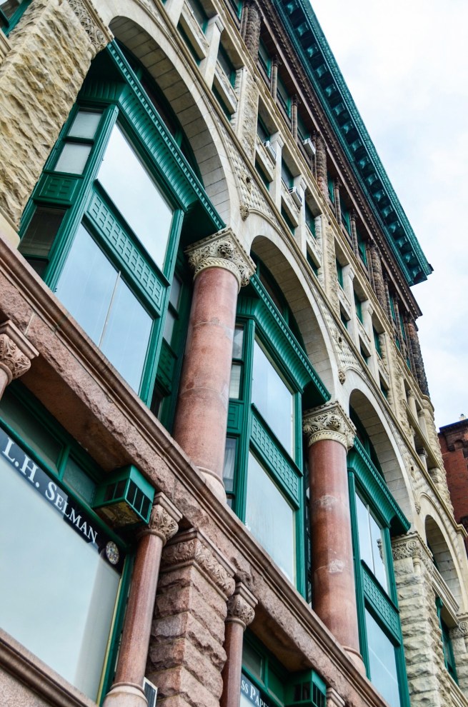
At the same time, Root also addressed the Insurance Exchange by lowering Jenney’s arcade from the tenth floor to match the ninth floor location in the Insurance Exchange. Still desiring to maintain Jenney’s rhythm of 2:2:3:2:1, however, Root was faced with a difficult problem: how to then detail the top of the seventh story? Having to keep Jenney’s stringcourse at this level meant that the arches in the ninth floor would result in only a two-story tall arcade. (The photo above is of the final eleven-story design, refer to the original design below.) Was this too short in a ten-story elevation? Jenney had also detailed capitals in his border piers at the major stringcourse levels. How should he cap the piers in floors five through seven when they reached the stringcourse at the eighth floor? The original ten-story rendering reveals Root’s indecisiveness at this point, the only unresolved detail in this elevation for which he can be truly faulted.

So why did Root feel he needed to put a second arcade in the Rookery’s two street elevations? The arch was a lingering romantic conceit in a skeletal-framed building, for the spandrel beams in a building were all iron by this date: a voussoir arch was no longer needed to span a window and was no longer “truthful.” As if he had not been satisfied with his two most recent elevations that incorporated only a single arcade (the Insurance Exchange and the Phoenix), he returned to the layered arcades of the Grannis Block (that was then being rebuilt following the fire) and the Burlington Building, by placing a second set of arches in the seventh story.

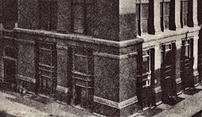
An arch was more expensive to construct than a flat-headed window, and it also reduced the amount of daylight, therefore he did not use them at the seventh-floor in the Rookery’s two alley elevations (other than to turn the corner in the first bay). Was this merely a budget item, or had he taken the opportunity to experiment once again with a full-scale model? I would love to be able to digitally add the central entrance bay to the alley elevation below to judge which elevation would have been better? After I had originally posted this piece, I realized that Root had also been looking diagonally across Adams and Quincy at the Quincy elevation of Boyington’s Royal Insurance Building (as, it is now obvious, so had been Jenney when designing the Home Insurance Building.)


Maybe the more “structural” alley elevation was too close to Jenney’s elevation for Root’s liking, nonetheless, the alley elevations were pointing to the future…

The addition of the second arcade posed apparently an unsolvable conundrum at this point in the upper portion of the seventh floor: in addition to Root’s objective of achieving a dynamic repose between his verticals and horizontals, Jenney had detailed colossal capitals under each of the major stringcourses in his border piers, especially noticeable were those on the pier overlooking the corner of La Salle and Adams. Without the seventh floor arcade, Root would have been free to locate his capitals immediately under the lintels (as Jenney had detailed), logically lending visual support to them (you can visualize this with the alley elevation).
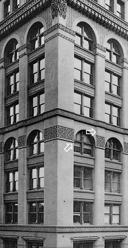
However, the lower arcade introduced the arch into this design problem. The arch’s spring point needed articulation, a job always achieved with a column capital… What to do? He needed to lower the capitals from being directly under the lintels so that they could visually support the arches. At the same time, he wanted the verticals to read continuous, so he recessed the plane of the arcade behind the plane of the wall surface so that the stub pilaster would read unbroken up to the lintel. Note that he did not recess the arch in the upper layer nor the lintel in the layer below. This detail allowed these two layers to read as a continuous surface between the corners of the building while the middle layer attempted to keep the verticals as a continuous line through all upper eight floors. (I believe he understood his mistake, for while he did detail two arcades in some of his subsequent designs, he never again recessed the arch in back of the wall plane in these buildings: he kept the arches always within the wall plane as he had done in the Rookery’s upper layer.)
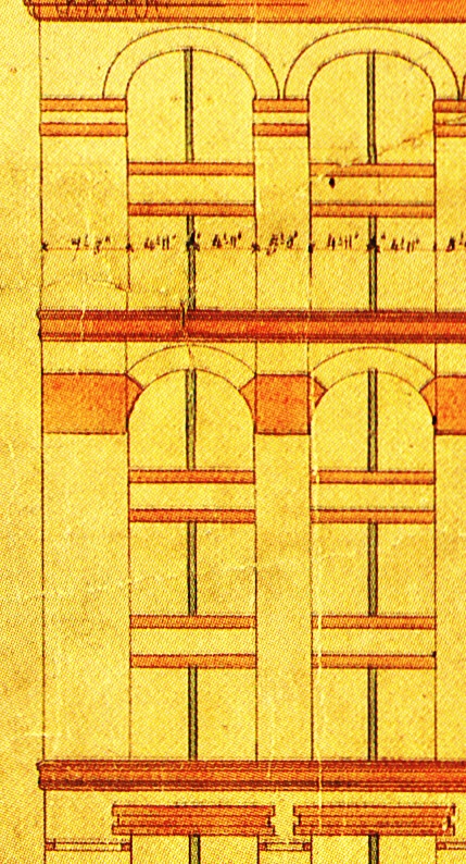
Overlooking the one aberration of the floating capitals in the seventh story, Root had struck a reposeful relation between horizontal and vertical in the original ten-story elevation of the Rookery: having taken the existing rhythm of the layers in Jenney’s Home Insurance Building as his point of departure, Root had delineated five horizontal layers, with each layer given a vertical counterpoint with the continuous piers. The single-story tenth floor combined with the two arcades to create a sense of false perspective in the upper six floors that had a diminishing progression with a 3:2:1 rhythm, resulting in one of Root’s better elevational designs to date. And then the owners demanded the addition of another floor, increasing its height to eleven floors… So much for all that time and effort in trying to resolve the subtle 3-2-1 visual foreshortening of the elevation. Unfortunately, contracts had been signed and as the owners had said, “just add one more floor to the top.” Indeed, it was just that simple, wasn’t it? I’m sure Root, known for his enjoyment of life’s finer pleasures, headed for the bar…
FURTHER READING:
Hoffmann, Donald. The Architecture of John Wellborn Root. Baltimore: Johns Hopkins University Press, 1973.
Stack, Joanne. Saving a Treasure: Chicago’s Rookery Building. Joanne R. Stack, 2019.
(If you have any questions or suggestions, please feel free to eMail me at: thearchitectureprofessor@gmail.com)
