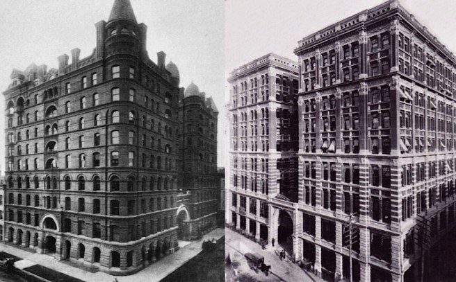
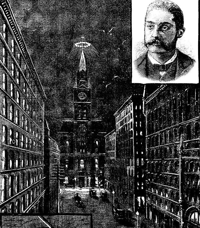
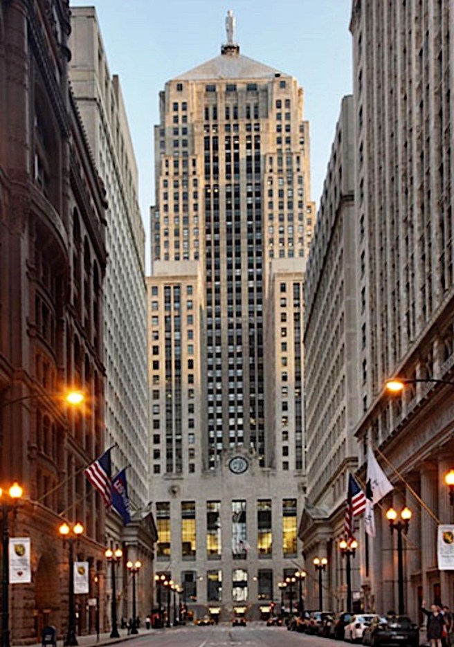
1883 marked the highpoint of Boyington’s career. Once the erection of the Board of Trade’s superstructure had actually commenced, however, Armour, Kent, and Bensley apparently no longer needing to keep him focused on completing the Board of Trade with the promise of their planned office building in back of it, dropped him from the second building, and hired Burnham & Root to design it, a belated apology for the loss of the Board of Trade from the corrupt competition. Although they had by that time produced three ten-story buildings, these were meager projects when compared to the grandeur of Boyington’s Board of Trade and Royal Insurance Buildings or to Beman’s Pullman Palace. Finally, they had the chance to design a large skyscraper in a similar scale. This event marked the beginning of the rise of Burnham & Root as having overtaken Boyington for the reputation as being Chicago’s leading architectural firm.

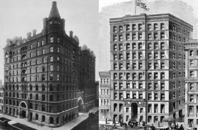
At this time they were confronted with the design of an even larger program (the project had grown to twelve stories, the first building in the U.S. that I can find to have been so proposed), American Architect had just published a full account of George Post’s design of the Mills Building in New York, a project very similar in program and scale. Instead of continuing with Boyington’s scheme of wrapping the entire site with a double-loaded corridor around an exterior lightwell in the center, however, Burnham and Root were influenced by Post’s Mills Building and Beman’s Pullman Building and placed the external light court immediately above the main entrance on Van Buren on axis with the central entrance of the La Salle Street Station, breaking the 175′ long elevation into two smaller masses. The design was announced early in March 1883, paralleling the timeline of Beman’s work on the Pullman Building, but now Burnham and Root would experience the same frustration Boyington had known in waiting for a decision by the owners to start construction, as no action on the project was taken for a number of months.

Although hindsight reveals a consistent pattern of stalling on the part of Armour, Kent, and Bensley with respect to this project from 1882 to 1885, a more immediate concern for them at this time had been the 1883 strike by Chicago’s bricklayers. The owners had leaked rumors once again early in November 1883, hinting that construction on the mammoth building was to begin in the coming spring of 1884. During the intervening period following the last rumor of its imminent construction, Burnham & Root apparently had reworked much of the project. I’ve decided to include this design here rather than push it back to 1885 when its construction finally began because while the floor plan changed, I believe the overall exterior design of the project changed little in Root’s mind from when he first conceived it in mid-1883. I also believe that by the time the owners finally gave the go ahead, Burnham & Root were inundated with other large projects, including the Phoenix and the Rookery, so that Root had little time to spare in redesigning a building he had already spent an inordinate amount of effort for naught.


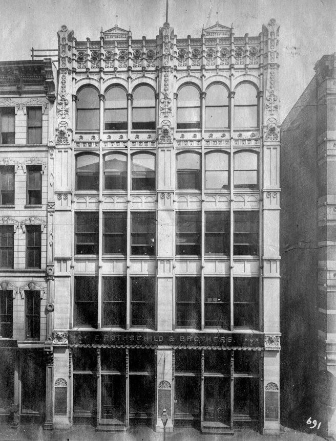
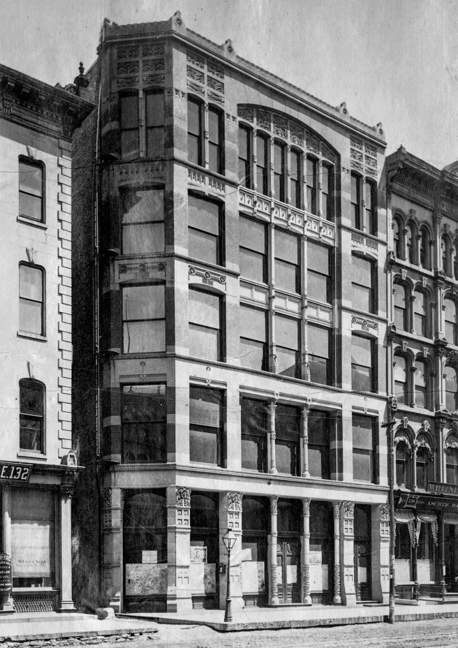
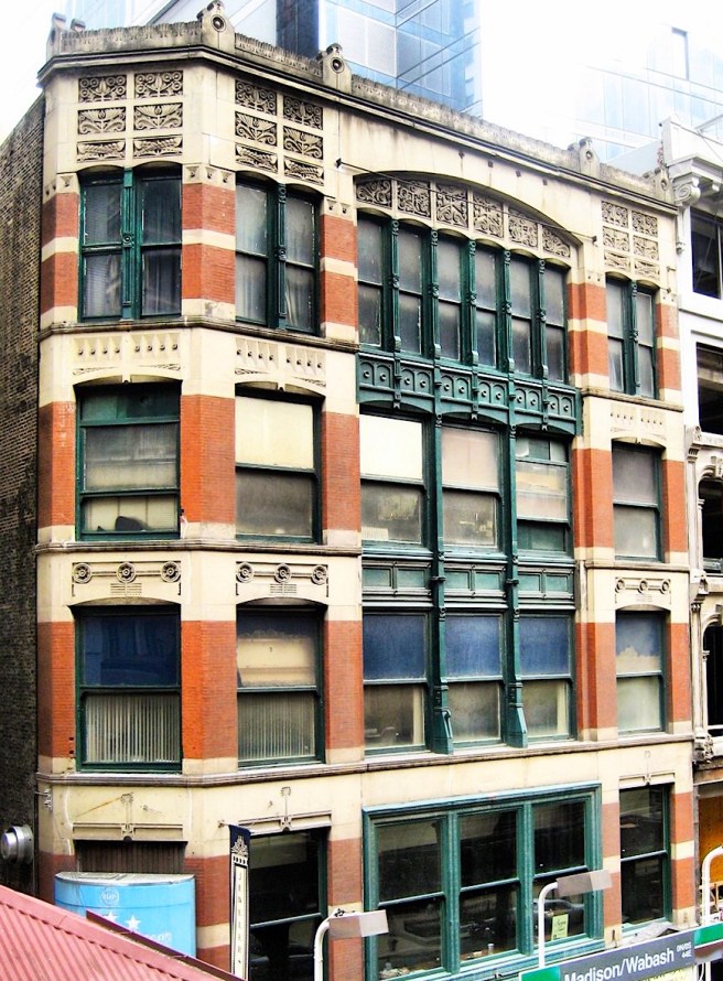
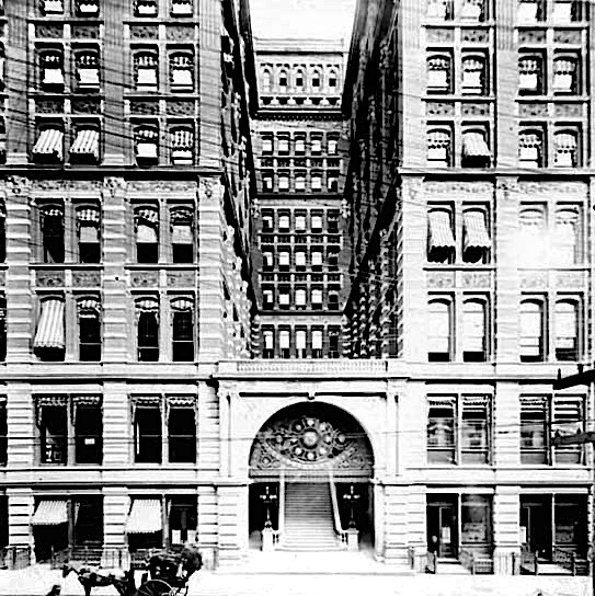
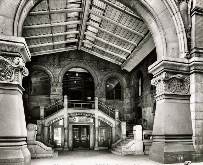
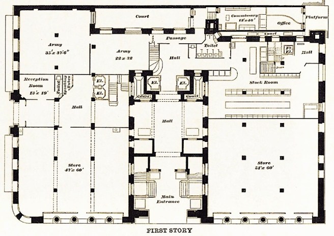
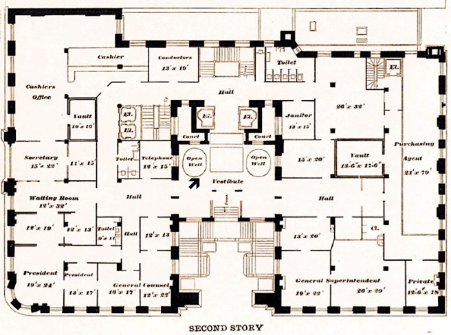
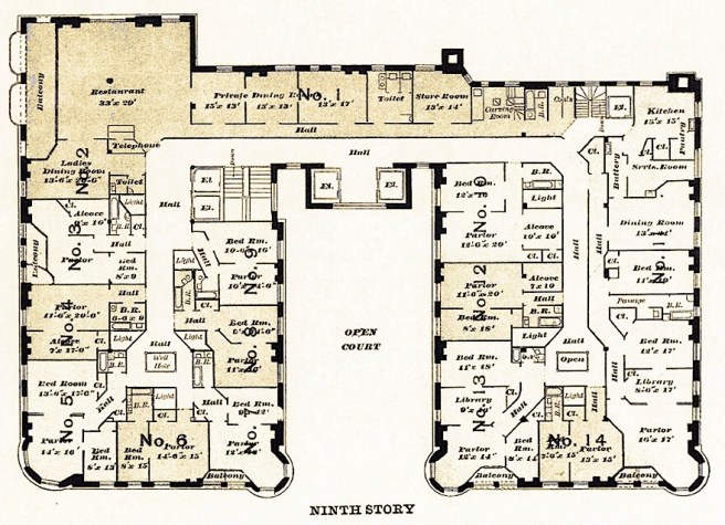
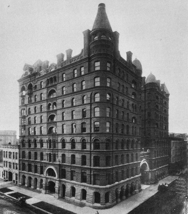
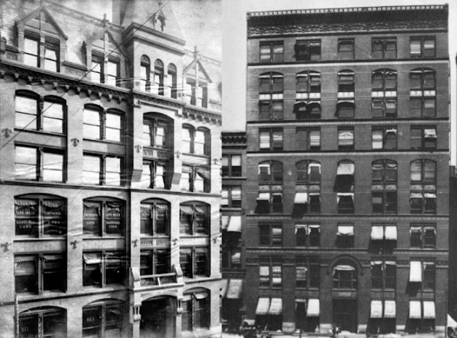
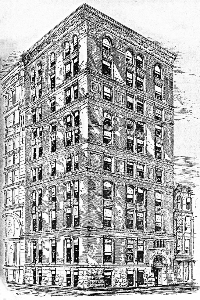
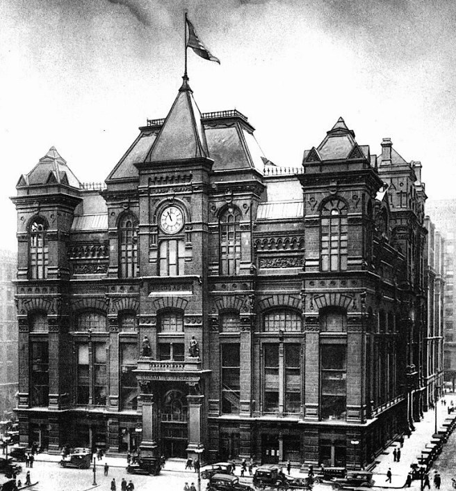
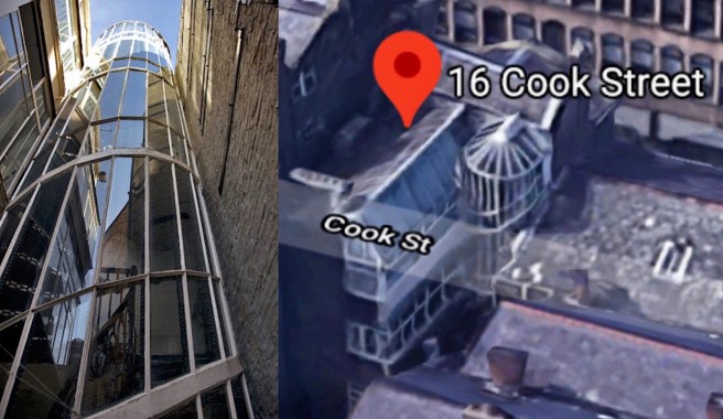
The plans completed during the summer of 1884 revealed a 90° rotation of the 1883 floor plan. The original external lightcourt had been removed from the entrance on Van Buren Street and duplicated in both the east and west fronts, creating a very efficient H-plan. The external lightcourts now marked the entries on the Pacific and Sherman Street faces that were covered with iron and glass skylights at the third-floor level, similar to how Post had designed the entrance in the Mills Building.The Van Buren elevation now ran unbroken for its entire 175′ frontage. In essence, Burnham had placed two nine-story, double-loaded office slabs on the north and the south sides of the lot, joining them in the center with a circulation spine that contained five elevators and a circular stairway contained within a projected oriel window (similar to Peter Ellis’ 16 Cook Street that Root would have seen during his student days in Liverpool).

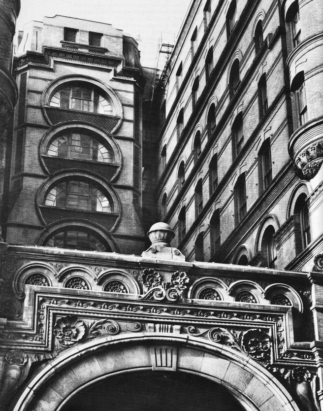
The north face of the building was to be linked to the Board of Trade’s main floor by an iron bridge that spanned the alley between the two buildings. Looking for his “theme,” Root latched onto the bridge and associated it with the Rialto Bridge over the Grand Canal in Venice for his inspiration, including its name.

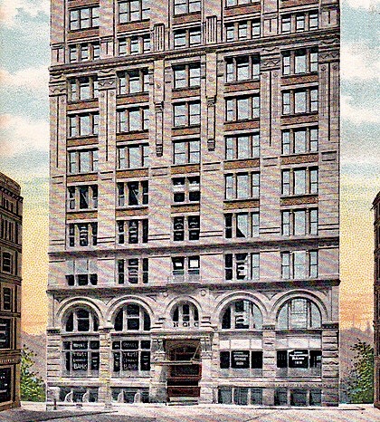
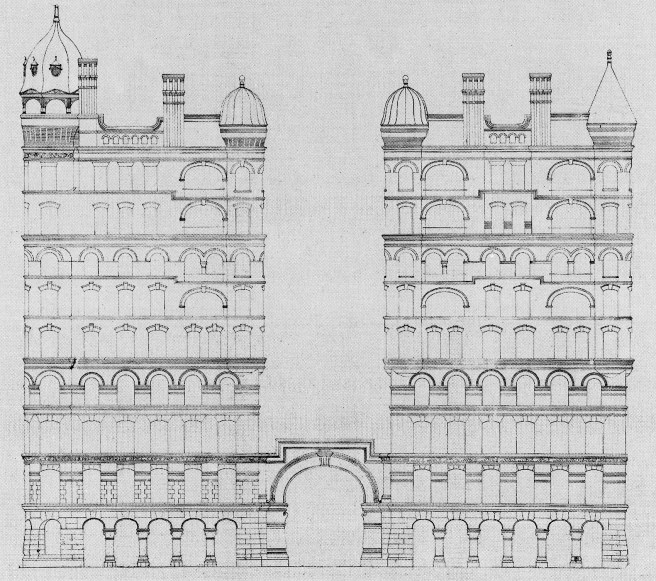
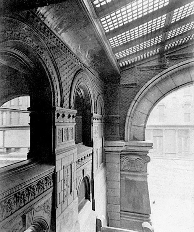
Root was quite partial to the writings of John Ruskin, especially his Stones of Venice (1851), and conceived of the building in a sympathetic “Venetian Gothic” language. The “Gothic” language would have allowed Root to easily experiment with his first use of the pier-and-spandrel language, rather than the wall language of his past skyscrapers, an opportunity to again play catch-up with Post’s design of the Mills Building. Instead of detailing the walls as planes, the elevations were comprised of a highly skeletal composition of vertical structural elements, counterbalanced with recessed horizontals.

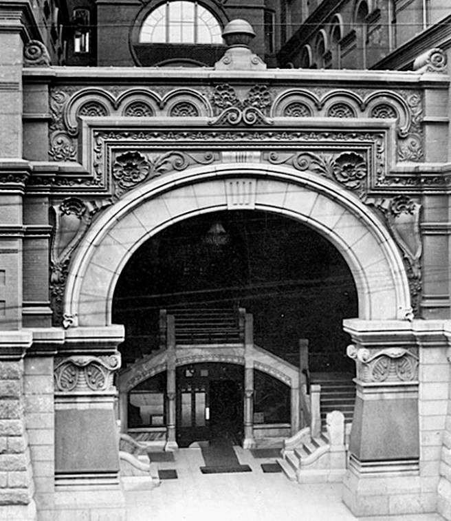
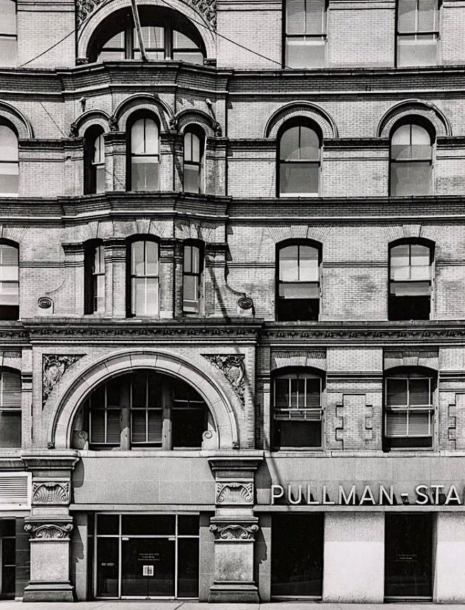
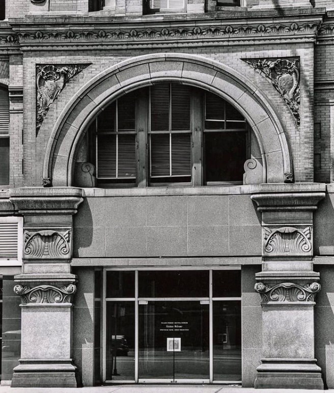
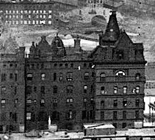
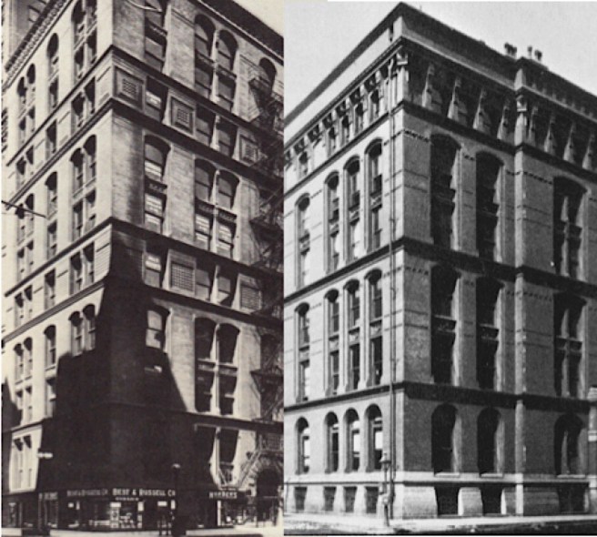
Confronted with the 175′ length of the Van Buren elevation (only the Burlington’s 199′ front along Franklin Street had presented him with a greater length), Root continued his practice of emphasizing the entrance by increasing the size of the piers that flanked it. Between these and the substantial corner piers (the corner piers avoided the nasty problem of how to detail the corner when the piers from both sides finally met), Root set a series of inset piers detailed as buttresses. He visually detailed these to narrow in section in the upper floors (6-9) with a progression of additive ribs in a sequence of 1:2:3 that formed a gothic cluster on each corner of the piers as they ascended unbroken for four stories.

Originally, Root apparently desired to reinforce the unleashed verticality of the piers by varying the color of the brick from dark at the base to light at the top, reinforcing the sense of visual perspective. Root had evolved his ideas pertaining to the use of color in architecture from the theories of John Ruskin that were, once again, grounded in Venetian Gothic. Root was attempting to transcend Victorian “structural” polychromy, that is achieving color in a building’s façade using “truthful” real materials, with “applied” polychromy, quoting Ruskin’s idea that color in nature is independent of form. (He would later attempt to use this detail also in the Monadnock, but to no avail. This technique would eventually be used in the upper portions of Art Deco skyscrapers.) This idea was consistent with his latest thoughts on the use of color in buildings that he had recently published in Inland Architect: “The Art of Pure Color” in the August 1883 issue and “Architectural Ornamentation” in the April 1885 issue:
“In large buildings the use of several colors should be less violent, so that while the general tone may be deep and full as we can make it, the variations of color are subtle and are obtained through gradations instead of contrasts… Probably no higher art exists than this: to produce in a great building that wonderful bloom obtained by mosaics of pure color.”
Note that he has used the term “bloom,” the same word used by critics to describe the effect that Owen Jones had achieved with his use of colors in his designs that spanned from the 1851 Crystal Palace to London’s St. James’ Hall.

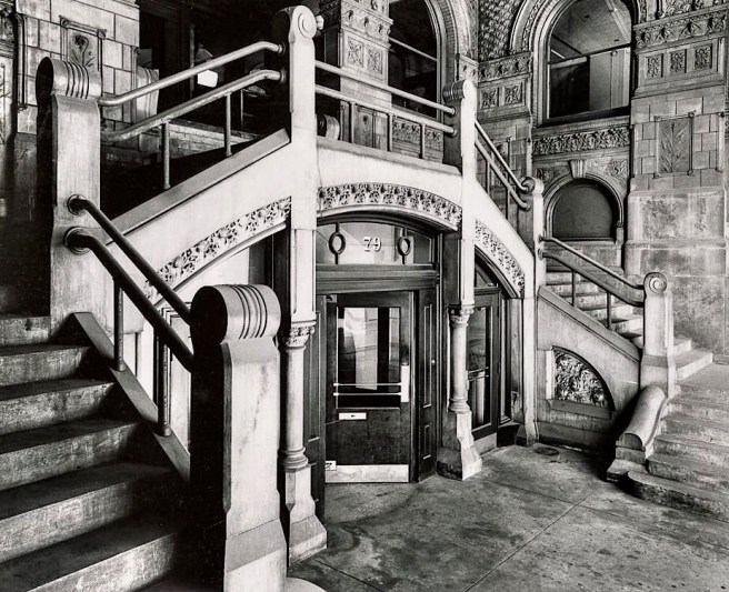
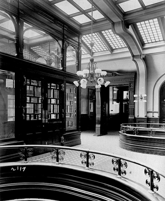
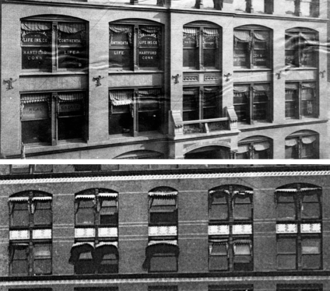
The piers grew out of the ground as individual elements, unimpeded except for a sillcourse that Root placed above the second floor as an attempt to demark a horizontal base in the building’s elevations that would also tie in the two-story arched entry pavilions (the only arches used in the building’s exterior). He reinforced this base by infilling the void between the piers in the first two floors with a bay or oriel window (once again, a detail he first saw in Liverpool’s Oriel Chambers as a student), recessed to the back plane of the piers that not only permitted one to view more of a pier’s mass, but also lent a sense of volume to the oriels, as if they were being restrained by the piers.


The piers then shot into the sky, unbroken by, and thus dominating the recessed roofline, terminating in an abstracted pinnacle, that I see Root appropriating from the Doge’s Palace. Root articulated the top floor with a continuous balcony detail that he projected beyond the plane of the piers on brackets: a detail not unlike that used by George Post in the Western Union Building.


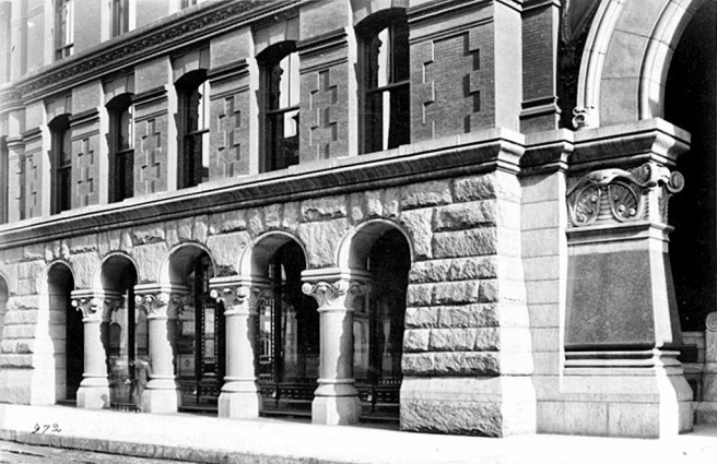
This break in the vertical ascent of the piers allowed Root to further emphasize the top floor by changing the window spacing between the piers from two to three. The corner piers were then topped by even taller pyramidal-roofed turrets that could be construed as bell towers. The turrets also found their way down to the Van Buren entrance, where they flanked the entryway, for which Root reserved a pointed arch, reprising (or restating) the Gothic theme he had woven throughout the building.

The building’s construction echoed that of its contemporaries: an exterior masonry box surrounding an interior that was completely supported with an iron skeleton frame. Root had taken the pier-and-lintel language of Boyington’s Royal Insurance Building and extended it completely around all four sides of the building, echoing George Post’s structure of the Mills Building. Root was quickly catching up to Post.

Root has been chastised by a number of historians for the design of the Rialto’s elevations, that seemed to have been entirely out-of-character with his firm’s other commercial designs. There were no arched windows that supposedly deviated from the narrative that Root was following Richardson’s lead in using the Romanesque Revival. This narrative is simplistic, and, quite frankly, is an injustice to what I believe were Root’s true artistic ideas. I have shown you Root’s first six commercial designs. The only one that comes to close to the “Romanesque Revival” is the Burlington Building because at least it uses the semicircular arched window with regularity. But it was based on a Renaissance palazzo, and looks more like one than it does a Romanesque church, doesn’t it? Root was not, especially in the first half of the 1880s, beholden to any one style, including the Romanesque. Like his piano improvisations, he based his compositions on a theme, and he was more than sufficiently talented to, and I’m sure, relished the challenge of, designing each building in a “style” that fit his chosen theme.
FURTHER READING:
Hoffmann, Donald. The Architecture of John Wellborn Root. Baltimore: Johns Hopkins University Press, 1973.
Monroe, Harriet. John Wellborn Root; A Study of His Life and Work. Park Forest: Prairie School Press, 1966.
(If you have any questions or suggestions, please feel free to eMail me at: thearchitectureprofessor@gmail.com)