

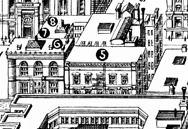
As if the two architects were in a race with one another to design the tallest building in Chicago, no sooner had Beman begun construction on the Pullman Building, than Boyington won the competition for a ten-story building for the Royal Insurance Company of Liverpool, England. A competition with eight architects was held in May 1883, their drawings being sent to England where the company awarded the commission to Boyington in June. The company had acquired the lot immediately to the west of C.C. Counselman’s lot on the northeast corner of La Salle and Jackson Streets, diagonally opposite Boyington’s Board of Trade, then well under construction. Because the lot at 160 W. Jackson was in the interior of the block and ran the entire 165′ depth of the block to Quincy Street, the building would have two front elevations, one on Jackson, the other on Quincy, that had no visual connection. The rather limiting configuration of the site, with its greater dimension denied any exterior exposure on the west by other proposed tall office buildings, forced Boyington into an interior court scheme similar to what he was proposing for the Armour, Kent, and Bensley building. Boyington arranged 163 offices around a balustraded nine-story interior atrium that apparently was quite breathtaking, for even fifteen years later the 1898 Rand-McNally Guide to Chicago would state that “The interior is one of the sights of the city.”
By May 1883, Chicago’s architects had sufficiently experimented with the rational pier-and-spandrel language that even “Old man Boyington” felt confident to abandon his tried-and-true language of the masonry wall and employed his first use of the rectilinear language in his elevations for the Royal Insurance Building. In order to better understand these, however, we must go back two years and trace the parallel development of this new language among Chicago’s architects from where we left it with Adler’s Borden Block and Burling’s First national Bank.
7.12. THE PIER-AND-SPANDREL DEVELOPMENT: DANKMAR ADLER
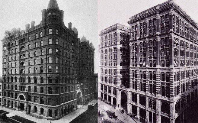
When we compare Chicago’s first 10-story skyscraper, the Pullman Building (let’s be honest, Root’s three meager 10-story brick shafts don’t stack up to the name) with Post’s 10-story Mills Building, it is evident that while Post was moving quickly to a rational rectilinear language of pier-and-spandrel, Beman’s inexperience relied on the stability of the traditional masonry box punctuated with windows. This is not meant to imply that Chicago’s architects were not interested in the rational elevational language, but rather the fact is that Post was just this much more in the lead in developing this language (as he was in so many other facets of the early skyscraper).

For example, Adler’s design of the Borden Block revealed that Jenney’s rational expression of structure in the Leiter Building had been accepted in Chicago as an appropriate alternative to the layered wall as an elevational motif for the red brick box. I have traced the lineage of the family tree of the rational elevation back to the Shillito’s Building in Cincinnati, before its New York and Chicago branches split off in their own pursuit. One could argue that portions of Adler’s Central Music Hall should then be included as next in line after the Leiter Building, but the building’s overall image still appeared to be more traditionally wall-oriented.
The conservative nature of the design and construction of the Pullman Building’s exterior walls (but let’s remember that it was a 10-story building vs. Adler’s six-story designs) is all the more apparent when compared to the Revell Furniture Company Building designed by Adler (with Louis Sullivan) in late 1881 for lumber magnate and real estate investor Martin Ryerson. The Revell design was actually the culmination of two earlier designs in 1881 by Adler (with Sullivan) for small, walk-up storefronts that picked up with the language of the structural frame infilled with the triple-window where Jenney had left it with the Leiter Building.
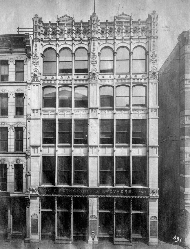
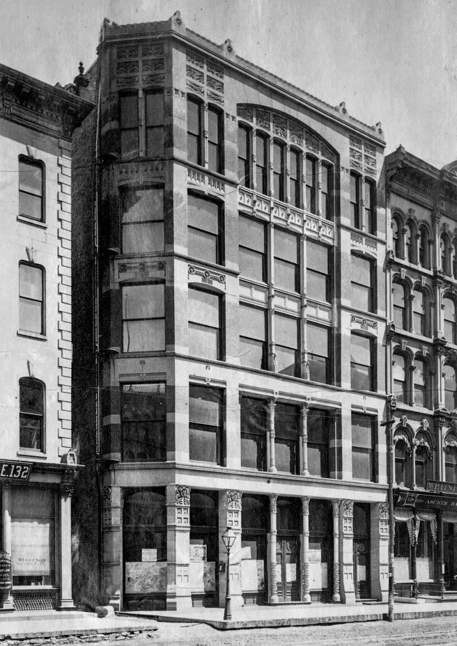
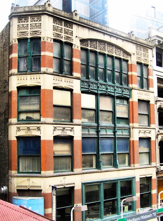
Following the Borden Block’s double window language, Adler (with Sullivan) first used the triple-window in the two-bay storefront for Emanuel Rothschild and Brothers at 210 W. Monroe, appropriately next door to the Leiter Building. As opposed to Jenney’s detailing, however, the floor spandrels were recessed in the third, fourth and fifth floors to allow the three masonry piers to read more as continuous vertical elements (albeit they were still interrupted with capitals at each floor intersection) with more success than those of the Borden Block. What really made this elevation read “vertical” was first, its narrow width, and second, the detailing of the cast iron mullions to be continuous verticals that is credited to the hand of Sullivan. These imparted a definite vertical emphasis to the elevation that was also reinforced by a progression in the window heads: flat-headed in floors 1-3, segmental arches in floor 4, to semi-circular arches in the top floor, once again using the arch to terminate elevation.

The second storefront was the Jewelers Building at 15 S. Wabash Street for Martin Ryerson. Here Adler (with Sullivan) again employed the triple-window with continuous mullions, but now these were framed by what amounted to corner pavilions created by joining two piers with their spandrels. The corner pavilions were detailed by grouping the adjacent masonry piers on either side of the single window to read as a continuous solid masonry surface with a punched window in it. The two pavilions were tied into a single plane by a segmental arch that spanned the center bay. As opposed to varying the shape of the window heads to create a sense of progression, they doubled the number of panels in the windows in the top floor. They also reused the polychromed horizontal and vertical language of the Revell Building.
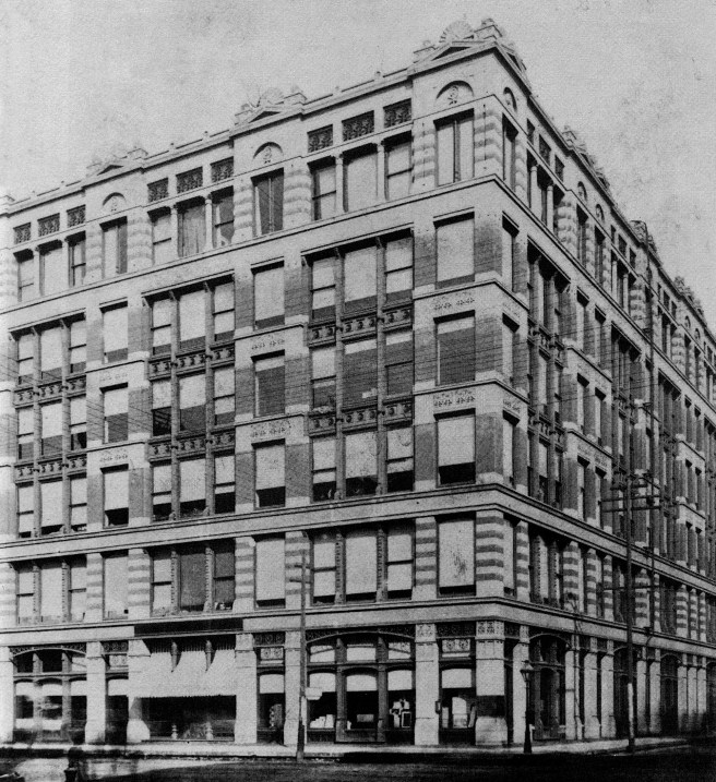
The Jewelers’ Building’s motif of single-windowed masonry pavilions spaced apart with the intervening void infilled with the triple-window formed the basis of the design for the elevations of the six-story Revell Building at the northeast corner of Wabash and Adams Streets. It was designed in mid-1881 again for Ryerson, costing over $160,000 and having a floor plan of 116′ x 172′ (which was almost three times the size of the Borden Block).

As was the case in the Borden Block and the Jewelers’ Building, Adler and Sullivan once again seems to be inspired by Semper’s “woven wall” theory as the Revell’s elevations of red brick piers and light stone lintels were rendered in a straightforward, rectilinear language (no arched window heads), but the placement of red brick versus the light stone was so unresolved that the resulting visual cacophony of the facades would begin to hurt the eyes of a viewer within only a few moments. It also hampered the reading of the building’s alternating language of spaced pavilions and triple windows. If there was ever an example needed to prove the negative effect of stripes on a building, this was it. I am led to believe Sullivan scholars who give him the majority of the credit for this design, in that its “visual immaturity” would have been another example of Sullivan’s inexperience with architectural design at this early point in his career.
The six floors of the elevations were articulated into four horizontal layers in a 1:1:3:1 sequence, the top floor being combined with an attic of rectilinear and semi-circular recesses and detailed as a continuous cornice. This was unfortunately compromised by the placement of ornamental pediments crowned with an acroterion above the roofline over each of the pavilions that, while breaking up the box-like appearance of the form, departed from the overall utilitarian aesthetic employed by the designers.
The Revell Building, however, contained an important departure from the two just-completed storefronts. The triple-window was no longer a mere repetition of three double-hung windows, but comprised of a larger, fixed pane of glass in the center, flanked on both sides by a smaller, operable double-hung window for ventilation. The Revell Building was surely one of the earliest uses of this device, soon to be known as the “Chicago window.”
FURTHER READING:
Twombly, Robert. Louis Sullivan: His Life & Work, Chicago: University of Chicago Press, 1986.
(If you have any questions or suggestions, please feel free to eMail me at: thearchitectureprofessor@gmail.com)
