
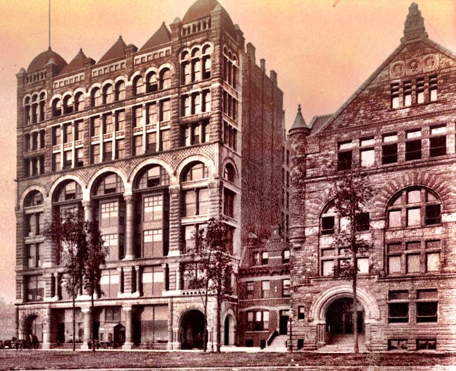
By this time, however, a building that was even more conspicuous in its Richardsonian detailing was already under construction immediately to the south of the Art Institute’s site along Michigan Avenue. Where else in a major city could one find the city’s Art Museum next to a new car showroom and assembly factory? The Studebaker Brothers, who manufactured carriages and wagons in South Bend, Indiana, had leased a showroom and sales office in Chicago since the end of the Civil War. In 1883, they had started acquiring the land along Michigan Avenue, just south of where the Art Institute would eventually locate, to erect their own building that would contain a showroom and a multistory factory to assemble the parts shipped from their factory in South Bend.
The choice of Michigan Avenue for a factory may at first glance appear to have been extravagant, but the building was also to be the company’s showroom. As Michigan Avenue was not only the main carriage drive due to its views to the lake, but also was still one of the primary residential areas for the city’s elite (i.e., customers), the location had been well-thought out. The 107′ x 170′ site on Michigan Avenue, was only two blocks south of the Pullman Building that was owned by another manufacturer. The proximity to the Pullman Building may have influenced the Studebakers to commission its designer, S. S. Beman, to design their new building. The June 27, 1885, issue of Real Estate and Building Journal announced the project, the date being of no little consequence, for only the day before Judge Moran had issued the injunction on the behalf of Leiter that had halted construction on Field’s skyscraper that had been designed by Beman. As no drawings of Beman’s design for the Field Building are known to exist, one is led to surmise how much of the Field design Beman carried over into the eight-story Studebaker Building.
Just prior to having received this commission, Beman had designed a four-story plus basement building for Milwaukee’s Northwestern Mutual Life Insurance Company. Its design was a straightforward Norman Romanesque in which Beman achieved a maximum of window area with a highly skeletal façade using arches only in the upper most floor of each of the building’s three layers.

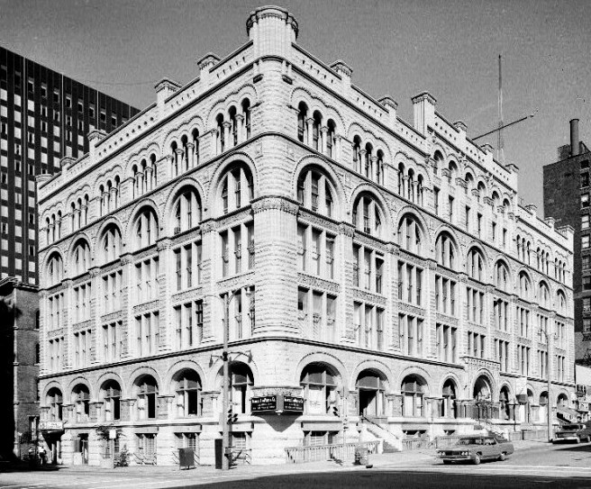
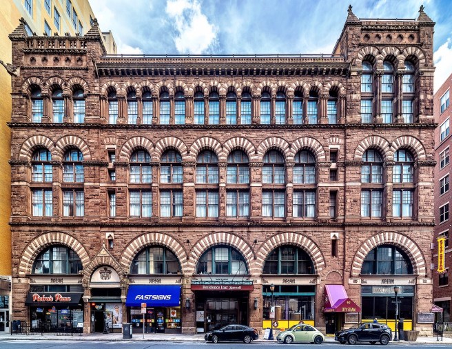
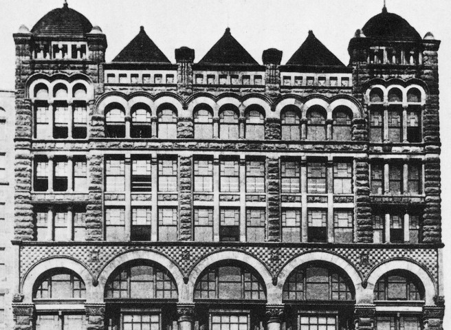
Upon first view, one’s suspicions are immediately aroused by Beman’s use of granite in the 107′ long Michigan Avenue elevation. As granite had been used up to that time on only one other commercial building, the Royal Insurance Building, and was planned for only one more, Field’s skyscraper, Beman’s use of it, instead of the more common and less expensive brick, on a relatively unimportant manufacturing house spoke either to the Studebakers’ desire to erect an extravagant commercial edifice on the lakefront, or Beman’s desire to get his ideas for the Field project built one way or another. Although he had employed many of Richardson’s Romanesque details, he failed to achieve any sense of Richardson’s repose.
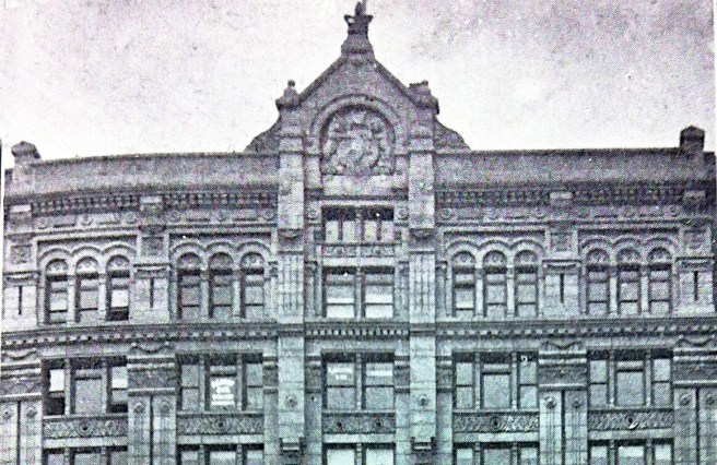
He layered the elevation in a 1-1-3-2-1 rhythm, thereby achieving a sense of false perspective in the upper floors. Vertically, he divided the elevation into five bays, the two end bays detailed as slightly thinner corner pavilions which framed the three wider, central bays. This scheme was further emphasized by projecting the two end bays slightly beyond the roofline of the building’s center and topping each of them with a domical roof that ended with a flagpole. Each central bay was also capped, but with a smaller pyramid. His overall massing scheme of end bays framing arcades in the middle reminds me of an elongated version of Richardson’s Cheney Building in Hartford from 1875, updated in Richardson’s current monochromatic palette.
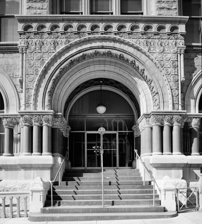
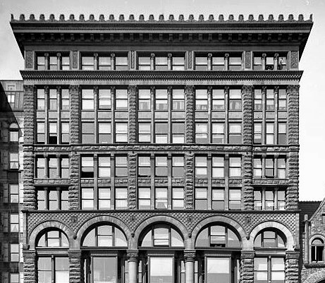
Because both functions of the building, showroom and factory, required a maximum of daylight, especially considering its 170′ depth, Beman’s objective in the design of the front elevation was to open up the wall for as much glass as physically feasible. The first two stories, which contained the show floors, were detailed as a base in red granite, while the upper six floors in which the assembly operations took place, were faced with a light gray Bedford granite. The ground floor, appropriately, was almost entirely sheathed in glass, the better to entice a prospective buyer into the showroom on the first floor. Huge plates of glass filled the three central bays which were flanked on both sides by a granite arch in the end bays: the left one likewise was filled in with glass as a display window, while the right one provided an entry way to drive one’s new purchase off the showroom floor. (If the Home Insurance Building that was finished and open for business by this date, had actually incorporated iron skeleton framing in its exterior, as was claimed by later historians, I must speculate why Beman, who himself had a fair amount of experience with iron framing, did not use iron framing in the Studebaker’s Michigan Avenue façade? My answer is simply that true iron framing was not used in the Home Insurance Building, and in fact, its use was still six to eight months in the future.)
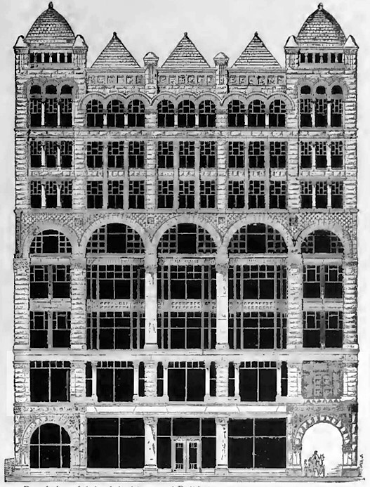
The building’s entrance was located not in either of the two monumental arches that one would have expected at first glance but was rather meekly understated within the glass of the middle bay. Undoubtedly, Beman attempted to overcome this weakness by placing polished granite columns (à la Jenney’s Home Insurance Building), at either side of the entrance bay, but because of the large span of the central bays, the columns not only were too far apart to reinforce the sense of entry of the small doors, but their scale also dwarfed the actual entry, tending to redirect one’s visual search for an appropriately scaled entry to the more monumental flanking arches.
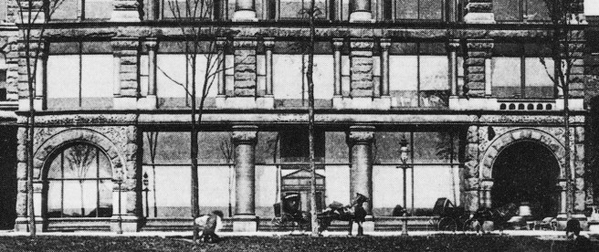
The second floor was also used to exhibit the company’s products, so Beman also located large panes of glass in this story so that all five bays could be used as display windows. In an attempt to again highlight the center three bays, he placed smaller flanking columns at both sides of each of these windows, trying to create a set of more specialized display windows in this location. This was an unfortunate detail for not only do the columns seem to be precariously balanced on short blocks cantilevered from the main piers, but this also forced Beman to use piers throughout the second story in order to be able to contrast the smaller flanking columns, rather than continuing to use colossal columns between the middle three bays that could have made a more promising connection between those in the ground floor and the two-story monumental columns that Beman placed in the third and fourth stories.
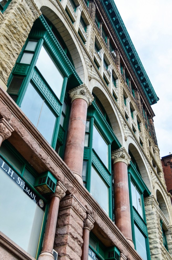
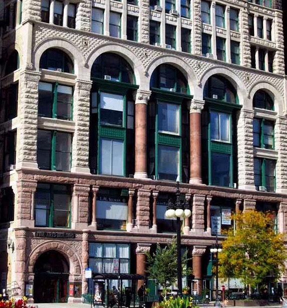
These two large columns supported an arcade at the fifth floor, thereby unifying floors three through five into one layer. The horizontal continuity of this zone was greatly enhanced by a Richardson-inspired grid of alternating sculpted and smooth-faced square stones that filled in the area above the arches. Although this detail tied together all five vertical bays at this point, its strong horizontality awkwardly interrupted the vertical thrust of the piers at this point, resulting in the upper three stories appearing to have been stacked on top of the arcade. Because these floors housed assembly operations, and not show floors, Beman could use less expensive, smaller panes of glass to enclose the space between the vertical members. To further accentuate the building’s highlight, the monumental two-story columns in floors three and four, Beman incorporated Root’s two-story bay windows from the Rialto Building. By pulling the sides of the oriels to the back of the columns, Beman had created a very effective frame that focused one’s visual attention on the columns.
Sources differ in the actual function of the various floors. Some same only the first two floors were showrooms, while Randall states that the first four floors were showrooms in which over 2000 carriages were always on view. Judging by the height of the floors and the size of the window panes, I believe that while the first two floors provided street display windows, the upper three floors, too high from the street for a carriage to be seen, still had large panes of glass to function as show floors, offering a view of a customer’s new carriage against a background of Lake Michigan. I include the fifth floor as a display floor because of its floor-to-floor height, and the fact that those beautiful arches overlooking Lake Michigan would have been under-appreciated for the mere assembly of carriages.
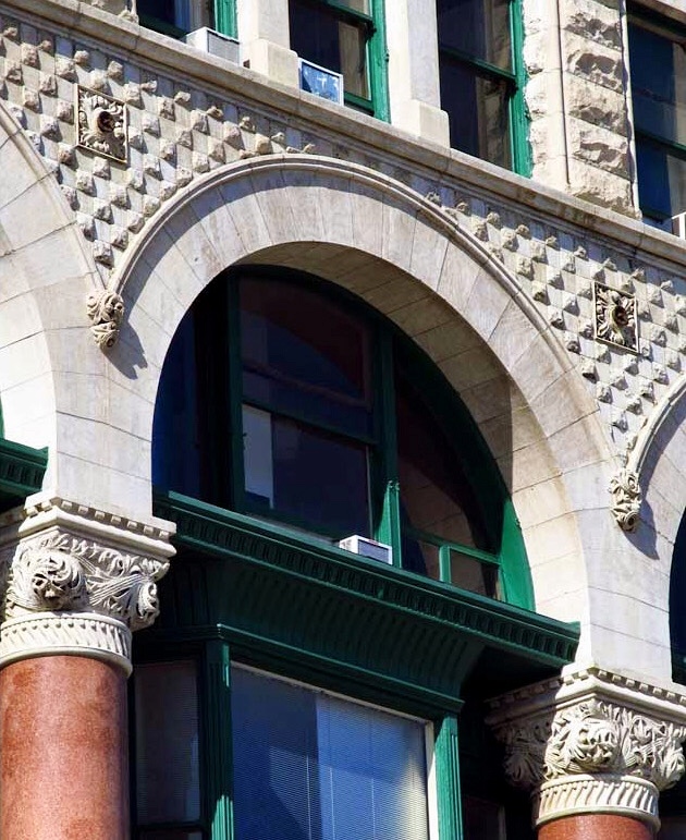

The bays in the upper three floors were each broken into three windows, similar to Boyington’s Royal Insurance Building, the triple arcade in the top floor being a virtual copy of the same detail in Boyington’s top floor. This smaller unit of division aided the sense of perspective, which was further reinforced by the shortening of the floor-to-floor heights in these stories. With that being said, let me critique the design and offer a few improvements:
-first, the second-floor piers and minor columns was simply wrong and just jarringly out-of-character. I want to combine the ground and second floor into a unified two-story base, within which the display windows are located and made to stand out by relocating the monumental columns in floors 3-5 to the base. Their current location simply pulls the eye towards the middle of the building and away from the base (merchandise the carriages).
-second, the central entry is totally out-of-scale with the building. I want to relocate it to the left bay and give the grand archway there some meaning. This also would balance the carriage exit in the right bay (i.e., one enters through the left arch and departs in one’s new carriage from the right arch). This would also remove the entrance from the center so that an onlooker could concentrate on three bays of carriages on display, on both floors. This could be reinforced by moving the recessed bay windows and the two-story tall columns from the third/fourth floors to this location. The recessed bays would push the carriages closer to the viewer and still allow the polished columns, now two stories tall, to be read as dominant structural elements (à la The Rookery). While one might argue about the asymmetrical nature of this, the carriage exit at the right has already destroyed any symmetry at the base, that this move might restore. Also, Root’s offset entrance in the adjacent Art Institute would reinforce this new location.
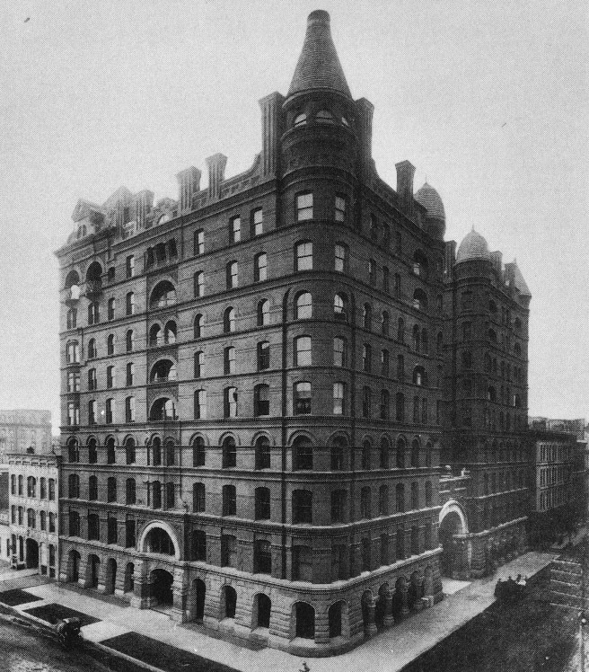
-third, either let the arcade at the fifth floor remain as is, terminating its “horizontal layer” and eliminate the corner pavilions above so that he upper three floors give a cleared reading of a layer with two floors with the top layer of one floor, OR…. continue the corner pavilions through the fifth floor as Richardson had done in the Cheney Building, rather than making them “disappear.” Beman did exactly that, eliminate the corner pavilions in his addition of 1898.
All things considered, Beman’s elevation was not only a remarkably wide open skeletal composition in which plate glass comprised the vast majority of the exterior surface, but visually, its subtle play with proportions also made the building appear taller than its 135 foot height. Beman could take some solace after the disappointment of the Field project, in the fact the two tallest buildings on Michigan Avenue, first viewed by people upon their approach by the Illinois Central tracks along the lakefront, had come from his drafting board.

FURTHER READING:
Larson, Paul Clifford (ed.). The Spirit of H. H. Richardson on the Midland Prairies. Minneapolis: University of Minnesota Press, 1988.
Zukowski, John. Chicago Architecture 1872-1922: Birth of a Metropolis, Munich: Prestel, 1987.
(If you have any questions or suggestions, please feel free to eMail me at: thearchitectureprofessor@gmail.com)
