Speaking of holes in the ground, let’s return to the gaping pit at the southwest corner of La Salle and Monroe, waiting for construction to begin on Field’s 13-story skyscraper designed by S.S. Beman. In Section 8.19 we saw how Field’s former partner, Levi Leiter had outfoxed Field’s plan for the skyscraper by not allowing Field’s crew to excavate under Leiter’s existing building at the western edge of Field’s lot during the fall of 1884. In March 1885, a frustrated Field ordered Beman to complete the details of the building and construction on the site was renewed. Field approved breaking into Leiter’s basement in order to shore up the existing wall and to place the new foundation. Leiter countered by obtaining a permanent injunction in May 1885 against Field from doing any more construction on Leiter’s side of the wall.
Field would eventually be vindicated by the Illinois Supreme Court but this wouldn’t occur until May 1886. Meanwhile, the store of his major wholesale competitor, his former “mentor” John V. Farwell had been destroyed by fire and Farwell had just announced that he was rebuilding on the same site, the block facing the south branch and border by Adams, Market and Monroe, the largest wholesale store in the country, designed by Van Osdel. Therefore, Field had a major public relations nightmare on his hands as well as the money he would have otherwise spent on the tower. Even though the lease on his existing wholesale store was not scheduled to expire until 1889, he decided to move up the date of construction for its replacement. In search of positive headlines to offset his defeat by Leiter, he initiated talks in April 1885 with America’s recognized leading architect, Henry Hobson Richardson, to design the new building. As soon as the papers got hold of the story, the ill-fated skyscraper was all but forgotten, except of course, for that huge hole at the corner of La Salle and Monroe… Field left the hole at La Salle and Monroe remain dormant for 1885, 1886, 1887, and 1888…
The last Richardson building that we reviewed was, coincidently, a wholesale store in Boston that he had designed for F. L. Ames in 1882. It was the last major commission on which he did any design work prior to his trip to Europe in the summer of 1882. The facade was typical of his earlier work with one notable difference: he had abandoned the “structural” polychromy he had achieved in his prior work with the use of two stones of different colors – a light body with a darker accent stone – in favor of a more unified, monochromatic stone surface. As construction did not start until after his return, this change from his past projects may have been inspired during his European travels. Whether it was or not, there can be no mistaking the fact that Richardson’s designs executed after the summer of 1882 can be viewed as an attempt on his part to bring a more unified image to his work. It might be said that he was attempting to impart a sense of chaste discipline to his beloved picturesque Romanesque, or as Owen Jones had recommended, “repose,” not unlike that which he saw in Renaissance buildings while visiting Italy, particularly Florence.
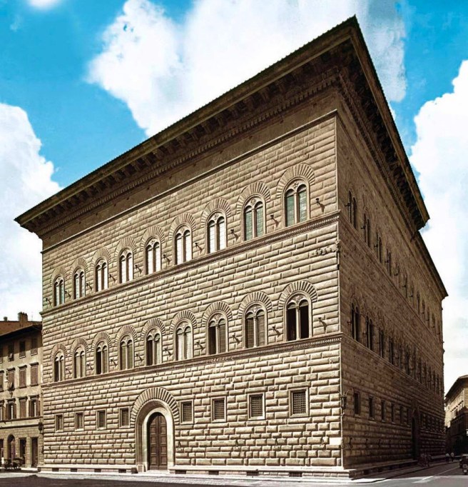
Giuliano da Sangallo the Younger, Palazzo Strozzi, Florence, 1489.
(Online)
In late 1883, Richardson produced a design for the competition for the new Allegheny County Courthouse and Jail in Pittsburgh that had been chosen as the winner on January 31, 1884. I consider this to be his magnum opus. All of his ideas have been combined into a highly articulated mass that resulted from a synthesis of his Beaux-Arts neoclassical training with his search for an American architectural vocabulary. The axial plan and pyramidal massing are pure Beaux-arts, while his time spent with the Labrouste brothers was revealed with his use of architecture parlanté, that is, the building’s massing expressed the building’s function and interior organization.
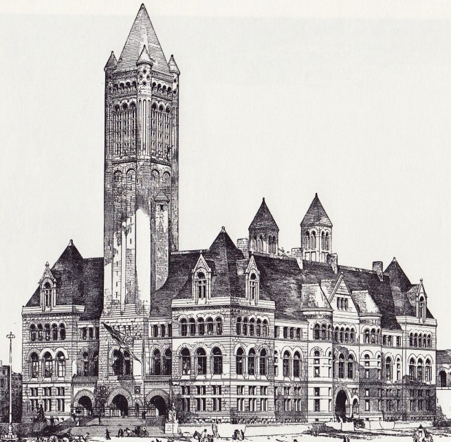
Richardson, Allegheny County Courthouse. (Author’s collection)
The motifs of his style are all here: the highly-picturesque roofline of a steeply-pitched hip roof punctuated with gabled dormers that extended the wall surface beyond the cornice, giving his roofline the spikey-ness that I refer to as his “crown,” the horizontal layering of the elevation achieved with continuous sill courses into the conventional Beaux-Arts tripartite elevation composition of base-shaft-capital; and the all-stone exterior with its corresponding arched openings, including his trademark cyclopean “Syrian” arched entrance. He repeated the monochromatic color scheme of the Ames Store, showing that he had indeed abandoned Victorian “structural” polychrome.
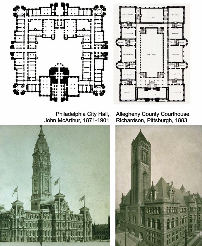
One can argue that he was inspired by Philadelphia, Pittsburgh’s cross-state rival’s City Hall in both the building’s hollow courtyard plan (although because of different-sized functions, office space vs. courtroom, the Philadelphia plan is double-loaded while Pittsburgh’s is single-loaded) and incorporation of an urban landmark tower (however, at 250’ tall it was less than half the height of the Philadelphia tower). Richardson used the tower to impart a vertical counterpoint to the otherwise completely horizontal composition (this would be the tallest structure he designed).
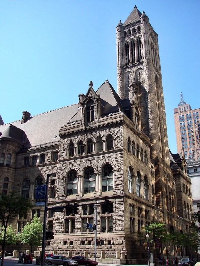
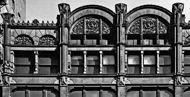
Richardson, Allegheny County Courthouse. Detail of tower. (Author’s collection/Van Rensselaer, Richardson)
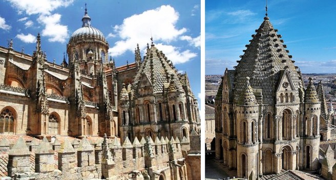
As I noted earlier in Sec. 8.4 Richardson’s design of the tower held many lessons for architects faced with the design of a skyscraper. Foremost among these was his unapologetic vertical thrust into the sky, like a Gothic steeple, that was not interrupted by any of the horizontal banding he used in the building below. He carried this vertical thrust from the ground up for all 250’; no horizontal line of the building’s body was allowed to interrupt it. Second, he imparted a sense of false perspective by using the, by now well-known device of layered arcades in a sequential progression of increasing arches in a decreasing height. In the tower he began with one arch, the huge entry arch at grade. At the cornice he then split this into two blind arches, that gave way to an intermediate range of three arches that culminated with an arcade of four arches. He also designed the height of each arcaded layer in a geometric progression of 8-4-1 that increased the sense of false perspective. The last motif he employed that would be picked up by architects (I have already showed Root to have been influenced in Sec. 8.4) is the attachment of a cylindrical turret at each corner, I noted earlier that his precedent for this detail is thought by Richardson scholars to have been the Spanish Romanesque Old Cathedral in Salamanca, Spain.
Old Cathedral, Salamanca, SP. (Online)
This detail accomplished two design ideas. First, by rounding the corner, it emphasized the building’s three-dimensional mass, rather than how a sharp corner would have accentuated the surface plane of the wall, that would have imparted a two-dimensional planar quality to the tower. Second, this detail allowed the surface material to completely envelope the interior volume and be read as such: a concept that could easily be transferred to a non-loadbearing “curtain wall” of brick that enveloped an iron skeleton frame.
Abbey of Saint-Étienne, Caen, FR, 1063. (Online)
Richardson, Allegheny County Courthouse. Courtyard. (Online)
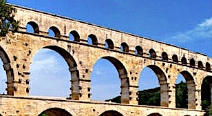
Pont du Gard, Nîmes, FR, 40-60 AD. Close-up of the upper two levels. (Online)
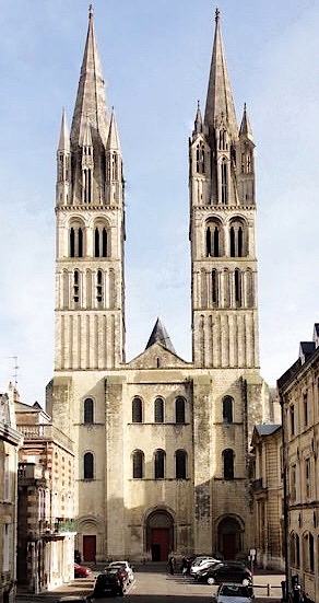
Richardson carried this verticality into the two shorter, subordinate mechanical towers at the rear of the courtyard that once more were given dominance over the horizontal layering of the remaining elevation. (Their sheer verticality immediately reminds me of the twin towers in the Norman church of Saint-Étienne in Caen.) Here we once again have a compositional counterpoint not only between the horizontal and vertical, but also between the central tower at the front offset by the pair of shorter towers at the rear, whose void is the exact width of the main tower!! Subtle, and pure genius… While the central tower was extended as high as possible in hopes of supplying less polluted, i.e., “fresh” Pittsburgh air, the building’s mechanical system would then expel the exhaust air through the shorter towers.
Richardson, Allegheny County Courthouse. Front elevation (Online)
It is the courtyard’s design where I find Richardson experimenting, indicating a continuation of the evolution in his aesthetic thinking, that began with his monochromatic exteriors. While one can easily argue that his inspiration for the elevation of the lower four floors was Pont du Gard, I am drawn to the simplicity of the uppermost two stories, whose elevation is an unarticulated surface of stone within which are carved the windows, be they arched or flatheaded. Because there are no “piers” in this range as there are in the lower elevation, this surface has a different visual scale than either that below or on the exterior. It does not consist of layers but is just a surface.
FURTHER READING:
Hitchcock, Henry-Russell. The Architecture of H.H. Richardson and His Times. Cambridge: MIT Press, 1961.
Burnam & Root, Rialto Building, Chicago, immediately behind the Board of Trade to the far right, 1884. (Chicagology)
The first two weeks in May 1885 had been, indeed, a heady time for Burnham & Root. On May 1, the opening of the Board of Trade, not only did Burnham & Root’s Insurance Exchange quietly open, but Armour, Kent, and Bensley proudly used the occasion of the Board of Trade’s opening to announce that finally, after more than two years of false starts, construction of the Rialto Building, located immediately to the rear of the Board of Trade and proclaimed to be the world’s largest office building, was about to commence.
Burnham & Root, Phoenix Building, Chicago, immediately to the east of the Board of Trae, 1884. (Chicagology)
Immediately to the east of the Board of Trade, their ten-story Phoenix Building was preparing to start construction. And to finish listing the office’s workload, Root was still working on the final design for the thirteen-story Monadnock to be erected just one block further east of the Phoenix, at the southwest corner of Jackson and Dearborn. The staff at Burnham & Root seemingly had their work cut out for them. And then twelve days later it was announced that E. C. Waller’s bid for the old “Rookery” site had been chosen. Root would, within days, be designing an office building for this site that was planned to be even larger than the Rialto.
Burnham & Root, Monadnock Block, Chicago, 1884-5. Preliminary studies of the Jackson Street elevation (13 floors). As the left drawing still bears the original name for the building, Quamquisset, it predates the elevation of the right. This is also evident in the building’s parapet; while the machicolated brickwork in the left design is corbelled, that in the right is flaired. (Left: Saliga, The Sky’s the Limit; Right: Hoffmann, Root)
Unfortunately, precisely at this moment, the owners of the stone quarries at Lemont and Joliet chose to refuse what apparently was a just demand on the part of their workers for an increase in their daily wage. On May 3, only two days after the announcement for which Burnham and Root had been waiting somewhat impatiently for the past two years, that construction was finally to begin on the Rialto, the quarry workers struck, denying Chicago builders the material traditionally needed first for any large construction project: the cut stone for a building’s pyramidal foundations. The timing of this event, coinciding with his office’s upcoming construction projects, cannot be easily ignored in understanding Root’s development, precisely at this moment, of a new type of foundation that required no stone at all, thus allowing construction of the Rialto to proceed on schedule.
A stepped or pyramidal stone footing. (Left: Author collection; Right: Baumann, Foundations)
As discussed earlier, the size of a stone pyramid required to transfer the weight of a ten-story office building to Chicago’s relatively weak soil could easily exceed ten feet in height. The combined bulk of all the pyramids in the basement of a ten-story building took up the majority of the usable space in this level, preventing any significant use of this potentially valuable floor area, just at the moment when such space was becoming more of a necessity for the growing amount of machinery being incorporated in tall buildings (elevator, electric generators, boilers and ventilating fans, etc.) With the advent of electric lighting in the mid-1880s, commercial buildings were now being equipped with their own power generators, a location for which had to be found. The basement seemed to be the appropriate space, if only the Egyptian-like monuments located there could be reduced in size, or better yet completely eliminated.
Whether it was the lack of cut stone due to the strike, or a desire on Root’s part to open up the basement for the location of mechanical equipment, or a combination of these two issues, necessity proved to be the mother of invention: Root invented the modern iron-reinforced concrete pad footing. Three years earlier, he had used a layer of iron railroad rails in a number of foundations in the Montauk Block to reduce their overall height by one course of stone, so that the foundations would still fit within the basement without either punching their way into the ground floor or forcing Root to locate their bases deeper below grade than was thought to be safe in Chicago. This was simply a “one-off” solution to this specific problem because Root did not use iron in his foundations for the next three-plus years,
John Wellborn Root. Railroad rails used to replace layers of stone in a foundation, 1885. (Hoffmann, Root)
Now, almost four years later, the idea of using iron rails in a foundation, albeit at a much larger scale, had returned to him. Instead of using a ten-foot high stone pyramid allowing gravity to gradually distribute the load at 45° in compression to a sufficient area of ground, Root used the inherent tensile strength of the iron sections to directly transfer the same load in two-directional bending, completely eliminating the need for the 45° angled stone pyramids. Apparently, Root had experimented with concrete sufficiently by this time to be confident that this relatively new material would stand the test of time in such a critical location, for he eliminated all cut stone, opting instead to place a leveling base of concrete on the ground. On top of this, Root laid a line of iron rails or T sections, each one immediately next to its neighbor. These were embedded in a layer of concrete in order to hold them in place, and apparently in an attempt to prevent them from rusting (which, although slowing the onset of oxidation, does not necessarily prevent it). Upon this was laid another layer of rails, running perpendicular to the lower line of rails. After also embedding these in a layer of concrete, a third layer of rails were laid in the same direction as the original layer, and so on, usually stopping after four layers of rails had been laid, creating a two-dimensional grillwork or criss-crossed stack of rails similar to how rails are still stored in railroad yards.
Rails stacked in alternating layers at Alexandria, VA. for the U.S. Military Railroads, some 20 years prior to Root’s use of the technique in the foundations of the Rookery. (Storer, American Railroads)
The resulting thinness of this multi-layered assembly of iron grillwork encased within the concrete pad permitted it to be located directly below the basement floor slab, but still safely within the thirteen feet deep soil strata that had sufficient bearing capacity. Upon this concrete and iron pad could then be placed either a brick pier or an iron column section that was no larger in section than the part of the above-grade superstructure it would eventually have to support. This reduced the size of the structural elements in the basement significantly, resulting in a greater amount of usable space available for mechanical equipment. The elimination of the cut stone pyramid also made such a substantial reduction in the weight of each space-consuming footing that also had to be supported by the ground, that meant that either the overall area of the footing could be correspondingly reduced, or that the building could be made even taller (i.e., heavier) without exceeding the capacity of the supporting soil. Either way, so successful was the new footing that in a short time, cut stone would be entirely eliminated in the construction of building foundations.
FURTHER READING:
Hoffmann, Donald. The Architecture of John Wellborn Root. Baltimore: Johns Hopkins University Press, 1973.
In the previous two chapters I have presented 1884 as a banner as well as a pivotal year in Chicago’s architecture. The major threads that I identified were:
Adler & Sullivan, 1885 Chicago Grand Opera Festival Hall, Chicago Expo Building, 1885. (Chicagology)
1. The political /social context of 1885 included the election of the first Democratic President, Grover Cleveland, in twenty-four years. In Chicago, class warfare had seen the city’s business elites battling a nascent labor/socialist movement over the eight-hour workday, In October 1884, the Federation of Organized Trades and Labor Unions had set the deadline for this to be implemented throughout the country on May 1, 1886. This timebomb was still ticking… The site for much of this class warfare had been the Exposition Building, in which the Socialists had established a tradition of celebrating the anniversary of the rise of the Paris Commune on March 19, 1871, with a mass rally each year. Ferdinand Peck had finally outwitted the Socialists by using the Exposition Building for the Chicago Grand Opera Festival in April 1885, as part of the overall celebration of the Grand Opening of the new Board of Trade scheduled for May 1, 1885.
2. Architects in Chicago and the Midwest had formed the Western Association of Architects in November 1884 in response to the “benign neglect” of the “Eastern” American Institute of Architects. I use this event as the birth of the “Chicago School” of architecture, as it was the first manifestation of the divergence between the Westerners and the Easterners in how the profession was understood and practiced. About this same time Wight, Jenney. Root, and Sullivan were speaking of the possibility of evolving a distinctly “American” architecture.
McKim, Mead & White, Henry G. Villard Houses, New York, 1884. (Wilson, McKim)
Palazzo della Cancelleria, Rome, 1489. (Online)
Just as these Western architects were finding their voices. the New York firm of McKim, Mead, and White was erecting the Henry Villard Houses in New York. Historian Richard Guy Wilson credits this building as “the first major appearance of Italian Renaissance precedent in the firm’s design.” Let me point out that George Post has been consistently using Classical details in his buildings since the 1872 Western Union Building. The difference between what he had done and the Villard Houses was that while he was employing “generic,” for the lack of a better term, details from the classical vocabulary, the designer of the Villard Houses, Joseph M. Wells, one of the firm’s associates, had accurately reworked the detailing from a specific building from the past: the exterior of the Palazzo della Cancelleria in Rome. This practice was diametrically opposed to the design theory Chicago’s architects were then evolving, following the ideas of mid-century European architectural theorists who promoted the learning from, but not the copying of historic precedents. In the The Grammar of Ornament, first published in 1856, Owen Jones had exhorted his readers not to “slavishly copy” the works from the past, but to develop new styles of art for the contemporary world:
“How is any new style of art or new style of ornament to be formed, or even attempted to be formed?… It is for their use that we have gathered together this collection of the works of the past; not that they should be slavishly copied, but that artists should, by an attentive examination of the principles which pervade all the works of the past, and which have excited universal admiration, be led to the creation of new forms equally beautiful… “
Root had thoroughly digested Jones’ theory and applied it rigorously :
“The object of all this study of architectural styles must be to acquire from former times the spirit in which our predecessors worked; not to copy what they did.”
This issue will continue to drive the two regions further apart in their architectural theory until Root and Burnham, having the courage of their convictions, arranged to plan to have both aesthetics constructed side-by-side for the American public to view and comment upon during the 1893 World’s Fair. Such was their plan until Root tragically died on the eve of the first meeting of the Fair’s architects. (I will examine this divergence in detail in the chapter on the planning for the 1893 World’s Fair.)
The Board of Trade sporting the Sperry Corona. Taken from the Home Insurance Building on left; on the right: Insurance Exchange, Maller’s Building, Gaff Building, and Counselman Building. The Rookery will fill the void across La Salle from the Insurance Exchange, left by the demolition of the old “Rookery.” (Wade and Meyer, Chicago)
3. The new Board of Trade building had topped off at 303’ (its corona extended it to 322’). This made Chicago the home of America’s tallest building, finally surpassing the long-time record holder of New York’s Trinity Church spire (281’). (This ignores the Washington Monument (555’) that was finally topped off in December 1884 because it was a monument, not a building). John Roebling’s Brooklyn Bridge, with its 272’ tall pylons had opened in May 1883, finally surpassing the span of his Cincinnati Bridge.
Statue of Liberty. Construction of pedestal in 1885, designed by Richard Morris Hunt. (Online)
Meanwhile, the French were shipping the 151’ tall Statue of Liberty in crates to New York that arrived on June 17, 1885. Embarrassingly, once they had survived their transatlantic crossing, the statue’s pieces would stay in their crates for the next ten months as its pedestal was still under construction. Nobody in the U.S. wanted to give the money needed to build the pedestal, so a fundraising campaign was eventually mounted by Joseph Pulitzer, publisher of the New York World. The pedestal designed by Richard Morris Hunt, when completed with statue, would increase the statue’s final height to 305,’ coincidentally (?) just two feet taller than the Board of Trade’s tower, leaving the two cities to argue over whether it was taller than the Board of Trade. (It would also be Pulitzer who would finally end the argument by building his New York World Building, designed by none other than the skyscraper’s grandfather, George B. Post, with a height of 309’ (its spire topped off at 350’) that was completed in December 1890. And just to repeat a fact, the World Building was constructed with bearing walls that at some locations were 88″ thick, that means the Monadnock Block was not the tallest skyscraper built with bearing walls. However, it can stated that it is the tallest surviving bearing wall building.)
George B. Post, New York World Building, New York, 1889-90. (Online)
4. there was a covey of skyscrapers under construction in the immediate area surrounding the Board of Trade, especially marching up La Salle Street, to be finished by the traditional date of lease signing: May 1 (1885): in addition to the existing Royal Insurance Building (Boyington), the Counselman and Calumet Buildings (Burnham & Root), the new towers included the twelve-story Maller Building (Flanders), the Insurance Exchange (Burnham & Root), and the Home Insurance Building (Jenney). Meanwhile, Marshall Field was still in court fighting Levi Leiter’s injunction against any further construction of his planned 13-story building designed by S.S. Beman. Farther north the Chicago Opera House Block was completed across the street from the new County/City Building, to where the City had moved its offices from the post-fire “Rookery,” leaving the southeast corner of La Salle and Adams ripe for investment.
I will now synthesize these threads through the lens of May 1, 1885…
FURTHER READING:
Wilson, Richard Guy. McKim, Mead & White: Architects. New York: Rizzoli, 1983.
While the interior of McVicker’s was based on one “consistent scheme,” the exterior of the renovated theater still exhibited Adler & Sullivan’s propensity to over activate their elevations, as they had done with their small business buildings that we have already reviewed (Sec. 7.12.) that were contemporary with the McVicker’s design, although it wasn’t constructed until 1885. Just imagine being Dankmar Adler in May 1883, having just agreed to Sullivan’s becoming an equal partner… especially after Sullivan’s theater interior designs were generating rave reviews in the local press. It would have been very hard to say “not yet” to the precocious designer’s desire to move into designing the exteriors of the firm’s new commissions. After looking at Sullivan’s early exterior designs, especially the Ryerson building, you may wonder “was the architect who designed this agglomeration of seemingly unrelated details the same genius who produced the glorious detailing in the Grand Opera House and Hooley’s Theater?” I can only offer my insight gained after having had over 2000 architecture or interior design students in my design studios during my forty-plus years at the University of Cincinnati, that not only does every student comes to the drafting, scratch that, the studio table with a different set of skills, but also the design of a building’s interior is quite different from the design of a building’s exterior. By no means am I trying to infer one is harder than the other; I am simply stating that these two design problems have their own problems to solve, and while related, are no means solved with a set of interchangeable skills. The young Sullivan was a perfect example. While he was a wiz at ornament and interior design, his young talents in designing the exterior of a building left much to learn.
Dankmar Adler, Central Music Hall, Chicago, 1879. The auditorium’s entrance is centered on the State Street façade, while immediately to the rear (left) of the business block is the auditorium with its three three-story tall stained glass windows. (Online)
I want to review Adler’s earlier designs for these loft buildings (skyscrapers would have to wait until 1890) simply to establish the firm’s development in designing the elevation of a business building. Following Adler’s design for the Central Music Hall in 1879, Adler had been hired by John Borden and his son William (using the returns of their investment in silver mining in Colorado during the late 1870s) to design a six-story office building. Adler, as had Jenney in the First Leiter Building, chose to emulate the “structural” elevation of expressed piers and spandrels (but not its triple window) so successfully employed two years earlier in Cincinnati by James McLaughlin in the Shillito’s department store.
Left: James McLaughlin, John Shillito and Co. Store, Cincinnati, 1877. (Cincinnati, “The Queen City,” 1901); Right: Dankmar Adler, Borden Block, Chicago, NW corner of Dearborn and Randolph, 1880. (Online)
Although Adler had articulated the building’s elevations into horizontal layers with a rhythm of 2-2-3 employing conventional continuous sill courses, compared to the classical base-middle-top scheme of the Shillito’s store, Adler’s design was awkwardly top-heavy, lacking any sense of repose. Adler had hired Sullivan during its design and it is thought that Sullivan may have been responsible for adding the semicircular terra cotta lunettes in the building’s cornice. This building set the pattern for the firm’s early business buildings: first, the exterior exhibited the period’s fashionable Victorian “structural” polychromy with the use of dark brick with lighter-colored stone accents; second, the building’s elevation expressed the pier-and-spandrel construction of the exterior wall; and third, each tier of windows between the piers was capped by an arch, alluding to a Romanesque Revival arcade.
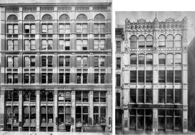
In the next iteration of this scheme, the Rothschild Store, as it was simply a storefront, Adler could rely on the building’s masonry bearing party walls to stabilize the structure, and could open up the front elevation for as much glass as Sullivan could squeeze in. Therefore, they borrowed Jenney’s triple window (who had borrowed it from the Shillito’s Store) from the adjacent First Leiter Building that increased the number of windows between the piers from two to three.
Left: Adler (with Sullivan), Rothschild Building (note at far right is the end wall of the First Leiter Buidling; Right: Jenney, First Leiter Building. (Left: Urbanremainschicago.com; Right: Art Institute of Chicago)
One other difference from the Borden Block is that they gave the Rothschild’s elevation an uncharacteristic, but distinctively vertical accent by eliminating the traditional layering of the elevation with continuous sill courses, more than likely due to the narrow proportions of the rectangular elevation. One could easily make the argument that here Sullivan was experimenting with the Gothic Revival, except those upper windows are not pointed. (Many Sullivan historians like to point to this building as an early example of what would eventually become a Sullivan trademark, the vertically-accented elevation for a skyscraper. If this was Sullivan’s true intention, in other words, he already at this point in his career was thinking that “tall” buildings should look “tall,” he had many opportunities after this project to continue his experiment in later designs but didn’t do so for a number of years to come. I think this interpretation of the Rothschild design is simply wishful post-writing of a history that never occurred. Quite frankly, the young Sullivan was still learning how to design a six-story elevation, let alone even dream of how to “correctly” design a new building typology that in 1881 Chicago had only one example, Burnham & Root’s Montauk Block.)
Left: Rothschild Store, Detail of pier/spandrel intersection. The First Leiter Building is at the far right of the photo; Right: Jenney, First Leiter Building. (Online)
Here again Adler & Sullivan may have been influenced by Jenney’s First Leiter elevation for he had projected the pier’s capitals beyond the plane of the sillcourses, thereby preventing the sillcourses from being read as a continuous horizontal. Instead of changing the material at this intersection, as Jenney did, they used the same material throughout the length of the pier, obviously reinforcing its unbroken verticality. One departure from Jenney’s elevation was that the mullions were not stopped at each spandrel but were detailed to pass in front of the spandrel, allowing them to extend unbroken past the cornice, thereby reinforcing the elevation’s verticality. Sullivan’s natural tendency and skill in designing ornament seems to increase in intensity as he worked his way up the building (as do the heads of the windows from flat, to segmental arch to complete semicircular arches), to his final flourish in the cornice, a centrally located pediment over each bay. The filigreed detailing on the cornice echoed the detailing he had employed on the contemporary Hooley Theater boxes.
The inherent problem, throughout the history of architecture with an even number of structural bays such as the Rothschild’s two bays, is the inability to enter the building on axis, in the center. Because with an even number of bays there is always a column at the center axis, this was a huge problem for traditional buildings, be they Classical or Gothic as both were symmetrically planned. If this column line is extended into the building itself, it results in a line of columns right through the middle of the central space, dividing the space into two halves. This also becomes a design issue on the exterior elevation because, once again, the central column line divides the elevation into two pieces, denying any ability for it to be read as a whole: you are either looking at the left half or the right half of the elevation. The Parthenon has an odd number of bays and the majority of Roman triumphal arches have either one bay (Titus) or three (Constantine).
For the five-story Jewelers’ Building, they changed the structure from two bays to a central bay with “side aisles.” This was accomplished by splitting the central column into two pieces and spreading them apart to create the central bay. This had the effect of locating a column closer to each party wall, for which they simplified the elevation by combining the end column and this new column into a corner pavilion with flush spandrels and a cornice to create the equivalent of a structural bay/pavilion that they first employed in the Jewelers’ Building, again a simple storefront. Bay/pavilions with a single window were placed at each corner and once again triple-paned windows infilled the rest of the elevation. A shallow segmental arch spanned the opening between the two pavilions, whose surface was detailed in the same plane of the pavilions, thereby unifying the two bays at the cornice into one frontal plane, albeit the building’s structural polychromy somewhat negated this effect. (One could project the image of a triumphal arch in this design.) This was the building where seemingly Sullivan was able to restrain his propensity to let his pencil run wild (budget constraints?), and his ornament was finally subordinated to the overall massing of the building.
Corner pavilions with a central void has been a pretty conventional massing scheme throughout architectural history. Some Sullivan scholars have tried to trace the lineage of Adler & Sullivan’s use of the bay/pavilion concept back to a variety of French designs. For instance, Narciso Menocal provided a number of precedents that had been published in the French periodical Revue Générale de l’architecture that Sullivan was known to have had in his library.
Left: Anatole Jal and Pierer-Jules Jollivet, Hôtel d’un peintre, 1858 Revue Générale de l’architecture; Right: Edmond Guillaume, Maison Commerciale, 1880 Revue Générale de l’architecture. (Twombly/Menocal, Poetry)
I think Sullivan’s precedents were not so exotic, but simply found among American buildings. I have already shown the American lineage of this idea in Sec. 5.3. that I traced back to Detlef Lienau’s Noel & Saurel Building in New York of 1864. Hunt then incorporated this idea in his 1874 design for a cast iron front at 478 Broadway.
Left: Detlef Lienau, Noel and Saurel Building, New York, 1864. (JSAH, May 1952); Richard Morris Hunt, 474-6 Broadway, New York, 1872. (American Architect, July 15, 1876)
Another Hunt building designed in 1874 that one may argue had influenced Sullivan, but not in the use of bay/pavilions for there were none, was the Roosevelt Building with its cast iron filigreed shallow arch, whose profile Sullivan first used in the Jewelers’ Building. He followed this up by directly quoting Hunt’s detail of the lacy iron arch in his next design the following year for the Revell Furniture Building, where he placed these at the ground floor in each void between the bay/pavilions.
Richard Morris Hunt, Roosevelt Building, New York, 1874. (Online; Twombly/Menocal, Poetry)
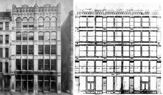
In the six-story loft building for the Revell Furniture Company at the northeast corner of Adams and Wabash, Menocal noted that Sullivan had repeated the alternating rhythm of the Jewelers’ bay/triple window (with continuous mullions) across both faces of the building, as if Sullivan had simply rubber-stamped the Jewelers’ façade onto the Revell’s two street elevations. If one considers the Jewelers’ Building to exhibit restraint upon Sullivan’s part, the opposite applies to this building, as well as its three following siblings.
Adler (with Sullivan), Revell Building, Chicago, NE corner of Adams and Wabash, 1881. One of the earlier uses of the “Chicago window,” i.e., a larger central pane of fixed glass flanked by smaller operable doublehung windows. Note the lacy, ornamental cast iron arches used in the ground floor between each of the pavilions. (Morrison, Louis Sullivan)
Adler & Sullivan had still used their three motifs: the exterior exhibited the period’s fashionable Victorian “structural” polychromy, second, the building’s elevation expressed the pier-and-spandrel construction of the exterior wall; and third, each tier of windows albeit now only within each pavilion was capped by an arched lunette. In the Revell Building they had spaced the bays far enough apart again to insert three windows, now detailed as one of the city’s first example of the “Chicago” window, that is, a fixed center pane with operable sidelites. The cornice of the pavilions consisted of the terminating semi-circle topped with a pediment brought back from the Rothschild design but with the addition of an acroterion. Meanwhile, apparently not satisfied with the existing visual cacophony of their prior designs’ “structural” polychromy, Sullivan “turned up the volume” in his color palette by using stripes of alternating of brick and stone in both the second floor and the sixth floor as transitions from the all-stone ground floor and attic to the brick/stone language of the middle three floors. Finally, as if he still felt the need for an arch in the triple window range between piers, he relocated the arch typically used in their cornices down to the ground floor with a reprise of Hunt’s filigreed cast iron arch.
The firm then experienced a two-year drought in business buildings from 1882-84 while their bread and butter, residential and industrial buildings (see Morrison for a list) kept it busy. During this period, Sullivan’s close friend, the itinerant John Edelmann, whom he had first befriended in Jenney’s office in 1874 and who was responsible for bringing Sullivan back from Paris in 1875 with the commission to design the murals in Moody’s church, had once again returned to Chicago. Menocal credited the change in Sullivan’s design aesthetic manifested in the following trio of buildings employing Egyptian and Pre-Columbian (a naive attempt at an “American” architecture?) detailing, to the almost Svengali-influence that Edelmann had on Sullivan. Sullivan was involved in the design of these next three buildings during 1884, although their construction was spread over the end of 1884 and the spring of 1885.
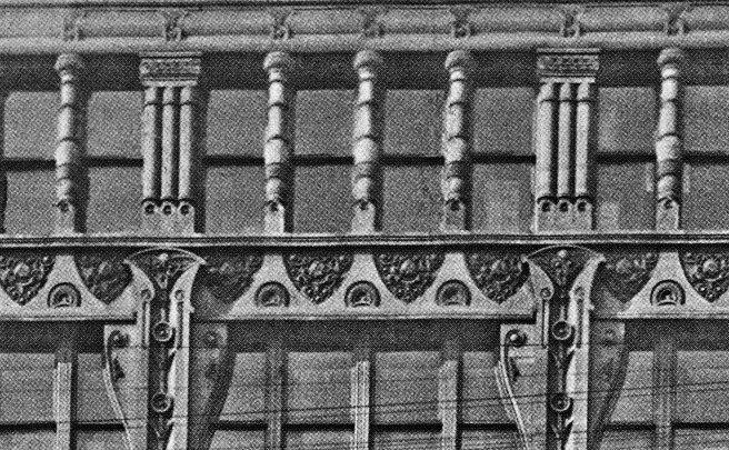
In my opinion, the worst of the three designs was the elevation for the six-story loft building they designed for Martin Ryerson in 1884 for the northside of Randolph Street, directly opposite the Central Music Hall. The lot was wide enough to break the elevation into three (odd number) identical bays, permitting its entrance to located on axis. Again, the triple window was incorporated in the design of the 70′ wide storefront.
Burnham & Root, Rialto Building, Chicago, 1883. Detail of recessed bay windows in the ground floor.
The middle three floors were detailed as slightly recessed bay windows, similar to Root’s use of this detail in the ground floor of the Rialto Building. In an attempt to use visual foreshortening to make the building look taller (I can think of no other reason) the two upper stories were divided into four openings. This, in and of itself was not the problem. The type and spread of ornament, however, was the issue.
In total, the Ryerson elevation had no compositional unity; it simply was a garish, unresolved exhibition of unrelated details. The base consisted of four stone columns described best by Twombly as “grotesque totems.” While the base of these exhibit a Furness-like Néo-Grec form, the remaining height of these consisted of one unrelated shape piled on top of the next, culminating in winglike brackets occupying the corner of the spandrel/column intersection. The brackets return in an enlarged version for an unfortunate encore in the fifth floor, where they block daylight more than they add to the visual unity of the façade. The ground floor totems also made a curtain call in the top floor, while in the floor below, the mullions between the four-windowed bays were appropriately rectangular. In total, the Ryerson elevation had no compositional unity; it simply was a garish, unresolved exhibition of unrelated details. The design, however, was not without merit for it represented the first example (that I have found) of Sullivan detailing the piers as unbroken, continuous piers (for three stories) whose vertical accent was reinforced by the continuous three-story mullions if the bay windows. Do not, however, confuse Sullivan’s first use of this detail with being “the first” use of continuous piers in Chicago, for Root and Edbrooke had already used such elements.
The design of the second of the trio, the six-story loft building for Anton Troescher brought a return of “repose” at least in the lower five floors. Its site, 15 S. Market (Wacker) located on the east side of S. Water between Madison and Monroe Streets, was wide enough to allow four (even number) structural bays. The elevation was well-ordered into a brownstone arcaded base of shallow elliptical arches suporting a four-story body of continuous brick piers and triple windows.
Sullivan scholars like to point out the four-story continuous brick piers as an early example what they claim was Sullivan’s claim to fame in skyscraper design: the vertical accent of a continuous pier. In fact, we have already seen in Sec. 7.15 that in the previous year, George Edbrooke had designed five-story continuous piers in the American Express Building, and seven-storied unbroken piers in the Hiram Sibley Warehouse.
George H. Edbrooke. Left: American Express Building, 1883. (Chicagology); Right: Hiram Sibley Warehouse, 1883. (Historic American Buildings Survey)
Like he had done in the Rothschild Building, Sullivan increased the quantity in each of the top two floors. In the fifth floor, not only did the infamous “totem” backets in the Ryerson make a reappearance, but they were also mirrored-imaged in the spandrel above.
In the sixth floor, the windows in the end bays were reduced to paired-windows. The Ryerson’s “totem” mullions also made a reprise appearance in this floor, completely out-of-character with the rest of the building’s vertical supports. The end bays were surmounted with semicircular roundels similar to those in the parapets of the Borden Block and the Revell Building, with their voussoirs making a nice recapitulation of those in the ground floor arcade. Each of the center two bays was topped by an ornamental tympanum that Sullivan allowed to break the roofline to assert their form against the sky. The even number of bays presented the standard conundrum: two arches in the center do not establish an axis, they are redundant. I give Sullivan some credit for treating the building as two stores joined together; he even located the entrance for each store at the end wall, creating a mirror image. Well done!
Unfortunately, he did not mirror-image the pattern of the terra cotta tympanum in the two central arches. Subtle, maybe so, but this would have been consistent. Or maybe a less expensive solution would have been to have detailed a symmetrical pattern for the central ornamental roundels. But why in heaven’s name would one make these panels asymmetrical is beyond me? So while the base of the building was a mirror-image, respecting the central axis, the top ignores the central axis by simply being repetitive. Inconsistent.
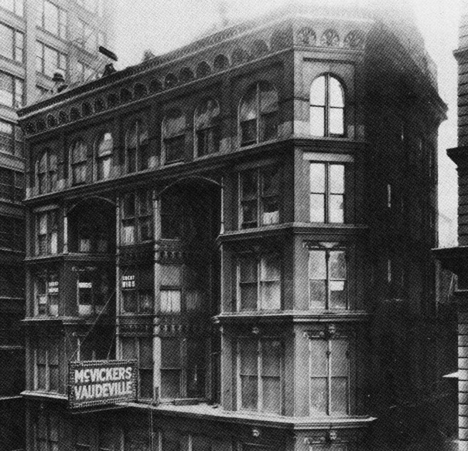
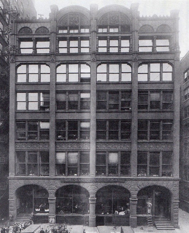
The remodeling of McVicker’s Theater was the third design of this 1884/5 trio. While Adler & Sullivan retained the theater’s office front’s original lower four floors, the added top two floors exhibited the same restlessness and lack of unity (or to quote Owen Jones, “repose”) evidenced in the contemporary Ryerson Building. The fifth floor extended the existing body while a bay window, echoing the form of the two corner bays, was added to the building’s center. The top floor ran the entire length of the façade, appearing to be supported merely by the same lacey, underscaled ornamental iron arches they had used in ground floor of the Revell Building. They capped each tier of windows with their typical semicircular arches/arcade, reprising the arcade in the surviving entrance portico. Fortunately, Adler’s knowledge of theater acoustics and Sullivan’s developing confidence with the design of interior ornament greatly overshadowed the inherent weaknesses in the design of the exterior because as theater is a complete artifice in and of itself, the exterior of a theater always plays only a supporting role. The Tribune recorded its satisfaction with the firm’s design, “work upon the Grand Opera-House, Central Music Hall, in the reconstructions of Hooley’s and the Columbia (Haverly’s Theater changed its name in 1885), lastly the perfect remodeling of McVicker’s, has placed this firm far beyond all competitors.” Next in line for their remodeling touch would be the Chicago Opera House Block theater.
Louis Sullivan, Earliest surviving drawing for his exterior for The Auditorium. Drawn by Paul Lautrup, Sept. 26, 1886. (Siry, Auditorium)
Theodore Tallmadge recorded in his 1941 book Architecture in Old Chicago the apocryphal story that Paul Mueller, Adler & Sullivan’s engineer during the design of the Auditorium, had told him “that the working plans [for the Auditorium] were well nigh finished for a highly ornamental façade replete with bays and oriel windows. However, a remark by John Root was repeated to Sullivan, to the effect that ‘Louis couldn’t build an honest wall without covering it with ornament.’ ” After having reviewed Sullivan’s last three buildings, whether Root’s comment was apocryphal or factual, these prior buildings were evidence to that fact…. Root’s comment was apparently generated by Sullivan’s first design of the elevations for the Auditorium, done in September 1886, some sixteen months after the reopening of McVicker’s. While Sullivan had apparently yet to change his exterior design ideas by late 1886, events had certainly changed Chicago and its architecture by then…
FURTHER READING:
Cannon, Patrick F. Louis Sullivan: Creating a New American Architecture. Petaluma, CA: Pomogranate, 2011.
Morrison, Hugh, Louis Sullivan: Prophet of Modern Architecture. 1935. Reprint, New York: W.W. Norton, 1962.
Siry, Joseph M. The Chicago Auditorium Building. Chicago: University of Chicago Press, 2002.
Twombly, Robert. Louis Sullivan: His Life & Work, Chicago: University of Chicago Press, 1986.
Twombly, Robert and Narciso Menocal. Louis Sullivan: The Poetry of Architecture. New York: Norton, 2000.
Van Zanten, David. Sullivan’s City: The Meaning of Ornament for Louis Sullivan. New York: Norton, 2000.
On the morning of June 14, 1885, some six weeks after the new Board of Trade’s Grand Opening, everyone in Chicago was talking about Sullivan. Sullivan’s name was in every local newspaper and on the lips of every man who “was a man.” In fact, Sullivan had been the talk of the town for the entire first half of June, as Chicago prepared to witness the great contest between the “Boston Strong Boy,” America’s champion heavyweight boxer John L. Sullivan, and Jack “Irish Lad” Burke scheduled for the night of June 13, 1885, at Chicago’s Driving Park. Over 12,000 spectators turned out that night to watch Sullivan overwhelm the middleweight in only five rounds. Two weeks later on July 1, just under 2,000 people attended the grand reopening performance in McVicker’s newly remodeled theater whose interior design by Louis H. Sullivan received rave reviews. The reviews notwithstanding, or, for that matter, his own recollections some forty years later in his Autobiography of an Idea, twenty-nine year-old Louis Sullivan was not yet a “household name” by the middle of 1885, as he had not yet developed into a first-rate architect. To give him credit where it is deserved, we can say that his ability to design interior ornament was quickly maturing with every new commission during this period of his early career.
Adler & Sullivan, McVicker’s Theater (remodeling). Drawing by Sullivan for the design of Private Boxes, dated Jan. 9, 1883 (this was part of their 1883 design, not the final late 1884 design.) (Van Zanten, Sullivan’s City)
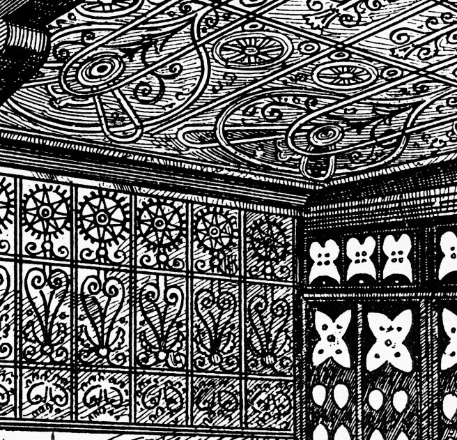
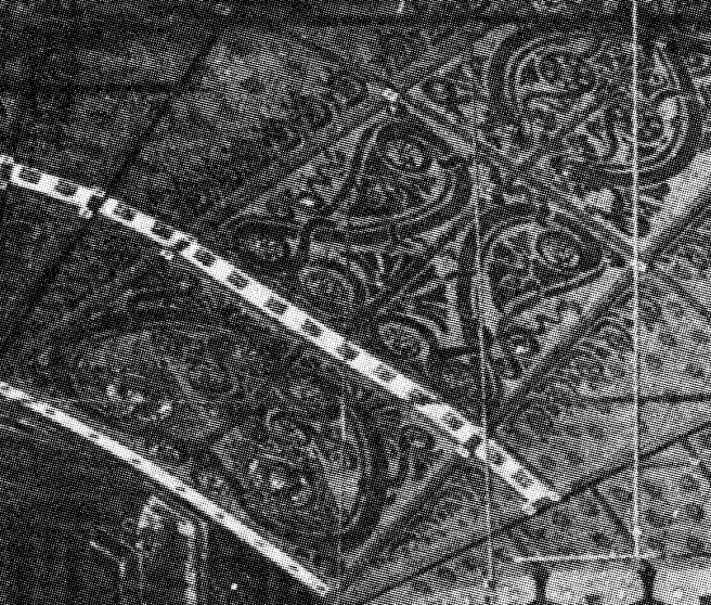
We have seen that in early 1883, following the Chicago debut of Adelina Patti, McVicker had first approached D. Adler & Co., Chicago’s premiere theater designers at the time (Sullivan would not advance to full partnership until later in May of that year), with a proposal to remodel his famous theater anticipating that the Patti concerts would continue the following year, but then had postponed the remodeling until the fall of 1884. Although Adler had vastly improved the sightlines, acoustics, ventilation in the remodeled structure, as well as having added 12 boxes, two tiers of three boxes to each side of the new proscenium, it had been Sullivan’s design of the interior that was the focus of the media’s attention: “Nothing like it, or anything approaching it, has ever before been seen in this country.” Although no pictures of the interior are known to exist, contemporary reports stated that the “style” of Sullivan’s ornament were “after the Moresque pattern, and everything conforms, with slightly varying degrees in different parts of the house, to this general idea.”
A drawing of the new vestibule of the theater shows the influence of Owen Jones in the patterns that Sullivan had designed in which he had employed Jones’ recommendations of geometry and organic shapes. As he had been working on both McVicker’s and the 1885 Opera Festival installation during late 1884 and the winter of 1885, Sullivan’s curves on the sidewalls and the ceiling echo those he had employed in the Exposition Center, and once again beg the question of the lack of mention by historians of Sullivan’s early development of Art Nouveau motifs.
Louis Sullivan, Ornamental Motifs. Left: McVicker’s Theater, Entrance; Right: 1885 Grand Opera Festival House, Exposition Center. (Gregersen, Adler)
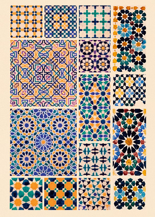
One also wonders why historians have puzzled over Sullivan’s employment of Moorish details as the point of departure for much of his ornament, because his inspiration and his design process for his ornament came straight out of Jones’ The Grammar of Ornament, that not only contained a vast collection of Islamic patterns, but also was influenced by Jones’ earlier 1842 published study of the Alhambra, in which he had documented the tradition of polychromatic ornament in Islamic buildings.
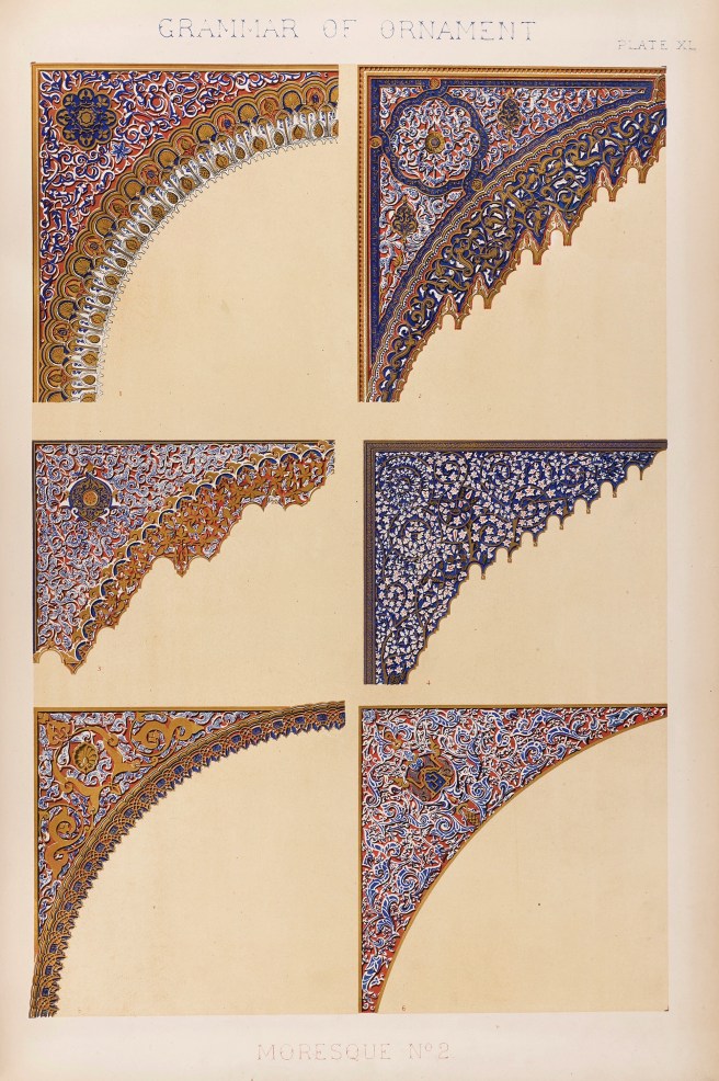
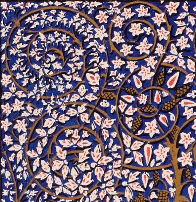
Owen Jones. Left: The Grammar of Ornament, 1856. “Moresque”; Right: Plans, Sections, Elevations, and Details of the Alhambra, 1836-45. Details. (Image rotated 90° for format) (Online)
As Sullivan later summarized his design, “The architectural treatment of the interior of McVicker’s Theater is based upon a single consistent scheme or plan which is differentiated into form, color and illumination.” Owen Jones could not have said it better.
Left: Owen Jones, The Grammar of Ornament, 1856. “Moresque-no.2.” (Online); Right: Louis Sullivan, McVicker’s Theater, Entrance. (Gregersen, Adler)
And it was Sullivan’s illumination that got people’s attention! (The Biblical quote in the title of this section came from Siry’s quoting Real Estate and Building Journal of July 18, 1885.) Although Thomas Edison had been granted his first patent for an incandescent electric light bulb in 1880, the technology was slow to catch on as it had taken time for building owners to accept the new technology and for designers to appreciate its aesthetic potential. Adler & Sullivan made the bold decision not only to incorporate this new technology for the first time in a theater, but Sullivan was also one of the first to take advantage of the bulb’s ornamental potential with his design of McVicker’s. This he did not only from a detail perspective, but also at a conceptual level. What was most revealing about Sullivan’s artistic talent in this early employment of the incandescent bulb was that he did not just place the 1,235 bulbs on the surfaces of the walls and sounding board but had the aesthetic imagination to actually incorporate the bulbs within his overall ornamental concept and details. The bulbs were placed within perforated plaster rosettes and bosses that Sullivan had designed with his own personal style of geometricized ornament that hid the exposed bulb from sight (and glare) but still allowed its indirect glow to highlight the surrounding surface’s color and texture.
“Handsomely moulded bosses and rosettes are profusely distributed over the walls, and are found in consecutive circles on the ceiling, and these being perforated are made the medium of admitting the softened light which permeates the house without the source of the combustion (of gas jests) being seen, not a bulb, not a jet, not a wick of any kind is visible, and yet so lavishly are the lights provided that the sounding board alone has 105 lamps concealed by its elaborate ornamentation.”
It could be said that Sullivan’s design was one of the earliest examples of the concept of indirect lighting. How I want you to envision how first-time viewers experienced this space is to project yourself back to that time, never having seen an electric light or the quality of light that it produces. It would be the equivalent of a “high-tech” interior of today. You were be experiencing “the future!”
The architects also realized that the traditional immense chandelier hanging from the ceiling would no longer be needed. As The Tribune’s reporter who covered the new construction noted: “one can say good-by to the cumbrous ornament without a pang, for people… in the house never looked up at it without thinking of the sword of Damocles.”
Inherently appreciating the new warmth of color rendition that resulted from the light produced by the incandescent bulb, Sullivan, in collaboration with Chicago’s leading decorative designers George L. Healy and Louis J. Millet (see next section), had conceived of an interior environment of graded colors. The Tribune reporter interpreted the interior colors as:
“…the keynote of the entrance will be dark mahogany leading into peacock blue. Then all the lower part of the theater proper, as it now appears, is done in reddish yellow, gradually growing lighter and lighter as the eye wanders upward until the in carved work of the ceiling and proscenium arch it is lost in a creamy whiteness. The effect can hardly be judged until the whole is illuminated by electric lights…”
Meanwhile, an Inter-Ocean reporter described its opening night:
“…it presents rich reds and metal effects; as you pass to the foyer it changes to blue and gold, and presently from the blue and gold there bursts on the eye a pale red brown, which floats up in mellowing metamorphosis – like the sun from the filmy veil of dawn – to cream color in the ceiling. In this beautiful transformation act in pigments not fewer than twenty-seven different shades blend into each other and so imperceptibly that the boundary lines are indefinable. The effect produced by this method of lighting cannot be described. The whole interior of the theater seems bathed in a luminosity which, while intensely penetrative, is so softened and refined that no glare can possibly hurt the vision or interfere with the fullest appreciation of the most delicate tints and the most subtle gradations.”
Once again, I am reminded of reviews of Owen Jones’ buildings, especially the “bloom” of daylight he was famous for recreating in St. James’s Hall. Sullivan, Healy, and Millet had accomplished in McVicker’s interior what Root had been trying to experiment with on the exterior of a building (since 1883 with the Rialto), a gradation of color from the base of a building to its cornice. Root was attempting use “applied” polychromy to transcend Victorian “structural” polychromy, that is achieving color in a building’s façade using “truthful” real materials, quoting Ruskin’s idea that color in nature is independent of form. (Root’s canvas during this period was the building’s exterior because his commissions were for large buildings that contained no space large enough for such gradations, while Sullivan, who had no tall buildings through this period, had many tall spaces in the interior of the vast theaters he was given to design.) Root had published this concept only three months (Inland Architect, April 1885) before McVicker’s opened to the public in his article, “Architectural Ornamentation:”
“In large buildings the use of several colors should be less violent, so that while the general tone may be deep and full as we can make it, the variations of color are subtle and are obtained through gradations instead of contrasts… Probably no higher art exists than this: to produce in a great building that wonderful bloom obtained by mosaics of pure color.”
In his earlier 1883 article, “The Art of Pure Color,” Root cited the paintings by “proto-Impressionists” Turner and Whistler for their “emotional” use of color,
“… in painting, form appeals directly to the mind, color to the emotions, just as in an oratorio or opera the mind is directly interested in the words, while the emotions are more moved by the music… [Whistler] was able to translate into pigments effects which were in their nature too vague to be drawn… When Turner first flung upon canvas the full chaotic strength of his wonderful palette, all the art world thought the graceful water-colorist had gone mad… Even after Turner had worked his miracles on them, they were not yet whole, seeing “men only as trees walking,” but they had been led toward sight, and could at least see enough to know that all sky was not blue, nor all grass green.”
Left: J. M. W. Turner, Dunstanburgh Castle, c. 1828. Detail; Right: James Abbot McNeil Whistler, Harmony-in-Blue-Trouville, 1865. Detail. (Online)
Surely, Root would have understood the gradations of “pure color” employed by Sullivan, Healy, and Millet as the logical evolution of the efforts of these avant-garde painters…
Speaking of papers, Sullivan made his debut as an architectural theorist six months later in October 1885 at the second W.A.A. Convention in St. Louis, where he presented his first written piece, “Characteristics and Tendencies of American Architecture.” Verbally articulating his artistic intensions toward evolving an American modern style of architecture that were self-evident in his prior theater designs, he centered his thesis, as he would continue throughout his career, on the inspiration gained from a thoughtful study of and the resulting use of metaphor for nature:
“Many who have commented upon the practice of architecture in this country have regarded the absence of a style, distinctively American, as both strange and deplorable… These theories have been for the greater part suggested by the feelings awakened in contemplating the matured beauty of Old World Art, and imply a grafting or transplanting process… their advocates have ignored the complex fact, that, like a new species of any class, a national style must be a growth, that slow and gradual assimilation of nutriment and a struggle against obstacles are necessary adjuncts to the purblind process of growth… We surely have in us the germ of artistic greatness…but architects as a professional class have held it more expedient to maintain the traditions of their culture than to promulgate vitalizing thought. Here then we are weak…
“If the conclusions set forth in this paper be accepted as correct, it becomes evident, however, that the formative beginnings of this national style, now in progress, are of the utmost immediate interest to us…”
10.22. INTERIOR DESIGNERS PAR EXCELLENCE: HEALY & MILLET
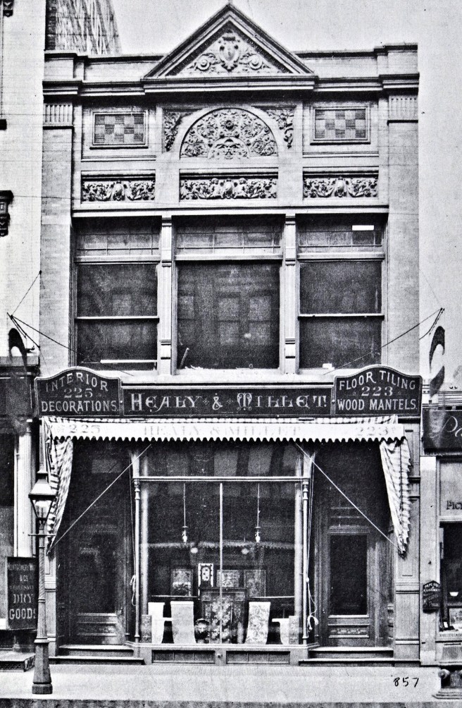
Healy and Millet’s Studio, Chicago, 223-5 S. Wabash, c. 1885. (Darling, Chicago Ceramics)
George Louis Healy (1856-?) was the son of Chicago’s famous portraitist, George Peter Alexander Healy (the two are often confused with each other) who was brought to Chicago by William Ogden in 1855 (see Vol. One, Chap. 8). (I have to insert this here: the long shadow of William Ogden as Chicago’s father grows ever larger…) While George L. was born in Chicago, his father had moved to Paris in 1869, where the son attended the École des Beaux-Arts in the second half of the 1870s. Here he befriended Louis J. Millet (1856-1923), born in New York and nephew of Parisian sculptor Aimé Millet, whose monumental statue of Vercingétorix we have already reviewed in Vol. 2, Sec. 5.6. As Viollet-le-Duc had consulted with his uncle on the statue, it is quite conceivable that the nephew Millet had been introduced by his uncle to the great French architect. It is generally thought that the two art students had befriended Louis Sullivan during his one semester stay at the École during the fall of 1874.
The two art students had been able to experience firsthand the emergence of Impressionism as they were in Paris during the first exhibition in April 1874 of the Cooperative and Anonymous Association of Painters, Sculptors, and Engravers (that adopted the name ‘Impressionism’ in 1877). In fact, they were able to view the second (1876) and the third (1877) exhibitions as well. As such, as far as I have been able to determine, they were the only designers in Chicago during the first half of the 1880s that had personally seen the products of Impressionist painters and, therefore, were able to bring to Chicago and apply the ideas of color and light of these paintings in their own work in Chicago. I include two paintings from each of the three exhibitions to give you a sample of what they had seen in Paris.
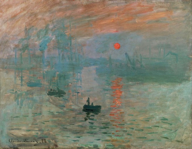
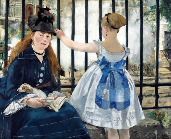
FIRST EXHIBITION: April 15-May 15, 1874:
Left: Claude Monet, Impression, Sunrise, 1872; Right: Édouard Manet, The Railway (Gare Saint-Lazare), 1873. (Online)
SECOND EXHIBITION: April 1876:
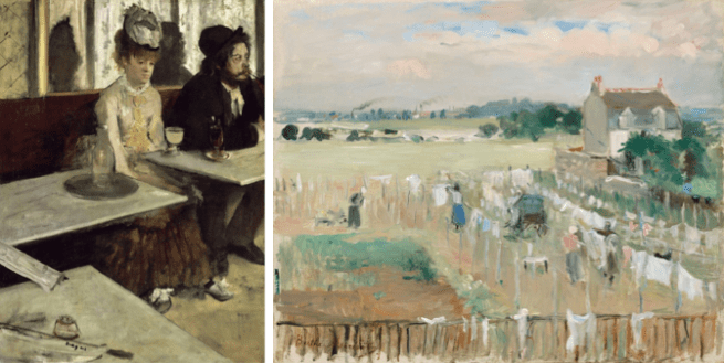
Left: Edgar Degas, L’Absinthe, 1875-6; Berthe Morisot, Hanging the Laundry Out to Dry, 1875. (Online)
THIRD EXHIBITION: April 1877:
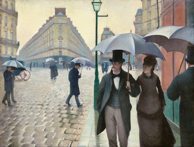
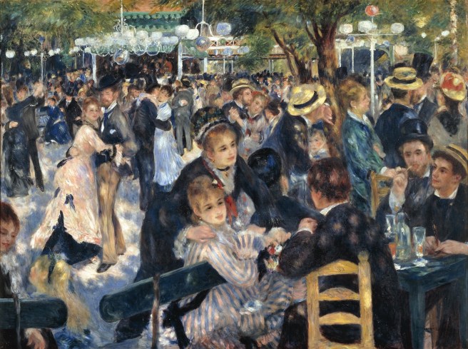
Left: Gustave Caillebotte, Paris Street; Rainy Day, 1877; Pierre-Auguste Renoir, Dance at Le Moulin de la Galette, 1876. (Online)
This also may mean that Healy could easily have been the first Chicagoan to set eyes on what would eventually become one of the Art Institute’s beloved masterpieces. The two art students had quickly became friends, and it would seem that Healy had convinced Millet to return to his home town and form a partnership in 1880. Millet would begin teaching design classes at the Art Institute in January 1886, where he taught an evening class where he stressed that decorative design was “the conventionalization of natural forms” and how to derive “designs from nature and historical ornament.” He founded its Department of Decorative Design and was its leader through 1918. The partners dissolved the firm in 1899, with Millet continuing to design many of the Midwest’s important buildings (many with Sullivan) into the early 1920s.
FURTHER READING:
Darling, Sharon S. Chicago Ceramics and Glass. Chicago: Chicago Historical Society, 1979.
Siry, Joseph M. The Chicago Auditorium Building. Chicago: University of Chicago Press, 2002.
Twombly, Robert. Louis Sullivan: His Life & Work, Chicago: University of Chicago Press, 1986.
Twombly, Robert. Louis Sullivan: The Public Papers. Chicago: University of Chicago Press, 1988.
Van Zanten, David. Sullivan’s City: The Meaning of Ornament for Louis Sullivan. New York: Norton, 2000.
Weingarden, Lauren S., “The Colors of Nature: Louis Sullivan’s Architectural Polychromy and Nineteenth Century Color Theory,” Winterthur Portfolio, Vol. 20, No. 4 (Winter, 1985), pp. 243-260.