
While the interior of McVicker’s was based on one “consistent scheme,” the exterior of the renovated theater still exhibited Adler & Sullivan’s propensity to over activate their elevations, as they had done with their small business buildings that we have already reviewed (Sec. 7.12.) that were contemporary with the McVicker’s design, although it wasn’t constructed until 1885. Just imagine being Dankmar Adler in May 1883, having just agreed to Sullivan’s becoming an equal partner… especially after Sullivan’s theater interior designs were generating rave reviews in the local press. It would have been very hard to say “not yet” to the precocious designer’s desire to move into designing the exteriors of the firm’s new commissions. After looking at Sullivan’s early exterior designs, especially the Ryerson building, you may wonder “was the architect who designed this agglomeration of seemingly unrelated details the same genius who produced the glorious detailing in the Grand Opera House and Hooley’s Theater?” I can only offer my insight gained after having had over 2000 architecture or interior design students in my design studios during my forty-plus years at the University of Cincinnati, that not only does every student comes to the drafting, scratch that, the studio table with a different set of skills, but also the design of a building’s interior is quite different from the design of a building’s exterior. By no means am I trying to infer one is harder than the other; I am simply stating that these two design problems have their own problems to solve, and while related, are no means solved with a set of interchangeable skills. The young Sullivan was a perfect example. While he was a wiz at ornament and interior design, his young talents in designing the exterior of a building left much to learn.

I want to review Adler’s earlier designs for these loft buildings (skyscrapers would have to wait until 1890) simply to establish the firm’s development in designing the elevation of a business building. Following Adler’s design for the Central Music Hall in 1879, Adler had been hired by John Borden and his son William (using the returns of their investment in silver mining in Colorado during the late 1870s) to design a six-story office building. Adler, as had Jenney in the First Leiter Building, chose to emulate the “structural” elevation of expressed piers and spandrels (but not its triple window) so successfully employed two years earlier in Cincinnati by James McLaughlin in the Shillito’s department store.

Although Adler had articulated the building’s elevations into horizontal layers with a rhythm of 2-2-3 employing conventional continuous sill courses, compared to the classical base-middle-top scheme of the Shillito’s store, Adler’s design was awkwardly top-heavy, lacking any sense of repose. Adler had hired Sullivan during its design and it is thought that Sullivan may have been responsible for adding the semicircular terra cotta lunettes in the building’s cornice. This building set the pattern for the firm’s early business buildings: first, the exterior exhibited the period’s fashionable Victorian “structural” polychromy with the use of dark brick with lighter-colored stone accents; second, the building’s elevation expressed the pier-and-spandrel construction of the exterior wall; and third, each tier of windows between the piers was capped by an arch, alluding to a Romanesque Revival arcade.
In the next iteration of this scheme, the Rothschild Store, as it was simply a storefront, Adler could rely on the building’s masonry bearing party walls to stabilize the structure, and could open up the front elevation for as much glass as Sullivan could squeeze in. Therefore, they borrowed Jenney’s triple window (who had borrowed it from the Shillito’s Store) from the adjacent First Leiter Building that increased the number of windows between the piers from two to three.
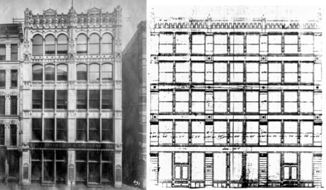
One other difference from the Borden Block is that they gave the Rothschild’s elevation an uncharacteristic, but distinctively vertical accent by eliminating the traditional layering of the elevation with continuous sill courses, more than likely due to the narrow proportions of the rectangular elevation. One could easily make the argument that here Sullivan was experimenting with the Gothic Revival, except those upper windows are not pointed. (Many Sullivan historians like to point to this building as an early example of what would eventually become a Sullivan trademark, the vertically-accented elevation for a skyscraper. If this was Sullivan’s true intention, in other words, he already at this point in his career was thinking that “tall” buildings should look “tall,” he had many opportunities after this project to continue his experiment in later designs but didn’t do so for a number of years to come. I think this interpretation of the Rothschild design is simply wishful post-writing of a history that never occurred. Quite frankly, the young Sullivan was still learning how to design a six-story elevation, let alone even dream of how to “correctly” design a new building typology that in 1881 Chicago had only one example, Burnham & Root’s Montauk Block.)
Here again Adler & Sullivan may have been influenced by Jenney’s First Leiter elevation for he had projected the pier’s capitals beyond the plane of the sillcourses, thereby preventing the sillcourses from being read as a continuous horizontal. Instead of changing the material at this intersection, as Jenney did, they used the same material throughout the length of the pier, obviously reinforcing its unbroken verticality. One departure from Jenney’s elevation was that the mullions were not stopped at each spandrel but were detailed to pass in front of the spandrel, allowing them to extend unbroken past the cornice, thereby reinforcing the elevation’s verticality. Sullivan’s natural tendency and skill in designing ornament seems to increase in intensity as he worked his way up the building (as do the heads of the windows from flat, to segmental arch to complete semicircular arches), to his final flourish in the cornice, a centrally located pediment over each bay. The filigreed detailing on the cornice echoed the detailing he had employed on the contemporary Hooley Theater boxes.
The inherent problem, throughout the history of architecture with an even number of structural bays such as the Rothschild’s two bays, is the inability to enter the building on axis, in the center. Because with an even number of bays there is always a column at the center axis, this was a huge problem for traditional buildings, be they Classical or Gothic as both were symmetrically planned. If this column line is extended into the building itself, it results in a line of columns right through the middle of the central space, dividing the space into two halves. This also becomes a design issue on the exterior elevation because, once again, the central column line divides the elevation into two pieces, denying any ability for it to be read as a whole: you are either looking at the left half or the right half of the elevation. The Parthenon has an odd number of bays and the majority of Roman triumphal arches have either one bay (Titus) or three (Constantine).
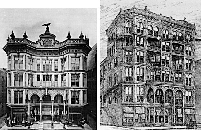
For the five-story Jewelers’ Building, they changed the structure from two bays to a central bay with “side aisles.” This was accomplished by splitting the central column into two pieces and spreading them apart to create the central bay. This had the effect of locating a column closer to each party wall, for which they simplified the elevation by combining the end column and this new column into a corner pavilion with flush spandrels and a cornice to create the equivalent of a structural bay/pavilion that they first employed in the Jewelers’ Building, again a simple storefront. Bay/pavilions with a single window were placed at each corner and once again triple-paned windows infilled the rest of the elevation. A shallow segmental arch spanned the opening between the two pavilions, whose surface was detailed in the same plane of the pavilions, thereby unifying the two bays at the cornice into one frontal plane, albeit the building’s structural polychromy somewhat negated this effect. (One could project the image of a triumphal arch in this design.) This was the building where seemingly Sullivan was able to restrain his propensity to let his pencil run wild (budget constraints?), and his ornament was finally subordinated to the overall massing of the building.
Corner pavilions with a central void has been a pretty conventional massing scheme throughout architectural history. Some Sullivan scholars have tried to trace the lineage of Adler & Sullivan’s use of the bay/pavilion concept back to a variety of French designs. For instance, Narciso Menocal provided a number of precedents that had been published in the French periodical Revue Générale de l’architecture that Sullivan was known to have had in his library.
I think Sullivan’s precedents were not so exotic, but simply found among American buildings. I have already shown the American lineage of this idea in Sec. 5.3. that I traced back to Detlef Lienau’s Noel & Saurel Building in New York of 1864. Hunt then incorporated this idea in his 1874 design for a cast iron front at 478 Broadway.


Another Hunt building designed in 1874 that one may argue had influenced Sullivan, but not in the use of bay/pavilions for there were none, was the Roosevelt Building with its cast iron filigreed shallow arch, whose profile Sullivan first used in the Jewelers’ Building. He followed this up by directly quoting Hunt’s detail of the lacy iron arch in his next design the following year for the Revell Furniture Building, where he placed these at the ground floor in each void between the bay/pavilions.
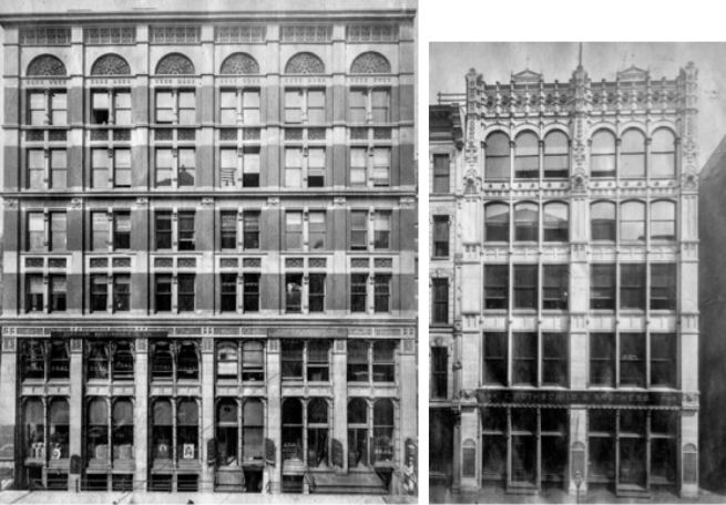
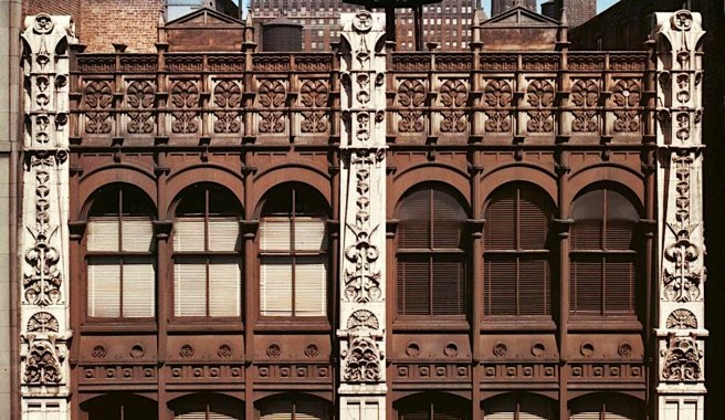
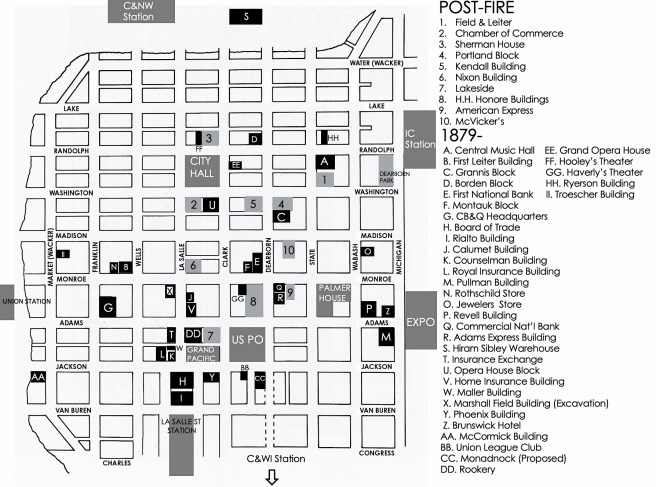
In the six-story loft building for the Revell Furniture Company at the northeast corner of Adams and Wabash, Menocal noted that Sullivan had repeated the alternating rhythm of the Jewelers’ bay/triple window (with continuous mullions) across both faces of the building, as if Sullivan had simply rubber-stamped the Jewelers’ façade onto the Revell’s two street elevations. If one considers the Jewelers’ Building to exhibit restraint upon Sullivan’s part, the opposite applies to this building, as well as its three following siblings.
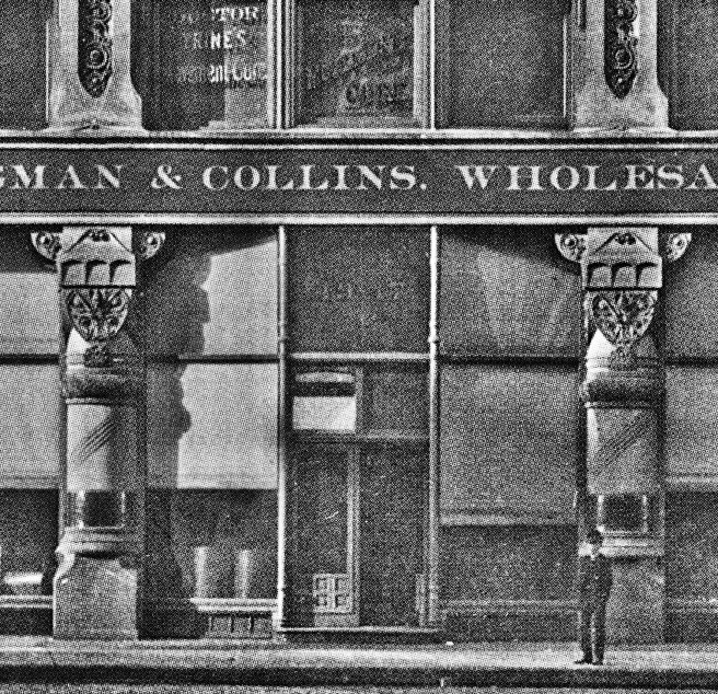
Adler & Sullivan had still used their three motifs: the exterior exhibited the period’s fashionable Victorian “structural” polychromy, second, the building’s elevation expressed the pier-and-spandrel construction of the exterior wall; and third, each tier of windows albeit now only within each pavilion was capped by an arched lunette. In the Revell Building they had spaced the bays far enough apart again to insert three windows, now detailed as one of the city’s first example of the “Chicago” window, that is, a fixed center pane with operable sidelites. The cornice of the pavilions consisted of the terminating semi-circle topped with a pediment brought back from the Rothschild design but with the addition of an acroterion. Meanwhile, apparently not satisfied with the existing visual cacophony of their prior designs’ “structural” polychromy, Sullivan “turned up the volume” in his color palette by using stripes of alternating of brick and stone in both the second floor and the sixth floor as transitions from the all-stone ground floor and attic to the brick/stone language of the middle three floors. Finally, as if he still felt the need for an arch in the triple window range between piers, he relocated the arch typically used in their cornices down to the ground floor with a reprise of Hunt’s filigreed cast iron arch.
The firm then experienced a two-year drought in business buildings from 1882-84 while their bread and butter, residential and industrial buildings (see Morrison for a list) kept it busy. During this period, Sullivan’s close friend, the itinerant John Edelmann, whom he had first befriended in Jenney’s office in 1874 and who was responsible for bringing Sullivan back from Paris in 1875 with the commission to design the murals in Moody’s church, had once again returned to Chicago. Menocal credited the change in Sullivan’s design aesthetic manifested in the following trio of buildings employing Egyptian and Pre-Columbian (a naive attempt at an “American” architecture?) detailing, to the almost Svengali-influence that Edelmann had on Sullivan. Sullivan was involved in the design of these next three buildings during 1884, although their construction was spread over the end of 1884 and the spring of 1885.
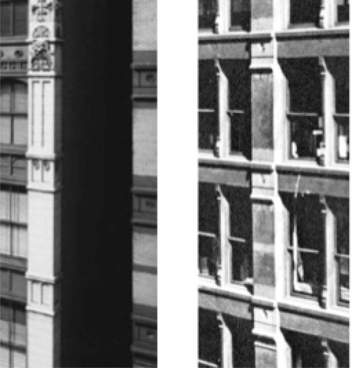
In my opinion, the worst of the three designs was the elevation for the six-story loft building they designed for Martin Ryerson in 1884 for the northside of Randolph Street, directly opposite the Central Music Hall. The lot was wide enough to break the elevation into three (odd number) identical bays, permitting its entrance to located on axis. Again, the triple window was incorporated in the design of the 70′ wide storefront.
The middle three floors were detailed as slightly recessed bay windows, similar to Root’s use of this detail in the ground floor of the Rialto Building. In an attempt to use visual foreshortening to make the building look taller (I can think of no other reason) the two upper stories were divided into four openings. This, in and of itself was not the problem. The type and spread of ornament, however, was the issue.
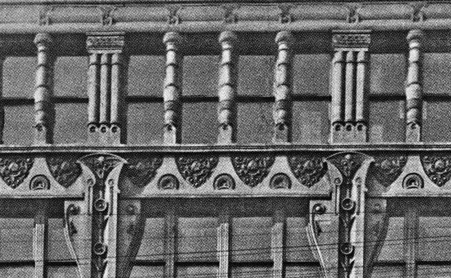
In total, the Ryerson elevation had no compositional unity; it simply was a garish, unresolved exhibition of unrelated details. The base consisted of four stone columns described best by Twombly as “grotesque totems.” While the base of these exhibit a Furness-like Néo-Grec form, the remaining height of these consisted of one unrelated shape piled on top of the next, culminating in winglike brackets occupying the corner of the spandrel/column intersection. The brackets return in an enlarged version for an unfortunate encore in the fifth floor, where they block daylight more than they add to the visual unity of the façade. The ground floor totems also made a curtain call in the top floor, while in the floor below, the mullions between the four-windowed bays were appropriately rectangular. In total, the Ryerson elevation had no compositional unity; it simply was a garish, unresolved exhibition of unrelated details. The design, however, was not without merit for it represented the first example (that I have found) of Sullivan detailing the piers as unbroken, continuous piers (for three stories) whose vertical accent was reinforced by the continuous three-story mullions if the bay windows. Do not, however, confuse Sullivan’s first use of this detail with being “the first” use of continuous piers in Chicago, for Root and Edbrooke had already used such elements.
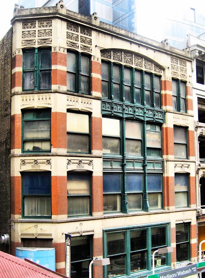
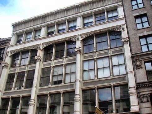
The design of the second of the trio, the six-story loft building for Anton Troescher brought a return of “repose” at least in the lower five floors. Its site, 15 S. Market (Wacker) located on the east side of S. Water between Madison and Monroe Streets, was wide enough to allow four (even number) structural bays. The elevation was well-ordered into a brownstone arcaded base of shallow elliptical arches suporting a four-story body of continuous brick piers and triple windows.
Sullivan scholars like to point out the four-story continuous brick piers as an early example what they claim was Sullivan’s claim to fame in skyscraper design: the vertical accent of a continuous pier. In fact, we have already seen in Sec. 7.15 that in the previous year, George Edbrooke had designed five-story continuous piers in the American Express Building, and seven-storied unbroken piers in the Hiram Sibley Warehouse.
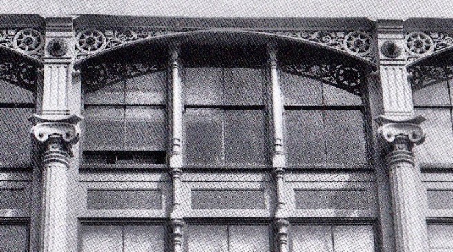
Like he had done in the Rothschild Building, Sullivan increased the quantity in each of the top two floors. In the fifth floor, not only did the infamous “totem” backets in the Ryerson make a reappearance, but they were also mirrored-imaged in the spandrel above.
In the sixth floor, the windows in the end bays were reduced to paired-windows. The Ryerson’s “totem” mullions also made a reprise appearance in this floor, completely out-of-character with the rest of the building’s vertical supports. The end bays were surmounted with semicircular roundels similar to those in the parapets of the Borden Block and the Revell Building, with their voussoirs making a nice recapitulation of those in the ground floor arcade. Each of the center two bays was topped by an ornamental tympanum that Sullivan allowed to break the roofline to assert their form against the sky. The even number of bays presented the standard conundrum: two arches in the center do not establish an axis, they are redundant. I give Sullivan some credit for treating the building as two stores joined together; he even located the entrance for each store at the end wall, creating a mirror image. Well done!
Unfortunately, he did not mirror-image the pattern of the terra cotta tympanum in the two central arches. Subtle, maybe so, but this would have been consistent. Or maybe a less expensive solution would have been to have detailed a symmetrical pattern for the central ornamental roundels. But why in heaven’s name would one make these panels asymmetrical is beyond me? So while the base of the building was a mirror-image, respecting the central axis, the top ignores the central axis by simply being repetitive. Inconsistent.
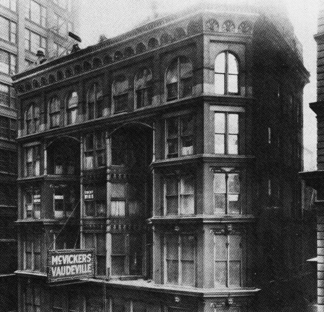
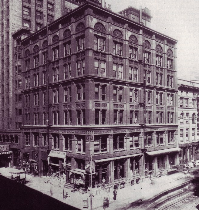
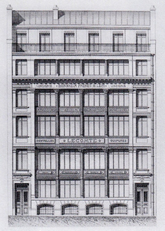
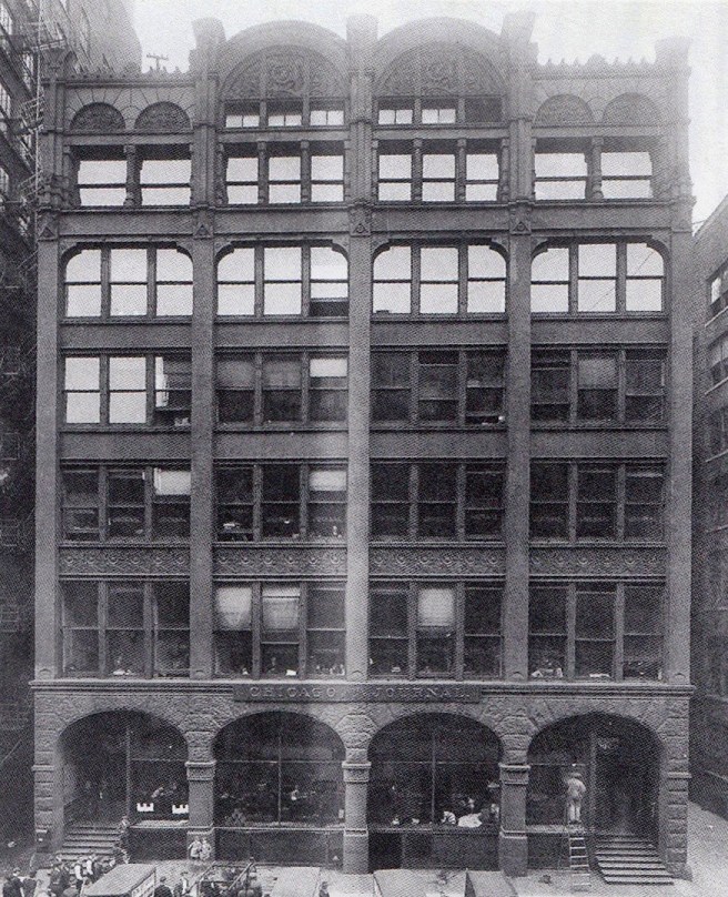
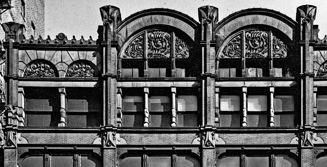
The remodeling of McVicker’s Theater was the third design of this 1884/5 trio. While Adler & Sullivan retained the theater’s office front’s original lower four floors, the added top two floors exhibited the same restlessness and lack of unity (or to quote Owen Jones, “repose”) evidenced in the contemporary Ryerson Building. The fifth floor extended the existing body while a bay window, echoing the form of the two corner bays, was added to the building’s center. The top floor ran the entire length of the façade, appearing to be supported merely by the same lacey, underscaled ornamental iron arches they had used in ground floor of the Revell Building. They capped each tier of windows with their typical semicircular arches/arcade, reprising the arcade in the surviving entrance portico. Fortunately, Adler’s knowledge of theater acoustics and Sullivan’s developing confidence with the design of interior ornament greatly overshadowed the inherent weaknesses in the design of the exterior because as theater is a complete artifice in and of itself, the exterior of a theater always plays only a supporting role. The Tribune recorded its satisfaction with the firm’s design, “work upon the Grand Opera-House, Central Music Hall, in the reconstructions of Hooley’s and the Columbia (Haverly’s Theater changed its name in 1885), lastly the perfect remodeling of McVicker’s, has placed this firm far beyond all competitors.” Next in line for their remodeling touch would be the Chicago Opera House Block theater.
Theodore Tallmadge recorded in his 1941 book Architecture in Old Chicago the apocryphal story that Paul Mueller, Adler & Sullivan’s engineer during the design of the Auditorium, had told him “that the working plans [for the Auditorium] were well nigh finished for a highly ornamental façade replete with bays and oriel windows. However, a remark by John Root was repeated to Sullivan, to the effect that ‘Louis couldn’t build an honest wall without covering it with ornament.’ ” After having reviewed Sullivan’s last three buildings, whether Root’s comment was apocryphal or factual, these prior buildings were evidence to that fact…. Root’s comment was apparently generated by Sullivan’s first design of the elevations for the Auditorium, done in September 1886, some sixteen months after the reopening of McVicker’s. While Sullivan had apparently yet to change his exterior design ideas by late 1886, events had certainly changed Chicago and its architecture by then…
FURTHER READING:
Cannon, Patrick F. Louis Sullivan: Creating a New American Architecture. Petaluma, CA: Pomogranate, 2011.
Morrison, Hugh, Louis Sullivan: Prophet of Modern Architecture. 1935. Reprint, New York: W.W. Norton, 1962.
Siry, Joseph M. The Chicago Auditorium Building. Chicago: University of Chicago Press, 2002.
Twombly, Robert. Louis Sullivan: His Life & Work, Chicago: University of Chicago Press, 1986.
Twombly, Robert and Narciso Menocal. Louis Sullivan: The Poetry of Architecture. New York: Norton, 2000.
Van Zanten, David. Sullivan’s City: The Meaning of Ornament for Louis Sullivan. New York: Norton, 2000.
(If you have any questions or suggestions, please feel free to eMail me at: thearchitectureprofessor@gmail.com)
