

Both of these “artistic” approaches to the design of a skyscraper’s facade revolve around the issue of how to detail a window within the surface of the exterior wall. The rational approach found the artistic challenge in how to best express the building’s structural system and how to respect the integrity of the materials employed (influenced by the ideas of Pugin, Jones, Ruskin, Viollet-le-Duc, Semper among others).
The primary formal or compositional concern was involved with visual or optical perception. Illusion would play a major role in the design of a skyscraper, especially in a design that wanted to look taller than it actually would be, for any number of reasons. Illusion simply means to make something look like something other than what it really was. Some of the favorite details of illusion in skyscrapers were:
-to make the vertical dimension of each floor slightly smaller than the one below it, thereby reinforcing the effect of perspective
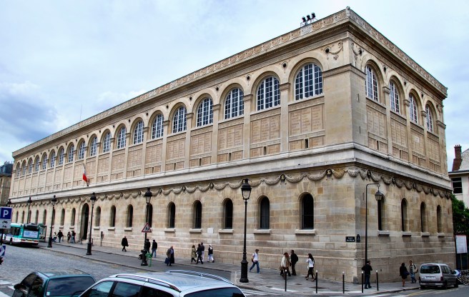
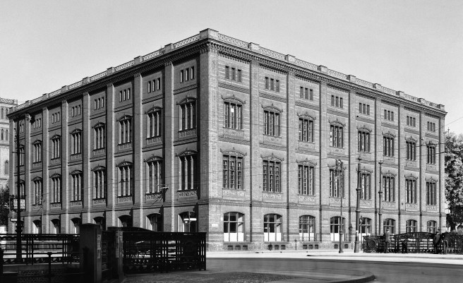
-to group a number of floors together into one horizontal unit with sillcourses only at certain intervals, which then would give the scale of the elevation a different reading than what would result if the banding occurred at each floor. A traditional progression would be the lowest layer would have three floors, the middle layer would have two floors, and the top layer would have only one floor). I will abbreviate this type of progression as 3:2:1. (see Hunt’s early study for the Tribune Building above)
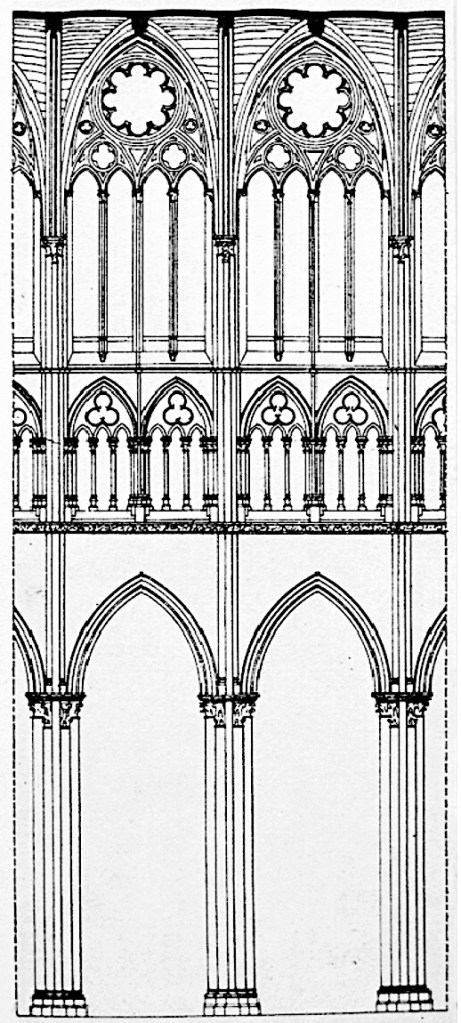
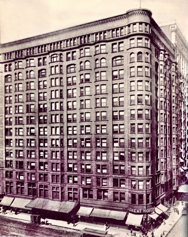
-to make the windows in the upper floors smaller than those in the lower floors. This was usually done in some type of geometrical progression between the columns or piers of the building’s primary structural bays. A traditional progression, which dated back to the Gothic cathedral was one (in the base), to two (in the middle), to four (in the top). I will abbreviate this type of progression as 1:2:4.
-to reinforce the perception of a skyscraper as a vertical object, the verticality of the facade could be complemented by giving the elevation a vertical emphasis, rather than a horizontal one, by eliminating all continuous banding. This could also be reinforced by grouping two or more windows in an unbroken vertical line by recessing the spandrel between the windows.
4.8. THE “RATIONAL” DESIGN OF AN ELEVATION
As the skyscraper continued to grow taller and architects began to understand the subtleties involved in its design, architects who had been influenced by the writings of theoreticians who were exploring what a nineteenth century or modern architecture should be, began to experiment with a rational approach to the design of a skyscraper. (Arguments on either side of the issue whether or not a “rational” façade was a “modern” invention can be made, but this point is outside the bounds I have set for this blog.) One of the first reevaluations of traditional facade design involved the formal scheme of diminishing the size of the windows as one rose up the building used in the layering or progression of arcades or window sizes. When viewed through the filter of rationalism, this detail was actually counter to what an architect should be doing if he wished to express the structural qualities of the building, or in other words, express what the structure was doing. As the gravity load accumulated from the roof to the ground, more structure was required in the ground floor then at the top.
In other words, the openings in a multistory building, if predicated on structural expression, should get LARGER as one rose up the building, because less structure was required in the upper floors than in the lower ones. Other rationalists, however, would counter this argument quoting the amount of daylight received by each of the floors in a skyscraper. From their standpoint, the lower floors of a building typically received less daylight than the upper floors due to shadows from buildings located across the street. The tradition of decreasing the size of the windows as one moved up an elevation, in their view, did have its basis in a rational design approach. This opinion was reinforced by the rational idea that a building’s windows should express the function of the space behind the window. For a typical skyscraper, the first two floors were prime rental floors, i.e., large, grand spaces and windows. The upper-most floor was typically reserved for mechanical equipment, that required small windows, with the body of the building comprised of the repetitive office floors.
Eventually as skyscrapers grew taller, however, the manipulation of the size of the windows became anachronistic because the number of floors had increased to the point where this idea was no longer perceptible or useful. Also by this time, the arched opening was a romantic daydream in a steel-framed skyscraper. Nobody had expressed the architect’s dilemma in the design of a skyscraper at the end of the nineteenth century better than Root:
“Think of the feelings of an Athenian architect of the time of Pericles to whom the problem should have been presented to design a building of fourteen stories, imposing upon him the following conditions: all of the stories except two to be 10 feet 6 inches high, all window sills to be exactly 2 feet from the floor, all lintels to be 6 inches from ceilings, and all windows to be in width not less than 4 and not more than 6 feet, and to be situated at distances apart of not more than 6 feet. If these conditions did not paralyze the architect, give him a few more: that all windows should have flat lintels, and that he must avoid as much as possible all projecting members on the facade, since these catch dirt and soot; and give him instructions to put on a few ten-story bay windows.”
(If you have any questions or suggestions, please feel free to eMail me at: thearchitectureprofessor@gmail.com)
