
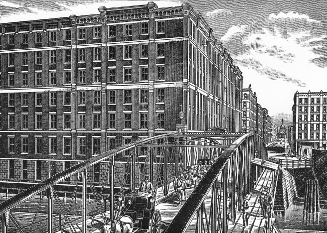
Some of the Bostonian financiers involved with the construction of the C&WI tracks into Chicago in the battle against Vanderbilt were also invested with the Chicago, Burlington, and Quincy. The CB&Q had originally been constructed as the next line west of Chicago for the Boston-owned Michigan Central consortium. But then Cornelius Vanderbilt had cleverly taken over control of the MC, forcing the CB&Q to find a new line to the East. While the CB&Q’s Boston investors still were involved with the new C&WI as it laid its racks to Chicago, the CB&Q had joined with Thomas Scott’s Pennsylvania as its new route to the East. On April 7, 1874, the CB&Q and the PRR joined with Timothy Blackstone’s Chicago & Alton, and Alexander Mitchell’s Milwaukee Road to finally build the grand station that Ogden had originally tried to build along the west bank of the South Branch prior to the start of the Civil War, to replace the small station that Ogden had helped to build for his Pittsburgh, Fort Wayne, and Chicago Railroad (that was eventually merged into the PRR) located along the west bank of the South Branch of the river, on the south side of Adams. While the station had survived the 1871 fire, the only station to have done so, it was badly in need of repair and undersized to serve these four major roads. Although Ogden had built the original station, he had also made mortal enemies of Mitchell’s Milwaukee (see Vol. I) as well as the CB&Q (that had been forced by Ogden’s Chicago & NorthWestern in 1864 to build their own tracks into Chicago) and both harbored a deep-seated distrust of the C&NW.
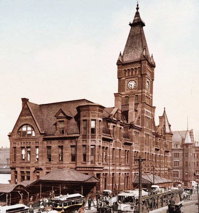
By 1874, however, Ogden was out of the management of the C&NW and while some political realignments had occurred, neither the Milwaukee nor the Burlington had any interest in using the NorthWestern’s station (that had been destroyed by the fire) and so joined forces with the PRR and the Alton to build the Union Station on the east side Canal Street, between Monroe and Adams (directly north of the existing PFW&C station so as not to disrupt operations).
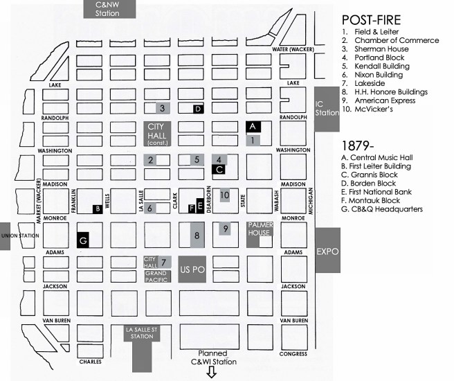
The new station was actually two stations built back-to-back: the CB&Q and the Milwaukee coming in from the north, while the Alton and the PRR came in from the south. Somewhat revealing, both these lines as well as the C&NW had chosen Boyington to design their post-fire stations, testifying to his professional reputation as Chicago’s premiere architect at the time. When Union Station opened in 1880, it made the western bookend for the emerging Adams Street corridor whose eastern bookend was the Interstate Exposition Building (that had also been designed by Boyington).
During the construction of Union Station, Root had fallen in love and married Mary (Minnie) Louise Walker on January 15, 1880 (see Sec. 1.18). Minnie was the daughter of James Monroe Walker who at the time had been the president of the Stockyards since 1873 (by this time Burnham’s father-in-law, John B. Sherman was its vice-president). In 1855 Walker had become the General Solicitor for the Burlington, becoming its president between 1871 and 1876, and then having returned to being its General Solicitor by the time Root met his daughter. Although Minnie had contracted tuberculosis after the engagement and died on February 22, only six weeks after the wedding, Root had continued to live with his in-laws for a while.
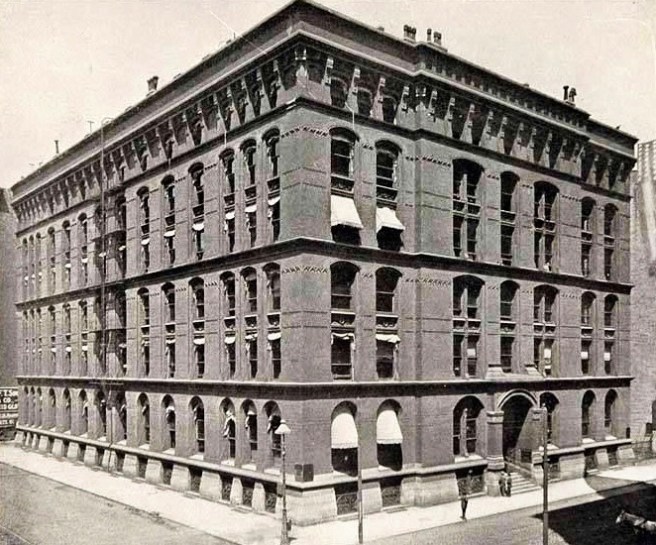
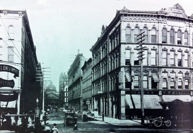
With the completion of the new Union Station in late 1880, the Burlington’s management had decided to move their headquarters closer to their new station from their pre-fire location at 2 S. Water Street to the northeast corner of Adams and Franklin Streets, only two blocks east of the Adams Street bridge. Root’s father-in-law, in good Bostonian tradition, made sure that business stayed “in the family” by having the design of the new headquarters awarded to Burnham & Root. Therefore, while Root was being forced to economize at every detail by Boston’s Peter Brooks, his obvious frustration was being more than compensated with the design during the same period of what was to be one of Chicago’s larger and more expensive buildings for another of the firm’s Boston’s connections. (What is intriguing to me is the relations between the Bostonian Brookses and the CB&Q’s John Murray Forbes that go back to the early China trade.)

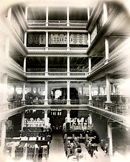
As opposed to Burnham & Root’s previous two office projects that were interior slices of a Chicago block, the Burlington handed them an entire free-standing corner site: 122′ on Adams and an extremely long 176′ frontage on Franklin Street. The size of the site was large enough that even after Root had wrapped the perimeter of the site on all four sides with single-loaded office space, an internal volume with the dimensions of 55′ x 75′ x 120′ high (for comparison, the Rookery’s atrium measures 62′ by 71′) still remained in the center of the lot, a situation similar to what Stephen Hatch had faced in the Boreel Building in New York two years earlier and what George Post was then designing in the Produce Exchange. This allowed Root to continue his development of the interior spatial composition within office buildings that he had initiated with the Grannis Block. The size of Root’s atrium overtook that of the six-story atrium in Marshall Field’s store (38′ x 68′). One entered the massive, rather dark exterior ascending a stairway flanked by polished red granite square columns. Proceeding past the building’s famous wrought iron gates (that echoed Post’s Mills Building gate), one entered a single-story vestibule whose vertical compression heightened the sense of explosion into the light-filled, airy six-story high courtyard.

Unlike the relatively narrow interior lightwells of the Grannis Block or the Grand Pacific Hotel’s lobby that was of a similar size but its skylight had to be brought down to the second level because Boyington had surrounded it with a double-loaded corridor of hotel rooms above that required daylight and fresh air, the Burlington’s atrium was actually a large, interior room unto itself, very much like the six-story atrium in the Boreel Building or the seven-story atrium in San Francisco’s Palace Hotel. A glass and iron skylight enclosed the atrium above the sixth floor, allowing daylight not only to flood into the courtyard, but also to assist in lighting the floor space immediately adjacent to the atrium’s bearing walls via glass in the office doors and transoms, that permitted a greater depth from the exterior wall in the design of the offices than was typical for the period.

Root’s design of the Burlington’s atrium was the first attempt in Chicago to match the grandeur of the Palace Hotel’s Grand Court designed over ten years earlier. When we compare the dimensions of the two spaces, the Grand Court was 84′ by 144′ (vs. 55′ x 75′) by seven stories tall, almost twice as long as the Burlington’s, and at least one floor higher, we find that Chicago still had a long ways to go to match what San Francisco had enjoyed for the past decade while Chicago had fought to rebuild after the fire. (I also need to include Post’s Produce Exchange although it did not sport the numerous balconies of these other courts, its 64’ height does put it in the same league, especially when its dimensions of 134’ x 215’ dwarfed either of the other spaces.) No photos of the Burlington’s atrium have survived, so in order to get a better feel for what Root had accomplished in the Burlington’s atrium, the photos of the Grand Court must suffice.

However, if it was height one was looking for, the tallest atrium in the U.S. at this time I believe was the 120 feet tall central atrium in James McLaughlin’s Shillito’s Store in Cincinnati. In fact, its 58′ diameter was larger than the width of the Burlington’s atrium (55′ x 75′).
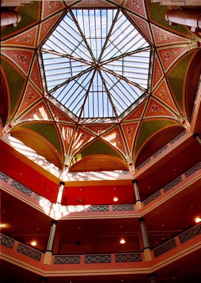
The theme of light, reflections, and openness pervaded Root’s detailing of the atrium. The walls were painted white, echoing the white marble used to pave the floor. The gallery-corridors were cantilevered from the bearing walls, appearing to float effortlessly within the space. The effect was heightened by a lightweight wrought iron railing supported on uprights of polished Georgian pine and butternut. The entire space was activated by the movement of three elevators, designed to thrill even the most hardened businessman. The cabs had no shafts but were walled in plate glass and mirrors, their sense of vertical movement culminating Root’s symphony of space. As opposed to the frugal planning and pragmatic image of the Montauk Block, the Burlington Building in its totality was, indeed, a “suitable architectural expression of a great and stable railway corporation,” appropriate for one of the leading companies in an industry founded on movement and technical evolution. Root’s ability to integrate a building’s technical systems within his compositional scheme also saw the potential of the atrium to aid in the heating of the Burlington Building. He used it as a large pressurized plenum to supply warmed air to all of the offices. Fans were used to draw outside air past radiators where it was warmed and then ducted to the court. As the warmed air naturally rose, it was forced into the offices by the positive pressure provided by the fans.
The site not only contained four times the area of the Montauk and was over twice the size of the Grannis Block, but, more importantly, also offered the opportunity for the design of two street fronts with a combined length almost 300.’ Root was not bound by Brooks’ tight-fisted budget, and as such, the Burlington Building would be Root’s first, unrestricted design of a large, commercial building. Root continued his exploration of the aesthetics of the red brick box, and although he designed both the Montauk and the Burlington during the same year, he was much more successful in the overall composition of the Burlington Building. Instead of being forced to merely “decorate” Brooks’ “building” in an attempt to make it look architectural, Root had the opportunity to design a building that would be appropriately symbolic as the headquarters for a very important company. Commerce, in an urban setting, was the idea. And historically, what better precedent was there for such building than the Florentine palazzo?!

As the Burlington Building was intended only for the use of the company, there was no need for two “ground” floors for rentable occupancies, so the bush-hammered Bedford limestone base was relegated to housing the smaller upper windows of the basement. The six stories of the building were again wrapped in a red St. Louis pressed brick body placed on the battered stone base. As opposed to the Montauk Block, Root’s use of the multistory arcade this time was given dominance over the expression of each floor, as continuous sillcourses were located only where they reinforced the 1:2:2:1 horizontal layering of the arcades. The ground floor was expressed as an independent entity, including the use of the only semicircular arches in the facade), while the repetitive floors from two through five were articulated as two, two-story layers (the only difference between them being a different pattern in the intermediate terra cotta spandrels) with the multistory arcade and sillcourse devices. Nonetheless, Root still felt compelled to express the existence of each floor on the exterior, so while he had eliminated the sillcourse at the intermediate third and fifth floors, he replaced these with their “shadows,” terra cotta bands within the plane of the brickwork at the floor locations (echoing how Stephen Hatch had detailed this location in the Boreel Building).
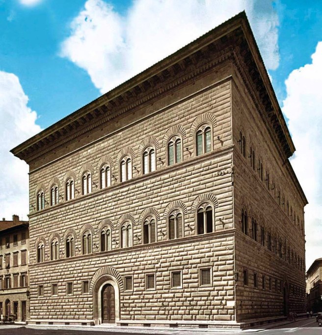
The sixth floor capped the composition with its smaller windows (that were not related to the spacing of the inline windows beneath, thereby giving this layer a distinct horizontal cap to the elevation) worked into a bracketed cornice that was topped with a tall parapet wall that allowed a comparison of the design of the Burlington Building to that of the Palazzo Strozzi in Florence. A more likely precedent, however, much closer to Chicago would have been the crisp box-like form and monochrome palette of Post’s Produce Exchange. The bottomline is: as opposed to the Montauk Block where Root had been forced into a flat-roofed box, in the Burlington Building he consciously had chosen the more reposeful flat roof of the brick box, rather than continuing to blithely design picturesque roofs as he had done with the Grannis Block.

Completely opposite of Post’s elevations that employed a repetitive bay within each dominant horizontal layer, however, Root articulated both of his elevations vertically into thirds: the Adams front having its three central bays projected to emphasize the entrance, as well as to express on the exterior the building’s interior section that comprised a central atrium flanked on both sides by the tiers of single-loaded office corridors. He reinforced the center’s visual dominance with paired windows to either side of the entrance bay. The Franklin Street facade, without an entrance, was detailed as one continuous plane, its articulation in thirds being achieved by an inversion of the Adams façade: ‘negative’ corner pavilions were formed by combining the end three windows at both corners into arcades. The inversion between the two facades was even carried into how each elevation read: while the projected central pavilion of the Adams elevation gave it a vertical accent, the unbroken plane of the Franklin elevation read horizontally. A neat trick attesting to his ability to synthesize elementally opposing forces/ideas.
Root’s concern for the building to be perceived as a volume or mass, as opposed to an assembly of planes, was evident in the detailing of the end piers that turned the corner without a vertical terminating edge (quarter-rounded bricks were probably used at this point to achieve surface continuity). The mass of the walls was further expressed by the deep recess of the windows and the corresponding detailing of their jambs (that also most likely incorporated the rounded brick). As opposed to the strong, horizontal accent of the Produce Exchange’s elevations, Root’s elevations had resulted in a successful synthesis of horizontal and vertical elements.
And once I again, I look for the reported Gothic Revival in this building and find none. Quite frankly, I believe I have shown the thesis that Root’s early buildings were Gothic Revival to be an erroneous, rather simplistic construction. It is also a stretch to label the building “Romanesque Revival” for only the first floor has semicircular windows. (So one might honestly say that it is 16% Romanesque.) What we have here in the Burlington Building is Root beginning to gain his confidence with the design of a large building. If we need to give its style an historical label, probably “Renaissance Revival” would be the most accurate, in at least its overall massing and bracketed cornice that speak to Florence in the 15th century. But the segmental arches and monochromatic palette still speak of the Néo-Grec. However, Root has not carved the openings into the plane of bricks as he had done in the Grannis Block. Instead, he has softened the edges of the openings, beginning to express the plasticity of the building’s mass. No, this is not Gothic Revival nor Néo-Grec nor Renaissance Revival; this is the synthesis of details with design and materials that we could call Root.
6.9. THE CALUMET CLUB HOUSE

Root was not a slave to the cubic aesthetic of the contemporary red brick box, however, for his primary concern was not the imposition of a uniform language in all or even in each of his buildings, but in finding an appropriate (symbolic) architectural expression for a given project. This is quite evident in the design of the Calumet Club, the third major commission Burnham & Root received in early 1881, that paralleled the design of the Montauk and Burlington Buildings. In fact, one can measure Burnham & Root’s ascendency to the top tier of Chicago’s architectural community at this time, for these three buildings represented three of the four most expensive buildings erected in Chicago in 1881 (only the First National Bank escaped their boards). Root chose to give the Club, located at the northeast corner of Michigan Avenue and 20th Street, a more picturesque massing, i.e., Queen Anne massing, to impart to it a domestic appearance appropriate for its use as well as its location in an upper-class, residential neighborhood. He even oversized the windows and details in an attempt to retain the residential image for the large (82′ x 160′) building. Although he had eschewed the polychrome of the Queen Anne, retained the red pressed brick body and stone base language of his other two buildings for the lower three floors, the fourth floor was worked into a steep slate hip roof that was punctured by a variety of dormers and chimneys. The tourelle that Root placed on the corner of the building again reveals his attention to current events in New York, especially to the designs by Hunt: an homage to Hunt’s the William K. Vanderbilt (the middle son of the “Commodore”) house in Vanderbilt Row along Fifth Avenue, the most expensive house ever constructed in America, then well on its way to completion. Completed in late 1882 with a final price tag of over $3 million (Potter Palmer had spent $3.2 million only eight years earlier building the entire Palmer House), it was renowned as being the most expensive house ever built in the U.S. up to this time.

What I stated at the beginning of this section bears repeating: summarizing the design of Root’s first four major projects in the new decade, it is quite obvious that Root’s primary concern was not the imposition of a uniform language (i.e., neither the Gothic nor the Romanesque Revival) in all or even in each of his buildings, but in finding either an appropriate (symbolic) or a thematic architectural expression for a given project. This was the primary artistic challenge (his plot, if you will) that he would set for himself in each of his works.
FURTHER READING:
Hoffmann, Donald. The Architecture of John Wellborn Root. Baltimore: Johns Hopkins University Press, 1973.
(If you have any questions or suggestions, please feel free to eMail me at: thearchitectureprofessor@gmail.com)
