
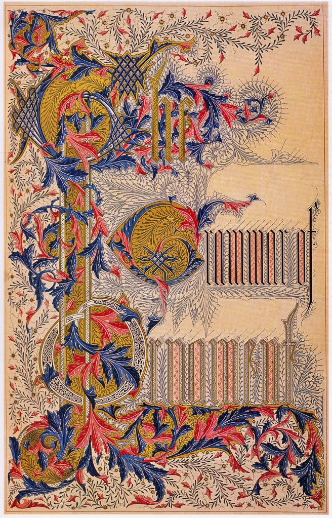
Returning to the criticism of Sullivan’s color palette above by some of Moody’s congregation as well as that by the critic of Sullivan’s color palette in the interior of the Grand Opera House who had described it as “garish,” I am reminded of the similar controversy in early 1851 that surrounded the color palette proposed by Owen Jones in 1851 for the interior of the Crystal Palace. We can trace the interest in color in both of Root and Sullivan back to Owen Jones and his Grammar of Ornament, as well as to his polychromed interiors in his mature building designs of the late 1850s. I have discussed the work of Jones in Volume One, but as it is on Instagram (#38/39), permit me to recapitulate the important aspects of his works for this blog. Jones, who afterwards went on to write and publish The Grammar of Ornament in 1856, had been put in charge by the Director of the Fair, Henry Cole (see Vol. 1) of the interior design of Paxton’s glass building, including the colors that the building’s iron structure was to be painted. While the main nave of the palace was to be covered with a glass barrel vault in order to permit sufficient daylight to penetrate for the health of the existing trees that were required to remain during the Fair, the rest of the horizontal glass roof was to be covered in calico canvas in order to reduce the heat gain.
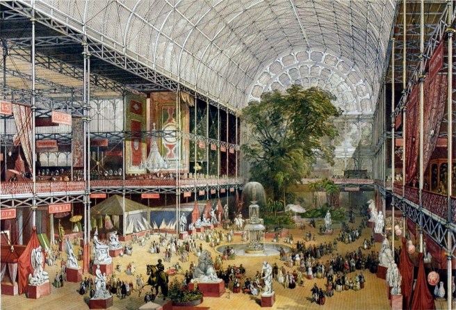
Jones believed that the light penetrating the calico would be deadly in the interior because it would be uniformly diffused, and, therefore, if the iron structure was painted white (typically like the interior of a greenhouse so that light can be reflected to the plants) the building’s structure would appear flat and muddled.
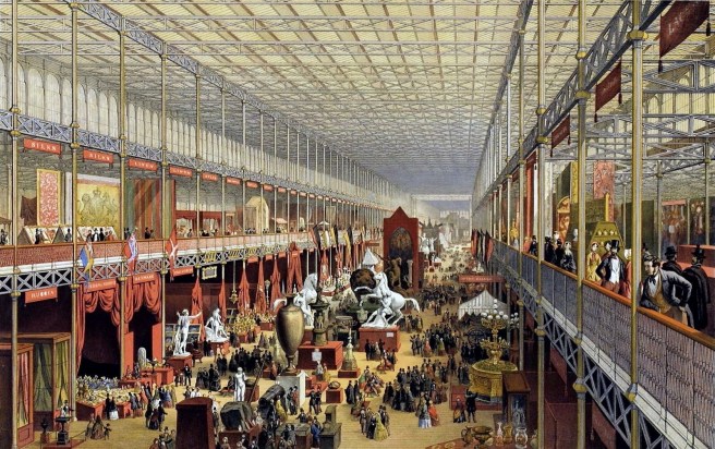
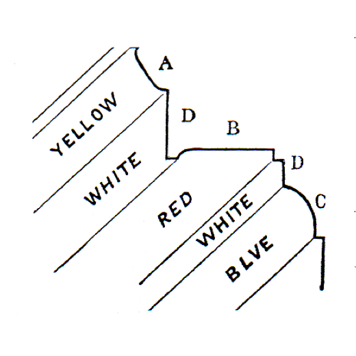
He wanted to give the interior some depth and life, or what he referred to as a “bloom of color” and so developed the following palette of primary colors based on his understanding of the latest scientific theories of color: horizontal surfaces were painted red, any convex surface that was projecting out at you he accented with yellow, while any concave surface that receded was given a cool blue, and white was used for all vertical surfaces. Once critics heard of the plan they cried out (as had Chicago’s critics after their first sight of Sullivan’s early interiors) in disbelief: “you are putting make-up on it like a prostitute!” Jones, however, had the confidence of Cole who had the ear of Prince Albert, and the plan went ahead successfully. Jones was vindicated when people viewed the interior and the “bloom of color” he had achieved with his scientific use of primary colors.
I have already mentioned the influence that Jones had had on Sullivan’s early work. I also stated that Jones had also made a significant impact on Root’s work and ideas as well. In fact, Root incorporated Jones’ idea of the “bloom of color” in two of his early articles in Inland Architect: “The Art of Pure Color” in the August 1883 issue and “Architectural Ornamentation” in the April 1885 issue where he stated:
“In large buildings the use of several colors should be less violent, so that while the general tone may be deep and full as we can make it, the variations of color are subtle and are obtained through gradations instead of contrasts… Probably no higher art exists than this: to produce in a great building that wonderful bloom obtained by mosaics of pure color.”
One wonders whether Root’s first article In the June 1883 was a defense of Sullivan’s “unorthodox” palette of interior colors in the above-mentioned theaters or a reaction to it (I think it is the latter, given Root’s preference for gradations over adjacent contrasts), or if he simply felt the urge at that moment to bring the issue to the attention of his fellow western architects. While Sullivan was incorporating color in his interiors, Root was proposing its use on his exteriors.

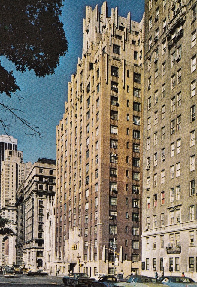
He had first proposed it for the Rialto Building in 1883 (see Sec. 7.14) apparently in an attempt to reinforce the verticality of the piers by varying the color of the brick from dark at the base to light at the top, reinforcing the sense of visual perspective. (The following year he would later attempt to use this detail also in the Monadnock, but to no avail. This technique would, however, eventually be used in the upper portions of Art Deco skyscrapers.)
In “The Art of Pure Color,” Root also cited ideas and works by Ruskin:
“Ruskin, a few years ago, called attention to the fact that in nature color was not applied according to the rules which were recognized in form; that the color of objects in nature was rarely coincident with their form, but generally overload it in waves and flamings, without any consideration to the outlines of the object decorated by it.”
Root was attempting to transcend Victorian “structural” polychromy, that is achieving color in a building’s façade using “truthful” real materials, with “applied” polychromy, quoting Ruskin’s idea that color in nature is independent of form. He also cited paintings by J.M.W. Turner, Jean-Baptiste-Camille Corot, as well as Americans James Whistler (with whom Jenney had palled around with in Paris during the late 1850s), George Innis, Louis Comfort Tiffany and John La Farge:
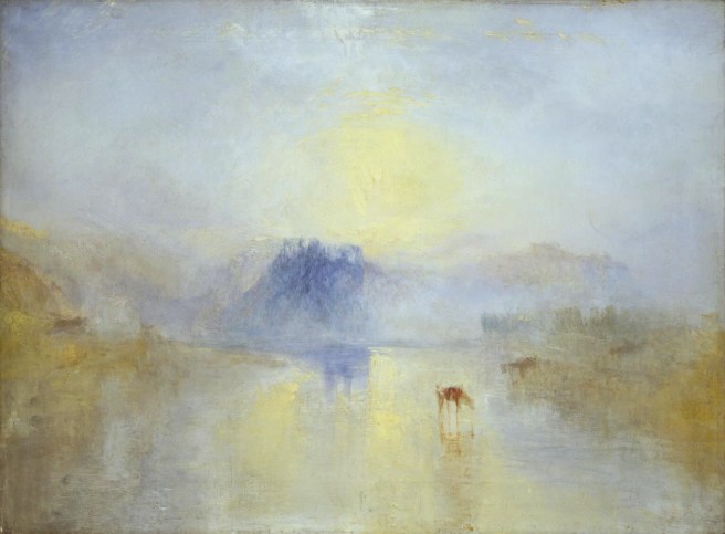
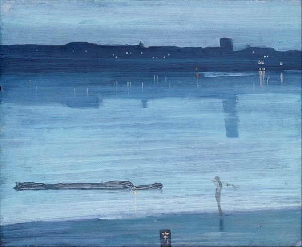
“This development from an art based upon simple need to one of pure emotion…by emotion, I mean sensations which are elemental, which, as I shall point out, we share with the greater part of all creation. Intelligence, I use to mean either immediate cognition, or sensations resulting from personal experience. It is in these senses that, in painting, form appeals directly to the mind, color to the emotions, just as in an oratorio or opera the mind is directly interested in the words, while the emotions are more moved by the music… [Whistler] was able to translate into pigments effects which were in their nature too vague to be drawn… When Turner first flung upon canvas the full chaotic strength of his wonderful palette, all the art world thought the graceful water-colorist had gone mad… Even after Turner had worked his miracles on them, they were not yet whole, seeing “men only as trees walking,” but they had been led toward sight, and could at least see enough to know that all sky was not blue, nor all grass green… Till within a few years color has been the most servile of handmaids…, it was entirely subordinate, being at no point recognized as a thing itself, but always as a slave to something else…” [Wassily Kandinsky’s essay “On the Spiritual in Art” was still some 26 years in the future.]
“The new art, whose birth is so recent that its voice is as yet inarticulate and almost unheard, is the art of pure color…Fancy, then, a group of optical instruments, each capable of producing a given color in all intensities and in larger or smaller masses; or fancy one composite instrument-like the organ; played by a single performer (remember Root was an accomplished organist). There is no musical effect now produced by the orchestra which would not have an analogous color effect produced by these instruments….(this is the phrase that made me suspect that Root had a touch of synesthesia like Kandinsky). Out of this chaos of color the new art will arise as great as music itself. Then will come the complete unification of the arts [gesamtkunstwerk] for which [Richard] Wagner labored, when we may hear “Coriolanus” acted, while to the reds and yellow of brasses, the greens of oboes and flageolets, the violets of ‘cellos and the blues of violins in Beethoven’s overture, will be added that symphony of color which another Beethoven has written to the same theme.”

FURTHER READING:
Flores, Carol A. Hrvol. Owen Jones. New York: Rizzoli, 2006.
(If you have any questions or suggestions, please feel free to eMail me at: thearchitectureprofessor@gmail.com)
