
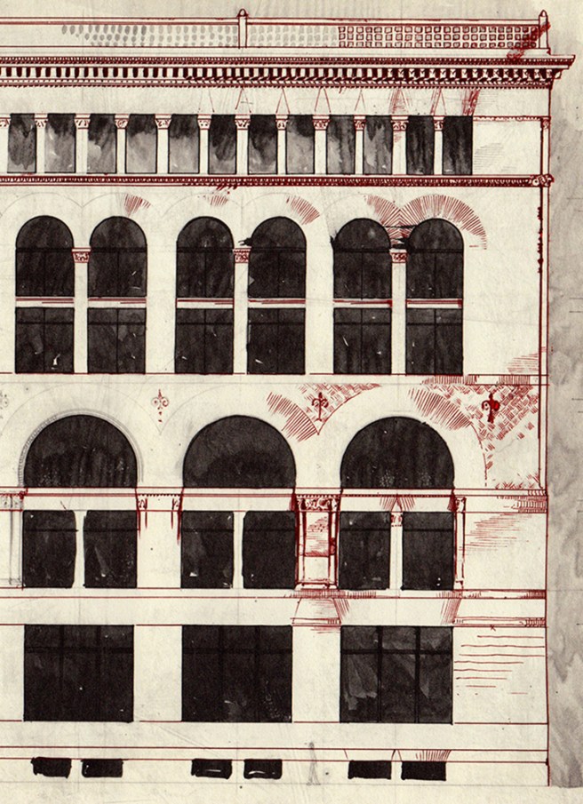
A very detailed elevational study by Richardson shows what he would have liked to have accomplished had he been given a bigger budget and been allowed to use brick. Like the Burlington, this design had a stone base with small basement lights, except Richardson saw Root’s error in making only the basement of stone (which became evident at the entrance where the stone and brick met in an awkward junction), and so allowed the stone piers to extend into the first floor to better frame the entrance. Brick flat arches capped the stone piers and made the transition to the brick body above. The second and third floors were grouped together by a large span, two-story arcade. The corners of the arcade’s piers were softened with engaged columns, while the edges of the underside of the arches were similarly rounded with ornamental terra cotta. The fourth and fifth floors were also grouped into one layer by a two-story arcade whose span was half of those below it so that now there were two arches within the original bay. These were also trimmed in terra cotta. A thinner intermediate pier (it may have been a column) supported the arches between the major piers of the bay, so that an alternating A:B:A:B rhythm articulated the major and minor piers within this range. The sixth floor was then boldly opened up, the cornice being supported by alternating thicker piers, marking the primary and secondary bays, and thinner columns marking the tertiary bays.
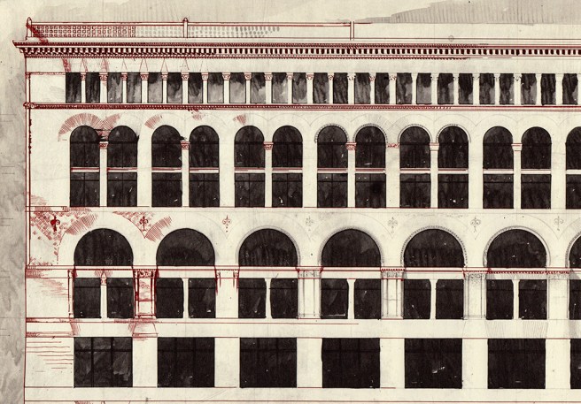
Although Richardson had used the device of the layered progression of decreasing arcades in other commercial buildings, the resemblance of this particular study to a design by Root, that I have yet to mention in relation with the Field Store, is quite striking. During Richardson’s two trips to Chicago in 1885 (in May to interview the Glessners, and in October to sign contracts for the Field Store) Root’s redesign of the burned Grannis Block was under construction. Root had added to the surviving exterior a new layer of three floors. While he kept the spacing between the piers of the lower section, he increased the number of mullions inserted in between the piers from one in the surviving portion to two that he also reinforced by correspondingly increasing the number of arches in the layer’s arcade from two to three. (Of course, this just countered what I had just claimed that Root had avoided in his designs, that is decreasing the size of the windows in the upper stories of his buildings. However, while he had increased the number of windows, he did this solely by inserting an extra mullion while the overall size of the opening between the piers remained the same as those below, so there was little reduction in daylight.) This addition not only established a 1:2:3 progression in the layered arcades in the elevation, but also replaced the picturesque roofline with a flat roof. It is the arcades in floors two through five that bore a remarkable likeness to what Richardson was experimenting with in this sketch, right down to the reuse of wrought iron fleurs-de-lis anchorheads.
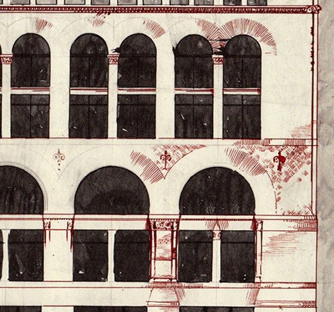
Comparing Richardson’s study with Root’s early ten-story study for the Rookery, two important differences are evident. First, while Root was attempting to come to grips with the vertical scale of his skyscraper, by making as many vertical lines read continuous as possible, Richardson’s long, 325-foot wall was predestined to be horizontal. Therefore, he did not allow a vertical line to continue unbroken from one layer into the next. The piers which mark the major bays even decreased in size from the first layer to the second, and even more so at the top, in order to prevent them from reading as a continuous line. Even the structural mullions in the second floor were stopped from continuing into the arched windows of the third floor. This was a typical Richardson detail that would have been filled in with the standard triple window with minimized mullions (as was the final design), and definitely reveals the difference in emphasis from Root’s, where, in the same location, the spacing of the intermediate pier was continued into the arched window to establish his desired vertical continuity with the pier above.
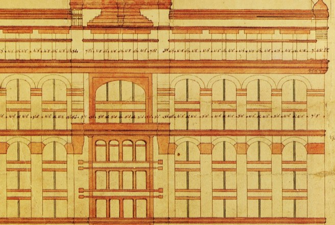
Meanwhile, the radical extent of the openness Richardson pursued in the top floor revealed that he was also looking at the work of another architect who had incorporated the layered arcade: George Post’s New York Produce Exchange. In fact, the base of the Produce Exchange bore a remarkable similarity to how Richardson had detailed the base in this study.

A comparison of the arcades in the two buildings, however, shows the difference in the intentions of the two designers. Although Richardson did not allow a vertical line to continue from one layer into the next (except at the edge of the corner piers), he always felt compelled to articulate the major bay or ‘measure’ of his rhythm by making the original, base piers in the upper layers larger than the newly-added, intermediate piers, so that the original bay could still be perceived. Post, on the other hand, treated each layer as an entity onto itself by keeping the width of each pier (while maintaining the centerline of the major piers) in a layer the same, thereby not emphasizing the major bay divisions in the upper arcades with wider piers. While Post’s Produce Exchange is solely horizontal to a fault, Richardson’s study exhibits an attempt to achieve a balance between the horizontal and vertical in the elevations.
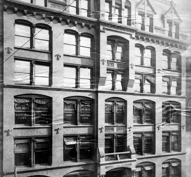
Although Richardson had probably received the Field Commission in June 1885, it was an unusually well-guarded secret, for news of Richardson’s involvement didn’t break in Chicago’s ‘booster’ press until September 30, when the Tribune first mentioned Richardson’s design. By October 11, Richardson was in Chicago to award contracts, staying in the Grand Pacific Hotel, across the street from the Insurance Exchange and next to the construction site of the Rookery. To be able to receive bids at this date, the design had to have been, for the most part, completed. This was confirmed by the accuracy of a description of the project published by the Tribune on October 25: “beauty will be one of the objects aimed at in the plans, but it will be the beauty of material and symmetry rather than of mere superficial ornamentation… It will be as plain as it can be made, the effects depending on the relations of the ‘voids and solids’…” Indeed, although Richardson’s original studies showed his characteristic ornamental trim, the realities of Field’s frugal purse had forced the architect to abandon all “mere superficial ornamentation.” Richardson, like Root with the Montauk Block, had no artistic choice but to depend “on the relations of the ‘voids and solids’ in the ‘plain’ elevation:” there was no budget for anything else.

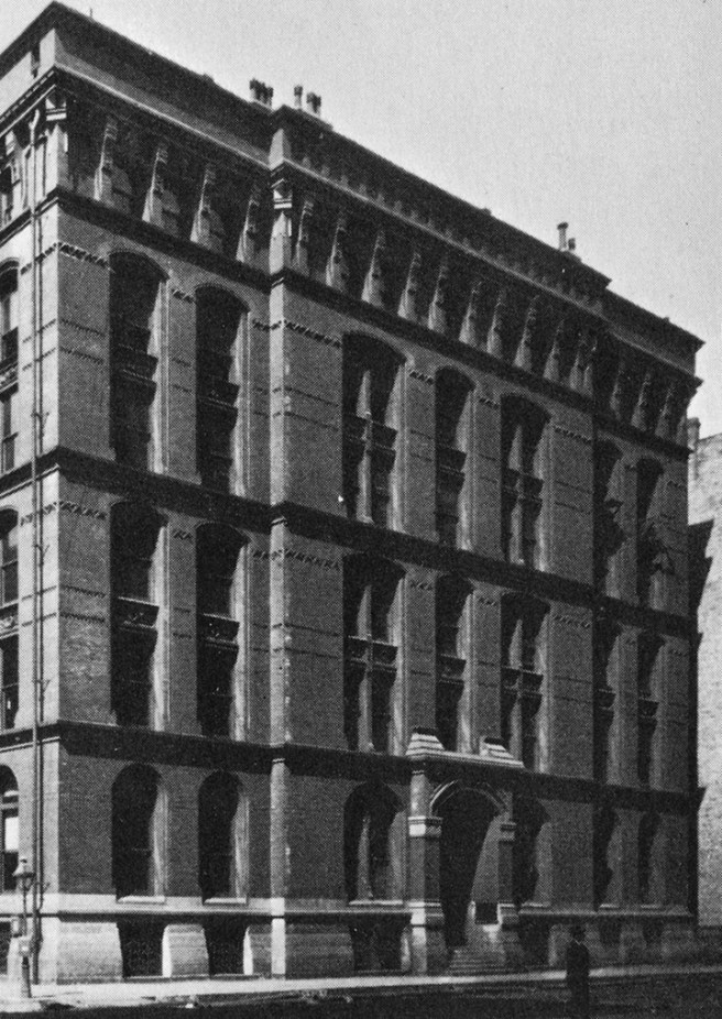
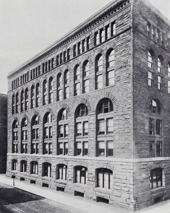
Fortunately for Richardson’s place in history, the program would eventually force an additional floor into the final design, increasing the height of the building to seven stories. This gave the elevation an extra floor that Richardson placed in the lower arcade, increasing its height to three stories. This now created a rhythm of 3:2:1 in the three layers above the base (the same rhythm that Root had used in the original 10-story design of the Rookery) resulting in a lighter facade with a better sense of false perspective than the squatter 2:2:1 sequence of the early studies. The windows of the first floor and basement were cut into a battered base that consisted of a brick bearing wall that was veneered with rock-faced Missouri red granite, laid in even courses.
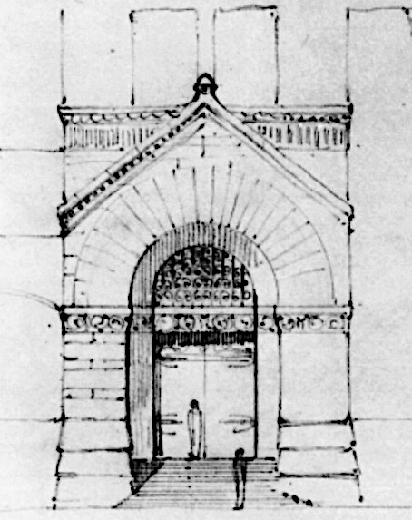
The tight budget also prohibited any lavish celebration of entry. In the center bay of the long Adams Street elevation, he was forced, of course, to eliminate the lintel between the basement and first floor so one could physically enter the building. To reinforce the sense of entry, he inverted the segmental arch that spanned the other windows in the first floor, by placing a tapered lintel over the entry (this shape roughly approximates the bending stress distribution along the length the beam).
A smooth-surfaced, continuous sillcourse severely separated the granite base from the upper six floors of East Longmeadow (Massachusetts) red sandstone. A slightly projected sillcourse at the seventh floor separated the top story, with its squared-headed windows, from the arcaded middle section of the elevation. It was in this middle section that Richardson had achieved a breakthrough that would have a great impact on Chicago’s designers. Consistent with his evolving simplicity over the past three years, he completely eliminated the traditional projected sillcourse between the lower and the midrange arcades, permitting all five stories of windows in the middle section to exist within one unbroken wall surface, creating a continuous field within which he could cut the windows at will).
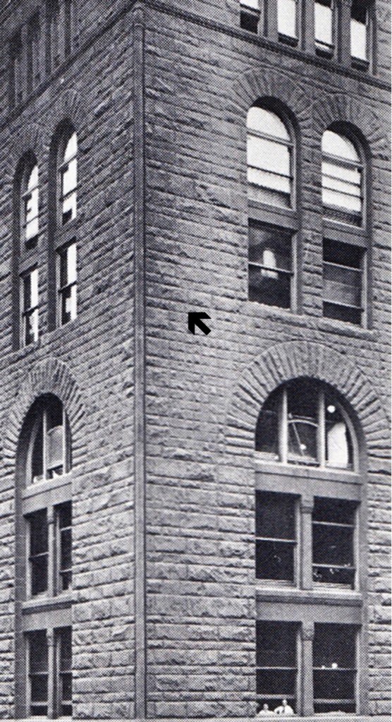

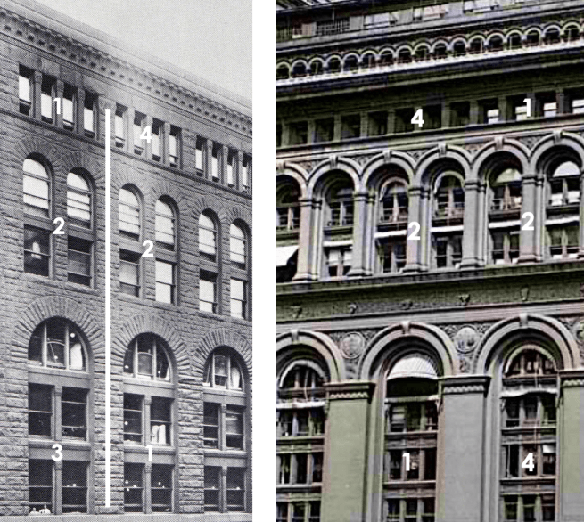
This was located in the middle of the elevation, framed at the top by the seventh floor, and at the bottom by the granite base. The continuity of the wall plane between the base and the top was accented and continued around the corner with an engaged column that stretched unbroken for five stories from the base to the top. The coursing in the top floor echoed the even spacing in the base, that further helped to set-off the middle which contained a variety of coursing techniques. The majority of the middle was coursed in alternating bands of thick and thin courses. This was modulated at every floor level (except at the fifth floor where he had eliminated the sillcourse) with an even thicker band that evoked the floor behind it.

In the final elevation of the Field Store, therefore, Richardson had succeeded at what had so far eluded Root’s grasp over the last four years: a straightforward expression of the continuity of function and volume in the repetitive floors located in the middle of his multistoried buildings. Richardson had jettisoned a superficial piece of horizontal trim in the Field Store and, thereby, had arrived at a tripartite elevation comprised of a base, middle, and a top, even though he had incorporated four ranges of arcades in the facade. This detail, and not the building’s boxlike form or “unornamented” exterior, was the paradigm-changing motif that impacted Chicago’s architects.
FURTHER READING:
O’Gorman, James F. Selected Drawings – H.H. Richardson and His Office. Cambridge, MA: Harvard University, 1974.
O’Gorman, James F. “The Marshall Field Whole Sale Store: Materials Towards a Monograph,” JSAH, Oct. 1978, pp. 175-194.
Ochsner, Jeffrey Karl. H.H. Richardson: Complete Architectural Works. Cambridge: MIT Press, 1982.
(If you have any questions or suggestions, please feel free to eMail me at: thearchitectureprofessor@gmail.com)
