
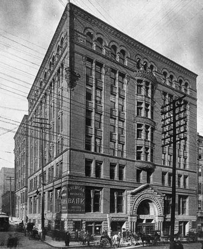
Immediately following Root’s return from Europe, the firm was commissioned by J. Foster Rhodes to design a new building in Kansas City for the American National Bank, for the northwest corner of Eighth and Delaware Streets. We need to keep our eyes open to see how Root’s trip influenced his post-Europe designs, similar to what we saw in Richardson’s post-Europe work. In this relatively small, eight-story office building, Root delivered one of his best performances to-date in the design of a commercial box. There can be little doubt that Root’s point of departure was Peabody & Stearns’ United Bank Building in New York (the last building George Fuller, then contractor for the Rookery, had designed/supervised prior to moving to Chicago).

Gone are the corner turrets of the United Bank Building as well as those of Root’s own medieval designs. It is the straightforward, relatively understated treatment of the two street elevations that reveal his maturing understanding of a commercial building.
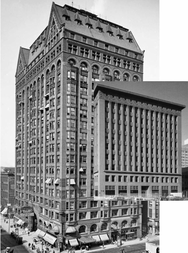
The elevations are divided into a 2:1:4:1 rhythm: two-story base (ground floor in rock-faced stone), one-story transition, four-story body, and one-story arcaded attic/cornice. These four horizontal fields are vertically woven vertically together with an implied single arcade across the face of the building: Root’s capricious mid-level arcade is gone. Also gone is the romantic geometric progression in the size of the windows: all the windows have the same width from the ground floor to the cornice. Both elevations were then framed by larger corner piers, that formally were required to buttress the thrusts of the arches of the arcade. The building’s corner sprouted a terra cotta flagpole that marked the building’s urban location.

The building’s entrance on Delaware was marked with a pedimented triumphal arch, almost a direct copy of the United Bank’s entry, that carried the stone of the ground floor into the second floor. This was the same entry design that Root had initially intended for the Board of Trade. This was reinforced in the center of the building by an oriel bay that carried the four floors of the middle level around it, similar to how he had detailed the entry elevation in the neighboring Midland Hotel, except that this time the oriel didn’t break the cornice. The oriel left enough space between it and the corner piers for a set of paired windows to either side of it.
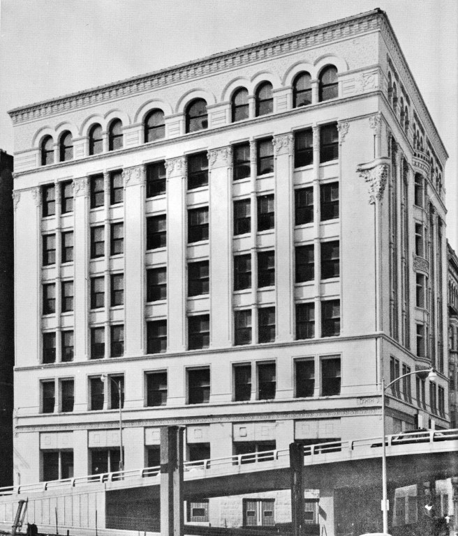
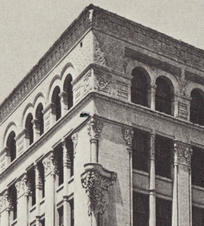
Meanwhile, the length of the Eighth Street elevation forced a slight variation: after spacing four sets of paired windows between the corner piers, Root filled in the remaining wall dimension in the middle with two ranks of larger windows framed by three piers whose widths were also slightly larger than those used in between the sets of paired windows. Using the same detail from the Midland Hotel, he also rounded the corner of each pier with a continuous colonette, imparting a plasticity and a shadow line which helped to visually reduce the width of the pier.
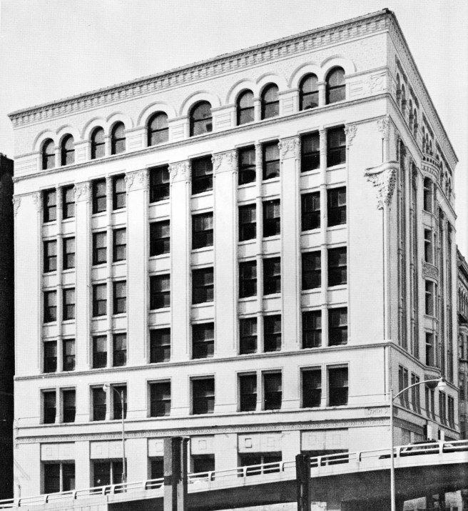

It is the four-story, unbroken piers that I find most interesting. This is the first building by Root that employs four-story tall piers. I take that back, it was his first constructed design with four-story piers, for he had already employed seven-story continuous piers in one of his early 1885 designs for the Monadnock Block. But it is not just the piers that are a first, it is also that Root made the mullions between the paired windows continuous, while recessing the spandrels in all three stories! When you compare the elevations above, the Bank’s continuous mullions override the spandrels’ potential horizontal offset to the vertical piers in the Monadnock. In fact, my eyes are more influenced by the thin continuous vertical mullions than the piers in imparting a definite vertical accent to the bank’s elevations. (I have included below a number of earlier Root designs for you to appreciate the subtle difference caused by this small detail.)
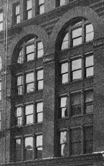
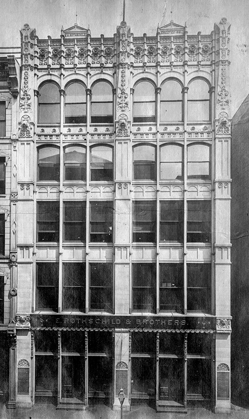

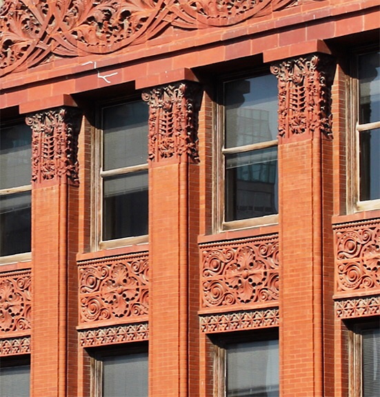
Some historians have postulated that Root’s use of this detail was influenced by Louis Sullivan’s use of this detail in a number of three-story portions of six-story storefronts he designed between 1881 and 1885 that I documented in Vol. 3, Sec. 10.23. I reviewed how the young Sullivan had experimented with this detail (above) in the Rothschild Store in 1881, the three-story portions in the six-story Revell Building and the three-story bay windows in the Ryerson Building). This detail, used in conjunction to the adjacent continuously vertical piers had imparted to these elevations a marked vertical accent.
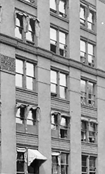
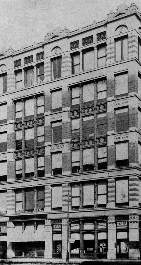
Curiously, in the Troescher Building, the last of this series by Sullivan prior to the Auditorium commission, he did not continue the mullions in front of the spandrels, but positioned them in between the spandrels, allowing the spandrels to create a counterbalancing horizontal accent to the verticality of the four-story continuous piers. More than likely, it was the broader horizontal dimension of this building that favored this solution.
I have always doubted the claim by some Sullivan scholars that Sullivan was the first to arrive at the ”vertical’ solution for the elevation of a skyscraper in his December 1890 design of the 10-story Wainwright Building in St. Louis, in which the unbroken piers extend continuous for all of seven stories (the same height that Root had used five years earlier in the 1885 version of the Monadnock Block. But if we really want to give credit to where credit is due, we need to remember that even earlier George Edbrooke in 1883 had used five-story piers in the Adams Express Building and seven-storied pilasters in the Hiram Sibley Warehouse.


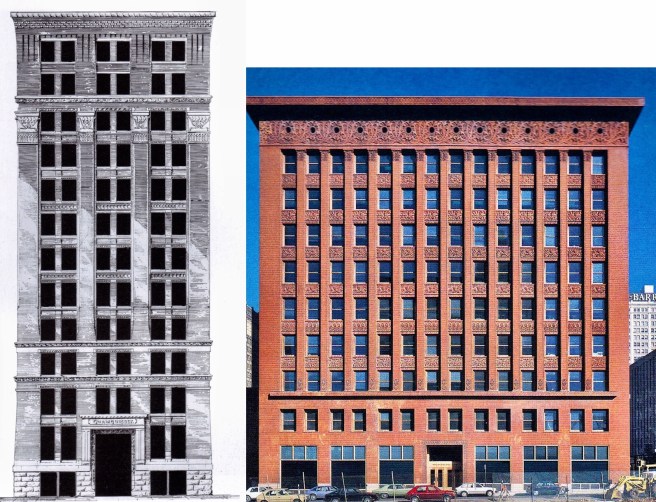
The Wainwright story completely ignores the fact that Root had incorporated 12-story high piers (in which the entire Wainwright Building could easily be placed with two stories to spare) in his early 1890 design for the 20-story Masonic Temple.
In fact, if we compare Root’s design of the piers in the Eighth Street elevation of the Bank, with Sullivan’s piers in the Wainwright, designed four years later, they seem remarkable similar… (Let’s not forget that both buildings were built in Missouri, meaning that while Root’s bank in far-off Kansas City was not well-known in Chicago, the St. Louis owner may well have been better acquainted with it. Root would be dead by the first publication of Sullivan’s design, but I’m getting ahead of my story…)

These four buildings in Kansas City (along with three houses) during the second half of 1886 and into 1887 were extremely important for Burnham & Root, as these contracts allowed them to keep their staff not only intact, that is, employed, but also provided continuity in their efforts to develop new design ideas and construction techniques during the construction slowdown Chicago in the aftermath of the Haymarket Affair.
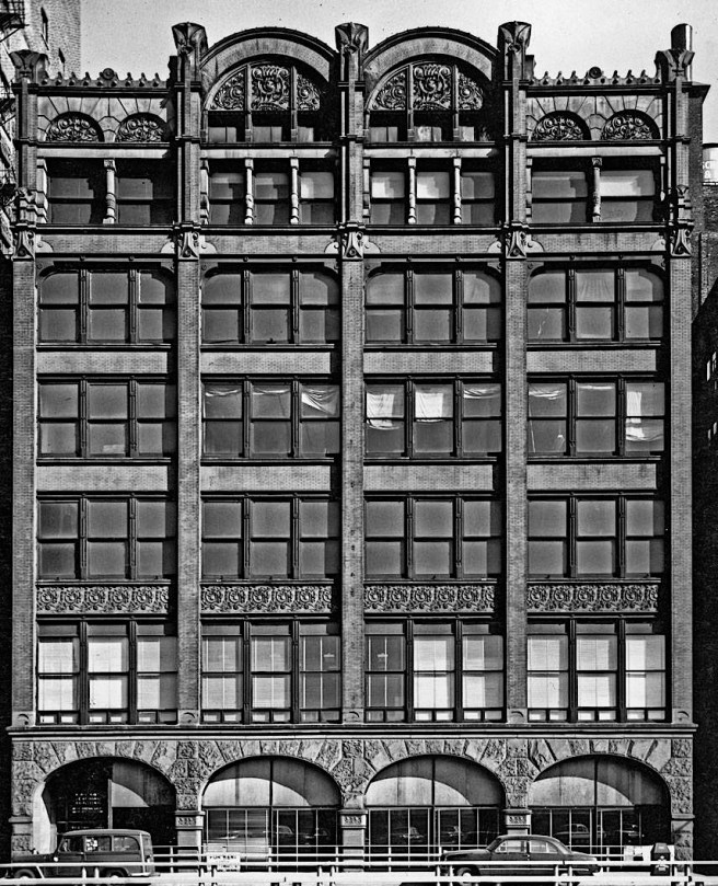
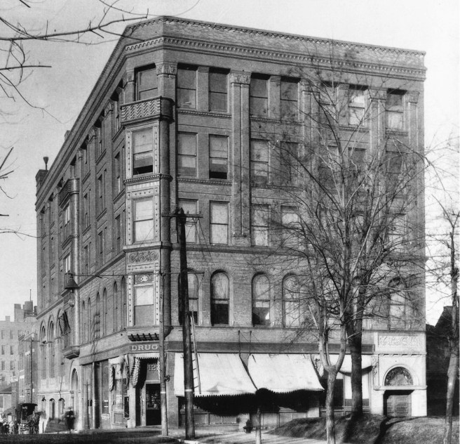
One footnote: below is a hard-to-find photo of the last of the four major buildings Burnham & Root designed in Chicago: the Kansas City YMCA. It seems obvious why it is hard to find…
FURTHER READING:
Hoffmann, Donald. The Architecture of John Wellborn Root. Baltimore: Johns Hopkins University Press, 1973.
Monroe, Harriet. John Wellborn Root; A Study of His Life and Work. Park Forest: Prairie School Press, 1966.
(If you have any questions or suggestions, please feel free to eMail me at: thearchitectureprofessor@gmail.com)
