11.23. THE FIELD STORE: FLOOR PLAN AND CONSTRUCTION

H.H. Richardson, Marshall Field Wholesale Store. Above: Preliminary first floor plan incorporating an interior atrium. (O’Gorman, Selected Drawings); Below: Final Ground Floor Plan. (Inland Architect, 1888)

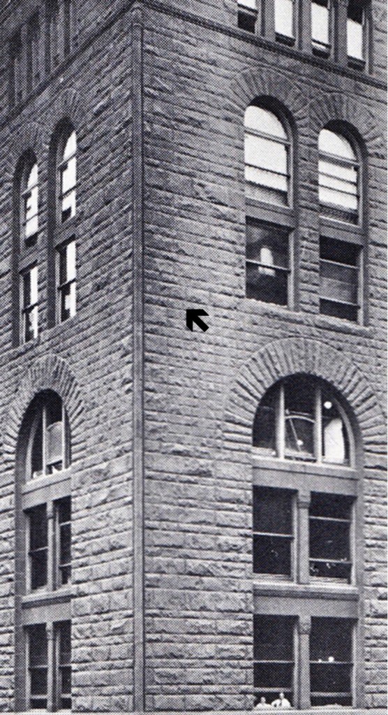
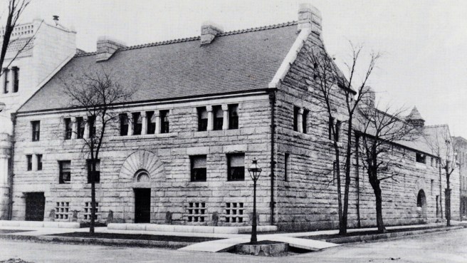
Field’s tight budget also forced Richardson to revise his initial floor plan.  The central skylighted atrium, along with its corresponding spatial complexity, was replaced with a more efficient plan that incorporated a loading dock at the rear of the building along Quincy.  This changed the plan from a hollow rectangle to an elongated U-shape by moving the floor area that was to have been under the skylight to the back of the building, thus forcing the floor at this perimeter location into the area where the atrium was to have been.  In order to replace the daylight lost from the elimination of the skylight, Richardson chose to design the rear elevation in back of the dock to be as open as possible, similar to how Root had just detailed the wall in back of the elevators in the Phoenix Building,  To save even more money, this wall appears to have been constructed only with brick (compare the arches in the Field wall vs. the Phoenix’s flat-headed iron grid).

Above: Marshall Field Wholesale Store, Rear Elevation along Quincy Street. (O’Gorman, JSAH, October 1978); Below: Burnham & Root, Phoenix Building. South(rear) elevation. (urbanremainschicago.com)

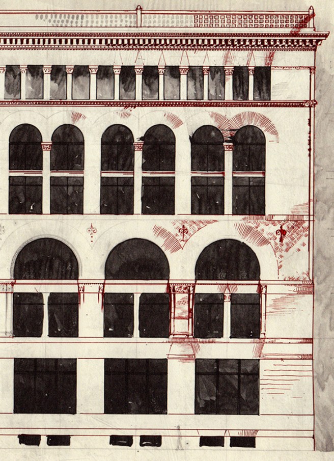
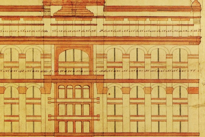
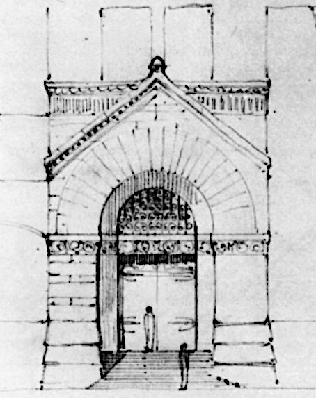
The loading dock was sheltered with a glass roof that may have been suspended from a cable that spanned between the two corners of the building. While this drawing shows such a system, no photograph exists that would confirm this detail.

Above: Drawing showing suspension system for the glass roof covering the loading dock. (O’Gorman, JSAH, October 1978); Below: Field Wholesale Store. Loading dock. Columns to support the open end would have inhibited movement so either the glass roof was, indeed, supported from a cable above or a deep truss system. (Ochsner, Richardson)

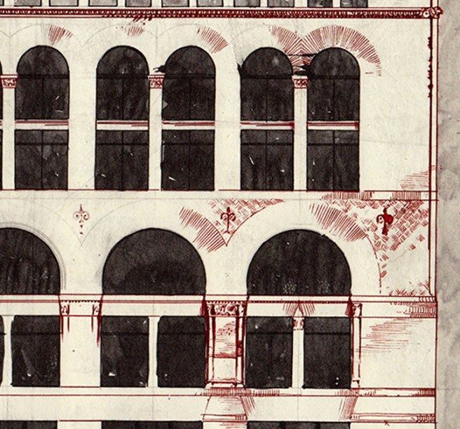
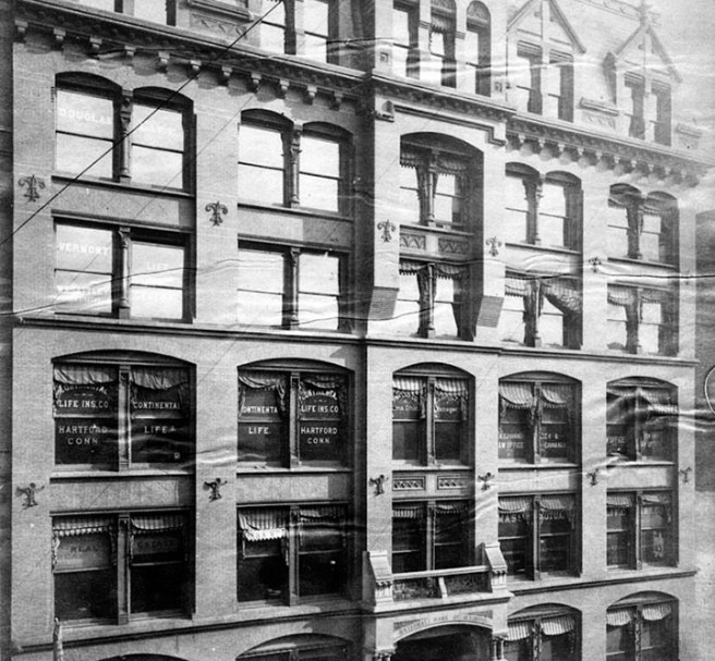
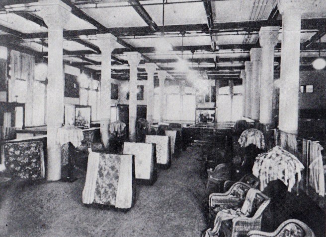
The spatial sequence of the store’s final plan was further simplified with two continuous, full-height walls that extended from the indentation of the loading dock, breaking the building into three vertical zones.  Within the huge floor area, the walls provided firebreaks that would compartmentalize the building to help to contain the spread of fire.  Field had been the victim of too many fires not to have been overly-cautious in the design of his new store.  Every window was provided with an iron fire shutter that was located on the interior side of each window.  Although the cast iron columns, protected with terra cotta casings, were used to support the first three floors, heavy timber mill framing was used in all the floors and for the columns in the four upper floors. 

Marshall Field Wholesale Store. Packing Department at the Eighth Floor. Note the timber columns. (Ochsner, Richardson)

Historians have speculated a number of reasons for Richardson’s use of timber in 1885.  First, this may have been simply a budget issue.  More likely, once again we must remember that Field had suffered significant losses due to fire, starting of course with the 1871 fire, and he would have demanded a tried-and-true system.  Such a system, we saw in Sec. 3.18 had been championed by Boston’s own Edward Atkinson of the Massachusetts Manufacturers’ Mutual Insurance Company, the same timber system that Peter Wight’s porous terra cotta casings with iron columns had proven equal to in the Boston Society of Architects tests only three and a half years earlier in November 1881.  I have noted a number of times that Atkinson was a neighbor of Richardson’s in suburban Brookline, and so one could believe that Atkinson may have played a role in this decision.

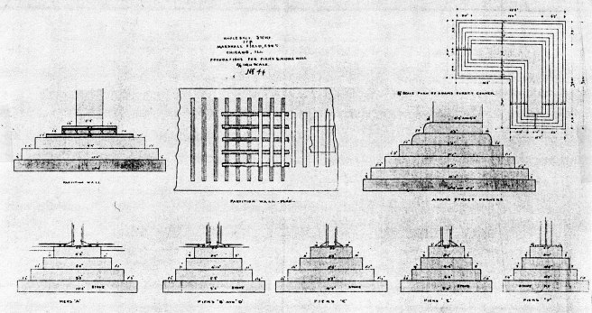
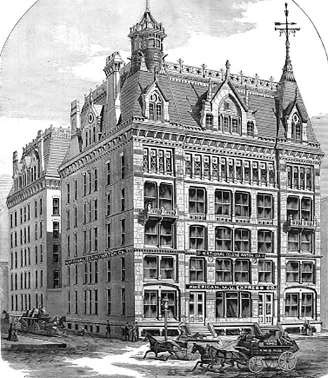
Finally, Richardson had to bring this structure to the ground via a foundation system, one the mistakes he had made in the earlier American Express Building. Root’s biographer, Harriet Monroe, reported that Richardson had visited Root’s office during one of his trips to Chicago, ostensibly to query Root about the design of the foundations for the Field Store.  In reality, professional courtesy of the time would have dictated that Root, the city’s leading architect, invite the famous Richardson to visit the office.  If the meeting actually took place, it more than likely occurred during Richardson’s stay in October 1885, as the Field project was still in secret gestation during Richardson’s earlier visit in May to discuss the Glessner’s house.  Although his construction drawings reveal that Richardson had incorporated Root’s relatively new technique of using iron rails in only the footings that supported the interior fire walls, it is apparent that Richardson had learned little from this talk with Root, or for that matter, his prior experience twelve years earlier with the problematic settlement in the American Express Building, for he still designed the stepped stone footings in the traditional Eastern way, either ignorant of or choosing to ignore Baumann’s theory for uniformly-stressed foundations.  This technical oversight would once again plague Richardson’s second building in Chicago’s Loop, but unfortunately, it would take more time for the mistake to manifest itself in physical distress than it did in the first building, so that it could not be as easily remedied as had been the American Express Building by Peter Wight’s redesign of its foundation and front elevation.  The heavier-loaded foundations of the exterior wall settled at a greater rate than did the interior pad footings under the columns, that resulted in the floors sloping to the lower, exterior walls (one can experience the same phenomenon in the floors of the side balconies in the Auditorium).

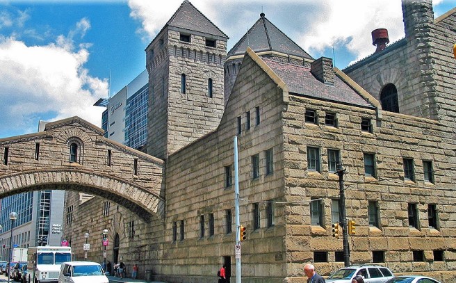
In summary, placing the technology that Richardson employed within its context of Chicago in late 1885, the Field Wholesale Store emerges as more of a dinosaur than as a harbinger of things to come.  A comparison with Root’s contemporary design for the Rookery, the construction of which had paralleled that of the Field Store, will prove the point.  In the Rookery’s foundations, not only had Root utilized Baumann’s twelve-year old theory, but he had also reduced the size and corresponding weight of the footings by using iron rails and concrete, while Richardson employed the old-fashioned pyramids of stone for most of the Field Store’s footings.  The interior of the Rookery was completely framed in terra cotta-encased iron with hollow terra cotta floors, that in 1885 had become the conventional construction system for large buildings in Chicago.  The Field Store relied on heavy timber mill framing for most of its structure.  Lastly, the exterior walls in the Rookery’s light court were enclosed with non-loadbearing terra cotta and brick supported on the iron frame, the way buildings would be constructed for the next forty years.  Richardson, on the other hand, had been forced by his client to revert to the use of the archaic mode of construction of the stone bearing wall.

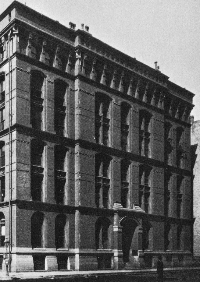
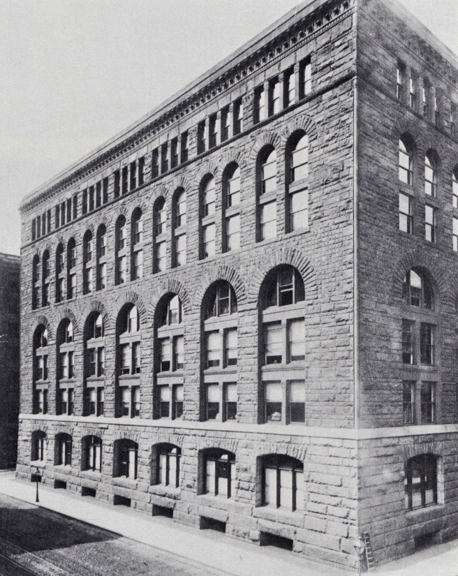
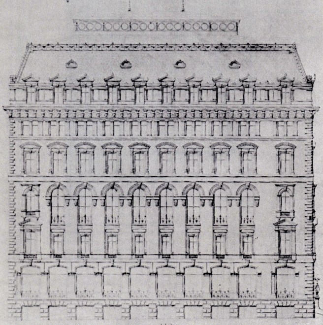
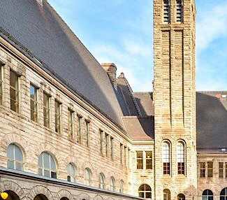
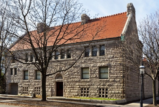
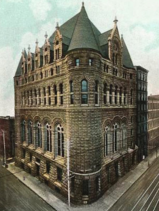
Like its construction technology, the design of the Field Store also did not contain many new ideas from which Chicago’s architects could learn.  Certainly, as a spatial experience, the building was bland at best, meaning that from the viewpoint of architectural history, the Field Store’s potential significance can be reduced to only its facades. The large, straightforward box of the palazzo without an expression of a roof had been in vogue in American architecture for at least a decade by 1885, except, as we have seen, in the work of Richardson.  Therefore, its overall massing and large, urban scale did nothing more than repeat what the best Chicago architects were producing at the time.  Even though Richardson had tried to incorporate more ornamental detail, Field’s budget had forced the elimination of all but the simplest of detailing.  The Field Store, therefore, could be understood as the equivalent of Root’s Montauk Building laid on its side.  Although stone was starting to make a comeback on the exterior of buildings in 1885, the stone that Field demanded was detailed as rock-faced, a rough texture that was highly susceptible to Chicago’s atmospheric pollution of the time.  Such surface textures were actually being abandoned by the city’s architects in favor of a smooth-faced exterior, be it of stone, brick, or the soon-to-come glazed terra cotta, any of which would show less of the city’s grime and was easier to clean.  Richardson’s motif of stacking arcades in a decreasing geometric progression was not a radical departure in the design of elevations, as has so often been stated by historians, but had been used by so many architects by 1885 that it was not only quite commonplace, but with the advent of the use of iron framing in the exterior of repetitive-floored office buildings, it was also on the verge of becoming anachronistic.  Definitely, the layered, arcaded elevation offered little new direction for those architects at the time who were facing the challenge of evolving an appropriate expression for the ever-increasing height of the skyscraper.  As Root’s troubled experimentation in the Rookery revealed, the skyscraper was growing upwardly, along the vertical axis, rather than the horizontal.  And it was going to do this not with the stacking of one layer of masonry arcades on top of another, but with the repetitive rectilinear grid of the iron skeleton frame.  For the most part, therefore, Richardson’s Marshall Field Wholesale Store didn’t break much new ground from which the city’s architects could learn.  Those who would try to emulate it in the design of a skyscraper soon found themselves on a path with a dead end.

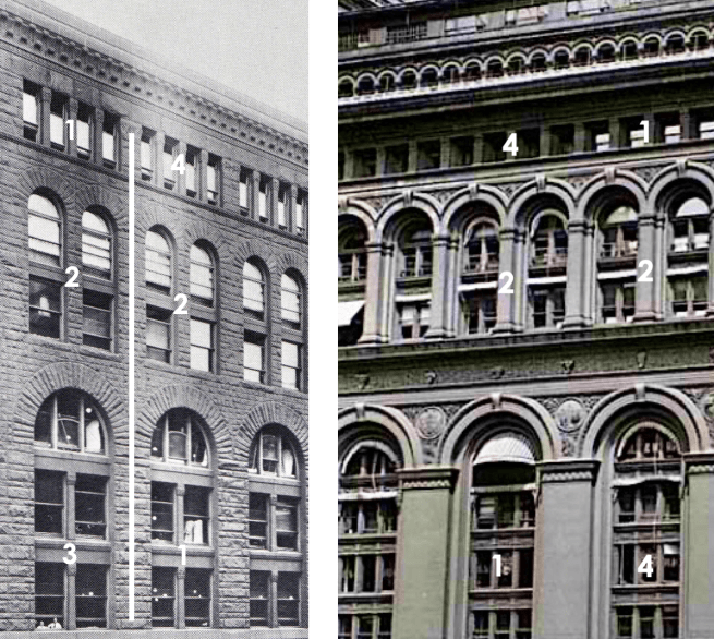
However, while directly copying its form or elevations held little hope for any advancement in the art of architecture, an architect who looked with a careful eye at the Field Store for principles, rather than mere formal precedents, however, would eventually understand Richardson’s true achievements in its design.  The elimination of all projecting sill and beltcourses in the middle of the building left it as an unbroken multistoried surface or layer (or field). Richardson not only gave Chicago a powerful example of a multistory building with a three-part elevation, but also finally broke the tyranny of the repetitive horizontal layer, the albatross that Root had yet to exorcise from his elevations.  No longer would an architect be forced to place one three-story building on top of another, adding layers to achieve the building’s total height. After the Field Store, an architect could unify all the floors (with no limit) in a skyscraper into one coherent totality.  The Marshall Field Wholesale Store was not the start of the layered elevation, but the end of it: a primarily horizontal building had wiped the elevation clean of repetitive horizontals, so that an architect could finally express either the vertical nature of the skyscraper, or the stacked quality of its repetitive floors, or the rectangular grid of the structural frame that supported it, or the continuity of the skin that enclosed its interior volume (there is NO ONE RIGHT WAY in design).  The Field Store’s impact on Chicago, especially that on Root’s later work, therefore, should not be misunderstood nor underestimated.  In the same breath, however, Chicago’s impact, especially that of Root’s, on Richardson’s last designs likewise cannot be ignored as it has so often been in the past.

POSTLUDE:

So how had the understanding of the influence of Richardson’s Field Store become so skewed over time? At the beginning of this segment I quoted Louis Sullivan’s 1901 Kindergarten Chats, in which he singled out Richardson’s building as his guiding star.  This reference will point International Style (“Modernist”) historians, such as Sigfried Giedeon, who were tracing the pedigree of the unornamented European International Style of the 1920s, to identify the Field Store as an early manifestation of this practice, i.e., minimal ornament. From there it was an easy jump to enshine the Field Store as one the early precedents of the “minimalist” buildings of the “Chicago School.”  Of course, as I have documented, this was a complete misreading of not only the Field Wholesale Store but also the ethos of the architects in what I have defined as the emerging “Chicago School.”  Nowhere in these last eleven chapters have I ever stated that any Chicago architect was pursuing a “minimalist” aesthetic. Quite the opposite was the reality, as I have shown with Root’s detailing in the Rookery for instance. The frugal Field could be excused for chuckling in his grave over this academic misinterpretation of his “billboard.”

FURTHER READING:

O’Gorman, James F. Selected Drawings – H.H. Richardson and His Office. Cambridge, MA: Harvard University, 1974.      

O’Gorman, James F. “The Marshall Field Whole Sale Store: Materials Towards a Monograph,” JSAH, Oct. 1978, pp. 175-194.

Ochsner, Jeffrey Karl. H.H. Richardson:  Complete Architectural Works. Cambridge: MIT Press, 1982.

(If you have any questions or suggestions, please feel free to eMail me at: thearchitectureprofessor@gmail.com)

11.22. THE FIELD WHOLESALE STORE: v. 2.0

A very detailed elevational study by Richardson shows what he would have liked to have accomplished had he been given a bigger budget and been allowed to use brick.  Like the Burlington, this design had a stone base with small basement lights, except Richardson saw Root’s error in making only the basement of stone (which became evident at the entrance where the stone and brick met in an awkward junction), and so allowed the stone piers to extend into the first floor to better frame the entrance.  Brick flat arches capped the stone piers and made the transition to the brick body above.  The second and third floors were grouped together by a large span, two-story arcade.  The corners of the arcade’s piers were softened with engaged columns, while the edges of the underside of the arches were similarly rounded with ornamental terra cotta.  The fourth and fifth floors were also grouped into one layer by a two-story arcade whose span was half of those below it so that now there were two arches within the original bay.  These were also trimmed in terra cotta.  A thinner intermediate pier (it may have been a column) supported the arches between the major piers of the bay, so that an alternating A:B:A:B rhythm articulated the major and minor piers within this range.  The sixth floor was then boldly opened up, the cornice being supported by alternating thicker piers, marking the primary and secondary bays, and thinner columns marking the tertiary bays.

Burnham & Root, Grannis Block. Left: Post-fire design with three-story addition; Right: Original pre-fire design. (Left: Hoffmann, Meanings, Right: chicagology.com)

Although Richardson had used the device of the layered progression of decreasing arcades in other commercial buildings, the resemblance of this particular study to a design by Root, that I have yet to mention in relation with the Field Store, is quite striking.  During Richardson’s two trips to Chicago in 1885 (in May to interview the Glessners, and in October to sign contracts for the Field Store) Root’s redesign of the burned Grannis Block was under construction.  Root had added to the surviving exterior a new layer of three floors.  While he kept the spacing between the piers of the lower section, he increased the number of mullions inserted in between the piers from one in the surviving portion to two that he also reinforced by correspondingly increasing the number of arches in the layer’s arcade from two to three.  (Of course, this just countered what I had just claimed that Root had avoided in his designs, that is decreasing the size of the windows in the upper stories of his buildings.  However, while he had increased the number of windows, he did this solely by inserting an extra mullion while the overall size of the opening between the piers remained the same as those below, so there was little reduction in daylight.) This addition not only established a 1:2:3 progression in the layered arcades in the elevation, but also replaced the picturesque roofline with a flat roof.  It is the arcades in floors two through five that bore a remarkable likeness to what Richardson was experimenting with in this sketch, right down to the reuse of wrought iron fleurs-de-lis anchorheads.

Comparing Richardson’s study with Root’s early ten-story study for the Rookery, two important differences are evident.  First, while Root was attempting to come to grips with the vertical scale of his skyscraper, by making as many vertical lines read continuous as possible, Richardson’s long, 325-foot wall was predestined to be horizontal.  Therefore, he did not allow a vertical line to continue unbroken from one layer into the next.   The piers which mark the major bays even decreased in size from the first layer to the second, and even more so at the top, in order to prevent them from reading as a continuous line.  Even the structural mullions in the second floor were stopped from continuing into the arched windows of the third floor.  This was a typical Richardson detail that would have been filled in with the standard triple window with minimized mullions (as was the final design), and definitely reveals the difference in emphasis from Root’s, where, in the same location, the spacing of the intermediate pier was continued into the arched window to establish his desired vertical continuity with the pier above.

Meanwhile, the radical extent of the openness Richardson pursued in the top floor revealed that he was also looking at the work of another architect who had incorporated the layered arcade:  George Post’s New York Produce Exchange.  In fact, the base of the Produce Exchange bore a remarkable similarity to how Richardson had detailed the base in this study.  

A comparison of the arcades in the two buildings, however, shows the difference in the intentions of the two designers. Although Richardson did not allow a vertical line to continue from one layer into the next (except at the edge of the corner piers), he always felt compelled to articulate the major bay or ‘measure’ of his rhythm by making the original, base piers in the upper layers larger than the newly-added, intermediate piers, so that the original bay could still be perceived.  Post, on the other hand, treated each layer as an entity onto itself by keeping the width of each pier (while maintaining the centerline of the major piers) in a layer the same, thereby not emphasizing the major bay divisions in the upper arcades with wider piers.  While Post’s Produce Exchange is solely horizontal to a fault, Richardson’s study exhibits an attempt to achieve a balance between the horizontal and vertical in the elevations.

Although Richardson had probably received the Field Commission in June 1885, it was an unusually well-guarded secret, for news of Richardson’s involvement didn’t break in Chicago’s ‘booster’ press until September 30, when the Tribune first mentioned Richardson’s design.  By October 11, Richardson was in Chicago to award contracts, staying in the Grand Pacific Hotel, across the street from the Insurance Exchange and next to the construction site of the Rookery.  To be able to receive bids at this date, the design had to have been, for the most part, completed.  This was confirmed by the accuracy of a description of the project published by the Tribune on October 25:  “beauty will be one of the objects aimed at in the plans, but it will be the beauty of material and symmetry rather than of mere superficial ornamentation… It will be as plain as it can be made, the effects depending on the relations of the ‘voids and solids’…”  Indeed, although Richardson’s original studies showed his characteristic ornamental trim, the realities of Field’s frugal purse had forced the architect to abandon all “mere superficial ornamentation.”  Richardson, like Root with the Montauk Block, had no artistic choice but to depend “on the relations of the ‘voids and solids’ in the ‘plain’ elevation:” there was no budget for anything else.

Fortunately for Richardson’s place in history, the program would eventually force an additional floor into the final design, increasing the height of the building to seven stories.  This gave the elevation an extra floor that Richardson placed in the lower arcade, increasing its height to three stories.  This now created a rhythm of 3:2:1 in the three layers above the base (the same rhythm that Root had used in the original 10-story design of the Rookery) resulting in a lighter facade with a better sense of false perspective than the squatter 2:2:1 sequence of the early studies.  The windows of the first floor and basement were cut into a battered base that consisted of a brick bearing wall that was veneered with rock-faced Missouri red granite, laid in even courses.  

The tight budget also prohibited any lavish celebration of entry.  In the center bay of the long Adams Street elevation, he was forced, of course, to eliminate the lintel between the basement and first floor so one could physically enter the building.  To reinforce the sense of entry, he inverted the segmental arch that spanned the other windows in the first floor, by placing a tapered lintel over the entry (this shape roughly approximates the bending stress distribution along the length the beam).

A smooth-surfaced, continuous sillcourse severely separated the granite base from the upper six floors of East Longmeadow (Massachusetts) red sandstone.  A slightly projected sillcourse at the seventh floor separated the top story, with its squared-headed windows, from the arcaded middle section of the elevation.  It was in this middle section that Richardson had achieved a breakthrough that would have a great impact on Chicago’s designers.  Consistent with his evolving simplicity over the past three years, he completely eliminated the traditional projected sillcourse between the lower and the midrange arcades, permitting all five stories of windows in the middle section to exist within one unbroken wall surface, creating a continuous field within which he could cut the windows at will).  

This was located in the middle of the elevation, framed at the top by the seventh floor, and at the bottom by the granite base.  The continuity of the wall plane between the base and the top was accented and continued around the corner with an engaged column that stretched unbroken for five stories from the base to the top.  The coursing in the top floor echoed the even spacing in the base, that further helped to set-off the middle which contained a variety of coursing techniques.  The majority of the middle was coursed in alternating bands of thick and thin courses.  This was modulated at every floor level (except at the fifth floor where he had eliminated the sillcourse) with an even thicker band that evoked the floor behind it.   

Richardson, Field Wholesale Store. Working drawing of exterior stonework. (O’Gorman, JSAH, October 1978)

In the final elevation of the Field Store, therefore, Richardson had succeeded at what had so far eluded Root’s grasp over the last four years: a straightforward expression of the continuity of function and volume in the repetitive floors located in the middle of his multistoried buildings.  Richardson had jettisoned a superficial piece of horizontal trim in the Field Store and, thereby, had arrived at a tripartite elevation comprised of a base, middle, and a top, even though he had incorporated four ranges of arcades in the facade. This detail, and not the building’s boxlike form or “unornamented” exterior, was the paradigm-changing motif that impacted Chicago’s architects.

Richardson, Field Wholesale Store, Wells Street Elevation. (Ochsner, Richardson)

FURTHER READING:

O’Gorman, James F. Selected Drawings – H.H. Richardson and His Office. Cambridge, MA: Harvard University, 1974.      

O’Gorman, James F. “The Marshall Field Whole Sale Store: Materials Towards a Monograph,” JSAH, Oct. 1978, pp. 175-194.

Ochsner, Jeffrey Karl. H.H. Richardson:  Complete Architectural Works. Cambridge: MIT Press, 1982.

(If you have any questions or suggestions, please feel free to eMail me at: thearchitectureprofessor@gmail.com)

11.21. “GIVE THE CLIENT WHAT HE WANTS”

H. H. Richardson, Studies for the Filed Wholesale Store, 1885. Left: Brick; Right: Stone. (O’Gorman, Selected Drawings)

The second design determinate Richardson faced was the client. (For the title of this section I have paraphrased Field’s famous slogan “Give the Lady what she wants.”)  While Richardson had dreams of transcending Root’s Burlington Building with a design of a commercial palace, he would quickly come face-to-face with the reality that all Marshall Field wanted was a warehouse with a stone front. (And what he wanted he usually got, with the exception of his stillborn skyscraper. Yet even after Field had died in 1905, he apparently still got his skyscraper on La Salle, for in his estate he specified that a skyscraper be erected on the site that he had purchased over the years that included where the Home Insurance Building stood. In 1931 his grandson Marshall Field III began construction on the Field Building, its planned height of 535’ was second only to the new Board of Trade one block south, until the Lindbergh Beacon was added to the Palmolive Building. The Board of Trade was designed by Root’s son; the Field Building was designed by Graham, Anderson, Probst and White, the successor to D.H. Burnham.)  

Graham, Anderson, Probst & White, Field Building, Chicago, NE corner of La Salle and Adams, 1931. (Online)

Marshall Field wanted two things with the design of the wholesale store: first, some sorely needed positive publicity to offset Leiter’s legal victory as well as Farwell’s new gargantuan store, and second, a well-designed billboard in stone for his wholesale store.  Richardson would soon find out that he had no budget to even try to compete with Root’s ornamented symphony of space across the street.  Field wanted a building for his wholesale division that catered primarily to out-of-town merchants and salesmen on tight schedules who came to Chicago on overnight trains from all over the Midwest, to order new merchandise that would then be shipped back for sale at their own stores. Most would be detraining in Union Station and would need only walk across the Adams Street bridge to Farwell’s new store.

View down Adams Street from the Bridge over the South branch to the Exposition Building. The Farwell Wholesale Block is across the river at the left center. (Andreas-vol. III)
Left: Richardson, Marshall Field Wholesale Store, 1885; Right: John M. Van Osdel, John V. Farwell Wholesale Store, 1885. In his book on the Auditorium Joseph Siry (rightly) wondered out loud how the early “Modernist” historians had chosen the Field Store as a protofunctionalist design and ignored the minimalist Farwell Store? The Farwell Store has a rational, structurally-based (post and beam) elevational design but iron columns were used only on the ground floor storefronts. So much for the theory that the use of iron framing on the exterior engendered this type of rectangular elevational language… But, of course, we’ve already seen that the Shillito’s Store in 1877 had a “rational” elevation without the use of exterior iron columns.

Field, therefore, needed a building that could compete with Farwell’s, even though it was two blocks farther east from the bridge. Actually, all he needed (wanted) was a billboard that could grab these men’s attention because wholesale meant lower prices than your competitor’s. Therefore, these out-of-town sales were to be the model of dry efficiency, both in time and money.  The overhead that Field’s new building would impose on his wholesale prices had to be kept to a minimum, in order for Field to remain competitive. 

Richardson, Field Wholesale Store, First Floor: Drapery and Upholstery Department. (Ochsner, Richardson)

This was not to be a department store like Field’s department store on State Street or Shillito’s in Cincinnati, that was based more on impulse buying and, therefore, in order to entice female prospective buyers inside, had to be as impressive on the interior as the exterior.  Salesmen coming to Field’s Wholesale Store knew what they needed to order before they even boarded the train for their destination:  good quality merchandise with as low a price as possible.  To keep that price down, Field’s Wholesale Store needed none of the spatial and ornamental delights of Shillito’s Department Store or Root’s Chicago, Burlington, and Quincy Building.  Nonetheless, the ego and reputation of the Chicago merchant still demanded an impressive exterior image that would compare with, if not exceed his competitors’ buildings, especially following the public relations debacle of his stagnant hole on La Salle Street only one block away.  Therefore, Field had hired America’s most renowned architect at the time to design merely a facade for a no-thrills warehouse.  And even then, given the meager resources Field was willing to furnish, Richardson would be forced, during the duration of the design of the project, to abandon all attempts to incorporate any carved ornament (except in the cornice) in favor of a very stark (less expensive), plain wall surface. 

This situation was curiously similar to what Root had faced in the design of the Montauk Block, some four years earlier.  Then, Peter Brooks, the client from Boston, had told his Chicago architects that he preferred, “to have a plain structure of face brick, with a flat roof.”  Now the positions were somewhat reversed: it was the Chicago client who would force the architect from Boston to shed all horizontal projections and rely on the simple massing of the building and its windows for its effect, barring one major indulgence.  Field still wanted a stone building, the same demand he had placed on Beman in the design of his skyscraper.  With a monumental stone facade in mind, whom better in America of the summer of 1885 could Field have pursued, one would have thought, than Richardson.  But once again, we find Richardson, upon his exposure to Chicago’s red brick boxes, wanting to deviate from his own oeuvre to design the Field Store in brick!

Richardson, Marshall Field Wholesale Store. Preliminary elevational study employing brick. (O’Gorman, Selected Drawings)
Between these two studies by Richardson, left in brick, right in stone, I have placed the R.H. White Store by Peabody & Stearns in-between them. The earlier left study incorporated the White’s lower floors, while the final stone design used the White’s top floor’s detailing except for increasing the number of windows in each bay from 3 to 4.

While the client eventually got what he was willing to pay for, a monumental stone facade, Richardson continued to work on a parallel alternative in brick, quite obviously hoping to change Field’s mind before actual construction began.  The design began as a six-story building, thereby allowing Richardson to attempt to reach a rapport with the six-story Burlington Building across the street.  It is readily apparent, even in the early sketches, that Richardson was committed to addressing at least one aspect of Root’s elevation: the static quality of stacking identical arcades one on top of another. (Remember that Root was attempting the same remedy in his original design for the ten-story Rookery.)

Richardson started the Field design where he had left off with the Ames Store, using the layered arcade motif with a decreasing geometric progression in the spacing of the windows of 1:2:4.  Here we confront another architectural history legend.  The story varies from writers claiming that Richardson’s progressive arcades unleashed a number of copycat designs in Chicago as the perfect solution to the skyscraper’s elevation (Sullivan did appropriate it for the Auditorium but it is not a skyscraper) to those who claim the Field Store was the first use of layered arcades in a diminishing progression even though historians have traced this motif back in American buildings (see Sec. 5.1) to Detlef Lienau’s 1864 design of the Noel and Saurel Building in New York (even in Richardson’s own work we find him using this motif as early as 1867 in his entry for the Equitable Building competition).

The fact is that Chicago’s architects were forced early into the development of the skyscraper to abandon the use of smaller windows in the upper portions of skyscrapers because not only did the smaller window reduce the quality of daylighting (lower rent), but it also raised the cost of the building’ construction because it forced the contractor into specifying and managing more pieces that also had different dimensions (although the cost of larger sheets of glass would somewhat offset this).  I took a quick look back at Chicago’s skyscrapers erected during 1881-85 and found only one, the Studebaker, that employed this detail (and there was a reason for this: the larger windows were used in the show floors, the smaller windows for the factory in the upper floors).  We can start with Jenney’s First Leiter and end with Root’s Rookery, they all have the same size windows within their respective facades, with the sole exception of the top floor that was typically detailed with smaller windows to act as a cornice (in many instances this was floor acted as an attic for equipment).  But one must also remember that the Field Store was not a speculative office building, therefore, the loss of light caused by the smaller arched windows would not cause a financial loss for the owner.  My point is that far from being a revolutionary, trend-setting design as some make Richardson’s Field elevation to be, the layered, progression of arcades was an anachronism in 1885. One of a number, I might add, that will be found in the Field Wholesale Store.

FURTHER READING:

O’Gorman, James F. Selected Drawings – H.H. Richardson and His Office. Cambridge, MA: Harvard University, 1974.      

O’Gorman, James F. “The Marshall Field Whole Sale Store: Materials Towards a Monograph,” JSAH, Oct. 1978, pp. 175-194.

Ochsner, Jeffrey Karl. H.H. Richardson:  Complete Architectural Works. Cambridge: MIT Press, 1982.

(If you have any questions or suggestions, please feel free to eMail me at: thearchitectureprofessor@gmail.com)

11.20. THE FIELD WHOLESALE STORE: v. 1.0

H.H. Richardson, Marshall Field Wholesale Store. Preliminary perspective study showing six stories with a brick exterior. (O’Gorman, H.H. Richardson-Selected Drawings)

The two central determinants in Richardson’s final design for the Marshall Field Wholesale store were first: its owner, and second, the building’s professional and physical context. I want to begin with the building’s context. Never, never underestimate the ego of an architect (or a surgeon, or a lawyer, or any professional for that matter, or Marshall Field as we will see in the next section..).  And Richardson, as I have already noted, was at the zenith of his career in June 1885.  His self-professed best design, the Allegheny County Courthouse was beginning to show its refined strength as it rose out of the ground, the members of the A.I.A. had just named his Trinity Church the best designed building in the U.S., along with four other of his designs among their top ten favorite buildings. And to top it off, his submission for the Cincinnati Chamber of Commerce had just been selected over that by Root, Chicago’s acknowledged leading architect.  In fact, those on the East Coast viewed Root (rightfully so) as being one of the ringleaders who had led the rupture in the country’s professional ranks the previous November with the formation of the W.A.A.

Burnham and Root, Chicago, Burlington and Quincy Railroad Building, Chicago, 1881. (Hoffmann, Root)

When he had inquired of Field’s representative where was the planned building going to be built, one wonders what was his inner reaction for the new building would sit immediately across Adams Street from Root’s first masterpiece, the headquarters for the Chicago, Burlington, and Quincy Railroad, Root’s personal interpretation in brick of the Palazzo Strozzi, the original of which Richardson must have viewed during his visit to Florence three years earlier.  One block east of the site for Field’s new store on Adams stood Root’s just-opened Insurance Exchange and in the next block across La Salle Street lay the site given to Root to design the Rookery.  Richardson’s long facade along Adams would sit face-to-face with the Burlington and also would be seen on the same side of the street in line with two of Root’s better elevations. The Field Store was to be a mano-a-mano face-off with Root: the best of the East was coming to meet the best of the West.

Reconstruction of Adams Street Looking East from Franklin, Left side, Burlington Building, Right side, in order, Field Wholesale Store, Rand McNally Building (1889), Insurance Exchange, The Rookery, with the Home Insurance Building across Adams. Cobb & Frost’s Owings Building (turret in back of the Rookery) is three years in the future. (Digital image by David Burwinkel)

The Burlington Building contained Chicago’s second longest elevation at this time (only the elongated arcaded facade of the Hiram Sibley warehouse along the river was longer), that Root had detailed into a four-layered composition of 1:2:2:1, the two middle ranges consisting of one two-story arcade placed above an identical two-story arcade.  Add to the power of the Burlington’s exterior image the magnificent spatial sequence of its atrium, and one was faced with a hard act to match, let alone eclipse.  But apparently this is exactly what Richardson had originally intended to do in his design of the Field Store.

Left: Burnham & Root, Burlington Building, Atrium. (Hoffmann, Meanings); Right: H.H. Richardson, Marshall Field Wholesale Store. Preliminary first floor plan incorporating an interior atrium much like that of the Burlington’s. (O’Gorman, H.H. Richardson-Selected Drawings)

At the same time, one cannot underestimate the influence of Peabody & Stearns’ R. H. White Store in Boston completed only a few years earlier. I have already mentioned how it influenced some of Root’s earlier work (Sec. 8.21). While Richardson stood at the head of American architects in 1885, one could argue that Robert S. Peabody’s reputation within the Massachusetts’ community was at least equal to that of the great Richardson (Peabody & Stearns had designed Shepherd Brooks’ estate in Medford in 1881). The R. H. White Store stood in stark tectonic contrast to Richardson’s own store designed for F. L. Ames the following year, 1882, and easily could have encouraged Richardson to attempt to design a brick box.

We also cannot ignore the influence of George Post’s New York Produce Exchange, an equivalent-sized project to what confronted Richardson.  While Root’s Burlington stood in front of his site, Post’s Produce Exchange was in the forefront of the consciousness of American architects as it had recently opened up to mixed reviews. As I have documented how Post’s design had influenced Root’s design for the Rookery at this precise moment, Post will also have a major influence on Richardson’s design.

George B. Post, Produce Exchange, New York, 1880. (Online)

We are indebted to James O’Gorman for his research of Richardson’s design process of the Field Store. Richardson took both the Burlington’s hollow rectangular plan and its brick, six-story arcaded elevations as his point of departure. but as such he had made two radical departures from his life’s oeuvre: he had abandoned not only his characteristic picturesque roofline in favor of Root’s palazzo-like flat-topped box of walls, but also his iconic rock-faced stone exterior for Chicago’s brick.  The palazzo-form was completely antithetical to Richardson’s prior fondness for a picturesque roofline, of which the fugal Field wholesale division would have nothing of the kind.

Richardson, Marshall Field Wholesale Store. 1885 preliminary elevational study employing brick. (O’Gorman, H.H. Richardson-Selected Drawings)

This was the major influence that Chicago’s architecture, especially Root’s, had had on Richardson.  The reverse argument, that Richardson brought the box to Chicago, and hence to modern architecture, has often been made, but, as I have attempted to present, this view has been entirely chronologically in error at best; at worst, it is a severe misinterpretation of Richardson’s own work.  It is also an historical injustice to other architects of the period, especially Root, for he had been producing red brick boxes since the Montauk Block, four years before Richardson received the Field commission.  Meanwhile, Richardson’s prior work did not even come close to the formal simplicity of Root’s commercial designs (as I have presented in the previous sections) until after the Bostonian had come face-to-face with Root’s designs. 

Whether it was a large urban wholesale store (the Ames Store) or a just a large urban block (Allegheny County Courthouse and the Cincinnati Chamber of Commerce) that he had just designed immediately before coming to Chicago, Richardson had no reservation about celebrating his roof.  Therefore, the Field design was not a high point in Richardson’s career, as is so often quoted (an honor that the Allegheny Courthouse merits) but it is more of a mid-life career change or major turning point in his ideas: a conversion to the simple, box-like forms of Chicago’s commercial buildings, especially those by Root, such as the McCormick Building that was located only two blocks to the southwest of Field’s site.

Burnham & Root, McCormick Harvesting Machine Company Offices and Warehouse, Chicago, SW corner of Jackson and Market (Wacker), 1884. (Hoffmann,  Root)

FURTHER READING:

O’Gorman, James F. Selected Drawings – H.H. Richardson and His Office. Cambridge, MA: Harvard University, 1974.      

O’Gorman, James F. “The Marshall Field Whole Sale Store: Materials Towards a Monograph,” JSAH, Oct. 1978, pp. 175-194.

Ochsner, Jeffrey Karl. H.H. Richardson:  Complete Architectural Works. Cambridge: MIT Press, 1982.

(If you have any questions or suggestions, please feel free to eMail me at: thearchitectureprofessor@gmail.com)

11.19. RICHARDSON BRINGS HIS PICTURESQUE ROOFLINES TO CHICAGO

The Glessners owned this photograph of this out building at Abingdon Abbey, England. Richardson used it as his starting point for the design of the Glessner House (below). (Zukowski, Chicago: Growth of a Metropolis)

It is the exterior form of the Glessner House that I am most interested in because it shows where Richardson’s aesthetic ideas as they pertained to how his buildings “met the sky,” were at almost the precise moment he received the commission for Field’s Store.  Elaine Harrington recorded that the Glessners told the story of how, during his first visit with them in Chicago Richardson had spied the above photograph of this out-building at Abingdon Abbey, England in their library. He asked Mrs. Glessner, “Do you like it?” She said yes, and he replied, “Then I’ll make that the key note to your home.”  As the gabled wall of the abbey broke the flat cornice of the rest of the structure, its form was right out of Richardson’s oeuvre of picturesque rooflines.  It is at this point that we now engage the legend of Richardson having brought the “palazzo box” form to Chicago in his design for the Field Store.  But before I do so, permit me one parenthetical addition:

Richardson’s last urban project immediately prior to the Field commission, the Cincinnati Chamber of Commerce designed in early 1885 had still employed his more traditional layered elevation of the Pittsburgh courthouse, albeit the upper sillcourses were detailed within the plane of the wall, instead of projecting them beyond as was still the case in the Courthouse. 

In comparing the earlier Ames Wholesale Store with the Cincinnati building, one can sense the subtle evolution of Richardson’s understanding of his elevations and massing.  The projected sillcourses that resulted in the layered elevation of the Ames Store have been reduced or absorbed into the wall surface of the Cincinnati Chamber of Commerce, allowing it to be read more as a unified mass that has been wrapped with a continuous surface.  It will be this detail (and not the Field’s box-like form as most historians cite) that will be the most influential design feature of the Field Store on Chicago’s architects. Why? As long as an architect layered a building with projecting sill courses, it would be impossible to rotate the articulation of a tall building ninety degrees to express its verticality (this was precisely the problem Root faced with the Rookery.). Once Richardson has distilled a multistoried building’s elevation to a continuous surface with the elimination of his layers, Chicago’s architects would be able to give their skyscrapers a vertical expression.

At the same time, one is struck by the overall formal similarities between the Ames Store and the Chamber of Commerce designed within the relatively short span of only three years, even though one is a commercial structure and the other is more of a civic institution.  Especially noteworthy is Richardson’s continued use of the picturesque, steep-sloped roof, punctuated by high-pitched dormers.  His love of a highly picturesque silhouette is also evident in the Allegheny County Courthouse (above) that was designed in the period between the other two buildings, where the ever-present dormers establish a continuity of effect among all three of these large, urban projects.

All three designs exhibit his favorite roof detail, allowing a dormer to extend to the plane of the exterior wall of the building, where it is intersected by the vertical projection of the wall plane beyond the eave of the roof until it blended into the dormer’s gable. (I refer to this detail in his buildings as a “medieval crown.”) This detail denied any chance for the wall to end in the Renaissance-like horizontal cornice of the palazzo, that could conceivably hide his beloved roofs from an observer on the ground.  Even the contemporary Pittsburgh jail and Glessner House can be seen to be in Richardson’s family of gabled roof/wall intersections. (While the MacVeagh House’s dormers were set-back in its still dominant hipped roof, the house still expressed its roof.)

H.H. Richardson. Above: Allegheny County Jail, 1884. (Ochsner, H.H. Richardson); Below: John J. Glessner House, Chicago, 1885. (Zukowski, Chicago: Growth of a Metropolis)

As one reviews Richardson’s designs following his return from Europe, be they small residential projects or large, urban blocks, therefore, one constant formal theme is quite evident: the roof of a building designed by Richardson at this time was an important, indispensible part of the building that had to be architectonically celebrated.  In no project, built or unbuilt during the decade 1875-85, prior to his arrival in Chicago, had H. H. Richardson even contemplated a palazzo box building with a flat cornice. You will find his last such design was the Hayden Block of 1875.  Even his 1881 design for the Ames Wholesale Store, the exact same program that Field was commissioning him to design, was topped with his iconic “crown.”  (To confirm this, please review Richardson’s complete oeuvre published in Jeffrey Ochsner’s H.H. Richardson: Complete Architectural Works.)

H.H. Richardson, Hayden Building, Boston, 1875. (Online)

So if Richardson had not designed a building with a flat cornice during the previous ten years, even after having spent time touring Florence in 1882, where did the box for which Richardson would become famous for bringing the box to Chicago come from because it is obvious that in the spring of 1885 he still preferred his “crown” sitting atop his buildings?  More importantly, how did the historical record get so skewed so that it is standard architectural history that Richardson’s striving for architectonic repose had, even before he received the Field commission, brought him to the realization that he should now design only palazzos with flat roofs and the Chicago commission gave him the opportunity to do so, because as I will argue, a box was the furthest thing from his imagination, until the moment he received the Field Commission.  

Like Chicago’s other architectural “urban legends” such as how the 1871 fire wiped the slate clean of historic architecture so that he city’s architects could invent a modern architecture without distractions, or how Jenney invented the skyscraper with the first use of iron skeleton framing in the Home insurance Building, the impact of Richardson’s Field Wholesale Store is also overblown in “Windy City” architectural legend.  And we have one person to point to for this: Louis Sullivan and his highly-selective memory.  In his Kindergarten Chats written in 1901, fifteen years after the fact, Sullivan enshrined the Field Store:

“I have meted justice to other buildings, in their iniquity; I would give justice to this one, in its justice… As you say, the structure is massive, dignified and simple.  But it is much more, … so much more that I have called it an oasis… Four Square and brown, it stands, in physical fact, a monument to trade, to the organized commercial spirit, to the power and progress of the age, to the strength and resource of individuality and force of character; … artistically, it stands as the oration of one who knows well how to choose his words, who has somewhat to say and says it – and says it as the outpouring of a copious, direct, large, and simple mind… Therefore, have I called it, in a world of barren pettiness, a male…”

Where did Richardson’s crown go? And from where did he get the idea to make the Field store a box? (Online)

FURTHER READING:

O’Gorman, James F. Selected Drawings – H.H. Richardson and His Office. Cambridge, MA: Harvard University, 1974.      

Ochsner, Jeffrey Karl. H.H. Richardson:  Complete Architectural Works. Cambridge: MIT Press, 1982.

(If you have any questions or suggestions, please feel free to eMail me at: thearchitectureprofessor@gmail.com)

11.17. RICHARDSON ELIMINATES HORIZONTAL LAYERING FROM HIS LAST DESIGNS

Richardson had actually begun to experiment with eliminating the continuous banding in his elevations in two buildings he had designed earlier in 1883.  The Emmanuel Episcopal Church in Pittsburgh, using brick, and the Converse Memorial Public Library in Malden, MA, using his more characteristic rock-faced stone. This technique may actually, however, have been inspired even earlier by his shingle-styled houses, the Bryant House of late 1880 and the Stoughton House designed after his return from his Europe tour. 

In both houses, he eschewed any sense of expression of the second floor by covering the surface of the entire two-story volume with the repetitive module of the wooden shingle.  At about the same time Richardson was also designing two houses that had exteriors of brick, to which he also imparted the same unity of the continuous surface, left unbroken by the elimination of the projected sillcourses. In both houses the windows were surgically incised into the brick surface. 

Two adjacent houses. Left: John Jay House.; Right: Henry Adams House. Washington, DC, 1884. (Ochsner, H.H. Richardson)

In Sec. 11. 3. I noted the unbroken surface of the upper two floors lining the courtyard in the Allegheny Courthouse. In 1884, this same approach appeared in his next stone design after the Pittsburgh jail, the Immanuel Baptist Church in Newton, MA.  

Therefore, when we are confronted by the unbroken stone wall surfaces in his designs for the Jail and the Glessner House of May 1885, we can appreciate them within the continuum of his efforts following his return from Europe to simplify his elevations into unbroken, continuous surfaces that tended to help one perceive the overall mass of the building as a unified totality, rather than an accumulation of horizontal layers.

H.H. Richardson. Above: Allegheny County Jail. (Ochsner, H.H. Richardson); Below: John J. Glessner House, Chicago, 1885. (Zukowski, Chicago: Growth of a Metropolis)

11.18. THE J. J. GLESSNER HOUSE

John Jacob Glessner was vice-president of a company that manufactured farm equipment (in 1902 the company would merge with others to become International Harvester), who had moved from the company’s headquarters in Springfield, OH, in 1885 to Chicago to manage the company’s expansion.  He had purchased the southwest corner of Prairie Avenue and 18th Street in the city’s premiere residential neighborhood along Prairie Avenue to join such stalwart business titans as Marshall Filed, George Pullman, and Philip D. Armour. Glessner contacted Richardson in May 1885 to design his new house. 

Prairie Avenue neighborhood. Above: Looking south down Prairie Avenue from the Glessner House at the far right. (glessnerhouse.org); Below: George Pullman, diagonally across from Glessner, 1729; Marshall Field, half a block to the south, 1905. (Zukowski, Chicago: Growth of a Metropolis)

Concerned about the city’s growing labor unrest and class conflict (it was becoming common for such families to routinely receive kidnapping threats) the Glessners communicated these concerns to Richardson who responded with a unique design: a Renaissance urban fortress pushed right up to the sidewalks along the two streets,  How unusual this was for the neighborhood is clear when compared to the “conventional” Victorian house-box sitting within a green lawn, such as Field’s own home just across the street half a block to the south designed by Richard Morris Hunt in 1873. 

Richard Morris Hunt, Marshall Field House, Chicago, 1905 S. Prairie Avenue, 1873. (Online)

Richardson’s Glessner design took advantage of the environmental context by placing its U-plan (actually it was a standard Arts & Crafts L-plan as prescribed by Pugin with a stable wing that finished the closure of the interior court. This orientation allowed Richardson to use the wall along the north face (aided by a servant’s corridor) to insulate the interior from the winter’s north/northeast winds while opening up the interior to the south to permit as much daylight and solar gain as possible in the winter.  

Glessner House vs. Robie House. The architectural ramifications of using the same plan concept (i.e., pushing the building up against the north edge of the lot and opening up the section of the house to the south) on different sides of the street: Robie House on the north side, Glessner House on the south side. (Zukowski, Chicago: Growth of a Metropolis)

Richardson was thus able to create a courtyard in the interior of the site completely isolated/protected from the streets that was assured of daylight all-year long, in which the children could play without parental fears of kidnapping. Richardson reinforced this “homelike” interior setting by facing the house’s courtyard walls with residential-scaled brick rather than the exterior’s castle stone walls.

Richardson, Glessner House. Courtyard. Note that the walls are built with brick, not the stone used on the exterior. (Author’s collection)

This plan concept would not have been possible if Glessner had bought a lot on the northside of a street (was it luck or had Glessner consciously picked such a location?). All we need to do to understand the formal difference between the two orientations is to put the same program on the north side.  Fortunately, this was exactly the problem solved by Frank Lloyd Wright in the Robie House some twenty year later.  

Glessner House vs. Robie House. The architectural ramifications of using the same plan concept (i.e., pushing the building up against the north edge of the lot and opening up the section of the house to the south) on different sides of the street. Above: Robie House on the north side, Glessner House on the south side; Below: Left: North faces; Right: South faces. (Author’s collection)

This is also quite evident in Richardson’s other house he was designing for Chicago banker and grocery wholesaler Franklin MacVeagh located on Lake Shore Drive, immediately to the north of Potter Palmer’s castle.  Once again Richardson used as his point-of-departure Pugin’s L-plan that he once again pushed to the northern edge of the site, although now he had to wall in the exterior “play court” (as would Wright) to provide some protection for the children.  Nonetheless, he still couldn’t hide the courtyard from public view as he was able to do with the Glessner’s lot on the southside of the street.

FURTHER READING:

Harrington, Elaine, “International Influences on Henry Hobson Richardson’s Glessner House.” Zukowski, John (ed.), Chicago Architecture, 1872-1922: Birth of a Metropolis. Chicago, The Art Institute of Chicago, 1987.

O’Gorman, James F. Selected Drawings – H.H. Richardson and His Office. Cambridge, MA: Harvard University, 1974.      

Ochsner, Jeffrey Karl. H.H. Richardson:  Complete Architectural Works. Cambridge: MIT Press, 1982.

(If you have any questions or suggestions, please feel free to eMail me at: thearchitectureprofessor@gmail.com)

11.15. RICHARDSON’S WORK PRIOR TO COMING TO CHICAGO

H.H. Richardson, Allegheny County Jail and the “Bridge of Sighs” from the Courthouse. (Online)

But the completion of the Rookery lay three long years in the future.  Meanwhile, as Root was working on its design during the spring of 1885, the hole in the ground one block north from the site of the Rookery at the southwest corner of La Salle and Monroe, from which Marshall Field’s 13-story skyscraper, designed by S.S. Beman was to grow, remained silent.  (See Sec. 11.2.) If Levi Leiter, his former business partner was going to succeed in stopping Field’s plan to erect Chicago’s tallest building, he would attempt to overcome this public-relations nightmare by proceeding to build one of Chicago’s bigger buildings.  Having anticipated the growth of his own wholesale business following the dissolution of the partnership with Leiter, Field had accumulated by May 1881, all of the lots that formed the half block on the south side of the Adams Street corridor, bounded by Franklin, Fifth (Wells), and Quincy, for the eventual erection of a new building to move his wholesale operation from its existing location two blocks north at the northeast corner of Madison and Market (N. Wacker).  Richardson’s first biographer, Mariana Griswold Van Rensselaer, stated (unsubstantiated) that while Field awaited the court’s decision on Leiter’s request for an injunction, he had opened secret negotiations in April 1885 with H.H. Richardson to design the new store.  It was on June 26, 1885, that Judge Moran had ruled in Leiter’s favor by granting hm a permanent injunction that not only forced Field to appeal the decision to the Illinois Supreme Court, but also squashed any hope on Field’s part for a quick resumption of construction of his skyscraper.  With the capital slated for the skyscraper now apparently freed, it would seem reasonable to suspect that Field decided to divert these funds to construct the new building for the wholesale division, giving Richardson the green light to complete the design.

H.H. Richardson, John J. Glessner House, Chicago, 1800 S. Prairire Avenue, 1885. (glessnerhouse.org)

Richardson had just burst onto the Chicago architectural scene during the month prior to Leiter’s injunction, and would seem to have been just the “hot pencil of the moment” that Field needed to make a publicity splash large enough to overcome the skyscraper debacle. On May 2, 1885, Real Estate and Building Journal announced that John J. Glessner had asked Richardson to design a house for his family on the southwest corner of Prairie Avenue and 18th Street diagonally across the corner from the home of George Pullman and only half a block north of Field’s house. 

H.H. Richardson, Cincinnati Chamber of Commerce, 1885. (Online)

Then on June 8, Richardson had been named the winner of the design competition for the Cincinnati Chamber of Commerce, beating out Root, Chicago’s leading designer.  Six days later, the June 14th issue of American Architectpublished a list of ten buildings considered by the American Institute of Architects to be the best-designed buildings in the United States (this was the first such list compiled and it had been conducted (suspiciously?) on the heels of the formation of the W.A.A. the previous November.  Not only did Richardson’s Trinity Church in Boston top the list, but four other buildings also designed by Richardson rounded out the list of ten.  (see Vol. Two Sec. 1.5) Can there be any doubt that if Field wanted to overcome the negative publicity of the skyscraper fiasco, there was no American architect more fashionable in June 1885 for him to invite to Chicago than H. H. Richardson for the purpose of designing his new building.  Another Bostonian (joining the ranks of the Brookses) would influence the direction of Chicago’s architecture during the 1880s. 

Gambrill and Richardson, Original Design for American (Merchant’s Union) Express Company Building, Chicago, 21 W. Monroe, 1872. (The Land Owner, November 1872)

Since the rather ignominious completion in 1873 of his earlier Chicago building, the American Express Building (for which Wight had to be called in to redesign the foundation and, correspondingly, the front elevation), Richardson’s career had steadily grown in stature and sophistication, to the point where he was now at the forefront of American architecture.  He had evolved an architectural style using the Romanesque of Southern France and Northern Spain as his inspiration, a style that he was successfully reinterpreting for the American context.  (In Vol. One I discussed that many European theorists, including German Gottfried Semper, had identified the Romanesque as a possible historic style to study for clues on to how to evolve a modern style because it was understood to have been the transition from Roman classicism to French Gothic.  It also was thought that Romanesque still had potential to develop because the onset of Gothic had prematurely ended its stylistic development.)  To best understand Richardson’s impact on Chicago at this time, as well as the influence that Chicago’s architecture had on his design for Marshall Field’s Wholesale Store (that has been severely underestimated by historians), it is necessary to review and understand the buildings that he had designed immediately prior to June 1885.

The last Richardson buildings that we reviewed were the Cincinnati Chamber of Commerce and the Allegheny County Courthouse.  I discussed the design of each in light of the manifest changes he was making in his work following his trip to Europe in the fall of 1882. Chief among these changes was a search for a simpler, more “reposeful” aesthetic, especially in his buildings’ color and form.  In the design of the courthouse he repeated not only the monochromatic color scheme of the earlier Ames Wholesale Store, but also its layered elevations that were broken up with projected continuous sillcourses. 

11.16. THE ALLEGHENY COUNTY JAIL 

Richardson, Allegheny County Courthouse and Jail. Note the elongated arcade. (Ochsner, H.H. Richardson)

This was only the case with the front half of the complex, the Courthouse, however, for with the Jail that was located immediately in back of the Courthouse where he was freed from the more traditional expectations of a courthouse, Richardson’s ‘functional formalism’ produced one of the most innovative and modern-looking buildings of the nineteenth century.  Similar to how he had detailed the unbroken vertical accent of the Courthouse’s tower, gone were the continuous sillcourses that had fractured his stone masses into horizontal slices.  

Above: Tower of the Allegheny County Courthouse; Below: Jail and the “Bridge of Sighs” from the Courthouse. There are no sillcourses breaking the elevations into layers. The building is now one continuous surface. (Ochsner, H.H. Richardson)

Not only were the walls of the multistory jail now unified into a single, unbroken multistoried surface that allowed one to read the building’s mass as an abstracted geometric sculpture carved from one piece of stone, but Richardson had also vertically grouped the windows of the four floors of jail cells under an elongated arcade that seemed to be carved within the continuous stone surface.

Above: Richardson, Allegheny County Courthouse. Four-story continuous arcade in the Jail elevations. (Author’s collection); Below: Beacon Hill Reservoir, Boston, 1849. (O’Gorman, Richardson-Selected Drawings)

This detail bore a marked resemblance to the Beacon Hill Reservoir in Boston erected in 1849, where the granite wall surfaces were also left unstriated.  Even the reservoir’s machiolated cornice was repeated by Richardson in the jail’s tower and octagonal central pavilion.  One also, however, cannot ignore the influence of Henri Labrouste’s Bibliothèque Sainte-Geneviève, that the young Richardson would have been quite aware of from his stay in Paris during the Civil War as well as his time working in Théodore Labrosute’s office while in Paris.

Herni Labrouste, Bibliothèque Sainte-Geneviève, Paris, 1838-51. Arcade digitally extruded for effect. (Author’s Collection)

FURTHER READING:

O’Gorman, James F. Selected Drawings – H.H. Richardson and His Office. Cambridge, MA: Harvard University, 1974.      

Ochsner, Jeffrey Karl. H.H. Richardson:  Complete Architectural Works. Cambridge: MIT Press, 1982.

(If you have any questions or suggestions, please feel free to eMail me at: thearchitectureprofessor@gmail.com)