

Martin A. Ryerson inherited his father’s estate and eventually decided to proceed with the construction of the planned seven-story loft building at the southwest corner of Adams and Market. This would cement this section of Adams Street as Chicago’s post-fire wholesale district as was State Street the retail district, as Ryerson’s new building was only two blocks west of the Field Wholesale Store and directly across Adams from John V. Farwell’s new Wholesale store (designed Van Osdel and had recently been completed to replace the one that was destroyed by fire in 1883).

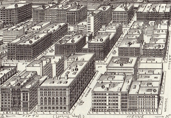
This neighborhood was perfect for wholesale as it stood immediately across the river from Union Station, the terminal of the Burlington where agents from the west would detrain, walk to the various wholesale houses to place their orders, and return to catch the next train home. The new building, in conjunction with Farwell’s gargantuan store would be the western bookends of the post-fire Adams Street corridor that began at Michigan Avenue with the Exposition Center and the Pullman Building. In between these two points, the new U.S. Post Office and Custom House Square bounded by Adams, Dearborn, Clark and Jackson had become the corridor’s urban center.
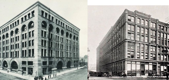
The Ryerson building’s primary client was the wholesale division of James H. Walker’s (no relation to Root’s former father-in-law James Monroe Wallker or son Wirt D. Walker) furniture and home furnishings store, thus it is still known as the Walker Warehouse. The eighteen-month interval during the building’s postponement had come at a very pregnant time in Sullivan’s evolution as an architectural designer. By the time construction had started in July 1888, almost immediately after the Republican Convention, Sullivan had had enough time to rework its elevations as his confidence and abilities grew, until he arrived at a very sophisticated and updated interpretation of Richardson’s Field Store and of his own design of the Auditorium’s elevations. Gone were the now-dated rock-faced granite and all continuous horizontal layering of the Standard Club.


Sullivan had learned the lesson of Richardson’s jettisoning of the continuous sillcourse and had actually taken Root’s early experiments with the continuous wall surface in his Argyle and Pickwick Apartment buildings the next logical step by eliminating all continuous horizontal projections except at the building’s cornice. The Walker Warehouse was Sullivan’s first design in which the entire building’s exterior was detailed as one, unornamented continuous surface, in which he proceeded to carve out the windows in a convincing tripartite composition. Whether this was by his choice or determined by the building’s budget is unclear. Nonetheless, this surface was made with a smooth-faced Indiana limestone, the same surface he had been forced to employ in the Auditorium.
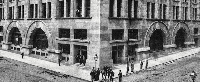

Sullivan combined the first two floors into a two-story base by employing two two-story high arches in the center of each of the public fronts. His use of an even number of bays and, corresponding two arched openings still looks rather odd (which one do I use to go in? – actually, neither one!) even after one realizes that their function was not as entries but display windows. Entry was gained through the doors located at either corner. (A reprise of the even-bayed Troescher elevation.)

The building’s most direct quote from his Auditorium design was in the four-story arcade of telescoping arches that comprised the middle of the tripartite composition, that actually echoed Root’s scheme in the McCormick Building, located only two blocks to the south on Market.

But even here, Sullivan chose not to repeat the A:A:A rhythm of his Auditorium or Root’s McCormick façade, but used an alternating A:B:A language derived from differentiating the secondary from the primary structural bays of the building, as Richardson had done in the Field Store. He then topped the building with a single story of square-headed windows in groups of four that restated the spacing of the primary bay so that the floors were composed in a 2:4:1 rhythm, while the central bays were articulated with a 1:2:4 rhythm. The composition was then subtly framed by the appropriate structural enlargement of the corner piers to buttress the arcade’s thrusts (the wider corners also allowed Sullivan to hide the slight difference in dimensions between the longer Adams Street front and the Walker elevation without having to use two different sets of measured windows and stone).
Abstract in form, with its emphasis on the structural rhythm within its surface rather than on his more typical surface ornament, the final design was, arguably, Sullivan’s best building up through this point in his career.
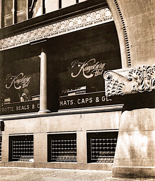
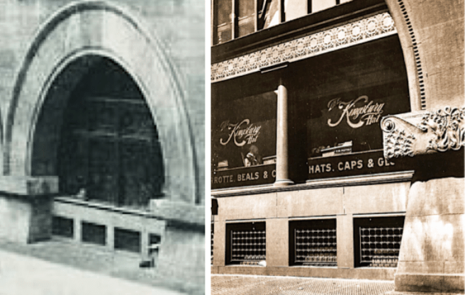

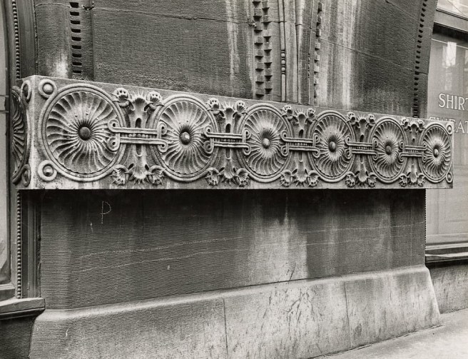
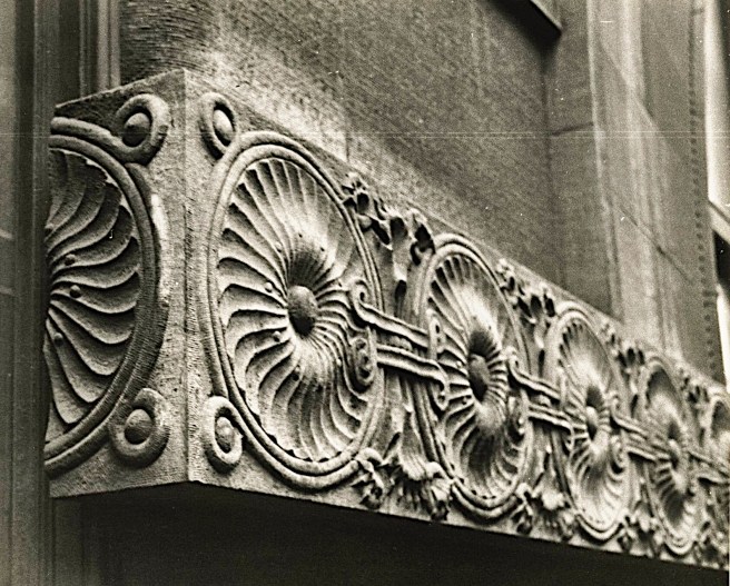
Speaking of ornament, Sullivan managed to restrain his natural tendency to “enrich” every surface by limiting his exterior ornament to only the entries and arched display windows, while he left the rest of the building’s seven stories “stark naked” like a Classical Greek statue. A modest cornice marked by a dentil molding at it base and an egg-and-dart top completed this chaste, sophisticated stone cube. Still, if you look closely at each corner of the cornice, you’ll see that he couldn’t help himself by “turning the corner” with his signature ornamental flourish in low relief. In both the cornice and the entrance, Sullivan has employed an “interesting” mixture of Classical and his own designed ornament.

Frank Lloyd Wright, then working as head draftsman in the office, recalled (in Genius and the Mobocracy) that when Sullivan had finished his drawing of the final design, he proclaimed that here “was the last word in the Romanesque.” In its construction (stone bearing walls and interior mill timber framing) as well as its minimalist aesthetic, it was indeed. The iron skeleton frame, whether Sullivan knew at that moment or not, was finally about to change everything.
FURTHER READING:
de Wit, Wim, ed. Louis Sullivan: The Function of Ornament. New York: W.W. Norton, 1986.
Siry, Joseph M. The Chicago Auditorium Building. Chicago: University of Chicago Press, 2002.
Twombly, Robert. Louis Sullivan: His Life & Work, Chicago: University of Chicago Press, 1986.
Van Zanten, David. Sullivan’s City: The Meaning of Ornament for Louis Sullivan. New York: Norton, 2000.
(If you have any questions or suggestions, please feel free to eMail me at: thearchitectureprofessor@gmail.com)
