

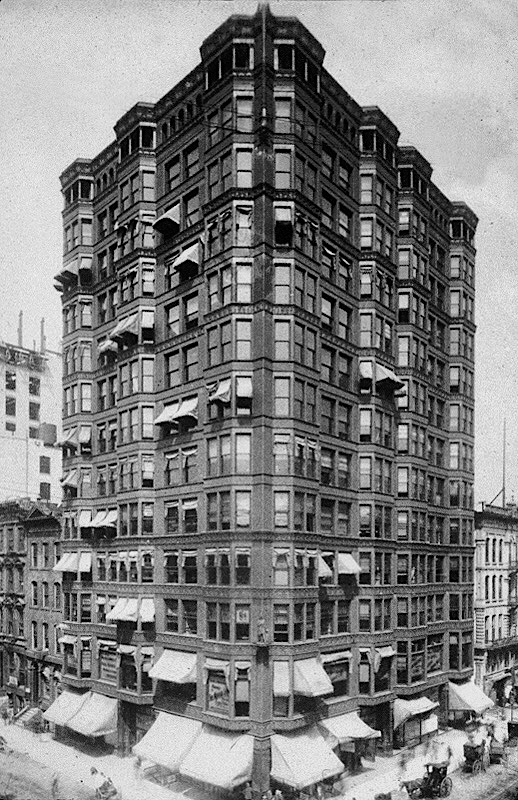
One can only imagine what the original design with a line of bay windows attached to every bay would have looked like (one can get an idea by looking at the middle of the Madison elevation where two bays are back to back). Edbrooke’s compromise had eliminated only four bays, two on each of the streets, of the original eleven. The final vertical programmatic section consisted of a ground floor of stores, the second floor, still deemed as valuable as the ground floor, had a higher ceiling than the repetitive office stories in floors three through twelve. The thirteenth floor, (or back then the fourteenth, as the number thirteen was typically superstitiously avoided) housed much of the equipment.
As the Inter-Ocean had dubbed the Tacoma as a “new order of architecture [that] is evidently here, and coming to stay – iron and fireproofing,” I will start with the repetitive main portion of the elevation, and then discuss the building’s top and base. I believe that Fuller, who had to construct the building, had suggested that they use the Rookery’s technique of cantilevering a lintel off the face of the columns upon which the exterior’s face brick/terra cotta and window glazing could be supported.

The “design detailing” was similar, but the difference between how Root detailed his bay elevation and how Holabird & Roche designed the Tacoma’s is quite revealing.
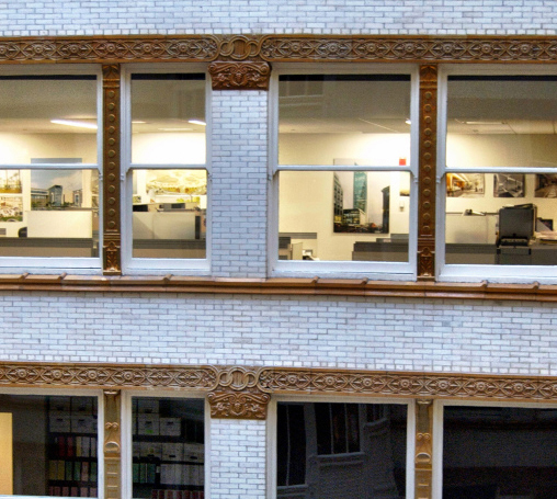
Root wanted to express the new idea of hanging the brick on the iron frame. He did this by first, locating the larger of the two continuous terra cotta bands immediately in front of the iron lintel that was cantilevered in front of the column face. The second continuous line of terra cotta, smaller because it didn’t represent the structural iron as did the lower band, was the window sill that terminated the spandrel panel that covered the ceiling/floor assembly. This detailing, however, was secondary to the primary detail of allowing the brick spandrel to run unbroken past the column. To say this in a different way: because Root’s brick spandrels were dominant, they interrupted the vertical, i.e., structural continuity of the columns (that had always been continuous in past buildings), therefore, this brick was not structural, but merely a facing applied to the iron frame that stood behind the brick and glass curtain wall.

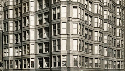
Root’s elevation reads as a series of layers alternating between spandrels and then columns and windows. Holabird & Roche’s detail at the same location repeated the continuous horizontal expression of each floor, but did not have the same concern/idea to communicate the skeletal nature of the building’s structure as had Root’s. At first glance of the overall elevation, one is struck by the amount of glass and the “skeletal” look of the building. It is when one zooms into the detailing around the windows, however, that we realize the difference between Root and Roche. Root has detailed a skeleton frame whose voids have been filled with windows. Roche has treated the zone between the continuous horizontal bands not as columns and windows with mullions, but as what still appears as a conventional brick wall with windows cut into it. This was a result of using brick not only to encase the iron columns, but also the intermediate mullions. The manner in which Roche continued this language around the bay windows only made it more difficult to articulate the “structural grid” in the facade.


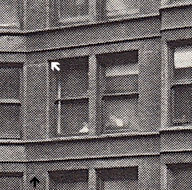
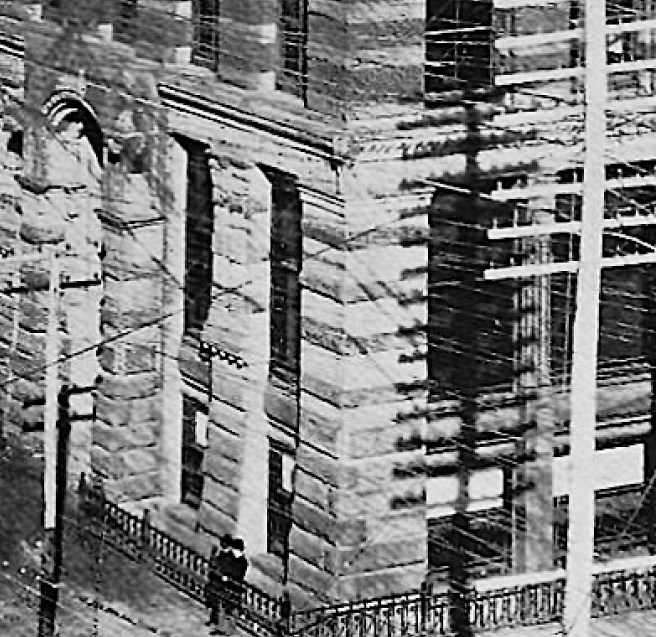
Roche didn’t “express” the exterior’s iron skeleton frame, consciously, or more likely unconsciously, but simply carried over the conventional brick wall language onto the Tacoma’s exterior. Again, this is not apparent until you look up close at the windows. The terra cotta window heads (the black arrows point to the joint between the brick and the terra cotta) were the same color as the brick. Therefore, from the street the terra cotta window heads blended with the brick, creating a wall-like surface, with little differentiation between the two materials. This left the area between the horizontal “beams” to be read not as a void of windows and mullions, as Root’s reads, but as a wall with windows cut into it. The brick spandrels without the terra cotta ornamental band only reinforced the “wall-like” nature of the elevation. These stories read not as a structural frame, but as a wall with minor horizontal lines of decorative trim.


Roche’s decision to detail the terra cotta window heads to read as flush with the columns and mullions blurred the reading of the elevation. To wit: rather than setting the projecting line of terra cotta at the top of the window, he raised it a distance of perhaps 12″. This was to be the lower edge for all of the terra cotta spandrel covers, that were to be detailed to fit within the space from the projection to the window sill. The backing for these panels was face brick, as is shown in Freitag’s detail. For whatever reason, (economics?), the ornamental bands were eliminated in floors 6, 7, 8, 10, and 12, leaving the face brick exposed in the spandrels, only confusing the reading of the elevation even more. In summary, while Roche’s elevation did express the reality of the repetitive nature of the horizontal floors, it did not express the skeletal nature of the frame behind the brick and glass. I believe Roche had no intention to do so, which, in and of itself is fine. But for historians to state that Roche expressed the building’s skeleton structure in its elevation is a simplistic misreading of Roche’s intent and detailing.

When I study the plan dimensions of the exterior “masonry piers” that Roche has detailed (within each was contained a cast iron column) versus the width of the three-foot wide masonry lateral walls that he left exposed on the exterior, I come to the conclusion that, because he had detailed both of these with almost the exact same width, he was attempting to either hide the existence of the lateral walls or to standardize the dimensions in all vertical elements for constructional/economic efficiency. Truth be told, he had a hard problem to solve: should he express the difference between the width of the iron columns and that of the lateral walls (by making the piers with the iron columns smaller than the ends of the walls) or what he finally chose to do? (There might have been one other option: that is to stop the end of the lateral walls short of the exterior and cover it with a facing that had the same width as the smaller piers. Curiously, Roche had actually detailed the ends of the four walls at the ground floor with exactly this detail!)
In summary, upon close examination of Roche’s detailing of the exterior, the Tacoma Building does not merit the reputation of having expressed the building’s structural system, while Roche did, consciously or not, successfully express the building’s overall program of repetitive office floors.
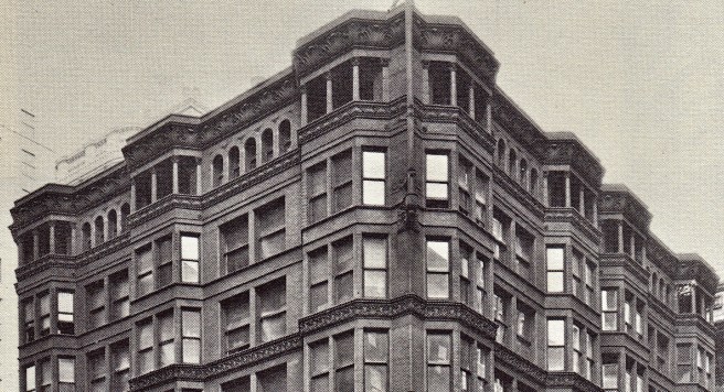
I hinted at “unconsciously,” simply because a “new order of architecture” is a very hard thing, as Root and Sullivan told us, to invent, especially in what may have been the first attempt to do so. How does one design something that has never been done before? This is quite evident in Roche’s final elevation design in which he was faced with how to design an accumulation of twelve repetitive floors? We could consider the Tacoma’s exterior walls to have been the first “systems building,” if we ignore the cast iron fronts of the 1850. It was way too early in the history of the modern Chicago School, however, to assume that Roche would accept, let alone appreciate, the reality and design each of the floors in the same manner. Tradition still demanded that he break the building’s composition into a number of horizontal layers, so as to reduce the vertical scale of such a tall building. This he did with what appears as a rather random attempt to group the floors by the application of a heavy frieze (a less pronounced frieze fronted floors two through four) at floors five, nine, eleven, and thirteen. I describe the overall effect as random as the rhythm that resulted from these cornices was Ground:3:4:2:2:Cornice; no discernable pattern is evident. (This is quite evident in the colored postcard below.)

The thirteenth floor was detailed as an open logia that rather successfully capped the tower. While the geometry of the bay windows was carried into this floor, the bays were left open, creating what appeared to be balconies on top of each line of bay windows. The reading of this floor as a cap was then reinforced first with a change in the fenestration from a pair of double-hung windows to an arcade of much smaller openings, upon which was placed an appropriately dimensioned sculpted terra cotta cornice. The result was a very satisfactory overlapping of the vertical force of the bays and the horizontal capping of the top floor.

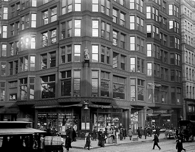
Meanwhile, the ground floor was detailed to be as open and transparent as possible with unusually large plate glass windows, taking advantage of the iron frame. In essence, it was an anti-base: gone was the traditional solidity of a massive masonry wall or a stone colonnade, replaced by the transparent veil of the enclosing glass planes, above which the upper floors appeared to magically float. Once again, we can point back to the Rookery for the precedent, this time in the glass walls that lined the two alley walls, that were also erected by George Fuller. In fact, this was the fourth building erected by Fuller that had used iron framing to open up the ground floor. He had first used iron framing in the United Bank Building of 1881 and then again in the Chicago Opera Block of 1884. So the Tacoma was not the first experiment of iron being used to open the ground floor, but the fourth in a series of buildings erected and/or designed by Fuller.

Holabird & Roche went to great extremes to pull most of the building’s columns just inside of the glass to be able to locate the glass up to the sidewalk. The only masonry purposely exposed on the ground floor were the ends of the four lateral walls, the building’s two entrances, and the heavy corner pier (the result of seeing both faces of the pier in perspective) that was detailed as freestanding at the corner of the site.
The ground floor plan was a model of efficiency: entrances on each street were located to the corner side of each of the interior lateral walls, with a corridor that led directly to a bank of four elevators. These were separated in the middle to provide an entrance to the spiral (the only) stairway in the building that was enclosed within a curved portion of each of the lateral masonry walls.

The iron framing also permitted the second floor to be as open and airy as the first. Note that large plate glass windows were also placed here, as opposed to the double hung windows used above, revealing that the height of the second floor was greater than that of the floors above. The Opera Block notwithstanding (and the Rookery’s were along the alley), never before in a Chicago building had the base of a building along its sidewalk been made so open that had to have been quite apparent in the evening, especially during the dark winter months, when the interior lights were on. In fact, the entire building lit up at 4 P.M. in November through February, would have provided quite a startling prophesy of the International Style glass towers of the future.

The opposite, however, was also true: that is, the building’s two street walls faced south and west, the worst orientations from a solar heat gain perspective. This problem was ameliorated in the typical nineteenth century manner with awnings. No awning would ever have been placed on an International Style glass box: this was quite evident in Sigfried Giedion’s Space, Time, and Architecture (1941), who went out of his way to find photographs of Chicago School buildings in the winter, when their awnings would have been removed to prevent snow and ice damage.
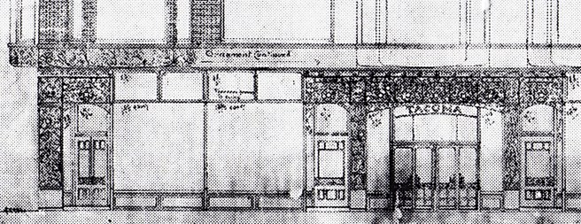
But of course, Chicago’s buildings of this period also varied from the future International Style in another important manner: ornament was a very important part of the design. In addition to the ornament of the terra cotta cornice and sillcourses, the entries on each street also sported contemporary floriated ornament.

The only other two exterior ornamental features were a flagstaff that graced the building’s corner in the top two floors, and the famous full-sized statue of Chief Tacoma that sat on its pedestal on the corner of the building at the third floor. (Bruegmann stated that Walker chose the name, Tacoma, as it was an Indian word that meant, “the highest.” It also had a romantic association with both Mount Rainier, in Washington State, and earlier, with a lake in Maine, as both were commonly nicknamed, “Tacoma.”)

Faced with having to utilize a new structural technique in the Tacoma’s exterior, Martin Roche had no thought of designing a “Chicago School” skyscraper. He did what he did best: he solved the problem as best he could and employed the current contemporary ornament to enrich the building. He did an excellent job in the face of a number of constructional and aesthetic unknowns. The Tacoma Building meets my two criteria of a “Chicago School” skyscraper: it displayed a non-historic ornament, and Roche’s design expressed the building’s function.
FURTHER READING:
Bruegmann, Robert. The Architects and the City: Holabird and Roche of Chicago, 1880-1918. Chicago: University of Chicago Press, 1997.
Leslie, Thomas. Chicago Skyscrapers: 1871-1934. Urbana: University of Illinois, 2012.
(If you have any questions or suggestions, please feel free to eMail me at: thearchitectureprofessor@gmail.com)
