
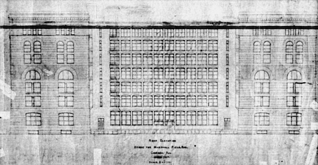
As far as our search for the first all iron skeleton-framed tall building in Chicago the Second Leiter was another “near miss.” Many historians have labelled this building as being all iron-framed, but if we walk around to the back of the building we find that the rear wall was a loadbearing gridwork of brick.


The building was only eight stories high. There was no reason for Jenney to expend the extra dollars to erect the iron frame in this location. (The same reason for Root’s use of the west masonry wall in the Rand-McNally Building.) This type of wall was exactly what Field had Richardson design with the rear of the Wholesale store, including its shallow U-plan to form a lightcourt. Leiter had simply followed the economical lead of Field in not wanting to pay the extra cost of using iron framing in this location and that of a multistory atrium to light the interior of his store.
With this exception, Jenney structured the building with the metal skeleton frame (cast iron columns and steel beams). This may be somewhat misleading, however, for although there were no “walls” on the exterior, Jenney had once again, as he had detailed the Home Insurance Building, placed the cast iron columns inside the granite piers. (Maybe a better way of saying this is that he wrapped the stone slabs of the exterior piers around the iron columns.)

In fact, these iron columns had the same box cross-section but without the concrete filling of the Home Insurance Building. The first question to ask is why use granite slabs on an iron frame? Of course, the answer must have been because Field had demanded that Richardson use stone, and Leiter, by no means, wanted to look “cheaper” than Field. Following Field’s lead, the Auditorium had been changed from brick to stone, that then led Sullivan to experiment with smooth-surfaced stone on the Walker Warehouse.
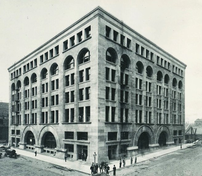
This might have sparked a “fashion” but the last three buildings I have reviewed did not use stone. Root used glazed terra cotta in the Rand-McNally Building, first as an experiment, but also, I pointed out that this would have reduced the power of the bricklayer’s union to control the project. This, no doubt, Leiter would have also added into his financial calculations.


The piers at the building’s corners comprised of five and half feet widths of granite, the eight intermediate piers were slightly thinner, all supported itheir own weight to the ground. The building was only eight stories high, so the stone would easily support its own weight; no need to increase the size and cost of the cast iron columns. The stone spandrels, however, would have to be carried by the steel spandrel beams. The weight and inertia of the granite exterior would have assisted in resisting wind loads. As this was only an eight-story tall building, however, relying on a stone exterior to assist in resisting wind loads was easier to do than in a 14-story skyscraper where the wind forces are a much more dominant design factor.

Curiously, the Inter-Ocean reported on July 7, 1889, that Jenney’s iron frame was like “the system of construction first used in this extensive way by Mr. Jenney in the Home Insurance Building, and which has since become so popular for commercial and office buildings.” This was the first published mention of the use of iron in the Home Insurance Building that I have uncovered since its completion in May 1885. Over four years had passed without any interest or mention of Jenney’s experiment with iron columns, until LeRoy Buffington had been granted his patent for iron framing on May 22, 1888. Why wasn’t the structure of the Home Insurance Building mentioned in any of the articles that covered the design and construction of any of the earlier constructed buildings that employed the iron frame in their exteriors, such as the Tacoma or Chamber of Commerce Buildings or the Rand-McNally Building? All three of these were designed and constructed, using iron shelves to support their masonry exteriors, during the publication of Buffington’s patent of iron framing. But over a year had since passed before anyone had really appreciated the threat that Buffington’s patent could pose to Chicago’s owners and builders. Could it have been the threat of royalties due to Buffington who now had a patent for iron framing that forced Chicago’s construction community to seek an example of “prior art” in order to negate his patent royalties? The “big lie” had been born.
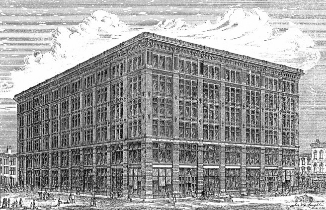
Jenney’s design consciously, or merely conceptually, once again recalled the Shillito’s Store in Cincinnati (v.2, sec. 6.13) that he had used as the basis for the design for his earlier 1879 building for Leiter. (Obviously either leiter or Jenney really liked Shillito’s building…) The second Leiter Building would be an updated version of the twelve year-old Shillito Store. In essence, Jenney would take its cubic, Renaissance palazzo form and structurally-based elevations to the next, logical evolutionary step. As was the case with Shillito’s store, there were no walls whatsoever in the interior of Leiter’s store. This was a departure from the Field store in which Field had demanded firewalls to reduce the spread of any fire. I also pointed out that Leiter had followed Field, and not Shillito by nixing the extra cost of an interior atrium.

In the wings of the Hercules building, Jenney’s elevational language was “structural.” That is, the columns were expressed as continuous piers, and the beams were expressed as recessed spandrels. However, rather than just simply covering the metal frame with a repetition of the minimum of fireproof material, as Root had always done in his lightcourt elevations, and as had Holabird & Roche with the exterior of the Tacoma, Jenney preferred to compose a lyrical elevation that still employed the conventional motif of a rhythm that expressed a compositional hierarchy. By increasing the widths of some of the piers, he created a second rhythm across the face of the building. I didn’t realize the reason for this until I spliced the tower out of the perspective sketch above; the two wings were not the same length! I had to count the number of bays in each wing to confirm this, because Jenney’s visual trick of using the widen piers to “camouflage” this asymmetry had completely fooled me. He also resorted to the Classical tripartite composition of the elevation with corner pavilions (with five vs. three windows) into a tripartite elevation of a two-story base, a four-story middle, and a two-story top, defined by making the spandrel flush with the piers at the seventh floor.

I reviewed the Hercules elevation so that we might better understand how Jenney arrived at the final elevation of the Second Leiter Building. His initial elevation for the six-story design was simply the Shillito’s elevation with three exceptions: first, Jenney had expressed only every other interior column with a pier (he had stretched the visual width of the bays). Second, he had placed two, rather than three double-hung windows in each bay. Last, and most importantly, instead of keeping the width of the corner piers the same as the interior piers as had McLaughlin, Jenney wanted to “compose” the building’s elevation rather than simply accept the repetition of the bays ad infinitum. Therefore, he widened the corner piers as the prevailing architectural conventions dictated. But when compared to his Hercules elevations, Jenney followed McLaughlin’s precedent by not creating “corner pavilions” at the corners, per the French Classical tradition.
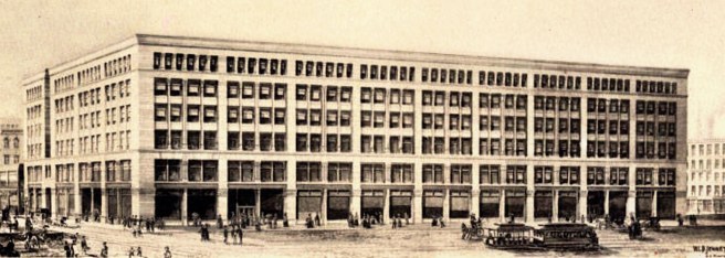
While this elevation still looks like a “structural” frame, in fact this façade was, as is the final elevation, a “structural” lie. Obviously, as I pointed out in the corner detail of the ground floor above, the two side elevations were most decidedly “dishonest,” as the repeated spacing of the piers from the front elevation bore no relation to the spacing of the interior columns along these two elevations. Jenney had chosen to “express” (not literally expose) in the State Street facade only every other column of the interior frame, probably for two reasons: first, the elevation would have been just “too busy” with piers at the same spacing of the interior columns; and second, those wide piers reduced the amount of daylight when compared to the intermediate smaller mullions (that are in front of every other structural column in the interior). Here is a perfect example of a “rational” design that is not “truthful.” The two terms are not necessarily synonymous. Then Leiter added two more stories, and just like Root who had to revise the elevations of the Rookery for the same reason, Jenney had to rethink the now eight-story elevations.
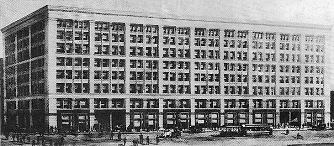
His solution was to remove the cornice of six-windowed bays, and rubber stamp the middle layer of three floors of the six-story scheme on top of the original three-story layer, with one exception: he placed the six-windowed cornice in the upper floor of the new, three-story layer. He capped this new layer with an appropriately scaled cornice, creating a crisp cubic volume. But then he faced a choice: should he keep the continuous spandrel at the sixth floor that would nullify the conventional tripartite scheme of the old elevation, or eliminate this line and allow the piers to extend unbroken for their entire six-story height so as to maintain a tripartite composition?

Unfortunately, he obviously couldn’t make up his mind and had naively tried to do both, but of course, this was inherently impossible. He capped each of the ten piers with abstracted capital as if they were six-story tall elements, that broke the elevation into nine equal bays. One of the few unfortunate design errors occurred where these piers were joined flush with the continuous spandrel that Jenney used to break the six-story body into two three-story layers. Instead of allowing the piers to be dominant by recessing this horizontal behind the vertical thrust of the piers, as he had done in the other four spandrels, Jenney kept this horizontal in the same plane as that of the pier, implying that the elevation was not a line of piers that supported the cornice, but a smooth plane into which the windows were carved, not unlike Root’s treatment of the Rand-McNally Building. This resulted in an awkward hermaphroditic quality when Jenney applied capitals at the top of the piers, that was only reinforced by the design of the joints in the granite that implied the frieze was dominant over the piers because the vertical joints of these blocks were consciously not aligned with the edges of the pilaster. Was the elevation a colonnade or a wall?
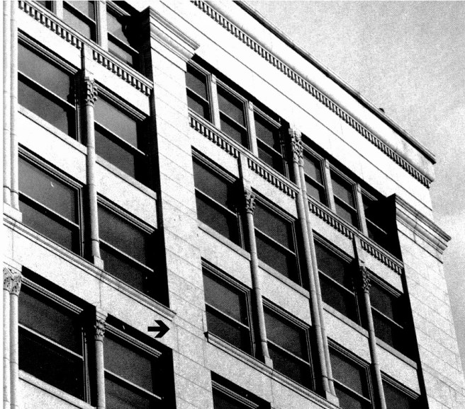
Each of the nine bays was broken into an upper three-story zone, and a lower three-story zone that were detailed with a subtle and sure-handed difference. The large horizontal distance between each pier was not a direct result of Jenney’s use of a steel beam to span this distance. (A plate girder, 36 inches high, made up of two cover plates, forming the upper and lower flanges, two web plates, and four angles, runs around the entire wall just above the first story. Box girders are also used as spandrels, but almost all the other beams are rolled steel I-beams.) As the floor plans clearly show, Jenney chose to place a pier in front of only every other column. This was a conscious choice on his part to reduce the number of vertical elements in the State Street elevation in an attempt, successful in my opinion, to achieve a better balance between the horizontals and the verticals in the façade. In essence, he had designed two almost identical horizontal layers in the elevation.
Rather than matter-of-factly just repeating the same window four times in each bay, Jenney’s lyrical intent arranged each of the two layers in a geometric hierarchy by first dividing each major bay in half with a thinner, secondary pier in front of the “every other column.” These contained two engaged colonettes that stretched for the three stories between the major central frieze. These broke up the four double-hung windows in each bay of the lower layer into pairs of two, that were then further divided by a tertiary pier that had one engaged colonette. In the upper layer, in the eighth floor he placed six narrower windows, three to either side of the secondary pier to help create the building’s top.

Obviously, this spacing forced him to stop the tertiary piers one floor shorter than in the lower zone, and here he made a second, minor, but still visible error. Instead of allowing the spandrel at the eighth floor to span continuously from the primary to the secondary piers, which he implied with the location of the capitals of the tertiary colonettes, he placed a vertical extension on top of this capital that extended to the sillcourse of the window above that broke the spandrel into two halves. He had located the capital of the tertiary pier in the correct location to support the lintels in the spandrel; it was the vertical extension block that simply confused the clarity of the otherwise exquisite structurally expressive hierarchy of the elevation. Jenney was forced into this compromise because he couldn’t repeat the detail he had used in the same location two floors below (see photo above) because while the lower detail had the spandrel in the same plane as the intermediate pier, he had recessed the spandrel in the eighth floor, but had kept the pier in the original plane, leaving the dimension of the recess to be addressed, hence, the reason for the offending stone extension.
A third, minor design error in the elevation was located in the second floor, where Jenney changed the intermediate pier from two to three engaged colonettes. The visual weight of the three columns was simply not sufficiently visually supported by the granite lintel that it sat on, and if Jenney was actually trying to impart a rhythmic progression in this vertical line, keeping the three in the lower level, and two in the middle, should not have the uppermost layer contained only one colonette, instead of two? It would have been better if he had maintained the two colonettes in this floor.

These minor flaws notwithstanding, Jenney’s final design was a well-balanced weaving of horizontals and verticals in search of Owen Jones’ “repose,” with the nostalgic stone voussoir arch finally relegated to the dustbin of history. This was a truly rational, modern elevational expression based upon (but not identical to) the underlying rectangular grid of the structural metal framework. It is my favorite of Jenney’s many designs.
FURTHER READING:
Turak, Theodore. William Le Baron Jenney. Ann Arbor: UMI Research Press, 1986.
(If you have any questions or suggestions, please feel free to eMail me at: thearchitectureprofessor@gmail.com)
