

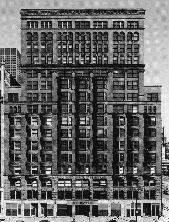
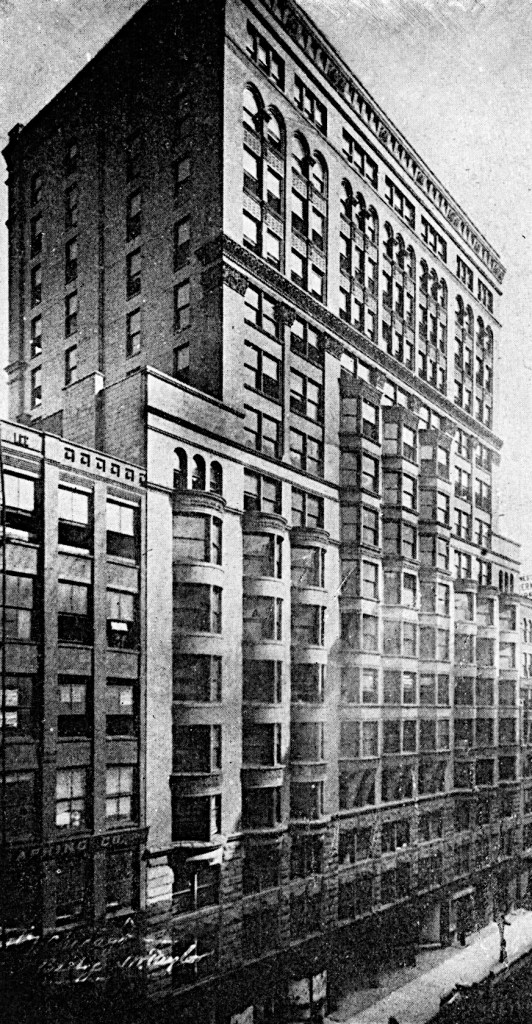
So while the Manhattan’s gravity loads were carried by its iron skeleton frame such that it heralded the future, Jenney’s design of its two identical elevations was much more traditional, especially when it is compared to his Second Leiter Building. The Manhattan elevations suffer from having no central idea or concept, and at the same time, too many conflicting details. Here is Jenney’s predilection to break a building into a stack of horizontal layers at its worst. While I defended Jenney in his earlier designs as an architect who had arrived at a very appropriate design solution for a building that would eventually have more floors added at a later date, he faced no such challenge, however, with the Manhattan. He, therefore, had simply fallen back on what he knew to do best: break an elevation of a tall building into a small number of horizontal layers. But the Manhattan Building was to have sixteen stories! It was also, by design, to be stepped back at the tenth floor. Either of these requirements could provide a viable concept around which an architect could develop an elevational scheme. Sixteen stories was way past the point of awkward proportions evident in the adolescent Rookery. The Manhattan was to be a tall adult, and in comparison to its surrounding neighbors, it would seem even taller. So one might try to express the vertical dimension in it elevations. In fact, even in the final design, there are pilasters that read as nine stories tall; there was simply no way of masking sixteen floors. Or one could have formally emphasized the stepback at the tenth floor by consciously giving the elevation a lower nine-story base upon which the seven-story upper block was placed.

This problem was exactly the same faced by Sullivan in the design of the Auditorium tower, and unfortunately, Jenney apparently followed Sullivan’s lead in trying to do both concepts, and in doing so, accomplished neither. Trying to give Jenney the benefit of the doubt, one could describe his design as an attempt to reduce the building’s gargantuan, completely out-of-the-character of the neighborhood’s scale by applying continuous lines of horizontal emphasis in such a manner to prevent the eyes from perceiving the true vertical dimension of 210.’

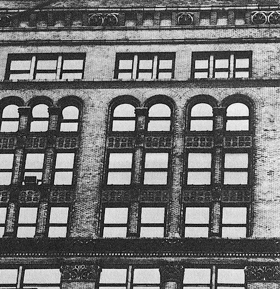
There are six distinct layers in Jenney’s elevation:
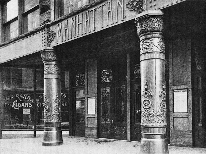
1. The ground floor of storefronts was covered with cast iron plates that had no aesthetic connection with the 15 upper floors, other than they sat on it.
2. Floors two and three are grouped by a straightforward grid of rough-hewn granite into the best-designed layer of the building. Here is the base of the Hercules Building par excellent! Unfortunately, it sits uncomfortably on top of the iron ground floor, seemingly floating in midair. We all know that granite cannot, nor should not float. Jenney would have been much better off to have simply let the granite piers continue to the ground, and then to have detailed his iron as an infill between and/or in back of the granite piers, as Root typically did.

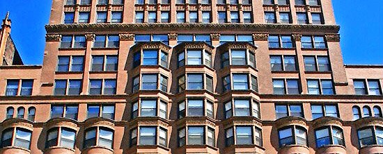
3. Floors 4-9 filled up the base of the building that extended to the top of the existing adjacent buildings, plus one story. By itself, it was a relatively straightforward design that had a definite vertical accent, especially once the nine lines of bay windows were added. He created a vertical center within the elevation by using polygonal bays in the three middle bay windows while changing to semicircular bays in three bays to either side of the center. While the three center bays continued up to the thirteenth floor, he stopped the three lines of bays at both ends at the ninth floor, ostensibly to create balconies on the roofs of these six projections. This decision forced him to add an unfortunate, continuous sillcourse at the ninth floor that really looked meaningless when it crossed in front of the building’s interior piers. Worse, however, was his decision to run it around the three lines of bay windows in the middle that, otherwise, did not stop at this point but continued to move upward into the upper block.
He capped this layer with an appropriately scaled cornice that would have been fine, except that not only did he wrap it again around the three center bay windows, but then also placed a superfluous parapet on top of the cornice to cap the end bays of the building that did not continue into the upper stories. This might have been acceptable if only he hadn’t continued it past the corner of the upper block into it. Having done this he was forced to detail the corner pilaster in the next layer as if it was sitting on the parapet, which broke all sense of structural, let alone, compositional hierarchy. Had this parapet simply stopped at the corner of the upper block, the pilaster would have then continued down to the cornice and would have had the same height as did its six siblings in the interior of this layer.
4. Floors 10-12 were grouped by the aforementioned pilasters (with the exception of the corner mutants) into an otherwise well-articulated structural elevation of pilasters and recessed spandrels. The three center bays projected out, reinforcing the sense of the elevation’s center, while the two bays at the sides, sans bays acted as corner pavilions. At the top of this layer Jenney sat the heaviest of his cornices that meaninglessly broke the upper block at the thirteenth floor. This still remains as the worst aspect of the Manhattan’s elevations. Why would one want to completely arrest the vertical rise of the eyes of a viewer at this level? To compound this error, the top four floors were detailed in a completely different language, as if they were added at a later date.
5. Floors 13-15 are grouped into a layer that not only looks like it was added later, but that it was also designed by a different architect, one who could not appreciate that the architect of the lower 12 stories had employed a columnular language of pilasters, spandrels and cornices. Instead, the second, later architect decided to switch to a wall or surface language in this layer. After all, why not use it now in this location because the architect of the floors below has not yet employed an arch in this façade? It was not the use of the arch that was totally out-of-character with the entire lower elevation, that he had somewhat remedied by placing arched openings in the top floors of both corner bays in the tenth story, but the fact that Jenney had carved the arcades into the wall, rather than placing them on the same pilasters he had used in the first twelve stories. Had Jenney’s office simply run out of column capitals?
6. Floor 16 capped the composition with triple windows carved into the wall language of the layer below. While the triple windows did align with the triple arcades immediately below in the center of the façade, they did not align with the paired windows below in the end bays. Here, again, is an example of not following a consistent logic when it was easier to simply change your mind. A corbelled cornice above completed the layer and capped the entire building.
The visual cacophony of the Manhattan’s elevations was then completed with a decorative addition of corbelled brackets at the base of the three center bay windows. And just to complete this tasteless addition, these were positioned one floor above the base of the flanking bay windows. To use a then au courant term, the Manhattan Building seemed to represent “parvenu” aesthetics at its worse. Or to employ a more contemporary phrase, “More is not always better.”


By no means, however, am I suggesting that Jenney should have used the rational language of the Second Leiter Building for the Manhattan. The Manhattan Building was not predestined to suffer such a garish, unsophisticated visage merely because it was the first 16-story skyscraper, for Root’s final design of the Monadnock disproves this argument at first glance. In fact, the seeds of a well-designed elevation were in place in Jenney’s final elevation. If one squints at the Manhattan’s elevation, one sees that Jenney employed two different widths of pilasters to cover the cast iron columns. I will label the wider of the two, A; the narrower of the two, B. Reading across the façade of the lower portion, one finds the rhythm of A-A-B-A-B-B-A-B-A-A. Jenney had broken the vertical layering of the wall into the conventional scheme of using the heavier pilasters at the corners and to frame the entrance bays. Because of the stepback, there is a second set of corner pilasters in the lower base, as the upper block corner pilasters continue into the lower base. Had he simply reinforced this rhythm without the abrupt interruption of the heavy cornice at the thirteenth floor, the building’s design would have been much better by emphasized the building’s 16-story center,
An alternative scheme to this one would have been to detail the setback upper block as a separate volume that simply sat on the lower nine-story base. Either of these schemes would have had an architectonic or conceptual logic that the final, constructed elevation of the Manhattan Building sorely did not. Jenney simply was “out of his league” in trying to design such a tall building. John Wellborn Root, however, as we shall see, was very much up to the challenge.
(If you have any questions or suggestions, please feel free to eMail me at: thearchitectureprofessor@gmail.com)
