6.7. POSTSCRIPT: THE LIFE OF THE AUDITORIUM

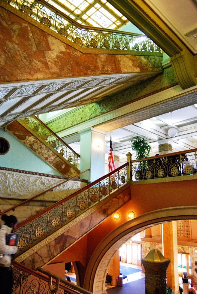
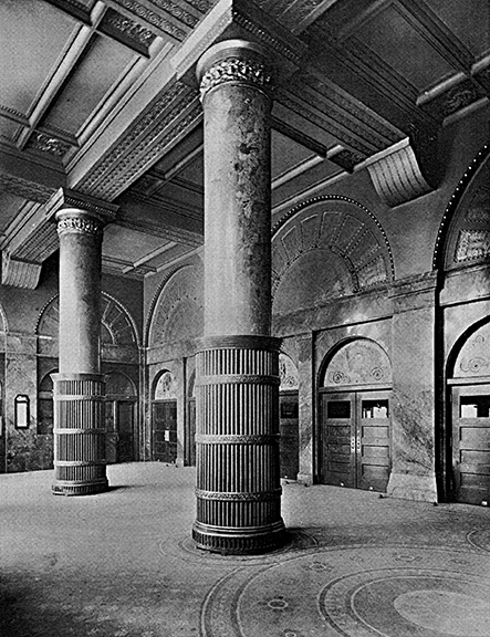
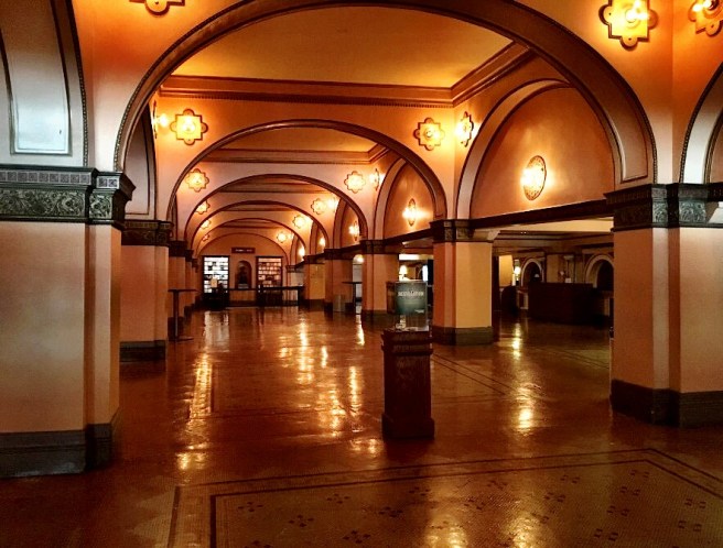
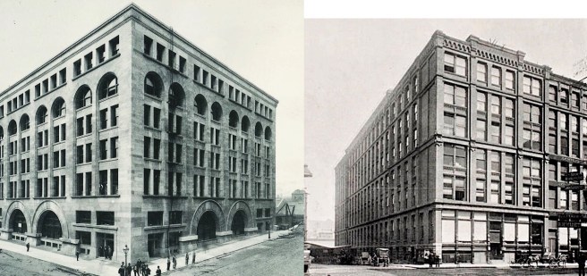
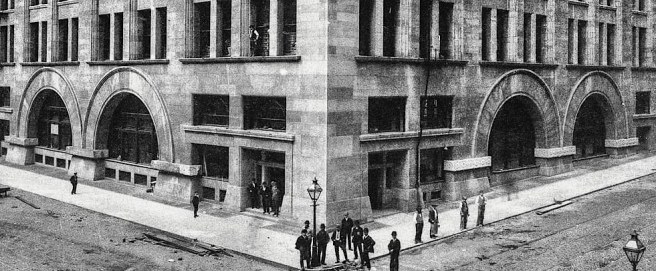
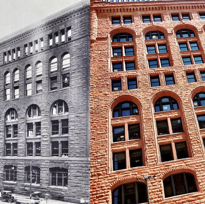
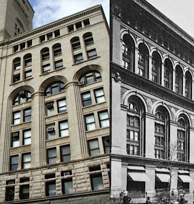
For all of the expense in time and treasure spent on designing and constructing the Auditorium, it was truly unfortunate for all involved that the Haymarket Square bombing had occurred in May 1886.  Had it been forestalled for only two years, with the entire timeline of the Auditorium being correspondingly pushed back by the same two years, it would have resulted in an entirely different building, one that might have better withstood the tests of time, for the Auditorium as built, was truly a white elephant in more ways than one.  In August 1886 it had been designed at the end of the era of the masonry bearing wall structure, meaning that Adler had only the masonry bearing wall to support the building’s exterior and tower, whose massive weight was responsible for the building’s excessive differential settlement and corresponding warping of the floor levels throughout.  There would be only one later significant building constructed in Chicago with the masonry bearing wall after the Auditorium, and that would be the sixteen-story Monadnock Block whose anachronistic construction was the result of the conscious rejection of the iron frame by its owner, Shepherd Brooks. The dawn of the iron skeleton frame had just begun (Root had just employed it in a design for the first time in the Rookery only months before the bombing).  If Adler had faced the design of the Auditorium in December 1888-April 1889, he could have employed iron framing in the building’s exterior (as we will see in the following chapters).  One thing is for certain: if Adler had used iron framing, the building’s functioning would not have been impaired by the severe floor slopes that the building has had to endure.  

Second, if the Auditorium had been built two years later, Adler would have used iron-reinforced pad foundations, rather than the antiquated, stepped stone pyramidal foundations that he had used.  While this would not have had any impact on the building’s exterior image, the much-reduced weight of the iron-reinforced pads, as well as the shallower depth required (with a corresponding increase in bearing strength) would have also diminished the amount of settlement the building experienced over time.

Third, within a year of the Hotel’s opening, American tastes in hotels had changed to expecting a private bathroom in their room.  The communal or hallway bathroom that Adler and Sullivan had based the design of the Auditorium’s Hotel plan (it was planned on the European plan of one shared bathroom for every ten rooms) fell out of favor, the result of which was to force the hotel management to lower its rates to attract a lower class of guests to whom this did not matter as much.  As such, the Auditorium’s Hotel never truly achieved the long-term prestige that Peck had envisioned for it.

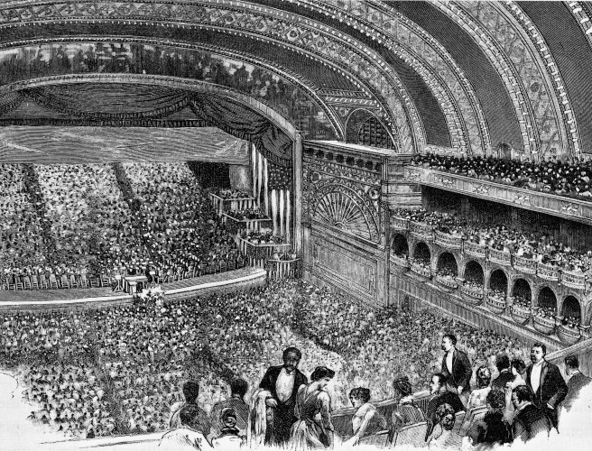
In fact, from the viewpoint of both Peck and Adler & Sullivan, the Auditorium Building never really achieved much that Peck had hoped for.  It never hosted a national presidential convention once it was completed.  We have already seen that due to the Association’s anti-union stance that the Democrats would never hold a convention in the building.  It was also simply politically naïve of Peck to expect that the Republicans would agree to always hold their convention in Chicago, let alone always in the same building, to the economic and political loss of other cities or owners of other buildings.  And just as Peck, a private citizen, had engineered the construction of the Auditorium, the free market could not prevent another Chicagoan from building an even larger building that might attract the Republican convention if they ever chose to return to Chicago.  This is exactly what occurred, following the 1893 World’s Fair, with the construction of the Chicago Coliseum at 63th and Stony Island that housed the 1896 Convention.  So the Auditorium, planned at its inception to provide a permanent venue for the national conventions of both parties, was able to function in this capacity only once for the Republicans in 1888.

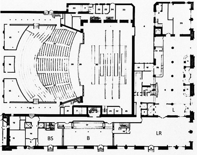
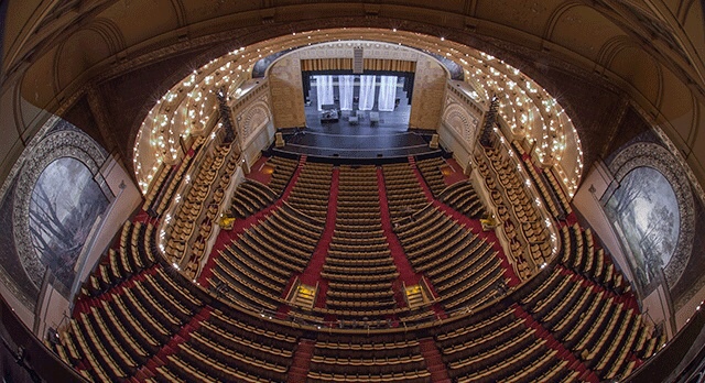
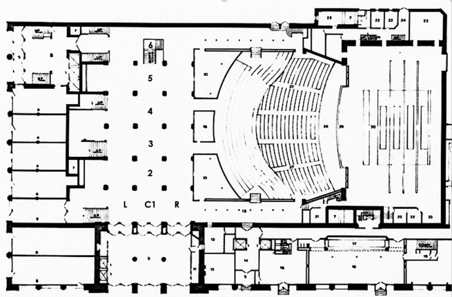
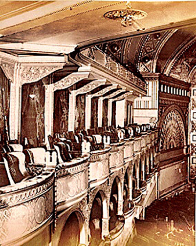
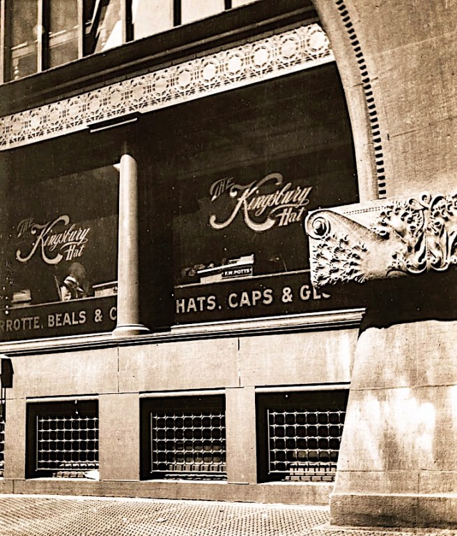
The need to be large enough to house a national convention had forced Adler to maximize the Auditorium’s seating capacity that over time also proved to be counterproductive to both the Opera and the Chicago Symphony Orchestra, that moved into the facility in October 1891.  Quite simply, there were always too many seats available that resulted in a constant disappointing sale of subscription series tickets, the lifeblood of all musical organizations, because everyone knew that there would almost certainly be the right number of tickets available for purchase on the night of a given performance.  The eventual sloping of the floor levels at the perimeter walls would so warp the building’s floor elevations that the reducing partitions for the two galleries could no longer function and were, thereby, left open, only exacerbating the seat/ticket issue.  

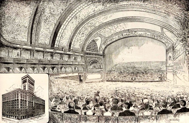
The size of the house to hold such an audience was also detrimental to the orchestral acoustics that only reinforced the CSO’s demand for an improved facility of its own (provided in the design of Orchestra Hall two blocks north on Michigan Avenue by Burnham in 1904).  While Adler had designed the Auditorium’s acoustics for optimum vocal performance, orchestra musicians needed to hear each other constantly during a piece, something the vast auditorium with its open rear did not really provide.  CSO Director Theodore Thomas was once overheard complaining, “Nothing comes back!”

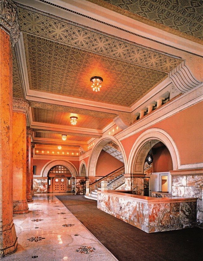
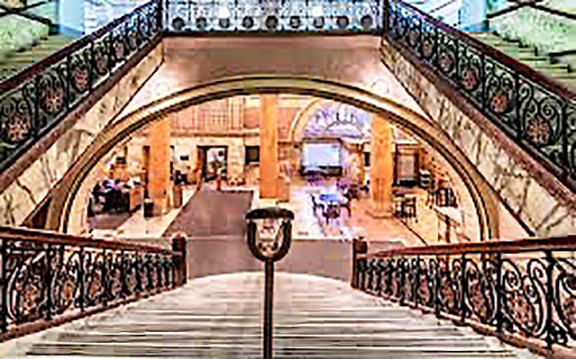
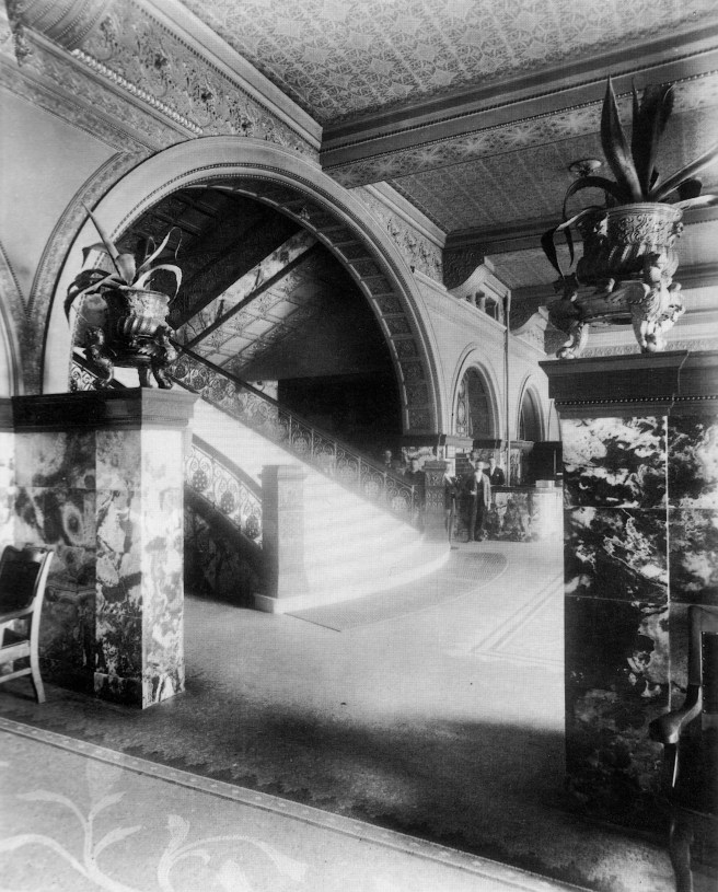
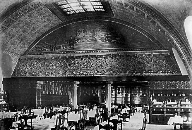
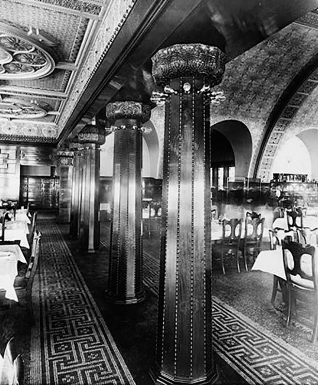
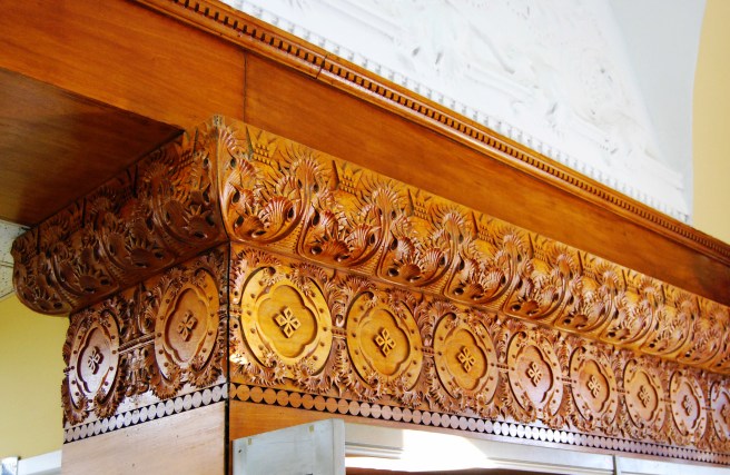
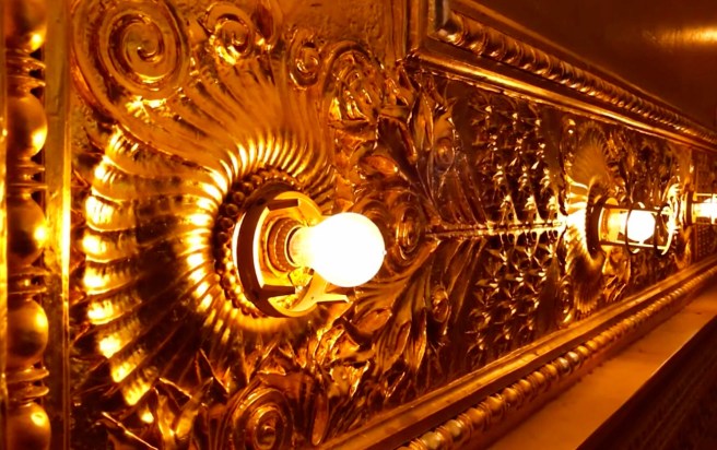
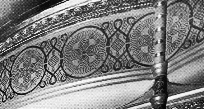
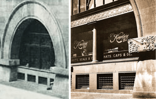
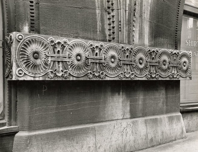
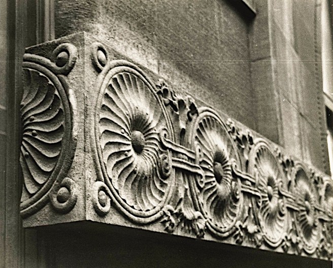
Lastly, the Auditorium’s artistic reputation, of representing one of Sullivan’s best examples of his now maturing ornamental style that was best described by Edward Garczynski, “It is indubitable that there is within these walls an architecture and a decorative art that are truly American, and that owe nothing to any other country or any other time,” would be short-lived and truly under appreciated for many years.  Within three months of the opening of the Hotel’s Banquet Hall, John Root would die, and without the Chicago School’s chief spokesman, the entire search for an American, let alone a Chicago style of architecture, would be pushed to the background of history as the American NeoClassical Style, as best represented by the 1893 Chicago World’s Fair, quickly gained stylistic preference among the city’s clients and architects.

Tragically, the harsh reality of the Auditorium was that Adler & Sullivan had spent over four years of their lives, sometimes to the detriment of the firm’s short-term profitability as well as to their individual long-term physical well-being, designing and constructing a truly magnificently detailed dinosaur.

I’d like to recognize Bart Swindall (1951-2019), the longtime Archivist and Tour Director for the Auditorium Theatre Council. He was a good friend and kindred spirit. He gave many tours of the Auditorium for my students during my teaching career. He also gave me a fond memory by allowing me to stand on stage alone while my students sat in the third balcony. I dropped a nickel to the stage floor, and yes, its sound rang through the space…

FURTHER READING:

de Wit, Wim, ed. Louis Sullivan: The Function of Ornament. New York: W.W. Norton, 1986.

Siry, Joseph M. The Chicago Auditorium Building. Chicago: University of Chicago Press, 2002.

Twombly, Robert. Louis Sullivan: His Life & Work, Chicago: University of Chicago Press, 1986.

Van Zanten, David.  Sullivan’s City: The Meaning of Ornament for Louis Sullivan. New York: Norton, 2000.

(If you have any questions or suggestions, please feel free to eMail me at: thearchitectureprofessor@gmail.com)

6.6. DETAILING THE INTERIOR OF THE HOTEL

Adler & Sullivan, The Auditorium Hotel. Lobby. Note that the Stair arch is twice as large as the adjacent arches. (Siry, The Auditorium)

While workmen had strained to complete the interior of the Auditorium, Sullivan had moved on to designing the interiors of the various spaces in the Hotel portion of the building. He was gaining confidence in his design abilities and theory with each new challenge he faced, applying the lessons he had learned from the mistakes he found in his earlier designs as they were constructed.  Chief among these, I believe, was his mistake to take a “modular” approach in the forming of the larger public spaces in the theater, i.e., the monotonous repetition of the cubic “boxes” in the Main and Upper Foyer.  I already pointed out that he quickly revised this idea in the Upper Foyer where it met the Grand Stairs by eliminating the curved soffits in the two bays immediately in front of the Grand Stair and by removing the main pier between these two bays at the base of the Stair by replacing it with two columns pushed to either side of the Stair, thereby combining these two bays into one larger space that formed a “lobby” for the Stair at this point.

Adler & Sullivan, The Auditorium Hotel. Lobby. By eliminating all of the curved soffits that he had detailed in the Theater’s Lobby, the structural bays are allowed to be perceived as one grand space, not a collection of modules. (Online)

He employed this detail at a larger scale in the Hotel’s lobby, eliminating all the curved soffits in favor of a more conventional beam and column language, that allowed all of the structural bays to be read as a single, “grand” space. He also repeated the elimination of the column between the two bays within which he had placed the Grand Stair.  This time choosing not to split the column into two minor ones as he had done in the Upper Foyer but using a larger arch to span both bays.

Adler & Sullivan, The Auditorium Hotel. The Grand Stair in the Lobby. (Online)
Adler & Sullivan, The Auditorium Hotel. Hotel Entrance on Michigan Avenue. (Author’s collection)

Being dropped off at the triple-arched entry on Michigan Avenue, a hotel guest proceeded through the doors into a two-story lobby similar in scale to the theater’s Vestibule. The reception desk in the Lobby was positioned immediately to the right, from where one then moved left to the Grand Stair that spilled into the space under the 34’ monumental arch (above which Adler had to locate a steel transfer beam to replace the column that supported the nine stories of columns above, that he had to remove to create the span).  This arch was flanked by smaller arches that recapitulated the three-arched entry on the exterior. 

 Unfortunately, Sullivan did not or could not align the two ranks of arches in plan so that they might reinforce each other in a better resolved composition (i.e., the Grand Stair could have and should have been symmetrically aligned with the central arch in the entry. This is readily discernable as one walks into the building through the central entry arch or when descending the stair.).  

Adler & Sullivan, The Auditorium Hotel. Descending the Grand Stair. My point is that the view down the stairs is anti-climatic, missing an opportunity to reinforce the exterior’s theme of triple arches. (Online)

The tightness of the ground floor plan was such, however, that Sullivan had been forced to shift the Grand Stair a full bay to the left (facing the desk), placing it off-center with not only the centerline of the center entry arch, but also with the loggia overlooking Lake Michigan that one approached upon arriving at the last step on the second floor.  I simply don’t understand why Sullivan did not align the three arches along the back wall of the lobby with the same three entry arches in the exterior? (As the Grand Stair arch spans two bays, as do all three of the exterior arches, actually the exterior arches have been fitted into the two bays and are slightly smaller but nonetheless, both ranks of arches could have had common centerlines/alignments.) I think the functions under the two smaller interior arches could have easily been redesigned within the larger diameter arches, and when done, the alignment of the two ranks of arches would have resulted in a more resolved architectural aligned space than what was actually built. To display my theory that there are more than just one solution to an architectural problem, I could also argue to keep the location of the Grand Stair and to rework the Michigan Avenue elevation into an asymmetrical solution that better reflects the reality of the building’s planning. In fact, a third solution would be to rotate the auditorium by 180°, moving the Theater entrance onto Michigan Avenue and the Hotel entrance to Congress. Entering the Theater lobby, one would walk up the stairs and into the Upper Foyer that would have that expansive view of the lakefront, a perfect spot for intermission, à la the Paris Opera House’s view back down the Avenue de l’Opéra. (Yes, indeed I would love to have a go at redesigning this building with a rotated theater, still employing all of Sullivan’s ornament…! But I suppose that Sullivan would have likewise.)

Adler & Sullivan, The Auditorium Hotel. Lobby and Grand Stair, view from the Ladies Entrance. Your back is to the entry for the Ladies Restaurant.  (Historic American Building Survey, #IL, 16-CHIG, 39—97)-1007-62)

The customs of the period also required the provision for a separate entry for women to avoid unwanted contact with men, as well as to discourage the activities of prostitutes. This entry was located through a separate door located in the southernmost entrance arch that was reserved solely for women.  From the Ladies Entrance, one could either proceed into the lobby or turn left into the Ladies Restaurant. Entrance to the ladies Restaurant was also gained through a corridor off the Grand Stair that also led to the Men’s Bar and the Barber Shop.

Adler & Sullivan, The Auditorium Hotel. Ground Floor Plan. L-Ladies Entrance; LR-Ladies Restaurant; B-Bar (note the local of the three cast iron columns); BS-Barber Shop. These three rooms were demolished in 1950 to make room for the sidewalk when Congress was widened into an expressway.
Adler & Sullivan, The Auditorium Hotel. The Ladies Restaurant. (Online)
Adler & Sullivan, The Auditorium Hotel. The Bar. Note how Sullivan detailed the top of the bar continuous into the adjacent column. While these columns were made from solid oak trunks, the barff-processed (bronze-plated with oxidized highlights) cast iron columns that supported the billiard mezzanine located over the bar were designed by Sullivan to display their much greater strength with the much smaller diameter he gave them. Take a close look at the “minimalist” geometric patterns he used on the face of the bar and on the opposite wall employing solid veneers that were cut cross-grained by a whipsaw. Its demolition in 1950 was a tragic loss for the city’s architecture. (Upper: Online; Lower: Historic American Building Survey, #IL-1007-#9843)

Hotel guests and visitors had the choice of either ascending the spatious Grand Stair or summoning a pair of elevators to the upper floors, where the Dining Room was located on the top floor, overlooking the lakefront.

Adler & Sullivan, The Auditorium Hotel. The Grand Stair. (Author’s collection)

The Dining Room on the Tenth Floor (linked bridges to the four-storied kitchen built over the stagehouse) allowed Sullivan to create a column-free space that was filled with copious amounts of daylight by inserting skylights between the arches used to span the entire width of the building. This created a space that was bright and cheerful for lunches, and during the summer, for evening suppers as well.  Such ambience without any intervening columns would have been simply impossible had the room been located in any floor below.  

Adler & Sullivan, The Auditorium Hotel. The Dining Room. (Online)
Adler & Sullivan, The Auditorium Hotel. The Dining Room. Note the variety of details and stenciling on the barrel-vaulted ceiling. Here at the north end of the Dining Room, under the flat ceiling, Sullivan located private dining rooms, in which he employed the same abstracted, rectilinear pattern of solid veneers that he had used in the bar. (Historic American Building Survey, #IL-1007-#9802)

At either end of the space, where the ceiling was flat before the first arch initiated the barrel vault. Sullivan created a more intimate dining space for smaller groups. In the North Alcove, he designed a number of private dining rooms, while in the South Alcove, the lower ceiling created a more intimate atmosphere.

Adler & Sullivan, The Auditorium Hotel. The Dining Room: South Alcove. As opposed to the North Alcove, where Sullivan created private dining rooms, he used a colonnade at the South Alcove to create a more intimate space under the lower ceiling for smaller parties. (Author’s collection)
Adler & Sullivan, The Auditorium Hotel. Colonnade between the Dining Room and the South Alcove. Note how he detailed the relatively new electric light bulbs as a column capital. (Historic American Building Survey, #IL-1007-#9805)
Adler & Sullivan, The Auditorium Hotel. The Dining Room: South Alcove. This gives a sense of the more intimate atmosphere in this space vs. the Dining Room beyond. (Online)
Adler & Sullivan, The Auditorium Hotel. The Dining Room. Carved wood detailing of the cabinetry. (Author’s collection)

The hotel opened in January 1890, a few weeks after the Opening Night of the Theater. However, there was still much work left to complete the eleventh-hour addition of the Banquet Hall (that Adler had to support over the roof of the theater with a bridge) whose construction extended throughout the summer and into the fall of 1890.  But following the rush to complete the Theater in time for the Grand Opening, Sullivan was thoroughly exhausted, physically as well as creatively. Even though he had not yet completed the details for the Banquet Hall, he desperately needed a vacation.  In his autobiography, Sullivan tells us that:

“Louis’s case was one of utter weariness. He went to central California.  The climate irritated him.  Then he moved to Southern California – the climate irritated him.  This was during January and  February, 1890.  He had friends in San Diego and stayed there awhile…. Then on to New Orleans.  That filthy town, as it then disillusioned him.  Here he met Chicago friends.”

The friends were James and Helen Charnley (for whom he would design their house on Astor Street in 1891) who were among the contingent of wealthy Chicagoans who had just discovered that Ocean Springs, Mississippi, on Biloxi Bay, only 90 miles to the east of New Orleans, was the closest oceanside winter retreat to Chicago, via the Illinois Central (whose General Superintendent at the time just happened to be Louis’ brother Albert).  The Charnleys invited Sullivan to join them in exploring the area, in the process of which all three fell in love with the beachfront and purchased adjacent lots.  Sullivan designed a house for himself and one for his friends, engaged a contractor to build both houses, and departed for Chicago rejuvenated on March 12. (I will pick up with Sullivan’s detailing of the Banquet Hall in a later chapter that will be chronologically more accurate.

Nonetheless, before I move on to other buildings designed in 1888/9, I wanted to give John Root the last word on Sullivan’s design. Within a month of the opening of the Banquet Hall in October 1890, Root penned an article for the Inland Architect in which he “anonymously” (everyone knew his writing style) reviewed all of the city’s leading architects.  Here is his contemporary description of Adler and Sullivan, having just completed their four-year plus Odyssey of the Auditorium:

“Among the highest in all the profession stands Mr. [Dankmar] Adler…Of late Mr. Adler has passed the artistic crayon to Mr. [Louis] Sullivan, but work designed by him in earlier days… shows a strength, simplicity and straightforwardness, together with a certain refinement, which reveal the true architect.  No professional man has pursued a more consistent and dignified course than he, and no man is more respected by his confrères.  The Auditorium, a really wonderful building, stands as a monument to his and Sullivan’s talent…

“One of the most individual personalities, and the author of some of the most characteristic work, is Mr. Sullivan.   Cultivated in many directions, with a bold, alert, vigorous and imaginative mind bending its energies into many channels, self-confident and enthusiastic, ideally supplementing Adler his partner, Sullivan has accomplished much admirable work, and will receive much more… his are the designs for the Auditorium with its decorations, as well as many other buildings, all of which attest the boldness, freshness and ingenuity of his mind.  So Exuberant is he that he sometimes seems to neglect the larger questions of mass, of light and shade, of sky-blotch in his care for delicacy, beauty and significance of detail, and even in this respect at times forgets that this detail should assume different expressions when executed in different materials.”

The master, though apparently impressed with the design of the Auditorium overall, still believed that the apprentice had a few more lessons to be learned…

FURTHER READING:

de Wit, Wim, ed. Louis Sullivan: The Function of Ornament. New York: W.W. Norton, 1986.

Siry, Joseph M. The Chicago Auditorium Building. Chicago: University of Chicago Press, 2002.

Twombly, Robert. Louis Sullivan: His Life & Work, Chicago: University of Chicago Press, 1986.

Van Zanten, David.  Sullivan’s City: The Meaning of Ornament for Louis Sullivan. New York: Norton, 2000.

(If you have any questions or suggestions, please feel free to eMail me at: thearchitectureprofessor@gmail.com)

6.5. MISSION ACCOMPLISHED: OPENING NIGHT

Adler & Sullivan, The Auditorium. Opening Night, December 9, 1889. The reducing curtain has been lifted to open up the entire stage. Note the Presidential box in which Peck sat at the right front of the stage. (Frank Leslie’s Illustrated Newspaper, Dec. 21, 1889)

The theater’s capacity had been increased for the inaugural performance with risers on the stage and temporary seats squeezed in throughout the hall so that over 7000 were in attendance as Peck, Harrison, and others made the pro forma introductory speeches that accompanied such events.  But truthfully, no one really could pay more than a cursory interest in their words for all eyes were focused on Sullivan’s own visual symphony of patterns, colors, and lighting.  (As this was one of the earlier concert spaces lit only by electric light, try to imagine what the audience must have experienced as they looked around the space: they were sitting in the future!) Peck had cleverly prohibited any premature description or photographs of the theater’s vast interior, hoping to add to audience’s sense of wonderment and delight.  The ambiance that Sullivan had successfully created was best summed up by a reporter from The Tribune:

“You could not feel the sense of immensity till you turned from the footlights and looked back under the white and gold-ribbed vault of the body of the Auditorium to the balconies, which flattered the eye and then bewildered it; for, first, there sloped back from the parquet a stretch like a flower garden; then came the curving balcony, black with thousands, as if more people were there than anywhere else; above it the straight line of the second balcony, with banks of sightseers; and last and highest of all the gallery, whose occupants looked like dots.  Now came the triumph of architecture – for, while you felt the largeness, you also felt the compactness of the whole.  Despite the distance, you knew these dots in the gallery were near you, and could hear every word or note uttered on the stage.”

Adler & Sullivan, The Auditorium. Opening Night, December 9, 1889. (Scientific American Building Edition, Feb.1, 1890.)

At 8:00 pm, the Presidential party appeared on stage and made its way to its box on the right side (stage left).  Once it was seated, the orchestra accompanied by the new huge (7000 pipes) organ, struck up “Triumphal Fantasia” composed for the occasion by Theodore Dubois.  Then followed Mayor Creiger who opened the festivities by welcoming all in attendance and then introduced Peck.  Peck spoke a few, well-earned remarks, after which he introduced the President.  Following Harrison’s brief remarks, the 500 voices of Chicago’s Apollo Club sung a cantata composed by Frederick Grant Gleason, using a poem specifically written for the occasion by 30-year old poet Harriet Monroe (who just happened to be Root’s sister-in-law).  Peck, again wanting to showcase Chicago’s artistic talent, had personally sought her out to compose the Ode, insisting that she use the word “Auditorium” at some point, which she had obliged in its climax, “My hall of state, thine Auditorium of Liberty.”  Then John S. Runnells, one of the country’s leading Republican orators who had just relocated to Chicago to be George Pullman’s General Counsel, rose and delivered a speech complimenting both the Auditorium Association as well as President Harrison.

Adler & Sullivan, The Auditorium. Opening Night, December 9, 1889. (chicagohistorytoday.wordpress.com)

As the applause died down following Runnells’ speech, the sense of anticipation was palpable throughout the great space. “Applause, first low and murmuring, but deepening into a loud roar, now marked the event of the evening.  Descending the steps from the right, escorted by Manager Adams, was Mme. Patti, who advanced smilingly, but almost timidly, to the front as the orchestra struck up a triumphal welcome.”   She warmly acknowledged the applause, looked directly at Peck, who was sitting with the President and proceeded to serenade him, accompanied by only a harp and a flute, with the song that she was best known for, “Home, Sweet, Home.”  The audience burst into applause, even the President was standing, and the rest of the evening was a testament to Peck’s confidence in Adler’s ability to produce a space with perfect acoustics.  “The expected cries of ‘Encore!’ followed from the delighted audience, and Mme. Patti responded with the ‘Swiss Echo Song’ that afforded wonderful evidence of the power and flexibility of her marvelous voice.  Repeated attempts were made to elicit another song, but she responded by a smiling bow of acknowledgment and retired to her apartments.” A brief intermission followed.  (For her performance of these two songs, Patti received $4200, an unbelievable 41% of the total paid attendance of $10,235.47 for the night’s event. Let’s remember, Adler & Sullivan’s commission was $50,000 (roughly $4 an hour) that had to pay the salaries of the entire staff for the better part of three and a half years as well as the corresponding office expenses …)

Adelina Patti. Portrait from the Opening Night Program. (online)

The concert continued after the intermission, ending just before midnight with the Apollo Club leading the audience in a rousing rendition of Handel’s “Hallelujah” chorus, that was followed by a thunderous ovation that brought Peck back to center stage for an encore of a closing valedictory.

“This has been done out of a desire to educate and entertain the masses.  This has been done out of the rich man’s largesse and the poor man’s mite for the benefit of all…  [We laud the architects, who] are entitled to a large share of credit.  These men have faced successfully unprecedented problems.  These men should never be forgotten… We must not forget the army of workingmen who have labored with their hands day and night, and have shown a zeal which is without precedent.  They knew that they were erecting an edifice for themselves and their associates as much for any class.  They knew that the Auditorium stood for all.”

Incredibly, no one, not even Peck, during the entire four-hour long ceremony, had thought to bring Adler and Sullivan onstage to receive a well-deserved congratulatory ovation. In fact, none of the introductory speakers, including both of Peck’s appearances, even mentioned the architects by name that night.  While he did thank the architects who “are entitled to a large share of the credit. [Applause] These men have faced successfully unprecedented problems.  These men should never be forgotten.”  But who were they?  Unfortunately, he never stated their actual names or brought them onstage to be recognized.  In fact, their names did not even appear in the evening’s program. As Chairman of the entire project, Peck had to have had the final say in the program for the Opening Night.  Was his failure to publicly recognize the architects a simple oversight, or were architects, even in Chicago, during the end of the Nineteenth Century simply not considered to be in the same social class that merited such appreciation that was granted Adelina Patti that night?

Adler & Sullivan, The Auditorium. Opening Night, December 9, 1889. (chuckmanchicagonostalgia.wordpress.com)

This would never had occurred in Europe.  To offer an example of how architects were appreciated differently in Europe than in America, one can compare Adler and Sullivan’s lack of acknowledgement with how Charles Garnier was recognized during the opening night of the Paris Opera House, January 5, 1875: 

“At the intermission, Charles Garnier stepped out onto the landing of the grand staircase.  The audience filled the floor below him, the foyer level, and the balconies around and above him on all sides.  Applause rose, punctuated by enthusiastic shouts of recognition, as if Garnier himself had just sung the tenor role in La Juive.”

But this was not Europe, it was the United States and the sad fact remains, even up to today, that even in Chicago, Americans, as a rule, do not appreciate architects or their art to the same level that do Europeans.  With, perhaps, the exception of the construction workers. One of the building’s contractors perceived this professional insult to Adler and Sullivan and made note of it in a letter to the editor of The Tribune:

“Workmen employed upon the building know that Mr. Sullivan was the guiding spirit, everywhere and all over, attending to the smallest details, giving up a great deal more time than his health warranted, until, in fact, his nervous force gave way, and he was some weeks in recovering. Had such an event as the opening of this building occurred in Paris or any large city in England the architects would have been among the first called before the people and publicly thanked upon the stage.  It is their due, and I am surprised that the citizens of Chicago should neglect to give the full measure of praise to whom it belongs.”

FURTHER READING:

de Wit, Wim, ed. Louis Sullivan: The Function of Ornament. New York: W.W. Norton, 1986.

Siry, Joseph M. The Chicago Auditorium Building. Chicago: University of Chicago Press, 2002.

Twombly, Robert. Louis Sullivan: His Life & Work, Chicago: University of Chicago Press, 1986.

Van Zanten, David.  Sullivan’s City: The Meaning of Ornament for Louis Sullivan. New York: Norton, 2000.

(If you have any questions or suggestions, please feel free to eMail me at: thearchitectureprofessor@gmail.com)

6.4. ORNAMENTING THE THEATER HOUSE

Adler & Sullivan, The Auditorium. “Spring Song” is on the south/right wall; “Autumn Reverie” is on the north/left wall. (National Trust for Historic Preservation: savingplaces.org-photo courtesy John R. Boehm Photography)

Of course, Sullivan would employ his nonhistorical, personal language to ornament the vast surfaces he faced, but what would be his inspiration? What theme or concept should he employ?  Where should he place the ornament, what colors should he use, and how would he provide electrical illumination were just some of the major decisions he faced.  Fortunately, he did not face this immense task alone as Healy & Millet were once again contracted to collaborate with Sullivan, especially in the design and production of much of the building’s interior’s ornamentation.  He then got word in February 1888 of a twenty-year old draftsman working in Joseph Silsbee’s office who might be just the type of assistant capable of doing what he needed.  He sent word to the young man that he would like to interview him.  His name was Frank Wright, he appeared the next day with a set of drawings, the two of them hit it off from the start, and Sullivan had found his righthand man for the Auditorium project and placed him in charge of the drafting room.  The timing of the interview couldn’t have been better for either party.

Sullivan revealed his overarching principles in his design process in an article, “Plastic and Color Decoration of the Auditorium,” that he wrote in 1891 for Industrial Chicago, “The plastic and color decorations are distinctly architectural in conception.  They are everywhere kept subordinate to the general effect of the larger structural masses and subdivisions, while lending to them the enhancement of soft tones and of varied light and shade.”  As a devoted follower of Richard Wagner, the leading composer of the era, Sullivan had employed not only Wagner’s idea of the leitmotif in his use of the spatial module of the arched-paneled box to compose his spaces, but also Wagner’s concept of the gesamtkunstwerk or a “total work of art” in ornamenting the interior of the building.

Thus, the four main elliptical arches that spanned the great hall were given the primary focus by being “treated in a scientific manner.  They are dark at the base and light at the springing of the arch.  This gives atmosphere and lightness to the arch.”  A reporter from the Chicago Herald seemed to have immediately perceived Sullivan’s approach during the opening night, “All of the petty ornamentation and excess of pretentious gingerbread work common to the minor theatres are lacking, and in place thereof there is breadth and dignity of treatment that harmonizes with the massive characteristics of the structure.”

Then Sullivan had to also choose a color, “A single idea or principle is taken as a basis of the color scheme [in each public room], that is to say, use is made of but one color in each instance, and that color is associated with gold.  The color selected varies with each room treated, but the plan of using one color with gold is in no case departed from.  Thus the main Auditorium is in old ivory and gold…in graded tones.”  Sullivan chose a warm, but neutral ivory for the base color for the theater, using an oil paint, and then applied 23-carat gold leaf to create highlights around the room.  “You were not satiated or overpowered by the decorations.  In light there is no satiety; and richness was kept from being overpowering because it was expressed in white and gold.  It was sumptuous and chaste.”  

Peck had approved the increased expense of gold leaf as a good, long-term value as it did not need to be restored periodically, therefore, its maintenance costs over time would be minimal.  Red, the overwhelmingly traditional color for theater interiors, was consciously banned for its obviously political overtone of symbolizing the Communist cause.  The colors in the theater would, instead, vary depending upon the season, as it would be provided by the women’s outfits, which were set off by the black coats of the men: “there sloped back from the parquet a stretch like a flower garden.”

Albert Francis Fleury, “Spring Song,” on the house right wall. “O Soft, Melodious Spring Time! First-Born of Life and Love!” (Photo courtesy Jyoti Srivastava: chicago-architecture-jyoti.blogspot.com)

Here at this point, most designers would have stopped, satisfied with their creation, however, Sullivan truly had yet to begin “to design.”  George Elmslie, an office draftsman at the time may have best stated his boss’s process, “Sullivan creates his designs by ‘communing’ with the problem far away from pencil and paper.  This method he urges upon us all.”  Sullivan chose his theme for the space characteristically not from history, but from nature; the cycles of nature and human life: growth and decadence.  There was, seemingly, no two points in the space that had the same color, as he tinted the color ever darker as one’s eyes moved farther away from the stage.  As the eye also moved across the room from the south of the hall (right side) to the north (left side), he also darkened the color, as a metaphor of the sun’s daily path.  This cyclical theme was reinforced with two murals located at either end of the central skylighted space that were painted by French-trained Alfred Francis Fleury.  On the lighter, southern wall was located “Spring Song,” in which the sky was portrayed at early morning light with a warm, light blue sky: 

“A scene at dawn within a wooded meadow, by a gently running stream.  The poet is abroad to greet the lark; the pale tints of sunrise suffuse the landscape; the early tinge of green is over all; the joy of this awakening life deeply touches the wandering poet, who sings in ecstasy, “O soft melodious springtime, first born of life and love!”

Albert Francis Fleury, “Autumn Reverie,” on the house left wall. “A Great Life Has Passed Into The Tomb And There Awaits the Requiem of Winter’s Snows” (Photo courtesy Jyoti Srivastava: chicago-architecture-jyoti.blogspot.com)

Facing it on the opposite, northern wall was “Autumn Reverie” with its cold gray sky at dusk: 

“The scene is of pathless wilds, in gray, subsiding autumn, where brown leaves settle through the air, descending one by one to join the dead, while winds, adagio, breathe shrill funeral lamentations… Sadly musing, the poet turns to descend into the deep and somber valley, conscious that “a great life has passed into the tomb, and there awaits the requiem of winter’s snows.”

Charles Holloway, The Proscenium Arch Mural. (Photo courtesy Jyoti Srivastava: chicago-architecture-jyoti.blogspot.com)

The two murals and their respective themes were brought together by a third mural painted by Charles Holloway with the theme, ”The utterance of life is a song, the symphony of Nature,” that spanned above the proscenium arch:

Charles Holloway, The Proscenium Arch Mural. ”THE UTTERANCE OF LIFE IS A SONG, THE SYMPHONY OF NATURE.” (Photo courtesy Jyoti Srivastava: chicago-architecture-jyoti.blogspot.com)

“The central painting… expresses in its many minor figures the manifold influence of music on the human mind…while a deeper meaning, conveying the rhythmic significance of life’s song, is embodied in special groups and figures… At the right [spring] is an altar on which burns the lambent flame of life.  Before it poses an exultant figure typifying the dawn of life, the springtime of the race, the early flight of imagination.  At the left [autumn] another altar is seen on which a fire is burning and flickering toward its end; near it the type of twilight, of memory, tenderness and compassion, stands with yearning, outstretched arms.  The central group signifies the present, the future, and the past.  The present, a lyre in her hand, sits enthroned, the embodiment of song, of the utterance of life.  Toward her all the elements of the composition tend, and at this focal point is developed their full significance and power, for the present is the magical moment of life; it is from the present that we take the bearings of the future and of the past.”

To light the space, Adler & Sullivan eliminated the traditional chandelier (the ubiquitous “Sword of Damocles”), replacing it with electric lights that once again followed the lines of the arches (when dimmed, they resembled the stars outside of the roof, ”instead of rafters the hall was roofed with ivory and gold and starred with electricity”).  Sullivan designed the plaster rosettes in which the base of each bulb was placed whose ornate profile was highlighted by the soft glow of the clear incandescent bulb, as Adler so ably described: “The use of richly-modulated plastic surface ornament is an important aid to successful color decoration.  It gives a rare interest to even the simplest scheme of color distribution by the introduction of modulations of light and shade, by the contrast variation of perspective effects, and by the brilliancy of the protuberant points and edges as they catch and reflect the light.”

Adler & Sullivan, The Auditorium. This gives a sense of the scale of the ornament lining each arch. (Online)
Adler & Sullivan, The Auditorium. Detailing of plaster ornamentation, lightbulbs, and ventilating grills. (chicagodetours.com: Photo by Alex Bean)

Sullivan designed a geometric pattern that lined each of the major ceiling arches in which hexagons (or pentagons depending upon its location within the arch) within which Sullivan had located the electric light bulbs, alternated with diamonds that containing the custom designed semispherical ventilation air grills that supplied the room from air ducts within the arches themselves, with heated or chilled fresh air as required by the outside temperature. Edward Garczynski, who was hired by the Association to write the official publication documenting the history of the building’s design and construction, may have best summed up Sullivan’s response to Peck’s challenge of employing nothing originating from Europe or the past in the design of the Auditorium: “It is indubitable that there is within these walls an architecture and a decorative art that are truly American, and that owe nothing to any other country or any other time.”

FURTHER READING:

de Wit, Wim, ed. Louis Sullivan: The Function of Ornament. New York: W.W. Norton, 1986.

Siry, Joseph M. The Chicago Auditorium Building. Chicago: University of Chicago Press, 2002.

Twombly, Robert. Louis Sullivan: His Life & Work, Chicago: University of Chicago Press, 1986.

Van Zanten, David.  Sullivan’s City: The Meaning of Ornament for Louis Sullivan. New York: Norton, 2000.

(If you have any questions or suggestions, please feel free to eMail me at: thearchitectureprofessor@gmail.com)

6.3. COMPLETING THE AUDITORIUM THEATER’S INTERIOR

Adler & Sullivan, The Auditorium. Congress Entrance to theater house. (historictheatrephotos.com)

While Adler managed the construction as it inexorably ground on during the summer and into the fall of 1889, Sullivan was furiously finishing off the building’s immense interior spaces. Finally, the last piece of stone, the copestone, was set in a Masonic ceremony on October 2.  Following a parade through the streets of the business district, the white-aproned Masons led the building’s dignitaries to the platform erected for the ceremony where after being introduced by Grand Master Pearson, Sullivan spoke the ritual words:

“Most worshipful Grand Master: having been entrusted with the duty of designing this edifice and of supervising and directing the workmen in its erection, and having been enabled to witness its completion, I now, with due respect present to you for inspection and approval the last stone (southwest corner of the tower’s parapet) that enters into its composition, and with it the implements of operative masonry, there being no further occasion for their use.

[the Grand master replied] Mr. Sullivan: From you, as the architect of this building, I accept the work, assuring you of my hearty approval, and will forthwith consecrate it according to ancient usage.

Over three and a half years had passed since Peck had first publicly announced the great endeavor at the Commercial Club, only weeks after the Haymarket Square bombing had changed the political and economic realities in Chicago.  Finally, it was time to plan the great celebration to mark its grand opening.  The local economy had gotten worse before it finally began to rebound in late 1888 with the election of Benjamin Harrison as President.  Then during the summer of 1889, a new challenge had slowly emerged on the horizon as Paris was enjoying the success and acclaim over its celebration of the centennial of the French revolution, more commonly referred to as the 1889 World’s Exhibition.  The idea of staging a similar fair in the U.S. in 1892 to mark the 400th anniversary of Christopher Columbus’ “discovery of the New World” was gaining momentum in the nation’s papers and among its politicians.  The main topic, of course, was where to hold the fair, and at least in Chicago, there was no question as to what was the best location.  A committee, that included Peck, to pursue the fair had been formed in August 1889 and was already hard at work (see Chap. 8).  And so, the grand opening of the Auditorium would serendipitously give the Windy City an opportunity for national exposure that could only aid its campaign to secure the 1892 World’s Fair.

The date for the Grand Opening was set for Monday, December 9, 1889, only five weeks after the Paris Fair had closed and was already part of history.  Of course, the President and Vice-President, who had been nominated in this very building some sixteen months earlier, would not only be invited, but whose presence would also be pivotal to Peck’s national ambitions for the entire project.  Their participation would also hopefully leave a positive impression with them as the debate over the Fair’s host city would heat up.  Regional, national, and even international dignitaries would need to be invited for the same two reasons.  And of course, the other given for the Opening Night, besides the attendance of the President, would be the headline performer for the evening: the country’s favorite prima donna, the beloved Adelina Patti, “the sovereign of song.”

Adler & Sullivan, The Auditorium Theater. Entry vestibule. The back of the stained glass tympanums located over the entry doors. Present condition, after the three front interior bays adjacent to the sidewalk had been removed in order to widen the Congress Expressway. Note that three stairs had to be added to compensate for the tower’s excessive settlement. (Photo courtesy Jyoti Srivastava: chicago-architecture-jyoti.blogspot.com)

Those attending the gala who had tickets in either the Parquet or the First Balcony would be delivered by carriage to the theater’s entrance at the base of the tower on Congress Street.   (Those whose tickets were in the less expensive galleries were provided with their own “separate but equal” entrance on Wabash that gave direct access to a bank of elevators so that there would be minimal interaction between these two groups.)  

Adler & Sullivan, The Auditorium Theater. Main Foyer, looking back at the Entry doors and their stained-glass tympanums. The asymmetric, lower ceiling in the aisle at the right interferes with the view of the last two tympanums. (Cannon, Louis Sullivan)

From Congress Street, one proceeded under one of the three arches within the tower’s base and into the two-story vestibule in which one could purchase tickets or wait for one’s companions.  Passing through one of six sets of doors, each marked with a stained-glass tympanum, an usher would check tickets and then the concertgoer would enter the Main Foyer. Each tympanum personified one of the six forms of art that Peck had planned would be celebrated in his building: Dance, Drama, Music, Oratory, Poetry, and Wisdom.

DANCE

DRAMA

MUSIC

ORATORY

POETRY

WISDOM

Adler & Sullivan, The Auditorium. The six tympanums over the entrance doors to the theater. (youtube.com/watch?v=XWTfHMLm3q4)

Unfortunately, the Main Foyer, unlike its contemporary counterparts the Cincinnati Music Hall or the Paris Opera House, was not an appropriately-scaled monumental public space but a dimly lit, low-ceilinged space that felt more like a dark, monotonous rabbit warren.  Sullivan had designed this space as a modular assembly employing the same spatial leitmotif that he would employ throughout the theater: a cubic box defined by the placement of arched plaster soffits between the structural columns of the building. It is thought that Sullivan took the curved profile of Adler’s four cycloid vaults over the Parquet and restated this throughout the theater.

As Sullivan had been influenced by Richardson’s design of the exterior of the Field Wholesale Store, I believe that Sullivan was also influenced by Richardson’s spatial detailing in the Grand Stair of the Allegheny County Courthouse. The Pittsburgh building was sufficiently completed for Sullivan to have taken a train to Pittsburgh to inspect its interior while he was conceptualizing his own interior design. The difference between the two, however, was that Richardson’s was a stone structural bay (requiring an arch) while Sullivan’s was merely a curved plaster soffit located between two steel columns.

Left: Adler & Sullivan, The Auditorium Theater. The spatial module used by Sullivan throughout the interior. A spatial cube defined by an arched plaster soffit spanning all four sides of the bay; Right: H.H. Richardson, Allegheny County Courthouse, Grand Stair. (Van Zanten, Sullivan’s City; Online)

Of course, we have also seen that Sullivan had experimented with a visually similar detail in the boxes for McVicker’s Theater in 1883, albeit this was a cantilevered structure growing from the center of the bay (similar to how Wright would later design the Johnson Wax columns), whereas in the Auditorium this detail lined the perimeter of each bay.

Adler & Sullivan, McVicker’s Theater (remodeling). Drawing by Sullivan for the design of Private Boxes, dated Jan. 9, 1883 (this was part of their 1883 design, not the final late 1884 design.) (Van Zanten, Sullivan’s City)

As David Van Zanten (Sullivan’s City) has traced the evolution of Sullivan’s ornamental abilities by analyzing the maturity of each ornamental detail and relating it to his chronological development over the two years it took to design the building, we can do a similar analysis with Sullivan’s maturing understanding of spatial design.  The spaces that he was first confronted with to design, the auditorium and its circulation, were all designed as assemblies of the box-like modules, no matter whether their function was a private box, an inglenook, or the Main Foyer. 

Adler & Sullivan, The Auditorium. Partial Ground Floor Plan. I have labelled the 18 bays of the Main Foyer: L-Left Aisle; C-Center Aisle; R-Right Aisle; and numbered the bays 1 through 6. I would like to have eliminated the curved soffits between L3/L4/C3/C4 to create a “center” in line with the Grand Stair (and maybe to open up a portion of the ceiling in these bays as well.) In the far upper left corner is the Wabash Street entrance and elevator lobby.

In the Main Foyer, he had simply repeated the box 18 times over the three-by-six grid of structural bays allocated to the space, arranging them in three aisles, inline with the three entry arches, (left, central, and right) of six bays each. The result was a rather dark (before the later installation of more effective electric lighting), spartan pedestrian space without any spatial sense of hierarchy or excitement, that revealed his inexperience with the design of such spaces. In fact, even with these eighteen modules, he had to compromise on the ceiling height (lower) of those in the right aisle, adjacent to the vomitoria that led to the Parquet, destroying any chance of a symmetric space about the central row of six bays.

Adler & Sullivan, The Auditorium. Here it is obvious that Sullivan was forced to “shoehorn” the right aisle under the descending floor of the seating above.

(Contemporary apologists for the building claim that Sullivan had purposefully designed it this way to create a sequence of “compression and release”. The fact is that Sullivan had no choice in the height of the space simply because the entire building was “designed with a shoehorn”: a maximum number of seats and rentable areas left little room for anything else.) At the bare minimum, Sullivan could/should have eliminated the arched beams in the center four bays (L3/L4/C3/C4) that would have been an attempt at the creation of a hierarchy of a central space surrounded by the modules ringing its periphery. (To Sullivan’s credit, he was a fast learner because he did just this at the top of the Grand Stairway as it opened onto the Upper Foyer.) And could not at least the two central bays immediately adjacent to the Grand Stair have had their ceilings opened up (similar to the Cincinnati Music Hall that was the same size…) giving some relief to its claustrophobic monotony, and thereby, creating at least a two-story central space that would have revealed the presence of and made a connection with the Upper Foyer in some relation with the Grand Stair? (However, this would have reduced the floor area in the Upper Foyer where more temporary seats could be located, and would have been nixed by the owners.) One can only wonder what Root, whose magnificent atrium in the Rookery had just been opened to the public, would have choreographed in this location?

Adler & Sullivan, The Auditorium Theater. Central Aisle of Main Foyer. (Historic American Buildings Survey ILL,16-CHIG,39—81)

Upon entering the Main Foyer, one either turned right and proceeded directly into the Lower Parquet via vomitoria (entry tunnels), or turned left to ascend the Grand Stair to the upper seating levels.  

Adler & Sullivan, The Auditorium Theater. Central Aisle, looking right to lower Right Aisle and vomitoria leading to Parquet. Using the Central Aisle as the main axis of the Main Foyer, the asymmetry of this space is obvious. (Author image)
Adler & Sullivan, The Auditorium Theater. Central Aisle, looking left to the Left Aisle and Grand Stairway. Obviously, the chandeliers were not original but added badly needed illumination.. (urbanremainschicago.com)
Adler & Sullivan, The Auditorium Theater. The Grand Stairway. Removing the curved soffits would have made the space more open; one also might have opened the ceiling to visually connect the Upper Foyer with the Main Foyer, signaling its presence and inviting one to ascend. (Historic American Buildings Survey ILL,16-CHIG,39—82)
Hannaford & Proctor, Cincinnati Music Hall, Foyer. (Online)
Adler & Sullivan, The Auditorium Theater. Landing of Grand Stairway. Enjoy how the space begins to open up at the Upper Foyer with the curved partitions eliminated. (National Trust for Historic Preservation: savingplaces.org)
Adler & Sullivan, The Auditorium Theater. Grand Stair at Upper Foyer. In order not to divide the stair down to the Main Foyer, they split the pier into two columns. While they kept the ceiling beam in its original location, they removed the curved soffit, allowing the two bays in front of the stair to read as one space. This could have been done in the Main Foyer below to create a more interesting spatial hierarchy. (Cannon, Louis Sullivan)

Sullivan then continued to use the cubic modules throughout the rest of the theater, including in the intermission inglenooks and the private boxes.

Adler & Sullivan, The Auditorium Theater. Inglenook with fireplace off the Upper Foyer. (Cannon, Louis Sullivan)
Adler & Sullivan, The Auditorium Theater. The Upper Foyer.
Adler & Sullivan, The Auditorium Theater. Upper tier of private boxes. (National Trust for Historic Preservation: savingplaces.org)
Adler & Sullivan, The Auditorium Theater. Box seats in Lower Tier, showing Sullivan’s spatial leitmotif of repetitive cubes defined by the arched partitions. Note how Sullivan has moved to the use of a much more abstracted geometry in the stencils lining the upper curved knee wall. (Siry, The Auditorium)

FURTHER READING:

Cannon, Patrick F. Louis Sullivan: Creating a New American Architecture. Petaluma, CA: Pomegranate, 2011.

de Wit, Wim, ed. Louis Sullivan: The Function of Ornament. New York: W.W. Norton, 1986.

Historic American Buildings Survey-The Auditorium: https://loc.gov/pictures/item/il0091/

Siry, Joseph M. The Chicago Auditorium Building. Chicago: University of Chicago Press, 2002.

Twombly, Robert. Louis Sullivan: His Life & Work, Chicago: University of Chicago Press, 1986.

Van Zanten, David.  Sullivan’s City: The Meaning of Ornament for Louis Sullivan. New York: Norton, 2000.

(If you have any questions or suggestions, please feel free to eMail me at: thearchitectureprofessor@gmail.com)

CHAPTER SIX: COMPLETING THE AUDITORIUM

6.1. PROGRAMMING THE AUDITORIUM: THE OFFICE FLOORS

Adler & Sullivan, The Auditorium. The corner of Congress and Wabash, showing the office floors. Note the dual-arched Entrance at the far end of the Wabash ground floor. This served the office floors, the upper balconies of the theater, and the recital hall. (Chicagology)

When Adler had returned in September 1888 from his two-month tour of Europe with Peck, in addition to being told by the Directors to add the seventeenth floor to the tower, he was also directed to focus on completing the office portion (a total of 136 offices) of the building in order to have it ready to lease by the traditional start date of May 1, 1889, so that it could generate some badly-needed revenue.  While he was in Europe, the Auditorium directors had turned their attention to completing the office portion of the building that they had added to the program on the same time (May 6, 1887) that they had changed the exterior material from brick to stone.  The original plan for the project since its inception had been to wrap the theater along the site’s three public street fronts with a first-class European hotel, but as the project grew out of the ground the harsh financial realities of this idea began to be fully comprehended.  The most important realization was that the placement of the theater in the middle of the site had forced Adler to relocate most of the traditional public functions of a hotel (lobby, bar, barber, etc) that were typically placed in the center of a hotel plan, to the perimeter of the building on the Ground Floor.  This took the place of the traditional rental commercial space along the sidewalk that hotels had traditionally used to generate income that, of course, was still desperately needed by the Auditorium’s owners, and forced them to change the hotel floors west of the tower and along Wabash to rentable office space.  It is somewhat surprising that it took so long into the project for the Board to appreciate this aspect of Adler’s design.

The decision in September 1888 by the Board to fast-track the rental office space revealed the fact that by this time, the Auditorium was not only accepted as a success, but had generated a synergy in real estate values similar to that fostered by the move of the Board of Trade, some six years earlier.  The Tribune reported, “Undoubtedly the erection of the Auditorium building was the prime cause of the [real estate] transactions, that structure now being looked upon as the center of a new business district.”  As was the case with the Board of Trade deal, those who were “on the inside” of the project from its beginning stood to make a killing in speculation if they bought the right property at the right time.  Repeating the success of the Board of Trade deal in getting the city to purchase land from a small group of its directors in order to extend La Salle Street (before they returned and asked for it back, free of charge to build the building upon), a proposal to widen Congress Street in the immediate vicinity to reduce the expected congestion of carriages in front of the theater’s entrance, was passed by City Council on February 1889. Congress Street would be widened along its southern edge from 66’ to 100’ by the city purchasing the needed 34’ from the owners of the lots across the street. Apparently, no one understood this potential better than Nathaniel K. Fairbank, the Auditorium’s second Vice-President, who by the start of 1889 had purchased three lots across the street from the construction site.  This may explain what I had noted earlier, that while he had originally pledged $100,000 in 1881 towards Peck’s project, when it came time to put his money where his mouth was in November 1886, he only gave a tenth of this sum to the project.  It would seem that some of the remainder of this amount was spent on real estate speculation.  Peck’s brothers had also handsomely profited from a series of purchases they had made along Wabash Street.

6.2. PROGRAMMING THE AUDITORIUM: THE HOTEL

Adler & Sullivan, The Auditorium. Section showing the Dining Hall at the Tenth Floor of the hotel and the four floors of the kitchen located over the Stage’s flyspace. (Inland Architect, July 1888)

As construction of the theater’s permanent interior continued through the fall of 1888, the attention of the Board then shifted to the last phase of design and construction, the 400-room hotel.  As of yet, a manager for the hotel had not been secured as the Association did not intend to run the hotel, but to lease its space to a company that had the expertise to run such an operation.  Hence, Adler & Sullivan had been on their own up to this point in programming the hotel (for which they had little experience and explains why the office space had to be added at the later date).  On July 6, 1888, the Board directed Adler & Sullivan (Adler didn’t depart for Europe until the end of the month) to make the top floor of the Michigan Avenue side into the hotel’s Dining Room.  While elevated dining rooms in the more upscale hotels were just becoming fashionable, and obviously the higher a guest was in the Auditorium, the better the view of the lake was, the primary reason for this decision during the time before effective forced mechanical ventilation, was to elevate the kitchen and its cooking odors to minimize their impact on the hotel’s guests.   But there were other design advantages to moving this room to the top floor, principally among them the ability to create a column-free space that Adler & Sullivan did by using arched trusses to span between the walls.    Adler located the new four-story kitchen on the trusses that spanned the loft space over the stage’s flytower and linked it to the Dining Room with a series of short bridges.

Adler & Sullivan, The Auditorium. Above: Original Section. Note that this drawing was completed before the Banquet Hall had been added, which is visible (arrow) in the lower drawing. (Inland Architect, July 1888; Van Zanten, Sullivan’s City)

Prospective managers in Chicago were interviewed but either were unimpressive or not interested, forcing Peck to expand his search to New York.  By February 1889, a management contract was seriously being hammered out with James H. Breslin, long-time manager of the Gilsey House, and Richard Southgate, who had been the manager of the Brunswick Hotel.  These two well-experienced Manhattan hoteliers were interested in forming a company to manage the new hotel in Chicago, but one requirement that they insisted upon in order to increase potential revenues was the addition of a banquet hall smaller than the Dining Room that could be rented out for more exclusive private occasions.  The contract was signed on April 20, and once again, Adler was informed to make another change, but by this time the building was nearing completion.  The only space remaining on the site large enough for such a room was over the theater at the seventh floor, immediately between the front of the stage’s flytower and the theater’s main skylight.

Adler & Sullivan, The Auditorium. Birdseye overview showing how Adler shoehorned the Banquet Hall between the stage tower/kitchen, at the back, and the theater’s central skylight in the foreground. This also gives a rare glimpse of the hotel corridor’s elevation. (Historic American Building Survey, #IL-1007-62)

Therefore, Adler had no alternative but to literally build a 120’ long bridge at the seventh floor over the theater’s already-completed roof that spanned between the two lateral masonry walls that enclosed the theater.  He designed two 15’ deep steel trusses that spanned the entire width of the theater, within which Sullivan could then design the requisite Banquet Hall that seated 300.  Immediate access for private guests would be provided by an elevator that was accessible through the Ladies’ Entrance on Congress Street. As was the case with the change from the brick exterior to the limestone veneer and the added seventeenth floor to the tower, this would add even more weight to these particular foundations than Adler had originally designed them for and would also cause greater settlement.  He tried to minimize this by employing trussed structural members and plaster fireproofing that weighed less than conventional iron framing and terra cotta fireproofing.  Again more calculations had to be made and more drawings had to be printed.  There would be no profit, but more than likely, a significant loss for the architects on this project (which fact only compounds the suspicious nature of Adler & Sullivan’s “initial subscription of $25,000 of stock”).

Adler & Sullivan, The Auditorium Hotel. Steel framing for the Banquet Hall. Note the Stagehouse to the far right; the Central skylight over the theater is just visible on the left, beyond the trusswork. (Siry, The Auditorium)

FURTHER READING:

de Wit, Wim, ed. Louis Sullivan: The Function of Ornament. New York: W.W. Norton, 1986.

Historic American Buildings Survey-The Auditorium: https://loc.gov/pictures/item/il0091/

Siry, Joseph M. The Chicago Auditorium Building. Chicago: University of Chicago Press, 2002.

Twombly, Robert. Louis Sullivan: His Life & Work, Chicago: University of Chicago Press, 1986.

Van Zanten, David.  Sullivan’s City: The Meaning of Ornament for Louis Sullivan. New York: Norton, 2000.

(If you have any questions or suggestions, please feel free to eMail me at: thearchitectureprofessor@gmail.com)

5.8. TABULA RASA: THE WALKER WAREHOUSE

Adler & Sullivan, Walker Warehouse, Chicago, SW corner of Adams and Market (Wacker), 1888. (urbanremainschicago.com)

Martin A. Ryerson inherited his father’s estate and eventually decided to proceed with the construction of the planned seven-story loft building at the southwest corner of Adams and Market. This would cement this section of Adams Street as Chicago’s post-fire wholesale district as was State Street the retail district, as Ryerson’s new building was only two blocks west of the Field Wholesale Store and directly across Adams from John V. Farwell’s new Wholesale store (designed Van Osdel and had recently been completed to replace the one that was destroyed by fire in 1883). 

John M. Van Osdel, John V. Farwell Wholesale Block, southwest corner of Monroe and Market, 1886. The Walker Warehouse would be across Adams at the far left. (Siry, Auditorium)
View of Adams Street looking west from Wells. #2 Field Store, #5 Burlington, #14 McCormick Building, #17 Walker Warehouse, #18 Farwell Store. Union Station is just across the Adams Street bridge. (Rand-McNally View #13)

This neighborhood was perfect for wholesale as it stood immediately across the river from Union Station, the terminal of the Burlington where agents from the west would detrain, walk to the various wholesale houses to place their orders, and return to catch the next train home.  The new building, in conjunction with Farwell’s gargantuan store would be the western bookends of the post-fire Adams Street corridor that began at Michigan Avenue with the Exposition Center and the Pullman Building.  In between these two points, the new U.S. Post Office and Custom House Square bounded by Adams, Dearborn, Clark and Jackson had become the corridor’s urban center.

Above: The intersection of Adams and Market (Wacker) looking west across the river. Left: Walker Warehouse; Right: J.V. Farwell Wholesale Store. (Chicagology.com. I have flipped the original image of the Monroe Street corner.) Below: View down Adams Street from the Bridge over the South branch to the dome of the Exposition Building. The Farwell Wholesale store is across the river at the left center. The site for the Walker Warehouse on the opposite side of Adams and immediately to the right of the bridge has just been cleared. (Andreas-vol. III)

The Ryerson building’s primary client was the wholesale division of James H. Walker’s (no relation to Root’s former father-in-law James Monroe Wallker or son Wirt D. Walker) furniture and home furnishings store, thus it is still known as the Walker Warehouse.   The eighteen-month interval during the building’s postponement had come at a very pregnant time in Sullivan’s evolution as an architectural designer.  By the time construction had started in July 1888, almost immediately after the Republican Convention, Sullivan had had enough time to rework its elevations as his confidence and abilities grew, until he arrived at a very sophisticated and updated interpretation of Richardson’s Field Store and of his own design of the Auditorium’s elevations.  Gone were the now-dated rock-faced granite and all continuous horizontal layering of the Standard Club.  

Left: Richardson, Field Wholesale Store; Right: Sullivan, Walker Warehouse. Sullivan has eliminated all continuous sillcoursing.
Burnham & Root. Left: Argyle Apartments, northwest corner of Michigan and Jackson, 1886. Right: Pickwick Flats, southeast corner of Michigan and Twentieth, 1886. Gone are all intermediate stringcourses, leaving an elevation of an unbroken plane of brick: the final solution for the Monadnock is born. (Hoffmann, Root)

Sullivan had learned the lesson of Richardson’s jettisoning of the continuous sillcourse and had actually taken Root’s early experiments with the continuous wall surface in his Argyle and Pickwick Apartment buildings the next logical step by eliminating all continuous horizontal projections except at the building’s cornice.  The Walker Warehouse was Sullivan’s first design in which the entire building’s exterior was detailed as one, unornamented continuous surface, in which he proceeded to carve out the windows in a convincing tripartite composition. Whether this was by his choice or determined by the building’s budget is unclear. Nonetheless, this surface was made with a smooth-faced Indiana limestone, the same surface he had been forced to employ in the Auditorium.

Adler & Sullivan, Walker Warehouse. Above: Ground floor elevation. Note the entrances are not under the arches but at the corners. Below: Entry detailing. A combination of Classical and Sullivan’s ornamentation. (urbanremainschicago.com)

Sullivan combined the first two floors into a two-story base by employing two two-story high arches in the center of each of the public fronts.  His use of an even number of bays and, corresponding two arched openings still looks rather odd (which one do I use to go in? – actually, neither one!) even after one realizes that their function was not as entries but display windows.  Entry was gained through the doors located at either corner. (A reprise of the even-bayed Troescher elevation.)  

Adler & Sullivan. Left: Troescher Building; Right: Walker Warehouse. (Online)

The building’s most direct quote from his Auditorium design was in the four-story arcade of telescoping arches that comprised the middle of the tripartite composition, that actually echoed Root’s scheme in the McCormick Building, located only two blocks to the south on Market.  

Left: Burnham & Root, McCormick Building; Right: Adler & Sullivan, Walker Warehouse.

But even here, Sullivan chose not to repeat the A:A:A rhythm of his Auditorium or Root’s McCormick façade, but used an alternating A:B:A language derived from differentiating the secondary from the primary structural bays of the building, as Richardson had done in the Field Store.  He then topped the building with a single story of square-headed windows in groups of four that restated the spacing of the primary bay so that the floors were composed in a 2:4:1 rhythm, while the central bays were articulated with a 1:2:4 rhythm.  The composition was then subtly framed by the appropriate structural enlargement of the corner piers to buttress the arcade’s thrusts (the wider corners also allowed Sullivan to hide the slight difference in dimensions between the longer Adams Street front and the Walker elevation without having to use two different sets of measured windows and stone). 

 Abstract in form, with its emphasis on the structural rhythm within its surface rather than on his more typical surface ornament, the final design was, arguably, Sullivan’s best building up through this point in his career. 

Adler & Sullivan, Walker Warehouse. Detailing under the arches along Market Street. Below: The geometric sophistication of the ornament in the lintel is a result of this being a later remodeling, as these two images of the original (left) and the remodeling (right) document.
Detail of impost block along Market Street. (urbanremainschicago.com)

Speaking of ornament, Sullivan managed to restrain his natural tendency to “enrich” every surface by limiting his exterior ornament to only the entries and arched display windows, while he left the rest of the building’s seven stories “stark naked” like a Classical Greek statue. A modest cornice marked by a dentil molding at it base and an egg-and-dart top completed this chaste, sophisticated stone cube. Still, if you look closely at each corner of the cornice, you’ll see that he couldn’t help himself by “turning the corner” with his signature ornamental flourish in low relief.  In both the cornice and the entrance, Sullivan has employed an “interesting” mixture of Classical and his own designed ornament.

Adler & Sullivan, Walker Warehouse. Cornice detail. Note the “honest” stone construction technique of the lintels spanning between the piers. (urbanremainschicago.com)

Frank Lloyd Wright, then working as head draftsman in the office, recalled (in Genius and the Mobocracy) that when Sullivan had finished his drawing of the final design, he proclaimed that here “was the last word in the Romanesque.”  In its construction (stone bearing walls and interior mill timber framing) as well as its minimalist aesthetic, it was indeed.  The iron skeleton frame, whether Sullivan knew at that moment or not, was finally about to change everything.

Adler & Sullivan, Walker Warehouse. Detail of impost block along Adams Street. (urbanremainschicago.com)

FURTHER READING:

de Wit, Wim, ed. Louis Sullivan: The Function of Ornament. New York: W.W. Norton, 1986.

Siry, Joseph M. The Chicago Auditorium Building. Chicago: University of Chicago Press, 2002.

Twombly, Robert. Louis Sullivan: His Life & Work, Chicago: University of Chicago Press, 1986.

Van Zanten, David.  Sullivan’s City: The Meaning of Ornament for Louis Sullivan. New York: Norton, 2000.

(If you have any questions or suggestions, please feel free to eMail me at: thearchitectureprofessor@gmail.com)

5.6. SULLIVAN’S FIRST BOX: THE STANDARD CLUB

Adler and Sullivan, Standard Club, Chicago, 1887. Remove the 1892 addition to the left to imagine the original formal simplicity. (Cannon, Louis Sullivan)

During the summer of 1887 while the contractor lockout dragged on, Adler & Sullivan had four other buildings on their boards whose design revealed how quickly Sullivan was maturing as a designer of building exteriors.  Prior to being asked by Peck in mid-1886 to design the Auditorium, Adler & Sullivan had been commissioned by the Standard Club, the premiere private club for Jewish men, among which included current and former clients such as Charles Schwab, Morris Selz, and Levi Rosenfeld, to design a new building on the southwest corner of Michigan and 24th.  This project was one of the casualties of the Haymarket Square bombing, however, as it was first shelved after the bombing, only to be further delayed by the bricklayers’ strike and lockout in the summer of 1887.  This period of incubation paralleled Sullivan’s maturation as a designer during the constant redesign of the Auditorium’s exterior under Ware’s tutelage.  The final design of the Standard Club, a rectangular box with a flat roof, exhibits Sullivan’s change from Furness’ picturesque massing to the geometric simplicity of Richardson’s Field Wholesale Store.  (I have labelled this Sullivan’s first “box” because the Borden Block of 1880 was the product of Adler.)

Left: Richardson, Field Wholesale Store; Right: Burnham & Root, Society for Savings, Cleveland.

Like Root had experimented in the Cleveland Society for Savings Bank, Sullivan also used Richardson’s rock-faced stone from the Auditorium, perhaps as an opportunity to experiment in response to the Auditorium Board’s dictate to change the exterior of the upper floors from brick to stone. This choice of material may also have been dictated by the Standard Club because the Union Club, THE CLUB on the northside had only recently completed its new building designed by Cobb & Frost that sported a rock-faced stone exterior.  Comparing the massing of the Union Club to Sullivan’s massing, however, reveals the change from the picturesque to the “classical” simplicity of geometric form that was occurring in American architecture at this precise moment.

Cobb & Frost, Union Club, southwest corner of Dearborn and Washington Place, 1881. (Wolner, Cobb)

Sullivan composed the elevation into a layered 1:2:1 ratio.  To accomplish this, he eliminated the stringcourse at the third floor à la Richardson’s example in the Field Store.  He also used this project to experiment with two other details he had intended to use in the Auditorium: first, the ground floor employed a very similar treatment to what he had used in his first design, including curved cantilevered balconies at the corner. Second, he capped the façade with the fourth floor that on the Michigan elevation consisted of a redoux of the Auditorium’s triple window motif from his final design.

Louis Sullivan. Left: Standard Club; Right: First Design for the Auditorium. Sullivan repurposed his original base and the curved cantilevered corner balcony.

5.7. THE MARTIN L. RYERSON TOMB

Adler & Sullivan, Martin L. Ryerson Tomb, Graceland Cemetery, Chicago, 1887. (Online)

While the Standard Club had sat on the back shelf during the aftermath of the bombing, Martin L. Ryerson, whose initial stock subscription of $25,000 to the Auditorium Association was larger than all others except for Peck and Field, had commissioned Adler & Sullivan to design a seven-story loft building at the southwest corner of Adams and Market.  The program was to be a wholesale furniture and home furnishings store.  Although Ryerson had secured a building permit on December 23, 1886, the depressed market and the 1887 lockout had also postponed the start of its construction.  The project was then further complicated with Ryerson’s death on Sept. 6, 1887.  His son, Martin A. Ryerson asked Sullivan to design his father’s tomb for Graceland Cemetery.  

Upper: Adler & Sullivan, Martin L. Ryerson Tomb, pilistrade detail; Lower: Valley Temple of Khafre, Giza. (Online)

Sullivan eschewed the rock-faced granite of the Standard Club, whose construction was then well under way, for a smooth-faced dark Quincy (MA) granite.  As the cornerstone of the Auditorium had recently been placed, one could surmise that Sullivan had used the tomb as an opportunity to experiment with a smooth-surfaced stone to see how it would look before he made the final decision on how to finish the Auditorium’s limestone.  Like the Standard Cub, he employed simple geometric forms that now recalled Egyptian architecture, traditionally associated with both death and the Hebrew captivity in the Old Testament.  A battered base with outward-curving lines bookended what can be interpreted as a truncated obelisk that was topped with the timeless symbol of death, a pyramid.

Adler & Sullivan, Martin L. Ryerson Tomb, Ornamental Bronzework. (jaapix.wordpress.com)

FURTHER READING:

de Wit, Wim, ed. Louis Sullivan: The Function of Ornament. New York: W.W. Norton, 1986.

Siry, Joseph M. The Chicago Auditorium Building. Chicago: University of Chicago Press, 2002.

Twombly, Robert. Louis Sullivan: His Life & Work, Chicago: University of Chicago Press, 1986.

Van Zanten, David.  Sullivan’s City: The Meaning of Ornament for Louis Sullivan. New York: Norton, 2000.

(If you have any questions or suggestions, please feel free to eMail me at: thearchitectureprofessor@gmail.com)

5.5. SULLIVAN’S FINAL EXTERIOR DESIGN OF THE AUDITORIUM

Adler & Sullivan, The Auditorium temporary enclosure during the 1888 Republican National Convention. The stagehouse is in the foreground. Note that Adler got most of the third-story’s exterior erected in time. (Chicagology.com)

While Root, the polymath was exhibiting signs of “burnout” in mid-1888, the prodigy, Louis Sullivan was finding his stride as an architect.  We left Sullivan in July 1888, in charge of dismantling the temporary construction needed to stage the Republican Convention within the construction site of the Auditorium (whose exterior construction had reached the third story).  Adler, meanwhile, had joined Ferdinand Peck on a two-month long tour of Europe’s great Opera Houses, researching the latest stage/scenery equipment.  He had returned in September 1888 to be greeted with another set of design revisions: first, to add one more floor to the tower for a total of seventeen (and an additional 1200 tons to its already overloaded foundation) ostensibly to make it taller (240′) than the recently announced Owings Building as well as its Minneapolis competitor, Mix’s 220′ tall Northwestern Guaranty Building, so that they could still claim it was tallest building (the 303’ Board of Trade was a mere spire) in the West. (I say in the West because this issue of tallest building vs. tower vs. spire gets all the more blurred when taking into account structures in New York. However, at this moment, Chicago’s Board of Trade tower still held the record in the U.S.) Eventually a two-story wooden belvedere used as an observatory and by the U.S. Signal Corps was added to the Auditorium’s tower that increased its overall height to 275.’

Adler & Sullivan, The Auditorium.  Rooftop Observation Deck and U.S. Signal Corps Tower.  (Lowe, Lost Chicago)
Adler & Sullivan (with William Ware?), Design for the Auditorium, April 1887. Note that the exterior material above the granite base is still brick and terra cotta. Watercolor by Paul C. Lautrup. (Siry, The Auditorium)

It is with Sullivan’s final design of the tower that I want to pick up with the design of the Auditorium. In Sec. 2.9. I recorded that Peck and Sullivan had travelled to New York in February 1887 to confer with William Ware over the final detailing of the building’s exterior. Judging from the differences Sullivan’s two earlier “unresolved” designs and this much more refined, mature design, I believe I am correct in giving Ware, and not Sullivan the bulk of the credit for having arrived at this design.  I believe this will be borne out after I present the “unfortunate” revisions that Sullivan made to this design in the tower’s final appearance.  This design was represented in Paul Lautrup’s third perspective dated April 1887.  I have stated that Ware had posited to Sullivan George Post’s Produce Exchange as a model for the project and had suggested the use of some of its details.  

Left: Adler & Sullivan, The Auditorium. Telescoping arches in floors 4-7; Right: George Post, New York Produce Exchange. Telescoping arches in the Exchange Hall.

 One such example was the telescoping arches in its main arcade. A second was in how Post had detailed its tower. In this third iteration, Ware had not only had pushed the tower in front of the 10-story body, but had also interrupted the body’s top cornice line, allowing the tower to extend from the ground to beyond, uninterrupted by the cornice, hence allowing the tower to read as its “own” mass: an unbroken, vertical 16-story element counter-balancing the long, 10-story horizontal body.  This was reinforced in Ware’s design by not allowing the sillcourse at the tenth floor or the body’s cornice to run past the four piers of the tower: therefore, the piers of the tower extended unbroken for six stories, making the tower dominate the similar language of the body.

Left: Adler & Sullivan, The Auditorium. Second Design, December 1886; Middle: Third Design, April 1887; Right: George Post, New York Produce Exchange. Note how Ware had revised the tower detailing so that it read as a continuous vertical element, similar to how Post’s tower read. In Sullivan’s second design on the far left, the cornice continues past the tower, making the 10-story body the dominant element.

Meanwhile, for whatever reason, and historians have offered a number of explanations, Sullivan revised the final design of the tower so that both the tenth-floor sillcourse and the cornice ran unbroken past the tower, confusing the clarity of the expression of the tower vis-à-vis the body.  He then further blurred the building’s architectonics by placing a second, corbelled cornice at the base of the tower, one story above the building’s cornice.  This one story acts as a base upon which the remaining six-stories of the tower are placed.

Sullivan vs. Ware: Here one can easily perceive the difference in how the towers read. Ware’s on the right has a dominant vertical thrust, as he had stopped all but one of the body’s sillcourses from passing through the tower’s piers, allowing them to extend vertically unbroken. Sullivan, on the left, allowed the sillcousre and the cornice of the body to continuously run past the “tower.”

One author has surmised that Sullivan had expressed his organic idea by detailing this six-story tower to have burst out of the 10-story base, (as a flower rising out of its pot) leaving this one-storied corbelled base as evidence. A good story, but it can’t hide the fact that Sullivan was “still maturing” as an architectural designer: is it a 17-story tower in front of a 10-story base, or is it a 10-story base with a seven-story tower placed on top?  And it doesn’t get any easier to discern which it is when looking at the lower, unresolved ten stories of the tower. 

Left: Palazzo Vecchio, Florence. An example of a tower being placed on top of the body of a building. (Online)

Could Sullivan have deferred to the Renaissance precedent of the Palazzo Vecchio in Florence?  However, there is no question that the Palazzo’s tower has been placed upon the body below because the elevational language of the body is not interrupted by any detail carried down from the tower above. Sullivan’s final design, however, tried to have it both ways: while the tower’s three-story granite base appears to have sprouted out of the ground and displaced the base’s third story into the fourth. the language of the body’s elevation continue across the upper portions of the tower’s three bays. This completely changed the reading of the tower from Ware’s continuous, 16-story vertically dominant mass that projected out from the body, to Sullivan’s six-story block that was added to the top of the ten-story horizontal body.

(Sullivan may have eventually perceived his mistake and in response, may have coined his famous dictum about a skyscraper, “It must be tall, every inch tall.  The force and power of altitude must be in it, the glory and pride of exaltation must be in it.  It must be every inch a proud, soaring thing, rising in sheer exultation that from the bottom to top it is a unit without a single dissenting line…” so that he would never repeat this mistake.  Whether or not the Auditorium’s tower was the source for his famous quote, there is no doubt that this description did not describe the Auditorium’s tower.  Sullivan did not repeat the mistake when he faced a similar design problem some three years later in the Schiller Theater.)  

Adler & Sullivan, Schiller (Garrick) Theater, Chicago, 1891. (Online)

Discounting these flaws in the final design of the tower, I must also note that Sullivan was quickly maturing as a designer during the process of designing this building (both on the exterior as well as in the interior, as historian David Van Zanten has thoroughly documented).  Sullivan was obviously carefully studying the elevation of Richardson’s Field Whole Store.  In his final constructed elevation of the body Sullivan eliminated à la Richardson, Ware’s superfluous continuation not only of the spandrel of the fifth floor onto the corner pier (see arrow) but also the impost block at the seventh floor.  I think he also improved the overall composition of the elevation by joining the eighth and ninth floors into a two-story arcade by recessing the ninth-floor spandrel, imparting the same 4:2:1 floor progression that Richardson had detailed in the Field design.

Van Zanten in his study of Sullivan identified this change in Sullivan’s designs:

“Between 1886 and 1890 Sullivan passed through a sudden phase of imitating the severe Romanesque style of H.H. Richardson.  This commenced abruptly with the design of the Auditorium Building in late 1886 and ended equally abruptly with that of the Walker Warehouse of 1888-89. At least by the time of the Walker project this had become a cathartic experience for him… In 1886, he simplified by retreating from his own Furnessic ornamental fantasizing and accepted the tutelage of another master, Richardson.”

I would make two additions to Van Zanten’s explanation of Sullivan’s epiphany: first, as I have argued in Vol. Three, Sec. 11.20., Richardson did not attempt formal simplification in his massing as his Field Store for which he is justly known, until he was commissioned to design a building across the street from Root’s Burlington building, i.e., Richardson’s first box was a response to Chicago’s boxes; and second, the missing link between Furness and Richardson in Van Zanten’s argument is the intervention of William Ware in the design of the Auditorium. Ware had taken Sullivan, the disciple of Furness, and by introducing Sullivan to the simplicity of George Post’s Produce Exchange, had turned Sullivan’s eyes and mind to studying Richardson’s design ideas as constructed in the Field Wholesale Store. As Richardson had been influenced by Root, so had been Sullivan’s catharsis: Ware was brought to Chicago because of Root’s supporters demanding a competition.

Sullivan revealed the lessons he had learned from Ware and Richardson in a talk he gave in April 1887, within six weeks of having returned from Ware’s office in New York, at the Illinois State Association of Architects:

“ ‘What is the Just Subordination. In Architectural Design, of Details to Mass?’… The more I ponder this title-question, the more I am at a loss for a precise answer; the possibilities, when within the limitations of climate, are so manifold, and so native.  But for the moment it suits me to favor a very simple outline, particularly at the roof, which is the part most vulnerable to the elements…

Within this simple outline, then, I prefer such subdivision of the masses into detail as is strictly called for by the utilitarian requirements of the building; and that they should comport with its size, location and purpose.  That the materials of construction should largely determine the special form of details, and all, that there shall effuse from the completed structure a single sentiment which shall be the spiritual result of a prior and perfect understanding and assimilation of all the data.”

“But for the moment it suits me to favor a very simple outline, particularly at the roof…” Sullivan had, indeed, come a long way from his first design of the Auditorium (drawn a mere six months earlier).  This would be evident in his next three designs.

Adler and Sullivan, The Auditorium, Chicago, 1886. First Design for the Auditorium, September 1886. Watercolor by Paul C. Lautrup. (Siry, The Auditorium)

FURTHER READING:

de Wit, Wim, ed. Louis Sullivan: The Function of Ornament. New York: W.W. Norton, 1986.

Historic American Buildings Survey-The Auditorium: https://loc.gov/pictures/item/il0091/

Siry, Joseph M. The Chicago Auditorium Building. Chicago: University of Chicago Press, 2002.

Van Zanten, David.  Sullivan’s City: The Meaning of Ornament for Louis Sullivan. New York: Norton, 2000.

(If you have any questions or suggestions, please feel free to eMail me at: thearchitectureprofessor@gmail.com)

5.4. THE WOMAN’S TEMPLE v.1.0.

Burnham & Root, Woman’s Temperance Temple, Chicago, 1888. (Inland Architect, Dec. 1888)

In early 1888 Burnham & Root were hired by the Central Woman’s Christian Temperance Union to design a 12-story headquarters building for the northeast corner of Dearborn and Jackson, diagonally across from the site of their stalled Monadnock project. Note the location: Dearborn Street, not La Salle.  During the construction lull of late 1886 through early 1888, the great railroad of the Southwest, the Atchison, Topeka, and Santa Fe Railroad, had secretly spent over $13 million on property around 20th and State Street for its eventual entry into Chicago (see Chapter 6 where I will discuss the importance of this event in detail).  In summary, the Santa Fe was financed by many of the same Boston financiers who controlled the Burlington and the Grand Trunk, therefore it would also use the Dearborn Street Station.  Finally, after some five years of battling City Hall as well as the La Salle Street interests, Dearborn Street was finally going to blossom.

The W.C.T.U. had been founded in 1874 in Cleveland to combat the negative influence that alcohol had on the lives of women and children.  In 1878, Matilda Bradley Carse had become president of the Chicago Central Christian Temperance Union and had also launched what would become The Union Signal, the largest women’s newspaper in the country.  She led the Chicago organization in establishing many charities and promoting issues central to women and families, some ten years before Jane Addams began Hull House.  The Building Association for this project had been incorporated in July 13, 1887, and consisted of Carse, the Chicago organization’s highly effective president, National President Frances E. Willard, Esther Pugh, William Deering, and James Hobbs, while local business leaders including William E. Hale, Norman B. Ream, and Melville E. Stone agreed to act as trustees of the building upon its completion.

Cobb & Frost, Ownings, Building, Chicago, SE corner of Adams and Dearborn, 1888. (Schuyler, American Architecture)

It is readily apparent at first sight that Root in this design was attempting to one-up the corner tower in the recently announced Owings Building (see next chapter).  At the southeast corner of Dearborn and Quincy, Root placed a corner tower (this location, and not at Jackson and Dearborn, was closest to the center of the downtown, i.e., it was the closest to the majority of people and therefore, perspective would make its image larger than if it was placed at Jackson) into the body that resembled his Cleveland Savings Fund Building.  Some who knew of Root’s personal appreciation for the “finer things in life,” called into question the integrity behind his design, and frankly, the poor quality of this project only reinforced such suspicions. The Inter-Ocean was quite generous in describing Root’s rather unresolved body of the building as an architectural history lesson:

“Since the purpose of the W.C.T.U. is essentially Christian, a type of purely Christian architecture was deemed essential for the expression of its purpose in this building, but a Christian architecture of any one period was not thought necessary.  Indeed, it seemed best that Christian architecture, in its comprehensive sense, should be used for the expression of the purposes so largely catholic as those avowed by the Woman’s Christian Temperance Union.  It is intended, therefore, that the completed building shall, in its lower stories, be of the earliest Romanesque type – a type growing into favor with the earliest growths of the Christian religion.  Beginning with these primitive forms, the building, as it rises higher, will take on later forms; the early and simple Gothic; types of the early decorated forms; then middle decorated; then types more enriched; and finally, in the tower, the forms used are those which belonged to the last period of Gothic, or essentially Christian development in flamboyant traceries, etc.”

William Smith with Prince Albert, Balmoral Castle Tower, Aberdeenshire, Scotland. (Online)

While his design incorporated numerous stylistic elements from past styles (a truly eclectic design!), it was constraint or control that was totally absent.  Where was Root’s mind when he put this eclectic monstrosity to paper?  Even the three visible corner towers each had their own language.  It appears that he had rotated the body of the Cleveland bank so that the large tower, à la   Balmoral Castle, was at the most public corner, and then topped off the whole confection with a mansard roof.  

Burnham & Root, Competition Submission for the Cincinnati Chamber of Commerce, Cincinnati, 1885. (Rudd, JSAH 1968)

He hadn’t used a mansard roof with dormers since his equally poor entry for the Cincinnati Chamber of Commerce. I think Root was having a mid-career crisis.  His creativity had simply expended itself in the design of twelve constructed (with many more stillborn) skyscrapers and numerous shorter office buildings (including the Burlington Building) in just five years.  Twelve skyscrapers were two more than the combined number of skyscrapers designed by all of Chicago’s other architects (ten) by 1888!  Beman ranked second in this category having designed three skyscrapers. 

In the spring of 1888, Burnham & Root were completing the Rookery, the Phoenix, and the Rialto in Chicago, the Board of Trade, the Midland Hotel and the American National Bank in Kansas City, and just beginning construction on the San Francisco Chronicle and the Cleveland bank.  In addition, they were in the process of moving their office from the Montauk Block to the top floor of the Rookery.  Last, but not least, both partners were intimately involved in their plot to consolidate the W.A.A. and the A.I.A.  I’ll simply say “burnout” and leave it at that. Fortunately for Root’s professional reputation, before contracts were let for the project, Marshall Field in July 1888 offered his hole in the ground at La Salle and Monroe that had defaced La Salle Street for over four years, as an alternative site with a lower annual lease. The W.C.T.U. Building Association jumped at the offer.  Root would get a second chance to completely redesign the building later in the year.  He would get it right this time.  Saved by, of all things, Marshall Field’s “generosity.”

FURTHER READING

Hoffmann, Donald. The Architecture of John Wellborn Root. Baltimore: Johns Hopkins University Press, 1973.

(If you have any questions or suggestions, please feel free to eMail me at: thearchitectureprofessor@gmail.com)