
“Out of this chaos of color the new art will arise as great as music itself. Then will come the complete unification of the arts [gesamtkunstwerk] for which [Richard] Wagner labored.”
Thus Root wrote in June 1883 in his article, “Art of Pure Color.” Denied by Peter Brooks the option of incorporating carved ornament in the exterior of the Monadnock, Root, in addition to treating its massing as a giant piece of sculpture, had resurrected his 1883 polychromatic scheme for the exterior of the Rialto Building, as an attempt to give the building a claim at being a legitimate piece of architecture (art). Undoubtedly, the criticism of his earlier Brooks-controlled Montauk Block still reverberated in the back of his mind. Six years, however, had passed since he wrote the lines above, and while he had done little towards achieving his goal of using “modern” color in his buildings, the younger Sullivan had continued to push the boundaries of color in his theater interiors, until his ultimate creation, the interior of the Auditorium, was being readied for its grand opening, only five months away in December (v.4, sec. 6.3).
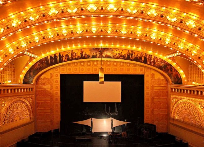
Sullivan chose a warm, but neutral ivory for the base color for the theater, using an oil paint, and then applied 23-carat gold leaf to create highlights around the room. “A single idea or principle is taken as a basis of the color scheme [in each public room], that is to say, use is made of but one color in each instance, and that color is associated with gold. The color selected varies with each room treated, but the plan of using one color with gold is in no case departed from. Thus the main Auditorium is in old ivory and gold…in graded tones.”
Sullivan chose his theme for the space characteristically not from history, but from nature; the cycles of nature and human life: growth and decadence. There was, seemingly, no two points in the space that had the same color. The four main elliptical arches that spanned the great hall were given the primary focus by being “treated in a scientific manner. They are dark at the base and light at the springing of the arch. This gives atmosphere and lightness to the arch.” He tinted the color ever darker as one’s eyes moved farther away from the stage. As the eye also moved across the room from the south (right side) of the hall, sunrise, to the north (left side), sunset, he also darkened the color as a metaphor of the sun’s daily path.
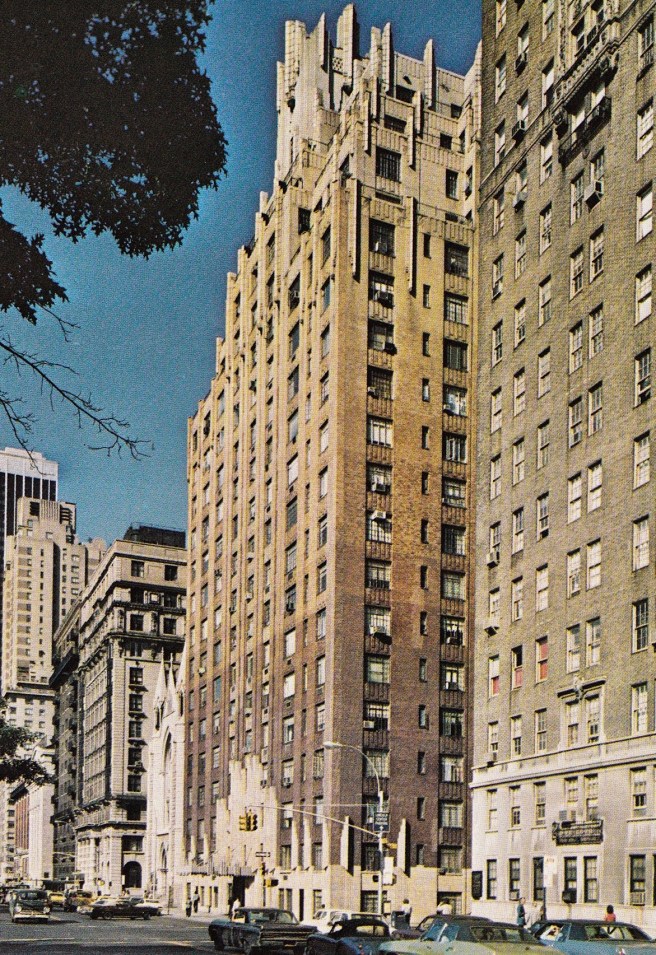
It was somewhat easier for Sullivan to explore the potentials of color because Adler’s acumen for acoustics had garnered a number of theater projects, offering Sullivan large spaces that could be swathed with paint of all hues. True, Root had finally found a kindred spirit in the use of color, William Pretyman, and the two had collaborated in the richly-colored ground floor spaces in Cleveland’s Society for Savings Bank, but the only large surfaces Root had to experiment with were the exteriors of his office buildings. The 215’ x 200’ long canvas of the Monadnock offered just such an opportunity.
In his 1887 paper, “Style,” Root seems to have actually prophesized his design two years before he put it on paper:
“The value of plain surfaces in every building is not to be overestimated. Strive for them, and when the fates place at your disposal a good, generous sweep of masonry, accept it frankly and thank God. If this goodly surface comes at the corners of your building, so much the better; for there can be no better guaranty that the house will “stay where it was put” than the presence of simple masonry at its angles.”
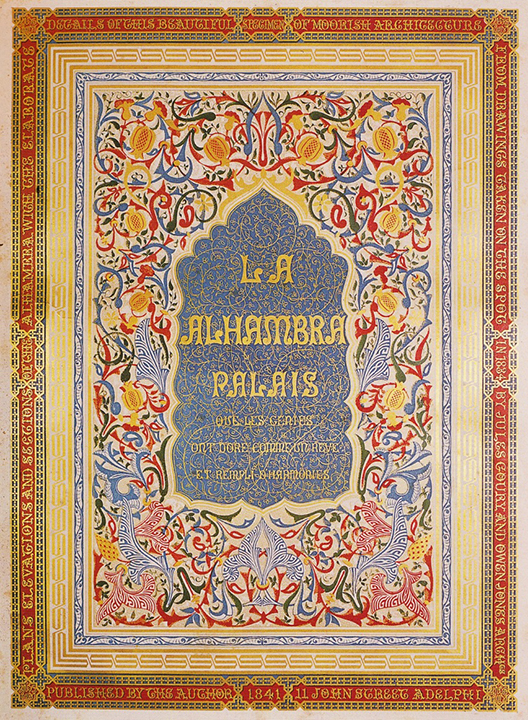
For Root, as with all “modern” artists during the mid-1800s, the only topic more important than “color” was “truth.” In my earlier sections (3.7.14; 3.10.11; 3.10.12; 3.10.13; 3.10.14; 3.10.15; 3.10.21), I have traced both Root’s and Sullivan’s interest in color in art starting with Owen Jones’ 1834 study of the use of polychromy in the Alhambra, that he had serially published between 1836 and 1845 as the Plans, Elevations, Sections and Details of the Alhambra. John Ruskin soon engaged this topic with his 1849 book The Seven Lamps of Architecture, in which he stated in “The Lamp of Beauty:”
“And the first broad conclusion we shall deduce from observance of natural colour in such cases will be that it never follows form, but is arranged on an entirely separate system. What mysterious connection there may be between the shape of the spots on an animal’s skin and its anatomical system, I do not know, nor even if such a connection has in anywise been traced: but to the eye the systems are entirely separate, and in many cases that of colour is accidentally variable. The stripes of a zebra do not follow the lines of its body or limbs,—still less the spots of a leopard. In the plumage of birds, each feather bears a part of the pattern which is arbitrarily carried over the body, having indeed certain graceful harmonies with the form, diminishing or enlarging in directions which sometimes follow, but also not unfrequently oppose, the directions of its muscular lines. Whatever harmonies there may be, are distinctly like those of two separate musical parts, coinciding here and there only—never discordant, but essentially different. I hold this, then, for the first great principle of architectural colour. Let it be visibly independent of form.”
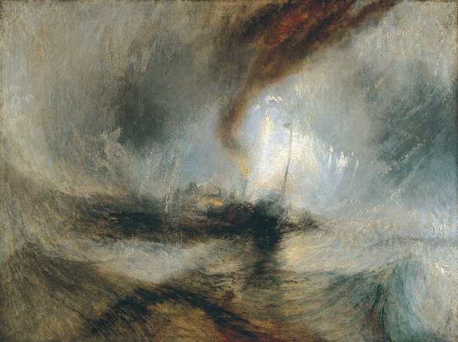
By this time Ruskin had already assumed the leadership mantle as the leading art critic of Great Britain with his 1843 first volume of Modern Painters, in which he came to the defense of J.M.W. Turner. Without reservation he claimed that Turner and other “modern” landscape painters were more “artistic” than the renowned early traditional landscape painters who merely had invented scenes in their studios. Turner observed nature and “truthfully” represented it without resorting to any “academic” conventions. Ruskin became a champion of the British “moderns” in the ongoing (and as this is in Great Britain, I will use my English interpretation of the phrase from now on), the War of the “Academics” vs. the Moderns.

He had extended his advocacy of the “modern” into architecture in 1849 with The Seven Lamps of Architecture. He clarified his position in the 1851 publication of his first volume of The Stones of Venice, in which in the first chapter he declared the Doge’s Palace in Venice as “the central building of the world.”
“SECTION XXIV. The work of the Lombard [Northern European] was to give hardihood and system to the enervated body and enfeebled mind of Christendom [Rome]; that of the Arab was to punish idolatry, and to proclaim the spirituality of worship. The Lombard covered every church which he built with the sculptured representations of bodily exercises—hunting and war…
“The Arab banished all imagination of creature form from his temples, and proclaimed from their minarets, “There is no god but God.” Opposite in their character and mission, alike in their magnificence of energy, they came from the North, and from the South, the glacier torrent and the lava stream: they met and contended over the wreck of the Roman empire; and the very centre of the struggle, the point of pause of both, the dead water of the opposite eddies, charged with embayed fragments of the Roman wreck, is VENICE.
“The Ducal palace of Venice contains the three elements in exactly equal proportions—the Roman, Lombard, and Arab. It is the central building of the world.”
Undoubtedly because of this passage, Root had always held a special place for Venice in his artistic heart, as we will see time and again. Most certainly, he had included the city in his 1886 European itinerary. First, however, I want to show that Root was not a blind sycophant of Ruskin. In 1877, James Abbott McNeill Whistler exhibited his 1874 painting, Nocturne in Black and Gold: The Falling Rocket (Yes, the same Whistler that Jenney had run with in Paris during 1858-60. v.3; sec. 2.10.) in a show consciously curated as an alternative to the annual Royal Academy of Art exhibition (i.e., the War of the Academics vs. the Moderns). Ruskin published a review of Whistler’s painting; “[I have] never expected to hear a coxcomb [a dandy] ask two hundred guineas for flinging a pot of paint in the public’s face.” Whistler sued Ruskin for defamation and while the jury found in his favor, awarded him only one farthing while making each of them split the court costs. This had bankrupted the painter.

Six years later, in his 1883 “Art of Pure Color,” when both parties were still very much alive, Root took Ruskin to task for attacking Whistler, “the real apostle of color:”
“Yet in [Ruskin’s] analysis of [color] he seems curiously blind to the right of color to be recognized as an independent art, and was so far astray in his perception of its proper and higher function that, in the whirligig of time, he found himself arrayed against Whistler, in a cause where Whistler was the real apostle of color…
“When the “London Bridge and Fireworks” was shown to this jury, someone asked which was the bridge, greatly to the artist’s discomfiture and the audience’s amusement. Now there was no cause for discomfiture nor the qualification on his part. Had the jury, the eminent defendant and the judge been actual spectators of the scene under similar circumstances, the identical question would have been to them quite puzzling. The merit of the artist here considered is the fact that he was able to translate into pigments effects which were in their nature too vague to be drawn.
“The criticism applied to Whistler has been equally applied to all of the “Impressionists”… People, whose highest ideal of art was reached in a Dutch painting of a cabbage leaf, laughed with infinite glee at Corot, because he might paint a tree in full foliage, on which the closest scrutiny failed to find a leaf. Yet the same critic would calmly tell that he was walking in a lane at dusk, and saw something which was either a man or a cow – the difference between himself and the artist (I had almost said cow) being that one could depict what he saw – the other could not.”
I repeated this section from Root’s paper not only to show Root’s intimate knowledge of contemporary artists and events in Europe, but also his commitment to those pursuing a similar approach to his in regards to color. There can be no doubt on what side of the War of the Academics vs. the Moderns Root stood.

Why did he want to use color on the Monadnock? First, he was truly committed to pursuing color as an art unto itself (v.3; sec. 10.11-4). Second, because of Chicago’s pollution, as he stated in his 1883 article, “The Art of Pure Color:”
“Think for a moment what our streets might become, if to the somber grays of stone or reds of brick were added the full unfading bloom [there’s that term of Owen Jones again: the same word used by critics to describe the effect that Jones had achieved with his use of primary colors in his designs that spanned from the 1851 Crystal Palace to London’s St. James’ Hall] of [non-absorbing] glass, marble, and tiles. These combined by artists.. would fill our cities with the eternal joy of color… [Compare Root’s urban ideal vs. Burnham’s “White City” in 1893…] Look back but a few years and recall the period when red brick began to be used with some appreciation of its inherent beauty. What oases in our street architecture these glowing walls of brick presented, contrasted as they were with all the smoke-begrimed and smoke-absorbing stone fronts! [my emphasis]…in a few years there will be everywhere, as in a lovely symphony, the full verdure of woods, the warm blue of summer sky, the eternal joyousness of blooming flowers, crystallized into unfading colors, and greeting us in our daily avocations.”
Once again, Root is getting dangerously close to German Expressionism, this time to Paul Scheerbart’s theory of colored glass in his 1914 Glasarchitektur, written some thirty years later. In fact, one could compare Scheerbart’s mysticism with Root’s beliefs in the Swedenborgian church. (For more on this, please see Merwood-Salisbury, p. 72.)
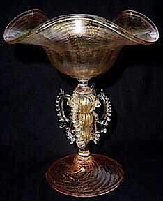
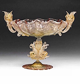
Root revealed his interest in Venice with his intimate knowledge of Murano glass:
“[The potential of colored blown glass] was recognized by artists in Venice… [Antonio] Salviati has revived [in 1859] some of the glories of old Venetian glass.”
Root was referring to the hand-blown colored glass manufactured in Murano, the manufacturing village of Venetian glass that employed striking colors and patterns. Being translucent, the glass generates a myriad of effects depending upon how light impinges on it. Murano glass production was first interrupted by Napoleon’s capture of Venice in 1797, and then further paused during the period of Venice’s transference to the Austrian empire, until Italian independence in 1866 saw the resurrection of Murano’s glass production. I am quite certain that among the cities Root had visited during his 1886 European tour, Venice must have been on the schedule. While Murano’s colored glass undoubtedly reinforced his views on “pure color,” I believe it was Venice’s other “craft” village, Burano, famous for its lace-making, that influenced his ideas for cities “filled with the eternal joy of color.” The city has been famous for its brightly-painted buildings, so famous that an owner still must submit a request to repaint his/her building.

In 1889 how would Root have constructed such an exterior color scheme in the Monadnock? Glazed brick had a few years of further development in the U.S. before such an application would become feasible. (The white-glazed brick in the Rookery’s light court was imported from Britain.) Therefore, Root would have had George Fuller assemble whatever colored (indigenous clay) brick was available in the U.S. For example, Milwaukee was known for its cream-(yellow)colored brick while Philadelphia produced its famous red brick. (Hence, the limited palette of browns, reds, and yellows.) Then Fuller’s masons would have the job to make the transitions from one color to another by gradually changing the percentage of the two colors of the brick in each course from 0% until the next color above was 100%.
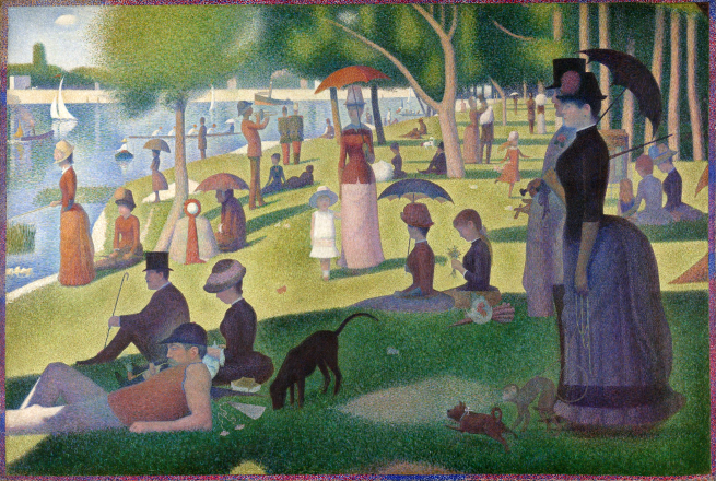
While Root’s 1886 itinerary is missing, we must assume that he also had visited Paris, if for no other reason to view the latest canvasses by the Impressionists, whose work he followed as kindred spirits in the use of color (see v.3, sec.10-14). Georges Seurat’s A Sunday Afternoon on the Island of La Grande Jatte was first exhibited in Paris that May in the eighth and final Impressionist exhibition (again as an alternative to the annual Salon curated by the Académie des Beaux Arts). Seurat’s painting technique employed only points of pure color, pointillism. (Today the same idea is referred to as pixilation.) Seurat’s monumental painting then reappeared later that summer in August’s Salon of the Société des Artistes Indédependants. The dates are important because Root was touring Europe during the summer of 1886. It is intriguing to stand in front of the painting in the Art Institute of Chicago and imagine what Root would have been thinking as his studied the painting. (If Root had not died in 1891, the painting would now be hanging in the Art Institute as designed by Root. Full circle!) Seurat’s use of pointillism to achieve a “bloom of color” was simply a reinterpretation of the traditional mosaic of small pieces of color to achieve a figural representation. The only difference between Seurat’s points of color and Root’s use of colored bricks was scale: Root’s canvas was 215’ high and 200’ long.
What I find most surprising is that Peter Brooks let the design team work on this idea for almost a year before he squashed it in May 1890, choosing instead obsidian purple-brown, the same color of brick that had been used on the Rookery.

FURTHER READING:
Hoffmann, Donald. The Architecture of John Wellborn Root. Baltimore: Johns Hopkins University Press, 1973.
Leslie, Thomas. Chicago Skyscrapers: 1871-1934. Urbana: University of Illinois, 2012.
Merwood-Salisbury, Joanna. Chicago 1890. Chicago: University of Chicago, 2009.
(If you have any questions or suggestions, please feel free to eMail me at: thearchitectureprofessor@gmail.com)
