4.10. ROOT’S FINAL DESIGN OF THE MONADNOCK

Burnham & Root, Monadnock Block, 1889. Note that this version shows six bay windows as it was drawn before Shepherd Brooks decided not to build on the last 75’ of property. (Inland Architect, Nov. 1889)

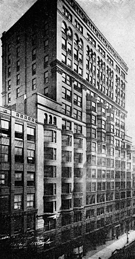
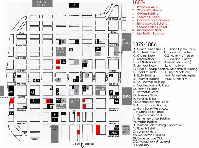
Meanwhile, in the face of Shepherd Brooks’ resistance to steel framing, Burnham & Root had no option but to completely redesign the Monadnock a third time.  The exterior would have to be constructed with loadbearing masonry and the resulting settlement of the building would be the cost of the client’s refusal to accept, or even understand, the new technology of iron framing.  (The architects had calculated the building would settle 8”; in reality it settled over 20.”)  Root now faced the daunting task of designing a 215’ high pile of bricks, and to please the other brother, there could be no carved ornament on the surface of this massive pile. But if you think about it for a moment, if one ignores the requirement for no carved ornament, the Rookery as constructed with its pier/spandrel language met Brooks’ demand. After all, while Shepherd had rejected exterior iron framing, he had not specified that a loadbearing WALL be used instead, as so many historians have assumed the Monadnock’s structure to be. So the question is, when did Root change from expressing the building’s structure in its elevation, to expressing the building’s skin or enclosing envelope as he just done in the Rand-McNally Building? And I ask this question, because, as I have shown in the plan below, the final structure was not a bearing wall, but a series of masonry piers. Even though past historians have claimed that Root’s design was the perfect “rational” or “honest” solution for a masonry bearing wall structure, this was not his idea that he expressed in its final design. We will examine this issue in detail later on.

Burnham & Root, Monadnock Block. Ground Floor plan. I chose this drawing because it highlights the “pier” nature of the exterior structure: it is not a bearing wall. (Online)

At least the floor plan seemed agreed upon by all parties.  The bay windows were a given, following the success of the Tacoma Building, as Aldis had stated earlier, “numerous bays for extra floor space.”  With a site width of 66,’ lining both long street fronts with 22’ deep office space, the resulting corridor would have been over 20′ wide.

Burnham & Root, Monadnock Block. Upper: Plan 14th Floor; Lower: Plan 3rd Floor. Note the lateral masonry wall in the middle of the building is so designed that it continues into the corridor in order to be able to lock one side off from the other if ever needed. Note the addition of another wall in the middle of the right (Peter Brooks’) half. This was included to provide the stability lost in the Jackson Street wall because of the openings needed for the bay windows. Note that there is no equivalent wall in the left (Shepherd Brooks’) half, as the party wall at the far south of the plan does not have the same amount of openings in it. Note each “section” has its own bank of elevators and stairway. (Hoffmann, Root)

Instead of placing a narrow atrium through the center of this overly-wide corridor as Baumann had done in the Chamber of Commerce, Burnham & Root first placed the stairs and elevator shaft for each of the four portions of the building within this central area, thereby keeping the building’s entire perimeter open for rentable office space. (This was only possible once artificial, gas or electric, light could be supplied to the elevators.) Without the interior lightwell, however, the only daylight available for the corridors would be provided by a meager 8’ wide skylight over the open stairways and what could be leeched through the glass panes in the corridor walls.

Burnham & Root, Monadnock Block. Stairway in the corridor. Just beyond is the continuous masonry wall that provided lateral stability and also could close off this half of the building from the other side if ever needed. Note the small arched doorways at both ends of the wall. The corridors have glass to allow daylight to pass from the rooms into the corridor. (Online)

Then, calculating the minimum width needed to walk around either side of the stairway, they found they could eliminate 30″ of width in the floor plate, so they pulled the exterior walls in from the lotlines some 15″ on the two long sides. This resulted in an unheard of 68% floor space efficiency as noted by Aldis. He compared this with the 50 to 55% in the Rookery and 45% in Home Insurance Building. This floor plan also saved the construction costs of the extra, unusable corridor floor area as well as by reducing the surface area of the exterior wall. I can see Root and George Fuller using this to justify the extra cost of the specially-made curved brick. This is the reason for the building’s flared form in the second floor: wanting to keep the ground floor at the lotline to maximize floor area (note in the ground floor plan above that there is no “bearing wall” directly under each of the bay windows, just open display windows at the sidewalk), the exterior gently curves inward the 15″ to the shallower depth of the upper office floors. (The display windows also prove that the structure is not a loadbearing wall but a series of masonry piers.)

Root was faced with how to detail the 16-story masonry exterior, that was not unlike that of the Albi Cathedral.

Cathedral of St. Cecilia, Albi, FR, 1282-1480. (Author image)

In his 1887 paper, “Style,” Root seems to have actually prophesized his design two years before he put it on paper:

“The value of plain surfaces in every building is not to be overestimated.  Strive for them, and when the fates place at your disposal a good, generous sweep of masonry, accept it frankly and thank God.  If this goodly surface comes at the corners of your building, so much the better; for there can be no better guaranty that the house will “stay where it was put” than the presence of simple masonry at its angles.”

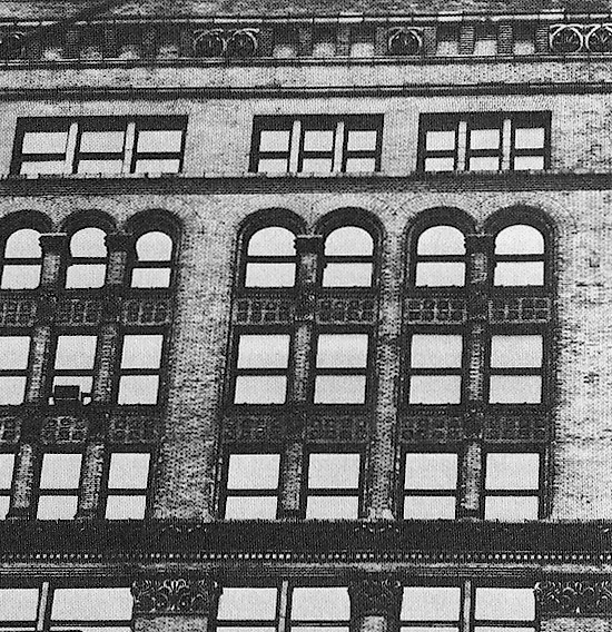
Sometime during the period after June 8 (when the Inter Ocean had published the description of the skeleton-framed version) and before July 9, 1889, when Aldis wrote to Brooks complaining about the new “bell-shaped cornice,” Root had completely reworked the exterior into the form of the final design.  Instead of employing the recessed spandrel of the pier/spandrel language of the framed design, Root decided to detail the spandrels flush with the piers, thereby creating a “good, generous sweep of masonry.” What were his intensions for this design?

Adler & Sullivan, Walker Warehouse, Chicago, SW corner of Adams and Market (Wacker), 1888. (urbanremainschicago.com)

Once again, he seems to have been looking over his shoulder to see what Sullivan’s latest projects could provide as a point of departure. Sullivan had recently completed his takes on the unornamented, smooth-faced pile of masonry with the Walker Warehouse and the Ryerson Tomb.  In the Walker Warehouse Sullivan had built a seven-story high box of smooth-faced stone.  He took the box as a given and proceeded to carve the windows into each face in a tripartite elevation of a two-story base, four-story arcade, and one-story cornice, that was capped with the conventional parapet.  What made this look “modern” was the complete lack of carved ornament on the building’s surface (other than the few pieces I noted in v.4, sec 5.8).  Sullivan, respecting the end thrusts of the arcades he emphasized the corner piers, in essence framing each elevation with a sharp corner. The building was conceived as a collection of planar surfaces that defined the masonry box. I could compare its architectonic concept with those of my elongated version of Labrouste’s Bibliothèque Sainte-Geneviève as being two “traditionally” conceived works of architecture. 

Herni Labrouste, Bibliothèque Sainte-Geneviève, Paris, 1838-51. Arcade digitally extruded for effect. (Author’s Collection)

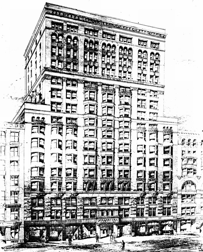
Peter Brooks had demanded no ornament to be placed on the Monadnock. Root could have easily designed it as a sixteen-story high rectangular mass of bricks, carved the windows into it in some “artistic” pattern as had Sullivan, and then stuck the bay windows onto the mass, similar to the Tacoma Building and moved onto more interesting projects, leaving Burnham to build it.  In fact, this was precisely what many critics claimed had occurred in post-construction reviews. Root’s death in January 1891, when the building was just coming out of the ground, had complicated the issue of the authorship of the design. (“Did Root design any of the “plain” building that was so out-of-character with his prior buildings, or did Burnham design it?”) There were two courses of thought pursued by later critics: one line argued that because the building was so “plain” it had to have been designed by Burnham; the second narrative again favored Burnham as the designer because the building’s form had been generated from “only” the building’s economic return. This was a positive comment from those critics who favored an “honest” design approach. Because of its positive portrayal of the design, Burnham did not go out of his way to dissuade such reviews during the post-Root phase of his career. This was entirely disingenuous on the part of Burnham. (I will discuss Burnham’s “tossing Root under the bus” following his partner’s death in Volume Seven that reviews the 1893 World’s Fair.) Although Root’s death in January 1891 blurred the issue of who deserved the credit for the building’s design, all of the rendered images I have shown you were published while Root was still alive. Construction had begun in May 1890, some seven months before Root’s death. The very “artistic” design of the Monadnock that I will document could only have been conceived by Root’s imagination.

Burnham & Root, Monadnock Block. Elevation and Section, showing the amount of the original “block of brick” Root had carved from the “original block.”. (Left: Leslie, Chicago; Right: Hoffmann, Root)

Needing/wanting to transcend “mere building” into the making of architecture, however, Root had risen to this artistic challenge by changing the conceptual method he had typically employed in his past projects.  Instead of conventionally applying/integrating carved sculptural elements onto the body of his buildings in an additive method, he would carve out from the original 200’ x 66’ x 215’ high pile of brick a sculptural form, subtracting material from the original block, not unlike what a sculptor does to a block of stone.  

Michelangelo Buonarroti, The Awakening Slave, 1519. (Online); Burnham & Root, The Rookery. Detail of column carved from the corner pier. (Author image)

In v.3, sec. 11.10, I had compared Root’s detailing of how he had “extracted” the form of the granite columns in the base of the Rookery from its sandstone corner piers to Michelangelo’s statement that all he did in making a piece of sculpture (I paraphrase) “was to release it from within the piece of stone he had chosen to carve.”  In the process of redesigning the Monadnock, Root had created a new type of architectural form; instead of a building with carved sculpture on it, the building now became a piece of sculpture.  Root had literally carved a 16-story piece of sculpture.

But before we analyze his final form, we need one more variable: Why “Egyptian”?  In Sec. 4.4, I echoed Hoffmann’s assertion that Root, in search of “meaning” for his design, had gravitated to Egyptian detailing in the 1884 designs to allude to the similarities between the Nile Delta and the Chicago River’s marshy conditions along the lakefront. Ancient Egyptian buildings were being found to have been very colorful, which may have also piqued his interest in the use of polychromy in his designs. I also want to speculate that Root might have been experimenting (that’s really what he was always doing, wasn’t it: improvisations) with Egyptian architecture because it was a “pre-arch” style, very appropriate as a point of departure to evolve a style for the iron skeleton frame. Later into the design process, Root began to translate, with the assistance of German-born Fritz Wagner, one of the city’s leading terra cotta fabricators, a section from German theorist Gottfried Semper’s 1860 study, Der Stil. Historian Joanna Merwood-Salisbury in her book, Chicago: 1890, posited that Semper’s discussion of Egyptian architecture could have easily reinforced Root’s innate curiosity in the potential of Egyptian forms to be a fresh point of departure for the development of an American architecture.  

Root’s original designs for the Monadnock had incorporated Egyptian motifs, and so it wasn’t really much of a stretch for him to restudy what the style might offer in this latest effort to use only brick walls.  As he had been working over the past four years in some of his designs with the idea of the continuous plane or surface as a mode of expression for the exterior of a skyscraper (I.e., the Rand-McNally Building) that expressed the enclosure or boundary surface of the interior’s volume, it would have been logical for him to apply this concept to the new design for Monadnock. After all, when we imagine a “215′ high pile of bricks” over the course of architectural history, the only culture that built with this technique that immediately comes to mind is, of course, Egypt.

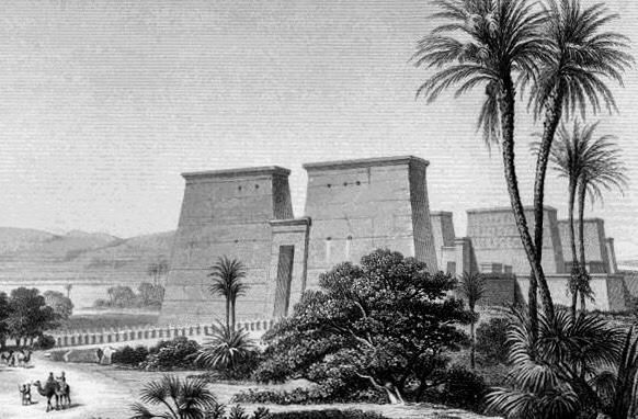
One significant change Root made from the 1885 Egyptian designs was to shift building precedent types from the columnular Egyptian temples to the continuous, massive planes of masonry in the Egyptian pylon, the gateway walls that flanked the entrances to the temple precincts.  The pylon was typically capped with a coved cornice, not unlike the profile he had been experimenting with in the 1885 design. Taking the pylon as his precedent, Root would also try to impart a battered, or slopping profile to the Monadnock’s walls, echoing the decrease of the wall’s required thickness as one moved up through the building.  

The pylon, like the Brookses’ program, had two parts that were so arranged as to create a central opening, in line with the axis of the precinct. This was because in the month before construction was scheduled to begin, Shepherd had decided to build only the first 100’ of the rest of the site that he owned.  This forced Root to eliminate the last line of bay windows shown in the November rendering.  This left a 180’ long plan that was not only designed to function as two completely independent entities with the placement of one of the lateral load masonry walls exactly in the middle, but Shepherd also decided to give his half of the building its own name, the Kearsarge, again named after another mountain in New Hampshire.  As Shepherd Brooks was planning to build some, if not the entire southern half, of the Monadnock at a later date, Root might just have the opportunity to echo the split nature of the pylon quite functionally.  So Root seems to have simply taken an Egyptian pylon as his point of departure, and added the appropriate number of bay windows:


Adler & Sullivan, Martin L. Ryerson Tomb, Graceland Cemetery, Chicago, 1887. (Online)

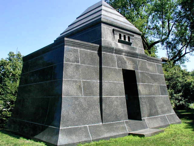
Here again, we find the added challenge of Sullivan coming into the equation: the Ryerson Tomb. With apologies to Root, there can be no mistaking the curving flare of the tomb’s base as the inspiration for Root’s final design.  In fact, if we look carefully at the tomb’s base, we find Root’s exact solution for the second story of the Monadnock: Sullivan brought the first course of stone out of the ground with a vertical face for a few inches, and then let the curve take-off.  Exactly the detail Root used at the second floor of the Monadnock.

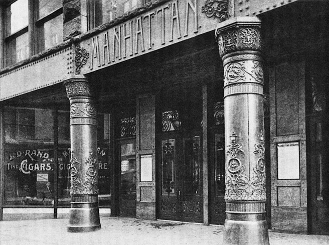
While Burnham & Root didn’t want to use the entire 66′ width of the site in the office floors for the reasons I discussed above, it was important to use every inch that could be incorporated in the Ground Floor. Therefore, the 6’4” thick brick walls of the base of the building grew straight out from the lot’s edges, until the second floor, where the function (and space requirements) changed to office floors. (Note below that each of the four “sections” of the building had its own entry along Dearborn.) Thus, we have the base of the Monadnock designed, but from here Root took architecture into the modern period:

Burnham & Root, The Monadnock Block. The 6’4″ thickness of the wall at grade was not required to support the loads from above. This thickness is an increase of 15″ from the second floor wall, which is much larger than what was required to support the additional load of the second floor. I have shown that the 15″ was a dimension arrived at from minimizing the depth of the office floors. However, what this increase in thickness accomplished structurally is that it spreads the loads of building over a greater area: yes, it actually is also part of the building’s foundation!

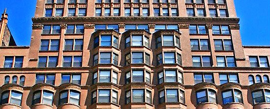
1. He then flared the second floor, à la Sullivan, back 15” over a height of 10’ with an elliptical curve to the third floor.

2. At this point the exterior face retained an “economical” verticality until the sixteenth floor, at which point Root reprised the flare of the second floor with the coved cornice, echoing the conventional termination of an Egyptian pylon.  In order to compensate for its distance from the sidewalk, Root somewhat exaggerated the curve for it bows out 24” over a height of 6’8.”

(SAH Archipedia)

3. He then carved out each of the openings in the “wall” where the bay windows would be located, defining the structural piers, that extended from the ground to the cornice. In concept and reality, the Monadnock was not a bearing wall, but a series of masonry piers with openings between these.

4. These openings in the “wall” were then infilled with a lightweight, cantilevered steel framework that held the bay windows.  (As the building envelope had been pulled 15″ back from the lotline, this had correspondingly reduced the projection of the bay windows into the public air rights above the sidewalk.) Root then applied his “continuous surface” of brick over the bay’s structure that he simply continued from the surface of adjacent brick pier with a fluidity that contained no sharp corners.  The brick seems simply to organically grow as a skin over the volume of the building. (It took the Anderson Pressed Brick Co. in Indiana over 100 different molds to make the variety of shapes required.) To complete the reading of this continuous masonry surface, Root did not recess the spandrels in the rectangular windows in the piers but made them flush with the face of the piers. Therefore, the exterior does read as a “wall” even though it consists of a seires of piers and bay windows.

In the final design of the building’s elevation, Root has finally admitted that a skyscraper could be “vertical”: he has scrapped all dominant horizontal projections. This leaves the vertical lines of the 13-story unbroken bay windows to soar to the sky (over a year before Sullivan is credited with having been the first to do so in the seven-story unbroken piers in the Wainwright Building. And just to set the record straight: Root had also designed the 12-story unbroken piers in the Masonic Temple at least six months prior to Sullivan’s Wainwright Building). Unlike in his Argyle Apartments, he chose, as he had detailed in the Pickwick Flats, to stop the bay windows one story short of the roof, rather than extending them to the roofline. This imparted a crisper edge to the building’s overall massing. He then capped each bay with a coved cornice that reprised the top of the building.

Burnham & Root. Left: Argyle Apartments, northwest corner of Michigan and Jackson, 1886. Right: Pickwick Flats, southeast corner of Michigan and Twentieth, 1886. (Hoffmann, Root)

5. A true subtly that I had never observed, but give credit to Donald Hoffmann for discovering and noting in his biography of Root, is how Root ever so gently curved the upper corners in the windows under each bay, but not in the single windows in the piers, in both stories. I agree with Hoffmann’s interpretation that Root is recording the genesis of the curved bays from the voids below by restating the bays’ curved plan in the elevation of the windows below, The subtlety of this detail should be proof enough of Root’s authorship of the building’s design… (Its gentle curved profile predates Victor Horta’s Art Nouveau windows by only two years…) If you have different interpretation of Root’s use of curved corners in these windows, please send me thoughts.

Victor Horta, Maison Horta, Brussels, 1898. (Online)

6. He then communicated to the onlooker the inherent contrast between the two structural systems (the masonry piers vs. the framed bay windows) with the location of the glass.  In the bay windows, the glass is pushed as close to the surface of the exterior brick as possible, creating a sense of a taut, thin surface that is being blown out, away from the building by the air pressure inside.  The windows that are located in the bearing walls, on the other hand, have been crisply carved into the “wall” and the glass pulled as far back as possible, revealing the immense thickness of the brick wall for all to see. Said in a different way, Root had brought the plane of the spandrels flush with the surface of the piers, thereby creating the unbroken continuity of the brick surface. (This is most effective in the curved second floor window openings: see image above.)

Burnham & Root, Monadnock Block. Longitudinal section showing how the thickness of the bearing walls decreses as the wall grows taller.

And lastly, the best of his details: still wanting to evoke the precedent of the pylons with their battered, sloping walls, while he could not literally afford to make the walls slope inward, (even though as the wall’s thickness had to increase as the wall approached the ground, it would have been easy to keep the same inside dimensions, but this would have cost space and money in sloped brick) he struck upon a truly ingenious visual illusion that is effective, and yet so subtle that many viewers aren’t even aware of its presence until someone points it out. 

Burnham & Root, Monadnock Block. Corner chamfer with the increasing radius. (Author image)

He detailed the corners of the buildings with a progressively increasing chamfer, starting rather imperceptibly at the third floor, until it reached a three-foot radius at the cornice.  Physically, it actually reduces the dimension from the last window jamb to the building’s corner as one moves up to the top of the building.  When one is standing obliquely to the long elevations this resulting angle does create the illusion that the wall is sloping inward.  This illusion is reinforced on a sunny day when the shade around the chamfer reinforces the visual angle at the wall’s edge.

Burnham & Root, Monadnock Block. Note how the reduction in the dimension from the last window jamb to the building’s corner creates an angle that creates the illusion that the walls are sloping inward. (Author image)

I do not label the Monadnock Block as a modern, Chicago School building because of its absence of ornament or because of its “structural expression.” I have already presented my argument that the structure of the Monadnock Block was not a bearing wall, but a series of masonry piers. At the start of this blog I stated that the aesthetic of the “Chicago School” was a design process aesthetic. Therefore, the Monadnock was a Chicago School building because of the manner in which Root conceptualized its design: by synthesizing its various determinants he arrived at a new form that he then enriched by sheathing it with a fluid, undulating skin of brick.  In this respect, Root was contemporary with the emerging Belgian Art Nouveau movement (as I earlier have noted Sullivan’s ornament was likewise) and twenty years ahead of the German Expressionists. He had achieved a true Vitruvian synthesis of commodity, firmness, and delight.

As I also stated in the beginning, there were at least four ways of conceptualizing a building that resulted in a Chicago School aesthetic. While expressing the building’s structure was one of these, Root with his design of the Monadnock had developed two other possible aesthetics: the building’s unbroken, continuous 13-story bay windows imparted a dominant vertical emphasis to its elevation, Chicago’s architects, in addition to expressing the building’s structural system, were now free to give a skyscraper a vertical accent to its elevations. In addition, Root’s continuous fluid surface of brick offered a third alternative aesthetic, emphasizing the skeletal-framed skyscraper’s thin, continuous enclosure of its curtain wall. The fourth type of elevational design was to express the repetitive nature of the office floor plans in the building by giving the elevation a horizontal accent, such as Holabird & Roche had done in the Tacoma Building.

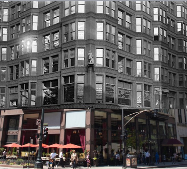
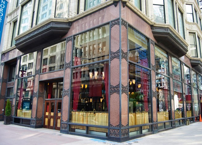
As far as Root’s search for a modern ornament, I have already identified his contemporary experiment with that he placed in the base of the Reliance Building.

The only variable I have yet to address is Root’s contemporary interest in the use of polychromy in his buildings.  Root had carried his original 1883 color scheme that he had planned for the Rialto Building over to the Monadnock, The Economist reported this on August 17, 1889:

“A uniform material is everywhere employed, brick… no two parts of the building will have the same color value… There is no cornice to the building only a bell-shaped coping.  There is no base, the entire building swelling outward at the bottom, to insure the expression of perfect stability.”

Burnham & Root, Monadnock Block. Original 1889 color palette. (Colors added by Signe Luebbers)

FURTHER READING:

Hoffmann, Donald. The Architecture of John Wellborn Root. Baltimore: Johns Hopkins University Press, 1973.

Leslie, Thomas. Chicago Skyscrapers: 1871-1934. Urbana: University of Illinois, 2012.

Merwood-Salisbury, Joanna. Chicago 1890. Chicago: University of Chicago, 2009.

(If you have any questions or suggestions, please feel free to eMail me at: thearchitectureprofessor@gmail.com)

4.9. THE ART OF THE WALL: THE 1ST REGIMENTAL ARMORY

Burnham & Root, First Regiment Armory, Chicago, NW corner of Michigan and Sixteenth, 1889. (Online)

In mid-1889 Root was, by no means, unfamiliar with the design of a large pile of bricks. During his European tour in the summer of 1886, he almost certainty took the time to study the all-brick cathedral in Albi, located in central France, details of which I have shown he used frequently.  The church was built as a fortress in the aftermath of the successful Albigensian Crusade (1209-1229) in which Papal forces joined with the French King’s troops to wipe out the Cathars, a group of reformist Christians considered to be heretical, centered in the Albi region. The bishop who began its construction wanted a symbol of the church’s power lest this sect think that it might overthrow him.

Cathedral of St. Cecilia, Albi, FR, 1282-1480. (Author image)

Following Root’s return, while the four remaining Haymarket Seven (two had their death sentences commuted by Gov. Oglesby and a third had committed suicide) had been hanged on November 11, 1887, the issue of the eight-hour workday still simmered in Chicago’s streets.  Chicago’s wealthy who lived along prestigious Prairie Avenue felt especially vulnerable to attacks by labor supporters (remember J.J, Glessner’s fortress at the southwest corner of Prairie and 18th Street designed by Richardson: v.3, sec. 11.18)

As Chicago’s labor unrest continued to simmer during the 1888 presidential election, Prairie Avenue’s most powerful residents banded together to finance an Armory for the Illinois National Guard to protect their neighborhood.  The northwest corner of Michigan and Sixteenth Street was purchased for the erection of the building.  The site was only four blocks from Glessner’s house as well as from the Calumet Club of Marshall Field, George Pullman, and Philip D. Armour.  As Burnham & Root had designed the Club, they were also hired to design the armory.

Map of Prairie Avenue Neighborhood, showing relation of the Armory to it. A: the Armory at the NW corner of Michigan and Sixteenth; C: Calumet club at the NE corner of Michigan and 20th. J.J. Glessner House: 1800; George Pullman House:1729; Marshall Field House: 1905. (Zukowski, Chicago: Growth of a Metropolis)

At this moment Root was also involved with another artefact relating to the bombing.  The Union League Club (Jenney had designed its building at the SW corner of Jackson and Custom House Place (now Federal Court), dedicated to defending the Union, had hired sculptor Johannes Gelert to design and fabricate a bronze memorial to the seven policemen who were killed in the bombing that was to be placed in the center of Haymarket Square.  Root voluntarily designed the stone base for the statue that was unveiled on May 30, 1889 (just one more item in Root’s head on June 1, 1889…). Five years later in 1893, supporters of the anarchists erected their own Haymarket Martyrs’ Monument in what is now the Forest Home Cemetery in suburban Forest Park.

Haymarket Square (N. Des Plaines and W. Randolph), showing location of the Police Memorial. (Online)

Root’s first rendering of the Armory is dated March 1889, tying it directly to the fear of more labor violence that could result from a letter written by the President of the American Federation of Labor, Samuel Gompers, that proposed to the newly-formed Second International formed in Paris during the World’s Fair on Bastille Day, July 14, 1889, that it declare May 1, 1890, as a day for an international day of demonstration in favor of the eight-hour workday.

Burnham & Root, First Regiment Armory. Entry archway detailing. (archinform)

Root designed the armory as a fortress with a single, massive 40’ wide arched entrance (the voussoirs were 10’ deep) with sloping sandstone walls at grade (the entrance was secured by an iron portcullis that weighed six tons).  The stone base supported two stories of solid red brick walls with appropriate gun slits. The brickwork employing large relieving arches foretold of the best of Louis Kahn’s brick detailing.  The building was capped by a machicolated cornice straight out of the Middle Ages.  Each corner of the building sported a cylindrical bartizan cantilevered beyond the exterior faces to enfilade each of the four walls.

Burnham & Root, First Regiment Armory. Detail of relieving arches and gunslits. (archinform)

In plan, the building was a hollow donut, with a column-free interior court for drills that measured 150’ x 168.’ This was enclosed by a 50’ x 105’ skylight that sat on top of the steel trusses that clear spanned over 150.’ (Undoubtedly, this brought back memories of Root’s first important job as an assistant for architect John Snook as the construction supervisor for New York’s Grand Central Terminal in 1870-1. In fact, the traveling construction crane was quite similar.) Two stories of living spaces were suspended from the trusses so as not to interrupt the drill floor below.

Burnham & Root, First Regiment Armory. Section. (urbanremainschicago.com)
Burnham & Root, First Regiment Armory. Interior court. (archinform)
Burnham & Root, First Regiment Armory. Construction photo showing traveling construction scaffold. (Online)
John B. Snook, Grand Central Depot, New York, 1869. Construction of the Trainshed. Root was Snook’s construction superintendent for this project. (Online)

FURTHER READING:

Hoffmann, Donald. The Architecture of John Wellborn Root. Baltimore: Johns Hopkins University Press, 1973.

(If you have any questions or suggestions, please feel free to eMail me at: thearchitectureprofessor@gmail.com)

4.8. THE RELIANCE BUILDING: THE MONADNOCK’S TWIN

Burnham & Root, Reliance Building, SW corner of State and Washington, 1889. (Author’s image)

While Brooks equivocated over the Monadnock, another of Burnham & Root’s clients, William Ellery Hale, whose livelihood was actually predicated on making buildings taller, pursued his own sixteen-story skyscraper.  (In 1869, Hale had patented the Hale-Balwin hydraulic elevator and the following year founded the Hale Hydraulic Elevator Company).  Hale had purchased the old, post-fire First National Bank building at the southwest corner of State and Washington, diagonally across from Marshall Field’s, once the bank had moved to its new building at Dearborn and Monroe in 1882.  Also concerned over the threat of the pending height limit legislation at this time, Hale had commissioned his close associates (Hale owned shares in the Calumet, Phoenix, Insurance Exchange, Rookery, and Midland Hotel, as did Burnham and Root) to design a sixteen-story office building for his site in the heart of Chicago’s retail district, to be named the Reliance Building.  In fact, apparently the Monadnock and the Reliance Building were originally conceived by Root as maternal twins (remembering Root’s propensity to build full-scale models). That the two finished buildings ended up being diametric opposites in almost every feature was simply due to the vagaries of history.

I would like to introduce the Reliance Building by quoting once again the description of Root’s then current design for the Monadnock cited in the previous section:

“The object has been to secure the greatest strength with the least weight, the most floor space with a maximum of light and air, the entire construction being held subsidiary to complete fire-proofing.  The building materials will be steel, sewer brick, Portland cement, red granite, hollow tile, and terra cotta.  The frontages of the ground and sixteenth floors will be flat, the intermediate stories being provided with bay windows.  The entire frontages will be covered with red terra cotta, and the building will not be unlike the Tacoma, although straight lines will predominate…”

Composite: The body of the Tacoma Building sitting on the base of the Reliance Building.

If I change one word in this quote, red (terra cotta) to white (terra cotta), the description also fits the final design of the Reliance Building as it was completed in 1895.  

Burnham & Root; D. H. Burnham and Co., Reliance Building, Southwest corner of State and Washington, 1890/1894.  (Author’s image)

The protracted date of the completion of the Reliance Building was due to the fact that the existing building’s tenants of the First Floor and basement had leases that expired on May 1, 1890, while the tenants in the upper floors held leases that continued until May 1, 1894, and had no interest in moving before the aforementioned deadline.  Meanwhile, the drygoods store of Charles Gossage & Co., that occupied the adjacent storefronts on both State and Washington, desperately wanted to link their premises with the space on the corner, including the basement, and agreed to lease both floors of the new construction under the existing three upper floors.  Evidently, Hale wanted to get an early jump on the construction of his skyscraper (and just maybe make life sufficiently inconvenient for the clients on the upper floors that they would want to move earlier then the lease required) so he had Burnham & Root design the entire building, but could have them construct only the lower two floors starting on May 1, 1890.

Burnham & Root, Reliance Building. Ground floor plan. (Online)

All Burnham & Root had to do was to erect a temporary underpinning to support the upper three floors of the existing building while the ground floor and basement were demolished, clearing the site for the construction of the building’s new foundation and lower two floors of iron framing.  The site’s dimensions (56’x 85’) were just sufficient for the floor plan to support a single-loaded corridor scheme that they wrapped around the corner.  Across the corridor, pushed up against the back or south wall they located a bank of three (increased to four in the final design) of Hale’s elevators and a stairway.  By this time, the structure of these taller skyscrapers had become more complex than what the prior experience of the architect or contractor could rely upon, forcing architects to engage the services of structural engineers to determine the required structure and corresponding size of its members.  Burnham & Root had hired engineer E.C. Shankland (1854-1924) to provide this expertise for their buildings.  The structure of the Reliance was from the beginning planned to be a totally iron-framed skyscraper.  The building code still required masonry party walls to be constructed on the building’s south and west sides, but Shankland detailed these as non-loadbearing partitions, cantilevered from the frame, as Jenney was doing in the Manhattan Building.

I think insufficient attention on the part of historians has been paid to Root’s two lower floors of the Reliance.  Here we have a surviving fragment of Root’s evolving modern “Chicago School” ornamental language, maybe the only such remnant ever constructed, because he died before the upper floors were constructed.  Although he had conceived of the elevations of both the Monadnock and the Reliance as “twins” the Monadnock was to be “unornamented” by orders of the Brookses. Hale was a close friend and supporter of Root, and so here, in these two stories of the Reliance, are the only hints of where Root was in his design thoughts about ornament prior to his death.  Contrary to claims by International Style historians, Root, as did Sullivan, did not equate a modern architecture with the elimination of ornament, but only with the development of a new, modern style of ornament.  Those historians who point to the lack of ornament in the Montauk and Monadnock as proof of Root’s desire to minimize ornament fail to acknowledge that he had been forced to eliminate all ornament in these two buildings, against his artistic will, by the Brookses as a cost savings measure.

Root designed the exterior of the ground floor to be the most open, transparent surface as-of-yet to be incorporated in a Chicago building, including the Tacoma.  He faced the steel structure with thin, flat sheets of reddish-brown Scottish granite that he located at the extreme of the property’s lotline, whose edges and joints were masked with a bronze trim.  In order to maximize the usable space within the site’s tight dimensions, he also pushed the large panes of glass to the lotline, leaving no depth whatsoever in the building’s exterior surface. Root had thus designed a piece of true contemporary or “modern architecture”: he had allowed the building’s rectilinear structure to establish the overall design of the façade, he had honestly detailed the granite slabs that sheathed the terra cotta-covered metal structure in such a manner that no one could misinterpret them as being solid structural piers, he had used the largest plates of glass available in 1890 to fill the void between the columns (the dimensions of these panes were not achievable only a few short years earlier, hence the building could not have looked like this before 1890: hence, it was as architecturally up-to-date as was possible), and he had accented the granite’s joints with an ornamental pattern that did not copy any historic design, but was as contemporary as was the size of the glass plates.  

Burnham & Root, Reliance Building, 1890. Photograph taken after the ground floor construction was completed for Carson, Pirie, Scott on June 1, 1891. Note the last bay to the left of the State Street elevation was left intact as the entrance for the businesses above that were left untouched by the construction. (Hoffmann, Root)
Burnham & Root, Reliance Building. Ground floor. (Author image)

Of course, the last (southernmost) bay along State Street of the existing building had to be maintained because it contained the entrance for the upper three floors, which was how the completed building appeared when the doors of a new client, Carson, Pirie, Scott & Co. opened for business on the new ground floor on July 1, 1891. Root also designed, in collaboration with the firm’s inhouse decorator, William Pretyman, (v.4, sec.5.3) the interior of the store using the best materials: English alabaster with gold inlay, mahogany, mosaic tile floors, and ceiling paintings by Pretyman himself.

The upper fourteen floors would have to wait until the other leases terminated on May 1, 1894, to be constructed. Unfortunately, Root would die in January 1891, so the upper floors of the Reliance Building would be the product of a different designer, operating under a different set of aesthetics.  It is very suspicious, however, that no drawings of Root’s original designs for these upper floors have survived.  Root’s biographer, Donald Hoffmann stated this fact quite bluntly:

“It is inconceivable that by this time Root had made no drawings for the entire building.  The loads had to be calculated. More importantly, he characteristically designed from the whole to the part; his mind was not so disengaged that he could have conceived the base and then rested without any clear idea of the whole building, even if the plans were understood as tentative.”

One can sense Hoffmann’s frustration with the loss of Root’s original drawings by this one footnote he included: “A search of more than forty possible sources has yielded not so much as a thumbnail sketch of what was intended in the upper stories.”  (Hoffmann, Root, p. 180.)  As I will elaborate in Volume Seven, I believe that Burnham undertook a concerted effort to eliminate as many drawings by Root as he could after he had changed his aesthetic values to Neoclassicism, in order to distance himself as far as he could from the work of Burnham & Root during the 1880s.

So we are left to imagine what modern elevation Root intended to place on top of the Reliance’s modern base.  I suggest that Root intended the same language that he had contemporaneously designed for the Monadnock:

“The frontages of the ground and sixteenth floors will be flat, the intermediate stories being provided with bay windows.  The entire frontages will be covered with red terra cotta, and the building will not be unlike the Tacoma, although straight lines will predominate…”

If we mentally juxtapose the Tacoma’s elevation on top of Root’s base, but revise Holabird & Roche’s horizontal layering with the vertical (“straight lines”) bay windows of Root’s Monadnock, and cover them in a “red terra cotta” (Root would not have used a white terra cotta in 1890 because of the pollution, also remembering that glazed terra cotta was not perfected until after he had died), we may then have an idea of how Root had originally intended the Reliance Building, as well as the Monadnock Block, to appear.

Unfortunately, neither of Root’s twin modern designed skyscrapers, were ever completely constructed, leaving the original two-story base of the Reliance as an even more important remnant of the Chicago School.

FURTHER READING:

Hoffmann, Donald. The Architecture of John Wellborn Root. Baltimore: Johns Hopkins University Press, 1973.

(If you have any questions or suggestions, please feel free to eMail me at: thearchitectureprofessor@gmail.com)

4.7. ROOT’S SKELETON-FRAMED MONADNOCK DESIGN

During the intervening years, Shepherd Brooks had managed to buy the remaining lots in the southern part of the block bounded by Jackson, Dearborn, Van Buren, and Custom House Place (now Federal Court), so the two brothers were now contemplating constructing one long building to fill the entire 360’ long block.  But in order to avoid any future disagreements among their heirs, this building would be planned to function both as one, continuous building, as well as up to four, separate buildings, if the heirs to their estates were at any time to split up the properties.  This also meant that Shepherd did not have to build all of the building at once but could choose to decide at any time to postpone construction on the southern parts until a later date.  Root now faced a similar problem that Jenney had in the past: the Monadnock would have to be designed for more floors to be added at a later date.  The only difference was, instead of adding the floors vertically, Monadnock needed to be designed so that it could grow laterally.

By May 1889, it was apparent that Aldis and Brooks had agreed that the time had come to take Monadnock off the shelf and get it ready for construction, if for no other reason than to secure a building permit before the impending height limitation ordinance was approved.  The big change between the final 1886 design and 1889 was an increase in the building’s total number of floors from 13 to 16.  During May reports about both the Manhattan and Eugene S. Pike’s building planned to be diagonally across Dearborn from the Monadnock, continually referred to both buildings as being planned to be 16 stories tall, hence Aldis’ desperate telegram on May 22, 1889, to Brooks (Peter Brooks disliked telegrams intensely) in one last, but ultimately successful attempt to get a final decision so the project could move forward: “MONADNOCK BETTER BE SIXTEEN.”  The additional three floors played havoc with Root’s prior design for one simple, unavoidable, reality:  the weight of the three extra floors, if constructed along the lines of the 1886 design, would push the loads on the building’s foundations beyond the 3000 pounds per square foot limit that was felt to be safe.  

Boyington’s Board of Trade Tower was already experiencing significant cracking as a result of its excessive settlement.  Adler had tried as best as he could to minimize the settlement of the heavy, 17-story tower in the Auditorium, but even he couldn’t overcome gravity or the capriciousness of the building’s owners.  Chicago architects had finally come face-to-face with the primary challenge for which they had been preparing for over the past eight years.  The weight of a skyscraper would have to be minimized so that it could continue to safely grow taller than ten stories, without generating excessive settlements in Chicago’s weak soil.  At the same time, these taller buildings still had to be as fireproof as a solid masonry structure. While Holabird & Roche in the Tacoma Building had replaced the exterior masonry bearing wall with skeleton framing, all they had accomplished was to relocate the weight of the bearing wall from the building’s perimeter to its interior. This problem would be solved only by completely replacing all the masonry bearing walls with the iron skeleton frame, which is why Peter B. Wight’s invention of a system of terra cotta fireproofing for the iron frame following the 1874 fire had been so pivotal to the future of the skyscraper in Chicago.

Wight’s former draftsman, Root, inherently understood the interrelated aspects of these technical issues and immediately changed the design of the 16-story Monadnock to all iron framing for just this reason, as had Jenney in the design of the Manhattan.  The exterior iron framing was easily worked into the pier/spandrel language of his earlier 1884-5 designs, that would give him the chance to show how to put the Rookery’s lightcourt elevations on the exterior of a building. (Why he chose not to do so in the Rand-McNally building is an open question, and yes, Holabird & Roche had done their best with the Tacoma Building, but see the Inter-Ocean’s comment on this below.) On June 9, 1889, (two days after the Manhattan’s permit was approved, revealing that the designs of these two buildings were on a parallel time track) the Inter Ocean published a complete description of Root’s new redesign for the Monadnock:

“The new structure will be strictly utilitarian.  The object has been to secure the greatest strength with the least weight, the most floor space with a maximum of light and air, the entire construction being held subsidiary to complete fire-proofing.  The building materials will be steel, sewer brick, Portland cement, red granite, hollow tile, and terra cotta.  The frontages of the ground and sixteenth floors will be flat, the intermediate stories [floors 2-15] being provided with bay windows.  The entire frontages will be covered with red terra cotta, and the building will not be unlike the Tacoma, although straight lines will predominate… [my emphasis]

“A hallway will extend the length of the building on each floor, suites of offices being arranged on either side.  A feature of the building will be four great walls, arranged equidistant of the greater length of the building, which will add much to its stability and give masonry the preponderance in its construction over steel.  The entire weight of the block will equal one and one-half tons (3000 lbs.) to each square foot of the deepest-laid foundation stones.  This is perfectly safe, the architects claim, but practically the limit.

“It is claimed by authorities on such subjects that the limit on what is known as office fireproof construction is sixteen stories, each of twelve or thirteen feet.  It is claimed that the weight of a building of this character will equal, when extended 200 feet into the air, one and one-half tons for each square foot of footing, which is the limit of the strain which the soil will bear.  An iron and steel skeleton, combined with masonry, is understood when fireproof office construction is referred to.

Whereas Jenney would take the final leap to shed all the masonry walls in the Manhattan Building, Root was using Shepherd’s requirement to break the building into separate entities with walls to his advantage to help resist the wind loads.  This was, more than likely due to the more “open” nature of Root’s planned exterior incorporating bay windows that echoed the design of the Tacoma Building, while Jenney’s elevations comprised of more masonry that would offer some lateral stiffness as discussed earlier. Burnham & Root’s new 16-story design can be imagined as the plan of Baumann & Huehl’s Chamber of Commerce wrapped with the bay windows of the Tacoma Building but without the balcony extension of the bay windows at the top floor. 

Above: Burnham and Root, Brunswick Hotel, Chicago, 1883. (Hoffmann, Meanings); Below: Burnham & Root. Left: Argyle Apartments, northwest corner of Michigan and Jackson, 1886. Right: Pickwick Flats, southeast corner of Michigan and Twentieth, 1886. (Hoffmann, Root)

Actually, the lineage of Root’s first 16-story design with bay windows can be traced back to three of Root’s earlier residential projects:: first, the 1883 Brunswick Hotel, and then Root’s Argyle Apartments and Pickwick Flats of early 1886. In all three designs Root had placed bay windows onto each of the buildings’ smooth brick walls, (Note that all three were constructed before Holabird & Roche began to design the Tacoma: those who credit the Monadnock’s bay windows to the Tacoma Building are overstating its influence on Root.)

The Economist continued with more details of Root’s latest design:

“The walls will be of steel covered with brown brick.  At the corners for two stories will stand heavy red granite columns and for the upper fourteen stories solid masonry columns of brown brick.  Between these columns there will be three-foot bay windows…  The four corners of the structure will each be in the form of a tower rising a short distance above the top of the building… The structure will have no ornamentation whatever, depending for its effect on its massiveness and the correct relation of its lines.”

This description implies that Root’s “framed design” employed a pier/spandrel elevational language, similar to his earlier designs. As of yet, Root had not, apparently, conceived of the building as a continuous, smooth surface of bricks, eventhough the three residential designs with bay windows had been so designed.

Owen Aldis was completely sold on the efficiency of its plan, which he relayed to Brooks:

“Numerous bays for extra floor space, built of iron and brick… The actual renting space is 68 per cent of floor space, as against 50 to 55 in the Rookery and 45 per cent in Home Insurance!…  I am satisfied that such a building built in the plainest and simplest manner, without one round arch or any ornament, would be of greater value than the Rookery…”

Unfortunately for Burnham & Root, but maybe fortunately for posterity, Shepherd Brooks squashed the entire design because he did not trust the long-term stability of this new-fangled idea of iron framing:

“As to erecting a tall building entirely of steel, for a permanent investment, I should not think of such a thing. It would no doubt pay well for many years but there is so much risk and uncertainty in regard to its lasting strength.”

In fact, Brooks wasn’t even certain that the building should be 16 stories high, “I do not think it a fixed fact yet, that buildings as high as 16 stories are altogether desirable.”

The Monadnock would be a 215′ high pile of bricks.

FURTHER READING:

Hoffmann, Donald. The Architecture of John Wellborn Root. Baltimore: Johns Hopkins University Press, 1973.

(If you have any questions or suggestions, please feel free to eMail me at: thearchitectureprofessor@gmail.com)

4.6. WHERE WAS ROOT’S HEAD IN JUNE 1889?

1888 U.S. Post Office and Custom House Square, c.1889. The Post Office is in the right center, immediately to its left is Jenney’s Union Club with its domed turret, and to the left of the Union Club it is the Phoenix Building, just to the right of the Board of Trade’s tower. The Rookery is just above the Post Office, with Burnham & Root’s office on the top floor, in the southeast corner, closest to the viewer. Note that construction on the Monadnock Block, to occur to the right of the Union Club,, nor its sister, the Chicago Hotel, has not yet started. (Bluestone, Constructing Chicago)

Before I review what was going on in Root’s mind when Brooks gave him the final go ahead to restart the Monadnock, I want to ask a question?  There are many of you who are Louis Sullivan fans out there, and I’m sure you want to ask me why I am ignoring Sullivan’s skyscrapers?  

The straightforward answer is: because I am trying to keep a chronologically accurate narrative, and Sullivan had not yet designed a skyscraper by June 1889, other than the tower of the Auditorium.  As I have stated a number of times, one of my objectives in writing this blog/book is to present a factual history of what happened in Chicago during the 1880s.  Two points that historians have completely skewed that I want to correct are first: the significance of Jenney’s Home Insurance Building’s structure, and second, presenting Sullivan, and not Root, as the leader of the Chicago School movement. 

Adler & Sullivan, The Auditorium. Top: View of interior showing central skylight over the first balcony. Both of the curved partitions have been lowered, closing off the second and third balconies. (Siry, The Auditorium.)

As I have shown, Sullivan in June 1889 was immersed in finishing the interior details of the Auditorium’s house in time for Opening Night, Dec. 9, 1889, a task he wouldn’t finish, including the remaining portions of the building until November 1890. Even by that date, he had yet to design a skyscraper. The facts are that all of Root’s skyscrapers were designed before Sullivan was commissioned to design his first skyscraper, the Wainwright Building in St. Louis.  Historians, starting with Sullivan’s own Autobiography of an Idea, and codified by Condit have created a “false narrative” about Sullivan’s role in the development of the Chicago skyscraper. Root was the leading figure during the 1880s, and most likely would have continued to have been so, but for his premature death in January 1891. All of Sullivan’s skyscrapers were designed in the following decade, meaning that Sullivan had the advantage of learning from Root’s mistakes during the 1880s. (By no means take this as my dislike of Sullivan’s work. Remember, I stated in Vol. Two, Sec. 1.3 that his Chicago Stock Exchange was the quintessential Chicago School skyscraper. I simply want people to acknowledge the chronological fact that all of Root’s skyscrapers were designed before Sullivan’s Wainwright.) This is self-evident when I list the skyscrapers designed Chicago’s architects during the 1880s:

In order to truly appreciate what Root was about to achieve in the design of his last buildings, we need to try to get into his head.  What I want you to appreciate is the number of different types of pressures he was under during the last year and a half of his life:

In June 1889, Root had the following buildings either under construction or design:

-Rand-McNally Building under construction

-the Monadnock Block

-the Reliance Building

-the second version of the Women’s Christian Temperance Union building

-the First Regiment Armory (see next section)

-and any number of houses for their clients that he enjoyed as a diversion.

Title page, Proceedings of the 1889 Consolidation Convention of the A.I.A. and the W.A.A., Cincinnati, 1889. (Online)

In addition, with only five months to go, he and Burnham were hard at work finalizing the Consolidation Convention for the new A.I.A. (v.4, sec. 4). In June the location and timing of the convention was far from settled as the A.I.A. was still trying to wriggle out from the 1888 Convention’s vote to hold it in Cincinnati by holding out for Washington, DC.  This issue wouldn’t be settled until Adler’s open challenge to the A.I.A. holdouts published by McLean in the August issue of Inland Architect forced them to agree to meet in Cincinnati on Nov. 21-2, 1889.  Root was hoping that this would be the culmination of their efforts over the past four years to reform the AIA.

With the success of the Paris World’s Fair of 1889 being reported in the papers, Root was, by June 1889 already quietly at work designing site plans for the insiders of the Mayor’s Committee of 100 assigned to bring the Fair to Chicago, for three potential sites: the Lake Front (Grant Park), Washington Park, and Jackson Park.  This was some six months before the Federal Government voted to give Chicago the Fair. In fact, so confident was Root of the whole affair during the summer of 1889 that he even sent one of his assistants, Jules Wegman, to Paris to study the design of the Fair.

And if this wasn’t enough, he knew the design of the country’s first 20-story building, the Masonic Temple, his chance to actually build Buffington’s “Cloudscraper,” was just waiting for its owners to give the final go ahead…

(If you have any questions or suggestions, please feel free to eMail me at: thearchitectureprofessor@gmail.com)

4.5. DEVELOPMENTS: MAY 1886-MAY 1889

Peter Brooks had sent a letter to Owen Aldis on March 16, 1886, putting the final hold on the project, stating “There is little chance of the Monadnock Block being begun before three years.” In those three years the Haymarket Square bombing and the ensuing court trial of the accused bombers had stopped investment in Chicago’s real estate dead in its tracks, so Brooks’ prediction of three years had actually extended for a number of months beyond. Between March 1886 and May 1889, when the Brookses finally gave the go ahead to restart the project, there were also many changes in architecture and construction that had occurred that would impact the final design of the Monadnock, with Root being responsible for many of these:

Burnham & Root, The Rookery. Elevation of the exterior walls lining the lightwell. (Author’s image)

-the iron frame of the Rookery’s lightcourt had emerged from the protection of its masonry exterior, so that it was being experimented with as a method for the construction of exterior walls;

-the multistory bay window, so extensively used in the San Francisco Palace Hotel, had finally gained acceptance in Chicago with the Tacoma Building;

Burnham & Root. Left: Argyle Apartments, northwest corner of Michigan and Jackson, 1886. Right: Pickwick Flats, southeast corner of Michigan and Twentieth, 1886. Gone are all intermediate stringcourses, leaving an elevation of an unbroken plane of brick: the final solution for the Monadnock is born. (Hoffmann, Root)

-Richardson’s Field Store had shown Chicago architects the new possibilities of architectural expression with the elimination of the horizontal layering of elevations.  Root had taken this idea and experimented with a smooth, unlayered masonry wall in the Pickwick and Argyle apartment buildings before the Haymarket Square bombing, and had just completed a similarly unbroken, all terra cotta exterior in the Rand-McNally Building.  The central figures behind these technical innovations were Root and George Fuller, who both would be responsible for designing and erecting the Monadnock Block.

Burnham & Root, Rand-McNally Building, Chicago, 1888. (Hoffmann, Meanings)

-Root had traveled to Europe in summer of 1886, and most likely had traveled to Albi, France to view its cathedral, reputed to be the largest all-brick building in the world.  The unbroken brick surfaces, and their plasticity would reappear on the exterior of the final design of the Monadnock (and the Armory that he would design for Chicago’s First Regiment of the National Guard). 

Cathedral of St. Cecilia, Albi, FR, 1282-1480. (Author image)

But before Root was able to take advantage of the lessons he saw at Albi, a former employee, Theodore Starrett collaborated with the ever-present George Fuller in designing and erecting the Hyde Park Hotel in 1887, on the south side, at 51st and Lake Park Avenue, a mere six blocks from Jaskson Park, the future site of the 1893 World’s Fair.  Starrett had worked as an engineer in Burnham & Root until 1886, meaning that more than likely he had met Fuller during the design of the Rookery, before he had left the firm during the onset of the Chicago building crash following the Haymarket Square bombing.  

Theodore Starrett, Hyde Park Hotel, Chicago, 1887. Note how Starrett turns the corners with a bay window, thereby avoiding a sharp corner, à la Root. (Condit, Chicago School)

Of course, what I am focusing on is Starrett’s design of the hotel’s exterior wall as one continuous, undulating dark red brick surface, within which he employed Root’s plastic rounding of every corner or edge of every window or door opening.  If we put ourselves in the shoes of the young designer, Root’s most recent building’s that would have provided inspiration, based on their formal similarities, would have been the Midland Hotel for its massing, the Kansas City Board of Trade for the brick detailing, and the Argyle and Pickwick Apartments for their smooth, unbroken brick walls.  

In plan, the hotel was a double-loaded corridor, with a 50’ x 100’ courtyard with the skylight at the second floor, a longer space than that of the Rookery or the Rand-McNally, again, both erected by Fuller (the Rand-McNally was built later).  Condit claimed that the hotel was all iron-framed construction.  As it was erected in 1887, it predated both the Tacoma and the Rand-McNally, two of Fuller’s early experiments in iron framing.  It also predated Jenney’s Manhattan Building, and, therefore, somewhat complicates the dating of Chicago’s “first” all iron-framed building because the hotel was “only” seven floors.  It seems to me that Fuller took the opportunity to experiment with an all-framed building of only seven stories, to avoid the larger wind loads of the coming challenge of the skyscrapers.  And, if I remind you of my intuitive claim that Root had used iron framing first in Kansas City’s Midland Hotel, the visual similarities of this with the Hyde Park Hotel speaks of a greater continuity in the early experiments with iron framing before this type of construction was used in the exterior of the Tacoma Building.

Per usual, when a lesser designer “copies” from a seasoned expert, the subtleties are unappreciated (such as those who copied Richardson’s arches but filled them in with only paired, rather than tripartite windows), hence, Starrett still used continuous sillcourses to break the elevation into a 4:2:1 layered scheme, while Root had used the apartment buildings to experiment with Richardson’s example of an unbroken, multistoried surface.

FURTHER READING:

Condit, Carl W. The Chicago School of Architecture: A History of Commercial and Public Building in the Chicago Area, 1875-1925. Chicago: University of Chicago Press, 1964.

Hoffmann, Donald. The Architecture of John Wellborn Root. Baltimore: Johns Hopkins University Press, 1973.

(If you have any questions or suggestions, please feel free to eMail me at: thearchitectureprofessor@gmail.com)

4.4. REVIEW: THE EARLY HISTORY OF THE MONADNOCK BLOCK

Burnham and Root, Monadnock Block, Chicago, SW corner of Dearborn and Jackson, 1889. (Lewis, An Early Encounter with Tomorrow)

In Vol. 3, I documented the early history of Root’s design for the planned 13-story Monadnock Block for Peter and Shepherd Brooks, slated for the southwest corner of Dearborn and Jackson. 

The Monadnock design had already undergone many variations as a 12- and 13-story building over a two-year period. As with the Montauk Block, Peter Brooks had a preconceived aesthetic for the project: “I would request an avoidance of ornamentation… rely upon the effect of solidity and strength, or a design that will produce that effect, rather than ornament for a notable appearance.”  (Those of us who are fans of Chicago’s architectural history owe Carl Condit a huge debt of gratitude for his uncovering the correspondence between the Brookses and Owen Aldis.) Brooks characteristically reasserted his control over Root’s ornamental proclivity in a letter to Aldis on May 6, 1884, revealing a functionalist theory that echoed Peter B. Wight’s call for a modern, Chicago aesthetic that he had articulated in his 1880 article in American Art Review (that was published in Boston): 

“My notion is to have no projecting surfaces or indentations, but to have everything flush, or flat and smooth with the walls with the exception of bosses, and ornamentation of that nature in low relief, on the red terra cotta… So tall and narrow a building must have some ornament in so conspicuous a situation… [but] projections mean dirt, nor do they add strength to the building… one great nuisance [is] the lodgment of pigeons and sparrows… “

Root worked on the project during the busy summer of 1884, but judging from a letter that Aldis sent to Brooks on September 16, Root had once again deviated from Brooks’ prescribed aesthetic:

“I have suggested to Mr. Root that Mr. Richardson, Mr. Root and some other architects have given up in despair the problem of architectural beauty and effect, under the conditions of the modern office building, viz., great height, straight thrusts and bearings, flat surfaces, all the light attainable, low stories, and economy… Mr. Root, however, refuses to give up the problem and vows that he is back on the right track with the sketch sent you some time ago.  His head is now deep in Egyptian like effects, and he declares that if he fails to make a harmonious and massive and artistic building this time, he will never build another Office Building.”

John Wellborn Root, Comparative Study of Five Skyscraper Elevations, 1883-5. From left (arcades with single windows) to right (pier/spandrel with paired windows): Insurance Exchange, Phoenix, Rookery (the synthesis of the two languages), 13-story version of Monadnock, Rialto. (Kyle Campbell)

The Insurance Exchange and Phœnix Buildings have been discussed as if they were siblings, i.e., a wall with single windows versus the pier-and-spandrel with paired windows language of the Rialto Building and Root’s March 1886 design for the Monadnock Block, the new name for the Quamquisset chosen by Brooks in early 1885 in honor of the mountain in New Hampshire that was the highest mountain within easy reach of Boston.  Root used paired windows separated by continuous piers and emphasized the corner piers to frame the elevation.  He even carried over the Rialto’s original graded polychromatic scheme into the design of the Monadnock Block.  Faced with four more floors than the Rialto had, Root placed an additional story in the “capital” or top layer, appropriately due to the increased vertical proportions of the taller building.  The remaining three extra floors were placed in the unbroken range of pilasters that comprised the “shaft” or middle grouping of floors.  This elongated the Rialto’s four-story continuous piers to seven floors in the Monadnock, including the pilasters’ lotus capitals that encompassed the eleventh floor, the tallest unbroken piers he had designed up to this point.  The only significant departure in the Monadnock’s design from the other three slab buildings, outside of the obvious stylistic choices, was the location of the major entrance.  Instead of placing it on the long side, Root located an entry on the short face that fronted Jackson Street and the Post Office Square.

Burnham & Root, Monadnock Block. Detail of cornice, 1885 design. (Hoffmann, Root)

Using the “capital” or top layer of the elevation to impart a majority of the “style” to his buildings, Root simply switched the gothic crown of the Rialto to an Egyptian cornice for the Monadnock.  This he detailed by subtly flaring the machicolated brickwork in the top floor to recall the capital of an Egyptian abstracted papyrus column.  Donald Hoffmann saw the capitals of the piers in the tenth story as lotus blossoms, traditionally symbolic of the Upper Nile, while, obviously, the “papyrus” cornice represented the Lower Nile. Hoffmann speculated the reason for Root’s choice of Egyptian detailing for the Monadnock as being consistent with his desire to impart symbolic content to his buildings.  As he was led to the Venetian Gothic for the Rialto because of the bridge between it and the Board of Trade, Hoffmann suggested that Root had equated the Chicago River’s marshy conditions with those of the Nile, as well as the origin of Chicago’s name, “wild onion place,” with a similar Egyptian plant, the papyrus. 

Adler & Sullivan, Above: Troescher Building, 1884-5. (Van Zanten, Sullivan’s City); Below: Ryerson Building, 1884. (Cannon, Sullivan)

As we will discover further into this story, Root’s innate competition with Sullivan will be outed, giving another reason for the Root’s use of Egyptian motifs.  In 1884, Sullivan had employed the papyrus profile in two buildings, the Ryerson and the Troescher Buildings.  There would be more to come.

FURTHER READING:

Hoffmann, Donald. The Architecture of John Wellborn Root. Baltimore: Johns Hopkins University Press, 1973.

(If you have any questions or suggestions, please feel free to eMail me at: thearchitectureprofessor@gmail.com)

4.3. JENNEY’S DESIGN FOR THE MANHATTAN BUILDING

So while the Manhattan’s gravity loads were carried by its iron skeleton frame such that it heralded the future, Jenney’s design of its two identical elevations was much more traditional, especially when it is compared to his Second Leiter Building.  The Manhattan elevations suffer from having no central idea or concept, and at the same time, too many conflicting details.  Here is Jenney’s predilection to break a building into a stack of horizontal layers at its worst.  While I defended Jenney in his earlier designs as an architect who had arrived at a very appropriate design solution for a building that would eventually have more floors added at a later date, he faced no such challenge, however, with the Manhattan.  He, therefore, had simply fallen back on what he knew to do best: break an elevation of a tall building into a small number of horizontal layers.  But the Manhattan Building was to have sixteen stories!  It was also, by design, to be stepped back at the tenth floor.  Either of these requirements could provide a viable concept around which an architect could develop an elevational scheme.  Sixteen stories was way past the point of awkward proportions evident in the adolescent Rookery.  The Manhattan was to be a tall adult, and in comparison to its surrounding neighbors, it would seem even taller.  So one might try to express the vertical dimension in it elevations.  In fact, even in the final design, there are pilasters that read as nine stories tall; there was simply no way of masking sixteen floors.  Or one could have formally emphasized the stepback at the tenth floor by consciously giving the elevation a lower nine-story base upon which the seven-story upper block was placed.

This problem was exactly the same faced by Sullivan in the design of the Auditorium tower, and unfortunately, Jenney apparently followed Sullivan’s lead in trying to do both concepts, and in doing so, accomplished neither.  Trying to give Jenney the benefit of the doubt, one could describe his design as an attempt to reduce the building’s gargantuan, completely out-of-the-character of the neighborhood’s scale by applying continuous lines of horizontal emphasis in such a manner to prevent the eyes from perceiving the true vertical dimension of 210.’

Jenney, Manhattan Building. The penthouses at either side of the tower on the tenth floor were later additions. (Photo courtesy Jyoti Srivastava: chicago-architecture-jyoti.blogspot.com)

There are six distinct layers in Jenney’s elevation:

1.  The ground floor of storefronts was covered with cast iron plates that had no aesthetic connection with the 15 upper floors, other than they sat on it.

Jenney, Manhattan Building. The detailing of the iron plates at the ground level. (Turak, Jenney)

2.  Floors two and three are grouped by a straightforward grid of rough-hewn granite into the best-designed layer of the building.  Here is the base of the Hercules Building par excellent!  Unfortunately, it sits uncomfortably on top of the iron ground floor, seemingly floating in midair.  We all know that granite cannot, nor should not float.  Jenney would have been much better off to have simply let the granite piers continue to the ground, and then to have detailed his iron as an infill between and/or in back of the granite piers, as Root typically did.

Jenney, Manhattan Building. Entrance. (lynnbecker.com)

3. Floors 4-9 filled up the base of the building that extended to the top of the existing adjacent buildings, plus one story.  By itself, it was a relatively straightforward design that had a definite vertical accent, especially once the nine lines of bay windows were added.  He created a vertical center within the elevation by using polygonal bays in the three middle bay windows while changing to semicircular bays in three bays to either side of the center. While the three center bays continued up to the thirteenth floor, he stopped the three lines of bays at both ends at the ninth floor, ostensibly to create balconies on the roofs of these six projections.  This decision forced him to add an unfortunate, continuous sillcourse at the ninth floor that really looked meaningless when it crossed in front of the building’s interior piers.  Worse, however, was his decision to run it around the three lines of bay windows in the middle that, otherwise, did not stop at this point but continued to move upward into the upper block.

Jenney, Manhattan Building. Original building design before an additional floor was added to each “setback” at the eleventh floor. (Chicagology.com)

He capped this layer with an appropriately scaled cornice that would have been fine, except that not only did he wrap it again around the three center bay windows, but then also placed a superfluous parapet on top of the cornice to cap the end bays of the building that did not continue into the upper stories.  This might have been acceptable if only he hadn’t continued it past the corner of the upper block into it.  Having done this he was forced to detail the corner pilaster in the next layer as if it was sitting on the parapet, which broke all sense of structural, let alone, compositional hierarchy.  Had this parapet simply stopped at the corner of the upper block, the pilaster would have then continued down to the cornice and would have had the same height as did its six siblings in the interior of this layer.

4.  Floors 10-12 were grouped by the aforementioned pilasters (with the exception of the corner mutants) into an otherwise well-articulated structural elevation of pilasters and recessed spandrels.  The three center bays projected out, reinforcing the sense of the elevation’s center, while the two bays at the sides, sans bays acted as corner pavilions. At the top of this layer Jenney sat the heaviest of his cornices that meaninglessly broke the upper block at the thirteenth floor.  This still remains as the worst aspect of the Manhattan’s elevations.  Why would one want to completely arrest the vertical rise of the eyes of a viewer at this level?  To compound this error, the top four floors were detailed in a completely different language, as if they were added at a later date.

Jenney, Manhattan Building. Floors 8-13. (Photo courtesy Jyoti Srivastava: chicago-architecture-jyoti.blogspot.com)

5.  Floors 13-15 are grouped into a layer that not only looks like it was added later, but that it was also designed by a different architect, one who could not appreciate that the architect of the lower 12 stories had employed a columnular language of pilasters, spandrels and cornices.  Instead, the second, later architect decided to switch to a wall or surface language in this layer.  After all, why not use it now in this location because the architect of the floors below has not yet employed an arch in this façade?  It was not the use of the arch that was totally out-of-character with the entire lower elevation, that he had somewhat remedied by placing arched openings in the top floors of both corner bays in the tenth story, but the fact that Jenney had carved the arcades into the wall, rather than placing them on the same pilasters he had used in the first twelve stories.  Had Jenney’s office simply run out of column capitals?

Jenney, Manhattan Building. Detail of Cornice. (Four Landmark Buildings)

6.  Floor 16 capped the composition with triple windows carved into the wall language of the layer below.  While the triple windows did align with the triple arcades immediately below in the center of the façade, they did not align with the paired windows below in the end bays.  Here, again, is an example of not following a consistent logic when it was easier to simply change your mind. A corbelled cornice above completed the layer and capped the entire building.

The visual cacophony of the Manhattan’s elevations was then completed with a decorative addition of corbelled brackets at the base of the three center bay windows.  And just to complete this tasteless addition, these were positioned one floor above the base of the flanking bay windows.  To use a then au courant term, the Manhattan Building seemed to represent “parvenu” aesthetics at its worse.  Or to employ a more contemporary phrase, “More is not always better.” 

By no means, however, am I suggesting that Jenney should have used the rational language of the Second Leiter Building for the Manhattan.  The Manhattan Building was not predestined to suffer such a garish, unsophisticated visage merely because it was the first 16-story skyscraper, for Root’s final design of the Monadnock disproves this argument at first glance.  In fact, the seeds of a well-designed elevation were in place in Jenney’s final elevation.  If one squints at the Manhattan’s elevation, one sees that Jenney employed two different widths of pilasters to cover the cast iron columns.  I will label the wider of the two, A; the narrower of the two, B.  Reading across the façade of the lower portion, one finds the rhythm of A-A-B-A-B-B-A-B-A-A.  Jenney had broken the vertical layering of the wall into the conventional scheme of using the heavier pilasters at the corners and to frame the entrance bays.  Because of the stepback, there is a second set of corner pilasters in the lower base, as the upper block corner pilasters continue into the lower base.  Had he simply reinforced this rhythm without the abrupt interruption of the heavy cornice at the thirteenth floor, the building’s design would have been much better by emphasized the building’s 16-story center,

An alternative scheme to this one would have been to detail the setback upper block as a separate volume that simply sat on the lower nine-story base.  Either of these schemes would have had an architectonic or conceptual logic that the final, constructed elevation of the Manhattan Building sorely did not.  Jenney simply was “out of his league” in trying to design such a tall building.  John Wellborn Root, however, as we shall see, was very much up to the challenge.  

(If you have any questions or suggestions, please feel free to eMail me at: thearchitectureprofessor@gmail.com)

4.2. THE MANHATTAN BUILDING: THE SKELETON FRAME

William Le Baron Jenney, Manhattan Building, Chicago, 1889. (Inland Architect)

Let us first examine Jenney’s Manhattan Building, as it was more traditional in its exterior design.  It was owned by Charles C. Heisin, who was granted a building permit on June 7, 1889.  Not only did the Inter-Ocean openly question whether or not the site was too far south to be profitable for office rental, but as I noted in the last section, the site also posed two new structural problems for Jenney to resolve.  The process of extending Dearborn south of Jackson Street (where the grid of Chicago changed from square blocks to rectangular blocks: three blocks per two streets) had further reduced the widths of lots on both along Dearborn, where both the Manhattan and the Monadnock were to be erected, from 100’ to 68.’

Printing House Row, Chicago, 1893. The Manhattan Building is #3. Across Dearborn from the Manhattan is Van Osdel’s Monon Building, #4. Holabird and Roche’s Pontiac Building is #7. Note that Congress Street does not extend through these blocks at this time; demolition began in the late 1940s. (Rand-McNally View #10)

The combination of the shallow depth of the site and the planned height of over 200′ concerned both architects about the potential deflection caused by the wind that they had to respond by stiffening the buildings’ interior structures against wind loads.  In addition, the Manhattan’s site had existing buildings on both the north and the south property lines.  To the north was a seven-story building containing printing companies; to the south was the Como Building designed by Van Osdel that also contained a number of clients.  Jenney faced the same problem that Root had the previous year in designing the Rand-McNally Building and solved it in a similar fashion.  The existing masonry party walls on the north and the south of both the adjacent buildings could not be increased to the new height planned for the Manhattan, as they would need to be extended by a number of additional stories.  The added weight of these floors would naturally have required the foundation of the existing walls to be increased, meaning that the basements of both buildings would have to be vacated for a number of months to allow the construction of underpinning to allow the foundations to be enlarged.  Inland Architect explained this problem:

“On the north is a building occupied by printers, in the basement of which three boilers against the party wall furnishes power for the steam presses, and on the south a fine office building, the basement for rent as stores or shops.  To have carried these party walls the sixteen stories, would have necessitated the removal of the boilers and the building of new foundations under each of the walls, requiring the use of each of the basements for some months., and from the necessities of the case entailing a very large expense, particularly the removal of the boilers, depriving that building of power until they could be reset.”

Jenney, concerned over these unique engineering problems hired engineer Louis E. Ritter to help design the building’s structure. The two of them resorted to the same concept that Root had first developed: they employed the cantilever to carry the loads of the new party wall away from the existing wall’s foundation to a new foundation set safely within the Manhattan’s lot.  As opposed to Root, however, who had brought the loads of each of the new floors down, one on top of the next, and then cantilevered only the final column load at the basement away from the existing foundation with tall iron box beams, Jenney avoided the extreme cost of these large beams and the corresponding loss of space in the basement by cantilevering each floor out to the party wall. 

Jenney, Manhattan Building. Ground Floor plan. Note the lack of any bearing walls, only iron columns appear in the plan. Also note that the two side walls contain no columns, evidence of the cantilevered construction Jenney employed. (Art Institute of Chicago)

As Jenney deemed that steel was also expensive to use, the columns were cast iron and the beams were wrought iron.  He cantilevered each floor with double girders that spanned from the second column line in from the wall, over the first column line, that acted as a fulcrum, and ended in midair at the party wall.  At this point, he constructed the new party wall with two wythes of 12” thick hollow tiles.  Even though the existing building’s walls stopped at the Manhattan’s ninth floor, Jenney extended his wall one more story to the new tenth floor that the cantilevered structure easily permitted.  Jenney could have continued to do this for the upper six stories with no problem, if he needed to do so.  The resulting exterior form, however, would have been a massive rectangular monolith. 

Jenney, Manhattan Building. Original building design before an additional floor was added to each “setback” at the eleventh floor. (Chicagology.com)

Instead, he stopped these upper floors at the first column line, that was the fulcrum for the cantilevers, and enclosed these stories with a wall of two wythes of 8” thick hollow tiles, the exterior wythe constructed with glazed tiles.  This move created what would later be called a “setback,” or a stepback skyscraper.  One can only surmise why this decision was made.   Could it have been that it was more important to construct a record-breaking 16 stories, because the same amount of the building’s final floor area would have resulted if the cantilevered volume had been continued for only 14 stories.  Or could it have been an overly cautious decision taken out of respect for the unknown wind loads on such an experimental structure to an unknown height, that had caused the building’s “sail area” to be prudently reduced?

Nonetheless, the wind loads in such a structure by this time were already being resisted with the help of diagonal bracing, quoting Buffington’s Cloudscraper or Gilbert’s Tower Building as two earlier examples.  The Manhattan Building would be no different.  Diagonal cross-bracing was located in the first line of columns in from both the north and south party walls, that were also the supports for the exterior walls in the upper six floors where they could run continuously to the top of the sixteenth floor.  These braces were not in every bay of these column lines.  The actual role of this bracing, however, has been called into question.  First, the actual size of the braces was only a ¾” diameter iron rod with turnbuckles.  This assembly simply was not sufficient in size to resist the magnitude of the forces generated by the wind on this size of structure.  Second, when the Manhattan was being inspected for potential restoration, a number of these rods were found to have been removed at some earlier time, with no apparent effect on the building’s overall stability.  Some of the removed braces had been located in the lower floors that completely negated all rigidity provided by the bracing located above it because the loads in the bracing then had no path to the foundation.  It was speculated in an interim study published in 1978 by the Chicago Landmarks Council that the bracing was included to provide temporary bracing for only the ironwork during construction, until the building’s exterior masonry and floors were in place so as to give the building its permanent lateral rigidity. 

Jenney, Manhattan Building, Upper: floor plan 10-15; Lower: floor plan 2-9. (Four Landmark Buildings)

Condit stated that lateral bracing was achieved through the rigid connections (known as portal bracing) made between the 15” deep wrought iron girders that were riveted along the entire depth of the web to an angle bolted to the cast iron columns.  While the existing party walls could not support any new gravity loads without resulting in major damage to the existing buildings, these walls could easily be used to assist the resistance to lateral loads on the new building assuming they were continued to the foundations as basement walls, and were connected to the floors that tied the building together horizontally at each level.  Thomas Leslie speculated that the interior hollow-tile partitions would also provide some rigidity as they would behave like the exterior hollow-tile party walls. This was, apparently, how Jenney’s structure behaved, therefore, the Manhattan’s lateral stability was achieved through a combination of its rigid-connected iron frame, the exterior masonry, the hollow-tile party and interior walls, the building’s floors, and most likely, the elevator core that is appropriately located in the exact center of the floor plan.  I believe that in the Manhattan Building, we have a genuine candidate for Chicago’s first completely skeleton-framed skyscraper. Whether it was or not, the Manhattan’s framed construction proved a 16-story skyscraper could be built on Chicago’s soil: it did not suffer the excessive settlement of the Monadnock Block or the Auditorium’s tower.

FURTHER READING:

Condit, Carl W. The Chicago School of Architecture: A History of Commercial and Public Building in the Chicago Area, 1875-1925. Chicago: University of Chicago Press, 1964.

Leslie, Thomas. Chicago Skyscrapers: 1871-1934. Urbana: University of Illinois, 2012.

Turak, Theodore. William Le Baron Jenney. Ann Arbor: UMI Research Press, 1986.

Weese, Harry and Associates. Four Landmark Buildings in Chicago’s Loop. Washington, D.C.: U.S. Department of the Interior, 1978.

(If you have any questions or suggestions, please feel free to eMail me at: thearchitectureprofessor@gmail.com)

CHAPTER 4. THE FULFILLMENT OF DEARBORN

4.1. THE 1889 HEIGHT LIMIT THREAT

As the Owings Building and the tower of the Auditorium continued to grow taller during the spring of 1889, concerns over the negative aspects of such tall structures in Chicago began to be discussed in the pages of the city’s newspapers, especially in light of the excessive cracking and lean in the Board of Trade’s tower (v.3, sec.7.4). Most of this concern (over fire safety and the extent of the shadows such buildings would cast) was legitimate, but some of it we could assign to those who had already built new office buildings along La Salle as a backdoor offensive to limit the amount of competing office space that would be erected along Dearborn.  This is by no stretch of the imagination a “conspiracy theory” because I have documented (v.3, sec. 6.5 and 8.24) how those who owned property along La Salle had stymied using their “clout” with various aldermen, the plans of not only the new C.&W.I. Railroad to build its station at Dearborn and Harrison, but also the development plans along Dearborn that Peter and Shepherd Brooks had hoped to achieve with the assistance of their property agent, Owen Aldis.

I had documented the plans of the Brookses to develop the entire area at the intersection of Dearborn and Harrison because they knew about the secret plans to build the new C.&W.I. station on the south side of Harrison, in line with Dearborn.  The Brookses already owned the Portland Block (SE corner of Washington), the Grannis Block (just south of the Portland, and the Montauk Block (that sat on the north side of Monroe, a mere 100’ west of Dearborn.)  Plotting these buildings on a map in time shows a calculated march down Dearborn to Harrison Street.  The next building in this march was to have been the Monadnock Block, to be erected at the southwest corner of Jackson.  This lot was immediately across from the Post Office Square, a choice site indeed, (as was the case with the Owings Building) one of the very few in downtown that offered a long-distance view in (and out) to a building on this corner because of the open space that surrounded the post-fire Post Office, the only open green space left in downtown (except for Lake Park and adjacent Dearborn Park). 

William A. Potter, U.S. Post Office and Customs House, 1874-1880. The only open space within a three block radius. (Gilbert, Chicago)

Unfortunately, these plans had conflicted with the La Salle Street interests who were planning their own secret development centered around the yet-to-be announced move of the Board of Trade into a new building at the foot of La Salle Street. These men had connections with the City Council and had used this “clout” first to stall the construction of the C.&W.I. station, eventually forcing its owners to build at Polk Street, a long two blocks farther south than they had wanted to at Harrison, and four blocks farther south from the La Salle Street Station. At the same time, they had the city postpone its plan to lengthen Dearborn from Monroe to Harrison, ensuring that any such development of Dearborn wouldn’t compete with the new space they were constructing along La Salle.  Although the first Grand Trunk train had arrived at Polk Street on February 9, 1880, Dearborn was not extended to it until 1885, after the success of the new office buildings along La Salle had been assured.

This was the reason the Brookses’ original plan to build the 13-story Monadnock Block at the southwest corner of Dearborn and Jackson had to be shelved (v.3 sec. 8.24). Peter Brooks had sent a letter to Aldis on March 16, 1886, stating “There is little chance of the Monadnock Block being begun before three years.” In those three years the Haymarket Square bombing and the ensuing court trial of the accused bombers had stopped investment in Chicago’s real estate dead in its tracks, so Brooks’ prediction of three years had extended for a number of months after.  But the Santa Fe’s arrival and then the defeat of Democrat Pres. Grover Cleveland by Benjamin Harrison in November 1888 had reignited their plan for the Monadnock Block.

Predictably, as rumors of a number of tall buildings being planned for Dearborn multiplied, June of 1889 brought Chicago’s second half-serious attempt (the first was in March 1884: v. 3,  sec.8.2) to limit the height of new buildings, this time to just the width of the street upon which they fronted.  While the restriction was not enacted, the flurry of building permits secured during this threat revealed plans for five buildings over ten stories high to be erected along Dearborn.  Owen Aldis had used this threat to finally convince the cautious Peter Brooks to begin construction on the project that Root had been working on and off again for the past five years with a terse telegram, “MONADNOCK BETTER BE SIXTEEN.”  The Monadnock’s permit was approved on June 3, 1889.  

Four days later on June 7, a permit was approved for the 16-story Manhattan Building, to be located on Dearborn in the middle of the two-block long block bounded by Van Buren, Harrison, and Plymouth Place.  This was to be designed by William Le Baron Jenney. Another 16-story building was proposed (but not built) by Eugene S. Pike for the Post Office Square, diagonally across from the Monadnock for the northeast corner of Dearborn and Jackson, where the W.C.T.U. had initially been planning to build.  The remaining two permits were for buildings to be located in the printing house district between Van Buren and Harrison: Brooks’ eleven-story Pontiac at the northwest corner of Dearborn and Harrison that Aldis had commissioned Holabird & Roche to design, and the twelve-story Monon Building to be designed by John Van Osdel.  All of these buildings, except Pike’s, was slated to be erected south of Jackson Street, where the city’s street grid changes from a square gridiron into a “three blocks per two main streets” pattern that resulted in narrow 68’ wide blocks. While this would prove a boon to the rental efficiencies of the buildings erected on these blocks (a doubled-corridor of 20’ deep offices on either side of an eight-foot corridor: no waste!) the narrow width would pose a distinct challenge to the engineers who had to figure a way to make these narrow slabs resist the wind loads on a 16-story building!

Map of Pre-1871 Fire Chicago. Note that Dearborn was constructed only to Monroe. Also, the “three streets in every two blocks” pattern was already established by the time of the fire that extended north to Jackson Street. The C.&W.I. would thread its tracks, as had the Michigan Central, between Third and Fourth Streets. The company had purchased the property on the southside of Harrison for its station, but the city made it build it at Polk Street, four blocks farther south than the La Salle Street Station. (Holland, Chicago in Maps)

While both the Monadnock and the Manhattan Buildings would be the first 16-story skyscrapers constructed in the world, they would represent a set of mirrored opposites in the way that they were designed and constructed.  While the Manhattan was the first skyscraper to be almost (read on…) completely iron framed (if the Tower Building in New York is discounted due to its small size), Jenney’s design of its elevation would not repeat the Spartan rectilinear grid of the Second Leiter Building, but curiously harken back to his past with the use of arches and multistoried horizontal layers.  In contrast, Shepherd Brooks would forbid Burnham & Root to use the iron frame in the exterior of the Monadnock.  So while it would be one of the last (but not the tallest as some historians claim: George Post’s New York World/Pulitzer Building was 309’ tall vs. the Monadnock’s 215’) of the bearing wall dinosaurs, Root would accept Peter Brooks’ challenge to design a modern building without any carved ornament.  The exterior design of the Monadnock was rationally inspired by its structural system: Root designed it to be one smooth, continuous wall, from which the ranks of bay windows appear to billow out.

FURTHER READING:

Hoffmann, Donald. The Architecture of John Wellborn Root. Baltimore: Johns Hopkins University Press, 1973.

(If you have any questions or suggestions, please feel free to eMail me at: thearchitectureprofessor@gmail.com)