3.10. JENNEY’S DESIGN FOR THE SECOND LEITER BUILDING

William Le Baron Jenney, Second Leiter Building, Chicago, 1889. (Art Institute of Chicago)

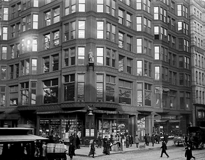
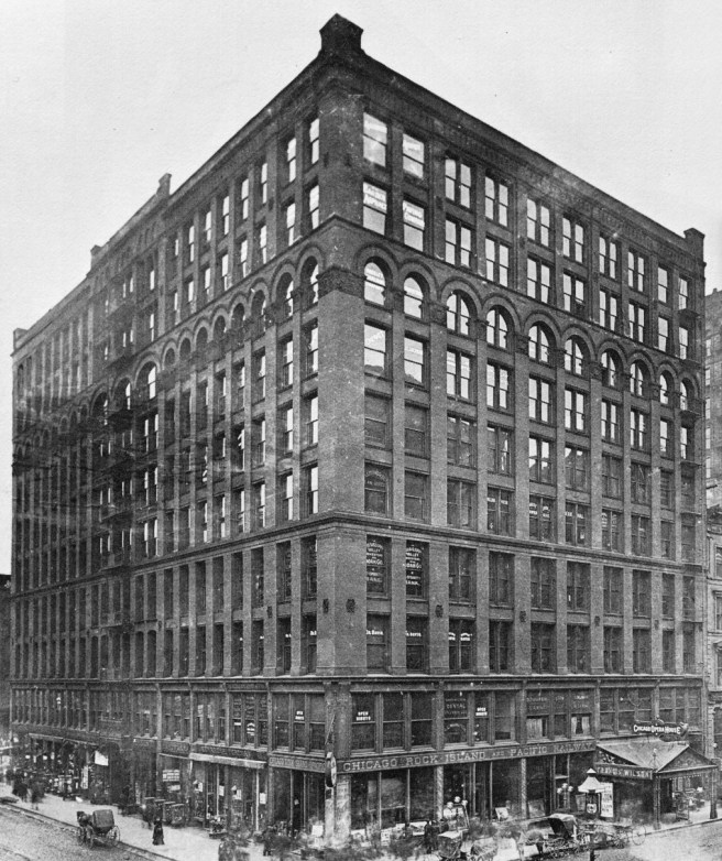
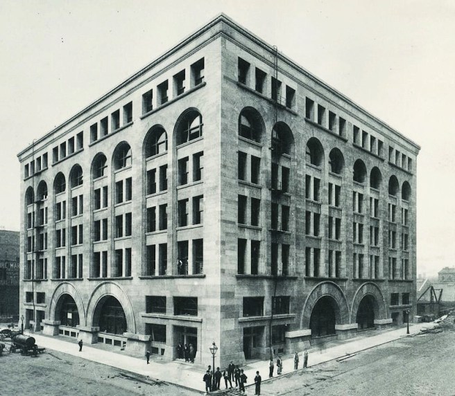
As far as our search for the first all iron skeleton-framed tall building in Chicago the Second Leiter was another “near miss.” Many historians have labelled this building as being all iron-framed, but if we walk around to the back of the building we find that the rear wall was a loadbearing gridwork of brick.  

Jenney, Second Leiter Building. Above: Rear elevation. (Left: Author image; Right: SAH Archipedia); Below: Second floor framing plan. As best as I can make out, the back wall shows solid masonry without any embedded iron columns. (Art Institute of Chicago)
.

The building was only eight stories high. There was no reason for Jenney to expend the extra dollars to erect the iron frame in this location.  (The same reason for Root’s use of the west masonry wall in the Rand-McNally Building.) This type of wall was exactly what Field had Richardson design with the rear of the Wholesale store, including its shallow U-plan to form a lightcourt.  Leiter had simply followed the economical lead of Field in not wanting to pay the extra cost of using iron framing in this location and that of a multistory atrium to light the interior of his store.

Marshall Field Wholesale Store, Rear Elevation along Quincy Street. (O’Gorman, JSAH, October 1978);

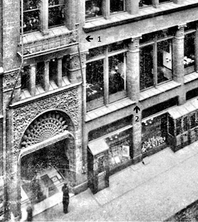
With this exception, Jenney structured the building with the metal skeleton frame (cast iron columns and steel beams).  This may be somewhat misleading, however, for although there were no “walls” on the exterior, Jenney had once again, as he had detailed the Home Insurance Building, placed the cast iron columns inside the granite piers. (Maybe a better way of saying this is that he wrapped the stone slabs of the exterior piers around the iron columns.)

Jenney, Second Leiter Building. Construction showing how the stone slabs encased the iron columns. (Art Institute of Chicago)

In fact, these iron columns had the same box cross-section but without the concrete filling of the Home Insurance Building.  The first question to ask is why use granite slabs on an iron frame?  Of course, the answer must have been because Field had demanded that Richardson use stone, and Leiter, by no means, wanted to look “cheaper” than Field.  Following Field’s lead, the Auditorium had been changed from brick to stone, that then led Sullivan to experiment with smooth-surfaced stone on the Walker Warehouse. 

Adler & Sullivan, Walker Warehouse, Chicago, SW corner of Adams and Market (Wacker), 1888. (urbanremainschicago.com)

This might have sparked a “fashion” but the last three buildings I have reviewed did not use stone. Root used glazed terra cotta in the Rand-McNally Building, first as an experiment, but also, I pointed out that this would have reduced the power of the bricklayer’s union to control the project. This, no doubt, Leiter would have also added into his financial calculations.

Jenney, Second Leiter Building. Above: Ground Floor Plan. Below: Detail of the entrance and corner. Note the thickness of the stone exterior casings and how Jenney embedded the cast iron columns into these. The surprise I found in this drawing is that there is no relation between the interior structural grid (arrows) and the two side elevations. Jenney simply continued the front elevation, that did correspond to the structure, around the building’s corners. (Art Institute of Chicago)

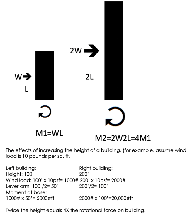
The piers at the building’s corners comprised of five and half feet widths of granite, the eight intermediate piers were slightly thinner, all supported itheir own weight to the ground. The building was only eight stories high, so the stone would easily support its own weight; no need to increase the size and cost of the cast iron columns.  The stone spandrels, however, would have to be carried by the steel spandrel beams.  The weight and inertia of the granite exterior would have assisted in resisting wind loads.    As this was only an eight-story tall building, however, relying on a stone exterior to assist in resisting wind loads was easier to do than in a 14-story skyscraper where the wind forces are a much more dominant design factor. 

Jenney, Second Leiter Building. Iron framing. (Art Institute of Chicago)

Curiously, the Inter-Ocean reported on July 7, 1889, that Jenney’s iron frame was like “the system of construction first used in this extensive way by Mr. Jenney in the Home Insurance Building, and which has since become so popular for commercial and office buildings.”  This was the first published mention of the use of iron in the Home Insurance Building that I have uncovered since its completion in May 1885.  Over four years had passed without any interest or mention of Jenney’s experiment with iron columns, until LeRoy Buffington had been granted his patent for iron framing on May 22, 1888.  Why wasn’t the structure of the Home Insurance Building mentioned in any of the articles that covered the design and construction of any of the earlier constructed buildings that employed the iron frame in their exteriors, such as the Tacoma or Chamber of Commerce Buildings or the Rand-McNally Building?  All three of these were designed and constructed, using iron shelves to support their masonry exteriors, during the publication of Buffington’s patent of iron framing.  But over a year had since passed before anyone had really appreciated the threat that Buffington’s patent could pose to Chicago’s owners and builders. Could it have been the threat of royalties due to Buffington who now had a patent for iron framing that forced Chicago’s construction community to seek an example of “prior art” in order to negate his patent royalties?  The “big lie” had been born.

James McLaughlin, John Shillito and Co. Store, Cincinnati, 1877. (American Architect, October 13, 1877)

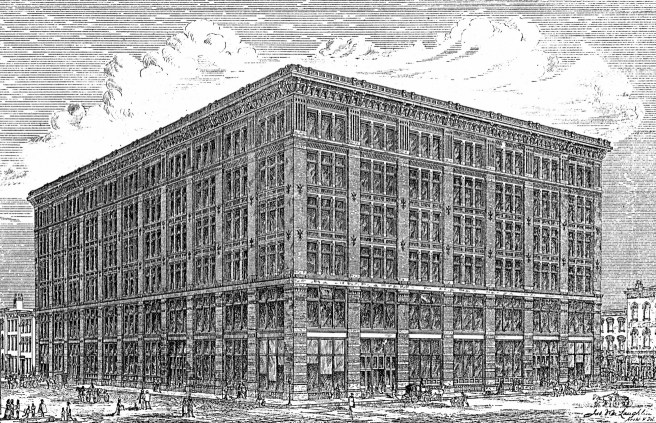
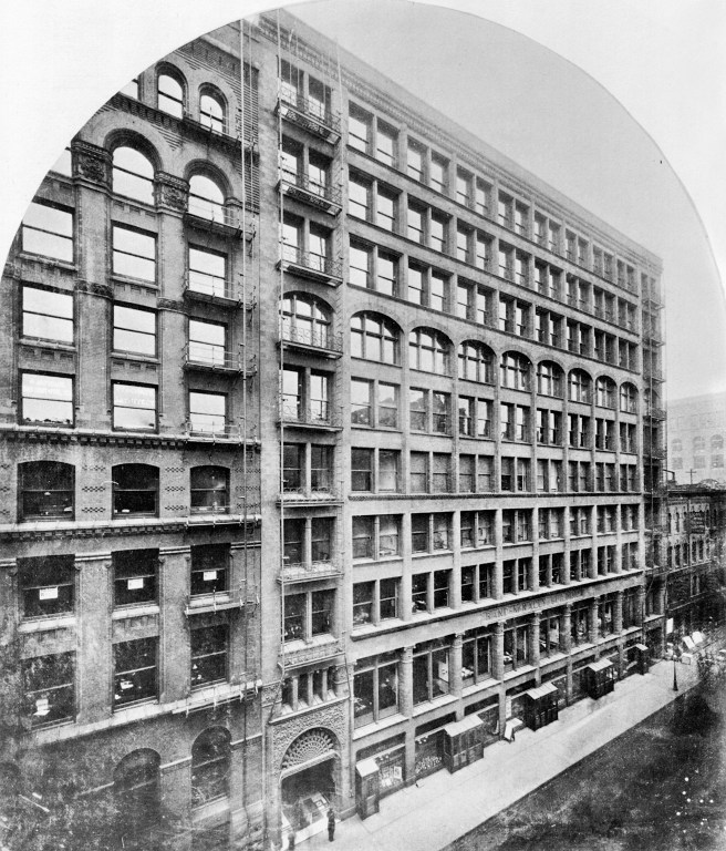
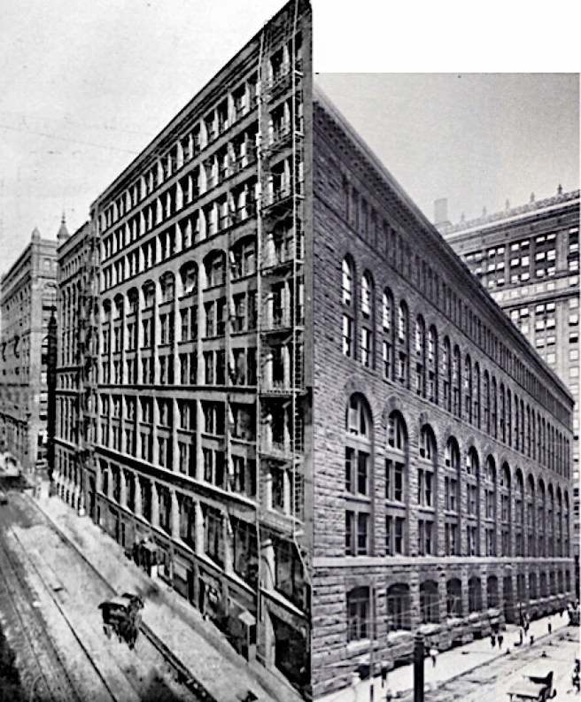
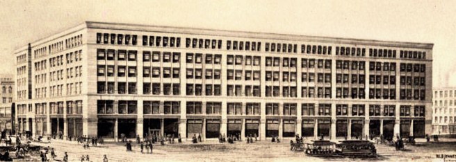
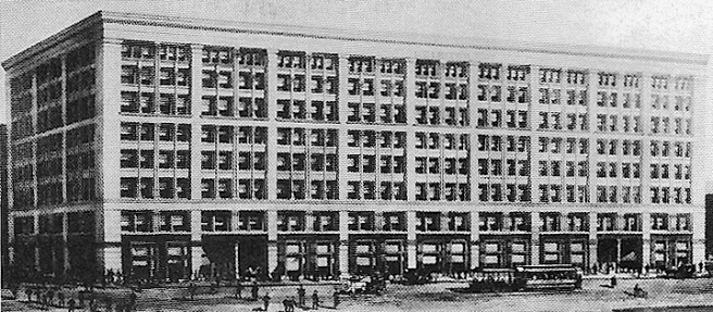
Jenney’s design consciously, or merely conceptually, once again recalled the Shillito’s Store in Cincinnati (v.2, sec. 6.13) that he had used as the basis for the design for his earlier 1879 building for Leiter.  (Obviously either leiter or Jenney really liked Shillito’s building…) The second Leiter Building would be an updated version of the twelve year-old Shillito Store.  In essence, Jenney would take its cubic, Renaissance palazzo form and structurally-based elevations to the next, logical evolutionary step. As was the case with Shillito’s store, there were no walls whatsoever in the interior of Leiter’s store.  This was a departure from the Field store in which Field had demanded firewalls to reduce the spread of any fire.  I also pointed out that Leiter had followed Field, and not Shillito by nixing the extra cost of an interior atrium.

Jenney, The Hercules Building (with tower removed). It was to have eight floors.

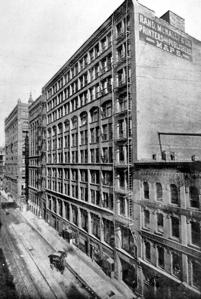
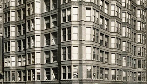
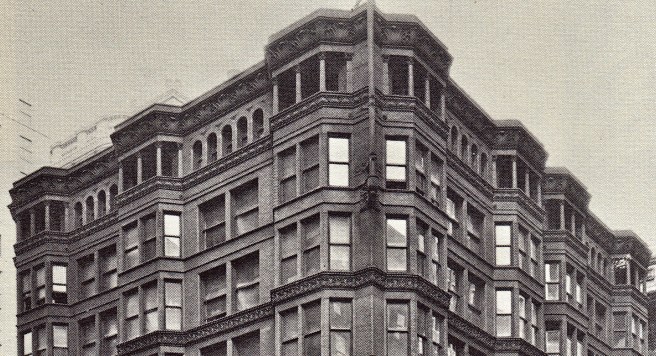
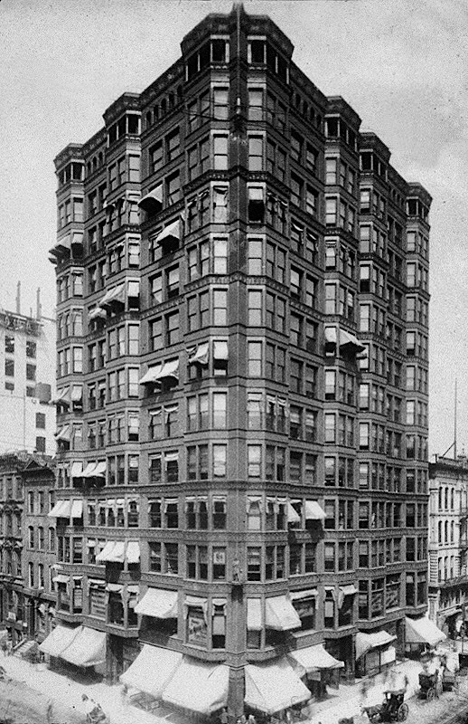
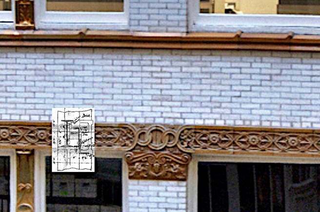
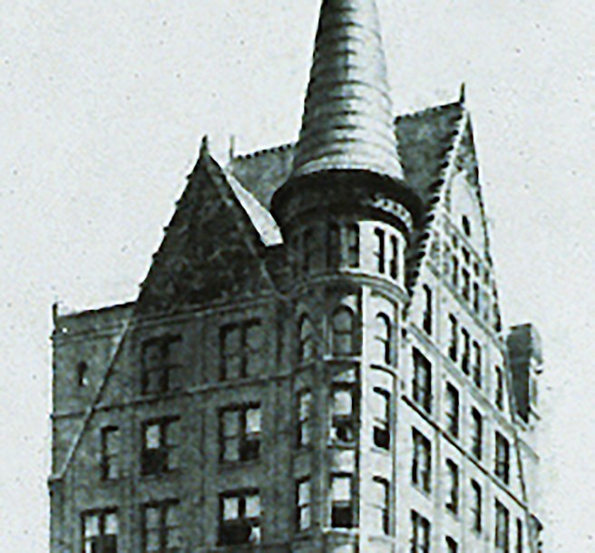
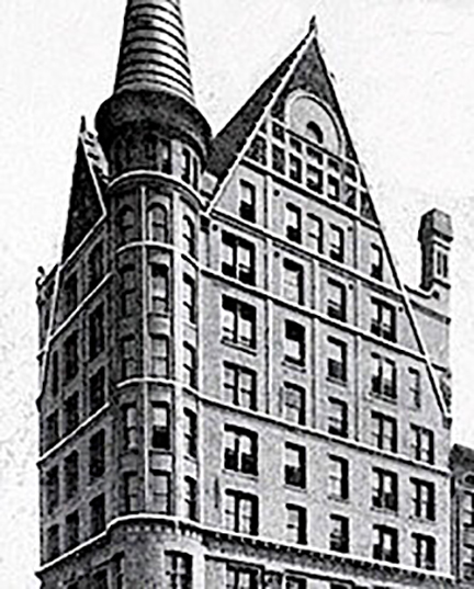
In the wings of the Hercules building, Jenney’s elevational language was “structural.”  That is, the columns were expressed as continuous piers, and the beams were expressed as recessed spandrels. However, rather than just simply covering the metal frame with a repetition of the minimum of fireproof material, as Root had always done in his lightcourt elevations, and as had Holabird & Roche with the exterior of the Tacoma, Jenney preferred to compose a lyrical elevation that still employed the conventional motif of a rhythm that expressed a compositional hierarchy. By increasing the widths of some of the piers, he created a second rhythm across the face of the building. I didn’t realize the reason for this until I spliced the tower out of the perspective sketch above; the two wings were not the same length!  I had to count the number of bays in each wing to confirm this, because Jenney’s visual trick of using the widen piers to “camouflage” this asymmetry had completely fooled me. He also resorted to the Classical tripartite composition of the elevation with corner pavilions (with five vs. three windows) into a tripartite elevation of a two-story base, a four-story middle, and a two-story top, defined by making the spandrel flush with the piers at the seventh floor.

Left: McLaughlin, Shillito’s Store. Bay elevation detailing. (Author’s collection); Right: Jenney, Second Leiter Building (six-story version), side elevation. (Art Institute of Chicago)

I reviewed the Hercules elevation so that we might better understand how Jenney arrived at the final elevation of the Second Leiter Building. His initial elevation for the six-story design was simply the Shillito’s elevation with three exceptions: first, Jenney had expressed only every other interior column with a pier (he had stretched the visual width of the bays). Second, he had placed two, rather than three double-hung windows in each bay. Last, and most importantly, instead of keeping the width of the corner piers the same as the interior piers as had McLaughlin, Jenney wanted to “compose” the building’s elevation rather than simply accept the repetition of the bays ad infinitum.  Therefore, he widened the corner piers as the prevailing architectural conventions dictated.  But when compared to his Hercules elevations, Jenney followed McLaughlin’s precedent by not creating “corner pavilions” at the corners, per the French Classical tradition. 

Jenney, Second Leiter Building. Preliminary Elevation, July 1889. This version shows a shorter (six floors) but a deeper building (note the extra bay and entrance along Van Buren that were not part of the final design. (Inland Architect, August 1889)

While this elevation still looks like a “structural” frame, in fact this façade was, as is the final elevation, a “structural” lie.  Obviously, as I pointed out in the corner detail of the ground floor above, the two side elevations were most decidedly “dishonest,” as the repeated spacing of the piers from the front elevation bore no relation to the spacing of the interior columns along these two elevations. Jenney had chosen to “express” (not literally expose) in the State Street facade only every other column of the interior frame, probably for two reasons: first, the elevation would have been just “too busy” with piers at the same spacing of the interior columns; and second, those wide piers reduced the amount of daylight when compared to the intermediate smaller mullions (that are in front of every other structural column in the interior). Here is a perfect example of a “rational” design that is not “truthful.” The two terms are not necessarily synonymous. Then Leiter added two more stories, and just like Root who had to revise the elevations of the Rookery for the same reason, Jenney had to rethink the now eight-story elevations.

Jenney, Second Leiter Building. Final Design. Two stories have been added and the top story of six windows per bay have been moved from the cornice to under the cornice. (Art Institute of Chicago)

His solution was to remove the cornice of six-windowed bays, and rubber stamp the middle layer of three floors of the six-story scheme on top of the original three-story layer, with one exception: he placed the six-windowed cornice in the upper floor of the new, three-story layer. He capped this new layer with an appropriately scaled cornice, creating a crisp cubic volume. But then he faced a choice: should he keep the continuous spandrel at the sixth floor that would nullify the conventional tripartite scheme of the old elevation, or eliminate this line and allow the piers to extend unbroken for their entire six-story height so as to maintain a tripartite composition?

Jenney, Second Leiter Building. Detail of State Street elevation. The doubled windows in the lower three floors are later additions. (SAH Archipedia)

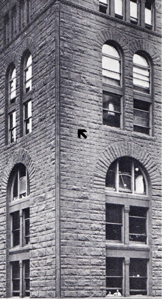
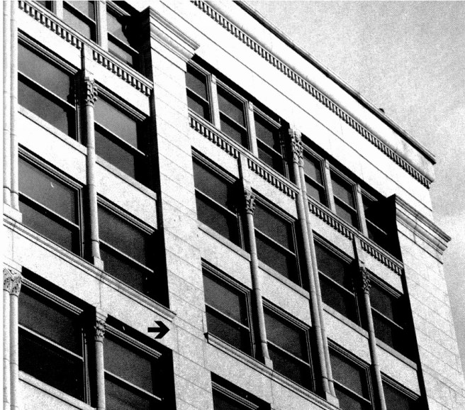
Unfortunately, he obviously couldn’t make up his mind and had naively tried to do both, but of course, this was inherently impossible. He capped each of the ten piers with abstracted capital as if they were six-story tall elements, that broke the elevation into nine equal bays.  One of the few unfortunate design errors occurred where these piers were joined flush with the continuous spandrel that Jenney used to break the six-story body into two three-story layers.  Instead of allowing the piers to be dominant by recessing this horizontal behind the vertical thrust of the piers, as he had done in the other four spandrels, Jenney kept this horizontal in the same plane as that of the pier, implying that the elevation was not a line of piers that supported the cornice, but a smooth plane into which the windows were carved, not unlike Root’s treatment of the Rand-McNally Building.  This resulted in an awkward hermaphroditic quality when Jenney applied capitals at the top of the piers, that was only reinforced by the design of the joints in the granite that implied the frieze was dominant over the piers because the vertical joints of these blocks were consciously not aligned with the edges of the pilaster.  Was the elevation a colonnade or a wall? 

Jenney, Second Leiter Building. Detail of the upper elevation. Note the joints of the primary spandrel at its intersection with the piers (black arrow), the joints are not inline with the edge of the pilaster, contradicting the implication that the vertical is a pier due to the addition of a capital at its top.

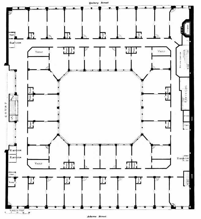
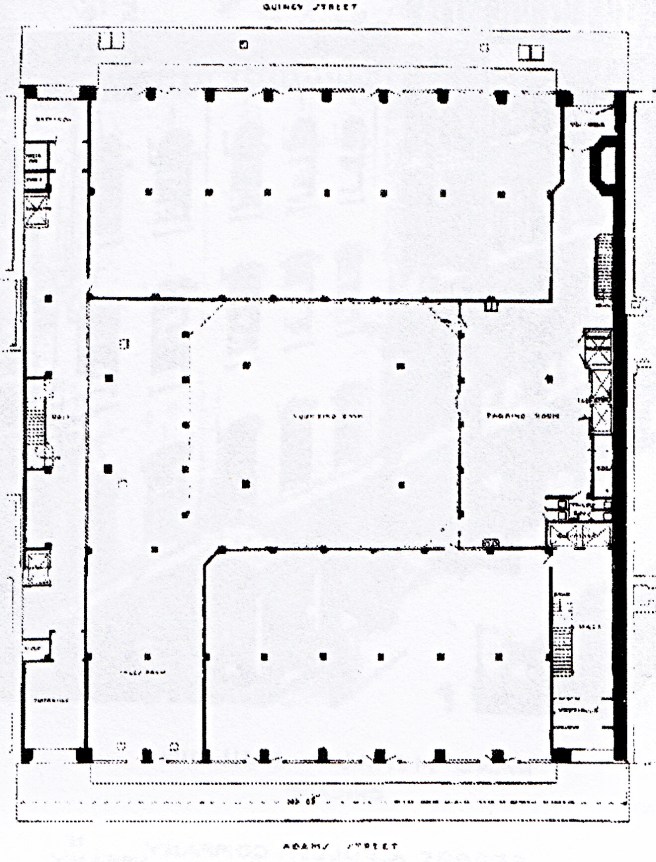
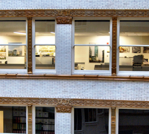
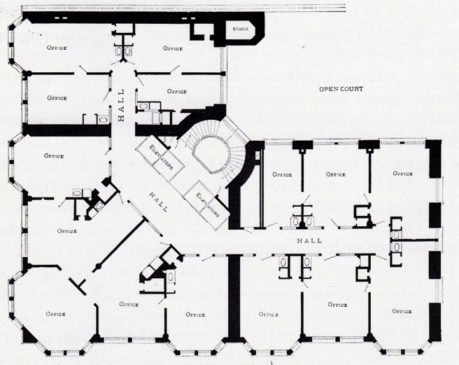
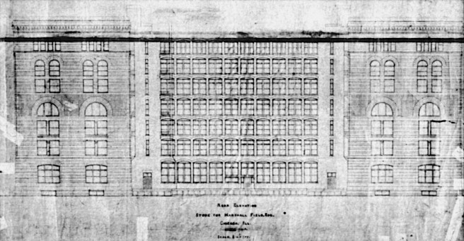
Each of the nine bays was broken into an upper three-story zone, and a lower three-story zone that were detailed with a subtle and sure-handed difference.  The large horizontal distance between each pier was not a direct result of Jenney’s use of a steel beam to span this distance. (A plate girder, 36 inches high, made up of two cover plates, forming the upper and lower flanges, two web plates, and four angles, runs around the entire wall just above the first story.  Box girders are also used as spandrels, but almost all the other beams are rolled steel I-beams.) As the floor plans clearly show, Jenney chose to place a pier in front of only every other column.  This was a conscious choice on his part to reduce the number of vertical elements in the State Street elevation in an attempt, successful in my opinion, to achieve a better balance between the horizontals and the verticals in the façade.  In essence, he had designed two almost identical horizontal layers in the elevation.

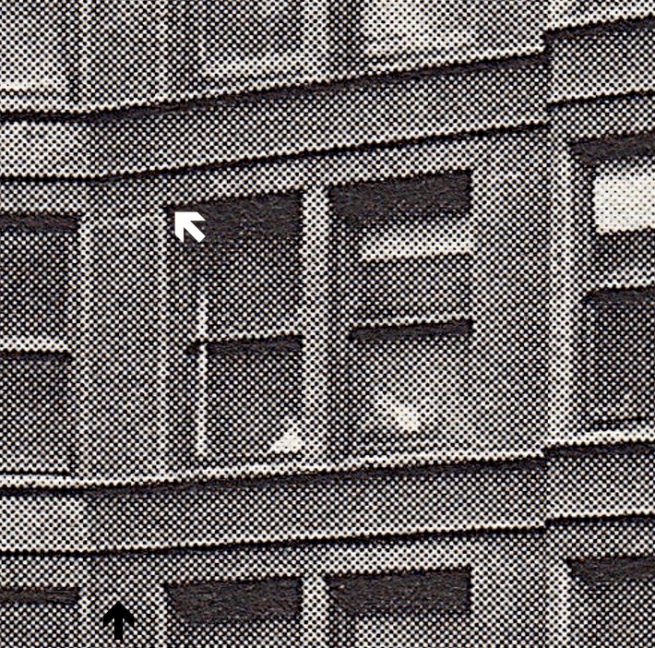
Rather than matter-of-factly just repeating the same window four times in each bay, Jenney’s lyrical intent arranged each of the two layers in a geometric hierarchy by first dividing each major bay in half with a thinner, secondary pier in front of the “every other column.” These contained two engaged colonettes that stretched for the three stories between the major central frieze.  These broke up the four double-hung windows in each bay of the lower layer into pairs of two, that were then further divided by a tertiary pier that had one engaged colonette.  In the upper layer, in the eighth floor he placed six narrower windows, three to either side of the secondary pier to help create the building’s top.

Jenney, Second Leiter Building. Detail of State Street elevation. The white arrow points to questionable extension of the intermediate mullion. This should have been detailed like the similar detail two floors below. (SAH Archipedia)

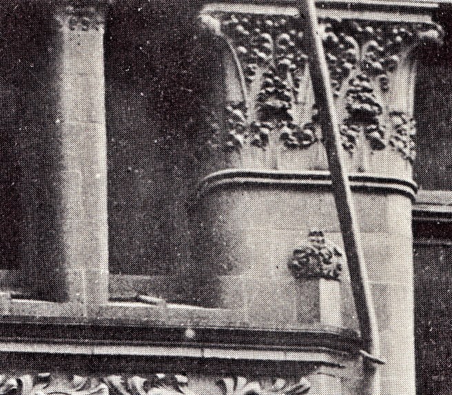
Obviously, this spacing forced him to stop the tertiary piers one floor shorter than in the lower zone, and here he made a second, minor, but still visible error.  Instead of allowing the spandrel at the eighth floor to span continuously from the primary to the secondary piers, which he implied with the location of the capitals of the tertiary colonettes, he placed a vertical extension on top of this capital that extended to the sillcourse of the window above that broke the spandrel into two halves.  He had located the capital of the tertiary pier in the correct location to support the lintels in the spandrel; it was the vertical extension block that simply confused the clarity of the otherwise exquisite structurally expressive hierarchy of the elevation. Jenney was forced into this compromise because he couldn’t repeat the detail he had used in the same location two floors below (see photo above) because while the lower detail had the spandrel in the same plane as the intermediate pier, he had recessed the spandrel in the eighth floor, but had kept the pier in the original plane, leaving the dimension of the recess to be addressed, hence, the reason for the offending stone extension.

A third, minor design error in the elevation was located in the second floor, where Jenney changed the intermediate pier from two to three engaged colonettes.  The visual weight of the three columns was simply not sufficiently visually supported by the granite lintel that it sat on, and if Jenney was actually trying to impart a rhythmic progression in this vertical line, keeping the three in the lower level, and two in the middle, should not have the uppermost layer contained only one colonette, instead of two? It would have been better if he had maintained the two colonettes in this floor.

Jenney, Second Leiter Building. Detail of Ground floor elevation, showing the triple colonette pier in the second floor.

These minor flaws notwithstanding, Jenney’s final design was a well-balanced weaving of horizontals and verticals in search of Owen Jones’ “repose,” with the nostalgic stone voussoir arch finally relegated to the dustbin of history.  This was a truly rational, modern elevational expression based upon (but not identical to) the underlying rectangular grid of the structural metal framework.  It is my favorite of Jenney’s many designs.

FURTHER READING:

Turak, Theodore. William Le Baron Jenney. Ann Arbor: UMI Research Press, 1986.

(If you have any questions or suggestions, please feel free to eMail me at: thearchitectureprofessor@gmail.com)

3.9. FIELD VS. LEITER: ROUND TWO-THE SECOND LEITER BUILDING

William Le Baron Jenney, Second Leiter Building, Chicago, NE corner of State and Congress, 1889. (Zukowsky, Chicago Architecture)

If Root’s Rand-McNally Building can be viewed as his attempt to “one up” Richardson’s Field Wholesale Store, a more vengeful response to Marshall Field’s new building was announced soon after it opened by his former partner, Levi Leiter.  We left off with the spite battle between the two former partners in March 1885, when Field had ordered S.S.Beman to complete the details of his planned 13-story skyscraper at the southwest corner of La Salle and Monroe and to renew excavation from its winter lull.  Field had approved the breaking into of Leiter’s adjacent basement in order to shore up the existing wall and to place the new foundation for his building.  Leiter countered by obtaining a permanent injunction in May 1885 against Field from doing any more construction on Leiter’s side of the wall.  Field had been vindicated the following year (in May 1886) when the Illinois’ Supreme Court ruled that the original agreement was a party wall contract, implying that the easement of support was given to both parties, and that one party could not have the benefits without submitting his property to the requirements of support for either party.  However, while Field had won the battle, he had lost the war, for the time lost during the postponement in construction had killed the project as the building boom had oversaturated the rental market and the Haymarket Square bombing and trials had all but halted construction. (see v.3, sec. 8.19).  So the partially excavated hole at one the busier corners of S. La Salle Street had sat quietly for the next three years, until Field, following the opening of his new Wholesale Store, in a rare show generosity, offered the site to the Woman’s Christian Temperance Union in July 1888 (v.4, sec. 5.4).

Three months later it was announced the Leiter had obtained the entire half block on the east side of State Street between Van Buren and Congress.  In April 1889, the local press announced Leiter’s intention to build a huge new department store covering the entire site.  Leiter was quoted as saying that in planning the building, he anticipated that the almost-completed Auditorium would draw business farther south from the existing core.  Not only was Leiter’s new building (now commonly referred to as the Second Leiter Building to distinguish it from his earlier building, now known as the First Leiter Building, designed by William Le Baron Jenney in 1879) going to be 20% larger than Field’s (and three feet taller!), but it was also being designed as the most modern building in Chicago, said “to be as complete and perfect in all its appointments as the resources of modern art and science can make it.”  

Leiter’s intent was quite transparent, he was attempting to steal all of the publicity surrounding his former partner’s new Wholesale Store, while implying that it was already a dinosaur.  The contrast between the two buildings couldn’t have been starker, yet there were less than four years separating the two designs.  The Field Store was a rough-hewn medieval fortress while the Leiter Store was an open, light-filled cage of smooth-faced, light gray Maine granite, due to its modern skeleton frame construction.  The Leiter Store still stands today as a testament to the owner’s faith in new technology; the Field Store had to be demolished in 1930 primarily because its architect had still not learned the lessons of modern foundations.  Truly, Leiter would take great pleasure in his new building, for more than one reason.

Leiter turned once more to William Le Baron Jenney to design the store.  In addition to having designed Leiter’s building at the northwest corner of Wells and Monroe in 1879, Leiter had also commissioned Jenney in 1884 to remodel his six-story Tobey Building, located at State and Jackson.  Jenney would benefit greatly from his professional relationship with Leiter, for this new commission would reinvigorate not only his firm’s business, but also his historical reputation.  Between the bookends of the ten-year period from the First Leiter Building of 1879 to the Second Leiter Building of 1889, Jenney had designed only two rather significant buildings, the Union League Club (of which he was a member) and the Home Insurance Building.  The Home Insurance commission, as I have already documented, was due not his preeminence within Chicago’s architectural community at the time, but because of a personal favor given by the company’s Chicago agent, Arthur Ducat, a Civil War acquaintance of Jenney’s. 

List of skyscrapers designed by Chicago architects, 1881-1888. Note that even Jenney’s former employees, Holabird and Roche had designed a taller building than Jenney had in 1888.

Following the completion of the Home Insurance Building, Jenney had no more commissions for skyscrapers or other large buildings that were erected.  If the Home Insurance Building was such a pioneering achievement in construction or architecture, as it has been made out to be by many historians, why didn’t building owners and contractors flock to Jenney’s door in 1885 or 1886, before the Haymarket Square bombing, or in mid-1888 with the upturn in construction?  We only have to list Chicago’s major architects and their completed skyscrapers during this period prior to Jenney’s commission for the Second Leiter Building to ascertain Jenney’s meager output during this important era.  One can only imagine what would have Jenney’s future reputation had been if Leiter had favored a different architect or had died prior to 1889.

William Le Baron Jenney, Proposed Hercules Building, Chicago, 1889. Note the ten-story unbroken piers in the tower. (Turak, Jenney)

While Jenney was in the initial design phase of the Leiter Store, he also was working on what one can only describe as a monster project, the appropriately named Hercules Building.  Apparently commissioned by the site’s owners, the Young and Farrell Stone Company, Jenney had designed a mammoth building, reported to cost over $3 million, for a site on the west bank of the river, on the south side of Polk Street.  Its dimensions were 497’ by 372’ with eight floors at a height of 120.’  In the center of the building, Jenney positioned a 14-story tower that rose to a final height of 212,’ that divided the mass of the building into two equal wings.  The building’s primary intent was to provide manufacturing space in close proximity to the business district and the railroad terminals.  Jenney took advantage of the site’s slope to the river in designing the building’s section to provide for a very efficient system of movement of materials and goods throughout the building.  Wharves would line the river’s edge, while the sectional grade was such that railroad tracks passed through the basement.  These moves permitted him to design the ground floor with an unencumbered openness that would have allowed horse-drawn wagons complete freedom of movement under the upper floors.  The building was scheduled to have an unprecedented 28 elevators for people and freight.

Its construction was reported to have been steel skeleton framing with stone walls.  The openness in the elevations, especially the end bays in which Jenney placed five windows, obviously reveals that the stone walls (the building’s owner was a stone company) were merely a veneer, for only a steel frame in the exterior could have achieved such spans.  The design of the building’s elevation was quite functionally-based, especially those of the two flanking wings.  No nostalgic arches are used; the entire elevation was an unornamented field of a rectangular grid.  Jenney articulated the eight floors of the wings into a two-story, rough-hewn stone base, a four-story middle, and a two-story top.  A balance between the wings’ primary horizontal proportions was achieved with the six-story, unbroken vertical pilasters that Jenney used to frame the corners and the entrance of each wing.

While the overall profile of the tower owes its allegiance to Sullivan’s tower in the Auditorium, it is quite evident that Jenney had thought that Sullivan had designed the intersection of his tower and the lower body of the Auditorium rather poorly. Instead of just placing the extra floors of the vertically-articulated tower on the top of the lower horizontal body, and trying to resolve the inherent conflict in this solution by blurring the merging of these two forces with the slight projection of the edges of the tower as Sullivan had done, Jenney simply let the 84’ x 112’ deep plan of the tower extend all the way to the ground by recessing the first two bays of the wings on either side of the tower (which was actually the way that Adler had detailed the construction of the Auditorium’s tower).  This perfectly articulated the tower as separate from the body of the wings.  He reinforced this effect by also raising the tower’s stone base one more story than that of the wings (as had Sullivan).  While Jenney did resort to the arch in the design of the tower, it is his design of a seven-story arcade, continued another three stories into the stone base, with its unbroken, continuous 10-story vertical piers that is prophetic.  (He had superseded the eight-story run of the continuous piers that George Edbrooke had detailed in the Hiram Sibley Warehouse of 1883.)  While the Hercules, obviously, must have been far more costly than even its projectors had anticipated, and, therefore, went unbuilt, Jenney would succeed in building both the straightforward body of the wings, as well as the sheer verticality of its tower in his next two projects.  

George H. Edbrooke, Hiram Sibley Warehouse. River elevation. Note the continuous seven-story piers in the righthand portion of the elevation. (Historic American Buildings Survey)

FURTHER READING:

Turak, Theodore. William Le Baron Jenney. Ann Arbor: UMI Research Press, 1986.

(If you have any questions or suggestions, please feel free to eMail me at: thearchitectureprofessor@gmail.com)

3.8. ROOT’S WHITMAN’S SAMPLER: THE RAND-McNALLY BUILDING

Burnham & Root, Rand-McNally Building, Chicago, 165 W. Adams Street, 1888. To the left is the Insurance Exchange and then sitting across La Salle is the Rookery. (Chicagology.com)

The third building of 1888 in which the iron frame was introduced into the exterior was the Rand-McNally Building.  In the fall of 1888, Burnham & Root were contracted by the local printing/publishing house Rand-McNally to design a new office building to be constructed adjacent to Root’s Insurance Exchange on a site that was in the interior of the block that ran between Adams and Quincy, to replace their existing building at 125 W. Monroe. While Root would push construction technology to the next level in this building, it was the site that controlled the overall design of this building.

The size of the lot was about the same size as that of the Rookery. The difference was that this site was not a corner site, but an interior site, very much like that of the Royal Insurance Building (v.3, sec. 7.11) that sat across the street facing the Quincy elevation.  

Burnham & Root, Rand-McNally Building. Typical floor plan. (Hoffmann, Root)

As in the Rookery, Burnham, who typically was responsible for figuring out the most efficient floor plan for a given project, had lined both street fronts with a double-loaded corridor while placing single-loaded offices against the two masonry party walls. 

Burnham & Root, Rand-McNally Building. Transverse section through the street fronts. (Hoffmann, Root)

This left a 60’ x 68’ lightcourt lined, once again lined in white-glazed brick, in the center with the skylight brought down to the second floor so that the interior ring of offices had access to daylight and fresh air, again echoing the Rookery.  As the building’s use was primarily for the company, the accounting department was located on the ground floor in the space directly under the skylight. Therefore, the building did not need, nor did it enjoy the exhilarating spatial sequence of the Rookery.  One could consider the Rand-McNally to have been the Rookery’s poor cousin…

Burnham & Root, Rand-McNally Building. Ground floor plan. (Prominent Buildings Erected by George A. Fuller)

The site in the interior of this block, in combination with the company’s program, dictated a very efficient ground floor plan: entries were located at each of the building’s four corners to minimize employee travel distance to an elevator bank at each end of the building. Employees simply passed through one of the corner entries and went directly to an elevator bank and up to their respective floor, except the accountants, who were able to enjoy the one inspiring space in the entire building.  Between the entrances at either end the street fronts on both elevations were to be rented out as stores.

Quincy Street, looking west from Adams Street (from the Rookery). From left to right: the Gaff Building, the Mallers Building, the Royal Insurance Building, the Rand-McNally Building, and the Insurance Exchange.

Although the size of the site was equivalent to that of the Rookery, because it was located in the interior of the block, Root was faced with the design of only an elevation, as opposed to the three-dimensional mass of the Rookery and his other corner buildings, including the neighboring Insurance Exchange and Burlington Building.  In concept, the problem of designing a building with two independent elevations was similar to what Boyington had faced with the Royal Insurance Building. While Boyington had designed two completely different elevations, economics dictated Root’s repetition. There were two considerations for Root to address in the design of the building’s elevations: one technical expression, and second, the building’s architectural/urban context.

Reconstruction of Adams Street Looking East from Franklin, Left side, Burlington Building, Right side, in order, Field Wholesale Store, Rand-McNally Building (1889), Insurance Exchange, The Rookery, with the Home Insurance Building across Adams (on the left) and Cobb & Frost’s Owings Building (turret in back of the Rookery). At the far end on the right side, in front of the Exposition Center is the Pullman Building. If Root had any intention to reference the arcades in the Field Store, it would have been with the second tier arcade in the sixth floor. (Digital image by David Burwinkel)

It was the context that was the more challenging of the two, and so, I’ll start there. Adams Street, as I’ve already alluded to, was quickly emerging as Chicago’s architectural showcase.  To the east of the site sat Root’s Insurance Exchange and the Rookery, as well as the Home Insurance Building; to the west sat his Burlington Building. But the real challenge was Richardson’s recently completed Marshall Field’s Wholesale Store. As this was on the same side of the street as the Rand-McNally lot, his design would be seen “inline” with the Field’s sophisticated use of stone arcades.

H.H. Richardson, Marshall Field Wholesale Store. By eliminating the continuous sill course at this level (note that he even went so far to avoid emphasizing this line that he did not increase the height of the stone coursing at this level even though he did do so at the other floor levels), Richardson transformed his elevation from a stack of four horizontal layers to a tripartite scheme in which the middle layer was one, continuous five-story high surface.

Given such an opportunity to have “the last laugh” with Richardson’s (who had died two years earlier) masterpiece next door, Root had to have been extremely frustrated with the company’s representatives who could not make up their mind on how many floors to build.  During the design phase, Root was asked to design elevations that contained 9, 10, 12, 14, and 16 floors.  This indecisiveness would have tried the patience of Job, so one can just imagine the utter frustration that Root went through trying to one-up Richardson with this particular project.  Eventually the company decided on ten stories.

As Root had been the first in Chicago to use the iron frame and curtain wall in the lightcourt of the Rookery, it was logical that he would also be one of the first to try the new system on the exterior of a tall building.  First, he restated the elevation of the Rookery’s lightcourt to enclose the Rand-McNally’s court. To this new type of exterior construction he added the extra challenge of using only enameled terra cotta to clad the iron frame.  In addition to the reducing the weight of the brick exterior and the corresponding increase in rentable area gained from using the thinner terra cotta, the work done on a building controlled by the members of the bricklayers’ union would be significantly reduced, lessening the chance of a slowdown in the building’s construction.

Burnham & Root, Rand-McNally Building. Entrance. Note that the entire exterior is made of one continuous, ten-story high surface of terra cotta. (Hoffmann, Root)

I am quite certain that in his mind, Root believed he had already solved in the Rookery’s lightcourt the problem of designing an elevation that rationally expressed the gridlike nature of the iron skeleton frame.  I think he took the opportunity afforded with the Rand-McNally design to explore the plastic potential of terra cotta as an exterior material.  

The year before the firm received the commission, Root had published in the Inland Architect a paper, “Style,” in which he clearly stated:

“The value of plain surfaces in every building is not to be overestimated.  Strive for them, and when the fates place at your disposal a good, generous sweep of masonry, accept it frankly and thank God.  If this goodly surface comes at the corners of your building, so much the better; for there can be no better guaranty that the house will “stay where it was put” than the presence of simple masonry at its angles.”

Think of the Rand-McNally’s facade as one 158′ long by ten-story high sheet (or curtain) of smooth clay hung on the building’s skeletal structure. Now you get to carve the windows for each floor in it. You could simply make the windows all the same, but for Root an elevation was still meant to be a composed piece of architecture. While one can easily read the steel frame behind the terra cotta skin, Root’s design was not a dry repetition of the same floor detailing, one on top of the next, as was his design of the Rookery lightcourt or Holabird & Roche’s design of the Tacoma Building’s elevations.  Root was Root, and the design of a building was but one more opportunity to experiment with a “full-scale model.”  

Burnham & Root, Rand-McNally Building, Chicago, 1888. To the left is Root’s Insurance Exchange. Richardson’s Marshall Field Store is in the right background. (Hoffmann, Meanings)

First off, he treated the facade of the Rand-McNally as one continuous, ten-story high surface of plastic terra cotta. In this aspect it continued his earlier experiments with such a surface in the two apartment buildings he had designed in 1886 following the precedent set by Richardson in the middle layer of the Field Wholesale Store’s elevations (in which he had eliminated the continuous sillcourse between the primary and secondary arcades). Sullivan had also experimented with the smooth, unbroken multi-storied surface in the elevations of the Walker Warehouse, that sat only three blocks to the west along Adams Street. The difference between the Sullivan’s building and Root’s was that Sullivan had used a smooth stone wall that also provided the building’s structure; Root was going to explore the same language of the smooth-surfaced exterior, except with a different material. Where Sullivan’s detailing was rightfully lithic and designed with Sullivan’s propensity to see a building as a series of intersecting, two-dimensional planes (i.e., sharp corners), Root explored the plastic possibilities with terra cotta designed with his propensity to see a building as a three-dimensional volume (i.e., rounded corners) to be sculpted. (Once again, no judgment, both approaches are valid, but very different in design.) This was not the only detail from Sullivan that Root appropriated in his design of the Rand-McNally Building.

Burnham & Root. Left: Argyle Apartments, northwest corner of Michigan and Jackson, 1886. Right: Pickwick Flats, southeast corner of Michigan and Twentieth, 1886. Gone are all intermediate stringcourses, leaving an elevation of an unbroken plane of brick: the final solution for the Monadnock is born. (Hoffmann, Root)
Adler & Sullivan, Walker Warehouse, Chicago, SW corner of Adams and Market (Wacker), 1888. The building stood a mere three blocks west along Adams Street. (urbanremainschicago.com)

At first glance, surviving photographs of the Rand-McNally Building’s exterior tend to make the viewer think that the elevation consisted of corner pavilions that acted as bookends within which Root placed a number of horizontal layers. These images contain the exterior fire escapes that were located in front of each of the corner pavilions, that obscured how each of the floors intersected with the corner pavilions.

He had detailed slightly wider pilasters within the elevation’s surface to articulate the two end bays of the façade. These contained the entries on the ground floor and the elevator corridors above. The corner pavilions made a frame but were still contiguous with the smooth, taut terra cotta ten-story surface.  It is when one zooms in for a closer inspection that we see that Root had detailed the entire 10-storied surface as one continuous plane, within which he then carved out the windows, experimenting with a number of different details.  Hence, the reason I call this building a “Whitman Smapler” of how terra cotta could be detailed in any number of different ways to frame a window opening. No matter if you move up or across the building’s face, you will find that the exterior is one continuous surface within which Root then proceeds to show a number of different corner conditions achievable with the plasticity of terra cotta. In fact, in the total ten floors, eight of these each had different details. Only floors 5 and 6 and 8 and 9 were duplicates. Within this building, Root took the opportunity to experiment with each of the four types of constructional articulation that I have listed as being an appropriate rational solution for the iron skeleton frame: the structural grid (the lightcourt), the column/vertical (floors 5-7), the horizontal repetition of stacked identical floors (floors 8-10), and the uniform surface enclosing the building’s volume (all ten floors).

Root used continuous projected sillcourses (that he stopped short at the corner pavilions) to break the elevation into four zones, each displaying a different window technique:

Burnham & Root, Rand-McNally Building. Zone 1: lowest two floors. Arrow #1 points to the flush surface of the corner pavilion and the spandrel. Arrow #2 points to the break in the sillcourse that allowed the terra cotta surface to continue up, into the second story.

Zone 1. The first two floors were one continuous two-story surface of terra cotta. In this close-up photo of the building’s base, I have highlighted where the building’s original surface continues past the joint between the corner pavilion and each floor (arrow #1).  At first glance, the two stories look like separate layers, defined by a continuous sillcourse. Yet, when we get closer, it is apparent that the sillcourse was broken for a few inches at the centerline of each column (arrow #2), just enough to allow the surface of the Ground Floor to ooze up, into the second floor.  The first floor storefronts were carved into the surface plane with his characteristics curved edges and with a curved corner between the pier and the beam.  The second floor was detailed as a line of single-story columns that Root had formed by taking the terra cotta surface of the lower floor and bending it to form a column that sat above the flat-fronted pier below.  These were capped with an ornamental capital that supported the sharp-cornered spandrel of the third floor. A pair of double-hung windows set the secondary vertical spacing between the primary spacing of the terra cotta clad steel columns.

Burnham & Root, Rand-McNally Building. Zone 2: Floors 3 and 4.

Zone 2.  He detailed this zone as a two-story colonnade by recessing the spandrels between floors three and four. While the columns had rounded corners, the lintel of the colonnade once again had a sharp corner. The mullions in floor 3 were detailed to be flush with the recessed spandrel above, while those in floor 4 were slightly different as they sat recessed from the original surface of the elevation.

Burnham & Root, Rand-McNally Building. Zone 3: Floors 5-7. The white arrow points to where the voussoir arch intersects with the rounded edge of the pier.

Zone 3.  This zone contained his old friend, the arcade, that obviously Root was having a hard time saying good-bye to. The piers in this zone were triple-stepped in section that supported crisply-detailed voussoir arches. He continued the same window spacing from below, with the exception, rightly so, under the arches in which he appropriately divided into three windows with smaller mullions than those used with the paired windows.  One detail I truly appreciate that I want to bring to your attention is how he detailed the connection of the arches to the wider piers of each corner pavilion: the sharp edge of the arch dissipates into a line as the pier’s corner curves away from it.

Burnham & Root, Rand-McNally Building. Zone 4: Floors 8-10. The black arrow is pointing to where Root recessed the roof’s spandrel to allow the piers to read as if they support the cornice.

Zone 4. Here he articulated each floor into its own layer with a continuous sillcourse. He continued to use the triple-stepped piers and the paired window language in these three floors, but with a final twist. He recessed the spandrel in front of the roof to be flush with the recessed secondary window mullions that allowed the primary piers to read as if they were helping to support the building’s cornice. While zones 2 and 3 had a vertical accent, with these sillcourses he gave zone 4 a distinct horizontal grain, probably to provide an appropriate cap for the elevation.  As the elevation was nearly as wide as it was tall, such a balance between these two forces would have imparted a sense of “repose” to the design.  A feat of master design, that is to synthesize four related, but different elevational languages into one “reposeful” elevation.

Comparison of the elevations of Rand-McNally Building and the Field Wholesale Store. There was no obvious relationship between Root’s arcade and those in Richardson’s design.

The enigma of the final design was his continued use of his old friend, the multistoried arcade.  Similar to his awkward placement of the arcade in the Phoenix elevation, he located the three-story arcade in the ambiguous midheight region, with the arches capping the windows in the seventh floor.  One wonders at first viewing why didn’t he put these at the top, in the compositionally more logical location, or was Root trying to tie his elevation back to the arcade in the Insurance Exchange, or had it something to do with Richardson’s arcades in the adjacent Field Store?  There is a reference that states that the company wanted its printing presses located on the seventh floor, but this flies in the face of everything we have learned about buildings with printing presses.  First, the presses are heavy, and second, they are susceptible to the slightest vibrations (that the building’s lightweight steel frame most certainly would not have retarded).  Nevertheless, if this was the case, then no one can question the logic of Root’s placement of the only arches in the entire field of the building’s elevation to mark the presence of this special activity. (If this was the case, then Root gave us five examples of a “rational” elevation for a skyscraper, i.e., an expression of the building’s internal function.) But again, Root told us that arches actually retard the amount of daylight making it to the interior,  This may have been somewhat offset because the openings under the arches were appropriately divided into three windows with smaller mullions than those used with the paired windows, arguably compensating for the lost daylight caused by the arches.  My instinct tells me that Root placed these arches here to tie the Rand-McNally to the Rookery in order to create an urban setpiece with the three Root designs lining these two blocks of Adams.

Burnham & Root, Buildings along Adams Street. From left: 2. Rookery, 3. Insurance Exchange, 4. Rand-McNally Building. Three things to note: 1. The elevational language in the lightcourts of the Rand-McNally and Rookery appear to be almost identical. This was because both buildings had an inner tier of offices lining the court requiring a maximum of daylight; 2. How the Rand-McNally Building was pushed right up to the lotline with the Insurance Exchange, allowing its lightcourt to provide daylight for its eastern corridor. Rolling fireshutters were attached to all of the windows in this area of the Rand-McNally; 3. The only reason I can find for the location of the seventh floor arcade in the Rand-McNally is to echo the arcade in the Rookery at the same location. (Rand-McNally View #1; of course it was the first view they included in this guide…)

The only other arches used by Root demarked the two entries at either end bay.  These were ornamented with terra cotta panels that bore Root’s personal organic-motifed designs. 

Curiously, while these were semicircular in profile, the arcade arches had an elliptical profile, the first use by Root of this shape.  While I can make an argument that this shape allows more daylight to enter than the semicircle, I am intrigued by another idea: Root took this shape from Sullivan’s interior of the Auditorium’s House, whose interior had only recently been opened to the public for the Republican Convention (opening night was still over a year in the future).  If this was the only quote from a recent Sullivan building, I would not have mentioned it.  But I have already mentioned Sullivan’s smooth-surfaced Walker Warehouse, in which he had employed projected ledges for their articulation and their shadow, in a similar manner to how Root then used them in the Rand-McNally Building.  In fact, I had pointed out how Root had interrupted these at the second floor to allow the building’s surface to continue through this opening. Sullivan had done this exact detail at the third and seventh floors in the Walker Warehouse.

Adler & Sullivan. Left: The Auditorium’s Main Foyer; Right: Walker Warehouse.

As I stated at the beginning of this chapter, the Rand-McNally Building was the third of this series of Chicago buildings designed 1888 to replace exterior masonry walls with iron skeleton framing in the evolutionary process of birthing the all iron-framed skyscraper that Buffington had prophesized in May 1888.  In addition to being the first exterior made from only enameled terra cotta, it also deserves credit for having been the first all-steel structure. This, however, does not mean that it was an independent steel-framed building without any bearing walls, for the west party wall was still a masonry bearing wall.  In other words, all of the building’s structure, except this one wall comprised of iron skeleton framing.  The family tree of its construction consisted of:

1. The Rookery: its lightcourt iron framing and curtain wall.

2. Cleveland’s Society for Savings Building: Charles Strobel’s riveted steel z-bar columns.

3. The Tacoma Building: its engineers, Wade & Purdy and its contractor, George Fuller, were responsible for its erection.

As was done in the Society for Savings Building, steel z-bar columns were used, hot-riveted to steel beams to achieve sufficient rigidity to resist the wind loads. The frame was braced in the horizontal plane with diagonal ties rods in the floors to resist wracking of the frame due to wind and to incorporate the rigidity of 44” thick west wall to assist against the wind. I am sure that it was less expensive to use load-bearing masonry in this wall rather than the skeletal construction used to erect the east wall.

Charles L. Strobel, Column Cross-sectional Shapes Using Riveted Z-Sections. (Birkmire, Skeleton Construction)

While the building code also required a masonry party wall between the Insurance Exchange and the Rand-McNally Building, the Insurance Exchange’s party wall had not been designed with the idea of eventually having to support an adjacent building, meaning that the Rand-McNally Building would have to be built with its own party wall in this location.  This posed a vexing problem for Root and his consulting engineers, Wade & Purdy, in that he could not locate the new party wall immediately up to the Insurance Exchange if he employed a conventional foundation, for he would have to place the new load of the Rand-McNally’s east wall on the Insurance Exchange’s existing pyramidal footing.  This would significantly increase the stress under the footing, which would expose the existing building to the subsequent additional settlement and would certainly result in cracking within the Insurance Exchange. 

Root evolved a revolutionary solution by cantilevering iron box beams in the basement from the first interior line of columns, over a fulcrum located a safe distance from the existing foundations of the Insurance Exchange, to the edge of the lot line.  Here the cantilevers could support the loads of the steel columns of the skeleton frame that Root placed in the party wall (to also lighten the weight of the wall that would have to be transferred by the cantilevers).  Thus, the cantilevers carried the load of the east party wall back to the fulcrum and down to the ground, without impacting the existing foundation. The rotation of the cantilever was counterbalanced by making the cantilever continuous over the fulcrum to the first line of columns whose loads offset that of the cantilevers..   He had achieved his second innovation in foundation engineering (the first being the use of iron rails to reinforce concrete in the construction of pad foundations, that replaced stone pyramidal foundations). However, the Rand-McNally Building still had one load-bearing masonry wall. We have yet found Chicago’s first all-skeleton framed skyscraper…

Burnham & Root, Rand-McNally Building. Cantilevered foundation for the party wall, next to the Insurance Exchange. (Hoffmann, Root)

FURTHER READING:

Condit, Carl W. The Chicago School of Architecture: A History of Commercial and Public Building in the Chicago Area, 1875-1925. Chicago: University of Chicago Press, 1964.

Hoffmann, Donald. The Architecture of John Wellborn Root. Baltimore: Johns Hopkins University Press, 1973.

Hoffmann, Donald. The Meanings of Architecture: Buildings and Writings by John Wellborn Root. New York: Horizon, 1967.

(If you have any questions or suggestions, please feel free to eMail me at: thearchitectureprofessor@gmail.com)

3.7. THE CHAMBER OF COMMERCE BUILDING

Baumann & Huehl, Chamber of Commerce Building, Chicago, SE corner of La Salle and Washington, 1888. (Online)

The Tacoma Building was the first, but only the first in a number of experiments that builders erected during the period 1888-89, in the process of carefully divorcing the iron frame from the lateral support imparted by the masonry wall.  The second experiment in Chicago occurred in the Chamber of Commerce building, one of the least documented and appreciated Chicago School buildings, but one of my favorite designs.

An eight-story addition was placed on top of the post-fire Chamber of Commerce building at the southeast corner of La Salle and Washington, just north of the Tacoma.  In fact, both buildings were on their respective drafting boards at the same time, so one can consider the Chamber of Commerce to simply be a bigger experiment of the Tacoma concept.  Once again, we can point to Cincinnati for the impetus for this project. 

H.H. Richardson, Cincinnati Chamber of Commerce, 1885. (Online)

The new Cincinnati Chamber of Commerce, for which H.H. Richardson had won the competition in 1885 had opened its doors on January 30, 1888. (Doesn’t it already look dated?)  During the period of its construction, the owners of Chicago’s outmoded Chamber of Commerce, following the jump of the Board of Trade to the south end of La Salle Street had simply continued to wallow in self-pity.  Construction of the Cincinnati building was garnering national recognition that simply forced the Chamber’s directors to take action.  The new construction was also influenced by the completion and occupation of the post-fire City Hall, that sat directly across on the northside of Washington Street. A group of Chicago investors bought the old building and hired Edward Baumann and Harris W. Huehl to remodel the existing building to accept an eight-story addition.

Edward Baumann (1838-1889) was born Marienwerder, near Danzig, Prussia, in 1838, completed his polytechnic training in 1856, and immediately immigrated to the US, being hired by his cousin Frederick in 1857.  (Frederick Baumann is often mistakenly credited with the design of this building.) Harris Huehl (1862-1919) was a native Chicagoan who had experienced all of his professional training in the office of Edward Baumann, who made him his partner in July 1888, as the project became a reality.  It was a prudent decision on the part of Baumann, who died before the building was completed, in Berlin, Germany, on January 25, 1889.  Huehl was left to see the building through to completion. The reason some authors connect Frederick Baumann with the design of this building is that the addition was erected with an iron skeleton frame and Frederick had been one of the earlier architects to actually publish an article discussing the possibility of such construction in the March 15, 1884, issue of Sanitary News, “Improved Construction of High Buildings.” (see v.3, sec. 8.15)

Cochrane & Miller, Chamber of Commerce, Chicago, 1872. (Chicagology.com)

The existing building was one of the first post-fire buildings to be erected so as to encourage investors to rebuild the city and to quickly replace the home of the Board of Trade to get its operation “back to normal.”  It had been designed by Cochrane & Miller.  There were two floors of offices that were topped by the three-story high Exchange Hall. While the new owners decided to keep much of the stone exterior of the old building whose existing structural rhythm would determine the elevation of the new addition, because the Board of Trade had abandoned the building in 1885, its outdated Exchange Hall was no longer needed so the building’s interior was gutted and replaced with the insertion of the iron frame within the existing stone walls.

Baumann & Huehl, Chamber of Commerce Building. Typical floor plan. (Ornamental Iron)

Baumann & Huehl lined the perimeter of the site with a single-loaded corridor plan that left a narrow 24’ wide (if we ignore the cantilevered walkways, it was 32′ wide) atrium that ran through much of the rear two-thirds of the plan and extended for the building’s entire height of thirteen stories.  This was covered by a 35’ x 108’ iron and plate glass skylight. (I’ll remind you that the skylight in San Francisco’s Palace Hotel (1871) was 84’ x 144.’)

Baumann & Huehl, Chamber of Commerce Building. Lightcourt. Note that the walls were sheathed in white Italian marble to reflect light. The walls also contained half-height windows that provided daylight to the inner row of offices (see floor plan).(explore.chicagocollections.org)
Baumann & Huehl, Chamber of Commerce Building (#7). Note the skylight. Behind is the Tacoma Building (#13). The Chicago Opera House Block (#8) is to the left. I included it to show how the scale of these buildings had quickly changed in only four years. (Rand McNally View 19)

After having demolished the interior of the existing building, new foundations were placed upon which were set the wrought iron columns of the skeleton frame, including those in the three public faces.  As Holabird & Roche had done in the Tacoma Building, Baumann & Huehl designed a hybrid structure that combined the rigidity of the iron frame’s connections with the stiffness of masonry lateral walls. The floor plan shows the location of two lateral masonry walls, that were interrupted at the atrium. The rear or alley wall appears from the plan and elevation to also have been a masonry wall.  Finding the centerline of the plan, these three walls were decidedly offset towards the southern portion of the building.  (This is obvious because the two walls do not align with the two “wider” central piers.) This leads me to speculate that the architects/engineers relied on the thick masonry piers to either side of the central pavilion (with the five windows) and, most likely, the elevator/stair cores (there were eight elevators) at the northern portion of the building to provide lateral support.

Baumann & Huehl, Chamber of Commerce Building. The south elevation. (digital-libraries,artic.edu)
Above: Cochrane & Miller, Chamber of Commerce, Chicago, 1872. (Chicagology.com); Below: Baumann & Huehl, Chamber of Commerce, 1888.

They kept the entrance portico with its four columns (and reprised the alternating drums of different diameters in the upper pediments). While they also kept the main piers of the deep-jointed stone two-story base, they eliminated the secondary piers and the arcade these supported in order to create larger windows. This forced them to keep the wider piers that framed the old elevation’s center pavilion, that they used in the same manner in the La Salle façade.  They also kept the arched entry along La Salle Street, which explains its asymmetrical location in the new building.  It appears that of the original upper portion, they kept only the four major pilasters on each front and the entablature these supported.

Baumann & Huehl, Chamber of Commerce Building. The awnings are on the west façade. Note the offset location of the La Salle Street Entrance. (Gilbert, Chicago)

The presence of the iron frame in the exterior of the addition is easily seen in the large openings between the piers in both elevations.  In the ten bays the architects inherited along La Salle Street, they placed triple windows. In the shorter Washington facade, they celebrated the strength of the steel beams by detailing an unprecedented line of five windows in the center pavilion that was framed with corner pavilions that had four windows each.

Baumann & Huehl, Chamber of Commerce Building. Note the large span, five-window central bay in the north façade. The Tacoma Building is at the right edge of the image. (Gilbert, Chicago)

In order to merge the older, horizontally layered original base, Baumann & Huehl broke the elevation of the eleven new floors into a layered composition with a rhythm of 3:3:4:1, the top floor terminating the elevation with an arcade that continued the spacing of the windows of the lower floors.  Although this rhythm inverted the conventional reduction of floors within a layer as one reached the top of the building, I think in this case putting the four floors in the top layer actually reinforced perspective to make the building look taller than it was. By recessing the spandrels (which they did not have to do!) they created a vertical accent that counterbalanced the horizontal layers, imparting what I find to be a true sense of repose in the building’s facades.

As opposed to the neighboring Tacoma Building where the bay windows gave the facade a three-dimensional quality while blurring the reading of the structural frame, Baumann & Huehl have rendered the elevation as flat as possible by detailing the windows almost flush to the masonry. The result was a frank expression of the gridline nature of the iron skeleton frame that supported the building. The centers of both facades were marked by a yoke-shaped pediment (similar to Root’s in the Phoenix) that was framed with the reprise of the alternating drums of the original portico that  successfully tied the old with the new design. 

Above: Baumann & Huehl, Chamber of Commerce. Pediment; Below: Burnham & Root. Left: Insurance Exchange; Right: Phoenix Building.

The architects chose a new color in Chicago for the exterior masonry, a bluish gray, in order to harmonize with the color of the existing stone in the base.  When completed, the building rose to a finished height of 182.’  So successful was Baumann & Heuhl’s design that, as I mentioned earlier, many historians simply assumed that the building had been designed fresh from the start.  Unfortunately, Baumann died while on a trip to Germany and never saw his completed building.

(If you have any questions or suggestions, please feel free to eMail me at: thearchitectureprofessor@gmail.com)

3.6. THE TACOMA BUILDING: THE FINAL DESIGN

John P. Gaynor, Palace Hotel, San Francisco, 1871. (Online)

One can only imagine what the original design with a line of bay windows attached to every bay would have looked like (one can get an idea by looking at the middle of the Madison elevation where two bays are back to back).  Edbrooke’s compromise had eliminated only four bays, two on each of the streets, of the original eleven. The final vertical programmatic section consisted of a ground floor of stores, the second floor, still deemed as valuable as the ground floor, had a higher ceiling than the repetitive office stories in floors three through twelve. The thirteenth floor, (or back then the fourteenth, as the number thirteen was typically superstitiously avoided) housed much of the equipment.

Holabird & Roche, Tacoma Building. Detail of the curtain wall in the middle portion of the building, (Online)

As the Inter-Ocean had dubbed the Tacoma as a “new order of architecture [that] is evidently here, and coming to stay – iron and fireproofing,” I will start with the repetitive main portion of the elevation, and then discuss the building’s top and base. I believe that Fuller, who had to construct the building, had suggested that they use the Rookery’s technique of cantilevering a lintel off the face of the columns upon which the exterior’s face brick/terra cotta and window glazing could be supported.

Left: Burnham & Root, The Rookery. Courtyard wall detailing. (Thanks to Kevin Wilson at TGRWA, Nathaniel Parks at the Art Institute of Chicago, and Gunny Harboe for helping me to find this image!); Right: Holabird & Roche, Tacoma Building. Exterior wall detailing. This drawing is inaccurate in how the masonry was constructed in relation to the window frame. (Freitag, Engineering)

The “design detailing” was similar, but the difference between how Root detailed his bay elevation and how Holabird & Roche designed the Tacoma’s is quite revealing. 

Root wanted to express the new idea of hanging the brick on the iron frame. He did this by first, locating the larger of the two continuous terra cotta bands immediately in front of the iron lintel that was cantilevered in front of the column face. The second continuous line of terra cotta, smaller because it didn’t represent the structural iron as did the lower band, was the window sill that terminated the spandrel panel that covered the ceiling/floor assembly. This detailing, however, was secondary to the primary detail of allowing the brick spandrel to run unbroken past the column.  To say this in a different way: because Root’s brick spandrels were dominant, they interrupted the vertical, i.e., structural continuity of the columns (that had always been continuous in past buildings), therefore, this brick was not structural, but merely a facing applied to the iron frame that stood behind the brick and glass curtain wall.

Holabird & Roche, Tacoma Building. Madison Street elevation. (Drawing by Thomas Leslie, Leslie, Chicago Skyscrapers)

Root’s elevation reads as a series of layers alternating between spandrels and then columns and windows. Holabird & Roche’s detail at the same location repeated the continuous horizontal expression of each floor, but did not have the same concern/idea to communicate the skeletal nature of the building’s structure as had Root’s. At first glance of the overall elevation, one is struck by the amount of glass and the “skeletal” look of the building.  It is when one zooms into the detailing around the windows, however, that we realize the difference between Root and Roche. Root has detailed a skeleton frame whose voids have been filled with windows. Roche has treated the zone between the continuous horizontal bands not as columns and windows with mullions, but as what still appears as a conventional brick wall with windows cut into it. This was a result of using brick not only to encase the iron columns, but also the intermediate mullions. The manner in which Roche continued this language around the bay windows only made it more difficult to articulate the “structural grid” in the facade.

Holabird & Roche, Tacoma Building. Exterior masonry detailing. The black arrows point to the joint between the brick and the terra cotta window head. The white arrows point to how the terra cotta was inset to receive the window frame.

Roche didn’t “express” the exterior’s iron skeleton frame, consciously, or more likely unconsciously, but simply carried over the conventional brick wall language onto the Tacoma’s exterior.  Again, this is not apparent until you look up close at the windows.  The terra cotta window heads (the black arrows point to the joint between the brick and the terra cotta) were the same color as the brick. Therefore, from the street the terra cotta window heads blended with the brick, creating a wall-like surface, with little differentiation between the two materials. This left the area between the horizontal “beams” to be read not as a void of windows and mullions, as Root’s reads, but as a wall with windows cut into it. The brick spandrels without the terra cotta ornamental band only reinforced the “wall-like” nature of the elevation. These stories read not as a structural frame, but as a wall with minor horizontal lines of decorative trim.

Holabird & Roche, Tacoma Building. Drawings of penultimate design (note: the balconies over the bay windows are missing). These show where the brick stops and the terra cotta banding, with the inset window heads, begin. (Bruegmann, Holabird & Roche)

Roche’s decision to detail the terra cotta window heads to read as flush with the columns and mullions blurred the reading of the elevation. To wit: rather than setting the projecting line of terra cotta at the top of the window, he raised it a distance of perhaps 12″. This was to be the lower edge for all of the terra cotta spandrel covers, that were to be detailed to fit within the space from the projection to the window sill. The backing for these panels was face brick, as is shown in Freitag’s detail. For whatever reason, (economics?), the ornamental bands were eliminated in floors 6, 7, 8, 10, and 12, leaving the face brick exposed in the spandrels, only confusing the reading of the elevation even more. In summary, while Roche’s elevation did express the reality of the repetitive nature of the horizontal floors, it did not express the skeletal nature of the frame behind the brick and glass. I believe Roche had no intention to do so, which, in and of itself is fine. But for historians to state that Roche expressed the building’s skeleton structure in its elevation is a simplistic misreading of Roche’s intent and detailing.

Holabird & Roche, The Tacoma Building. Detail plan of the bay windows and the lateral wall at the right.

When I study the plan dimensions of the exterior “masonry piers” that Roche has detailed (within each was contained a cast iron column) versus the width of the three-foot wide masonry lateral walls that he left exposed on the exterior, I come to the conclusion that, because he had detailed both of these with almost the exact same width, he was attempting to either hide the existence of the lateral walls or to standardize the dimensions in all vertical elements for constructional/economic efficiency. Truth be told, he had a hard problem to solve: should he express the difference between the width of the iron columns and that of the lateral walls (by making the piers with the iron columns smaller than the ends of the walls) or what he finally chose to do? (There might have been one other option: that is to stop the end of the lateral walls short of the exterior and cover it with a facing that had the same width as the smaller piers. Curiously, Roche had actually detailed the ends of the four walls at the ground floor with exactly this detail!)

In summary, upon close examination of Roche’s detailing of the exterior, the Tacoma Building does not merit the reputation of having expressed the building’s structural system, while Roche did, consciously or not, successfully express the building’s overall program of repetitive office floors.

I hinted at “unconsciously,” simply because a “new order of architecture” is a very hard thing, as Root and Sullivan told us, to invent, especially in what may have been the first attempt to do so. How does one design something that has never been done before? This is quite evident in Roche’s final elevation design in which he was faced with how to design an accumulation of twelve repetitive floors? We could consider the Tacoma’s exterior walls to have been the first “systems building,” if we ignore the cast iron fronts of the 1850. It was way too early in the history of the modern Chicago School, however, to assume that Roche would accept, let alone appreciate, the reality and design each of the floors in the same manner.  Tradition still demanded that he break the building’s composition into a number of horizontal layers, so as to reduce the vertical scale of such a tall building.  This he did with what appears as a rather random attempt to group the floors by the application of a heavy frieze (a less pronounced frieze fronted floors two through four) at floors five, nine, eleven, and thirteen.  I describe the overall effect as random as the rhythm that resulted from these cornices was Ground:3:4:2:2:Cornice; no discernable pattern is evident. (This is quite evident in the colored postcard below.)

Holabird & Roche, Tacoma Building. Period postcard showing purported colors of exterior. (Online)

The thirteenth floor was detailed as an open logia that rather successfully capped the tower.  While the geometry of the bay windows was carried into this floor, the bays were left open, creating what appeared to be balconies on top of each line of bay windows.   The reading of this floor as a cap was then reinforced first with a change in the fenestration from a pair of double-hung windows to an arcade of much smaller openings, upon which was placed an appropriately dimensioned sculpted terra cotta cornice.  The result was a very satisfactory overlapping of the vertical force of the bays and the horizontal capping of the top floor.

Holabird & Roche, Tacoma Building. Detail of upper floors and cornice. (Condit, Chicago School)
Holabird & Roche, Tacoma Building. Detail of Ground floor and Entrance. (preservationchicgo.org)

Meanwhile, the ground floor was detailed to be as open and transparent as possible with unusually large plate glass windows, taking advantage of the iron frame.  In essence, it was an anti-base: gone was the traditional solidity of a massive masonry wall or a stone colonnade, replaced by the transparent veil of the enclosing glass planes, above which the upper floors appeared to magically float.  Once again, we can point back to the Rookery for the precedent, this time in the glass walls that lined the two alley walls, that were also erected by George Fuller. In fact, this was the fourth building erected by Fuller that had used iron framing to open up the ground floor.  He had first used iron framing in the United Bank Building of 1881 and then again in the Chicago Opera Block of 1884.  So the Tacoma was not the first experiment of iron being used to open the ground floor, but the fourth in a series of buildings erected and/or designed by Fuller.

Holabird & Roche went to great extremes to pull most of the building’s columns just inside of the glass to be able to locate the glass up to the sidewalk.  The only masonry purposely exposed on the ground floor were the ends of the four lateral walls, the building’s two entrances, and the heavy corner pier (the result of seeing both faces of the pier in perspective) that was detailed as freestanding at the corner of the site.  

The ground floor plan was a model of efficiency: entrances on each street were located to the corner side of each of the interior lateral walls, with a corridor that led directly to a bank of four elevators. These were separated in the middle to provide an entrance to the spiral (the only) stairway in the building that was enclosed within a curved portion of each of the lateral masonry walls.

Holabird & Roche, Tacoma Building. Ground floor: note that the end of the lateral walls at the sidewalk has been reduced to a minimum. (Buildings by George A. Fuller)

The iron framing also permitted the second floor to be as open and airy as the first.  Note that large plate glass windows were also placed here, as opposed to the double hung windows used above, revealing that the height of the second floor was greater than that of the floors above.   The Opera Block notwithstanding (and the Rookery’s were along the alley), never before in a Chicago building had the base of a building along its sidewalk been made so open that had to have been quite apparent in the evening, especially during the dark winter months, when the interior lights were on.  In fact, the entire building lit up at 4 P.M. in November through February, would have provided quite a startling prophesy of the International Style glass towers of the future. 

Holabird & Roche, Tacoma Building. Note the large plate glass windows in the second floor and the full size statue of Chief Tacoma at the Third Floor. (Online)
Burnham & Root, The Rookery. Alley elevation at dusk. (Author image)

The opposite, however, was also true: that is, the building’s two street walls faced south and west, the worst orientations from a solar heat gain perspective. This problem was ameliorated in the typical nineteenth century manner with awnings. No awning would ever have been placed on an International Style glass box: this was quite evident in Sigfried Giedion’s Space, Time, and Architecture (1941), who went out of his way to find photographs of Chicago School buildings in the winter, when their awnings would have been removed to prevent snow and ice damage.

Holabird & Roche, The Tacoma Building (with awnings). (Online)

But of course, Chicago’s buildings of this period also varied from the future International Style in another important manner: ornament was a very important part of the design.  In addition to the ornament of the terra cotta cornice and sillcourses, the entries on each street also sported contemporary floriated ornament.

Holabird & Roche, Tacoma Building. Details of ornamental terra cotta. Above: cornice. Note that in this drawing the balconies above the bay windows have not appeared; Below: Ground floor along Madison Street. (Bruegmann, Holabird & Roche)

The only other two exterior ornamental features were a flagstaff that graced the building’s corner in the top two floors, and the famous full-sized statue of Chief Tacoma that sat on its pedestal on the corner of the building at the third floor. (Bruegmann stated that Walker chose the name, Tacoma, as it was an Indian word that meant, “the highest.”  It also had a romantic association with both Mount Rainier, in Washington State, and earlier, with a lake in Maine, as both were commonly nicknamed, “Tacoma.”) 

Faced with having to utilize a new structural technique in the Tacoma’s exterior, Martin Roche had no thought of designing a “Chicago School” skyscraper. He did what he did best: he solved the problem as best he could and employed the current contemporary ornament to enrich the building. He did an excellent job in the face of a number of constructional and aesthetic unknowns. The Tacoma Building meets my two criteria of a “Chicago School” skyscraper: it displayed a non-historic ornament, and Roche’s design expressed the building’s function.

FURTHER READING:

Bruegmann, Robert. The Architects and the City: Holabird and Roche of Chicago, 1880-1918. Chicago: University of Chicago Press, 1997.

Leslie, Thomas. Chicago Skyscrapers: 1871-1934. Urbana: University of Illinois, 2012.

(If you have any questions or suggestions, please feel free to eMail me at: thearchitectureprofessor@gmail.com)

3.5. THE TACOMA BUILDING: HOLABIRD & ROCHE

Holabird & Roche, Tacoma Building. Period postcard showing purported colors of exterior. (Online)

I have kept the architects for the last because I believe that they, of all the major players, had the least impact on the Tacoma’s final design. Walker had set the final configuration and height. Fuller/economics had determined the building’s overall detailing of the elevation in terms of the amount of glass and the bay windows. In fact, even Commissioner Edbrooke had more of an impact than the architects in that he had decided how many bay windows were constructed that directly affected the building’s final exterior appearance.

Therefore, the design role Holabird & Roche played in the exterior of the Tacoma appears to have been nothing more than decorators: placing architectural ornament on the frame to impart a hint of architectural respectability to what otherwise could have been called a “building.” I think this might also describe many of their later office buildings as well. Neither partner had any formal architectural education. Neither partner during their career made the time to write anything serious about their work from a theoretically point of view. They were also not very interested in polemics in their designs, in contrast to Root and Sullivan.  No theory or point of view in my mind means there no is no idea underpinning the design process.  Earlier I stated that a piece of architecture needs an idea (even if that idea is not to have an idea) in order to transcend “building.” To enlarge this argument, a piece of art must have an idea to transcend its craft into art.  This is the dividing line between what is art and what is craft.

This is not meant so much as a criticism of the work of Holabird & Roche as a statement of fact.  For Holabird and Roche, architecture was a very serious business, and they were very, very good at what they did.  They were “professional” architects, proficient at meeting a client’s needs and delivering a building on budget.  They typically chose a building’s style without any deep artistic meaning (to paraphrase Marshall Field, “give the client what he wants”), and that was just fine for their clients.  But they weren’t artists, as were Root and Sullivan, who had ideas about what their designs were and meant, beyond meeting the client’s program. I believe it was the great Louis Kahn that said: “An architect always has two problems to solve; the one given to him by the client, the second one being the one that the architect has set for him/herself to solve” (i.e., the idea).  Holabird and Roche were “one problem” architects.

William Holabird (1854-1923) was born in Amenia Union, NY.  He had spent the better part of two years at West Point focused on engineering, but left in 1875 before he graduated in order to marry Molly Augur. The newlyweds moved to Chicago where Holabird’s father was stationed as the chief of the Military Division of Missouri.  He was apparently hired by Jenney as a draftsman because of his brief engineering studies at West Point. Here the young Holabird received his architectural training and met his future partners, Ossian C. Simonds, and Martin Roche.  Simonds (1855-1931) was born in Grand Rapids, MI, and had studied engineering and architecture at the University of Michigan, having had Jenney as a professor.  In 1878 he was hired by his former professor, working primarily on the firm’s landscape projects. 

Bruegmann has traced the long-term success of the firm back to Simonds being assigned by Jenney to survey an expansion of Graceland Cemetery for its president, Bryan Lathrop. I introduced Lathrop in Vol. 3, Sec. 1.16 as the nephew of local real estate magnate Thomas Bryan (who had taken over William Ogden’s unofficial role as Chicago’s “First Citizen” as Ogden grew older), who had become one of the city’s more successful and wealthier men. Bryan had groomed his nephew, Lathrop, to be his protégé and under the tutelage of his uncle, Lathrop had quickly grown to be one of Chicago’s leading real estate managers, sharing in his uncle’s profitable investments, including life insurance, and in 1878 had succeeded his uncle as the President of Graceland cemetery. In the meantime, Lathrop had married Helen Lynde Aldis in 1875, whose younger brother, Owen, Lathrop had brought to Chicago, following the old “keep it in the family tradition,” and had then helped him “to set up shop.” Holabird & Roche’s future seemed secure through this connection with one so influential as Bryan Lathrop.

Lathrop appreciated Simonds’ talents and offered him, and not Jenney, the commission to design the expansion of the cemetery. The size of this commission allowed Simonds to convince Holabird to leave Jenney and form their own firm, Holabird & Simonds in 1880. The following year Lathrop named Simonds the superintendent of Graceland, which required an ever-increasing amount of his time, leaving less for the firm’s other jobs. The two partners also had realized that while they both had excellent engineering backgrounds, neither of them had much in the way of architectural design experience.  They went back to Jenney’s office and raided Martin Roche, his chief draftsman to expand the firm to Holabird, Simonds, & Roche in 1881. Holabird was the business partner while Roche designed and supervised construction.  

Roche (1853-1927) was born in Cleveland, OH, but his family had moved to Chicago two years later.  Little is known about his early training, other than he was hired at the age of seventeen by Jenney in 1872, to help with the post-fire rebuilding. He had become Jenney’s righthand man, quickly rising to being his chief draftsman. So he was the first of three to join Jenney, and the last to leave the Major.  In 1883, Simonds left the firm to work full-time for Lathrop at Graceland. My reading of what happened next is that having “stolen” Simonds from the two architects, Lathrop went out of his way to assist the new firm of Holabird & Roche by arranging for the firm to lease an office directly across from his in the recently occupied Root-designed Montauk Block.  This brought them into direct contact with Owen Aldis, the agent for the Brooks brothers, the owners of the building and who were then working with Burnham & Root on a number of planned projects.  Aldis first hired Holabird & Roche to design a small addition for a building at the intersection of Wabash and the river, probably because Burnham & Root were too busy for such a small project, and also as a chance to evaluate their potential for larger projects.  He then recommended them in October 1884 to the Brookses to commission a design for a six-story building at the northwest corner of Dearborn and Harrison, across Harrison from where the C. & W.I. station was originally planned to be built (see v.3, sec. 8.24). It was through this project that the two partners came into contact with George Fuller, already contracted to be the project’s builder.  It was during this period in 1886 that Wirt Walker had walked into their office with the Tacoma commission.

Holabird & Roche, Tacoma Building. Madison Street elevation. (Drawing by Thomas Leslie, Leslie, Chicago Skyscrapers)

FURTHER READING:

Bruegmann, Robert. The Architects and the City: Holabird and Roche of Chicago, 1880-1918. Chicago: University of Chicago Press, 1997.

Leslie, Thomas. Chicago Skyscrapers: 1871-1934. Urbana: University of Illinois, 2012.

(If you have any questions or suggestions, please feel free to eMail me at: thearchitectureprofessor@gmail.com)

3.4. THE TACOMA BUILDING: THE BAY WINDOW

John P. Gaynor, Palace Hotel, San Francisco, 1871. (Online)

One of the more curious revisions that apparently was slipped in under the radar to the 1872 post-fire building code (Chapter 11, Section 2) was that the dimension that bay windows above the second floor were allowed to extend beyond the property line was increased to three feet.  Why this issue was addressed in the new “fireproof ticket’s” building code is puzzling, to say the least.  It was a gift just waiting to be taken advantage of by a greedy real estate developer: three square feet spread over the width of the window, multiplied by the number of windows and by the number of floors, all at no cost to the owner. (For instance, the Tacoma contained 7 bays per floor with eleven floors equating to 77 bays of roughly 30 sq. ft. each, totaling some 2300 extra square feet of rentable area that generated an extra $4500 per year.)  Today, the difference between the definition of a bay and an oriel window is that a bay window sits at grade, while an oriel window is cantilevered from the exterior wall and does not extend to the ground.  This is an arcane argument that I will gloss over and simply will refer to all such projected windows simply as bay windows.

Burnham & Root, Calumet Club House, Chicago, NE corner of Michigan Ave. and 20th St., 1881. (Lowe, Chicago Interiors)

Of course, this type of window has a long history. In post-fire Chicago, a bay or an oriel window put on a house by an architect was a romantic conceit from the domestic Queen Anne style.  A window seat could be provided that would offer a more expanded view of the outside than a traditional window in the wall.  The bay window represented a symbol of domesticity, and as such, was often placed on the exterior of hotels for just this reason.

Louis Sullivan, Earliest surviving drawing for his exterior for The Auditorium. Drawn by Paul Lautrup, Sept. 26, 1886. Sullivan sprinkled bay windows over the first two of his exterior designs. (Siry, Auditorium)

An early maximum use of the bay window on a hotel was the Palace Hotel in San Francisco, designed in 1871 (therefore its design preceded Chicago’s 1871 fire) by John P. Gaynor, the architect of New York’s cast iron-fronted Haughwout Building in 1857. The Palace Hotel was built by William C. Ralston, president of the Bank of California, the largest financial institution in the west, to be the largest and most opulent hotel in the world, intended as a “bookend” for the western terminus of the transcontinental railroad. 

John P. Gaynor, Palace Hotel, San Francisco, 1871. The Grand Court. (Lewis, Bonanza Inn)

It was specifically designed to be more opulent and expensive than its Eastern counterpart, the Palmer House ($5 million vs. $3.5 million). I have already discussed the Palace’s seven-story Grand Court (84′ wide by 144′ long; Chicago’s largest atrium, until the 20-story high Masonic Temple, was the 55’ x 75’ by six-story high atrium in the Burlington, designed ten years later!) that was far larger, especially in 1875 when it opened, than was any space in Chicago. The most important element of Gaynor’s design for this post, however, was the building’s exterior.  

John P. Gaynor, Palace Hotel, San Francisco, 1871. The gilded boltheads at the corner are visible. (Online)

All of the walls, exterior and interior were made as strong as possible in anticipation of an earthquake, using brick and a very strong, cement mortar.  The exterior walls were two feet thick and were “reinforced every four feet by double strips of iron (over 3000 tons of iron straps were used) bolted together, forming continuous bands from end to end.  The ends of the bolts were visible on the outer surface of the walls.”  The walls were painted a bright white and the exposed bolt-heads were gilded.  Gaynor had given every hotel room along the streetfronts a bay window in which the glass ran from floor to ceiling.  (This somewhat negated the advantage of an expanded view, because the only extra view one had from these bays, with the exception of those at the building’s corners, was that of the adjacent bay.) The result was an undulating white facade comprised of six-story continuous projections of horizontal floor structure and an infill of all glass.  The vertically-stacked bay window would be one of the key elements of a Chicago School skyscraper in the late 1880s, but it was used first here in San Francisco, at least 15 years before Chicago architects would begin experimenting with it, and twenty years before the Reliance Building, famous for the exact same detail, was constructed.  

Gaynor’s design of the Palace Hotel, in both its facade as well as its Grand Court, heralded what was to come in Chicago’s architecture, some ten years later.  It’s Grand Court and its crystalline bay windowed facades, let alone its existence, however, would be a well-kept secret for many years by Chicago’s architectural historians.

In trying to gain a better appreciation for the use of bay windows on the Tacoma, I spent over an hour yesterday reviewing each of my 237 past posts, looking for buildings that sported bay windows, in order to gain a history of this detail in prior Chicago buildings. I did not include inset oriel windows, such as those in the Rookery and the Studebaker, as they were not cantilevered beyond the face of the building. What I found was that the first such use, no surprise, was in Burnham & Root’s Brunswick Hotel in 1883.  Root had placed four-story bays at each corner of the Adams Street (across from the Pullman Building) facade.

Burnham & Root, Brunswick Hotel, Chicago, NW corner of Michigan and Adams, 1883. (Hoffmann, Root)

In 1884, John J. Flanders used the bay window for the first time to purposely increase the floor area in an office building the Mallers Building.  The small size of the lot (38’ x 60’) forced him to be the first to exploit the 1872 Code’s allowance for bay windows above the second floor. He placed one eight-story tall bay on each of the building’s two streetfronts.

John J. Flanders, Mallers Building, Chicago, 1884. (Van Zanten, Sullivan’s City)

Meanwhile, Root used the bay window for a completely different purpose in his next three skyscrapers: to house the main stairway that was cantilevered into the building’s lightcourt. This he used in the Rialto, the Insurance Exchange, and of course, the Rookery.  He would go to use his “signature” half-spiral stair in a number of later buildings (including the Midland Hotel and the Chicago Hotel).

Burnham & Root. Bay window containing stair in the lightcourt. Left: Midland Hotel. (Hoffmann, Meanings); Right: The Rookery. (Hoffmann, Root)

In 1885, Root “played” with the multistoried bay window in the Phoenix Building as a formal device. He extended a six-story bay window (its projection was minimal and therefore, not a rental-enhancing detail) over the building’s entrance. He then reprised the bay windows, albeit now only four stories tall at either end of the long Jackson Street façade, creating, in essence, corner pavilions. Then he inverted this scheme on the side elevations, a trick he had used before in corner buildings (see the Burlington and Counselman Buildings), by placing the bay window in the center bay of each of these elevations.

Burnham & Root, Phœnix Building, Chicago, SW corner of Jackson and Clark, 1885. (Hoffmann, Meanings)

He continued employing the central bay window to mark the entrance in each of his next four out-of-town designs, the three in Kansas City and the San Francisco Chronicle Building. Note that in none of these Root buildings was the bay window used to increase the rentable area, probably because the buildings were already sufficient in size.

Burnham & Root, San Francisco Chronicle, San Francisco, 1887. (Online)

Interestingly, E. Townsend Mix had used multistoried bay windows in both of his two skyscrapers in the Twin Cities at the same time that Holabird & Roche were putting them on the Tacoma Building.

In what was another high stakes poker game (like the one he had played to get the adjacent site), Walker had his architects originally draw up the Tacoma with bay windows over every bay of both street fronts.  Betting that this radical proposal would be rejected during the permit review, his end game more than likely was that he would “compromise” with Commissioner Edbrooke with a design that alternated bays on every other bay that was to be the building’s final configuration. The original design immediately garnered the anticipated rebuke from the Inter-Ocean in October 1888:

“And why, pray… should this Tacoma Building shoot out such a crop of projecting bow-windows way over into both streets, Madison and La Salle?  Or, does it own the whole of both thoroughfares, that it thus reaches forth its by no means translucent and fleshless arms to impede the light of adjacent buildings and of the streets.  The same sort of thing – and it is an undisguisable outrage on the public generally as well as neighboring owners – has been condemned and stopped in the past, and the same course ought to be taken now.

Inter-Ocean: Let me ask you specifically about the Tacoma and its plans submitted to you.   Were they approved after due examination?

“Edbrooke: Yes, sir, and this was fuller than usual, owing to some delay over an external feature.  Yes, I refer to the bays, to which I know that some of the citizens have taken exception… The design as originally presented, showed a continuous line of bays, and to this I objected, as there was really no street wall at all, no plain surface, simply one bay right after another on supporting piers.  Judge Green, the corporation counsel, with whom I consulted, agreed with me that I had a right to insist that only every other section should be a bay, the alternate spaces being plain wall and Judge Green also agreed with me that I could not prevent the building of bays to this extent, nor does the construction differ from other Chicago buildings with bays – quite a number of them – except that the latter buildings are not as high as the Tacoma.”

Holabird & Roche, Tacoma Building, Chicago, NE corner of La Salle and Madison, 1888. (preservationchicgo.org)

(If you have any questions or suggestions, please feel free to eMail me at: thearchitectureprofessor@gmail.com)

3.3. THE TACOMA BUILDING: GEORGE FULLER

Burnham & Root, The Rookery. Elevation of the exterior walls lining the lightwell. (Author’s image)

Just who deserves the credit for initially suggesting that the Rookery’s lightcourt’s detailing be used on the exterior of the Tacoma Building has never been resolved.  I tend to favor the building’s contractor, George Fuller, who, not so coincidentally, was the contractor of the Rookery.  The timing would seem to confirm my suspicions as it would have been very cost-effective for Fuller to simply move his now experienced crews from where they were wrapping up the job on the Rookery two blocks north to begin construction on the Tacoma.  

Root had modeled the Rookery’s courtyard from George Post’s pioneering use of iron framing in the lightcourts of New York’s Equitable Building (1867) and the New York Produce Exchange (1881).  Quite frankly, as I review the dates of George Fuller’s early career, it is plausible that he may also have played a role in transferring Post’s technology to Chicago. I have already shown that Root always kept abreast (and would continue throughout his short career) of the latest developments in New York construction.  For instance, before he moved to Chicago in 1872, he was practicing in New York during the construction of the Equitable Building. Meanwhile, Fuller was in New York erecting the Untied Bank Building during the same period Post’s Produce Exchange was under construction.  Historically, George Post should be recognized as the first American architect to employ the iron skeleton frame in the exterior of a tall building.  Root’s achievement was the first use of such technology in a Chicago building. (I repeat, and will continue to do so, throughout this blog, New York, and not Chicago, was the birthplace of the iron skeleton frame.) 

Sooner or later, some architect would be the first to put Root’s Rookery lightcourt’s iron frame and curtainwall on the outside of a building.  I have surmised that Root, himself, may have been the first to do so in the Midland Hotel in Kansas City.  The first confirmed application on the exterior appears to have been Holabird & Roche in the Tacoma Building.  For this reason, as the topic of what building was the first “skyscraper” became a subject of continuous debate among architectural historians in the 1920s, while many historians favored Jenney’s Home Insurance Building, other  early histories of Chicago’s architecture argued that this honor belonged to the Tacoma Building, Some historians who championed the Home Insurance Building, attempted to trace Holabird & Roche’s structural detailing back to the Home Insurance Building, if for no other reason than they believed that the two partners were employed in Jenney’s office during the design and construction of the Home Insurance Building.  Later research has proven not only that they both had left Jenney’s office prior to the commission for the Home Insurance Building, but also as I will review, their detailing followed not Jenney’s, but Root’s structure in the Rookery.  Jenney’s detailing had elicited little professional interest during its construction (as we have already seen, no one copied his details) and its conventional construction generated no public interest.  Quite the contrary happened once construction of the Tacoma began; police had to called to the northeast corner of La Salle and Madison to control the throng of “sidewalk gawkers.”

Burnham & Root, The Rookery. Detail of cantilevered brick and tera cotta overlaid the lightcourt’s elevation. (Author’s image)

Root’s detailing in the Rookery was a logical first step toward the use of iron skeleton framing in skyscrapers (as was George Post’s in the Produce Exchange) because the Rookery’s massive masonry exterior walls would more than adequately brace the building against the city’s significant wind loads.  This meant that he did not have to impart a significant amount of lateral rigidity to the iron framing in the lightcourt.  We have already examined Bradford Gilbert’s solution to the wind loads in the thin sliver of the 11-story Tower Building in the diagonal bracing that he had detailed in each bay.    Trying to erect a much larger footprint, to a height even greater than eleven floors would pose a greater challenge, and one that demanded of its builders the ultimate level of respect for the nature of this challenge.  Only a fool would try to “do everything at once” in constructing a large 12-story building with an untested, experimental structural system.  And so, builders of the iron frame would slowly, and carefully, shed those heavy, rigid, masonry bearing walls, one wall at a time, as buildings grew taller and taller.

Holabird & Roche, Tacoma Building. Martin Roche’s diary notes. Left: March 8, 1888: proposed double-loaded corridor scheme in masonry bearing wall; Right: March 23, 1888: Walker’s scheme to move masonry into the interior and line the exterior with all glass and terra cotta. (Bruegmann, Holabird & Roche)

Bruegmann’s research had uncovered Roche’s diary in which he jotted brief summaries of the day’s events. After Walker had stopped excavation upon having succeeded in buying the adjacent lot to the north and had sent Holabird & Roche literally back to the drawing board to design a larger building for the expanded site, Roche recorded in his diary on March 8, 1888, that elevator manufacturer William E. Hale had suggested that the planned building should consist of a conventional masonry bearing exterior with a double-loaded corridor plan that wrapped around the corner, leaving the northeast corner of the site open as a light court.  The architects, along with Fuller and their consulting engineers, Charles G. Wade and Corydon T. Purdy, had compared the cost of this scheme against that of a much thinner, Rookery-like iron frame and curtain wall exterior, calculating that the extra rental floor area gained with the thinner curtain wall would generate $4500 a year more that would quickly offset its $10,000 higher construction cost.  (We will hear about Purdy’s importance in later buildings. Corydon Tyler Purdy [1859-1944] was born in Grand Rapids, WI, studied Civil Engineering at the University of Wisconsin, and after having worked for a number of bridge design and construction firms, moved to Chicago in 1888, forming a partnership with Charles G. Wade.)

Holabird & Roche, Tacoma Building. Above: Typical Floor Plan. Note the panoramic view that the corner office on each floor offered; Below: Ground Floor Plan. Note that the end of the lateral walls at the sidewalk has been reduced to a minimum. (Buildings by George A. Fuller)

Two weeks later, March 23, Roche recorded that Walker himself had approved this alternative, that is, the building’s final configuration should consist of two masonry u-shaped shafts aligned at a right angle to each other with the two exterior streetfronts made with the Rookery’s lightcourt detailing of iron framing that supported the glass and terra cotta exterior enclosure.  This scheme did not eliminate the heavy exterior masonry walls, it simply had rotated them 90° so they were perpendicular to the street.  In other words, his plan had not eliminated any of the conventional masonry, it had simply relocated it from the exterior to the interior.  In essence, this plan had simply turned the Rookery inside out.  Walker, meanwhile, had added another floor to the ever-growing project, making it 13 stories tall, (probably as a response to Minneapolis’ Northwest Guaranty Building and Owing’s proposal to build his 13-story tower).

The increase in height demanded added caution with regards to the building’s ability to resist the increased wind loads because wind loads increase exponentially and not just linearly in relation to height. Not only does the amount of wind increase with the extra surface, but also the point at which the accumulated windload is applied, the length of the lever arm, grows farther from the ground, twice increasing the rotational force the building has to resist. I have used some basic numbers to illustrate the effect of increasing the height of a building below:

Fuller recommended that rivets be used wherever possible to connect the cast iron columns with the wrought iron and steel beams for speed of construction as well as for the extra rigidity to be gained in the connections. The wind-resisting structure was conceived, therefore, as a hybrid system that reinforced the riveted iron frame with the massive lateral masonry walls. One thing to remember, however, is that while Walker’s idea had opened up the exterior for a maximum of glass, it had not removed any of the heavy masonry. While this was good for the wind loads, Holabird & Roche would still have to design a foundation for a building that was going to be three floors higher (heavier) than the traditional soil strength limit of ten floors. Fuller responded with a relatively new technique.  Soil borings had indicated the presence of a number of pockets of soft clay or water within the bearing strata.  These were replaced with concrete that was pumped under pressure into these locations.  (Despite these precautions, when the building was demolished in 1929, the building was found to be leaning 11 ¾” to the east.

Conceptually, the architects and engineers had turned the Rookery inside out.  Nevertheless, for the first time, the iron frame was to be seen on the streets of Chicago (for the construction of the Rookery’s lightcourt had been hidden from the public by its massive masonry exterior), and the Inter-Ocean immediately had appreciated the revolutionary nature of the Tacoma’s exterior cladding: “its skeleton as it were – fireproofing tile will be used with such completeness that not a vestige of iron will be seen anywhere.  A new order of architecture [my emphasis] is evidently here, and coming to stay – iron and fireproofing.”  As early as 1888, the reporter from the Inter-Ocean had identified the Chicago School language.

Holabird & Roche, Tacoma Building. Note the large plate glass windows in the second floor and the full size statue of Chief Tacoma at the Third Floor. (Online)

The Tacoma Building was not just “a new order of architecture,” but was also revolutionary in its construction process.  So much so that a company of policemen had to be assigned to the construction site for crowd control, as people were flocking to the site to see for themselves what rumor had called “floating brick.”  Floating brick was a result of Fuller’s realization that as the masonry curtain wall was no longer a continuous brick wall from the ground up, but a series of brick partitions that were constructed on the iron frame. Therefore, it would be faster and less expensive, that if instead of having his bricklaying crew start the brick exterior at the ground and proceed upwards, he had three separate teams that would start laying brick at three different floors at the same time. In order for this to proceed, Fuller had to have erected all thirteen stories of iron framing around the building’s exterior perimeter, in conjunction with the four masonry bearing walls, before letting his three crews of masons start placing the exterior’s brick and terra cotta. By all rights, this should have been the first time this was done in Chicago, if not the country, (i.e., the entire iron frame erected on a building’s exterior before it was clothed) and would have added to the public’s perception of the radical nature of this building.

 In fact, as we will examine in the next section, Holabird & Roche had taken advantage of this system to completely open up the ground floor: there was only glass and what little metal needed to frame it along the sidewalk. The result of these decisions was that the three crews were laying brick on three different upper floors (second, sixth, and tenth) that had no contact with the ground, hence, to eyes that had become accustomed to seeing brick walls grow from the ground up, the brick in the upper floors did, indeed, appear to “float.” 

Not everybody was convinced, however, that such a radical departure from conventional construction would generate a safe building.  So much concern was raised, in fact, that the Inter-Ocean took the unusual step of interviewing Building Commissioner W. J. Edbrooke about concerns that people had raised about the Tacoma’s overall strength:

“Reporter: On the score of strength and height you made no objections?

“Edbrooke: No, none whatever.  The inside and alley walls – or the principal supports – are very heavy and very strong.  Then the foundation, the shape of the building on the ground makes it self-supporting to a great extent, while the floors are essentially iron and steel.  The floors are so braced laterally as to make the structure simply a tower of iron… Every connecting part is riveted and bolted and braced together in a manner unknown in mere masonry.  While externally it looks to be all brick and terra cotta, all this is in reality mere sheathing of an iron tower.  Inside, every steel pier, between the windows, are massed, vertically and horizontally, these iron and steel supporters, braced and riveted together in all directions… Certainly there can be nothing stronger than such an iron constructed building.”

Holabird & Roche, The Tacoma Building. Photograph of demolition taken on May 29, 1929, showing the iron framing and masonry bearing walls. (Bruegmann, Holabird & Roche)

FURTHER READING:

Bruegmann, Robert. The Architects and the City: Holabird and Roche of Chicago, 1880-1918. Chicago: University of Chicago Press, 1997.

(If you have any questions or suggestions, please feel free to eMail me at: thearchitectureprofessor@gmail.com)

3.2. THE TACOMA BUILDING: WIRT D. WALKER

Holabird & Roche, Tacoma Building, Chicago, NE corner of La Salle and Madison, 1888. Note that the Tacoma sculpture at the third floor corner has been removed. (preservationchicgo.org)

The opening of the new, post-fire City Hall caused a renewal of demand for office space in close proximity to this reinvigorated center of municipal power.  One of these sites was the old, post-fire Chamber of Commerce building, on the southeast corner of La Salle and Washington, and another site was immediately to the south, at the northeast La Salle and Madison.  The architects of the buildings to be erected on both these sites would push the iron frame to the next logical step in its development: finally, Chicago’s architects began to use the iron skeleton frame in the exterior of skyscrapers, during the same period that Buffington was submitting his patent application.

Cochrane and Miller, Post-fire Chamber of Commerce Building, Chicago, SE corner of La Salle and Washington. The Tacoma site is to the far right. (The Landowner, February 1872; Chicagology.com)

Wirt D. Walker had initially managed to purchase the existing eight-story building at the northeast corner of La Salle and Madison that had 101’ 6” frontage on Madison, but only a 25’ depth along La Salle.  Walker was the scion of the late James M. Walker, former president of the Union Stockyards as well as the CB&Q Railroad, among other powerful positions. He had assisted another of the city’s young scions, Ferdinand Peck, in financing the Auditorium, and was now moving into real estate investment on his own.  The contrast between attorney Walker and “hustler” Francis Owings, as well as between the appearance of their respective buildings each erected during the same period was as stark as that between day and night.  

(I have used Robert Bruegmann’s excellent monograph on Holabird & Roche for much of the information on the pre-construction phase of the Tacoma.) Walker wanted to erect a larger building but was prevented by the owner of the lot on La Salle immediately to the north of Walker’s lot who knew of his plans and was holding out for a higher price than what Walker wanted to pay.  Walker was the younger brother of John Root’s late wife Minnie Walker when the two had married in 1879, although she had lived for only another six weeks after the wedding.  Therefore, it is curious that Walker did not hire Burnham & Root to remodel the existing building.  (The relatively small size of this project may have been the reason for not bothering Root.)  Instead, he returned to the small firm of William Holabird and Martin Roche (see Section 3.4 below), whom he had recently hired to design a six-story loft building at the southeast corner of Dearborn and Harrison.  In late 1885, he had queried a number of firms, including Holabird & Roche, for ideas of how to improve his existing building at the northeast corner of La Salle and Madison.  

Bradford Gilbert, Tower Building, 1888. Right: Diagram of diagonal bracing. (Landau/Condit, New York)

He chose their proposal to replace the existing building’s exterior masonry walls with iron framing  (similar in concept to Gilbert’s contemporary Tower Building in New York) that supported a new brick and terra cotta curtain wall à la the Rookery, in order to free up more rental floor area per floor.  There have been a number of speculations on who had first suggested using a system similar to that then being erected in the Rookery.  A firm employee’s recollections late in life had identified Chicago Terra Cotta owner Sanford Loring as having made the recommendation. I, however, favor George Fuller, who at this moment was building the Rookery with just such a system. Holabird & Roche were already involved with Fuller by this date for a project for Peter C. Brooks slated to be erected on the northwest corner of Dearborn and Harrison (the site on which the Pontiac Building would be built).

Walker did not, however, find the economics of the design to be profitable, and followed up with a demand for a new 12-story building.  During 1887 they explored a variety of structural solutions until in January 1888 they had arrived at a design that placed a three-foot thick bearing wall on the north and east edge of the site, up against the property line of the stubborn neighbor.  For the same reason that Gilbert had resorted to iron framing in the Tower Building, at about this same moment, they proposed that the south-facing Madison front “be constructed of wrought iron and steel, terra cotta, and glass,” again similar to Root’s detailing in the Rookery’s lightcourt.  

Burnham & Root, The Rookery. Elevation of the exterior walls lining the lightwell. (Author’s image)

Walker approved and gave the go-ahead to start construction.  Following the demolition of the existing building, excavation on the foundation began, when unexpectedly Walker stopped all construction.  His ruse had worked.  Walker had played a game of high-stakes poker with the “hold-out” neighbor and won.  Apparently, Walker had to start construction to call their bluff, for he caught even the architects off-guard.  Walker got the lot for $200,000 and told Holabird & Roche to go back to their boards once again and design a new building for the expanded lot.

FURTHER READING:

Bruegmann, Robert. The Architects and the City: Holabird and Roche of Chicago, 1880-1918. Chicago: University of Chicago Press, 1997.

(If you have any questions or suggestions, please feel free to eMail me at: thearchitectureprofessor@gmail.com)

CHAPTER THREE: THE IRON FRAME MAKES ITS CHICAGO APPEARANCE

I laid out the essential characteristics of my definition of the Chicago School “style/movement” in the first chapter to be able to reference these as I move into the buildings of 1888-91.  By no means did all of Chicago’s architects pursue this aesthetic as we will examine, in fact, even the ones who did could not just flick a switch and were able to design such buildings. Both Root and Sullivan continually stated that a new, “American style” could not be invented overnight, if ever… But if it did happen, it would be a slow, tedious experimentation with ideas, materials, and details, that might evolve such a style, citing the organic/natural metaphor of growth that the European modern theorists had used to describe how such a style, as any true style had before, would evolve. And don’t forget that just as it was in France and Britain, there were two sides of la querelle des anciens et des modernes, in Chicago that included not only architects, but owners and critics as well.

Cobb & Frost, Ownings Building, Chicago, SE corner of Adams and Dearborn, 1888. Looking from the Post Office Square, down Adams: the Exposition Center’s dome is at the end of the vista. (Chicagology.com)

3.1. THE OWINGS BUILDING

It would seem almost preordained, therefore, that the first new office building constructed in this post-Haymarket It would seem almost preordained that the first new office building constructed in this post-Haymarket period would be at the intersection of Adams and Dearborn. Francis P. Owings, a developer whose reputation could be described either as a flamboyant showman or a shady boodler, depending upon one’s personal outlook on life (either way, he eventually ended up declaring a $5 million bankruptcy that was purported to be “the largest schedule of liabilities ever presented for discharge under the National Bankruptcy Act”), shrewdly had purchased the southeast corner of Dearborn and Adams at the northeast corner of the Post Office Square, a site that offered an unobstructed view of the building, as well as from the building, he was planning to erect.

Owings’ planned building was a good example of the current competition between the Twin Cities and Chicago.    As a pure publicity stunt, he had held a design competition to determine the architect for his planned building. All designs were to have “certain picturesque features” in order to impart a unique visual image to the building that would hopefully generate more than the usual attention (and profit) such a building at the time normally would merit. As opposed to the “frugal” Brookses who would not pay for an unusable roof for their office buildings, Owings had challenged the city’s architects to give his tower a unique silhouette that would truly make his building standout within the city’s skyline.  In other words, he had no interest in architectural theory, he wanted a traditional design with as much flair that still looked reasonably tasteful. (Here I will once again invoke the contemporary French term, parvenu, to describe Owings’ artistic taste and appreciation, as I had in describing Potter Palmer’s association with “good taste” with copious ornament in Cobb & Frost’s “castle” for Palmer and his wife Bertha. See v.3, sec. 3.8.)

Cobb & Frost, Chicago Opera House Block, 1884. (Condit, Chicago)

 Cobb & Frost, who had designed the “Commercial Romanesque” 10-story Chicago Opera Block some four years earlier, won the commission as their submission was judged “as best combining with the convenience of an office building that strong individuality which the owner desired.”  The Owings Building was originally announced on March 10, 1888, to be twelve stories (compare its height to the twenty-eight stories of Buffington’s recently announced “Cloudscraper”).  The next week it was increased to thirteen stories, an apparent response to the announcement that St. Paul was going to build Beman’s twelve-story Pioneer Press Building.  Minneapolis entered the race in May by announcing the thirteen-story Northwestern Guarantee Loan (Metropolitan) Building, designed by E. T. Mix.  The Owings Building was then increased to fourteen floors that ended the argument once and for all.  Although it had a relatively small footprint (75’ on Dearborn, 50’ on Adams), when it was completed, the Owings Building became, momentarily, the tallest (number of floors) office building in the U.S.   

Cobb & Frost, Ownings, Building, Chicago, 1888. Looking south down Dearborn. The one-story building following the two taller buildings was to be the site for the W.C.T.U. Temple, but eventually the Great Northern Hotel would be built on it. (Gilbert, Chicago and its Makers)

Cobb & Frost’s design of the building’s exterior was definitely romantic or picturesque per the owner’s requirement. Stylistically, it could be called, if one wished to be kind, at best, eclectic.  Eccentric, however, might be a more accurate description in that the building sported a fashionable corner curved bay window that was topped with a tourelle capped with a copper conical roof.  This was uncomfortably framed by gable roofs of red clay tiles on both street fronts, whose ridges, unfortunately and awkwardly (especially when viewed from the northwest), were not at the same elevation.  The architects were forced into this solution by wanting to keep the angle of the two gables the same, but as the Dearborn elevation was 25’ wider than the Adams front, its gable extended to the top of the fourteenth floor, while that of the narrower Adams side stopped at the thirteenth floor.  The awkward intersection of these two gables at the building’s corner was somewhat masked by the corner turret with its conical spire, that was commonly referred to as its “Nuremberg Clock Tower.”  In defense of Cobb & Frost, however, in its review of the building, the Tribune reported that the architects were not “altogether responsible for the appearance of the tall slender structure with its animated top.”

Cobb & Frost, Ownings, Building. Roof from the northwest. Note the geometric finesse of the designer: the lower eave of both gables begins at the eleventh floor, while the other gable intersects the corner bay at the same, thirteenth floor. This was accomplished while keeping the same angle in both gables. Because the Dearborn façade (right) was longer than the Adams front (left), the ridges of the two gables did not meet. This irresolution was hidden by perspective. (Gilbert, Chicago and its Makers)

There are good examples of eclectic (Hunt’s Vanderbilt mansion) and there are examples of buildings that merely have details from a variety of periods thrown rather unresolved over a building’s exterior, that are also so labeled “eclectic.”  The Owings Building’s elevations revealed it to be of the latter category.  A Romanesque arch, à la Richardson and Root, was topped with a Gothic pointed gable (that surprisingly did not have the same angle as the two gables at the roof) including the requisite crockets, within which was located a glorious terra cotta tympanum sculpture employing a writhing Moresque organic pattern.

Cobb & Frost, Ownings Building. Entrance. (Wolner, Cobb)

I think we need to go back a minute and remember that this building was projected to be fourteen stories tall… We are still dealing with Chicago’s poor soil that could support a ten-story building without suffering excessive settlement. Cobb & Frost tried to use the same solution that Boyington had tried under the Board of Trade: a raft foundation under the entire building. They first detailed a two-foot thick concrete slab, reinforced with railroad rails throughout. They then, surprisingly, still placed stone cut pyramid foundations on top of the raft from which they then started construction of the building’s structure. The building’s exterior structure apparently was still masonry bearing walls, the first three floors being of a rock-cut gray granite that had a maximum thickness of 36,” while the upper floors were made with a roman brick of a matching color.   Its color and the repetitive window alignments, however, were the only elements that gave the exterior any aesthetic cohesion.  Two heavy cornices broke it into three, unrelated layers. The three-storied rock-cut base was topped with a four-storied layer of plain brick walls with punched windows that was articulated with shallow pilasters. This was topped by the third “layer,” using the term loosely: a two-story layer sans pilasters that was even plainer than the layer below it, was followed with three floors of the same window rhythm articulated with even thinner projected lines than the pilasters below that imparted a grid-like appearance.  It was into this layer that the gable on each street front was extended asymmetrically until it stopped at the eleventh floor. (This was detailed the same on both elevations which was a neat geometric trick!) The other end of the gable, on both sides, began from the thirteenth floor at the corner bay and met the other eave above the fourteenth floor (or the thirteenth floor on the Adams front). The Dearborn triangular gable front was given a voussoir rounded arch, recapitulating the arch at the entry. Unfortunately, the rather clever geometric design of the gable was overshadowed by the pedestrian inclusion of what appeared to be the building’s chimney, given a totally alien profile, undoubtedly an attempt to balance the thrust of the corner bay’s spire.

Cobb & Frost, Ownings Building. Detailing in the upper portion of the building. (Chicagology.com)

Its interior structure exhibited the construction evolution that had continued outside of Chicago during the aftermath of the Haymarket bombing: while the building’s interior columns were cast iron, the architects had used steel beams throughout the structure’s fourteen floors.  The building’s pioneering height made the architects take the unusual precaution of encircling the entire building with “heavy steel girders” at the third and seventh floors hoping that this would increase the building’s resistance to wind forces.

FURTHER READING:

Wolner, Edward W. Henry Ives Cobb’s Chicago. Chicago: University of Chicago Press, 2011.

(If you have any questions or suggestions, please feel free to eMail me at: thearchitectureprofessor@gmail.com)